Uncategorized

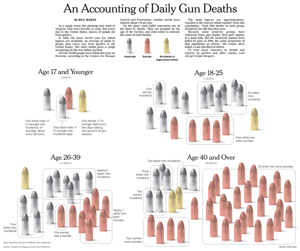
Accounting of Daily Gun Deaths - Bill Marsh

What Works

This is an odd kind of chart, it uses 2004 data to show how the average of 81 people who die each day by guns are killed – suicides, homicides, accidents/police action. Note that people who die in war are not included. I find this both intriguing and incomplete. For contextualizing sensational events like yesterday’s murders and suicide in Alabama, this is useful. People die everyday at the wrong end of guns, some as a result of homicide, more as a result of suicide in older cohorts. But…

What Needs Work

… where’s the depth? The dotted circles grouping the bullets are not all that sensitive. It’s the same dots across the board, no matter what’s being grouped. Somehow that seems too hasty; it takes a lot of reading to decode this graphic. There could have been a way to do it so that race and gender were visually obvious without needing the words. Maybe the bullets representing dead females could have taken on a feminine form. Maybe race could have been represented by colored bands around the bullets.

Relevant Resources

Arum, Richard and Taylor, Edward. (2007, 7 May) The Sociology of School Shootings Edited transcript and audio link of a recent Voice of America interview with Richard Arum of the SSRC and Edward Taylor of U. Minn., presented with the permission of VOA. From the SSRC site.

Dewan, Shaila. (2009, March 10) Gunman Kills at Least 10 in Alabama, Then Takes His Own Life After a Chase in The New York Times US Section.

Marsh, Bill. (2007, 21 April) An Accounting of Daily Gun Deaths in the New York Times.
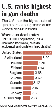
World Gun Deaths - From the AP
Crude Suicide Death Rate by Age Group - Canadian First Nations vs. All Canadians

What Works

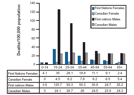
I went looking for information about suicide and American Indian populations because I know that this is one indicator of the mental and physical health of a population. There is written work on American Indians out there, but this was the best information graphic on the subject and it happens to come from Canada where the population in question is referred to as First Nations. I like it because it respects that there has been (and continues to be) a difference in the rate of male and female suicide victims. Women tend to attempt suicide more often; men tend to be more successful in their attempts. I like it because it shows that the teen years are the most dangerous years for First Nations members by continuing the analysis across all age groups. They could have just truncated the graph at age 35 or so, since they are primarily concerned with the teen years, but instead they show the entire range of age cohorts. The viewer has to pick up on the fact that the difference between suicide rates of First Nations vs. all Canadian populations is most during the teen years and then falls off so dramatically that there is hardly any difference in old age. When viewers have to figure things out for themselves they are more likely to remember and trust those insights. I like that the tabular data is appended below the graph.

What Needs Work

Bar graphs are best when they are simple and this one is beginning to move away from simple. There are four bars for each cohort – it’s still legible, but it’s becoming hard to grasp the message at a glance with all those comparisons going on at once.

Relevant Resources

The North American Aboriginal Two Spirit Information Pages University of Calgary

Pew Research Center  - Views on divorce
Pew Research Center - Views on divorce

Also in the original graphic: Notes: Whites include only non-Hispanic whites. Blacks include only non-Hispanic blacks. Hispanics are of any race. Don’t know responses are not shown.
Survey Date: February 16-March 14, 2007

What Works

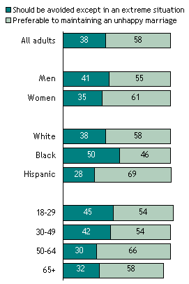
This is one simple way to display data that is supposed to add up to 100%. It doesn’t work well when there are more than two categories, but I would rather see two categories like this than see two categories in pie charts. Two category pie charts often end up looking like pac man which could be particularly unfortunate when it is divorce data that is being displayed.

What Needs Work

I don’t understand why there are colors here. Shades of gray are just fine and would give the graphic a cleaner look overall. More importantly, I am unsure that it makes sense to portray age, race, and gender as the same kinds of data. From a strictly technical perspective, age is ordinal data here but race and gender are nominal data. More broadly, thinking that gender and race and age are having similar impacts on how people feel about divorce just doesn’t make sense.

Another thing that bothers me is the missing data. Sure, there’s a disclaimer than don’t know answers aren’t displayed, but I kept fixating on the fact that the numbers didn’t add up to 100 as they should. I would show those don’t know’s since not knowing how you feel about divorce seems like a piece of data to me, not just something someone forgot. I can forget a behavior (like whether or not I locked the door behind me this morning) but I can’t very easily forget an attitude. I have trouble, for example, forgetting how I feel about leaving an unhappy marriage. It’s also hard to use an “I forget” response when the question has been posed. If you’ve forgotten, now’s the time to remember! How about it, marriage forever or leaving if you’re pretty sure you’d be better off alone? The point is, saying “I don’t know” to this question is a key data point, not just a trivial lapse of memory about what a behavior.

Relevant Resources

Pew Research Center Social and Demographic Trends Views about Divorce by Age, Race and Gender

Stimulus Package - Washington Post (Laura Stanton)

What Works

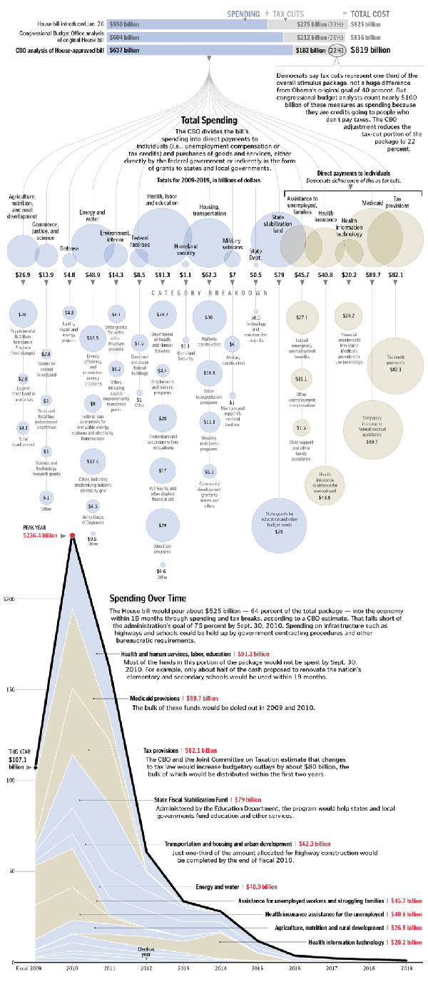
First, the paper allowed three different graphics to run – the overview provided by the bars at the top that show how the stimulus is divided by spending and tax cuts, the more granular breakdown of the pigeonholes for these dollars, and the time line that helps us understand when the money is going to hit the economy (and when we can expect all these transit programs to get going). Second, the main graphic does two things. It is both a fairly simple, readily understood cascading design that draws each category down to its constituent parts across the vertical access. It is also artful – when I look at this I see a sort of mobile hanging over head offering glassy baubles of funding to the madding crowds (ie the states). I’m not trying to insult the states here. In this economy, we’re all the madding crowds, but I really like the fact that the graphic incorporates mood and sensibility. Third, the timeline is a critical component of the stimulus package because there is so much anxiety about when this down turn will be ending. The stimulus money hitting the market is not a direct indicator that the downturn will end, but it is an indicator of when we can start looking for positive economic signs. Furthermore, the timeline could almost stand alone as both a timeline and a description of how the money was allotted. It is nice to be able to look at the package’s pigeon holes/piles of money in two different ways.

I also smiled when I didn’t see a map. Not every story can be visually summed up by the deployment of a shaded map.

What Needs Work

This blog isn’t wide enough to satisfactorily display the graphic so click through to get the whole story.

Relevant Resources

Congressional Budget Office

Stanton, L. (2009, 1 Feb.) Adding up the $819 Stimulus Package – Graphic. The Washington Post.

Yourish, K. (2009, 1 Feb.) Adding up the $819 stimulus package – Reporting The Washington Post

amazon.com, walmart.com, target.com, kmart.com
City Data
City Data

What Works

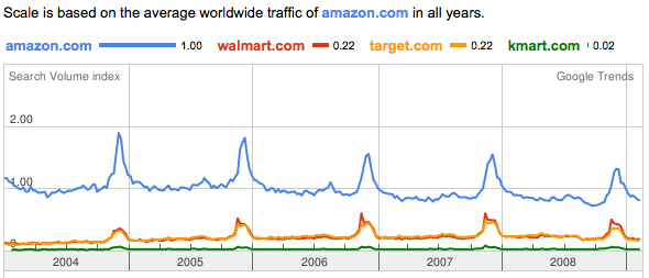
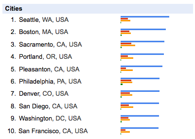
This is a graphic generated by one of google’s trend analysis tools. I simply typed in the web addresses I was curious about and google graphed their relative traffic patterns, using the first page I entered to set the scale. In their words, this is what the tool does: “Google Trends analyzes a portion of Google web searches to compute how many searches have been done for the terms you enter, relative to the total number of searches done on Google over time. “ If I were you, I would ignore the value of the scale and just keep in mind that it is relative. We’re measuring not total volume, but the volume of these four sites relative to one another.

Amazon clearly has far more traffic than the other three sites. Because walmart, target, and kmart rely on their physical stores, just looking at this web traffic does not tell you much about relative sales. I don’t who else is like me, but I often use amazon as a sort of loosely organized reference site, finding it faster to look their for publication dates of books than to go to my library’s site or fish the book off my shelf. I might be an outlier in this regard – most people don’t spend time every day wondering about publication dates – but there is probably a fair amount of traffic on amazon related to their product reviews that may not result in sales at amazon. All of this activity generates traffic, not sales. All three of the other retailers also feature customer reviews, by the way.

What works here is sort of unclear. On the one hand, just look at how similar walmart.com and target.com are. They track each other so closely they are visually difficult to distinguish. And just look at how important the holidays are to all these retailers.

The city data relies heavily on which website is input into the search field first. Seattle might not have even been included if I had put walmart.com first, but many cities in the south would have been. Minneapolis would be up there if I had put target.com first. kmart.com first motivates Philly to the front of the pack.

What Needs Work

My biggest critique of this sort of thing is that it’s unclear what the heck to take from it. If you are just trying to beat some competitor, having google show you their relative traffic is immensely useful. But what else is this good for? Anyone?

Let me just point out that this only works for large sites. Google can’t tell us much about the vast sea of smaller sites.

Open Access – Transparency

In the end, though, the move towards making data publicly available is fabulous. I can’t see how this particular instance is broadly useful to me – it’s fascinating, sure, could be good for marketing departments internal to these companies, but then what? My confusion just means that I am a short-sighted fool. Google should be applauded for creating a non-prescriptive tool to explore the data they have that is so basic it can be used by anyone for who knows what.

Relevant Resources

Benkler, Y. (2006) The Wealth of Networks: How Social production Transforms Markets and Freedom. New Haven: Yale University Press.

Google Trends Information.

Google Trends the digital widget or digi-wigi.

Himanen, P. (2001) The Hacker Ethic. New York: Random House.

Raymond, E. (2001) The Cathedral & the Bazaar: Musings on Linux and Open Source by an Accidental Revolutionary. Sebastopol, CA: O’Reilly Media.

Population Growth Animation - China

First Thing’s First: Apologies

My apologies for failing to post for a few days. If you noticed, I’m flattered. I had some deadlines and limited access to the internet late last week. Unfortunately, March is a very busy month and I will likely have this problem again before the month is out. I’ll try to make up for it when I can.

What Works

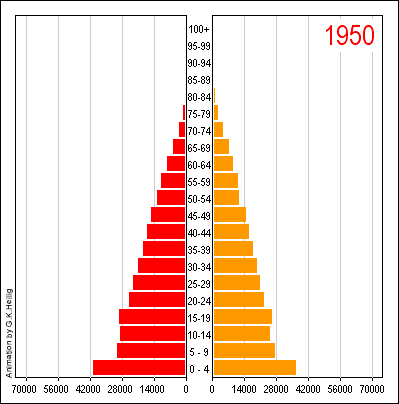
I have always been a fan of the population by gender and age chart, even in the static form that you see before clicking through above. It is quite an achievement to clearly represent three different variables on a two dimensional graph. It helps immensely that gender here is a binary value. If it were tertiary or tertiary plus, this strategy would fall apart. Once you click through, you’ll see that the animation adds yet another variable, time. And time is a real kicker here. You can see how China’s population goes from having many young people and few old people to 2050 where the largest category is between 60 and 64 years old. Great way to take an old graphic technique – the static version – and animating it.
(I would love seeing this thing as population by age sticking married people on one side and unmarried people on the other as an animation.)

What Needs Work

The colors and overall treatment of the graphic as a designerly element. Red and orange makes it look a little like it’s yelling ‘Caution! Proceed at your own risk!” the whole time. But then, I guess we all have to worry about what is going to happen when the population pyramid becomes a slender pillar with an ionic capital.

Relevant Resources

United Nations (1999): World Population Prospects. The 1998 Revision. New York. Link to animation. [graphic credit to Heilig, G. 1999]

Death Penalty Costs in Maryland - The New York Times

What Works

As you may recall from last week’s post on the death penalty, the use of the death penalty is not a deterrent to murder. Today in the New York Times, an article by Ian Urbina focuses on the fiscal reality of the death penalty citing a study done by the Urban Institute along with proposed legislation to get rid of the death penalty to help states meet their budgetary goals. “The Urban Institute study of Maryland concluded that because of appeals, it cost as much as $1.9 million more for a state prosecutor to put someone on death row than it did to put a person in prison. A case that resulted in a death sentence cost $3 million, the study found, compared with less than $1.1 million for a case in which the death penalty was not sought.”

What works about the graphic is the combination of bars with numbers. Basically this is just a spreadsheet with some bars next to the costs. For those of you social scientists out there who have grown fond of your tables, think about adding bars with interval level data (like costs and population).

What Needs Work

The bars should also appear in the last row on the table where the totals are displayed if this bar-in-table trick is going to work. I can see that the graphic would have had to stretch to accomodate the $3m bar, but the visual effect of having the whole table stretched to fit that bar would have been powerful. As it is, the visual impact of the bar technique is not fully realized.

Relevant Resources

Roman, John; Chalfin, Aaron; Sundquist, Aaron; Knight, Carly; and Darmenov, Askar. (1 March 2008). The Cost of the Death Penalty in Maryland. Washington, DC; The Urban Institute.

Urbina, Ian. (24 February 2009) Citing Cost, States Consider End to Death Penalty. The New York Times, US Section.

Network Structure of the Internet - Carmi et al

Necessary Background

This visualization is going to take a bit of explaining. Mapping the internet is a question that has intrigued folks who are worried about internet security, the digital divide, robustness, even artists who just wonder about all those bits of information flowing around us.

Remember The Matrix?  Couldn't help but mention it here.
Remember The Matrix? Couldn't help but mention it here.

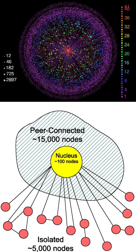
This visualization attempts to describe the structure of the internet as a network, not to map its black holes, censorship holes or describe actual geographic nodes like Akamai in yesterday’s post. This is a different sort of map and it requires some background reading. The authors set up a strategy for exploring the network terrain of the internet that generated these three areas – the central nucleus area consisting of the most highly connected nodes, a fringe around the edges of a whole bunch of pages that would be cut off completely if the nucleus were removed, and then a sort of spongy area in between these extremes full of nodes that could connect to each other if the nucleus were removed but not nearly as efficiently. Call it the peer-to-peer zone.

Here’s how the authors described the process that generated the three classes of nodes:

First, we decompose the network into its k-shells. We start by removing all nodes with one connection only (with their links), until no more such nodes remain, and assign them to the 1-shell. In the same manner, we recursively remove all nodes with degree 2 (or less), creating the 2-shell. We continue, increasing k until all nodes in the graph have been assigned to one of the shells. We name the highest shell index k max. The k-core is defined as the union of all shells with indices larger or equal to k. The k-crust is defined as the union of all shells with indices smaller or equal to k.

We then divide the nodes of the Internet into three groups:

  • 1. All nodes in the k max-shell form the nucleus.
  • 2. The rest of the nodes belong to the (k max − 1)-crust. The nodes that belong to the largest connected component of this crust form the peer-connected component.
  • 3. The other nodes of this crust, which belong to smaller clusters, form the isolated component.

Even if you don’t spend your days dividing networks into k-shells, I hope you now understand that this model’s strength comes from the fact that the structure was generated rather than imposed by initial assumptions. There were no initial assumptions.

What Works

Success here is that people who do not study networks can understand what these researchers did at all. Most highly specialized research (and pretty much all research is highly specialized) only makes sense to the people occupying the sub-sub-discipline actively working on those questions, equipped with the right language, fully immersed in the discourse of the niche. That would have been true if I had just tried to read this article without the accompanying image.

I also think it helps immensely to see the sketchy, comparatively unglossy schematic along with the polished final image. The glossy version adds in enough detail that I might have missed the big picture without having the schematic there to remind me that it isn’t about color or distance – that the contribution is all about the three types and their relationship to one another.

What Needs Work

Similar problem with this image as I had with yesterday’s image: the final image is so glossy and sealed that I feel like it’s hiding something. The more gloss on an image, the more it becomes impenetrable to critique. It presents itself as hermetically sealed – how can anyone get under the skin and assure themselves that this is a trustworthy image? This glossiness of the final image is probably why the schematic has so much appeal. It’s easier to see how the two were put together and *why* it is the way it is.

Aesthetically, I am not sure I like the colors and I think I would have tried to achieve the look of a solid core, a very fringe-y outer layer that has more volume but is almost insubstantial in its lacy-ness, and then a middle layer that sort of looks like a network made of jello. It is so easy to say these things when you don’t have to kill yourself in photoshop and illustrator making them happen.

Note

[There is another post on Graphic Sociology about mapping the internet about visualizing the map of an individual site which is here.]

Relevant Resources

Carmi, Shai; Havlin, Shlomo; Kirkpatrick, Scott; Shavitt, Yuval; and Shir, Eran. (2007) “A model of Internet topology using k-shell decomposition” Proceedings of the National Academy of Sciences of the United States of America.

Moskowitz, Clara. (11 April 2008) Black Holes Charted on the Internet. msnbc.com, Technology and Science.

Reporters Without Borders (2007) Internet Black Holes.

Wachowski brothers (directors, writers) The Matrix.

For those of you who aren’t watching the Oscars (or, in fact, maybe especially for those of you who are), I send some statistics your way on a Sunday evening. It doesn’t fit with a theme and there’s no way it’s going to be as popular as the blog about marijuana arrests in New York City. (Note that like any curious person, I fully intend to test my hypothesis that writing about drugs is more popular than writing about sex. Coming soon is a blog about measuring marital infidelity, an historically slippery subject that has generated competing statistics and tends to say more about survey methods than about sexual habits.)

But for tonight, I am sending you to a surprisingly emotional essay by Stephen Jay Gould on the trouble with reducing statistics to the central tendency. Yes, I said emotional. And then I said ‘central tendency’. What, you may wonder, can get your cold hearts pumping while talking about how to measure the central tendency? In a word? Cancer. In a few more words? A life expectancy delivered in terms of a right skewed median of 8 months.

He uses his own biography to make a broader point about the general tendency to divorce the intellect from the emotions: “Many people make an unfortunate and invalid separation between heart and mind, or feeling and intellect. In some contemporary traditions, abetted by attitudes stereotypically centered on Southern California, feelings are exalted as more “real” and the only proper basis for action – if it feels good, do it – while intellect gets short shrift as a hang-up of outmoded elitism. Statistics, in this absurd dichotomy, often become the symbol of the enemy.”

logic + love = the well-lived life? These are the questions I don’t even try to answer, it’s why I do sociology, not philosophy.

Seeing Skew

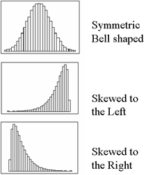
Skew Graph Examples - No Skew, Left skew, Right Skew (which is closest to Gould's case)

Just to refresh your memory on skewness, here’s a visual reminder of what’s at stake. Refer back here when Gould talks about the many people who aren’t diagnosed with the type of cancer he had until they die, stacking the left side of the graph high with cases of life expectancy equal to zero and creating a right-skewed life expectancy.

Epilogue: Gould is no longer alive, but he didn’t die of the cancer in this essay. He lived for another 20 years and died of a different cancer at age 60.

Relevant Resources

Gould, Stephen Jay. (1985) The Median Isn’t the Message currently reposted all over the blogosphere, but originally published in Discover Magazine in 1985.

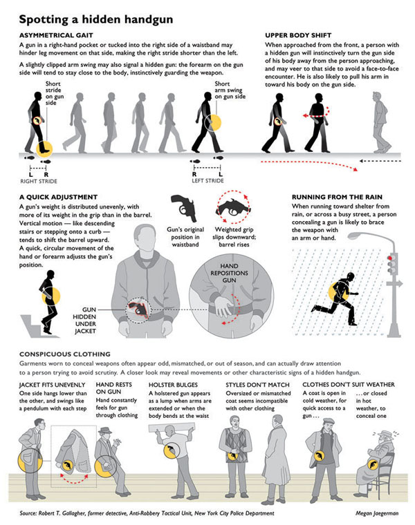
Spotting a Hidden Handgun - Graphic by Megan Jaegerman

What Works

This is one of my favorite information graphics of all time. A somewhat smaller version of this appeared in the New York Times and was then amended as you see above to appear in Edward Tufte’s book “Beautiful Information”. Since Edward Tufte is seen by many as the king of presenting data visually, I’d say his endorsement is worth far more than mine. Click through the links under Relevant Resources to see what he has to say about this graphic on his blog (which is basically a scan of a page or two from his $52 book). You will also get to see more of Megan Jaegerman’s graphics including the lifecycle of women in the developed world, the price of mowing the lawn, the price of quitting smoking, a complete strength training workout, a guide to rest/ice/compression/elevation after a soft-tissue injury, and sports graphics covering hockey, figure skating, baseball, gymnastics, and diving.

I want you to have time to look at the stylistic conventions she has developed. So follow the first link below.

What Needs Work

Megan disappeared from the graphics scene. Megan, if you’re out there, know that you are missed.

Relevant Resources

Edward Tufte reviews Spotting a Hidden Handgun by Megan Jaegerman.

Tufte, Edward. (2006) Beautiful Evidence. The Graphics Press.

Jaegerman, Megan. (June 1997) Life: Start Here Women’s Health graphic adapted for the web. The New York Times.