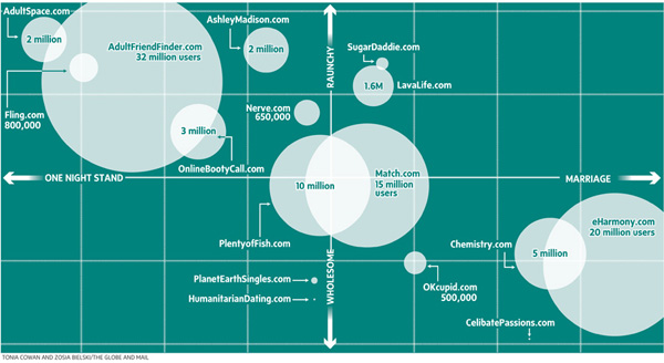
relationships

First Date vs. Reality TV First Date - by Nathan Yau from Flowing Data

What Works

I love jokes told via infographic.

What Needs Work

We need to tell more jokes via infographic and some of those jokes could be inside jokes that you wouldn’t immediately understand. When I come across an example of what I mean I’ll post it.

Reference

Yau, Nathan (25 April 2010) “First Date vs. Reality TV First Date” at Flowing Data.

An Overview of the Online Dating Field by Zosia Bielski and Tonia Cowan

What Works

Imagine this data as a bar graph that illustrates how many users each site has. Maybe there is even some sort of inception date from the site included, too. That would be a typical way to represent this sort of data because all the reporters had in terms of numbers, were user totals. But they weren’t interested in simply showing how big one site was with respect to another. They were interested in discussing hook-up culture. Now, so far as I know, there is no agreed upon quantitative measure of ‘hooking up’. These folks didn’t claim to invent one (which is nice). They just used a couple different qualitative axes to illustrate the distinctions they saw within the field of online dating when it comes to marriage vs. hooking up and raunchiness vs. wholesomeness.

I think Bourdieu would have recognized some of his own influence here. He had similar Cartesian field maps in Distinction. Granted, he may not have been thrilled to have his concept used to describe online dating – ‘raunchy’ is a word that may not have been part of his vocabulary. On the other hand, his axis of choice probably would have been class (high and low) and as far as I can tell, the desire for lasting vs. fleeting sex does not show a clear relationship to class. Feel free to debate that assertion in the comments.

What Needs Work

Not a fan of the colors. I also wonder how certain smaller sites made the list – seems a bit arbitrary considering how many sites were left off the list.

References

Bielski, Zosia. (2009, April 9) “One Click Stands” in The Globe and Mail. [Tonia Cowan also contributed to the production of the graphic.]

Bourdieu, Pierre. [tras. Richard Nice] (1987) Distinction: A Social Critique of the Judgement of Taste. Cambridge, MA: Harvard University Press.

Divorce rate - the short and incomplete story

Zoom in and it looks like poverty could be good for marriage

Philip N. Cohen from the Family Inequality blog (and the sociology department at UNC Chapel Hill) sent along the two line graphs in this post saying, “For the last week I’ve been steamed about these two figures from a report on marriage by W. Brad Wilcox.” [Note: W. Bradford Wilcox is the director of the National Marriage Project at the University of Virginia where he is also Associate Professor of Sociology.] The zoomed-in graph above was used in the main text to show that the divorce rate is going down during the current recession. Poverty must be great for marriage! No matter how folks feel about their spouses, they must feel more strongly about having enough money so they stay together. Or, to put it slightly differently: what unemployed person is about to leave the comforts of an intact home, even if that home is a disgruntled one?

Cohen goes on to point out that Mr. Wilcox’s strategy of zooming in on the data was also picked up by the media who are happy to run a story about the unexpected positive impact of the recession on lasting marriages.

Mr. Wilcox did include a complete picture of the divorce rate since 1970 in his appendix which is copied below.

Divorce rate in the US |  1960 - 2008
Divorce rate in the US | 1960 - 2008

Zoom out and it just looks like the divorce rate hit a speedbump on the way down

As evidenced by this line graph, the divorce rate has been declining for years. The brief period of increasing divorce from 2005 to 2007 was more like a speedbump in a declining trend than the end of a trend of increasing divorce rates.

Read more about why this matters at Philip Cohen’s blog.

An improved graphic

Philip Cohen's sketch including recessions in purple

My point is simply that all infographics tell richer stories the more data they depict. Zooming in is generally a bad idea because it reduces the context from which the reader can draw solid conclusions. If the recession were going to be part of the story about divorce, recessionary periods should be indicated on the graph, too. That would make it easier to tell if all recessions tend to decrease divorces or if somehow a decrease in divorce just happened to coincide with this current recession. It’s easy to ‘lie’ with info graphics by being overly selective. And lying just isn’t what we’re after.

References

Wilcox, W. Bradford. (2009, December 11) “Can the recession save marriage?” in The Wall Street Journal. Opinion Section.

Cohen, Philip. (2009) Recession, resilience, divorce?” in The Family Blog.

Excerpt from "Knot Tied" infographic at GOOD magazine
Excerpt from 'Knot Tied' infographic at GOOD magazine

What works

I cropped what you see above from an infographic that is part of GOOD magazine’s infographic section called Transparency. If you haven’t checked it out, I highly recommend it.

This was the strongest part of the graphic. It does a masterful job of elegantly illustrating a relationship both in space and time. We see that in 1998 hardly any states cared enough about gay marriage to have banned it or legalized it or had any kind of vote whatsoever. Except Alaska. Hello, Palin family. By 2004 the issue had hit the big time and gay marriage bans blanketed about half the country. The east coast showed signs of tolerance. Finally, in 2009, the east coast is holding out against a national tendency towards homophobia. Iowa surprises many by legalizing gay marriage.

What needs work

Please click through to the larger graphic. I feel that the map time series is by far the strongest part of the graphic. Perhaps because it is so elegantly simple, it was shrunk and deposited in the lower right corner.

References

Porostocky, Thomas. (2009) A History of Gay Marriage in Transparency, a section of GOOD magazine published out of New York and Los Angeles.

Mapping Singles - J. Soma

What Works

Your sense of who’s single and when they’re single will grow immensely in three or four minutes of playing around with this interactive map of single-ness in the United States, by age and gender. Men get married later and die younger. This means that at young ages, there are more single men than single women because some men who will eventually get married won’t marry until later, on average, than the women they end up marrying. This is just a complicated way of saying that men often marry younger women. In old age, there are more single women than men (the imbalance is because the men start dying younger). During the decade of the twenties and then after about age 65 you’ll find the largest proportions of single-ness. People in the middle decades, from 30-60 or so, are more likely to be coupled. But don’t take my word for it, click through and play around. This data actually understates the number of people who are functionally single because single is measured here as never married. So the folks who have been divorced or widowed and haven’t remarried do not count as single for the purposes of this graphic.

The writer of the text accompanying the graphic is interested in the geographical distribution of single women and single men so there’s more on that if you click through.

What Needs Work

I like this one a whole lot so I don’t have much to say except that I wish the designer wouldn’t have gone with the red/blue, female/male color scheme. How about purple and green? Or orange and teal?

I also think I would have counted people who are divorced/widowed and NOT remarried as single.

The graphic designer is careful to note that since homosexual couples cannot get married, they will erroneously be counted as single, even if they are partnered. That’s a problem with the underlying data collected by the census, not the graphic design.

Relevant Resources

American Community Survey (2006)

Soma, Jonathan. (2008) The Interactive Singles Map