
 | Betsey Stevenson and Justin Wolfers")
What Works
Last night this blog received a deluge of spam from someone with an IP address in Australia promoting wholesale wedding dresses. In response, I first exercised a wholesale ‘delete’ event. Now we’ve got a graph about the stability of marriage in the US since the 1950s. The next time someone tells you that 50% of marriages end in divorce, you’ll know how to show them that they’re wrong.
As you can see from the above graphic representation, marriages in the 1950’s were less likely to end in divorce within the first 25 years of marriage than any subsequent cohort of married folks. We have no idea if those were ‘good’ marriages that lasted, we just know that they were less likely to end in divorce. From the representation we see that divorce rates climbed through the 1960s and 1970s but started falling in the 1980s and continues to fall, inching back towards 1960s levels.
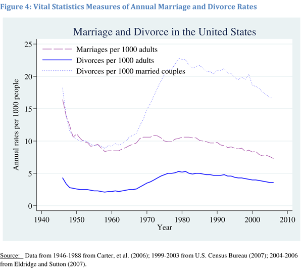
Furthermore, from this next graph, we can see that the decrease in the divorce rate is not only due to marriages lasting, but that any given person is less likely to experience divorce because we are now less likely to get married in the first place. If one doesn’t get married, one cannot get divorced. It would seem that people might actually be making fairly appropriate decisions around the ‘I do’ moment because the people who choose marriage are staying married longer. In other words, the folks less likely to stay married may somehow recognize this about themselves and opt out of marriage altogether.
Using multiple graphs tells a much more complete picture than relying on just one. The first graph was designed to debunk the notion that 50% of marriages end in divorce by showing that for a brief moment, marriages formed in the 1970s may have approached that dissolution rate but that marrieds have been sticking together more and more since then. The second graph is more interesting to me because it details overall trends in marriage, including the slow slide away from marriage altogether. It could be that people are just waiting longer to get married, in which case the decline in the marriage rate recently might just be a lag. Lifetime marriage rate is something I’d still be interested in checking out, though I feel that we haven’t maxed out on age at first marriage so it would be hard to see, at least not in 2010, if the trend is toward later marriage or no marriage at all. My prediction would be that age at first marriage will start to hit a plateau at around 30 for women because reproductive ability tends to decrease markedly starting at about 35, or so I’ve been told, and many people get married at least in part because they’d like to have some kids. But we’ve got a long way to go before we hit 30 for women’s marrying age. Median age at first marriage for women is just 26 and even though it is climbing, it isn’t skyrocketing.
References
Stevenson, Betsey and Wolfers, Justin. (2007) Trends in Marital Stability. Working Paper.
Wolfers, Justin. (21 March 2008) Misreporting on Divorce. on the Freakonomics blog at the New York Times.
Comments 3
Divorce OR Trends in Marital Stability » Graphic Sociology Divorce on Me — May 19, 2010
[...] here to see the original: Divorce OR Trends in Marital Stability » Graphic Sociology By admin | category: Uncategorized | tags: graphic-representation, the-1950, were-less | [...]
Get Six Pack Abs | Autism Families: High Divorce Rate Is a Myth — May 19, 2010
[...] Divorce OR Trends in Marital Stability » Graphic Sociology [...]
cna training — May 23, 2010
Terrific work! This is the type of information that should be shared around the web. Shame on the search engines for not positioning this post higher!