Manhattan traffic patterns
Manhattan traffic patterns | Wired Magazine June 2010

What works

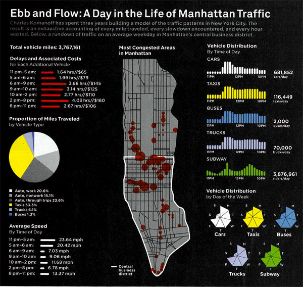
The tendency with geographical data is to try to find a way to portray everything on a map. Surely, there is a map up there, and many people will recognize that the area is Manhattan instantly by looking at the map before they read it in the title. That’s a nice thing about maps – they transcend language and bad captioning to some degree. However, much of the detail is not to be found in the map. The map just shows us where congestion tends to occur, but it doesn’t tell us when we can expect these areas to be congested or just what “congested” means. In Manhattan, the average speed is under 10 mph so does congested mean less than 5 mph? Or what?

But if we look at the other graphs and charts it is a veritable jackpot of traffic information, at least at the collective level. I wouldn’t try to use this collection of information to plan your route through the city unless, of course, this collection of information causes you to take the subway instead of driving.

I hate pie graphs (as in the “Proportion of Miles Traveled”), but I am sympathetic to the triangulated pie graphs in the “Vehicle Distribution” graphic. At least it is visually easier to calculate the volume of a true triangle than a rounded off triangle. So if you find that you have to go with a pie graph, emulate the triangulated version found here and your viewers will come away with a better understanding of the information you are attempting to convey. I was surprised at how many people take taxis to get to work. But I am even more surprised at how many fewer trips there are on weekends. Fewer than half of those made on an average weekday.

Anecdotal evidence warning: When I first moved to Manhattan, I remember sitting in the car for two hours to drive around the block. There was a street fair nearby (not on any of the sides of the block traversed in this trip) and that seemed to slow everything to a standstill.

What needs work

I would have found a way to combine the average speed and the delays and associated costs. Clearly, the two are related – lower average speed must mean more delays. I had a little trouble understanding the delays and associated costs without the text from the article. If the speed and costs had been integrated into a single graphic instead of split into two (with a big pie graph in between), I think the link between speed, delays, and costs would have started to become more intuitive.

Here’s an excerpt from that section for the curious:

“In the end, Komanoff found that every car entering the CBD causes an average of 3.23 person-hours of delays. Multiply that by $39.53–a weighted average of vehicles’ time value within and outside the CBD–and it turns out that the average weekday vehicle journey costs other New Yorkers $128 in lost time.”

For more on how that was calculated, you’ll have to read the article. But the bottom line came down to a proposed $16 toll to enter Manhattan below 60th Street. It’s about what drivers in central London pay and the proceeds would go to bolster public transportation. Such an idea – known as congestion pricing – was proposed by the Bloomberg administration but voted down in 2008.

References

Salmon, Felix. (June 2010) “The Traffic Cop.” in Wired Magazine [infographic by Pitch Interactive].

Bonanos, Christopher. (17 December 2007) “Fare Enough” New York Magazine.

Map comparison highlighting walking distances in urban grid vs. cul-de-sac layout
Cul-de-sac urban planning limits walking distances | Urban Design 4 Health

What works

This side by side comparison is meant to show the length of all possible paths from a given point, assuming a person walks for five minutes. (Or maybe it’s ten minutes, but you get the idea.) Because the grid goes on forever – remember calculus? a line is defined by two points in space but continues for infinite length – the length of linear X-minute walking paths is longer than the more ‘organic’ length of cul-de-sacs. Of course, in cities, we are not talking about the ideal typical infinite lines found in calculus nor are cul-de-sacs some naturally determined path based on where deer walked down to the stream to get water before developers plopped a suburb down in the same spot. Both the grid and the cul-de-sac based suburb are planned developments. The question has become (see references below for a small sample of the people who are asking it): is the grid better than cul-de-sacs?

The folks who constructed the graphic above are interested in fit cities. They want you to see that because cul-de-sacs make it much harder to walk (or bike) around the neighborhood, they might be contributing to car culture and, in the end, making us fat. Fit cities are the antidote to fat cities and there is much urban design being driven by our collective (and towering) BMI. Lawrence Frank, Bombardier Chair in Sustainable Transportation at the University of British Columbia gets his hands dirty researching this question and he found that, “neighborhoods in King County, Washington: Residents in areas with the most interconnected streets travel 26% fewer vehicle miles than those in areas with many cul-de-sacs.” Furthermore, “Recent studies by Frank and others show that as a neighborhood’s overall walkability increases, so does the amount of walking and biking—while per capita, air pollution and body mass index decrease.

Cul-de-sac illustration
Illustration by Lauren Nassef

I think the concept behind the above graphic is solid. It doesn’t do the best job at showing distances walked, but it does a great job of visually demonstrating general walkability. The grid is good at making space permeable; cul-de-sacs are good at making space rather impermeable. I would point out that everything could have been much cleaner if some of the information and colors in the background had been dropped out. A grey-scale representation of the available routes overlaid with the walking routes in color would have put some polish on the visual without altering the concept. Plus, I would have liked a key somewhere telling me if this is 5 or 10 minute walking distance.

What needs work

Collective fitness has only recently hit the urban planning scene as a concern foremost in designers’ minds. Back in the 1980s when crime rates tended to be higher, for example, there was a great deal of concern about safety. Shane Johnson and Kate Bowers did a similar comparison also setting cul-de-sacs up against the grid (sadly, without generating any infographics) but this time they were wondering if cul-de-sacs experienced fewer burglaries than linear streets. Before you get your panties in a snit about demographic issues like income that could impact both burglary rates and the likelihood of living in a cul-de-sac neighborhood, I’m telling you that Johnson and Bowers controlled for income. They also controlled for ethnic heterogeneity. They were not able to measure whether or not cul-de-sac neighbors were more likely to have home security systems. What did they find? Cul-de-sacs are safer – fewer burglaries. They point out that there could still be elements of cul-de-sac neighborhoods that have nothing to do with urban design that they weren’t able to fit in their statistical model. Feel free to read the paper and make your own decision, but I was compelled by the fact that even the presence of foot paths connecting cul-de-sac hoods tended to increase the incidence of burglaries.

Johnson and Bowers sum it up thus:

For this study area at least, the policy implications would seem to be quite clear; permeability should be limited to that necessary to facilitate local journeys and sustainable transportation. Additional connectivity may lead to elevated burglary risk and so should be avoided. Cul-de-sacs, in particular, would appear to be a beneficial design feature of urban areas and so should be encouraged.

Overall, then, I think the jury is still out on the question of cul-de-sacs. Perhaps the most important point is to note that like many other things – fashion, food, sport – scholarship has trends. The trend in urban design now focuses on public health, especially fitness. It used to be crime. Before that one might remember that fears of nuclear annihilation influenced design. I’m not picking on urban designers for being faddish. Trends flow through all disciplines with which I am familiar.

References

Johnson, Shane and Bowers, Kate. (Online | December 2009, Print | March 2010) Permeability and Burglary Risk: Are Cul-de-Sacs Safer? . Journal of Quantitative Criminology Vol. 26 (1).

Popken, Ben. (23 June 2010) Cul-de-sacs are making us fat at Consumerist.

New York Times Magazine. (2009) “Ninth Annual Year in Ideas: The Cul-de-Sac Ban”. [above illustration by Lauren Nassef].

New York Chapter of the American Institute of Architects. (2010) Fit City 5: Promoting Physical Activity Through Design” Architecture Lab.

Wieckowski, Ania. (May 2010) Back to the City in Harvard Business Review.

Conquest of Pestilence | Courtesty of New York City Dept. of Health via Glaeser

What works

Ah, old-timey graphics. What works here is that this graphic reveals how far we’ve come, I think. The purpose is to show what percentage of New York City’s population died, annually. We can see the trend jumps around a bit – infectious diseases cycle through, sanitation improvements are made, the demographics of the population change – but mostly trends downwards. I like the inclusion of information about deadly diseases though I wouldn’t have just stuck labels on the peaks. The labels here clutter up the graphic territory and do not leave any room for adding other kinds of helpful trendlines and so on like that.

What needs work

Of course, there is not nearly enough context to make proper sense of this information. The implication is that the general downward trend is due to public health improvements, so of course the spikes are all labeled with diseases. I do not dispute that people were dying from cholera or typhus, I just want to hear more about what might have been causing people to LIVE (rather than just seeing what was causing them to DIE). What about demographic changes that shifted the population towards and then away from a preponderance of new immigrants? From young babies to slightly older people (who used to be at risk of death more than children and adults)? What of other changes (like, say, improvement in building codes that made the Triangle Shirt Waist Fire an anomaly rather than one of many similar situations)? What about income levels? The assumption is that as income rises, death rates drop, but I’d like to see that represented because it’s unclear just how rising income is linked to public health measures. Are we healthier because our increased contributions to the general fund (through taxes) go to support public health? Or is there simply something about being richer – either as individuals or as a collective – that leads to better health independent of the direct funding of public health?

More to come on Time Lines

I’m working on timelines this week but I want to create something new rather than just talking about existing ones which is going to take me some time. It will be a group effort, I strongly encourage you to send in your favorite time lines, your least favorite time lines, and comments about the time line I put together once I’ve got it posted.

Thanks much.

References

Glaeser, Edward. (22 June 2010) The Health of the Cities in The New York Times, Economix blog.

New York City Department of Public Health. [the image]

Stadium Variety Bathroom of the Future | Molotch and Nor&ecute;n

What’s new?

If you read the blog regularly, you’ve seen this before. So what’s new, you ask? Well, for one thing, we decided it was necessary to add a lactation area. It’s adjacent to the attendant’s booth; in a perfect world the attendant can watch the stroller while mom pumps or breastfeeds. The divider between the lactation area and the attendant’s booth is a heavy curtain – like a theatre’s curtain – so that if mom has little kids running around, there are fewer places for fingers to be pinched. Swinging doors and small children have been known to be a bad combination, especially when mom may not be able to react in a lightening quick fashion as she is in the midst of feeding a different child or pumping (or changing a different child’s diaper). Furthermore, the lactation area is near the attendant to lend the sensibility and the reality of extra watchfulness over both mom’s with their breasts out and the potentially escaping toddlers. This configuration also places the lactation area just about as far away from the noise and commotion of the rest of the bathroom as is possible. Nobody likes to eat where others…well, you know what I mean. We included a changing area in here in addition to the one in the main space because we figured it would be more convenient for moms who are breastfeeding to have the opportunity to change a baby right in the same spot. There wasn’t enough space for a toilet (for mom herself, or for accompanying folks like dads, siblings, and nannies). We were hoping to have space for at least two lactating moms or a lactating mom and a dad to fit in this cubby of a space. But I’ll leave it as an open question? Should we have fully enclosed this space and put a toilet in there? Or is it better that two moms can do what they need to do at the same time? Leaving it a little bigger and not stuffed with a toilet also means dad or grandma or whoever is part of the crew can have a spot next to mom while she pumps or breastfeeds.

Adding the lactation area forced us to reorient the attendant’s booth to face mostly into the main bathroom area. There is still a small window on the right hand side which will be the first thing most people see as they enter the bathroom. Folks who are a little shy about asking for tampons or clean needles or whatever like that might be able to approach the smaller, more private side window rather than the big one in the front. However, from the big front window, the attendant will be able to see most of what is going on in the main space, save for the urinal area. There was discussion of adding a one-way mirror between the attendant’s booth and the urinals, high enough so that no penises would be in view. This would allow the attendant to be within site of just about everything, save the individual stalls. Safety would be increased, privacy would be decreased. What do you think? Mirror or no mirror? Remember, the one-way mirror would be located too high to see any penises unless those penises were attached to someone standing well away from a urinal.

Office-scale bathroom of the future | Molotch and Norén

What’s new?

In this office scale version, I reconfigured some of the wall segments and added a completely new one in the middle of the space after a commenter on this blog mentioned that visibility into (and out of) the urinals might not be desirable and would be easy to screen. He was right. Now men can be more comfortable knowing that they cannot be seen and nobody will spot the back of a man at a urinal upon stepping into the bathroom. There are still more stalls than urinals – better for women and men, if you ask me. Not better for the environment since toilets use far more water than urinals (especially when the urinals are waterless, as they now are in many new construction projects).

Style points?

I admit these are not the most stylish of plans. I’m not an architect and not aware of all the style conventions employed to make plans both interesting and legible. I’m taking opinions on what to change. Bring it on, folks, bring it on.

I decided to give the sinks a radial gradient though now I’m not sure if it’s obvious that they are sinks. I made the font bigger in the stadium version because it appears that our publisher will be printing it at about the same scale as the one you see above. Small.

The book?

The book – “Toilet: The Public Restroom and the Politics of Sharing” will come out on World Toilet Day, November 19, 2010. These two images, or images quite like these, will appear in the concluding chapter by Harvey Molotch.

World Cup Carbon Footprint | EU Infrastructure

Background

Timon Singh at EU infrastructure looked at the travel distance of the fans, the efficiency of the hotels, all the concrete used to build the new venues, and a bit of a credit for intra-venue mass-transit to create the graphic above. By way of comparison, the previous World Cup in Germany released far less carbon because the fans didn’t travel as far and they used existing venues instead of building new ones. So perhaps that isn’t even the relevant comparison, you’re thinking. Singh predicted that response and notes that this World Cup will release more carbon than the Beijing Olympics. Before I believe that claim, I’d like to see the numbers in more detail. No matter which one was worse, the point is that large-scale one-off events in which hundreds of thousands of people travel great distances come with environmental costs.

What works

I like these flower chain graphs, sort of. They are colorful and allow information of the same sort to be broken into categories; it is all about carbon emissions but we get to see all the different sources that funnel into the big pot in the middle. There’s plenty of space for labels and numbers to appear with the circles, which is critical.

What needs work

What do you think, readers? Is this kind of circle comparison easy on your eyes? I mentally struggle when circles get close in size and when I am trying to sort of visually add the area of two or more circles. Personally, I think a more linear version would have been easier for me to handle. The longest line would be the biggest carbon contributor, the color codes could have stayed, the labels could have stayed, and I would have had an easier time mentally adding one segment to the next. (I really wanted to try to mentally add all the ‘flight’ components together but I couldn’t do it visually so I ended up just doing it mathematically. But I could have done that more easily in a table.)

Reference

Singh, Timon. (June 2010) The carbon footprint of the World Cup. EU Infrastructure.

Cancer Rate Changes for Six types of Cancer

What works

Cancer is not a single disease, as this graphic’s text reads, it is a collection of at least 100 diseases. This does a good job of showing how rates of infection and mortality vary from one kind to the next. The text explains cancer types for which targeted treatments have constituted a large part of the explained change in the rate of infection and mortality for particular kinds of cancer.

What needs work

Cancer sucks.

I don’t have more to say about this right now. I chose this set of graphs because it is of personal relevance. Don’t feel like being critical just now.

Migration into and out of Los Angeles, CA (2008)

What works

This is an interactive graphic situation so to get the most out of it, I recommend clicking through to forbes.com and playing around.

What works is that we can see a lot of internal migration between Los Angeles and other west coast cities as well as between LA, Florida, and the DC-NYC-Boston corridor. I know plenty of bi-coastal folks so the picture matches up with my experience. To get the proper context, I suggest you click through and pick some rural counties to see how much people tend to move from small place to small place and from big place to big place but not so much from very small to very big or vice versa.

Overall, what the interactive graphic ends up showing us is that people move quite a bit. The map gets saturated with lines.

Man, we can really make some cool graphics – and interactive ones at that – with the ridiculous capacity of desktop computers these days. This is a data-driven graphic that would have been nearly impossible not that long ago.

What needs work

There is no comparison for this graphic. I can’t tell if all this migration is more than normal, trending up, trending down, or anything of that nature. Sheer volume at one time can generate lots of questions but it doesn’t answer many.

I’d also be curious to know if the movers are evenly spread across the life course. Plenty of people move to go to college and then again when they leave college, or so I think. And there has been plenty of ink spilled about retirees moving south from places like Chicago and Minneapolis. Then, about ten years ago, I remember reading stories about the plight of the managerial class having to move around within their multi-national corporations to keep progressing in their companies all through their mid-life. With all those half-baked hypotheses, I would love to see how life stage impacts internal migration.

References

Bruner, Joseph. (15 June 2010) Map: Where Americans Are Moving at forbes.com.

Suicide Rates of Canadians by sex, age, and First Nations status

What works

What do you all think of the bar graph/table combination? I’m liking it. It’s not elegant, but it shows both trends and granular data. Furthermore, it would be easy for someone without much training in graphic design (ahem, most social scientists) to recreate this double-up style.

What needs work

Of course, of course, the biggest and most relevant criticism one could levy against this table + bar graph combo is that one or the other should suffice. If one needs to add a table to explain the bar graph based on the table, something isn’t jiving, right? Well, maybe.

Adding one to the other doesn’t actually add any new information and takes up space which used to be under a great deal of pressure but got somewhat cheaper online, especially in the vertical dimension.

The bar graph shows trends in a way that enters your mind on EZ mode. No thinking required – just cast a glance and you can immediately tell something is decreasing and one bar is a lot taller than the rest in most cases. A table, on the other hand, always requires thinking. Lest it sound like I am against thinking, the reason I approve of this doubling up is that tables contain enough information for inquiring minds to concoct even more patterns than the graphic alone. Coming up with new patterns does require some thinking, but I support it. Thinking is fine, it’s just that mindlessness is a nice fallback, a solid no-frills default. Suicide is highest among the young (though the very young are nearly exempt) and decreases with age. First Nations males have the highest rates just about all the time and they are dramatically higher than other males and higher than First Nations females. [By the way, the Canadian trends shown here are also true for males living on American Indian reservations in the US.]

The other issues I have concern the construction of this sort of graphic. The line weights here are all even. Simply making the ones defining the bar graph different than the ones defining the table would help pull the two elements apart visually, even if the spacing remains the same.

On spacing: I would have put an empty line after the line containing the age range labels and before the first line of observations in the table. Otherwise, the eye has some difficultly figuring out if the labels are labels or if they are observations.

I would have chosen two dramatically different colors for males and females. Blue and gray are different, but not dramatically so. What about purple and green or blue and gold? There’s some drama there which would help mentally divide each of the clusters of four bars into halves (the male half and the female half).

While we are making a table, I would have either included cells showing the difference in male and female First Nations people or between female/male non-First Nations Canadians and female/male First Nations Canadians. The most interesting part about the graph, to me, is not that suicide declines with age but that the First Nations folks have much higher rates. It used to be taught in Intro to Sociology textbooks that American Indians had lower suicide rates, but at least in the past decade, the reverse has been true: American Indians have higher suicide rates, especially among the young.

The graphic remains agnostic about the causes of the differences in suicide rates across the population. I will do the same.

References

Community Health Programs Directorate, First Nations and Inuit Health Branch (2001), Citing: Health Canada (1996), using Health Canada in-house statistics.

European football revenues, 2008-08 | The Economist

What works

This is not my favorite graph (donuts, pie charts, any graph named after a pastry seems doomed to be difficult to digest). Having trouble finding much to like, except that it is about the economics of a current event, which adds a data-driven contextual angle to a cultural event. That part I like.

What needs work

The text accompanying this graph points out that, “Most of the money coming in from television, tickets and so forth goes out in wages. Deloitte says that only two of the big five, Germany’s Bundesliga and the English Premier League, operate at a profit.” However, the graph doesn’t give any indication of profit, only of revenue. It also doesn’t explain where the revenue comes from and goes to, which leaves this infographic horribly flat.

Further, reading these donut things, the next generation of the hated pie graphs, is visually difficult. Bar graphs would have been better. At least they included the numbers so we can forget looking at the graphic and just compare the numbers.

References

The Economist. (10 June 2010) “Football”.

Shipping by Barge
Shipping by Barge | Lock and Dam #1, Mississippi River at St. Paul/Minneapolis

What works

Amidst all that discussion of environmental sustainability and local food movements, I haven’t heard anyone even whisper a mention of barge shipping. Waterways used to be some of the best shipping lanes (sometimes some of the only shipping lanes) available. Now there isn’t much traffic of that sort at all. This graphic implies that it might be in the best interest of economical and environmental efficiency to reconsider barge shipping. It certainly got my cognitive wheels whirring.

Style points for the reduced color pallet. In my book, lots of things could be black, white, and red* all over.

*where red can be switched out for just about any color at all

What needs work

First, I apologize for the quality of the photograph. Cell phone cameras, big posters, and narrow walkways make for crappy pictures. At least it was a cloudy day and there wasn’t so much glare.

This graphic was clearly created a long time ago – I’m guessing it has been hanging in the same place for a couple decades. Still one would think that since the 1970’s, at least some people in the US have cared about fuel efficiency. This graphic only displays an odd kind of size efficiency which is incredibly difficult to understand the more you think about it. Sometimes size matters. In this case, size as measured by number of hauling units (which themselves are different sizes) is nearly irrelevant.
In my opinion, it would be better to describe efficiencies in terms of the amount of fuel required for their example trip of a bunch of wheat. Measuring fuel burned would not only allow us to be able to compare between the modes, it would also allow us to understand the cost per pound of wheat (or whatever) in terms of transport alone, which could be of interest to all the local food folks. Does living on the Mississippi make all upstream food “local” in a way that overland food isn’t, at least if it is shipped by barges?

The next step after adding some kind of measure of fuel efficiency would be to spell out the kinds of emissions that are involved with each mode of transit per pound of item delivered.

I’m also curious about what kinds of commodities can be shipped efficiently by barge – is it only commodity level items like grains, coal, corn, taconite? Or would it make financial and environmental sense to load barges up with products like cars and consumer goods? And what happens to the materials when they come off the barge? Are they mostly shipped to areas where the manufacturing takes place near the river port? Minneapolis used to be a city in which grain mills lined the banks of the Mississippi and a barge full of flour could just be brought directly from the barge into the flour mill, no trucks or trains got involved. But what about other products? Not all cities are located on navigable rivers so once goods come off the barges are they usually placed on trains, on trucks, or what?

In short, this graphic implies that barges are more efficient or more economical than train or truck shipping modes but it fails to provide enough context to support that claim or to indicate which kinds of shippable goods are best for barge shipping.

References

Photograph by Laura Norén, June 2010. Feel free to borrow it, morph it, post it elsewhere, etc.