Search results for bathroom

Stadium Variety Bathroom of the Future | Molotch and Nor&ecute;n

What’s new?

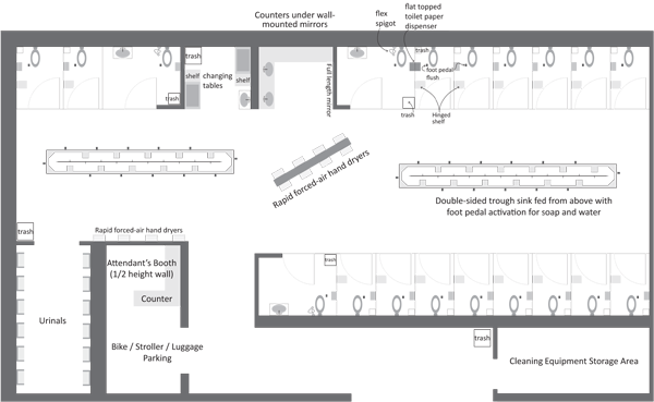
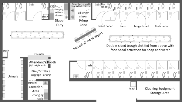
If you read the blog regularly, you’ve seen this before. So what’s new, you ask? Well, for one thing, we decided it was necessary to add a lactation area. It’s adjacent to the attendant’s booth; in a perfect world the attendant can watch the stroller while mom pumps or breastfeeds. The divider between the lactation area and the attendant’s booth is a heavy curtain – like a theatre’s curtain – so that if mom has little kids running around, there are fewer places for fingers to be pinched. Swinging doors and small children have been known to be a bad combination, especially when mom may not be able to react in a lightening quick fashion as she is in the midst of feeding a different child or pumping (or changing a different child’s diaper). Furthermore, the lactation area is near the attendant to lend the sensibility and the reality of extra watchfulness over both mom’s with their breasts out and the potentially escaping toddlers. This configuration also places the lactation area just about as far away from the noise and commotion of the rest of the bathroom as is possible. Nobody likes to eat where others…well, you know what I mean. We included a changing area in here in addition to the one in the main space because we figured it would be more convenient for moms who are breastfeeding to have the opportunity to change a baby right in the same spot. There wasn’t enough space for a toilet (for mom herself, or for accompanying folks like dads, siblings, and nannies). We were hoping to have space for at least two lactating moms or a lactating mom and a dad to fit in this cubby of a space. But I’ll leave it as an open question? Should we have fully enclosed this space and put a toilet in there? Or is it better that two moms can do what they need to do at the same time? Leaving it a little bigger and not stuffed with a toilet also means dad or grandma or whoever is part of the crew can have a spot next to mom while she pumps or breastfeeds.

Adding the lactation area forced us to reorient the attendant’s booth to face mostly into the main bathroom area. There is still a small window on the right hand side which will be the first thing most people see as they enter the bathroom. Folks who are a little shy about asking for tampons or clean needles or whatever like that might be able to approach the smaller, more private side window rather than the big one in the front. However, from the big front window, the attendant will be able to see most of what is going on in the main space, save for the urinal area. There was discussion of adding a one-way mirror between the attendant’s booth and the urinals, high enough so that no penises would be in view. This would allow the attendant to be within site of just about everything, save the individual stalls. Safety would be increased, privacy would be decreased. What do you think? Mirror or no mirror? Remember, the one-way mirror would be located too high to see any penises unless those penises were attached to someone standing well away from a urinal.
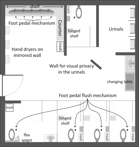
Office-scale bathroom of the future | Molotch and Norén

What’s new?

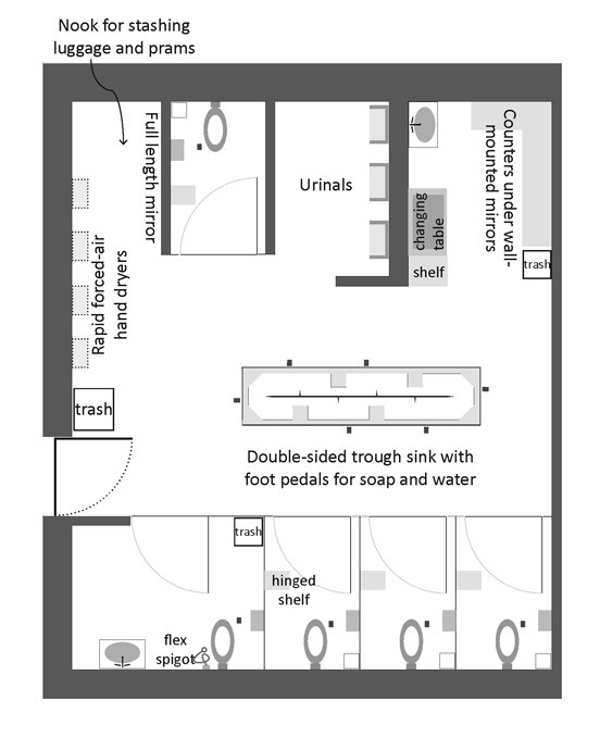
In this office scale version, I reconfigured some of the wall segments and added a completely new one in the middle of the space after a commenter on this blog mentioned that visibility into (and out of) the urinals might not be desirable and would be easy to screen. He was right. Now men can be more comfortable knowing that they cannot be seen and nobody will spot the back of a man at a urinal upon stepping into the bathroom. There are still more stalls than urinals – better for women and men, if you ask me. Not better for the environment since toilets use far more water than urinals (especially when the urinals are waterless, as they now are in many new construction projects).

Style points?

I admit these are not the most stylish of plans. I’m not an architect and not aware of all the style conventions employed to make plans both interesting and legible. I’m taking opinions on what to change. Bring it on, folks, bring it on.

I decided to give the sinks a radial gradient though now I’m not sure if it’s obvious that they are sinks. I made the font bigger in the stadium version because it appears that our publisher will be printing it at about the same scale as the one you see above. Small.

The book?

The book – “Toilet: The Public Restroom and the Politics of Sharing” will come out on World Toilet Day, November 19, 2010. These two images, or images quite like these, will appear in the concluding chapter by Harvey Molotch.

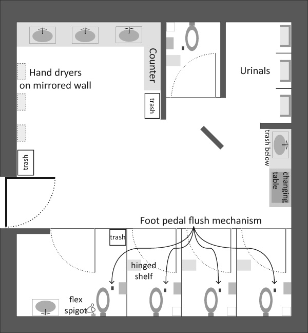
Work place bathroom design schematic

Work in progress

Regular readers will recognize this as a slightly modified version of a bathroom design I posted a couple weeks ago. I took some time to incorporate readers’ comments and hope you’ll continue to make recommendations.

Here are the major changes:

+ all the plumbing is routed through exterior walls
+ sight lines are improved so that it is more difficult for women to accidentally see the back of a peeing man.
+ there is no longer a trough sink – regular sinks instead. Cheaper.
+ if men really want to stay separate from women, they could wash their hands at the sink next to the changing station.

Request

Constructive criticism is still welcome.

Office bathroom semi-public bathroom

Suggestion for a future unisex office bathroom

Stadium/Airport public bathroom

Suggestion for a future large public restroom

A better public bathroom

One of the reason this blog has been quiet recently is that I have been busy with too many projects, one of which is just finishing up now. It’s a book about the politics and social life of public bathrooms that I am co-editing with Harvey Molotch and will come out maybe next fall with NYU Press. In the concluding chapter, in a practice uncharacteristic of sociologists, Harvey and I suggest a design solution to a social problem in the form of the schematics you see above.

Here’s the context that you would have gotten had you read the book:

1. There aren’t enough public bathrooms and access to safe, clean places to go often operates to sort out the undesirables and, thus, make them even more undesirable as they are faced with the nowhere-to-go situation.

2. Public bathrooms heighten fears of the Other via their association with waste and dirt (ala Mary Douglas). Electronic fixtures have been installed to alleviate the frisson of coming up against other people’s private moments, past and present (in the stall next to you). But electronic fixtures can be quite frustrating and controlling, especially if you are doing something out of the ordinary like trying to brush your teeth.

3. People who don’t conform to traditional gender norms are not well-served by the bathroom binary. A person got kicked out of a restroom for using the woman’s room when she didn’t appear to be feminine enough. Her attempt to prove that she now identified and had always identified as female was dismissed.

4. The assumption that visiting the restroom is an act undertaken by individuals is faulty. Pairs and groups go, too. People with disabilities might need to take a helper in with them and that helper may very well be of the opposite sex. Parents with young children have all sorts of difficulty. When their kids are babies, where does the stroller go? When they get to be tots, are they going to crawl under the stalls or sit on floors of dubious cleanliness while mom/dad uses the toilet? When they get to be old enough to know the difference between boys and girls but not old enough for mom/dad to feel comfortable letting them use the public restroom alone, what can be done?

5. Architects and regulatory boards often do not have the time or the desire to rethink the design of the bathroom. Offering up a schematic plan is a step towards closing the gap between social science research and the physical world under construction.

Our solution is to make bathrooms unisex. Rather than tuck each individual into a small room completely sealed off from other bathroom users, we maintained the shared space. There’s a lot to learn about navigating taboos in the bathroom, and sorting people into their own private rooms would eliminate those opportunities altogether. On top of the primary concern that sharing the anxious space of the public restroom is a socially productive situation, there’s also the problem that most buildings don’t have enough space for as many private stalls as would be required by law.

We’ve kept urinals because they are so much more environmentally sound than toilets. But they’re tucked away so that men will keep their privacy and women won’t be confronted with the potential site of a penis out of pants.

We’ve turned sinks and toilets into mechanisms operated with foot pedals. Women kick to flush anyways; putting the pedal on the floor makes it a whole lot more accessible and thus, safer.

We’ve suggested that prams and bikes and luggage are part of everyday life and they need a place to be. In the large public restroom, they are parked near an attendant’s area. In the office-scale version, there is a parking nook next to the hand dryers, outside the general circulation route and also outside the typical lines of sight to help prevent theft.

The question

What do you think of our attempt to solve social problems by design? Should we stick to sociology and leave the designing to the architects and planners? Or, is it helpful to see – in plan – how all of the bathroom difficulties from diverse user groups can sit more comfortably together in space?

Are these plans convincing as communication tools? As pieces of graphic design, what else could be done? (color isn’t an option)

Visualization of outbreak pathways in a hospital
Visualization of outbreak pathways in a hospital | Scientific American, Graphic by Jan Willem Tulp

What works

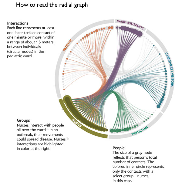
Using RFID tags worn by hospital staff and patients at the Bambino Ges&#uacute; pediatric hospital in Rome, researchers with the SocioPatterns group tracked interaction patterns to help understand how nosocomial illnesses spread. Nosocomial infections are infections patients and hospital staff contract while they are in the hospital. According to wikipedia, about 10% of patients in hospitals in the US contract some kind of nosocomial infection every year; the most common infection is the urinary tract infection (36%).

The RFID tags were distributed to 119 individuals to tally up each person’s encounters with anyone who came within 1.5 meters for a minute or more. Of course, this generated a great deal of data. The graphic above does a good job of condensing the data into a single image – well, actually, there is one image for each category of person in the hospital and it is important to look at all five images for full analytical impact. Click on the graphic to go to Scientific American and see them all.

Legend for reading the radial graph of outbreak pathways in a hospital
Legend for reading the radial graph of outbreak pathways in a hospital | Scientific American, Jan Willem Tulp [graphic]

Somewhat unsurprisingly, nurses proved to be the most well-connected people in the hospital. They interact frequently with each other and with every other category of person: patients, ward assistants, doctors, and care givers. Even though I said this finding was “unsurprising” it is extremely important to have solid data supporting what seem to be obvious findings. For instance, imagine you had not read the previous paragraphs or looked at the graphics and I had written: “Unsurprisingly, doctors proved to be the most well-connected people in the hospital, interacting frequently with patients, care givers, nurses, and ward assistants”. It sounds almost as logical as what I wrote about nurses (quite frankly, I would have found it hard to believe that doctors interact frequently with ward assistants). The point is, before data exists, it is easy to convince ourselves that a variety of different logical scenarios are playing out. The RFID methodology was a wise choice because it did not rely on self-reports. Self-reports are tough because they ask responders to remember all their contacts AND to be unbiased about reporting them. Some encounters in hospitals are more valued than others. Contacts with patients are valuable because patient care is the manifest purpose of a hospital and would thus be more likely to be reported than, say, standing next to another nurse at the bathroom sink or urinal for a minute.

What needs work

Radial graphs, to me, are difficult to read. The science of networks is still what I would call an emerging field in the sense that both the methodologies and the techniques for analyzing data are not yet fixed. New strategies are still being developed at a relatively rapid rate. I think there might be a better way to present the data than the above radial graph, but the radial graph is a huge step ahead of the messy network nests that used to dominate the presentations/analysis of network research.

Messy nest network visualization
Nest visualization technique. Even with the colors it’s hard to make sense of the cluster on the left.

Here’s where I am having a hard time making sense of the radial graph. First of all, I didn’t get the immediate impression that nurses were the network hubs holding this whole situation together. I had to click through each of the five graphics twice to ‘see’ the finding that nurses are more well-connected than others in the network. Even then, it would have been relatively easy to make a mistake and think that ward assistants were just about equally important (and maybe they are!) because the dots representing their total contacts are just as large and somewhat more tightly clustered than the dots representing the nurses total contacts. However, the size of the dots records only total contacts and it seems that ward assistants have a great deal of contacts with each other (perhaps they work in teams?), but relatively little contact with patients or physicians. But the lines representing that data are faint compared to the weight of the dots making that part of the data analysis seem secondary, which is not the case.

I don’t have a great solution to the radial graph visualization of networks situation. To me, it seems like it is a huge step beyond the messy nests that used to be the go-to for network visualization but not yet fully baked as the gold standard.

References

Matson, John. (November 2012) RFID tags track possible outbreak pathways in the hospital Scientific American.
Note: The official date on the above source is 15 November 2012 but since it is only 4 November 2012, I left the day out of the date field.

Graphic by Jan Willem Tulp; Source: “Close Encounters in a Pediatric Ward: Measuring Face-to-Face Proximity and Mixing Patterns with Wearable Sensors,” by Lorenzo Isella et al., in PLoS ONE, vol. 6, No. 2, article e17144; 2011

Water Supply Infrastructure Schematic
Water Supply Infrastructure Schematic | Laura Norén

Water Infrastructure Schematic Diagram*

I put together the diagram above to help me explain how water is delivered and taken away from urban locations. The point I want to make with the diagram is that the infrastructure is designed to deliver water to ‘typical’ buildings and that this means people who are wandering around cities where buildings are all private also lack access to water. There is a political debate going on right now about whether or not access to water is a human right – the UN voted on this and decided water IS a human right but large countries like the US disagreed. When the US does not back UN resolutions, those UN resolutions tend not to mean as much.

So why would the US vote against this resolution? I am not altogether sure, but I believe it has something to do with the fact that many places have privatized their water. Privatization of water takes different faces. Sometimes a system like the one diagrammed above is privatized. Studies have shown that when this happens, the company that sets up a system like the one above delivers a poorer quality product – more sedimentation and other low level contaminants which are the typical results of choosing sources quite close to cities. The closer the source is to the delivery, the lower the expenditure for engineering and installation of water mains, monitoring stations along the route, and reservoirs. The other way in which water can be privatized is through bottling – bottled water in some parts of Africa is more expensive than Coca-Cola. And this in areas that may have no access to safe alternatives for drinking water. Nestle owns the Poland Springs brand and folks in Maine are scrambling to get hydrological studies performed that can prove Nestle’s water extractions are drawing down lake volumes on adjacent properties. The only way to fight Nestle, it seems, is to prove that they are damaging one’s own property and yet water sources – rivers, lakes, oceans, springs – technically do not belong to private individuals. The individuals or corporations can own the land surrounding them, but the water is a bit like air and cannot be owned. (Rights to the fish found in the water CAN be owned. As you can see this gets complicated quickly.)

The diagram above contains none of the politics of the discussion below. For me, it is important to attempt to create graphics that are not political, even when I am creating them for the express purpose of delivering a presentation that takes a side in a political fight. For me, the challenge is two-fold. First, I face the technical difficulty of creating any kind of complex diagram. I’ll leave questions about execution out of this particular discussion though feel free to comment on execution below. Second, when I know I have a political message that I want to keep out of my graphics, I am often too far into my own head to be able to step back and determine whether I have created something that is both comprehensive enough to tell a complete (but apolitical) story and one that does not drift into the political. As it is, this diagram seems to err on the side of being incomplete rather than being more fully detailed where the details start to carry politics with them. My larger point is that this is one way in which cities are exclusionary zones by design. It would be easy to find a way to provide the basic infrastructure to supply water outside of buildings – fire hydrants do just that. But maintaining the ‘last mile’ of infrastructure is almost always completely given over to the private sector. Individuals and companies maintain bathrooms with all of their fixtures, cleaning, and maintenance requirements. This is big business. Just about every shop and restaurant on the street in New York reserves the rights to the bathroom for customers only.

2nd Avenue "no bathroom" sign, East Village, New York City (2009)

One of Starbucks redeeming qualities is that their bathrooms tend to be open to all, proving that it is possible to continue to service a relatively affluent clientele no matter who is in the bathroom.

Obama on Water

The word on the political street is that even though Obama’s stimulus efforts contain plans to address infrastructure, water infrastructure has been taken off the table at this point. Our water infrastructure is ageing; most of the current infrastructure is due to age out of acceptable functionality in the next ten years. Already there are an average of 240,000 water main breaks. Just yesterday the New York Times reported that a dam outside of Bakersfield is uncomfortably close to catastrophic failure, threatening the lives and livelihoods of thousands of people. There are another 4400 dams in the US that require work in order to fall within comfortable safety ranges. Some are publicly owned, some are privately owned. In either case, it is unclear which entities can foot the bill (projected at $16 billion dollars over 12 years).

*This diagram uses New York City as a guide. Not all cities have overflow valves that risk the release of raw sewage due to increases in rain. What’s more, in New York there are some other systems in place to recapture some of the overflow at the point of release. But this is a different kind of political discussion, one that focuses on the other typical focus of water discussions – the environment.

References

Ascher, Kate. (2005) The Works: Anatomy of a City. New York: The Penguin Press.

Bone, Kevin, ed. and Gina Pollara, Associate Ed. (2006) Water-Works: The architecture and engineering of the New York City water Supply. The Cooper Union School of Architecture, New York: The Monacelli Press.

Bozzo, Sam. (2009) Blue Gold: World Water Wars [Documentary film, available streaming for free]

Davis, Mike. (2006) Planet of Slums. Brooklyn, NY: Verso Books.

Fountain, Henry. (2011) Danger Pent Up Behind Aging Dams. New York Times. 21 February 2011.

Open Defecation by Region in India

India’s Public Restrooms

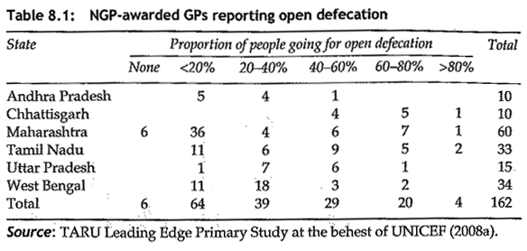
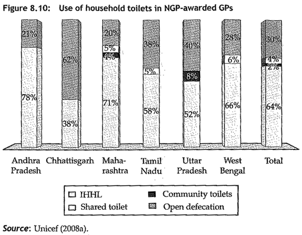
In “Squatting with dignity: Lessons from India” Kumar Alok details efforts to increase the provision of sanitation at the household and community level. Along the course of the book, he presents all sorts of interesting data – some of his studies present information rarely gathered in the US. In the first table I’ve chosen (on page 293), Alok demonstrates that even after areas have received ‘Clean Village Awards’ (Nirmal Gram Puraskar = NGP and means Clean Village Award) there is generally still open defecation, one of the key elements that was supposed to have been eradicated in order to achieve the NGP status in the first place. He writes that the reason for this is multiple. Of course, the first problem is the lack of household toilets, then there’s the lack of public toilets both of which force people out into the open. The Clean Village Award was intended as a measure to increase investment in toilet infrastructure and winners in the first year were photographed shaking hands with the President of India. Alok’s deep research revealed that this photo opportunity caused leaders in many villages to seek the award just to have a photo with the President. This increased the number of awardee villages in the second year of the program so much that the President was not able to shake all the hands: “…only few were allowed to personally receive the award from the President of India. For the rest, the photographers did the magic. Using the modern computer tools, they produced photographs of individual PRI members shaking hand with the President of India….There was a serpentine queue outside the photo shops in Bengali Market immediately after the NHP award distribution ceremony was over.”

It is hard to predict just what will stand in the way of public toilet provision. I would never have guessed photoshop (and its knock-offs) could have led to an increase in pro-toilet hype while subverting actual investment in toilet infrastructure.

Where do people excrete in India?

Where do people in India excrete?

The bars above are a bit clumsy as graphics, but they contextualize the information about open defecation by illustrating where else people might relieve themselves. The IHHL category refers to Individual Household Latrines and is the lowest section of the bars [the color coding does not come through at all]. Basically, this refers to people who use the toilet at home but does not indicate just how those toilets are plumbed. They may or may not be flush toilets. Many of them are not flush toilets. I find it useful to see how much variation there is across space. I also think it is worth noting that there are very few people who report using community or shared toilets. Open defecation is far more common than either of those two categories. In her film Q2P Paromita Vohra shows viewers that women have very few opportunities to use public or shared bathrooms. There are not many public facilities and where they do exist, the women’s areas are often taken over by men, leaving the women without a place to go. What’s more, where women’s rooms are still for women, the women have to pay to pee but men can use urinals in the men’s room for free.

Alok notes that another contributing factor to the relatively high proportion of open defecation is that not all toilets are being used. Sometimes open defecation is preferred. He writes that children are not deemed to need as much privacy as adults and that, furthermore, their feces is not thought to be as ‘dirty’ as adult feces. Thus, children are often allowed to go in the open rather than seeking out toilet facilities. As a result, “in only 51 per cent of the households either children are using toilets or child feces are disposed in the toilet. Forty-one per cent of households dispose feces in open space or along with solide waste, while 3 per cent drain out feces in the drain.” While it may at first seem a bit silly to think that children’s waste is somehow different than adult waste, think about what we do with dog waste. In the US people use hands covered with thin layers of plastic (or paper) to pick up dog poo and then dispose of it as if it were solid waste.

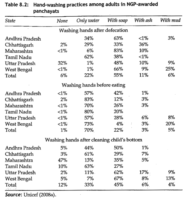
Alok continues to investigate sanitation practices, writing about hand-washing practices. This kind of information is something I would like to see for US-based populations. It is out there for hand-washing following the bathroom but there are not always break downs by what the person was doing (pooping or peeing) and I cannot recall coming across information about hand-washing before eating or after changing diapers…or picking up after dogs.
Hand Washing in Indian towns with "Clean Village Awards"

What works and needs work

My job here is to critique graphics and graphical representation of social science data. The tables and graphs here are not at all easy to use or beautiful to view. But the information is fascinating. It is almost always more important to get the information out in front of a public than to hide it away because it may not be formatted as well as you might like it to be.

References

Alok, Kumar. (2010) Squatting with Dignity: Lessons from India. New Delhi: Sage Publications India.

Kira Alexander. (1976)  The Bathroom.  Urine Trajectories
Kira Alexander. (1976) The Bathroom. Urine trajectories by sex

What works

This is the most graphic of graphic sociology so far. For those of you with delicate constitutions, give yourself a pat on the back for taking a deep breath and deciding to read the rest of this post without tossing it upon first glance.

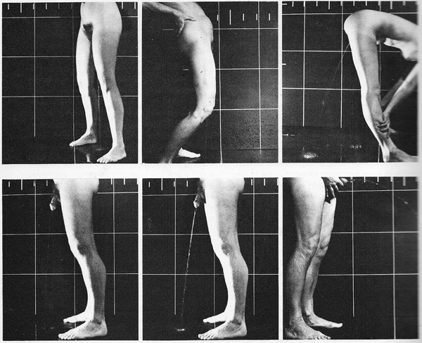
This was published in 1976 in a book that is now out of print called The Bathroom by Alexander Kira, an architect and professor at Cornell. He was interested in the bathroom as a design challenge with an eye to the ergonomics of the fixtures and spaces commonly encountered in standard bathrooms, home to standard fixtures. The bathroom is not exactly a hotbed of design revolution so many of his ideas are not only still relevant, but still fresh. This particular diagram was used to help sort out how one might go about designing a urinal for women (if not a unisex urinal that could serve both women and men, not at the same time, though).

I usually find the use of photographs in information graphics to be superfluous. Generally, there is some graph about, say poverty or out of wedlock birth and the photograph paired with the graph takes a person and turns them into a token. The homeless man as icon of poverty; the mother and child (usually a woman of color) as icon of poignant nurturance. That sort of reductive photography has no place in information graphics. Quite frankly, I’d be happy never to see predictable, reductionist photography like that anywhere.

But in this case, Kira used a grid in the photo shoot turning the resulting photograph into an infographic. Did I mention that his ideas still seem fresh? With the grid, we have a much easier time making the visual comparison between trajectories of urine between women and men.

Imagine you are a urinal designer. Ask yourself: how would I use these diagrams to help me design a urinal that works for women? Realize that you would either pursue a trough strategy or, better, a urinal that women do not face. They could stand with their backs to it and bend forward like the woman in the third panel is doing. Of course, there are sartorial concerns. Backing up to a urinal works just fine if you are naked, like our urination model is. But what if she’s wearing clothing? That’s a different design challenge. I would be interested to see what would be possible by relocating pants’ zippers so that they open between the legs rather than in the front.

What needs work

I apologize that in some of these panels it is hard to see the stream of urine, which is a necessary piece of information. With the women, it’s pretty much straight down except when bent over at the waist. For the men, it is slightly in front of the body unless he is holding his penis in which case the trajectory is quite a bit in front of him — it leaves the photographic frame.

Reference

Kira, Alexander. (1976) The Bathroom New York: Viking Adult. [out of print]