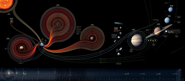
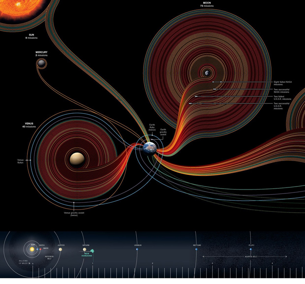
Search results for technology

Measuring the Impact of Humans on the planet | National Geographic

Note

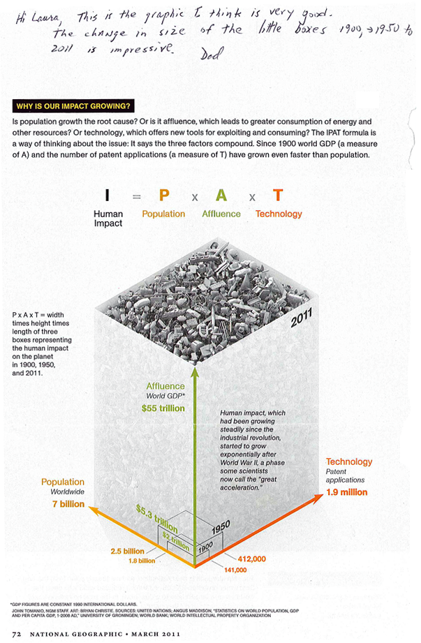
My dad sent this along to me and I decided to leave his handwritten note at the top. Since he was interested in the graphic and not the article, I do not know exactly which article in the March 2011 issue of National Geographic contained the Human Impact graph, but my educated guess suggests it came from the one entitled, “The Age of Man” by Elizabeth Kolbert. I checked out the online version and could not find this graphic, but print and online versions of magazines do not always contain the same content.

This is why it’s nice to have parents who will cut things out of print magazines for me. Thanks, dad.

What works

The best feature of this graphic is that it provides a way for readers to understand population growth taking into consideration the qualities of the population – and the way that changes in those qualities over time mean that population growth at one point in time is not the same as population growth at a different point in time. As we all get richer, we demand more of the planet in terms of food (increased affluence leads to eating higher up the food chain which is less ecologically efficient), in terms of energy (more affluence means more demands for electricity and fossil fuels), and all of our affluence allows us to spend more time inventing things that will make our lives even better than they already are. The increase in affluence as measured by global GDP and the increase in technological sophistication as measured by patent applications are going to go hand in hand. I would point out that patent applications would not be necessary in economic systems other than capitalism, so that particular metric might be off in countries that aren’t wholly capitalist (Cuba comes to mind).

What needs work

What’s weird about this to me is that this growth is exponential and yet it has been represented linearly. I’m wondering what an exponentially growing volume looks like – probably looks pretty interesting depending on how the parameters constraining the volume are keyed to the variables. This is a tough criticism because I don’t even know the answer myself, I just know that something isn’t quite right with the tidy right angles here.

I’m a bit upset, too, about the fact that we’ve run into the apples and oranges problem again. One unit on any of these axes cannot be compared to one unit on the other two – a patent application is not like a human and neither of these are like dollars of GDP. Because I cannot compare one axis to the next, I know that I cannot use this graphic to form anything other than an impression about the factors comprising the impact of humans being born today. I cannot, say, decide that cutting back on technological growth would be better or worse for the planet than limiting population growth.

There is something good to be said about graphics that represent concepts rather than data. Impressions are not worthless so if this thing gives viewers the impression that population growth is not a problem on its own, but only a problem in the context of the way humans live, that is an accomplishment of which to be proud.

References

Tomanio, John and Bryan Christie. (March 2011) “Why is our impact growing?” [Graphic] in National Geographic p. 72.

Kolbert, Elizabeth. (2011) Age of Man National Geographic Magazine.

50 years of space Exploration
50 years of space Exploration | by Sean McNaughton and Samuel Velasco
50 years of space exploration, zoom-in
50 years of space exploration, zoom-in | by Sean McNaughton and Samuel Velasco

Why space exploration is like a small-group network graph

This blog is supposed to be about social data and while there are certainly social components to space exploration, that’s not the angle I am going to discuss here. [See Alex Madrigal’s piece in The Atlantic Moondoggle: The forgotten opposition to the space program” to get a taste of the sociopolitical forces behind the American space program.] Rather, what excited me about this graphic was the form and it’s potential application to relatively small network visualizations. Here’ what I’m thinking: say you have small work groups (like, for instance, in my dissertation) and you would like to visualize some kind of behavior or linkage pattern in that network. You might also like to have the power hierarchy in the visualization – and this would be the structural hierarchy that exists in relation to, but not as a cause of, the pattern of linkages and/or traffic in the network. You could use a nest-y network map like this:

Clear, well-visualized network graph

OR…the formal standards in the space exploration graphic could be modified to suit network traffic, assuming a network with a small number of nodes. The planets could be people and they could be scaled and positioned to reflect their structural hierarchy. The edges – which in the space graphic are the trips – could be meetings or emails or any other kind of linkage that is important in the network. In the case of meetings, some meetings last longer or are otherwise more consequential so the edge could be thicker or more saturated with color.

Lots of network analysis looks at big networks where the nest-y network graph visualization technique is a good fit. But networks with fewer nodes and edges in which we know something about the social structure of the arrangement end up losing some of that context when they are represented in the nest-y network graphs. Those graphs are designed to help identify patterns where researchers either do not know much about the patterns in the first place or want to find an unbiased way to test their assumptions about the patterns they will find. But with the networks I am studying, I have discovered social patterns through ethnographic methods that I would like to have represented in my graphs. This space exploration graphic looks a lot like my back-of-napkin sketches for small groups. Of course, it is far more polished and more well-integrated with the ‘site plan’ running along the bottom of the graphic that helps establish scale, much like the way architect’s include a thumbnail site plan on their blue prints to establish a context for the siting of the building that’s represented in much greater detail on the plan.

Coming attractions

Over the next week, I hope to have a better sketch of a small-group network informed by ethnographic research up on Graphic Sociology.

References

Graphic Designers
Sean McNaughton, National Geographic Staff, www.nationalgeographic.com
Samuel Velasco, 5W Infographics, www.5wgraphics.com [this website was under renovation at the date of this blog post]

Madrigal, Alex. (Sept. 2012) Moondoggle: The forgotten opposition to the space program”. The Atlantic.

Hat-tip to Adam Crowe and <a href="http://www.flickr.com/photos/adamcrowe/sets/72157622579426670/"his flickr account.

Housing vacancy rate in Wisconsin, 2010
Housing vacancy rate in Wisconsin, 2010 | Jan Willem Tulp

What works

The “Ghost Counties” interactive visualization by Jan Willem Tulp that I review in this post won the Eyeo Festival at the Walker Art Center last year. The challenge set forth by the Eyeo Festival committee in 2011 (for the Festival happening in 2012) was to use Census 2010 data to create a visualization using Census data that did not rely on maps…or if it did rely on maps, it had to use maps in a highly innovative way. This is an excellent design program – maps are over-used. Yet it’s one thing to assert that maps are over-used and another thing to produce an innovative graphic representation that is not a map.

Tulp does a great job of leaving the map behind. He also does a phenomenal job of incorporating a large dataset (8 Mb of data serve the images in the interactive graphic from which the stills in this post were captured). The graphic has a snappy response time once it has loaded and his work makes a solid case for the beautiful union of large data and clear representation thereof.

The color scheme is great and reveals itself without a key. Those counties with low vacancy are teal, those sort of in the middle are grey-green, and those with high vacancy are maroon. The background is light, but not white. White would have been too stark – like an anesthetized space. He experimented with darker backgrounds (see his other options at his flickr stream here) but those ended up presenting an outer space feel. The background color he settled on was (and is) the best choice. Background colors set the tone for the entire graphic, along with the font color, and Tulp’s work is positive evidence of the value of carefully considering them.

Pie charts might be better than circles-in-circles

The dot within a dot is difficult for the eye to measure. Pie charts- which I only recommend if there are very few wedges – would have worked well with this type of data because there are only two wedges (see here for an example of a two wedged pie chart). I just finished reading Alberto Cairo’s important new book The functional art and he had a solid critique of the circle-in-circle approach that helped me realize what’s so appealing, but just plain wrong, about circles-in-circles:

“Bubbles are misleading. They make you underestimate difference….If the bubbles have no functional purpose, why not design a simple and honest table? Because circles look good. (emphasis in original)”

In this case, a wedge in a pie chart could have represented the percent of total housing units occupied.

Why is it so hard to ‘see’ rural vs. urban?

The x-axis is a log scale for population size. It’s clear from what we know about the general trend towards urbanization that we would expect urban areas to have lower vacancy rates than rural areas. Even in 1990 – two census surveys before the 2010 data that was used here – the New York Times ran a story about the population decline in rural America and there has been widespread coverage of the trend towards urbanization by both journalists and academics (the LSE Cities program does nice work).

Housing vacancy rate in Minnesota, 2010
Housing vacancy rate in Minnesota, 2010 | Jan Willem Tulp
Housing vacancy rate in New York, 2010
Housing vacancy rate in New York, 2010 | Jan Willem Tulp

The two states shown here – New York and Minnesota – both have some big cities and a whole of small cities in rural areas. Some small cities are also in suburban areas. That’s a problem with this visualization, the distinctions that have been established in academic literature between rural, suburban, ex-urban, and urban are difficult to pick out of this visual scheme. While it would be difficult to find a sociologist who could wrangle the data to produce this kind of visualization, I imagine many of my intellectual kin would be confused by this visual scheme and demand to return to a map-based graphic because at least in that case they could see patterns associated with the rural-urban spectrum the old-fashioned way. I am not wedded to the notion that a map is the only way to “see” the rural-urban spectrum, but the current configuration makes it difficult to think with the existing literature about housing patterns even though the attempt to distinguish between population size was built into the graphic on the x-axis. Population size is not always a great proxy for urban vs. rural, so it is a weak operationalization of spatial concepts social scientists have found to be meaningful. For instance, a small, exclusive ex-urban area filled with wealthy folks and their swimming pools is conceptually much different from a small, depopulating rural town even if they have roughly similar population sizes.

It is important in a research community to build on good existing work and reveal the weaknesses of existing work where it’s falling short. Either way, it is a bad idea to ignore existing work. Where a project does not relate to existing work – neither building momentum in a positive direction nor steering intellectual growth away from blind alleys – it will likely become an orphan. In this case, the project is only an orphan with respect to urban scholarship. As a computational challenge, it most definitely advanced the field of web-based interactive visualization of large datasets. As a visual representation, it adhered to a design aesthetic that I would like to see more of in academic work. But as a sociological analysis, it’s nearly impossible to ‘see’ clearly or with new eyes any of the existing questions around housing patterns. It is also my opinion – and this is far more easily contested – that it does not raise new important questions about housing patterns in urban, suburban, or rural America either.

My critique here is not that all data visualization is pretty but useless and that we should stick to our maps because they tie us to our existing disciplines and silos of knowledge. Rather, my critique is that in order for data visualization to become a useful tool in the analytical and communication toolkits of social scientists, the work of social science is going to have to find a way into the data visualization community. As anyone who has tried to use Census data knows, looking at piles of data is not synonymous with analysis. While Tulp’s graphics certainly present an analysis, that analysis seems to have turned its back on a fairly sizable swath of journalism on urbanization, not to mention the hefty body of academic work on the same set of topics.

Graphic Sociology exists in part to find a way to keep social scientists motivated to produce higher quality infographics and data visualizations than what is currently standard in our field. But the blog is equally good for sharing a social scientific perspective with computer scientists and designers who are ahead of us with respect to the visual analysis and display of social data. There is a way to bring the strengths of these fields together in a meaningful, positive way. We are not there yet.

References

Cairo, Albert. (2013) “The Functional Art: An introduction to information graphics and visualization.” Berkeley: New Riders.

Eyeo Festival.

Tulp, Jan Willem. (2011) “Ghost Counties” [Interactive Visualization] Submitted to Eyeo Festival and selected the winner in 2012.

Image created by EngineeringDegree.net

What works

It works to start with a provocative question.

They make good use of the vertical layout by building in a vertical pagination. It’s a decent way to make a graphic web-friendly, narrative in structure, but with enough structure that it doesn’t suffer from the ‘infinite scroll’ phenomenon in which a person can get lost in a band of information lacking delineation of any kind.

The career path graphic in No. 3 is a great use of a hybrid table/graph display that does a good job of indicating how gender and major interact.

It works to compare the descriptive statistics about girls to the same statistics about boys. This graphic mostly includes girl/boy comparisons (see No. 1 and two-thirds of No. 3), but in some cases it only presents statistics about girls. For instance in No. 2 we see that girls don’t do as well on exams when they are asked to indicate their gender. Are boys the same? This particular piece of data needs more context before I would feel as though I properly understand the correlation. If girls do not mark their genders is it as if they have set gender aside for a moment and were able to take the test without remembering to ‘play dumb’? Or do they feel that they are trying as hard on either the gender-marked or the non-marked test but they do more poorly without deliberately playing dumb? Does everyone – male or female – feel more pressure the more their tests are associated with markers of identity like gender and therefore maybe all of us do worse the more we have to disclose about ourselves? Bottom line: the least they could have done was included the male comparison for all of the data points.

What needs work

I’m not a huge fan of the pictures. They imply that this is an old-fashioned problem, and I suppose it is a rather OLD problem, but it has significant contemporary impacts. I’m also not convinced that any images would have added to the information component so perhaps this is a case of ‘less is more’.

Some of the text is awfully small.

In general, I wish these vertical strips of individuated graphics could find a way to feel more like a single graphic and less like a curated collection of related data points.

Women in engineering majors

I’m including a snippet from the article that was accompanied by this graphic because the author was able to make a point that the graphic failed to depict which is that there are ways to make engineering education more welcoming to women. The strategies suggested here are so obvious that it’s hard to believe someone had to articulate them, but I think many people who have gone through undergraduate education know that advising is a rather haphazard affair.

More broadly, what the studies found was that “the climate of the department makes a really big difference about who’s attracted to the major, who chooses to stay in the major and eventually graduates,” St. Rose said. “The active recruitment of students is absolutely necessary. That’s a no-brainer but a lot of departments don’t do it, they just say, ‘Students will choose the majors they decide on,’ but inviting students to take an introductory course or to consider the major can really help.”

References

Hill, Catherine; Corbett, Christianne; St. Rose, Andresse. (2010) Why So Few?: Women in Science, Technology, Engineering, and Mathematics. [Report] American Association of University Women.

Epstein, Jennifer. (2010) Attracting Women to Stem Inside Higher Ed

Spring Counter | John Maeda

What works

John Maeda (now head honcho at RISD, formerly of MIT’s Media Lab) designed this simple interactive graphic in 2006 while contemplating the cyclical nature of life during the still grey days of a New England winter. His visualization shows the number of springs men can expect to have if they live an average life span for men in their country. Users input their age and select their country. The flowers in color are those in the user’s future; the ones in grey represent the past. Simple. Elegant. An infographic haiku.

What needs work

I have a slightly sunnier view of the past than does Maeda, perhaps. I think I would have colored both the past and present flowers, just used different schemes. Maybe it’s the social scientist in me, but I believe our past and future both provide the context for our present. Perhaps some past years have been grey, but the territory of the past is not generally a cemetery.

References

Maeda, John. (2006) Life Counter. Interactive web-based graphic.

See also:
Maeda, John. (2006) The Laws of Simplicity. Cambridge, MA: MIT Press.

Citeology - Step 1
Citeology - Step 1

Step 1

The image above was constructed using the citations from the CHI/UIST papers. CHI stands for Computer-Human Interaction; UIST stands for User-Interface Software and Technology; both are considered to be important and maybe even ‘cool’ by product designers, software designers, and those on the peripherals of the space between product design and software design. UIST had their 24th annual conference in 2011 and CHI started in 1982. By way of full disclosure: Autodesk is a major sponsor of UIST. They paid the people who put this graphic together, too.

The graphic above took the conference proceedings from these two conferences as datasets, compiling all of the articles that were included and their references. Each of the small grey-ish bars is an article.

Citeology | Tangible bits by Hiroshi Ishii and Brygg Ullmer

Step 2

Hovering a mouse over a grey-ish bar will pop up the actual title of the article. Clicking on the bar will bring up a graphic that displays both the articles which the original article cited (in blue) and the articles published after the original article that referred to the original article (in brown).

What works

How is this thing useful? Well, compare the article above about Tangible Bits with the article below about Cooperation in Computer-Aided Design. It is easy to see that The Tangible Bits article is more clearly within the mainstream of this new sub-discipline because it both refers to articles that were published in these two proceedings and is then widely referred to by future publications in the proceedings. The Cooperative Design piece was less firmly situated in the discipline, which is instantly obvious because they did not include citations from within the proceedings in their article (and they have fewer citations by others for quite a few years before this older article gets popular again). Things like disciplines and sub-disciplines are difficult to understand, difficult to define, have fuzzy borders, and suffer from all sorts of other kinds of infringements on their existence. This visualization technique at least allows us to see some of that border-making work happen by following citation patterns.

Citeology | Cooperative Computer-aided Design

To be fair, the Cooperative Computer-Aided Design paper was written when these conferences were still being established and thus the number of articles available in the proceedings were smaller back in 1990. What’s more, it was probably still a little unclear just exactly what kind of sub-discipline CHI and UIST would come to define. Building up a new research field does not happen overnight and some of the things that seem relevant at first, turn out to fit in better elsewhere.

What needs work

It is a little unclear just how important it is to understand the boundaries of a discipline. For an academic trying to shape a particular kind of career, one in which they believe getting published in CHI or UIST is important, I guess it would be nice to have something like this so they can figure out what the core of popular articles has been so they can get themselves in the stream they’d like to be in. On the other hand, I’m not sure it is always good for academics to create loops in which everyone is citing the things everyone else in their circle has read. Seems problematically narrow to me. Maybe a graphic like this could demonstrate such a narrowing (one would expect the number of cites to grow for a while and then plateau in a false narrowing situation rather than to continue to expand exponentially in a more open-minded, exploratory research field). However, my beef with this kind of thing is that it seems that as a *tool* it will be used to help induce closure in the circle of citations. At the moment, it doesn’t seem like this is happening, but then, we might not expect the closure to be evident until after authors have had a chance to use the tool for a while to help them figure out what to read and cite when they submit to these journals. It does seem like some kind of narrowing of the field happened in about 1992-ish where a plateau in the total number of articles being cited is evident. I would imagine that was a kind of natural impact of having finally settled upon a definition of what the field would be, a necessary winnowing process so that the sub-discipline could find its boundaries and come into existence as a clearly defined entity (a column of water in a glass) rather than spreading out to encompass a little bit of everything (the same water poured out over a table).

Giving credit where it’s due

Thanks to Letta Wren Page, an editor at The Society Pages, for sending the Citeology visualization along.

References

Autodesk. (2010) Citeology Part of the Visualization Project within the Learning Project group.

The internet crosses the ocean

What works

I like the colors in the graphic above, however, the version I found does not come with a key but if you click through you can see one. The internet does not always deliver material the way it was originally designed or in the way that we would prefer it.

So I went looking for the original, the one that would probably have had a key attached to it, and found this map of the same information instead.

The internet's undersea world | The Guardian

I realize it is hard to see the tiny thumbnail of a graphic so you can either click through to the full version at the Guardian or look through the images I’ve distilled from the original below.

The internet undersea world | Thumbnail from the Guardian

Besides the map above, which shows where all of the cables are laid out and is very similar to the colored version at the top of this post, the Guardian cartographers/infographic designers included useful contextual graphics. Often, there is much more to maps than just the map, and to fully understand why and how the geography matters, it is critical to understand characteristics of the relationship that are not available through the map alone. For instance, in the case of undersea internet cables, the paths and linkages indicate that connections between, say, New York and London are probably quicker than connections between Minneapolis and Leeds. But it is also useful to know how fat the cables are because this is a good proxy for their bandwidth. If the traffic between two points in this network approaches the carrying capacity of the cable, connections might slow down, there would be reasons to build more cables, and so forth.

Undersea internet cable width | The Guardian

The Guardian carried on with this sort of critical analysis by showing how submarine operations sell capacity to other carriers, who mostly buy it as back-up. On the busy trans-Atlantic route, 80% of the capacity is purchased but only 29% of it is being used. This kind of arrangement is in place for times when communication bandwidth needs spike far, far higher than normal and when cables are cut.

World cable capacity, inset | The Guardian

Discussion

I was turned on to ferreting out these maps by a book I’m reading by Michael Likosky called “Obama’s Bank: Financing a Durable New Deal.” In the book, Likosky points out that one strand of the global internet infrastructure was privately financed, though still heavily reliant on governmental cooperation.

He writes:

In 1995, the US West finalized an agreement fo the construction of the Fiber Optic Link Around the Globe (FLAG). This $1.5 billion project would run a fiber-optic cable from the United Kingdom to Japan. In the process, it would link up twenty-five political jurisdictions. It contributed to a series of interlacing global information infrastructure project. Although underwater telegraphic cables had been laid at the close of the previous century, this project represented the first ever privately initiated and financed transnational communications link of this size and scale. FLAG was only as strong as the public guarantees of the twenty-five licensing authorities involved in legitimizing the project. In other words, it was a transnational public-private partnership.”

I was left wondering who financed the other strands of this aquatic internet infrastructure, realizing that it was probably more reliant on the public sector than the private sector, which is why FLAG is so unique. One of the reasons this matters is that global communications connectivity makes the current trans-national spoke and hub pattern of US business development possible. Without high speed communications connectivity, it would not be feasible for multi-national corporations to situate call centers and other communications-heavy activities far from the hub of commercial activities they are supporting.

If the US Federal government was indeed responsible for some of the early undersea internet bandwidth, I wonder if they had an inkling of how that might impact the development of off-shoring. It has been argued, though maybe not recently, that off-shoring is a good thing because it puts environmentally and socially negative jobs outside of America. Then we can reap all the rewards of growth up the management chain by locating the better jobs here. Clearly, it is irresponsible to locate environmentally detrimental projects in places were regulations are lax for the sake of increasing profits here. The same argument holds with respect to social ills like poor safety standards for workers, child labor, inhumane hours, and other negative working conditions. Increasing the ability to communicate instantly with far flung places makes the spoke-and-hub pattern more possible.

What needs work

Neither of the maps show who paid for the cables or who generates what kind of revenue from their use. I really want to know. I was hoping the color-coded one might do that, but without the key it’s impossible to tell.

References

Likosky, Michael. (2010) Obama’s Bank: Financing a durable New Deal. New York: Cambridge University Press.

Johnson, Bobbie. (2008, 1 February) How one clumsy ship cut off the web for 75 million people. The Guardian, Technology Section. Map graphic by telegeography.com.

Tenure Trends | Robin Wilson for The Chronicle of Higher Education

Tenure dies, three graphics

Tenure is declining. There are many reasons for this, most of which are economic. Tenured professors are very expensive compared to, say, adjuncts and graduate student TAs. Once upon a time in departments far far away, even recitation/discussion sessions were led by tenured faculty members. The only experience I ever had with such a situation was in a department (physics) heavily funded by dollars from the Department of Defense. Don’t say the militaristic state never gave you anything, my fellow classmates. I’m not bragging, but I do think I am pretty clever when it comes to Newtonian physics, at least for a sociologist.

The story here is clear in the graphics…or is it?

This first graphic ran in The Chronicle of Higher Education last July in an article written by Robin Wilson who asked:
“What does vanishing tenure mean for higher education? For starters, some observers say that college faculties are being filled with people who may be less willing to speak their minds: contingent instructors, usually working on short-term contracts….But others argue that the disappearance of tenure is actually not the worst thing that could happen in academe. The competition to secure a tenure-track job and then earn tenure has become so fierce in some disciplines that academe may actually be turning away highly qualified people who don’t want the hassle. A system without tenure, but one that still gave professors reasonable pay and job security, might draw that talent back.”

It’s not my place to get into that discussion here, but I do want to interrogate the graphic that ran with the story to see if it captured the essence of the tenure story.

First, the Chronicle’s graphic has numbers that do not add to 100%. So I went back to the report from the American Association of University Professors that the Chronicle had pulled their numbers from and came up with this:

Trends in Faculty Status, 1975 - 2007 | AAUP

This report clearly has more detail – we can see where those missing numbers are (full-time non-tenured faculty) – as well as understand the distinction between full-time already tenured faculty and those who are in the process of seeking full-time tenured positions.

I decided to compile this information into a line graph for two reasons. First, a line graph is the best way to show trends over time. Second, the data were collected at odd intervals so the eye would not have an easy time just stringing together a line connecting the bar graphs to understand the pattern. I imposed a grid. I added in the missing category. I gave it some color (darker colors correspond to more reliable, financially sound employment categories; lighter colors refer to more fleeting or otherwise less remunerative employment categories).

Tenure is Dying | Laura Noren

References

(16 December 2010) The disposable academic: Why doing a phd is often a waste of time The Economist. Accessed online but it ran in the print edition.

Relevant quote:
“The earnings premium for a PhD is 26%. But the premium for a master’s degree, which can be accomplished in as little as one year, is almost as high, at 23%. In some subjects the premium for a PhD vanishes entirely. PhDs in maths and computing, social sciences and languages earn no more than those with master’s degrees. The premium for a PhD is actually smaller than for a master’s degree in engineering and technology, architecture and education.”

Wilson, Robin. (4 July 2010) Tenure, RIP. In The Chronicle of Higher Education.

The Annual Report on the Status of the Profession, 2007. The American Association of University Professors. Fact Sheet: 2007.

Getting drugs to market faster, timeline graphic | Wired Magazine May 2010
Getting drugs to market faster | Wired Magazine May 2010

What works

I am not a huge fan of this graphic though I admit it works better in print than it does in this crappy scan of the print article. My apologies. Click through here for a crisp version.

In summary, the article is about the way that research is done in the presence of many more data points (specifically, complete DNA maps of numerous individuals) and much more processing capacity. They argue using a case study revolving around the personal story of Sergey Brin who is at risk of developing the as-yet-untreatable Parkison’s disease, that data mining means research will progress much faster with no loss of accuracy over traditional research methods. They use a medical research case so they get to conclude that moving to data mining will mean people who might have died waiting around for some peer review committee (or other tedious component of double-blind research methodology) will live. Hallelujah for data mining!

They summarize their happiness in this Punky Brewster of a timeline.

What needs work

First, why did the art director order a timeline and not a diagram about how the assumptions underlying the research method have changed? It is clear that the article is taking a stand that the new research methods are better because they are faster and, in the case of Parkinson’s, could save lives by speeding things up. That is undoubtedly true, as it would be for any disease for which we currently don’t have anything that could be referred to as a “cure”. However, as a skeptical sort of reader, I find it difficult to simply believe that the new data-mining variety research is always going to come up with such a similar result – “people with Parkinson’s are 5.4 times more likely to carry the GBA mutation” (hypothesis driven method) vs. “people with Parkinson’s are 5 times more likely to carry the GBA mutation” (data-mining method). If the article is about research methods, which is ostensibly what it claims. However, featuring the chosen cause of e-world celebrity Sergey Brin could indicate that Wired doesn’t so much care about changing research methods as it cares about selling magazines via celeb power. Fair enough. It’s kind of like when Newsweek runs a cover story about AIDS in Africa accompanied by a picture of Angelina Jolie cradling a thin African child. Are we talking about the issue or the celebrity? In this particular article, it seems to me that if the core message were to focus appropriately on the method, the graphic could have depicted all of the costs and benefits of each research model. The traditional model is slower but it makes more conservative assumptions and subjects all findings to a great deal of peer review which offers fairly robust protection against fallacies of type 1 and type 2 (ie it protects us from rejecting a true hypothesis as false and accepting a false hypothesis as true). In the data mining scenario, since the process begins not with a hypothesis but with the design of a tool, there are reasons to believe that we may be more likely to run into trouble by designing tools that too narrowly define the problem. A graphic describing just how these tools are constructed and where the analogous checks and balances come in – where are the peer reviewers? What is the hypothesis? How do data-miners, who start by developing tools to extract data rather than hypotheses in line with the current literature, make sure they aren’t prematurely narrowing their vision so much that they only end up collecting context-free data (which is basically useless in my opinion)?

Don’t get me wrong, I am excited by the vast quantities of data that are both available and easy to analyze on desk top computers (even more can be done on big work stations and so forth). Caution is in order lest we throw out all that is reliable and robust about current research methods in favor of getting to a result more quickly. We could use the traditional hypothesis driven, double-blind kind of trial procedure coupled with the power of DNA analysis and greater processing capacity. It’s somewhat unclear why we would abandon the elements of the traditional scientific method that have served us well. There is a way to integrate the advances in technology to smooth over some of our stumbling blocks from the past without reinventing the wheel.

Concerns about the graphic

My second major problem is that this graphic is one of a type commonly referred to as a ‘time line’. In this case, what we appear to have is a time line warped by a psychedelic drug. This might, in fact, be appropriate give that the article is about neurology and neuropathy. Yet, the darn thing is much harder to read in the Rainbow Brite configuration than it would be if it were, well, a line. Time. Line. And the loop back factor implies that there is going to be a repetition of the research cycle starting with the same question (or dataset) all over again. That’s sort of true – the research cycle has a repetitive quality – but it is not strictly true because hopefully the researchers will have learned enough not to ask the exact same question, following the exact same path all over again.

References

Goetz, Thomas. (July 2010) Sergey’s Story Wired Magazine.

Wired magazine. (12 March 2009) Science as Search: Sergey Brin to Fund Parkinson’s Study on the Wired Science blog.

23andme (11 March 2009) A New Approach to Research: The 23andMe Parkinson’s Disease Initiative. [This was an early announcement about this project from 23andme who offered the DNA analysis].

Facebook Privacy Settings 2005 Facebook Privacy Settings 2006

Facebook Privacy Settings 2007Facebook Privacy Settings Nov 2009

Facebook Privacy Settings Dec 2009 Facebook Privacy Settings 2010

What Works

If you are a New York Times reader or a facebook user you are probably aware that Facebook periodically makes changes to their privacy policy. These changes often anger advocates for privacy who then write articles about why they are upset and which settings Facebook users should change in order to protect their online privacy. There are also ongoing debates about whether or not it would be measurably detrimental to simply delete one’s Facebook account as well as whether or not there will continue to be social stigma related to pictures and wall posts of activities that are common enough (drinking, wearing bathing suits, sleeping in, telling little white lies).

Regardless of where you stand, it has been a little hard to understand just how Facebook’s privacy changes are, well, changes. The series of graphics above eliminate the need to read dry legalese (or even those New York Times articles) and allow us to see the changes. The graphic is interactive and I encourage you to click through and play around with it. Among it’s great features, it allows you to select the privacy settings so that you can see just which bits of your personal data you can still protect and which bits are out of your cyber control.

What Needs Work

There is nothing that needs work about this graphic – the author explains his methods and assumption, invites comments, provided this graphic from the motivation to make information free, and he provides full-disclosure about what he does for his day job (works for IBM Research at the Center for Social Software).

References

Holson, Laura. (8 May 2010) Tell-All Generation Learns to Keep Things Offline. In The New York Times, Fashion & Style Section.

McKeon, Matt. (May 2010) The Evolution of Privacy on Facebook. Personal website.

Nussbaum, Emily. (12 February 2007) Say Everything. New York Magazine, Features.

Perez, Sarah. (20 January 2010) The 3 Facebook Settings Every User Should Check Now. In The New York Times, Technology Section.

Valentino-DeVries, Jennifer. (26 April 2010) http://blogs.wsj.com/digits/2010/04/26/getting-control-of-your-facebook-privacy-settings/tab/article/. In the Wall Street Journal, Digits Section.