
Reinventing the Automobile* is a book that lays out a vision for a progressive evolution of urban mobility transition that offers a robust point-to-point on-demand mobility network of 2-passenger fully electric vehicles. These vehicles would take up less parking space because not only are they small, but one proposed design folds up when parked. And they’d be able to tell you where the nearest parking spot is as you’re approaching your destination. Being fully electric they require a plug….or do they? The authors suggest that after an initial period of individual owners plugging these babies into outlets in their garages overnight, folks in city planning departments or franchise owners would trust the technology and economics enough to start installing wireless charging devices available curbside or in the road bed itself. Stuck in a bottleneck at a bridge or tunnel entrance? At least charging pads in the roadway can ensure that your 2-seater won’t run out of juice before you get where you’re trying to go. You can sit there and it will charge itself with embedded charging device in the road surface while plodding through gridlock. Even farther down the timeline, the cars might be able to drive themselves. So you can sleep through the gridlock or make calls or surf the ‘net. Just don’t post facebook status updates about your traffic problems. Nobody cares.
What I like most about the book as an object of intellectual design is that even if readers decide to skip all the words and they only look at the images, charts, maps, and diagrams, they won’t miss much. This book is stuffed with great graphics. I haven’t included them all as that would constitute copyright infringement and be too long for a single post. What you see below is just a small sample from Chapter 9: Personal Mobility in an Urbanizing World.
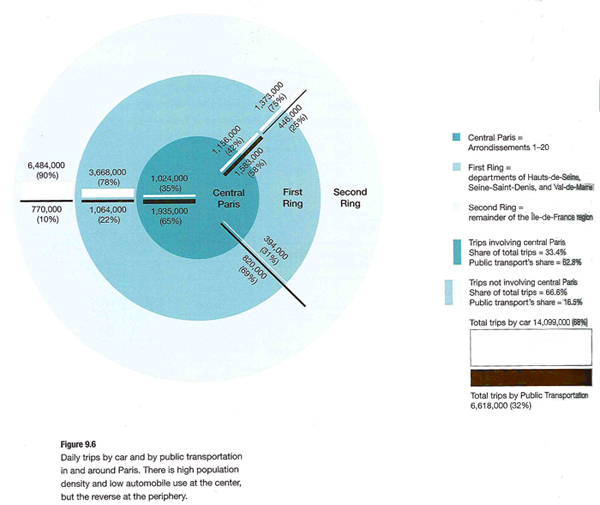
Daily driving in Paris
What works
This graphic is both elegant and deep. (Or it would be elegant if I had a better scanner.) It’s a simple form – Paris as concentric circles – but the more you look at it the more you learn. Rewarding that way. What sometimes happens in elegant graphics is that the details become obscured in iconography or approximations. But this graphic includes percentages as well as absolute numbers of two different kinds of trips – public transit and trips by cars. We see that Central Paris is defined as Arrondissements 1-20, the first ring is Seine Saint-Denis, Val-de-Marne, and Hauts-de-Seine, and the second ring is the rest of the Île-de-France region. There’s a summary of all the trips over in the legend so that the graphic itself can just show you the break down of different kinds of trips.
What needs work
In terms of transit, things like rivers often represent real barriers. There are only so many bridges and tunnels which creates a bottleneck effect. Paris is a city on a river so the one thing the elegance of this graphic obscures is the impact of the natural geography on transit choices. Maybe it’s not important when it comes to the cars vs. transit question, but bottlenecks are critical factors when it comes to planning mobility and I’m curious about whether bottlenecks push more people to transit or cars. In Boston/Cambridge, MA only one bridge has a train running across it and I have always assumed that pushed more people into their cars because many of them would have to go out of their way if they took the train and could only go over that one bridge.
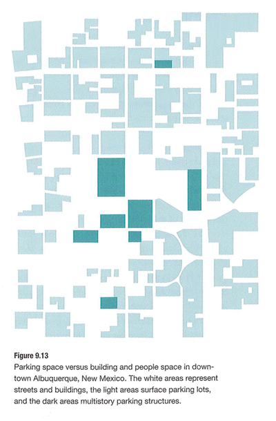
Parking in Albuquerque
What Works
What you are seeing here is a simplified map of downtown Albuquerque, New Mexico. The white areas are buildings. The teal areas are parking – darker teal represents multi-story parking structures while the lighter teal shows us where surface lots can be found. Lovely way to show this information. One could imagine the same sort of information as a percentage-of-land-use pie chart or some far less granular collection of numbers. This schematic doesn’t bother to calculate just how many square feet of land are dedicated to parking. Nope. This is the visual equivalent of the ‘show don’t tell’ rule that writing professors are always encouraging their students to adopt when constructing essays. A table with land use percentages would be telling. This graphic is showing.
Albuquerque is like a parking lot with some buildings in it.
What needs work
I have never been to Albuquerque but I’m guessing that if you lived in Albuquerque you might like to see some sort of orienting label. Even just a single recognizable street name thrown in their somewhere to help orient. Now, the point of Reinventing the Automobile is not to provide urban planning for Albuquerque so I know they aren’t all that concerned with just precisely which neighborhood in Albuquerque this schematic represents. Still. It’s almost too cleaned up to read as a city plan right away.
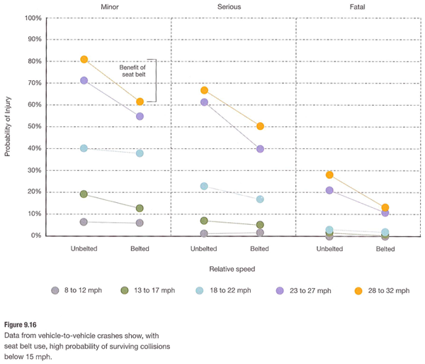
Vehicle-to-Vehicle Crashes
What works
This graph does a great job of providing us with granular data and indicating a couple different trends visual. Keep in mind that they have multiple layers collapsed into a single graphic. It looks easy once it’s done but when one is faced with a pile of related numbers along multi-dimensions it isn’t always clear how to relate them to one another visually.
This graph has three levels of accident severity – minor, serious, fatal. It also shows the probability of injury. It also factors in variation in speed (which it does by creating five speed ranges). And then there’s the belted vs. unbelted division. That is a total of four different dimensions all displayed on one graph with a single measure on the y-axis. Color is used well. Grid lines are all that separates minor from serious from fatal accidents which are more or less three different graphs lined up next to one another.
References
Mitchell, William; Boroni-Bird, Christopher; and Burns, Lawrence. (2010) Reinventing the Automobile: Personal Urban Mobility for the 21st Century Cambridge, MA: MIT Press.
* The book specifically credits Ryan Chin, Chih-Chao Chuang, William Lark, Jr., Dimitris Papanikolaou, and Ruifeng Tian with “Illustration Production”.


