
What Works
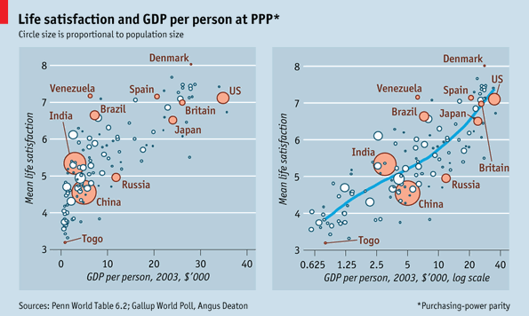
This graphic comparison in The Economist is an excellent piece of evidence in support of the use of logged scales. If you are an economist or quantitative sociologist reading this, you probably just fell asleep because you know about log scales already. Still you have to agree that the graphs here do an excellent job of visually explaining why log scales are better than linear scales in this case.
One of the general rules in multi-variable models involving per capita income data is that this data should be logged. The above graphs visually describe what happens when linear wage data is logged. That is the only change made between these two graphs. On the left, the wage data is measured just as it comes, on a linear scale which assumes that the difference between one dollar of per capita GDP is the same between no dollars of per capita GDP and that very first dollar of GDP as it is between the 10,000th dollar of GDP and the 10,001 dollar of GDP. The graph on the right logs the per capita GDP. This changes the assumptions about the distance between the zeroth and first dollars of income and the distance between the 10,000th and 10,001st dollars of income. In the graph on the right, logging the per capita GDP gives us a scale that is far more sensitive to differences when integers are small than when they are large. That difference between having no per capita GDP and having just one dollar of per capita GDP, or between one dollar and ten dollars has a relatively greater impact than the difference between 10,000 and 10,001 (or between 10,000 and 10,010). Logged values are sensitive to differences in orders of magnitude. There is an order of magnitude change between 1 and 10, then not again until we get to 100, not again until we get to 1000, and not again until we get to 10,000. The distance between each of these milestones grows successively larger. That’s the mathematical logic behind logged scales. Why do they tend to produce better fit lines for per capita income level data than the linear scale does?
Imagine this: you have no money and someone gives you $10. That is quite meaningful. Now you are able to take the subway, get something to eat, and make a call at a pay phone, three things you would not have been able to do when you had nothing. Those $10 mean a whole lot to you in a way they wouldn’t if you had $10,000 and I gave you $10. With your $10,000 you would already have been able to do all the things I mentioned above. Having an extra $10 would not make much meaningful change in your immediate material conditions or your investing options. The point here is that when folks have no income, they are a lot more sensitive to small changes in income than they are when they have a measurable income. The more income they have, the less sensitive they are to small (or even moderate) changes in income. This is why economists and quantitative social scientists almost always log measures of income. The assumptions I just explained are almost always true.
In the graphs, once the per capita GDP (which isn’t exactly a measure of income, but it is closely correlated) is logged, the relationship between income and happiness is much clearer. The model fits better when per capita GDP is logged and it appears that there may be a positive relationship between money and happiness after all.
What needs work
These happiness measures are rather uninspiring. Happiness is quite possibly culturally specific – what makes my mother happy, for instance, is my singleness. What makes mothers in other places happy might be that their 30-year-old daughters are married and have healthy children. I can hear you all saying, ‘But wait! Your mom is weird, what makes her happy is singular’. And that is just exactly my point. Happiness is contingent upon so many other things that trying to measure it is difficult – what makes a person happy changes over time and place so we cannot measure happiness based on easily observed objective measures. Some people like to think they can measure levels of depression or even serotonin to figure out who’s happy or not. But I simply don’t buy it. In places where there is more health care, more people are going to be diagnosed with depression. But does that mean that a population with a high level of reported cases of depression (a seemingly scientific diagnosis of unhappiness) is any less happy than a place in which seeking a diagnosis for mental illness bears a prohibitively high financial or social cost such that people do not even seek diagnoses in the first place? Perhaps the people getting treated for depression are now happier than they were before they were treated and thus the place with a high collective rate of diagnosed depressives is actually happier than a place where people are not being treated for their depression?
Dalton Conley was on a panel I recently attended that was called together to offer thoughts on THE MEASURE OF AMERICA 2010-2011: MAPPING RISKS AND RESILIENCE”. Someone from the audience pointed out that the book tends to use measures like health, education, income, and mortality but that these may be missing the right question. The right question was something along the lines of, “But are people happy?” Dalton pointed out that this is a normative question (and thus not the point of the volume which is demographic in nature) and that it is methodologically nearly impossible. The reason the information in the book is meaningful is that the measures that have been established can be rigorously measured across time and place. And they HAVE been measured across time so we are able to see patterns. The problem with any new measure is that there isn’t much to compare it against for a couple decades. More importantly, there is no objective way to measure happiness. A pound is a pound where ever you weigh it on the face of the earth (OK, yes, there are some exceptions to this but those are for physicists). A dead person is a dead person just about no matter where they are so mortality tends to be a good measure, too. But happiness does not fit well into a measurement framework. And even if it did, we’d be back to Dalton’s first point, which is that all we could do with that information is become normative.
This increasing desire to find the roots of happiness seems both misguided and heavy handed. Just as people appreciate seasonality in nature, I tend to think there is something to be said for having a full set of emotions. If that is true, there is no particularly good reason to run around trying to doggedly pursue happiness. There are benefits to being sad and introspective just as there are benefits to being happy. What is *with* all this fixation on happiness?
You’ve heard plenty from me at this point so I’m shutting up. I would like to hear your thoughts about both log scales and measuring happiness.
References
(25 November 2010) Money and Happiness [Daily Chart] The Economist online.
Lewis, Kristen and Burd-Sharps, Sarah. (2010) The Measure of America 1900-2010: Mapping Risks and Resilience. with an introduction by Jeffrey Sachs. New York: NYU Press. Part of the American Human Development Project of the Social Science Research Council.