environment

Shipping by Barge
Shipping by Barge | Lock and Dam #1, Mississippi River at St. Paul/Minneapolis

What works

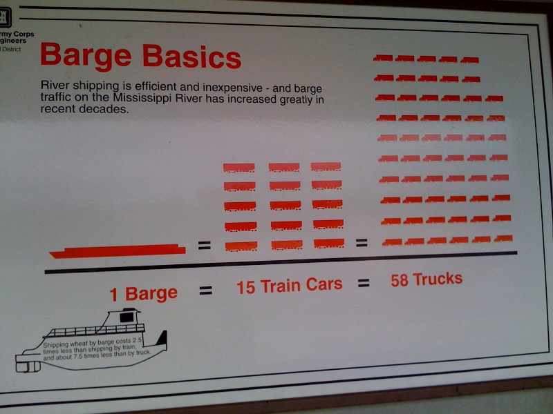
Amidst all that discussion of environmental sustainability and local food movements, I haven’t heard anyone even whisper a mention of barge shipping. Waterways used to be some of the best shipping lanes (sometimes some of the only shipping lanes) available. Now there isn’t much traffic of that sort at all. This graphic implies that it might be in the best interest of economical and environmental efficiency to reconsider barge shipping. It certainly got my cognitive wheels whirring.

Style points for the reduced color pallet. In my book, lots of things could be black, white, and red* all over.

*where red can be switched out for just about any color at all

What needs work

First, I apologize for the quality of the photograph. Cell phone cameras, big posters, and narrow walkways make for crappy pictures. At least it was a cloudy day and there wasn’t so much glare.

This graphic was clearly created a long time ago – I’m guessing it has been hanging in the same place for a couple decades. Still one would think that since the 1970’s, at least some people in the US have cared about fuel efficiency. This graphic only displays an odd kind of size efficiency which is incredibly difficult to understand the more you think about it. Sometimes size matters. In this case, size as measured by number of hauling units (which themselves are different sizes) is nearly irrelevant.
In my opinion, it would be better to describe efficiencies in terms of the amount of fuel required for their example trip of a bunch of wheat. Measuring fuel burned would not only allow us to be able to compare between the modes, it would also allow us to understand the cost per pound of wheat (or whatever) in terms of transport alone, which could be of interest to all the local food folks. Does living on the Mississippi make all upstream food “local” in a way that overland food isn’t, at least if it is shipped by barges?

The next step after adding some kind of measure of fuel efficiency would be to spell out the kinds of emissions that are involved with each mode of transit per pound of item delivered.

I’m also curious about what kinds of commodities can be shipped efficiently by barge – is it only commodity level items like grains, coal, corn, taconite? Or would it make financial and environmental sense to load barges up with products like cars and consumer goods? And what happens to the materials when they come off the barge? Are they mostly shipped to areas where the manufacturing takes place near the river port? Minneapolis used to be a city in which grain mills lined the banks of the Mississippi and a barge full of flour could just be brought directly from the barge into the flour mill, no trucks or trains got involved. But what about other products? Not all cities are located on navigable rivers so once goods come off the barges are they usually placed on trains, on trucks, or what?

In short, this graphic implies that barges are more efficient or more economical than train or truck shipping modes but it fails to provide enough context to support that claim or to indicate which kinds of shippable goods are best for barge shipping.

References

Photograph by Laura Norén, June 2010. Feel free to borrow it, morph it, post it elsewhere, etc.

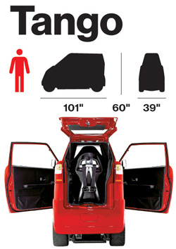
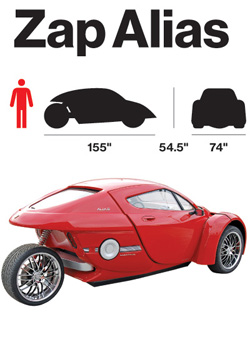
Tango VehicleZap Alias Vehicle

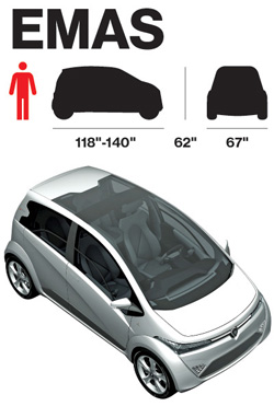
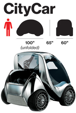
EmasCityCar Vehicle

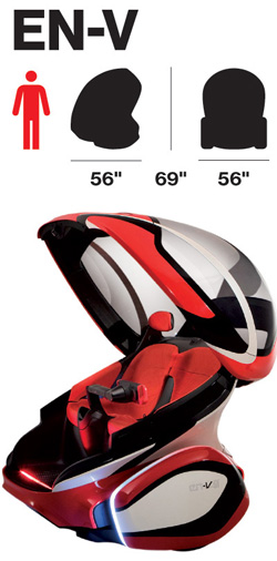
EN-Vehicle

What works

It’s nice to have the dimensions of the cars represented along with their profile and frontal massing.

What needs work

In order to make this work better, I would have put the dimensions and massing images right next to each other instead of next to the renderings/photos. It’s hard to compare when they are so distant from one another.

More important, the choice of these images to tell the story about the electric cars of the future is missing at least half the story. It continues to do for cars what we have long done for cars which is to treat them as fetishized objects. But in reality, most of the time we experience not A car, but cars as streets and highways carving up space or cars as a parking lot (either full or empty, but they always have to exist whether or not they are full at any given point in time) or cars as sources of air pollution or cars as noise. The implied message here is that because these cars are electric, at the least we shift the pollution story out of the city. But to where? We must generate electricity to run these babies and there is no hope to do that with renewable sources right now.

Furthermore, on the parking angle, these cars are smaller and will therefore take up far less space when parked. But if they have to be charged, does that mean that we will have to build new infrastructure on top of the existing parking infrastructure? Will we use the extra space not taken up by these vehicles to park bigger combustion engine vehicles? Will we have two distinct parking set-ups whereby these new cars, because they are green, get to take over sidewalk space? Or will it be something different? At the very least, I would have liked to see how many of these cars can fit in a normal parking space for, say, a Corolla as well as for a Lincoln Navigator. That would have added to the graphic.

And on pollution, I want to know if the faster models above – the Zap! – are less efficient. Generally, to go faster the car will need a bit more on board which will weigh more and thus require more batteries (which themselves weigh more). So what about relative efficiencies? [Was the Tesla left off this list for some reason?]

Also, I’m under the impression that electric cars are quieter simply because the Prius is quiet. But is that always true? I feel like I have also heard some surprisingly whiny electric scooters. Another point: can they engineer these cars of the future so that their security systems make car alarms obsolete? As far as the noise cars make is concerned, the car alarm has to be one of the worst. Every time a bus or sanitation vehicle drives by my house a car alarm goes off. And my apartment is on a bus route for two more weeks which means I am almost happy that the bus route has been eliminated due to budget shortfalls. Can’t believe I am cheering the demise of public transportation because of a pesky car alarm. But in this case, I am.

Overall, these graphics simply fail to tell the story of the future of electric cars. The change is not going to come in the fetishism of the car-as-object, but in the changing relationship between cities, suburbs, energy sourcing, and mobility.

References

Bear, Adrian. (5 March 2010) Ginebra 2010, Protón Emas, Emas3, and Emas Country concept at cocheseco.com.

Bloomberg BusinessWeek. (13 May 2010) Fully Charged.

Commuter Cars. Tango Car.

GM Media. (24 March 2010) “GM Unveils EN-V Concept: A Vision for Future Urban Mobility”. Press release from GM about the EN-V.

Smart Cities Group at MIT – CityCar

Zap Cars Zap Alias.

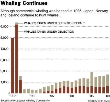
Whaling Continues | 1985-2009

What Works

It’s easy to see, even without the explanatory text, that there must have been something happening circa 1986 that changed the way whales were killed. The explanatory text is necessary to understand that it was a legislative change as opposed to a whale disease or a human health scare similar to mad cow disease (crazy whale disease?).

What I like more about this graph is that it suggests something fishy might be going on when it comes to the ‘scientific’ capture of whales. The argument goes something like this: in order to understand and protect whales and whale habitats, some whales need to be captured and killed. Just eyeballing the bars, it would seem that from 1985-1990 something like 100-300 whales were killed annually in the name of science. Then the number of whales killed for the scientific preservation of whales started to drift upwards. In 2005 my estimation suggests that well over 1000 whales were killed for science. And that 1000/year number seems to hold from there through 2009. Now, maybe whale science has grown by leaps and bounds and requires the death of about 1000 whales per year.

The article does not address the increase in scientific whale deaths so I am left to wonder if the graphic is revealing some questionable whale fatality accounting procedures. In other words, this graphic is a champion because it raises a political question in a largely apolitical way. Good work, New York Times.

Reference

Broder, John. (14 April 2010) “Whaling Continues”. In The New York Times, Environment Section.

Reinventing the Automobile* is a book that lays out a vision for a progressive evolution of urban mobility transition that offers a robust point-to-point on-demand mobility network of 2-passenger fully electric vehicles. These vehicles would take up less parking space because not only are they small, but one proposed design folds up when parked. And they’d be able to tell you where the nearest parking spot is as you’re approaching your destination. Being fully electric they require a plug….or do they? The authors suggest that after an initial period of individual owners plugging these babies into outlets in their garages overnight, folks in city planning departments or franchise owners would trust the technology and economics enough to start installing wireless charging devices available curbside or in the road bed itself. Stuck in a bottleneck at a bridge or tunnel entrance? At least charging pads in the roadway can ensure that your 2-seater won’t run out of juice before you get where you’re trying to go. You can sit there and it will charge itself with embedded charging device in the road surface while plodding through gridlock. Even farther down the timeline, the cars might be able to drive themselves. So you can sleep through the gridlock or make calls or surf the ‘net. Just don’t post facebook status updates about your traffic problems. Nobody cares.

What I like most about the book as an object of intellectual design is that even if readers decide to skip all the words and they only look at the images, charts, maps, and diagrams, they won’t miss much. This book is stuffed with great graphics. I haven’t included them all as that would constitute copyright infringement and be too long for a single post. What you see below is just a small sample from Chapter 9: Personal Mobility in an Urbanizing World.

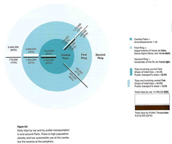
Daily driving in Paris

Daily Trips in Paris - Reinventing the Automobile (Mitchell, Boroni-Bird, and Burns), Figure 9.6

What works

This graphic is both elegant and deep. (Or it would be elegant if I had a better scanner.) It’s a simple form – Paris as concentric circles – but the more you look at it the more you learn. Rewarding that way. What sometimes happens in elegant graphics is that the details become obscured in iconography or approximations. But this graphic includes percentages as well as absolute numbers of two different kinds of trips – public transit and trips by cars. We see that Central Paris is defined as Arrondissements 1-20, the first ring is Seine Saint-Denis, Val-de-Marne, and Hauts-de-Seine, and the second ring is the rest of the Île-de-France region. There’s a summary of all the trips over in the legend so that the graphic itself can just show you the break down of different kinds of trips.

What needs work

In terms of transit, things like rivers often represent real barriers. There are only so many bridges and tunnels which creates a bottleneck effect. Paris is a city on a river so the one thing the elegance of this graphic obscures is the impact of the natural geography on transit choices. Maybe it’s not important when it comes to the cars vs. transit question, but bottlenecks are critical factors when it comes to planning mobility and I’m curious about whether bottlenecks push more people to transit or cars. In Boston/Cambridge, MA only one bridge has a train running across it and I have always assumed that pushed more people into their cars because many of them would have to go out of their way if they took the train and could only go over that one bridge.

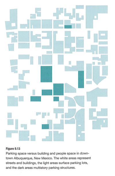
Parking in Albuquerque

Parking in Albuquerque - Reinventing the Automobile (Mitchell, Boroni-Bird, and Burns), Figure 9.13

What Works

What you are seeing here is a simplified map of downtown Albuquerque, New Mexico. The white areas are buildings. The teal areas are parking – darker teal represents multi-story parking structures while the lighter teal shows us where surface lots can be found. Lovely way to show this information. One could imagine the same sort of information as a percentage-of-land-use pie chart or some far less granular collection of numbers. This schematic doesn’t bother to calculate just how many square feet of land are dedicated to parking. Nope. This is the visual equivalent of the ‘show don’t tell’ rule that writing professors are always encouraging their students to adopt when constructing essays. A table with land use percentages would be telling. This graphic is showing.

Albuquerque is like a parking lot with some buildings in it.

What needs work

I have never been to Albuquerque but I’m guessing that if you lived in Albuquerque you might like to see some sort of orienting label. Even just a single recognizable street name thrown in their somewhere to help orient. Now, the point of Reinventing the Automobile is not to provide urban planning for Albuquerque so I know they aren’t all that concerned with just precisely which neighborhood in Albuquerque this schematic represents. Still. It’s almost too cleaned up to read as a city plan right away.

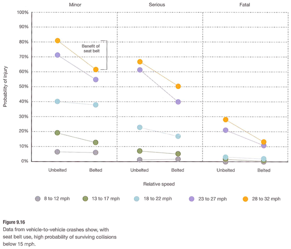
Vehicle-to-Vehicle Crashes

Vehicle-to-Vehicle Crashes - Reinventing the Automobile (Mitchell, Boroni-Bird, and Burns), Figure 9.16

What works

This graph does a great job of providing us with granular data and indicating a couple different trends visual. Keep in mind that they have multiple layers collapsed into a single graphic. It looks easy once it’s done but when one is faced with a pile of related numbers along multi-dimensions it isn’t always clear how to relate them to one another visually.

This graph has three levels of accident severity – minor, serious, fatal. It also shows the probability of injury. It also factors in variation in speed (which it does by creating five speed ranges). And then there’s the belted vs. unbelted division. That is a total of four different dimensions all displayed on one graph with a single measure on the y-axis. Color is used well. Grid lines are all that separates minor from serious from fatal accidents which are more or less three different graphs lined up next to one another.

References

Mitchell, William; Boroni-Bird, Christopher; and Burns, Lawrence. (2010) Reinventing the Automobile: Personal Urban Mobility for the 21st Century Cambridge, MA: MIT Press.

* The book specifically credits Ryan Chin, Chih-Chao Chuang, William Lark, Jr., Dimitris Papanikolaou, and Ruifeng Tian with “Illustration Production”.

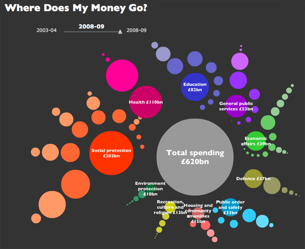
Where does my money go? in the UK - Open Knowledge Foundation, raphic by Iconomical

What works

This visually arresting graphic does a great job of presenting data about national spending in an apolitical but altogether fascinating way. It’s interactive, by the way, but I’m not commenting on the interactive part, just the static graphic. I find that getting the static graphic clear is an important first step towards making a functional interactive graphic. If ever I hear someone say ‘but it’s interactive’ as an excuse for having a weak static graphic, I cringe. See my post about the USDA mypyramid food guide for a case study on the importance of a strong relationship between the static and interactive iterations of graphics as tools.

Each dot represents a different department or governmental program with the size corresponding to the funding level. Smart.

If you link through to the originating site, you’ll be able to follow blog posts that take readers through the development of the graphic. They ask for input and do their best to incorporate it. I like that approach. Good use of technology, OKF.

What needs work

I can’t quite tell why the circles are arranged the way they are or why their hues are the shades they are. Graphics, especially the beautiful ones, are the best when their simple clarity gives way to an elegant complexity. In other words, when I pose the question: “why does the hue vary within given funding types?” I’d like the graphic to lead me to an answer. I’m sure there is a reason for each hue, I just haven’t been able to figure it out.

One tiny, American-centric request: Add ‘UK’ to the page or the graphic somewhere. Maybe change “Total spending” to “Total UK spending”. Or “Where does my money go?” could be “Where do UK taxes go?”. These here interwebs are global. Yes, of course, the £ symbol tends to give it away. Maybe I’m just being too picky.

References

Open Knowledge Foundation. (2009) “Where does my money go?” United Kingdom. Data available

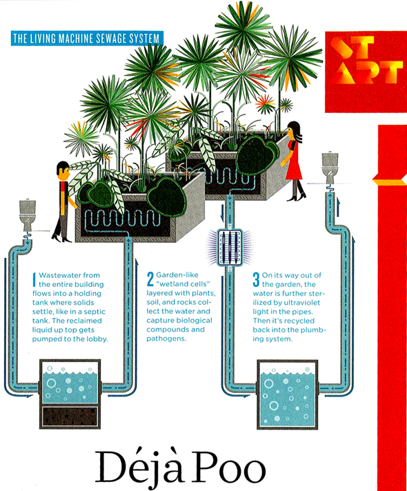
Deja poo - Visualizing wastewater recycling in commercial buildings (Wired, June 2009)

What Works

For some reason, sewage lends itself to visualization quite well. This info-graphic uses less than 100 words to describe the process of wastewater recycling in a commercial building. From toilet bowl back to toilet bowl via a potted garden in the lobby and a UV pipe light.

These kind of cartoon-like diagrams are quite useful as communication tools. The fact that they leave out important details is usually compensated by a verbal presentation or accompanying text.

What Needs Work

In this case, the accompanying text only references a few places where this system will be used in the future. There’s no word on whether it can be installed as a retrofit or any additional technical information about how it works.

Important unanswered questions

Just how many plants per person are needed in the lobby? Do most commercial lobbies have enough space for all that greenery? Could it be installed on a rooftop instead? Would the whole system work better if inhabitants adopted the “if it’s yellow let, it mellow; if its brown, flush it down” toileting strategy? What happens to the sludge at the bottom of the septic tank?

Relevant Sources

Illustration by Leandro Castelao for Deja Poo: The Living Machine Sewage System in Wired Magazine, June 2009: p. 32. Text by Nate Berg.

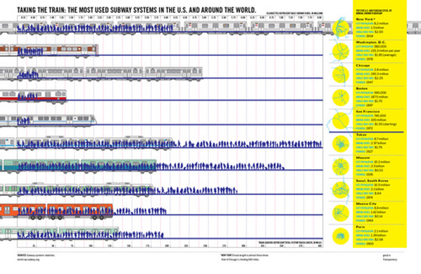
World City Train Comparison

What Works

Good magazine is indeed a good source for thought provoking information graphics. This one has to be clicked through to be seen in any kind of entirety. What I like is the layering – they manage to represent total track length, total yearly ridership (both visually and with absolute numerical data), as well as showing little schematic maps of the systems themselves. You see that many of these systems are hub and spoke systems.

As urban areas continue to grow, transit options are going to need to expand and grow in places that don’t have mass transit infrastructure dating back to the turn of the 20th century like New York and Boston. An article in this month’s context magazine by Michael Goldman and Wesley Longhofer writes about the difficulty of adding mass transit of any sort to the existing urban fabric looking at the Indian city Bangalore: “hundreds of residents marched to protest the widening of streets and felling of trees for the new elevated Metro system. Bicyclists claimed that tearing down more than 90.000 beautiful shade-producing trees ruined the appeal of what was once known as India’s “garden city.” Shop owners and concerned citizens pushed for the Metro to be built underground so businesses wouldn’t be shuttered to make way for it. Advocated for the poor argued that widening roads would turn sidewalks, where so much daily commerce and social interaction occurs, into prime real estate. Purge the city of its street vendors and sidewalks, and you’ve stripped the life out of the Indian city.” That gives a whole new context to systems with hundreds of miles of track.

What Needs Work

I wish that there would be a way to show that the installation of mass transit systems bulldozes old neighborhoods and creates new opportunities. New growth tends to look very different that the old growth it replaces. I think there’s a call for a new kind of mass transit graphic that can show the past and present of transit decisions both in economic and social/cultural terms.

Relevant Resources

Good Magazine Transparency Graphic with Robert A. Di Ieso, Jr.

Goldman, M. and Longhofer, W. (2009) making world cities Contexts, pp. 32-36.

State of the World's Fisheries and Aquaculture - UNEP GRID-Arendal

What Works

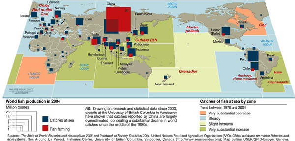
I couldn’t end the agriculture week without including a bit about the state of the oceans as a source of food. To be clear, agriculture is often related to farming the land and raising land-based livestock. Aquaculture is the term used to talk about fish farming. Catching fish out of the open water is not considered agriculture. I ought to have used the broader theme of food production.

I like this graphic because it’s got multiple levels of information – aquaculture vs. open water catches by volume, fish catch by country, and the status of the stocks by oceanic region. It can be difficult to figure out how to represent global level data when it isn’t possible to fall back on national boundaries. It’s a little odd to see the oceans chunked into squares, though.

What Needs Work

This graphic has a sort of not-quite-done look to it overall. The treatment of the aquaculture vs. open water catch could have been more elegantly integrated – superimposing the red and blue blocks on one another makes it look a little bit like the kids left their wooden blocks laying around on top of a map. I might have preferred pie charts with two pie pieces – one for the aquaculture bit and one for the open catch bit to communicate relative share. The size of the pies would be determined by absolute value of the total catch + aquaculture.

What I really would have liked to see would have been a more logical representation of the catch volume by oceanic region. The colors chosen don’t indicate much of anything, except perhaps the static areas which are just blue, standard ocean color. What would have been great would have been to indicate the relationship between areas that have decreased yields because they have been overfished and areas that are currently being overfished which will soon have decreased yields even though their current yields are high. This is complicated because the largest increase and the largest decrease are far more closely related to one another than they are to steady areas or areas with only a slight increase. It would be great if the ocean regions could be depicted by the replacement rate with an extra classification for areas that have been severely over-farmed to the point that the concept of replacement rate no longer has the same meaning.

Relevant Resources

United Nations Environment Programme – GRIDA (2009) State of the World’s Fisheries and Aquaculture

Public Service Announcement: The amount of mercury and arsenic found in predator fish is high enough that people who eat these fish recently can suffer the effects of heavy metal poisoning. To figure out what is safe to eat and what should be avoided, check out the Monterrey Aquarium, one of the best, if not *the* best source for guidelines about what to eat when what you’re eating lived in the water. They even have an iPhone app for easy reference at the grocery store and your favorite restaurants.

Monterrey Aquarium Seafood Watch

US Milk Production 1980 and 2003 by Region

What Works

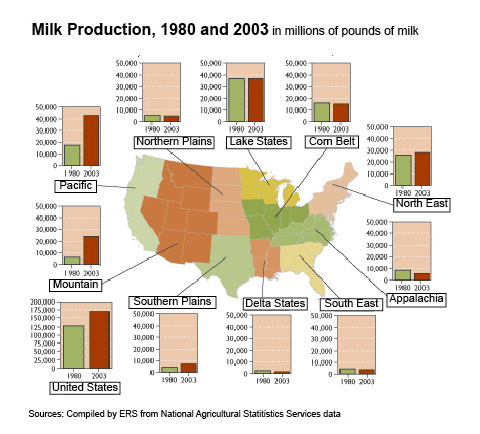
The first map was produced by the USDAs Economic Research Service in 2004 to show the change in milk production by US region from 1980 – 2003. The accompanying text is surprisingly brief, “Since 1980, milk production in the U.S. has increased almost 33 percent. Regional production growth has been most pronounced in the Pacific and Mountain regions, the result of development of low-cost systems of milk production in the Pacific region and some Mountain States. Growth has been much slower in the Northeast and Southern Plains, and the other six regions have seen essentially flat or declining production.”

The graphic is a fairly straightforward way to combine a map with a bar graph. I like it better than if it were just a bar graph with regional labels, but I would like it even more if it were better integrated so that the data from the graphs were embedded in the map, maybe by showing the change in production by color or by applying concavity/convexity to the map.

What Needs Work

There is a serious drawback to the map + graph combination. One of the problem with images is that they tend to appear as sealed, complete narratives that are telling the whole story. It’s hard to interrogate an image, harder than interrogating a text. We’re taught not to believe everything we read, but those strategies don’t translate directly into the world of images. The important missing information here is that the population in the US is shifting to the south and west out of the north east. The image doesn’t suggest causal links; but the text does. However, it leaves out the no-brainer that since milk is a localized commodity, population growth is generally going to result in increased milk production in that area.

US Population Change, 1970-2030

Bonus Image

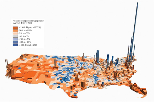
I found this image depicting population density and population change in the US. Cool colors indicate a loss of population; warm ones suggest growth. The z-axis represents human volume. A solid graphic. I have looked and looked and been unable to find the original source which just goes to show that once information hits the digital domain it really does have a life of its own. Hackers were right about that, information wants to be free.

Relevant Resources

Blayney, Donald. (2004) Milk production shifts West USDA Economic Research Center.

Dupuis, E. Melanie. (2002) Nature’s Perfect Food: How Milk Became America’s Drink. New York: NYU Press.

Mendelson, Anne. (2008) Milk: The Surprising Story of Milk Through the Ages. Knopf.

Figure 1 from "Diet, Energy, and Global Warming" by Eshel and Martin

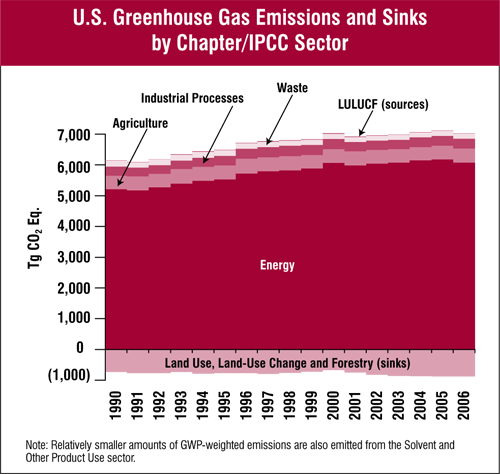
US Greenhouse Gas Inventory Report - Executive Summary, Figure ES-11

Why This?

Continuing what I have decided will be an agriculture theme for the week, I went looking for data related to energy efficiency of diets. This concept first became news in the 1970’s during the energy crisis, championed in the book “Diet for a Small Planet” by Frances Moore Lappé which has recently been released as a 20th anniversary edition. I was interested in getting to the bottom of the planetary (rather than the personal) part of her argument which is that to produce unit weight of protein in the form of beef/veal, the animal is going to need an input equivalent to 21 units of protein and we’d be globally better off if we just ate the plant sources ourselves in terms of energy consumption and intelligent stewardship of the planet. I didn’t quite find what I was looking for to back up that data (yet) but I did find the contemporary twist on that argument which relates dietary choice to greenhouse gas emissions.

What Works

The first graphic doesn’t work all that well and probably makes no sense to you so we’ll come back to that. The second graphic, from the EPA, is not particularly pretty, but it has strength in simplicity and it makes intelligent use of the x-axis to represent greenhouse gas sinks. (Note: The visual representation does a great job of communicating that are emissions dwarf our sinks better than reading a number on a page would do.) Whereas the first graphic fails miserably to represent the difference in the energy efficiency of diets, the second graphic at least conveys the conclusion of the report that went along with the first graphic which is that the difference between eating the standard American diet and a vegan diet is, “far from trivial, …[it] amounts to over 6% of the total U.S. greenhouse gas emissions.”

The details of the report accompanying the first graphic are worth perusing and I only wish they would have spent more time trying to represent them graphically. The authors, Eshel and Martin, compute the comparative impacts of transit choice vs. dietary choice and find that, “while for personal transportation the average American uses 1.7 × 10⁷–6.8 × 10⁷ BTU yr−1, for food the average American uses roughly 4 × 10⁷ BTU yr−1.” That would make an excellent graphic in about ten different ways and catapult them past the problem that many readers are going to get tripped up looking at the orders of magnitude and units and miss the point.

What Needs Work

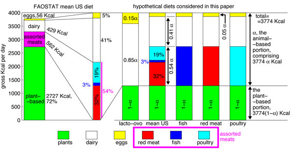
The first graphic is supposed to show the composition of the hypothetical diets considered. The mean American diet as reported by FAOSTAT has a little break-out component that provides more detail about the constituents of the animal products category but it took me a long hard look to figure that out. The break out part should have been constructed so it wasn’t exactly the same scale as the rest of the graphic (which it isn’t, by the way) otherwise it just reads like another column with viewers liable to assume that they can follow the scale on the y-axis. But the y-axis doesn’t relate to the break-out part at all – only the percentages listed alongside it are salient.

My bigger problem with the first graphic are the next five bars. Just to help you navigate α represents the proportion of the standard 3744 kcal diet that comes from animal sources. See α, think animal. A key would have been nice. Now that you know that, looking at the graph, it appears that each of the diets gets the same amount of kcals from plant sources because the green segments are all the same size. However, this is not actually what the authors are trying to convey. You have to read through the text quite carefully to pick out what proportion of each diet comes from animal sources overall. Once having done that, this graphic can help you further breakdown how those animal sources are apportioned. For example, the ovo-lacto group gets none of their animal protein from animal flesh – only from dairy (.85 of animal protein total) and eggs (.15 of animal protein total). But it took a good ten minutes of going between text and graphic to figure out what they have charted here. In all honesty, I’m still a little confused about whether the last three diets just switch out fish for meat for poultry and keep the same total number of kcalories in the animal flesh category relative to dairy+eggs. And I certainly can’t tell if any of those hypothetical diets have a greater or lesser proportion of kcals coming from plants by looking at this graphic.

In summary, the two graphics here were not trying to make the same point. The first one was trying to explain how the authors modeled their hypothetical diets in order to convince you that, in the end, and in conjunction with some other writing and graphic representation, if Americans moved to vegan diets the national greenhouse gas emission rate would drop by 6%, on par with what would happen if everyone started driving a Prius. The second graphic does this much better using aggregate data (and thus a totally different approach than Eshel and Martin).

Relevant Resources

Eshel, Gidon and Martin, Pamela. (May 2005) Diet, Energy and Global Warming. Submitted to Earth Interactions.

United States Environmental Protection Agency. (April 2008) Inventory of U.S. Greenhouse Gas Emissions and Sinks: 1990-2006

Moore Lappé, Frances. (1971, 1991) Diet for a Small Planet Ballantine Books.