*Update: Sociological Images has videos from Ways of Seeing*
What works
John Berger’s “Ways of Seeing” is a series of 7 essays, three of which are composed of visuals only, collected into a short book. They are based on a BBC television series.
He starts the first essay:
“Seeing comes before words. The child looks and recognizes before it can speak. But there is also another sense in which seeing comes before words. It is seeing which establishes our place in the surrounding world; we explain that world with words, but words can never undo the fact that we are surrounded by it. The relation between what we see and what we know is never settled. Each evening we see the sun set. We know that the earth is turning away from it. Yet the knowledge, the explanation, never quite fits the sight.”
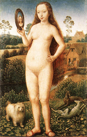
Vanity by Hans Memling, 1485
In one of the essays about the female nude he goes on to develop how power has been embedded in the relationship between seeing and being seen. This sort of exposition on the female nude is common in art history but made especially accessible in Berger’s short essay collection. Using Vanity by Hans Memling (above) as an example, he writes: “The mirror was often used as a symbol of the vanity of woman. The moralizing, however, was mostly hypocritical. You painted a naked woman because you enjoyed looking at her, you put a mirror in her hand and you called the painting Vanity, thus morally condemning the woman whose nakedness you had depicted for your own pleasure.”
References
Berger, John. (1972) Ways of Seeing [essay collection] London: BBC and Penguin Books.
Waiting and Watching the XX at CMJMaybe you should have given your band name more thought
What works
The top graphic makes abstract art out of the concert going experience – and it’s funny, too. It’s a translation of an experience into a visual in an unexpected way, something that Andrew Kuo is now widely known for, at least when it comes to music.
The bottom graphic about band names is a good example of a more standard translation – more and more people like graphics like these because they allow for the communication of relativity. Let me try to explain in words what Kuo so easily explains in his picture. All of these band names have something in common – they’re sort of odd. But some of them are far more odd, or at least they were before we got used to them, than others. Death Cab for Cutie is farther out there than, say, MGMT. I could go through and type out the relative odd-ness of all the band names. But you’re better off just getting the same information in a fraction of the time by looking at Kuo’s graphic.
Think about explaining in words: “So you see kids, sharks get confused. They see a surfer and it looks like a seal to them.” Now think about being a little tyke and imagining a surfer and a seal. They don’t look anything alike to you. You wonder if sharks are practically blind or something.
Now think about showing them the first graphic. Instant comprehension. The kids don’t even have to think, they just know. This is graphic design at its best.
As for the second graphic, man, I think everyone loves some Venn diagrams. Such a powerful way to depict the union of two sets. This one is even better than average so I thought I would share it.
What needs work
I might have run these without captions. Errol Morris had a piece, “Photography as a Weapon” about how much captions can change the meaning of an image and ever since I read it, I’ve been looking at images with and without captions to see if it changes the way I think about them.
Flowchart of Beatles song 'Hey Jude' created by dannygarcia inspired by jeannr
What Works
I love it when I find evidence that someone has taken something not at all visual or even all that hierarchical and turned it into an information graphic. It can be difficult to convince people (and here I mostly mean academic sociologists) that developing information graphics is a critical part of communicating research findings or teaching concepts. Coming across examples like this helps – then again, it’s pretty easy to dismiss this as a silly exercise unrelated to the important work sociologists are doing.
I love the loop on ‘na’ at the end.
Good use of gray scale, too.
What needs work
I am now curious about developing a way to understand how to choose a path. When should Jude ‘make it better’ vs. ‘let her into your heart’?
Stanley Lieberson’s “A Matter of Taste” looked at the way trends spread by examining baby names. He wanted to avoid the impact of marketing and advertising – the point was not to figure out how to create, perpetuate, or stop a trend, but to see if there is such a thing as a trend in the first place. Nobody is in the business of promoting baby names, and yet there are patterns. Lieberson looked for these patterns in the US. French sociologist Baptiste Coulmont has also looked at the way baby naming trends move across space and change in popularity over time.
The graph below shows how the final syllable of female names has changed over time. The -ette ending waned in popularity while the -ine and -a or -ah endings have increased in popularity. Graphically, I love that this diagram looks like sound intensity diagrams.
Female name endings in France - courtesy of Baptiste Coulmont
More interesting yet, Coulmont also animated a map to show how the name Loic spread from Brittany across the entire country over the course of about 60 years. I like this because it takes a static map and makes it dynamic. Sure, you could have lined up maps to march across a page at five or ten year intervals and cognitively filled in the blank spots. But here, his animations do the cognitive heavy lifting for you, revealing the pattern instantly.
Here’s what Coulmont had to say about the map graphic:
“As to my animation : there is no yet an accompanying sociological argument. I was struck by the spatial mobility of “Loic” from 1945 until 2005 : it seems to be a steady eastward shift [nowadays, Loic is one of the 20 top names for boys in francophone Switzerland : the eastward movement jumped the frontier!
How to explain this movement ? It seems that “Loic” moved from one district to another by means of personal interactions : some people knew some “Loic” living in the west, chose this name for their baby boy, and the movement continued eastward. “Loic” is not alone : especially during the nineties and now, names from Brittany are somewhat fashionable (“Celtic names”) : it could be the unforseen consequence of a strong nationalist movement in Brittany during the seventies. Those independantists fought for the right to name their children with “real” Celtic names… and the names spread in other regions.”
French provinces (note where Brittany is way to the west)
The United States Department of Agriculture has been in the business of creating one particularly important information graphic: the food pyramid. This graphic has not always been a pyramid. Back in the 1980’s it was still a square made up of four equal sized squares. (Because the 1980’s were not digitized I have had a difficult time finding a representation of this early four-square diagram. The basic gist was that there was a dairy/milk/cheese group, a meat group, a fruit/vegetable group, and a beans/breads/starches group. I will look for this diagram and repost here when I finally find it.)
The USDA’s dietary recommendations are consequential. School lunches are crafted to comply with them, young children learn the ‘science’ of eating in school with the diagrams as a guide (presumably they would have already started learning the culture of eating at home), and the nutrition guidelines on food packaging are based on these recommendations as well. Marion Nestle’s work (Food Politics) exhaustively shows that these recommendations are often influenced by lobbying groups like the National Pork Producers Council, Archer Daniels Midland, Conagra, the National Dairy Council, and the National Cattleman’s Beef Association. That is not meant to be an exhaustive list or to point fingers, just to remind you that food is a business and like any other business, interested stakeholders go to Washington to lobby for themselves. So, for example, the dairy council is quite interested in suggesting that people should be getting 3 servings of dairy every day even though the majority of people over the age of five are at least mildly lactose intolerant. Furthermore, there is conflicting research evidence on the “milk builds strong bones” claim that often gets parents pouring glass after glass for their children. Calcium from milk may not, in fact, make bones any stronger. Regular exercise is a more reliable solution (along with good genes).
From a graphics perspective, then, there is a lot of summarizing that has to happen in the production of a definitive picture of a healthy diet. Like I mentioned, we started with a square made up of four squares. But that diagram emphasized foods relatively high in saturated fat — meat and dairy. Saturated fat was, and is, deemed to be bad for health. However, there was some debate at the time about whether or not the public would be able to tell the difference between saturated and unsaturated fat. They could get confused. They might eat the wrong things and avoid the right things. So, to simplify, it was easier to just promote a low fat diet all around and skip the distinction between saturated and unsaturated fats (see Walter Willett, Eat Drink and Be Healthy for more on this debate). After a fairly rigorous study, it has been deemed that low fat diets are not a panacea and do not lower risks of heart disease or cancer.
The food pyramid: Round I
The first food pyramid emphasized the consumption of starches above all else: 6-11 servings per day. No distinction was made between whole grains and processed grains that are less nutritious. Cereal and pasta are specifically listed in this group. Fruits and vegetables stack on top of this base, on top of them are protein sources – meat, dairy, nuts, legumes. At the very top is the eat “sparingly” category containing sugar and fats. It’s unclear just how often sparingly is. Nestle talks about how recommendation language is often massaged so that it seems no foods are bad as long as they are eaten in moderation. From a nutritional perspective, this is only half true. What’s the point of eating something that has no positive nutritional value and might come with negative side effects like tooth decay, weight gain, and worse? There is no point; those things should be avoided.
So why not just come out and tell people not to eat candy, soda, chips, cake and ice cream? Promoters of those particular food commodities don’t want the government telling people that ice cream is bad for us. They’d prefer that it be ‘eaten sparingly’. This is the difference between schools on the federal lunch plan serving ice cream once or twice a week or never at all. It’s a lot of money. Quite frankly, this pyramid’s cap is so vague – “fats naturally occurring and added” and “sugars” – that it would be hard to know how to follow this advice. Many foods are not primarily fat or sugar. Take, for example, a chocolate covered strawberry. Is that a fatty, sugary food to be avoided or a piece of nutritious fruit to be eaten for three servings a day? Frosted mini wheats? Good because of the fiber or bad because of the frosting? Sweetened packets of instant oatmeal? Good or bad? It’s much easier to tell what is in all the other categories of this graphic than the cap on top where all the fat and sugar are quarantined, somehow stripped out of the food products where they occur in real life.
USDA Food Pyramid: 1995-2005
mypyramid.gov
For all it’s shortcomings, this pyramid was targeted for a redesign. Some were upset that it’s only in English, others that it seems to encourage people to eat too many carbohydrates (rates of obesity and diabetes have continued to rise even amidst a lower fat intake, see Nestle). People who view the world holistically wanted to see some mention of lifestyle – isn’t exercise part of the consumption cycle? In 2005, the pyramid below came out as an interactive graphic which you can play around with at mypyramid.gov.
mypyramid.gov static graphic from the USDA
As a stand alone graphic this is ridiculously awful. The one good thing it did was to have a stick figure running up the side, indicating that exercise is part of the program. The rest has almost no instructive value as a static graphic. If there were concerns before that some people wouldn’t be able to use the chart properly because they couldn’t read English, this chart has far greater problems to surmount. It can only be used in an interactive setting. The color coded bars aren’t even labeled, they all appear to be more or less even. So the idea it’s offering seems to be: eat everything in equal amounts and then go running. If you make it over to the mypyramid site you’ll see that it asks you questions about your height, weight and gender to help suggest a pyramid just for you. But the graphic gets left behind in the process in favor of tables.
Next?
For a project I was working on last summer, I took my own stab at redesigning the food pyramid by literally standing it on its head. Walter Willett’s book “Eat, Drink and Be Healthy” served as the nutritional guide. In addition to telling people what TO eat, the graphic tells people what NOT TO eat. Down at the bottom there is also a grey area representing foods in which the evidence has gone both ways. Some studies suggest that a glass of red wine every day is good but we also know that too much drinking is bad. And at least one study suggested that one daily serving of any alcoholic beverage was therapeutic, not just red wine. Vitamin supplements are another hot area with recent studiesshowing that they don’t do much.
I welcome comments on this particular pyramid.
Based on data from Walter Willett's Eat Drink and Be Healthy
This is a great concept because CEO compensation has ballooned relative to compensation for the rest of us.
What Needs Work
I would like to see some of the comparative data on compensation for the rest of the work force somehow, not just CEOs.
It would be nice for the graphic to say that the figures are all in year 2000 dollars.
Collapsing the bars instead of stringing them out diminishes the visual impact dramatically. If the highest compensation was displayed end-to-end instead of broken up and stacked it would look far more disparate compared to the 1970 compensation data. Now, realizing that this would skew the page layout, the graphic designer could have pursued a volumetric portrayal instead of just a two dimensional version.
Relevant Resources
Conley, D. (2008) You may ask yourself: An introduction to thinking like a sociologist New York: W.W. Norton & Company. p. 563.
The Price of a Pair of Nike's in 1995 (Conley, 2008)
What Works
The smart thing about this graphic is that it does not oversimplify. The story about Nike that gets told in popular conversation often reduces the profit makers to a monolithic Nike entity. But here we see that profit is extracted at three points in the process – only one of those profit chunks goes to Nike, the other two go to the suppliers and the retailers. It’s also instructive to see just where the rest of the money is allocated – rent, shipping, materials, labor, import duties, marketing, and some rather large “other” catch-all.
What Needs Work
The shape of the shoe just confuses things. It makes it hard to visually compare the relative volumes of the various chunks. It would have been more helpful to skip the gimmicky shoe shape and line up the profit chunks in one row, the labor chunks along a row, and so on for ease of visual comparison. Right now “production labor – $2.75” for the supplier looks to be only a bit smaller than “materials – $9.00” for the manufacturer when in fact, they differ by a factor of three.
Relevant Sources
In case you recognize this citation from yesterday, I should say that I am currently looking at Intro to Sociology text books so I pulled a few things from the same book.
Conley, D. (2008) You may ask yourself: An introduction to thinking like a sociologist New York: W.W. Norton & Company, p. 399.
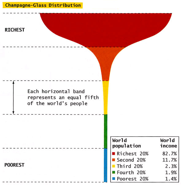
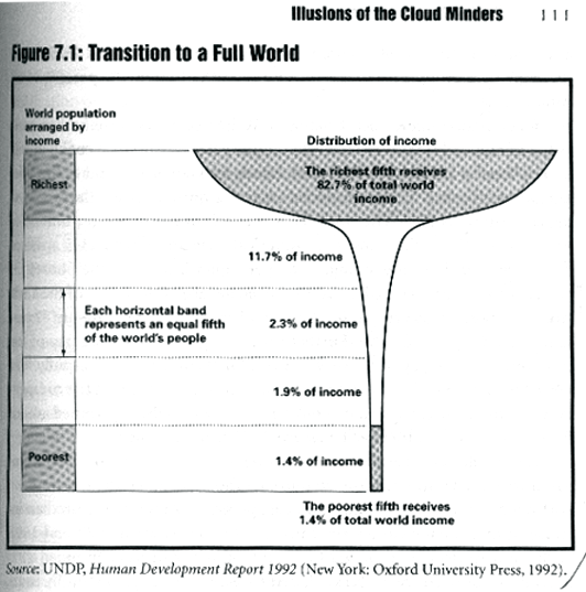
Champagne Glass Distribution from Conley (2008) You May Ask Yourself
What Works
This graphic works as well as it does in part because it evokes the too-delicate feel of a champagne glass in hand. All that wealth resting on so little. The shape does what a data table alone cannot – it subtly suggests that the wealthy are resting on the poor and that the balance is quite precarious.
Chandler, David. L curve [another graphic depicting wealth distribution by a mathematician/educator – it’s interactive.]
Update
I found a much earlier 1992 version of the champagne glass distribution of wealth graphic and wanted to give credit where credit is due. It came from the UNDP 1992 “Human Development Report” and was republished in chapter 7 of When Corporations Rule the World by David Korten.
Deja poo - Visualizing wastewater recycling in commercial buildings (Wired, June 2009)
What Works
For some reason, sewage lends itself to visualization quite well. This info-graphic uses less than 100 words to describe the process of wastewater recycling in a commercial building. From toilet bowl back to toilet bowl via a potted garden in the lobby and a UV pipe light.
These kind of cartoon-like diagrams are quite useful as communication tools. The fact that they leave out important details is usually compensated by a verbal presentation or accompanying text.
What Needs Work
In this case, the accompanying text only references a few places where this system will be used in the future. There’s no word on whether it can be installed as a retrofit or any additional technical information about how it works.
Important unanswered questions
Just how many plants per person are needed in the lobby? Do most commercial lobbies have enough space for all that greenery? Could it be installed on a rooftop instead? Would the whole system work better if inhabitants adopted the “if it’s yellow let, it mellow; if its brown, flush it down” toileting strategy? What happens to the sludge at the bottom of the septic tank?
Analyzing the visual presentation of social data. Each post, Laura Norén takes a chart, table, interactive graphic or other display of sociologically relevant data and evaluates the success of the graphic. Read more…


!['A Common Mistake' [original caption]](https://thesocietypages.org/graphicsociology/files/2009/11/shark1.jpg "A Common Mistake")
!['Identity Crisis' [original caption]](https://thesocietypages.org/graphicsociology/files/2009/11/shark2.jpg "Identity Crisis")


")


")
")
")