What Works
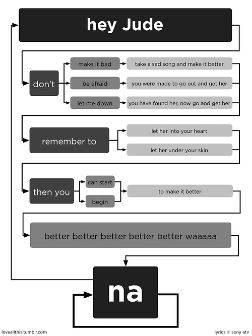
I love it when I find evidence that someone has taken something not at all visual or even all that hierarchical and turned it into an information graphic. It can be difficult to convince people (and here I mostly mean academic sociologists) that developing information graphics is a critical part of communicating research findings or teaching concepts. Coming across examples like this helps – then again, it’s pretty easy to dismiss this as a silly exercise unrelated to the important work sociologists are doing.
I love the loop on ‘na’ at the end.
Good use of gray scale, too.
What needs work
I am now curious about developing a way to understand how to choose a path. When should Jude ‘make it better’ vs. ‘let her into your heart’?
References
dannygarcia at the blog Danny Garcia.

Comments 1
uberVU - social comments — November 23, 2009
Social comments and analytics for this post...
This post was mentioned on Twitter by mainecopywriter: This is hilarious! KISS principle applied to The Beatles http://bit.ly/MAqRU...