What Works
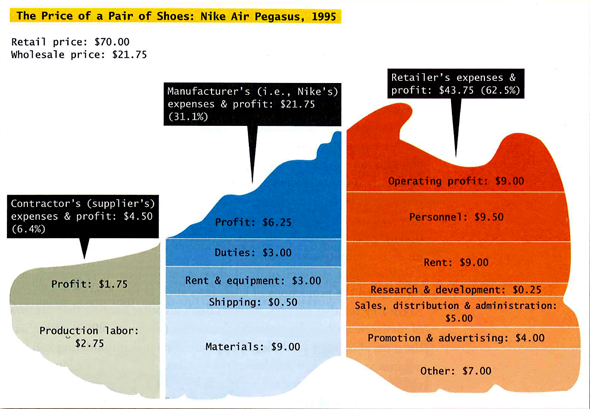
The smart thing about this graphic is that it does not oversimplify. The story about Nike that gets told in popular conversation often reduces the profit makers to a monolithic Nike entity. But here we see that profit is extracted at three points in the process – only one of those profit chunks goes to Nike, the other two go to the suppliers and the retailers. It’s also instructive to see just where the rest of the money is allocated – rent, shipping, materials, labor, import duties, marketing, and some rather large “other” catch-all.
What Needs Work
The shape of the shoe just confuses things. It makes it hard to visually compare the relative volumes of the various chunks. It would have been more helpful to skip the gimmicky shoe shape and line up the profit chunks in one row, the labor chunks along a row, and so on for ease of visual comparison. Right now “production labor – $2.75” for the supplier looks to be only a bit smaller than “materials – $9.00” for the manufacturer when in fact, they differ by a factor of three.
Relevant Sources
In case you recognize this citation from yesterday, I should say that I am currently looking at Intro to Sociology text books so I pulled a few things from the same book.
Conley, D. (2008) You may ask yourself: An introduction to thinking like a sociologist New York: W.W. Norton & Company, p. 399.

Comments 3
AM Khosla — May 30, 2009
Since when do retailers do R&D? Is it possible that the orange and blue sections are mislabeled?
Laura Norén — June 9, 2009
I am not precisely sure what activities count as "R&D" for retailers so I would be willing to entertain an argument that the R&D segment ought to be placed in the orange section. I do not think that the orange and blue segments are mislabeled overall, though, because the rest of the data is plausible.
Does anyone else know what might count as R&D for retailers? Market research about where to build new stores and focus group testing about how to promote products? I could see that eating up some funds and falling within the purview of retailers.
Rod Stokes — December 15, 2009
http://www.accessmylibrary.com/article-1G1-19874215/retailers-pressing-irs-rampd.html
DOWNTOWN - The 105th Congress recently extended the research and experimentation tax credit, which was enacted in 1981 to encourage retailers to develop new software for things like tracking inventory and payroll. But the Internal Revenue Service has begun tightening rules for the exemption, requiring retailers to prove tougher standards of risk and innovation before they can receive the credit.