Regular readers will recognize this as a slightly modified version of a bathroom design I posted a couple weeks ago. I took some time to incorporate readers’ comments and hope you’ll continue to make recommendations.
Here are the major changes:
+ all the plumbing is routed through exterior walls
+ sight lines are improved so that it is more difficult for women to accidentally see the back of a peeing man.
+ there is no longer a trough sink – regular sinks instead. Cheaper.
+ if men really want to stay separate from women, they could wash their hands at the sink next to the changing station.
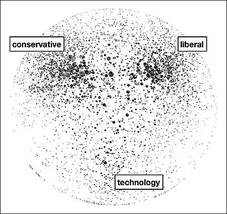
Oversimplification makes this a surprisingly legible collection of tiny dots.
What needs work
I have no idea how to trust this graphic. The labels seem arbitrarily applied – that could just as easily be food blogs, design blogs, and gossip blogs. Or maybe if you left the labels blank it could be a Web 2.0 Rorschach test.
The article is built around these key findings:
+ “The Web sites of legacy media firms are the strongest performers. The top 10 mainstream media sites, led by nytimes.com, washingtonpost.com, and BBC.com, account for 10.9 percent of all dynamic links.”
+ “By contrast, the top 10 blogs account for only 3.2 percent of dynamic outlinks.”
In other words, old media (still) rules. Not exactly sure why, if those two points are the primary arguments, the story ran with a graphic about politics and tech blogs dominating the blogosphere.
[As far as I can tell, the author agrees with me that it’s not even all that interesting to talk about why politics and technology dominate the blogosphere. Tech geeks are comfortable in cyberspace (they may even prefer it). So that’s a no-brainer. Blogs are perfectly designed to facilitate the dissemination of opinions what with the casual tone and the comment features. Politics is heavily rationalized opinion. Thus: blogs + politics = eureka.]
I would love to see someone write about the relationship between recipe trading and the development of the internet. THOSE are the blogs that are inexplicably everywhere. And the early users of the internet were happy to use primitive bulletin boards for trading recipes.
Bottom line
Just because it’s pretty doesn’t mean it’s relevant.
Infant mortality gap between blacks and whites in Wisconsin
What works
I like the inset map. Architects often include a small site map in the main exterior section of a new building to help the viewer understand where the building is in relation to the rest of the world. News programs often start out international stories with maps. I love that this line graph comes with an orienting map. I might have included just a shadow of some neighboring states simply because many Americans have only a fuzzy idea of where Wisconsin is. Sad but true.
The lines show a great deal of information, some of which is not addressed in the article. Quoting the main thrust of the article: “Here in Dane County, Wis., which includes Madison, the implausible has happened: the rate of infant deaths among blacks plummeted between the 1990s and the current decade, from an average of 19 deaths per thousand births to, in recent years, fewer than 5. The steep decline, reaching parity with whites, is particularly intriguing, experts say, because obstetrical services for low-income women in the county have not changed that much.”
Then it goes on to quote a local doctor and professor: ““This kind of dramatic elimination of the black-white gap in a short period has never been seen,” Dr. Philip M. Farrell, professor of pediatrics and former dean of the University of Wisconsin School of Medicine and Public Health, said of the progress in Dane County. “We don’t have a medical model to explain it,” Dr. Farrell added, explaining that no significant changes had occurred in the extent of prenatal care or in medical technology.””
The graph suggests an explanation that the article (and the doctor) may not have considered. Presenting information visually is about more than presentation; rearranging data to reveal patterns is a research tool in itself.
What needs work
This is a critique of the article, based on the line graph: isn’t it possible that the at-risk folks in Dane County ended up moving to Racine for some reason? Right at the time the infant mortality rate in Dane was plummeting, the rate in Racine was spiking. From the line graph it seems that this happened in the vicinity of Clinton era welfare reform. Maybe there were some reasons for the most at-risk folks to get out of Dane and into Racine at this time.
If there is no medical explanation, let’s have a look at other possible explanations.
New York City - Upper East Side {from the Center for Urban Pedagogy, envisioning development project}New York City - East Harlem {from the Center for Urban Pedagogy, envisioning development project}
Maps are hot. They’re everywhere. I was at a final presentation last night and one of the students said, “I’m kind of a map geek”. I didn’t realize it was possible to be a map geek, but I’m starting to understand. It’s quite easy to present a map – maps have been in use for centuries and some of the oldies are still goodies. It’s not so easy to combine a map with social science data in a smart, legible way. Folks try all the time. These folks at the Center for Urban Pedagogy got it right. Their affordable housing map tool is a solid example of the capability and execution of interactive data.
Why?
The map itself has been stylized. All they want to show you is neighborhood boundaries and neighborhood names. Gone are street markings, terrain, unnecessary color, landmarks, subway stops, and so on. They’re going to add some layers and your eyes are going to be better off without excess detail at the level of the map. Plus, they’re helping you to understand that it isn’t possible to get more granular than neighborhood masses. You can’t use this map to look at property values by block or by proximity to a subway stop so there’s no reason to include the subway map or street markings.
This grey massing approach helps focus my attention (and hopefully yours) on the layer of information about income by neighborhood. This information IS in color. It is added as a layer on top of the map without obscuring the map. They’ve used a modified bar graph layout in which information is embedded in the x-axis itself. The y-axis is implied – that’s just fine here.
And it’s interactive. In a good way.
From a technical perspective, this site makes good use of Flash. It loads quickly and is responsive. Once a neighborhood is selected the bar graphs realign themselves with colored blocks flying in from cyberspace to construct the balance of income for that neighborhood. Note that this is enough movement to make the whole experience a little exciting, a little sparkly but it doesn’t take so long to load or run that you’ve lost interest before you’ve gotten through it.
Layers.
It is my pedagogical opinion that the best graphics encourage the viewer to formulate a question which is then answered. In this case, what we see first is a neighborhood map. The viewer has to pick a neighborhood before any of the juicy data is revealed. This is great. Now, say, we’ve picked the Upper East Side and we see a towering skyscraper-like bar graph way over in the “High Income” department. Our next step can either be to compare to nearby neighborhoods, by clicking on East Harlem to the north, or to add the information about housing prices. The title is “What is affordable housing?” so clearly this is what the designers hope you’ll do. But they aren’t so impatient about it that they try to incorporate it into the first splash page.
Think about what this graphic could have been: basically just a line graph showing growth over time. Now look at it again. The little flags point out cnn.com’s busiest days and remind you what was happening on those days – Obama’s inauguration, the September 11th attacks, various other political happenings. Even if this graphic weren’t labeled ‘cnn.com’ I bet you would have been able to predict it was a news site just by looking at which days it had the most hits.
Other things to like: the little graph at the top showing global internet use to remind us that the growth of page views per day could largely be a function of the growing number of people who have access to the internet rather than an inherent growth in popularity of cnn.com. Of course, the little bitty bar graph isn’t big enough to see if there is a difference in the growth rate in access to the internet overall and the growth rate in page hits at cnn.com.
Mirroring the trend over the x axis is a brilliant move here. On top, we see the page views per day averaged over the week in red and the annual weekly average. This allows them to go granular with their highest hit days and also give a trend line that smooths over the outliers. Nice. And on the bottom, then, they can show basically the same trendline broken into content areas. So if you’re a skeptic and you think all this growth is probably in entertainment because folks are just nitwits feasting on celebrity-ism, well, you can see that the home page gets by far more traffic than the entertainment page. It’s possible that the nitwit theory holds, but folks aren’t turning to cnn for juicy gossip. We can also see that video takes off and politics has more page views in election years.
And on Christmas, the number of people ignoring cnn peaks.
From Feltron, the graphic’s designer, the best thing about the narrative depicted by this graphic is the trust we all put in the internet as a reliable source of news after 11 September. “Ultimately, I think the most fascinating story here is the change in our news habits after September 11, 2001. After this day, a new and higher baseline for visits to the site is established, and the inference is that this event really established CNN.com and the greater Internet as a reliable, timely and indispensable source for news.”
What needs work
This is a sophisticated, well developed graphic that basically needs no work.
But…
The text is too small to read. Of course, it’s virtually impossible to create a graphic with this much detail that is elegant and uncluttered with text that fits in 800 x 800 pixels, or thereabouts. For folks who happened to have the ever widening monitors, it would have been nice to link to a ginormous version. I bet feltron has a larger version since I’m not sure how he would have been able to convince himself that some of the smallest text was legible otherwise.
I never thought of a fuzzy halo-like hairstyle as an exploded pie chart before. Mostly, I just saw this and it made me smile. Recall from my earlier post Translating inspiration into better design that seeing something which you believe to be beautiful or clever can be a springboard for improving your own ability to design elegant information graphics.
What needs work
Clearly, it would be great if this had anything at all to do with social science or research. But it doesn’t. And I’m sure some of my readers are going to be upset that it had anything to do with Mr. Gladwell, but it is unfair to let personal opinions about Malcolm alter the reception of Christopher Niemann’s graphic.
Charles Blow's graphs to track voter apathy by age group
What needs work
These graphs are meant to illustrate voter apathy by age group.
Jay Livingston, blogger at Montclair socioblog, points out that comparisons between age groups would be far easier if all the age groups appeared on one graph. I agree.
I would also point out that I’m curious about whether it is strictly age or a cohort effect that is really at the heart of the question about who votes. In order to answer that by using infographics, I might have looked at voting rates within cohorts over time (so graph the baby boomers voting rates as they age and so forth).
One picky little detail: when making graphs that have to do with voting, it’s probably best to assume many people will see red and blue and think Republican and Democrat. I would have preferred any other colors, just to avoid confusion.
The bigger problem
Folks, leave your computer alone for a minute and vote.
Michael Schwabs poster design for the Art Center College of Design in Pasadena, CA
How to go from inspiration to design?
There are plenty of great graphic designers plastering walls with posters, filling magazines with intelligent ads, and even getting their work into museums. A lot of the time, it’s hard to see how all the inspiration and excitement of graphic design for advertising can make it’s way into the information graphics social scientists use to communicate their findings.
I took a fake example to show you how I translated my appreciation for Schwab’s design into some thoughts about enlivening a basic line graph. Let me emphasize this one more time: this example is fake. I didn’t use real data. Yes, global consumption of meat is increasing per capita, but no, it’s not as dramatic at it appears here. I went ahead and left off scales on the X and Y axes to ensure this graphic doesn’t end up traveling around the interwebs as truth.
Step 1
Break down Schwab’s graphic. He’s basically got a right triangle sitting on a single color background that bleeds into a thick border. The border contains the only text. The only realist element – the pencil – intersects the triangle to make what is like a giant X in the center of the poster.
How is this at all like social science graphics? Well, if you flip the triangle, it’s a lot like any positive relationship as depicted by a line graph.
Basic positive relationship depicted by a line graph
What next?
Now that you can see how a line graph is a little like Michael Schwab’s elegant pencil poster we can start to apply his decisions directly to our graphic. First, we can add a clearer background. If it’s just white the thick borders do not read as thick borders. They just look like the same old place everyone puts their axial labels. I distinguish this by adding a background color which will pull the borders into a relationship with the background behind the graph. I also go ahead and fill in the area under the graph to help nudge it into reading as an area, rather than some jiggly line.
The tough part here is the graphic. Not all stories we want to tell are going to be linked to a slender X-making image. I chose to depict the rise in meat consumption. Sure, I could have picked a cattle prod or other cattle killing tool dripping with blood. It would have been slender and I could have made an X. But I was trying not to appear unbiased so I just went with an iconic image of a beef cow. I planted the cow in the middle. We do lose a few data points in the middle – there are ways to deal with that if it’s important (overlay a yellow line across our cow’s gut where the data points are missing).
Here’s what we’ve got. The point is that the graphic below is the basically the same data as our line graph above except far more arresting (I took the liberty of adding two more lines of text – not necessary, but I was trying to closely follow Schwab’s concept). If you are trying to keep the attention of the audience in a presentation, be they sleepy students or sleepy colleagues, it might be worth your while to take a little extra time on your most important graphics. And if you do have one or two major points you want the people to take away from the graphic, you can write them across the top or up the side. Writing up the side is not as good – use it only for secondary points or graphic credits in the case that you hire someone to craft your graphics.
Simple line graph copying Michael Schwab's concept
References
Schwab, Michael. (2009) “Instrument of Creativity” [poster design] Art Center College of Design in Pasadena, CA.
One of the reason this blog has been quiet recently is that I have been busy with too many projects, one of which is just finishing up now. It’s a book about the politics and social life of public bathrooms that I am co-editing with Harvey Molotch and will come out maybe next fall with NYU Press. In the concluding chapter, in a practice uncharacteristic of sociologists, Harvey and I suggest a design solution to a social problem in the form of the schematics you see above.
Here’s the context that you would have gotten had you read the book:
1. There aren’t enough public bathrooms and access to safe, clean places to go often operates to sort out the undesirables and, thus, make them even more undesirable as they are faced with the nowhere-to-go situation.
2. Public bathrooms heighten fears of the Other via their association with waste and dirt (ala Mary Douglas). Electronic fixtures have been installed to alleviate the frisson of coming up against other people’s private moments, past and present (in the stall next to you). But electronic fixtures can be quite frustrating and controlling, especially if you are doing something out of the ordinary like trying to brush your teeth.
3. People who don’t conform to traditional gender norms are not well-served by the bathroom binary. A person got kicked out of a restroom for using the woman’s room when she didn’t appear to be feminine enough. Her attempt to prove that she now identified and had always identified as female was dismissed.
4. The assumption that visiting the restroom is an act undertaken by individuals is faulty. Pairs and groups go, too. People with disabilities might need to take a helper in with them and that helper may very well be of the opposite sex. Parents with young children have all sorts of difficulty. When their kids are babies, where does the stroller go? When they get to be tots, are they going to crawl under the stalls or sit on floors of dubious cleanliness while mom/dad uses the toilet? When they get to be old enough to know the difference between boys and girls but not old enough for mom/dad to feel comfortable letting them use the public restroom alone, what can be done?
5. Architects and regulatory boards often do not have the time or the desire to rethink the design of the bathroom. Offering up a schematic plan is a step towards closing the gap between social science research and the physical world under construction.
Our solution is to make bathrooms unisex. Rather than tuck each individual into a small room completely sealed off from other bathroom users, we maintained the shared space. There’s a lot to learn about navigating taboos in the bathroom, and sorting people into their own private rooms would eliminate those opportunities altogether. On top of the primary concern that sharing the anxious space of the public restroom is a socially productive situation, there’s also the problem that most buildings don’t have enough space for as many private stalls as would be required by law.
We’ve kept urinals because they are so much more environmentally sound than toilets. But they’re tucked away so that men will keep their privacy and women won’t be confronted with the potential site of a penis out of pants.
We’ve turned sinks and toilets into mechanisms operated with foot pedals. Women kick to flush anyways; putting the pedal on the floor makes it a whole lot more accessible and thus, safer.
We’ve suggested that prams and bikes and luggage are part of everyday life and they need a place to be. In the large public restroom, they are parked near an attendant’s area. In the office-scale version, there is a parking nook next to the hand dryers, outside the general circulation route and also outside the typical lines of sight to help prevent theft.
The question
What do you think of our attempt to solve social problems by design? Should we stick to sociology and leave the designing to the architects and planners? Or, is it helpful to see – in plan – how all of the bathroom difficulties from diverse user groups can sit more comfortably together in space?
Are these plans convincing as communication tools? As pieces of graphic design, what else could be done? (color isn’t an option)
About Graphic Sociology
Analyzing the visual presentation of social data. Each post, Laura Norén takes a chart, table, interactive graphic or other display of sociologically relevant data and evaluates the success of the graphic. Read more…


![New York City - Upper East Side [from envisioning development]](https://thesocietypages.org/graphicsociology/files/2009/12/upper_east_side_sm.png "New York City - Upper East Side {from the Center for Urban Pedagogy, envisioning development project}")
![New York City - East Harlem [from envisioning development]](https://thesocietypages.org/graphicsociology/files/2009/12/east_harlem_sm.png "New York City - East Harlem {from the Center for Urban Pedagogy, envisioning development project}")


