
What works
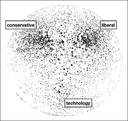
Oversimplification makes this a surprisingly legible collection of tiny dots.
What needs work
I have no idea how to trust this graphic. The labels seem arbitrarily applied – that could just as easily be food blogs, design blogs, and gossip blogs. Or maybe if you left the labels blank it could be a Web 2.0 Rorschach test.
The article is built around these key findings:
+ “The Web sites of legacy media firms are the strongest performers. The top 10 mainstream media sites, led by nytimes.com, washingtonpost.com, and BBC.com, account for 10.9 percent of all dynamic links.”
+ “By contrast, the top 10 blogs account for only 3.2 percent of dynamic outlinks.”
In other words, old media (still) rules. Not exactly sure why, if those two points are the primary arguments, the story ran with a graphic about politics and tech blogs dominating the blogosphere.
[As far as I can tell, the author agrees with me that it’s not even all that interesting to talk about why politics and technology dominate the blogosphere. Tech geeks are comfortable in cyberspace (they may even prefer it). So that’s a no-brainer. Blogs are perfectly designed to facilitate the dissemination of opinions what with the casual tone and the comment features. Politics is heavily rationalized opinion. Thus: blogs + politics = eureka.]
I would love to see someone write about the relationship between recipe trading and the development of the internet. THOSE are the blogs that are inexplicably everywhere. And the early users of the internet were happy to use primitive bulletin boards for trading recipes.
Bottom line
Just because it’s pretty doesn’t mean it’s relevant.
References
Kelly, John. (2009) “Mapping the Blogosphere: Offering a Guide to Journalism’s Future” The Nieman Reports. Nieman Foundation for Journalism at Harvard University.
Comments 2
John Kelly — December 7, 2009
I'm so glad you found my work, but how unfortunate you chose to review the black and white image that Nieman put in their online article, rather than the original color images available in the Berkman Center study from which the Nieman piece was adapted! I think the color image would go a long way toward satisfying part of your critique--the full mapping actually has dozens of different clusters, with just three labelled here (an editorial choice). The black and white version was produced only because Nieman's paper journal doesn't print in color. Trust me, nobody bemoans the loss of complexity more than yours truly! The Berkman paper also has additional graphics more relevant to the cited findings.
In any case, I agree fully with you that the top-level findings you cite are neither surprising nor particularly provocative for internet-oriented social scientists. However, the original research report was written for a non-academic audience, and those findings have proven to be informative to many folks who don't study this stuff for a living. If you are looking to dive a little more deeply into the work behind the journalistic version of it you came across, I'd suggest having a look at the "Pride of Place" article available in pdf here:
http://cyber.law.harvard.edu/pubrelease/mediarepublic/downloads.html
Also, take a look at the Berkman Center studies of international blogospheres here:
http://cyber.law.harvard.edu/publications/2008/Mapping_Irans_Online_Public
http://cyber.law.harvard.edu/publications/2009/Mapping_the_Arabic_Blogosphere
It's refreshing to be accused of oversimplification for a change! Critique mainly comes from the opposite direction. Both my academic work and the work of my firm, Morningside Analytics, specializes in getting as far down into the amazing details of online interaction as anyone could want to go:
http://www.morningside-analytics.com/
I actually have a lot to say about recipe and craft blogs, globally, but that will wait for another day.
Laura Norén — December 8, 2009
Thanks for finding me, John. The feedback is great.
I am looking forward to what you have to say about recipe blogs. Your comment will get me going on proposing new graphic designs for recipe layouts.