What needs work
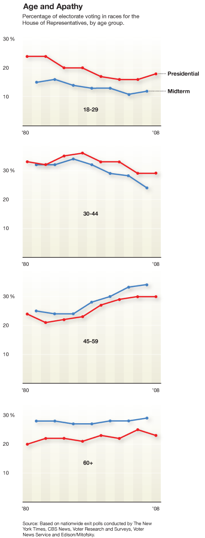
These graphs are meant to illustrate voter apathy by age group.
Jay Livingston, blogger at Montclair socioblog, points out that comparisons between age groups would be far easier if all the age groups appeared on one graph. I agree.
I would also point out that I’m curious about whether it is strictly age or a cohort effect that is really at the heart of the question about who votes. In order to answer that by using infographics, I might have looked at voting rates within cohorts over time (so graph the baby boomers voting rates as they age and so forth).
One picky little detail: when making graphs that have to do with voting, it’s probably best to assume many people will see red and blue and think Republican and Democrat. I would have preferred any other colors, just to avoid confusion.
The bigger problem
Folks, leave your computer alone for a minute and vote.
References
Blow, Charles. (2009, 14 November) “The Passion of the Right” op-ed in the New York Times.

Comments 3
Computer Internet and Technology Articles. » Blog Archive » Graphic Sociology » Mapping voter apathy by age — November 14, 2009
[...] Read more here: Graphic Sociology » Mapping voter apathy by age [...]
Tweets that mention Graphic Sociology » Mapping voter apathy by age -- Topsy.com — November 15, 2009
[...] This post was mentioned on Twitter by Jure Cuhalev, Marilyn Rich. Marilyn Rich said: Graphic Sociology » Mapping voter apathy by age: In order to answer that by using infographics, I might have lo.. http://bit.ly/1FJ4IW [...]
Emily — November 16, 2009
If it's mapping apathy, I'd expect greater numbers to mean more apathy. But the reverse is happening here.