What Works
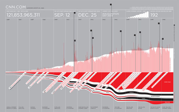
Think about what this graphic could have been: basically just a line graph showing growth over time. Now look at it again. The little flags point out cnn.com’s busiest days and remind you what was happening on those days – Obama’s inauguration, the September 11th attacks, various other political happenings. Even if this graphic weren’t labeled ‘cnn.com’ I bet you would have been able to predict it was a news site just by looking at which days it had the most hits.
Other things to like: the little graph at the top showing global internet use to remind us that the growth of page views per day could largely be a function of the growing number of people who have access to the internet rather than an inherent growth in popularity of cnn.com. Of course, the little bitty bar graph isn’t big enough to see if there is a difference in the growth rate in access to the internet overall and the growth rate in page hits at cnn.com.
Mirroring the trend over the x axis is a brilliant move here. On top, we see the page views per day averaged over the week in red and the annual weekly average. This allows them to go granular with their highest hit days and also give a trend line that smooths over the outliers. Nice. And on the bottom, then, they can show basically the same trendline broken into content areas. So if you’re a skeptic and you think all this growth is probably in entertainment because folks are just nitwits feasting on celebrity-ism, well, you can see that the home page gets by far more traffic than the entertainment page. It’s possible that the nitwit theory holds, but folks aren’t turning to cnn for juicy gossip. We can also see that video takes off and politics has more page views in election years.
And on Christmas, the number of people ignoring cnn peaks.
From Feltron, the graphic’s designer, the best thing about the narrative depicted by this graphic is the trust we all put in the internet as a reliable source of news after 11 September. “Ultimately, I think the most fascinating story here is the change in our news habits after September 11, 2001. After this day, a new and higher baseline for visits to the site is established, and the inference is that this event really established CNN.com and the greater Internet as a reliable, timely and indispensable source for news.”
What needs work
This is a sophisticated, well developed graphic that basically needs no work.
But…
The text is too small to read. Of course, it’s virtually impossible to create a graphic with this much detail that is elegant and uncluttered with text that fits in 800 x 800 pixels, or thereabouts. For folks who happened to have the ever widening monitors, it would have been nice to link to a ginormous version. I bet feltron has a larger version since I’m not sure how he would have been able to convince himself that some of the smallest text was legible otherwise.
References
Feltron (2009, 11 November) cnn.com traffic graphic on Feltron’s blog at tumblr.com.

Comments 4
Laura Norén — November 17, 2009
Thanks to Jon Smajda for sending me the link to feltron's graphic in the first place.
Jon Smajda — November 17, 2009
You can see a giant version here, which is actually linked to in the original article, but the javascript slideshow thing he uses overrides that link and gives you a smaller version on click instead. Yay javascript.
Btw, I found this on daring fireball.
Computer Internet and Technology Articles. » Blog Archive » Graphic Sociology » cnn.com traffic since launch day — November 17, 2009
[...] Read more from the original source: Graphic Sociology » cnn.com traffic since launch day [...]
Graphic Sociology » cnn.com traffic since launch day « Blogging — November 28, 2009
[...] See original here: Graphic Sociology » cnn.com traffic since launch day [...]