Uncategorized

Living Single is More Expensive than Marriage? | The Economist Online

What Works

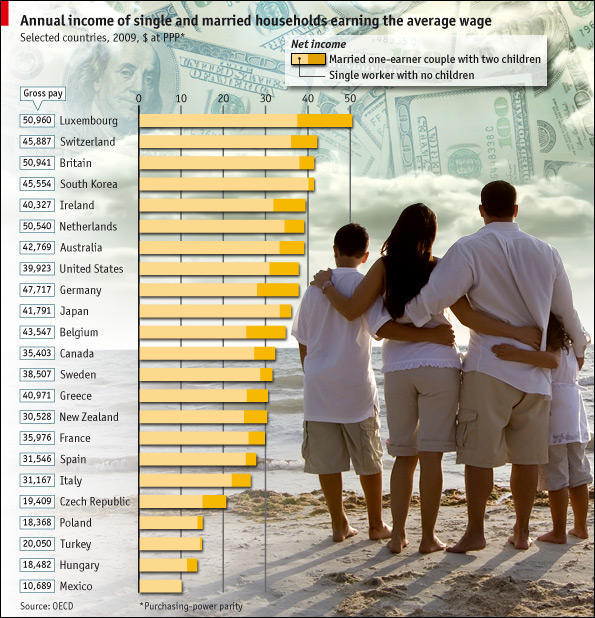
In this particular case, where the point is to show the difference between two groups (not three or four) it is acceptable to use the stacked bar graph approach. This technique emphasizes the difference between the two groups. When people use the same technique with three or four groups, it becomes very difficult to pick out the visual differences. But the folks at the Economist stuck to two groups and it does show the difference in earnings between singles and married-with-two-kids people.

What Needs Work

The picture is not helping anything. Please, people, think twice before inserting stock photography in your infographics. There should never be an element of an infographic that fails to communicate information clearly. The whole money in the clouds motif is also…questionable in terms of the art direction.

Aside from my qualms about the aesthetic choices, I have a more important contention. It would seem that the point of this graphic is to suggest that married people operate under more favorable tax laws than unmarried people. If that is the case, I think it would be nice to see some information about the taxes coming into play. I say this in part because the commenters to the article revealed that they mistakenly believed this data is pre-tax. But it isn’t. Furthermore, this graphic implies that marrieds have more money on hand than singles in the same income brackets, but that isn’t necessarily true either. Those kids do cost something – they need clothes, food, bigger houses, bigger cars, and an endless list of other things. So even though Mr. and Ms. Single do not take home as much, I bet they have fewer carrying costs. Granted, the graphic is about taxation policy, not about discretionary spending opportunities, but it fails to emphasize taxation and leaves itself open for other interpretations. These interpretations are available for your reading pleasure in the comments section following the original post. I do encourage you to read the comments because it makes clear that people do not read, not even the single paragraph of explanatory text.

Reference

Economist Online Staff. (11 May 2010) Single supplement: The average single worker takes home less than his married counterpart. The Economist online.

Facebook Privacy Settings 2005 Facebook Privacy Settings 2006

Facebook Privacy Settings 2007Facebook Privacy Settings Nov 2009

Facebook Privacy Settings Dec 2009 Facebook Privacy Settings 2010

What Works

If you are a New York Times reader or a facebook user you are probably aware that Facebook periodically makes changes to their privacy policy. These changes often anger advocates for privacy who then write articles about why they are upset and which settings Facebook users should change in order to protect their online privacy. There are also ongoing debates about whether or not it would be measurably detrimental to simply delete one’s Facebook account as well as whether or not there will continue to be social stigma related to pictures and wall posts of activities that are common enough (drinking, wearing bathing suits, sleeping in, telling little white lies).

Regardless of where you stand, it has been a little hard to understand just how Facebook’s privacy changes are, well, changes. The series of graphics above eliminate the need to read dry legalese (or even those New York Times articles) and allow us to see the changes. The graphic is interactive and I encourage you to click through and play around with it. Among it’s great features, it allows you to select the privacy settings so that you can see just which bits of your personal data you can still protect and which bits are out of your cyber control.

What Needs Work

There is nothing that needs work about this graphic – the author explains his methods and assumption, invites comments, provided this graphic from the motivation to make information free, and he provides full-disclosure about what he does for his day job (works for IBM Research at the Center for Social Software).

References

Holson, Laura. (8 May 2010) Tell-All Generation Learns to Keep Things Offline. In The New York Times, Fashion & Style Section.

McKeon, Matt. (May 2010) The Evolution of Privacy on Facebook. Personal website.

Nussbaum, Emily. (12 February 2007) Say Everything. New York Magazine, Features.

Perez, Sarah. (20 January 2010) The 3 Facebook Settings Every User Should Check Now. In The New York Times, Technology Section.

Valentino-DeVries, Jennifer. (26 April 2010) http://blogs.wsj.com/digits/2010/04/26/getting-control-of-your-facebook-privacy-settings/tab/article/. In the Wall Street Journal, Digits Section.

Global Population and Cereal Production
Global Population and Cereal Production - FAOSTAT database

What Works

The strength of this graph is its simplicity. It shows two trends at once – neither would be all that interesting without the other, but in concert, they tell us something. It’s a simple move that most social scientists ought to consider because it isn’t all that much harder than creating two individual graphs and displaying them side by side. This simple move, contextualizing global cereals production with the growth in the global population, clearly summarizes the issue addressed in the multi-thousand word essay. That message is, as I am sure you can guess from looking at the infographic above, is that population growth is not driving the growth in world hunger. The production of cereals is outpacing the growth in overall population.

For the sake of cross-media comparison, what would that infographic look like in words?

“Scarcity is a compelling, common-sense perspective that dominates both popular perceptions and public policy. But while food concerns may start with limited supply, there’s much more to world hunger than that.

A good deal of thinking and research in sociology, building off the ideas of Nobel laureate economist Amartya Sen, suggests that world hunger has less to do with the shortage of food than with a shortage of affordable or accessible food.” –Stephen Scanlan, J. Craig Jenkins, and Lindsey Peterson, Contexts Vol. 9:1; Winter 2010, p. 34-39.

What Needs Work

The article also ran with a graphic that shows the increase in the number of calories available per capita. Personally, I would have combined this data with the rise in global population because it is a more intuitive combination, even though the y axis would no longer be quite the same (one of them would be population in millions and the other would be calories in thousands – both are absolute scales so there would be a relatively easy work around that would allow the trend lines to be compared, which is what we are aiming for in the end). The original graphic looks at cereal production next to global population growth which invites questions about what portion of caloric intake comes from cereal, how sensitive cereals are to market fluctuations, and so forth like that.

References

Scanlan, Stephen; Jenkins, J. Craig; and Peterson, Lindsey. (Winter 2010) The Scarcity Fallacy in Contexts Vol. 9:1; p. 34-39.

FAOSTAT. Food and Agriculture Organization of the United Nations.
Note: I highly recommend FAOSTAT.

How Genetics Works - repost from 9gag

I felt like sharing this one with you but I have no commentary because none is necessary.

Reference

9gag (photographer) How Genetics Works which was possibly originally from a book of photographs published in the 1960s. I couldn’t find that source with certainty.

First Date vs. Reality TV First Date - by Nathan Yau from Flowing Data

What Works

I love jokes told via infographic.

What Needs Work

We need to tell more jokes via infographic and some of those jokes could be inside jokes that you wouldn’t immediately understand. When I come across an example of what I mean I’ll post it.

Reference

Yau, Nathan (25 April 2010) “First Date vs. Reality TV First Date” at Flowing Data.

An Overview of the Online Dating Field by Zosia Bielski and Tonia Cowan

What Works

Imagine this data as a bar graph that illustrates how many users each site has. Maybe there is even some sort of inception date from the site included, too. That would be a typical way to represent this sort of data because all the reporters had in terms of numbers, were user totals. But they weren’t interested in simply showing how big one site was with respect to another. They were interested in discussing hook-up culture. Now, so far as I know, there is no agreed upon quantitative measure of ‘hooking up’. These folks didn’t claim to invent one (which is nice). They just used a couple different qualitative axes to illustrate the distinctions they saw within the field of online dating when it comes to marriage vs. hooking up and raunchiness vs. wholesomeness.

I think Bourdieu would have recognized some of his own influence here. He had similar Cartesian field maps in Distinction. Granted, he may not have been thrilled to have his concept used to describe online dating – ‘raunchy’ is a word that may not have been part of his vocabulary. On the other hand, his axis of choice probably would have been class (high and low) and as far as I can tell, the desire for lasting vs. fleeting sex does not show a clear relationship to class. Feel free to debate that assertion in the comments.

What Needs Work

Not a fan of the colors. I also wonder how certain smaller sites made the list – seems a bit arbitrary considering how many sites were left off the list.

References

Bielski, Zosia. (2009, April 9) “One Click Stands” in The Globe and Mail. [Tonia Cowan also contributed to the production of the graphic.]

Bourdieu, Pierre. [tras. Richard Nice] (1987) Distinction: A Social Critique of the Judgement of Taste. Cambridge, MA: Harvard University Press.

War on Drugs in Mexico (Civil war - Mexican cartels versus Mexicans)

What works

Throwing in a map is smart – most Americans do not know where all the Mexican states are. Breaking the murders down by location is also smart. A national total would obscure part of the point, which is that the drug wars in Mexico are not hitting the whole country equally. Some areas are much more important to the cartels and are getting walloped while others are relatively unscathed, at least in terms of murders and other violence. Including the map and breaking the graph down by geographical boundaries both communicate the geographical specificity of the murder problem.

What needs work

This graphic illustrates just one element, one metric, of a whole constellation of economic and social problems. In journalism, getting any graphics into an article on a tight deadlines is difficult. One could argue that since the troubles in Mexico are not so new, it might be worth putting some extra time into the production of a graphic that could display murders, kidnappings (of whom and for what purpose – money, political deals, revenge), the quantity and type of drugs trafficked from which areas, trafficked/processed through which locations, for distribution where and by which cartels.

Besides a comprenhensive narrative of the trade, which is probably nearly impossible to construct because if it were easy to get information about where drugs are grown, processed and distributed I would be amazed. However, there is at least one other way to demonstrate the violence in a more comprehensive fashion, just by making some assumptions about social/economic networks with respect to the people murdered. The information on kidnappings may not be available – the article mentioned that five journalists had been kidnapped but only one was reported to the police. So we are left with murders, and that is probably why the Washington Post ran the graphic that it did.

Widespread murder creates a terror society – one in which fears and suspicions impact daily life over a sustained period of time. But it can be quite difficult to quantify terror and many graphics rely on quantifiable data. The article is well written and its narrative does a good job of conveying the magnitude of the drug violence and its encroachment on the lives of everyday folks.

The spasm of killing, kidnapping and extortion in the northeastern states of Tamaulipas and Nuevo Leon — vital trade, energy and manufacturing centers on the Texas border — marks a serious escalation in the U.S.-backed drug war and comes with a 21st-century twist: Mexican officials struggle to calm what they call a mass psychosis of fear, stoked by social-media chatter and grisly YouTube videos, by using Twitter to post warnings about “situations of risk.” — William Booth

There is clearly good reason for graphics to accompany text – each play unique roles. That being said, I still think there may be a way to create a network graph that demonstrates the social span of the violence. It could look at one of the hard hit communities in which all people are assumed to be alive and unrelated to anyone who was murdered. Let’s imagine one dot for each person, colored green to show they are alive. Now, a person who is murdered will become a black X and all of their family members and close friends will become black dots (still alive, but severely impacted by violence since they lost friends or family). In a perfect world, more distant friends would become brown dots. But it would be difficult to make a map like that because it is difficult to identify looser friendships. Use guest books at funerals to gather data? Facebook? Hard to say. Kidnappings, where known, could be similarly mapped. After constructing a network map like this, it would be much easier to see that one murder impacts a much wider swath of a community. Once there are many murders, there will be very few people left as green dots. Widespread murder is like necrotic tissue.

Where the persons murdered and kidnapped were wage earners, it would also be possible to demonstrate the income lost by the community as compared to the estimated value of the trafficking activity over a given time period. Of course the value of human life should not be measured by the money they failed to earn because they were dead. It’s just as silly as reducing the value of a human life to the market value of the chemical components of the human body. The point of such a comparison would be to demonstrate the economic impact on the community rather than some sort of death calculus.

References

Booth, William. (21 April 2010) “Drug war violence appears in Mexico’s Northeast, near Texas border”. In The Washington Post, World, North America section.

Humanities and Social Science PhDs - completion failure and job market failure

What needs work

Actually, the graphics aren’t bad, but the story is depressing for someone nearing the final year of a PhD in sociology. The first one is quite good. I might have added a horizontal line under which the ‘failures’ ended up and above which the ‘successes’ floated.

Many people who read this blog are academics and thus familiar with the concept that getting a tenure track job is tough. These graphics do an excellent job of contextualizing what might often seem like personal anxiety to present the problem as a mismatch between supply and demand. There are far more PhDs minted each year than we need and there would be even more if everyone who started down the PhD path actually finished. Who is to blame? For an answer to that question, link to the article (in references below).

Otherwise, just get depressed looking at the graphic story.

References

Cohen, P. (8 April 2010) The Long Haul Degree. In The New York Times, Education Life section.

Reinventing the Automobile* is a book that lays out a vision for a progressive evolution of urban mobility transition that offers a robust point-to-point on-demand mobility network of 2-passenger fully electric vehicles. These vehicles would take up less parking space because not only are they small, but one proposed design folds up when parked. And they’d be able to tell you where the nearest parking spot is as you’re approaching your destination. Being fully electric they require a plug….or do they? The authors suggest that after an initial period of individual owners plugging these babies into outlets in their garages overnight, folks in city planning departments or franchise owners would trust the technology and economics enough to start installing wireless charging devices available curbside or in the road bed itself. Stuck in a bottleneck at a bridge or tunnel entrance? At least charging pads in the roadway can ensure that your 2-seater won’t run out of juice before you get where you’re trying to go. You can sit there and it will charge itself with embedded charging device in the road surface while plodding through gridlock. Even farther down the timeline, the cars might be able to drive themselves. So you can sleep through the gridlock or make calls or surf the ‘net. Just don’t post facebook status updates about your traffic problems. Nobody cares.

What I like most about the book as an object of intellectual design is that even if readers decide to skip all the words and they only look at the images, charts, maps, and diagrams, they won’t miss much. This book is stuffed with great graphics. I haven’t included them all as that would constitute copyright infringement and be too long for a single post. What you see below is just a small sample from Chapter 9: Personal Mobility in an Urbanizing World.

Daily driving in Paris

Daily Trips in Paris - Reinventing the Automobile (Mitchell, Boroni-Bird, and Burns), Figure 9.6

What works

This graphic is both elegant and deep. (Or it would be elegant if I had a better scanner.) It’s a simple form – Paris as concentric circles – but the more you look at it the more you learn. Rewarding that way. What sometimes happens in elegant graphics is that the details become obscured in iconography or approximations. But this graphic includes percentages as well as absolute numbers of two different kinds of trips – public transit and trips by cars. We see that Central Paris is defined as Arrondissements 1-20, the first ring is Seine Saint-Denis, Val-de-Marne, and Hauts-de-Seine, and the second ring is the rest of the Île-de-France region. There’s a summary of all the trips over in the legend so that the graphic itself can just show you the break down of different kinds of trips.

What needs work

In terms of transit, things like rivers often represent real barriers. There are only so many bridges and tunnels which creates a bottleneck effect. Paris is a city on a river so the one thing the elegance of this graphic obscures is the impact of the natural geography on transit choices. Maybe it’s not important when it comes to the cars vs. transit question, but bottlenecks are critical factors when it comes to planning mobility and I’m curious about whether bottlenecks push more people to transit or cars. In Boston/Cambridge, MA only one bridge has a train running across it and I have always assumed that pushed more people into their cars because many of them would have to go out of their way if they took the train and could only go over that one bridge.

Parking in Albuquerque

Parking in Albuquerque - Reinventing the Automobile (Mitchell, Boroni-Bird, and Burns), Figure 9.13

What Works

What you are seeing here is a simplified map of downtown Albuquerque, New Mexico. The white areas are buildings. The teal areas are parking – darker teal represents multi-story parking structures while the lighter teal shows us where surface lots can be found. Lovely way to show this information. One could imagine the same sort of information as a percentage-of-land-use pie chart or some far less granular collection of numbers. This schematic doesn’t bother to calculate just how many square feet of land are dedicated to parking. Nope. This is the visual equivalent of the ‘show don’t tell’ rule that writing professors are always encouraging their students to adopt when constructing essays. A table with land use percentages would be telling. This graphic is showing.

Albuquerque is like a parking lot with some buildings in it.

What needs work

I have never been to Albuquerque but I’m guessing that if you lived in Albuquerque you might like to see some sort of orienting label. Even just a single recognizable street name thrown in their somewhere to help orient. Now, the point of Reinventing the Automobile is not to provide urban planning for Albuquerque so I know they aren’t all that concerned with just precisely which neighborhood in Albuquerque this schematic represents. Still. It’s almost too cleaned up to read as a city plan right away.

Vehicle-to-Vehicle Crashes

Vehicle-to-Vehicle Crashes - Reinventing the Automobile (Mitchell, Boroni-Bird, and Burns), Figure 9.16

What works

This graph does a great job of providing us with granular data and indicating a couple different trends visual. Keep in mind that they have multiple layers collapsed into a single graphic. It looks easy once it’s done but when one is faced with a pile of related numbers along multi-dimensions it isn’t always clear how to relate them to one another visually.

This graph has three levels of accident severity – minor, serious, fatal. It also shows the probability of injury. It also factors in variation in speed (which it does by creating five speed ranges). And then there’s the belted vs. unbelted division. That is a total of four different dimensions all displayed on one graph with a single measure on the y-axis. Color is used well. Grid lines are all that separates minor from serious from fatal accidents which are more or less three different graphs lined up next to one another.

References

Mitchell, William; Boroni-Bird, Christopher; and Burns, Lawrence. (2010) Reinventing the Automobile: Personal Urban Mobility for the 21st Century Cambridge, MA: MIT Press.

* The book specifically credits Ryan Chin, Chih-Chao Chuang, William Lark, Jr., Dimitris Papanikolaou, and Ruifeng Tian with “Illustration Production”.

US household size shrinks, living alone increases

Living Alone

I am helping a professor develop some graphics for his forthcoming book about the increase in people living alone. Above is just a rough draft; I’m still thinking about adding a border. Comments are welcome. More graphics coming in drips and dribbles.

References

US Census: Living Alone