
What Works
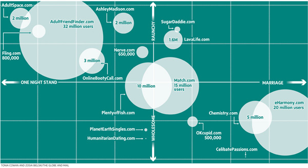
Imagine this data as a bar graph that illustrates how many users each site has. Maybe there is even some sort of inception date from the site included, too. That would be a typical way to represent this sort of data because all the reporters had in terms of numbers, were user totals. But they weren’t interested in simply showing how big one site was with respect to another. They were interested in discussing hook-up culture. Now, so far as I know, there is no agreed upon quantitative measure of ‘hooking up’. These folks didn’t claim to invent one (which is nice). They just used a couple different qualitative axes to illustrate the distinctions they saw within the field of online dating when it comes to marriage vs. hooking up and raunchiness vs. wholesomeness.
I think Bourdieu would have recognized some of his own influence here. He had similar Cartesian field maps in Distinction. Granted, he may not have been thrilled to have his concept used to describe online dating – ‘raunchy’ is a word that may not have been part of his vocabulary. On the other hand, his axis of choice probably would have been class (high and low) and as far as I can tell, the desire for lasting vs. fleeting sex does not show a clear relationship to class. Feel free to debate that assertion in the comments.
What Needs Work
Not a fan of the colors. I also wonder how certain smaller sites made the list – seems a bit arbitrary considering how many sites were left off the list.
References
Bielski, Zosia. (2009, April 9) “One Click Stands” in The Globe and Mail. [Tonia Cowan also contributed to the production of the graphic.]
Bourdieu, Pierre. [tras. Richard Nice] (1987) Distinction: A Social Critique of the Judgement of Taste. Cambridge, MA: Harvard University Press.
Comments 5
leis0082 — May 8, 2010
Though I do too complain about the arbitrary lines that appear to be drawn on the "one-night stand" and "marriage" spectrum, overall the graph is quite shocking. Its impact seems large and the message is clear; people use the internet for sex. Though sites like adultfriendfinder.com and adultspace.com don't likely advertise on TV or other public mediums while eharmony and chemistry.com plaster airwaves with advertisements. Even if this appears to be the case, society is still finding ways to meet other people with the same "intent." The use of raunchy on the axis isn't particularly my favorite word choice. To me it has a few too many connotations that make the graph seem a little tilted towards defaming hook-up sites. Overall, simple and effective.
nod — July 8, 2010
Big problem - number of registered users != active users, which is the truly important figure. Unless I missed something, she's going by the former... which creates a hugely misleading impression, since the pool of total users is almost always many times that of the active user base.
Tonia Cowan — September 8, 2010
Love the critiques! I based the concept for this graphic on a market graphic from the New York Times. (Love those guys) And I think the color was subconsciously intended as "chalkboard." I thought Zosia did an awesome job of ranking the sites though. Got it spot on.
Fluffy — March 6, 2011
I wonder where Science Connection (http://www.sciconnect.com/index.htm) would fall on this figure?