Archive: 2009

Mapping Singles - J. Soma

What Works

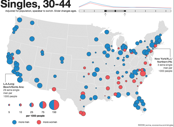
Your sense of who’s single and when they’re single will grow immensely in three or four minutes of playing around with this interactive map of single-ness in the United States, by age and gender. Men get married later and die younger. This means that at young ages, there are more single men than single women because some men who will eventually get married won’t marry until later, on average, than the women they end up marrying. This is just a complicated way of saying that men often marry younger women. In old age, there are more single women than men (the imbalance is because the men start dying younger). During the decade of the twenties and then after about age 65 you’ll find the largest proportions of single-ness. People in the middle decades, from 30-60 or so, are more likely to be coupled. But don’t take my word for it, click through and play around. This data actually understates the number of people who are functionally single because single is measured here as never married. So the folks who have been divorced or widowed and haven’t remarried do not count as single for the purposes of this graphic.

The writer of the text accompanying the graphic is interested in the geographical distribution of single women and single men so there’s more on that if you click through.

What Needs Work

I like this one a whole lot so I don’t have much to say except that I wish the designer wouldn’t have gone with the red/blue, female/male color scheme. How about purple and green? Or orange and teal?

I also think I would have counted people who are divorced/widowed and NOT remarried as single.

The graphic designer is careful to note that since homosexual couples cannot get married, they will erroneously be counted as single, even if they are partnered. That’s a problem with the underlying data collected by the census, not the graphic design.

Relevant Resources

American Community Survey (2006)

Soma, Jonathan. (2008) The Interactive Singles Map

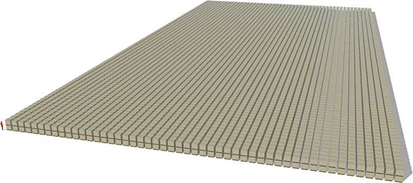
Visualizing a Billion Dollars - Those are pallets
That's a Trillion Dollars - See the guy still in the lower left corner?

What Works

This is a blatant repost of content – all these blogs are – but this one is particularly blatant. [For full effect, click through.] The folks over at pagetour.com went to the trouble to visualize just how much money a billion and a trillion dollars actually is. I have heard on NPR that it’s hard for people to make decisions about monetary volumes once the order of magnitude goes above 7 or 8, that humans unconsciously shift to logarithmic scale thinking which leaves 100 million dollars being only slightly less than 1 billion dollars. That’s like thinking that 100 dollars is only slightly less than 1000 dollars. Have a look. Think about it.

Relevant Resources

pagetour.com A virtual tour of one trillion dollars

Cigarette Tax, Washington State

What Works

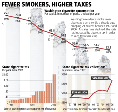
A simple overlay of graphs goes a long way to telling the story that as cigarette taxes increase, rates of smoking decrease. At the deli where I buy snacks, the cost of a pack is $12. Ouch. The reason raising taxes works so well in this situation is that it tends to prevent teens from starting to smoke in the first place because they are relatively poor and cannot afford to support an addiction causing habit. If they don’t start as teens, they are far less likely to start later in life when they might have more disposable income. Increasing tax rates works when it comes to causing a decline in smoking rates, but it might not work in causing other sorts of macro-behavioral changes, at least not over the long run.

Clearly, because we are looking at tax rates and prevalence rates, the two graphs could not share scales. I probably would have gone for either all line graphs or all bar graphs – I don’t like to mix it up for no good reason.

What Needs Work

Not sure I like the use of burning cigarettes as bars, or at least not these ones. Too cartoon-y for a serious subject.

Relevant Resources

Good Magazine (2008) Up in Smoke Interactive Graphic.

Virgin, B. (2007, 6 March) A taxing problem in anti-cigarette age Seattle PI.

Books are still great, no matter what happens on these here internets. They make much better references because the information stays where it is and is accompanied by indices and tables of contents. No link rot, no head scratching while trying to navigate a tag cloud, no wondering if the review was posted by the publisher or an actual reader (ie not the author’s mom, either). They do cost more than free-media (aka e-media?), unless you can find them at your library.

Here’s a start to a list of books you might consider buying if you’re interested in graphic design. Most social scientists might like to be better informed about graphics, but have a bit of trouble getting into it. Below are books that are compelling and beautiful. They won’t tell you how to run the software you might use or write clean html/css or insert hacks for working around the stupidity of IE6. I can post some of those another day, if you like. Our contexts IT guru Jon will be invited to guest blog on the topic of how to do online publishing, as well.

1. Edward Tufte

Tufte is widely regarded as a key figure in graphic design, especially the visual display of quantitative information (which is the title of one of his books). He also has a brilliant essay on powerpoint, of which he is not a fan.

Envisioning Information - Edward Tufte
Visual Explanations - Edward Tufte
The Visual Display of Quantitative Information - Edward Tufte
Beautiful Evidence - Edward Tufte

2. Typography

The Elements of Typographic Style by Robert Bringhurst review by Roy Johnson.

The Elements of Typographic Style by Robert Bringhurst

Typography is a critical component of graphic design. Font size is often the least flexible component and thus serves as a starting point for the rest of the design, assuming the design includes text. With respect to accessibility, small font sizes are terrible since many people have trouble with their eyes. (Even if only a few people had trouble with their eyes, designers should still make inclusive designs.) With respect to design, it is often better to have small fonts so that text blocks read as blocks rather than stripes. Reconciling those two and adhering to branding and identity strategies relies on a firm command of typography. Bringhurst’s book is recommended wide and far so I’m not saying anything new here.

Hoefler and Frere-Jones

Tobias Frere-Jones and his partner Jonathan Hoefler are current giants in the field of typography and have resources on their website – Hoefler & Frere-Jones. They have created typography for the White House, Gucci, the United Nations, Saatchi and Saatchi, Wieden + Kennedy, J. Walter Thompson, all the Martha Stewart magazines, Wired, The New York Times, The Washington Post, Apple, IBM, Sony, and on and on. They represent a sizable portion of the world of font development.

Thinking With Type - Ellen Lupton

Ellen Lupton of Maryland Institute College of Art says/writes much worth hearing/reading, including typography. Her Thinking With Type has it’s own website with additional information. Cheaper than buying the book, but I still recommend owning books if you can afford them.

3. The Grid

Grid Systems in Graphic Design - Josef Muller-Brockmann
Grid Systems in Graphic Design - Josef Muller-Bronfmann

Grid Systems in Graphic Design (Josef Muller-Brockmann)

Muller-Brockmann’s book is a solid introduction to the grid as a design framework. It’s good to read if you know nothing about design and good to read if you need a refresher in the basics, before you slide down what can be a slippery Flash-driven rabbit hole into a world where nothing makes sense.

See also tutorialblog on the use of grid systems in web design.

4. Universal Principles of Design by William Lidwell, Kritina Holden and Jill Butler

Universal Principles of Design - Lidwell, Holden and Butler

This book is not just about graphic design, but is more, well, universal, as the title suggests. It’s organized alphabetically, with one page of explanation and one page of examples for each of the 100 principles they’ve chosen. They admit that there are more than 100 principles, but they had to cut it off somewhere. Included are the 80/20 rule (or pareto’s principle), the Fibonacci sequence, the golden ratio, the baby face principle, and so on. I was so fascinated by it that I couldn’t put it down.

5. 79 Short Essays on Design by Michael Beirut of Pentagram

79 Short Essays on Design by Michael Beirut

Michael Beirut is a towering figure in design, as is the company he works for, Pentagram. His little collection of essays includes some gems, though not all are equally worthy of recommendation. The book has been widely recommended by others; maybe they were more evenly impressed by the collection than I was. Good one for checking out of the library because all the essays go pretty quickly so it would be nice to read on the train.

6. Design Blog Recommendation #1

Design Observer - Helfland and Drenttel

Design Observer and the related Winterhouse Institute (Jessica Helfand and Bill Drenttel)

This last one is a blog you might want to follow that features design related books, articles, entries, videos and so on. I am new to following it, but I like it so far.

Diabetes rates in New York and the US

What Works

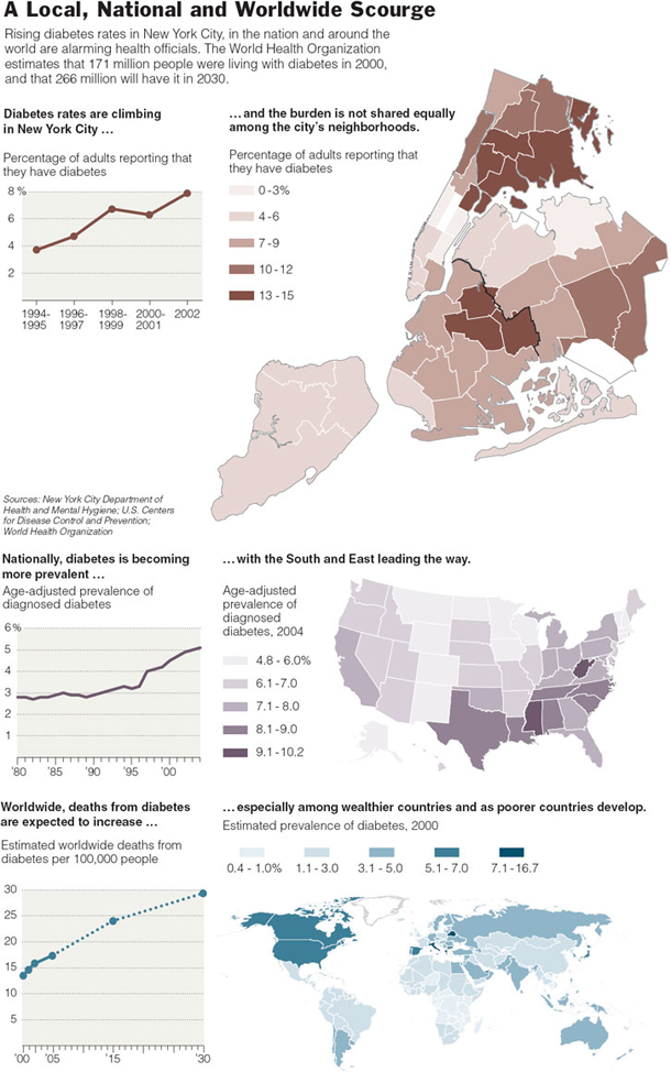
Contextualizing the story about diabetes in New York by including data at the national and global level is quite smart. Sticking with maps to tell the whole story lends consistency.

What Needs Work

Comparison maps like this are clearest when their scales are the same. I see no reason that they should be different or why the colors need to be different. In the sense that the scales, in fact, are different, I appreciate the choice to use different colors. At least there’s some visual indication that direct comparison between the maps is not a good idea.

With respect to the graphs, it appears that they are all the same, just different populations, but that is not the case. The city and national data shows prevalence rates but the global data shows mortality, not morbidity. Close readers can figure it out.

Relevant Resources

Kleinfield, N.R. (2006, 9 January) Diabetes and Its Awful Toll Quietly Emerge as a Crisis The New York Times.

Diagram of Binghamton School Shooting

What Works

Not sure. The maps are helpful enough.

What Needs Work

First, the numbers 1-5 need to clearly relate to something. I was looking for them to relate to particular areas but then I realized they were more like time stamps. If that is the case, then it would be nice to have the actual time stamps or some kind of approximation. More importantly, I had to ask myself if this graphic helped me understand the “sequence of events” at all. And it didn’t. But maybe others see some value here?

Relevant Resources

The Sequence of Events in the Binghamton Shooting

Obama Inauguration Animation - FlowingData

What Works

This is an animation based on twitter data from Obama’s inauguration day in the US – Inauguration was at noon. In case you weren’t a twitter user at the time, it is worthwhile to point out that twitter had partnered with Facebook for the day to increase usage. Both twitter and facebook were encouraging users to point their comments towards the topic of the inauguration.

I like it because its like watching fireworks from above and gives a tangible sense of the excitement amongst Obama fans that day. Best thought of as an emotional animation of political temperature than as any kind of quantitative data. I wouldn’t even call it an information graphic/animation. I would call it popcorn, animated.

What Needs Work

I have the same problem with this animation that I have with twitter which is that I really don’t know what good they do, even though I’m intrigued. I’ve been trying to figure twitter out by using it and I still don’t see the appeal. Thus, it is quite alright to think this animation is pretty, but dumb.

Relevant Resources

Flowing Data (2008) Worldwide Inauguration via Twitter

World Wide Web Usage - Browser Market Share

What Works

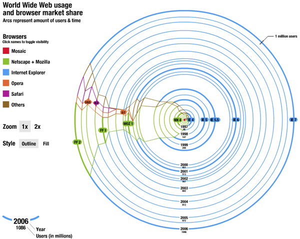
This is one amazing piece of advanced pie chart. The trouble with mapping browser market share is that the number of people online keeps growing so absolute numbers don’t mean anything for more than a minute – most figures with respect to market share are giving no more than a cross section, a snapshot in time. This goes way beyond that and breaks out of the cartesian coordinates, too.

This works by starting at T=1, a red dot in the middle of the graph when the internet was in its infancy. At that point Mosaic was king which got clobbered by Netscape. Then Internet Explorer grew and then took off when it started to be bundled with all Windows installations. Remember those lawsuits? Who can forget. Netscape became Mozilla, which is now known as Firefox to most of us. Safari and Opera have some share, but it’s negligible. The game now is between IE and FF with enough representation by the smaller browsers that we cannot ignore them.

The graphic is great as it shows how many total users are online over time and what proportion of those users log-on with IE, FF, Safari, Opera, and others. So smart. Even managing to capture the changing names and ownerships of the browsers without cluttering things up with text box descriptions.

What Needs Work

I’m so impressed by this that I can’t think what needs work. Here’s where readers come in. What is wrong with this graphic? Anything? It was just a class project, so it’s hard to fault him for anything, even little things, knowing that he wasn’t aiming for a professional audience.

Relevant Resources

Gimpl, M. (2006) Systems of Representation – Affective Map Exercise. Research Group at Media Lab Helsinki.

Simple SIR model - Epidemic Spread

What Works

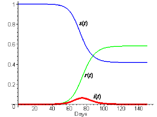
The relationship between infectious agents and the host populations is a tricky one, with three-parts at the very least. In order to understand how they relate, it helps to visualize what could otherwise be spelled out. In this graph, s(t) represents the proportion of the population who is susceptible (ie unexposed) to the infectious agent, r(t) represents the recovered population, and i(t) represents in the infected population – all are varying over time. You can see that everyone starts out susceptible, but slowly that proportion drops, though it doesn’t drop to zero. Some portions of the population are likely to remain uninfected. Note that the exact shape and inflection of these trend lines will depend on the particulars of the infectious agent – fatal agents have models that look different from non-fatal agents, long latency periods model differently than short latency periods.

Note the the peak of the i(t) trend will come before the crossover of the recovered and susceptible trends, as it does in this case. As soon as the derivative of the infection rate becomes negative, more people will have recovered than are susceptible and those two trend lines will intersect. I love this sort of graph.

What Needs Work

I would love this graph a whole lot more if it had a legend and applied to some specific disease. That’s mostly my fault.

World City Train Comparison

What Works

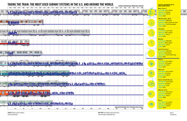
Good magazine is indeed a good source for thought provoking information graphics. This one has to be clicked through to be seen in any kind of entirety. What I like is the layering – they manage to represent total track length, total yearly ridership (both visually and with absolute numerical data), as well as showing little schematic maps of the systems themselves. You see that many of these systems are hub and spoke systems.

As urban areas continue to grow, transit options are going to need to expand and grow in places that don’t have mass transit infrastructure dating back to the turn of the 20th century like New York and Boston. An article in this month’s context magazine by Michael Goldman and Wesley Longhofer writes about the difficulty of adding mass transit of any sort to the existing urban fabric looking at the Indian city Bangalore: “hundreds of residents marched to protest the widening of streets and felling of trees for the new elevated Metro system. Bicyclists claimed that tearing down more than 90.000 beautiful shade-producing trees ruined the appeal of what was once known as India’s “garden city.” Shop owners and concerned citizens pushed for the Metro to be built underground so businesses wouldn’t be shuttered to make way for it. Advocated for the poor argued that widening roads would turn sidewalks, where so much daily commerce and social interaction occurs, into prime real estate. Purge the city of its street vendors and sidewalks, and you’ve stripped the life out of the Indian city.” That gives a whole new context to systems with hundreds of miles of track.

What Needs Work

I wish that there would be a way to show that the installation of mass transit systems bulldozes old neighborhoods and creates new opportunities. New growth tends to look very different that the old growth it replaces. I think there’s a call for a new kind of mass transit graphic that can show the past and present of transit decisions both in economic and social/cultural terms.

Relevant Resources

Good Magazine Transparency Graphic with Robert A. Di Ieso, Jr.

Goldman, M. and Longhofer, W. (2009) making world cities Contexts, pp. 32-36.