Archive: 2009

Cabspotting - San Francisco

What Works

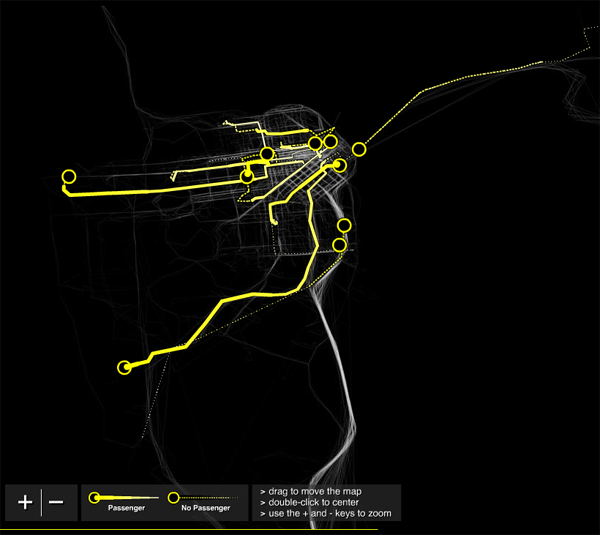
First, the elegant sophistication of this graphic is breathtaking. I love watching it and I have watched it for long enough to start asking questions about it. Maybe I am different than other people, an outlier of some sort, but in this case I don’t think so and that’s why my own fascination indicates a larger virtue of the graphic. If it draws people in and gets them asking questions, it is doing something right. Holding eyeballs in this media saturated world is a triumph in itself. Having answers to the questions that are posed is a secondary but even more critical step. To figure out what you’re looking at, here’s what the folks who made it have to say for themselves: “Cabspotting traces San Francisco’s taxi cabs as they travel throughout the Bay Area. The patterns traced by each cab create a living and always-changing map of city life. This map hints at economic, social, and cultural trends that are otherwise invisible. The Exploratorium has invited artists and researchers to use this information to reveal these “Invisible Dynamics.” The core of this project is the Cab Tracker. The Tracker averages the last four hours of cab routes into a ghostly image, and then draws the routes of ten in-progress cab rides over it.”

Second, they are right that just knowing where cabs go is more than knowing where cabs go. It’s knowing about urban space over time. It’s certainly knowing where the airport is (and that airports are far away). Looking at this we get to see the grid of the city and the longer stretch of highways and bridges bringing people in/out. It would be nice to see what this sort of ghostly cab mapping technique would reveal about cities I know a little better than San Francisco. Keep this site tucked in your back pocket for later this year, all you ASA meeting-goers.

What Needs Work

I just wish there were a simple way to say a little more about the cabbies themselves, who end up looking like infrastructure or phantoms, rather than actual people. In New York, 91% of the cab drivers are immigrants and only 1% are women (2006 Schaller Consulting). Is there a way that this cab-tracker could become a little more about the humans in the city?

Relevant Resources

Richards, P. and Schwartzenberg S. Snibbe S. and Balkin A. cabspotting San Francisco.

Schaller Consulting. Repository of Reports on Cabs in New York and beyond

Plaut, M. (2007) Hack: How I Stopped Worrying About What to do with my life and started driving a yellow cab. New York: Random House.

Buddhacab blog written by a New York yellow cab driver

amazon.com, walmart.com, target.com, kmart.com
City Data
City Data

What Works

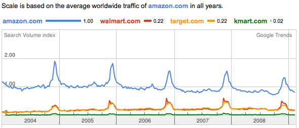
This is a graphic generated by one of google’s trend analysis tools. I simply typed in the web addresses I was curious about and google graphed their relative traffic patterns, using the first page I entered to set the scale. In their words, this is what the tool does: “Google Trends analyzes a portion of Google web searches to compute how many searches have been done for the terms you enter, relative to the total number of searches done on Google over time. “ If I were you, I would ignore the value of the scale and just keep in mind that it is relative. We’re measuring not total volume, but the volume of these four sites relative to one another.

Amazon clearly has far more traffic than the other three sites. Because walmart, target, and kmart rely on their physical stores, just looking at this web traffic does not tell you much about relative sales. I don’t who else is like me, but I often use amazon as a sort of loosely organized reference site, finding it faster to look their for publication dates of books than to go to my library’s site or fish the book off my shelf. I might be an outlier in this regard – most people don’t spend time every day wondering about publication dates – but there is probably a fair amount of traffic on amazon related to their product reviews that may not result in sales at amazon. All of this activity generates traffic, not sales. All three of the other retailers also feature customer reviews, by the way.

What works here is sort of unclear. On the one hand, just look at how similar walmart.com and target.com are. They track each other so closely they are visually difficult to distinguish. And just look at how important the holidays are to all these retailers.

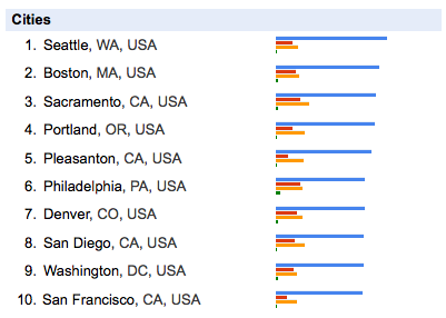
The city data relies heavily on which website is input into the search field first. Seattle might not have even been included if I had put walmart.com first, but many cities in the south would have been. Minneapolis would be up there if I had put target.com first. kmart.com first motivates Philly to the front of the pack.

What Needs Work

My biggest critique of this sort of thing is that it’s unclear what the heck to take from it. If you are just trying to beat some competitor, having google show you their relative traffic is immensely useful. But what else is this good for? Anyone?

Let me just point out that this only works for large sites. Google can’t tell us much about the vast sea of smaller sites.

Open Access – Transparency

In the end, though, the move towards making data publicly available is fabulous. I can’t see how this particular instance is broadly useful to me – it’s fascinating, sure, could be good for marketing departments internal to these companies, but then what? My confusion just means that I am a short-sighted fool. Google should be applauded for creating a non-prescriptive tool to explore the data they have that is so basic it can be used by anyone for who knows what.

Relevant Resources

Benkler, Y. (2006) The Wealth of Networks: How Social production Transforms Markets and Freedom. New Haven: Yale University Press.

Google Trends Information.

Google Trends the digital widget or digi-wigi.

Himanen, P. (2001) The Hacker Ethic. New York: Random House.

Raymond, E. (2001) The Cathedral & the Bazaar: Musings on Linux and Open Source by an Accidental Revolutionary. Sebastopol, CA: O’Reilly Media.

US population growth 1790-1990 [freeze frame at 1920] - University of Kentucky Appalachian Center
US population growth 1790-1990 {freeze frame at 1920} - University of Kentucky Appalachian Center

Link rot note

This post used to source a population growth animation from zachofalltrades.net but that website is no more. The University of Kentucky Appalachian Center is better, so count yourselves lucky if you missed the original post in favor of this update.

What Works

First, you must click through and watch the animation. Praise #1: yay for gifs.

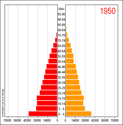
Like the previous post that looked at China, this animation is trying to tell a story about population growth over time. The major difference is that the Chinese example was strictly demographic – looking at variables like gender and age but not at all concerned with geography. This one shows both geography and population growth though it does not include information about gender, age, race, etc.

What Needs Work

If this graphic were three dimensional, if density piled up, it would start to ‘feel’ heavier over time so that the same way that the westward expansion of the population just appears without you having to puzzle it out, the density of population in cities would be simply obvious. This is not meant to be a dig to the graphic’s creator. I just offer this critique as a way to think about just why and how ‘seeing is believing’. Watching the population move west is certainly a ‘seeing is believing’ moment because viewers do not have to think, they just have to watch. Realizing that the population of the US is now hugely larger than it was back in the 1880’s actually takes a little thought. You have to realize that not only did people move west, but they continued to live in the east in greater densities which is indicated by the size of the yellow circles, but would be even more obvious if the cities were like little hillocks on the landscape. Big yellow dots equaling density requires a move from the ‘seeing is believing’ to something else. If, however, the map grew in the third dimension as a more direct representation of the mass of humanity sitting on the face of the earth at these locations, we’d be back in ‘seeing is believing’ territory.

A graphic that is a ‘seeing is believing’ creation is instantly legible and can free your brain to think about other things which is a good thing. On the other hand, a graphic that achieves a ‘seeing is believing’ mechanism will end up obscuring complexity. This is good when that complexity does not add to the ability to think through the next set of concerns, but can be a serious drawback. It is good to be able to get a diversity of people able to quickly grasp an argument, but there is a danger in presenting an hermetically sealed glossy image.

Relevant Resources

University of Kentucky Appalachian Center. US Population Growth from 1790-1990

Population Growth Animation - China

First Thing’s First: Apologies

My apologies for failing to post for a few days. If you noticed, I’m flattered. I had some deadlines and limited access to the internet late last week. Unfortunately, March is a very busy month and I will likely have this problem again before the month is out. I’ll try to make up for it when I can.

What Works

I have always been a fan of the population by gender and age chart, even in the static form that you see before clicking through above. It is quite an achievement to clearly represent three different variables on a two dimensional graph. It helps immensely that gender here is a binary value. If it were tertiary or tertiary plus, this strategy would fall apart. Once you click through, you’ll see that the animation adds yet another variable, time. And time is a real kicker here. You can see how China’s population goes from having many young people and few old people to 2050 where the largest category is between 60 and 64 years old. Great way to take an old graphic technique – the static version – and animating it.
(I would love seeing this thing as population by age sticking married people on one side and unmarried people on the other as an animation.)

What Needs Work

The colors and overall treatment of the graphic as a designerly element. Red and orange makes it look a little like it’s yelling ‘Caution! Proceed at your own risk!” the whole time. But then, I guess we all have to worry about what is going to happen when the population pyramid becomes a slender pillar with an ionic capital.

Relevant Resources

United Nations (1999): World Population Prospects. The 1998 Revision. New York. Link to animation. [graphic credit to Heilig, G. 1999]

Death Penalty Costs in Maryland - The New York Times

What Works

As you may recall from last week’s post on the death penalty, the use of the death penalty is not a deterrent to murder. Today in the New York Times, an article by Ian Urbina focuses on the fiscal reality of the death penalty citing a study done by the Urban Institute along with proposed legislation to get rid of the death penalty to help states meet their budgetary goals. “The Urban Institute study of Maryland concluded that because of appeals, it cost as much as $1.9 million more for a state prosecutor to put someone on death row than it did to put a person in prison. A case that resulted in a death sentence cost $3 million, the study found, compared with less than $1.1 million for a case in which the death penalty was not sought.”

What works about the graphic is the combination of bars with numbers. Basically this is just a spreadsheet with some bars next to the costs. For those of you social scientists out there who have grown fond of your tables, think about adding bars with interval level data (like costs and population).

What Needs Work

The bars should also appear in the last row on the table where the totals are displayed if this bar-in-table trick is going to work. I can see that the graphic would have had to stretch to accomodate the $3m bar, but the visual effect of having the whole table stretched to fit that bar would have been powerful. As it is, the visual impact of the bar technique is not fully realized.

Relevant Resources

Roman, John; Chalfin, Aaron; Sundquist, Aaron; Knight, Carly; and Darmenov, Askar. (1 March 2008). The Cost of the Death Penalty in Maryland. Washington, DC; The Urban Institute.

Urbina, Ian. (24 February 2009) Citing Cost, States Consider End to Death Penalty. The New York Times, US Section.

Network Structure of the Internet - Carmi et al

Necessary Background

This visualization is going to take a bit of explaining. Mapping the internet is a question that has intrigued folks who are worried about internet security, the digital divide, robustness, even artists who just wonder about all those bits of information flowing around us.

Remember The Matrix?  Couldn't help but mention it here.
Remember The Matrix? Couldn't help but mention it here.

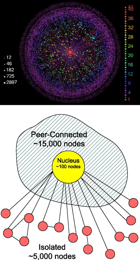
This visualization attempts to describe the structure of the internet as a network, not to map its black holes, censorship holes or describe actual geographic nodes like Akamai in yesterday’s post. This is a different sort of map and it requires some background reading. The authors set up a strategy for exploring the network terrain of the internet that generated these three areas – the central nucleus area consisting of the most highly connected nodes, a fringe around the edges of a whole bunch of pages that would be cut off completely if the nucleus were removed, and then a sort of spongy area in between these extremes full of nodes that could connect to each other if the nucleus were removed but not nearly as efficiently. Call it the peer-to-peer zone.

Here’s how the authors described the process that generated the three classes of nodes:

First, we decompose the network into its k-shells. We start by removing all nodes with one connection only (with their links), until no more such nodes remain, and assign them to the 1-shell. In the same manner, we recursively remove all nodes with degree 2 (or less), creating the 2-shell. We continue, increasing k until all nodes in the graph have been assigned to one of the shells. We name the highest shell index k max. The k-core is defined as the union of all shells with indices larger or equal to k. The k-crust is defined as the union of all shells with indices smaller or equal to k.

We then divide the nodes of the Internet into three groups:

  • 1. All nodes in the k max-shell form the nucleus.
  • 2. The rest of the nodes belong to the (k max − 1)-crust. The nodes that belong to the largest connected component of this crust form the peer-connected component.
  • 3. The other nodes of this crust, which belong to smaller clusters, form the isolated component.

Even if you don’t spend your days dividing networks into k-shells, I hope you now understand that this model’s strength comes from the fact that the structure was generated rather than imposed by initial assumptions. There were no initial assumptions.

What Works

Success here is that people who do not study networks can understand what these researchers did at all. Most highly specialized research (and pretty much all research is highly specialized) only makes sense to the people occupying the sub-sub-discipline actively working on those questions, equipped with the right language, fully immersed in the discourse of the niche. That would have been true if I had just tried to read this article without the accompanying image.

I also think it helps immensely to see the sketchy, comparatively unglossy schematic along with the polished final image. The glossy version adds in enough detail that I might have missed the big picture without having the schematic there to remind me that it isn’t about color or distance – that the contribution is all about the three types and their relationship to one another.

What Needs Work

Similar problem with this image as I had with yesterday’s image: the final image is so glossy and sealed that I feel like it’s hiding something. The more gloss on an image, the more it becomes impenetrable to critique. It presents itself as hermetically sealed – how can anyone get under the skin and assure themselves that this is a trustworthy image? This glossiness of the final image is probably why the schematic has so much appeal. It’s easier to see how the two were put together and *why* it is the way it is.

Aesthetically, I am not sure I like the colors and I think I would have tried to achieve the look of a solid core, a very fringe-y outer layer that has more volume but is almost insubstantial in its lacy-ness, and then a middle layer that sort of looks like a network made of jello. It is so easy to say these things when you don’t have to kill yourself in photoshop and illustrator making them happen.

Note

[There is another post on Graphic Sociology about mapping the internet about visualizing the map of an individual site which is here.]

Relevant Resources

Carmi, Shai; Havlin, Shlomo; Kirkpatrick, Scott; Shavitt, Yuval; and Shir, Eran. (2007) “A model of Internet topology using k-shell decomposition” Proceedings of the National Academy of Sciences of the United States of America.

Moskowitz, Clara. (11 April 2008) Black Holes Charted on the Internet. msnbc.com, Technology and Science.

Reporters Without Borders (2007) Internet Black Holes.

Wachowski brothers (directors, writers) The Matrix.

Akamai Internet Traffic - Click Through for Interactive Graphic

Internet Traffic

This week we’re going to have a look at the internet. Here are two reasons why:

  • 1. The not entirely superficial reason is that there are many great visualizations out there dealing with the internet, internet traffic, internet usage patterns, and so on. Many are interactive so you can play around with them yourselves.
  • 2. The larger theoretical question about studying the internet and online behavior goes something like this: How much is people’s online behavior reflective of their offline behavior? Are people role-playing when they’re online, trying out personas they may not fully embrace offline (see Sherry Turkle)? Or is online behavior seamlessly integrated with offline behavior? We IM the people we’re about to have dinner with indicating that the people we talk to online are just about the exact same people we talk to offline? And if the relationship between online and offline behavior is somewhere between these two, how can we figure out just what is going on?

What Works

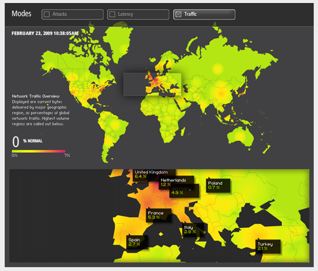
The graphic above is just a screen capture from Akamai’s site. In order to get the full impact, you have to click through and play around with it. Akamai has a slew of other visualizations you can play with that deal with network attacks, latency/network failure, retail data, news traffic, and so on.

Just to be clear, Akamai is a private company providing web-optimization services. In their shareholders’ quick facts, they say they serve up 10-20% of global internet traffic. What does this mean? It’s easy to forget that the internet requires physical structures, but this is part of what Akamai does. They maintain “40,000 servers in 70 countries within nearly 950 networks” all over the world slurping up electricity and information at about equal rates. The reason they do this is because if you are, say, a blogger in New York and you store your files on a server just down the hall (which is unlikely, but play along), if someone in Singapore wants to read your blog, the request is going to have to come all the way from Singapore to the server down the hall from you in New York and then the files will have to be sent all the way back to Singapore. This takes time, there might be network congestion along the way and if you are serving your readers in Singapore something a bit more bandwidth intensive than text (say a little clip of a new car racing around a track or a high quality music download) the person in Singapore may just lose interest before they even get the whole file. Akamai gets around this in part by duplicating files and storing them on servers all over. So if your reader in Singapore wants to access your site and you’re an Akamai customer, they will end up pulling those files from a server much closer to them, maybe in Singapore, but at least somewhere much closer than New York. Akamai’s clients tend to be Fortune 500 companies with global client bases and companies that rely on being able to transfer heavy files reliably and quickly (like music and software downloads). They do more than just the physical infrastructure, they mobilize their resources to detect net attacks, congestion, and then to re-route and avoid those things. The bottom line for us is that they make some of their knowledge of the ‘net available in these visualizations like the one above.

What Needs Work

I would love to have more granularity and access to the actual numbers and the methodology. All these shiny interactive graphical toys run the risk of being too glossy, not data-transparent enough.

Not as Shiny, Quite Helpful

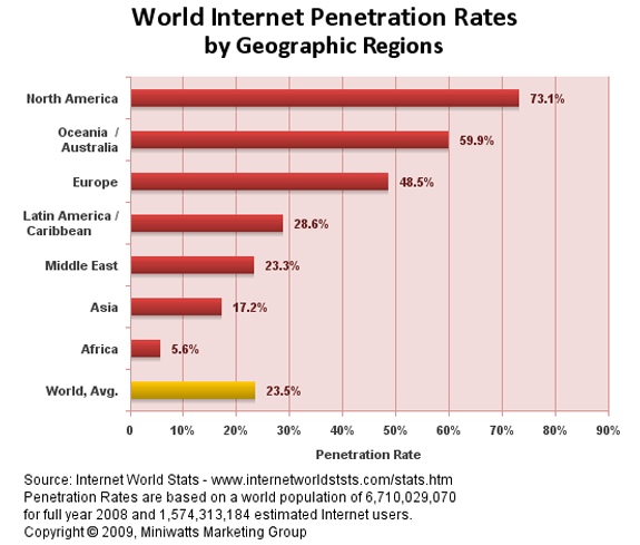
Internet Global Penetration Rates - Internet World Stats
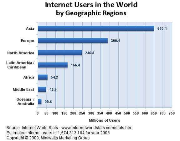
Global Distribution of Internet Users - Internet World Stats

These two graphs give a quick overview of who is using the internet by geographical location. You’ll see that rates of traffic can be a bit misleading – not all continents have the same population. That’s why I included the rate of internet penetration within the continents. A low rate of penetration tells you a lot about how the digital divide which is a very real problem. More on that later this week when we will address the digital divide directly. For now, it’s enough just to notice the difference in looking at the flashy, glossy Akamai graphic and the simple bar graphs. I don’t know about you, but I quite enjoyed playing with the Akamai graphic and encourage interactivity. Still, the combination of these two bar graphs above gave me a clearer answer to the big question about who in the world has access to the internet in the first place.

Relevant Resources

Akamai – Data Visualizations

The Berkman Center for Internet and Society at Harvard University School of Law.

Deibert, Ronald, Palfrey, John; Rohozinsky, Rafal; and Zittrain, Jonathan (2008) Access Denied: The Practice and Policy of Global Internet Filtering Cambridge, MIT Press.

Internet World Stats

Turkle, Sherry. (1984) The Second Self: Computers and the Human Spirit Cambridge, MIT Press.

For those of you who aren’t watching the Oscars (or, in fact, maybe especially for those of you who are), I send some statistics your way on a Sunday evening. It doesn’t fit with a theme and there’s no way it’s going to be as popular as the blog about marijuana arrests in New York City. (Note that like any curious person, I fully intend to test my hypothesis that writing about drugs is more popular than writing about sex. Coming soon is a blog about measuring marital infidelity, an historically slippery subject that has generated competing statistics and tends to say more about survey methods than about sexual habits.)

But for tonight, I am sending you to a surprisingly emotional essay by Stephen Jay Gould on the trouble with reducing statistics to the central tendency. Yes, I said emotional. And then I said ‘central tendency’. What, you may wonder, can get your cold hearts pumping while talking about how to measure the central tendency? In a word? Cancer. In a few more words? A life expectancy delivered in terms of a right skewed median of 8 months.

He uses his own biography to make a broader point about the general tendency to divorce the intellect from the emotions: “Many people make an unfortunate and invalid separation between heart and mind, or feeling and intellect. In some contemporary traditions, abetted by attitudes stereotypically centered on Southern California, feelings are exalted as more “real” and the only proper basis for action – if it feels good, do it – while intellect gets short shrift as a hang-up of outmoded elitism. Statistics, in this absurd dichotomy, often become the symbol of the enemy.”

logic + love = the well-lived life? These are the questions I don’t even try to answer, it’s why I do sociology, not philosophy.

Seeing Skew

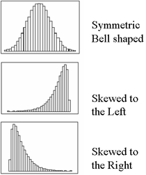
Skew Graph Examples - No Skew, Left skew, Right Skew (which is closest to Gould's case)

Just to refresh your memory on skewness, here’s a visual reminder of what’s at stake. Refer back here when Gould talks about the many people who aren’t diagnosed with the type of cancer he had until they die, stacking the left side of the graph high with cases of life expectancy equal to zero and creating a right-skewed life expectancy.

Epilogue: Gould is no longer alive, but he didn’t die of the cancer in this essay. He lived for another 20 years and died of a different cancer at age 60.

Relevant Resources

Gould, Stephen Jay. (1985) The Median Isn’t the Message currently reposted all over the blogosphere, but originally published in Discover Magazine in 1985.

The Story From Across the Pond

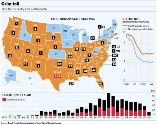
There are so many stories that get played out on the legal stage and the stakes are highest when death is involved. I found two graphics each of which attempted to provided an overview of the death penalty in America. We start with the view from London (though the writer of the article was in New York while he was writing).

The Death Penalty in the US - An Overview with an emphasis on Texas

The graphic they’ve come up with over at The Independent does a great job of summarizing the story of the death penalty in the US. The best part of this graphic is the right-most graph showing that the states with the death penalty started with lower murder rates and *still* have lower murder rates than those states that have the death penalty. Murder rates in both types of states change over time, but those changes seem to be largely independent of the death penalty. Great way to show that the death penalty does not make a good deterrent.

One last notable point from this article is that the graphic seems to do a better job at representing “just the facts” than the text. From the other side of the pond, the continued use of the death penalty in the US looks, well, barbaric beyond anachronism.

From Usborne writing in The Independent: “China tops the world’s executions league table (officially it used the death penalty 470 times last year, though Amnesty International believes the true figure is far higher), followed by Iran and Saudi Arabia. Among developed industrialised nations, only the US, Japan and South Korea persist in retaining capital punishment. None of the United States’ European allies entertain it nor do its neighbours, Mexico and Canada.”

In case you aren’t accustomed to decoding dry British writing, it is most certainly not a good thing to fall into the same category as China or Iran when it comes to human rights.

The Story from the Backyard

Not to be outdone, the New York Times has also run a number of graphics about the death penalty which is a recurrent topic of popular and academic debate.

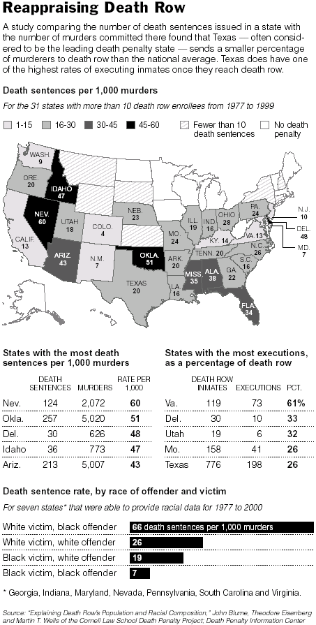
Death Penalty Overview - The New York Times

Here’s where the difference between the US depiction and the UK depiction starts to stand out. The UK added up all the executions since 1976 which tends to imply a great magnitude of death. There’s a big red 409 over Texas in their graphic and ‘just’ 20 in the NYTimes graphic, because the Times took a statistician’s more favored approach of looking at the number of death sentences per 1,000 murder convictions. This makes it easier to compare state by state data because it acts as a control for population size and murder rate. In this version, Oklahoma, Nevada, and Idaho appear to be more invested in the death penalty than Texas. Don’t mess with Texas becomes don’t mess with Nevada. (I guess what happens in Vegas really does stay in Vegas…but not in a good way).

The NYTimes graphic also looks at the sentencing rates when the race of the victims and perpetrators are the same and when they’re different. The way they’ve simply represented the facts speaks clearly to the continued machinations of racism in America. When whites are the victims, the perpetrators are more likely to be sentenced to death, especially if those perpetrators are black. Look at that part of the chart for a while then think about why the writer from The Independent has such strong negative feelings about America’s death penalty.

The Story from the US – 2003

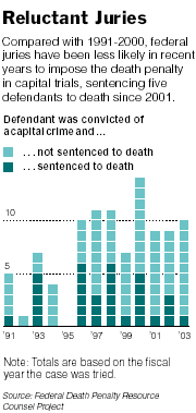
Juries Reluctant to Give the Death Sentence

This post is not about how the general population in America feels about the death penalty – check out some of the death penalty blogs listed below for more on public opinion. I was beguiled by this next graphic because it so simply illustrated ambivalence which is not all that easy. Each block is a case, every case has to have only one outcome with respect to death sentencing, and the designer manipulated this binary to produce a picture of declining conviction. Bravo.

The article’s text offered about five competing reasons for the decline in the rate of death sentences applied, including poor representation. They ended with this one:

Alan Vinegrad, a former United States attorney in Brooklyn, said the recent statistics represented something larger.

”It reflects that the tide is turning in this country with regard to attitudes about the death penalty,” Mr. Vinegrad said. ”There has been so much publicity about wrongfully convicted defendants on death row that people sitting on juries are reluctant to impose the ultimate sanction.”

Relevant Resources

About.com’s list of the Top Ten Death Penalty Blogs. Most are not big on graphics or visuals of any kind.

Amnesty International’s Human Rights Now blog which hosts their posts on the death penalty.

The Death Penalty Information Center

Liptak, Adam. (18 November 2007) Does the Death Penalty Deter Murders? in The New York Times. National Section.
–Including this, ““You have two parallel universes — economists and others,” said Franklin E. Zimring, a law professor at the University of California, Berkeley, and the author of “The Contradictions of American Capital Punishment.” Responding to the new studies, he said, “is like learning to waltz with a cloud.””

Liptak, Adam. (15 June 2003) Juries Reject Death Penalty in Nearly All Federal Trials. National Section.

Usborne, David. (7 August 2008) Why is the United States still imposing the death penalty? in The Independent.

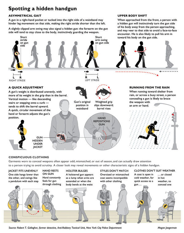
Spotting a Hidden Handgun - Graphic by Megan Jaegerman

What Works

This is one of my favorite information graphics of all time. A somewhat smaller version of this appeared in the New York Times and was then amended as you see above to appear in Edward Tufte’s book “Beautiful Information”. Since Edward Tufte is seen by many as the king of presenting data visually, I’d say his endorsement is worth far more than mine. Click through the links under Relevant Resources to see what he has to say about this graphic on his blog (which is basically a scan of a page or two from his $52 book). You will also get to see more of Megan Jaegerman’s graphics including the lifecycle of women in the developed world, the price of mowing the lawn, the price of quitting smoking, a complete strength training workout, a guide to rest/ice/compression/elevation after a soft-tissue injury, and sports graphics covering hockey, figure skating, baseball, gymnastics, and diving.

I want you to have time to look at the stylistic conventions she has developed. So follow the first link below.

What Needs Work

Megan disappeared from the graphics scene. Megan, if you’re out there, know that you are missed.

Relevant Resources

Edward Tufte reviews Spotting a Hidden Handgun by Megan Jaegerman.

Tufte, Edward. (2006) Beautiful Evidence. The Graphics Press.

Jaegerman, Megan. (June 1997) Life: Start Here Women’s Health graphic adapted for the web. The New York Times.