What Works
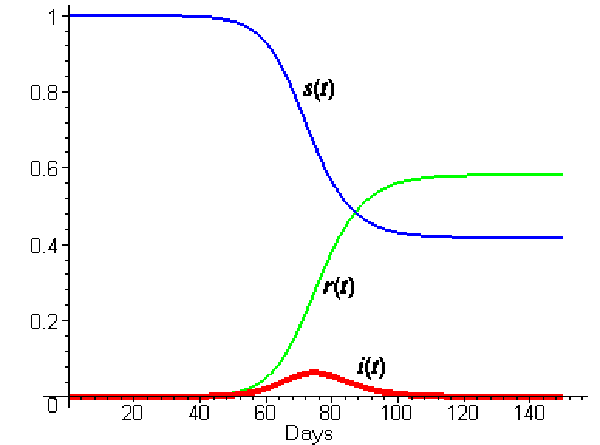
The relationship between infectious agents and the host populations is a tricky one, with three-parts at the very least. In order to understand how they relate, it helps to visualize what could otherwise be spelled out. In this graph, s(t) represents the proportion of the population who is susceptible (ie unexposed) to the infectious agent, r(t) represents the recovered population, and i(t) represents in the infected population – all are varying over time. You can see that everyone starts out susceptible, but slowly that proportion drops, though it doesn’t drop to zero. Some portions of the population are likely to remain uninfected. Note that the exact shape and inflection of these trend lines will depend on the particulars of the infectious agent – fatal agents have models that look different from non-fatal agents, long latency periods model differently than short latency periods.
Note the the peak of the i(t) trend will come before the crossover of the recovered and susceptible trends, as it does in this case. As soon as the derivative of the infection rate becomes negative, more people will have recovered than are susceptible and those two trend lines will intersect. I love this sort of graph.
What Needs Work
I would love this graph a whole lot more if it had a legend and applied to some specific disease. That’s mostly my fault.
