Any successful pregnancy is viable with just one egg. As an increasing number of women delay pregnancy until their 30s and 40s, getting pregnant is increasingly a sociotechnical process. Assisted reproductive technologies can force women’s ovaries to produce a clutch of eggs at once…but it cannot force women to produce high quality, viable eggs. Quality still depends on age, with a higher rate of chromosomal abnormalities present in any given egg, the older mom is. The question becomes: what quantity of mixed quality eggs is enough to get to a live birth? Is the likelihood of getting a live birth correlated with the number of eggs retrieved? Yes. But how many eggs does it take?
As with almost all fertility issues, that question rests on the age of the egg. Usually, the age of the egg is the same as the age of the mom-to-be. Now that eggs can be frozen (in time and in the freezer), the age of the egg can be younger than the age of the mom-to-be.
A study by Sunkara, Rittenberg, Raine-Fenning et al. looked at data from 400,135 IVF cycles performed in the UK from 1991 to 2008. They found that 15 eggs is basically the magic number. No matter her age, a woman’s chance of getting a live birth increases up to ~15 eggs. Less than that OR more than 20, her chances for live birth are lower. Notably, most women did not make 15 eggs: “The median number of eggs retrieved was 9 [inter-quartile range (IQR) 6–13] and the median number of embryos created was 5 (IQR 3–8).”
For those freezing eggs, it is especially productive to wonder how the number of frozen eggs impacts the chance of a live birth because egg freezers could opt for more than one cycle (if they can afford it). The study I am quoting does NOT look at egg freezers, it only looks at IVF patients. There are not enough egg freezers who have gone on to try to become moms to produce data nearly this robust. Biologically, the stimulation protocol for egg freezers and IVF patients is largely the same so the number of eggs harvested should be decently reliable across populations. Egg freezers may produce more eggs than IVF patients, because egg freezers aren’t reporting infertility. On the other hand, IVF patients in this study were infertile for a number of reasons, the largest percentage had male-factor infertility. Pregnancy rates may vary between IVF and egg freezing patients. IVF patients usually get pregnant using fresh embryos. If they do freeze material before implantation, they usually freeze embryos which survive the thawing process better than a single egg does.
What Works
The nomogram above is able to display chances of live birth by age group using a U-turn in the trend line for each age cohort. This demonstrates that the chance of live birth rises until 15 and then drops for egg counts higher than ~20 no matter how old the woman.
This graphic has a number of key characteristics. First, it is legible in black and white, which is key for printing in academic journals. Academic journals rarely print in color. Second, the nomogram allows each age cohort to be visualized without overlap. If this were presented with a million lines – one for each age cohort – there would be overlap or bunching and it would be harder to understand each age cohort clearly. Third, the U-turn shape allows us to see that there is an optimal number of eggs, above and below which sub-optimal outcomes arise. Fourth, the authors do not try to hide the fact that these types of assisted fertility are low probability events. The maximum probability of a live birth is just over 40% for the youngest cohort of women who produce the optimal number of eggs for retrieval.
Overall, the two key strengths of the nomograph type are that it is able to show each age cohort without overlap and that it allows for the data to U-turn in cases where there is an inflection point.
What needs work
Many of us are accustomed to comparing slopes in trend lines. This format does not allow for any kind of slope, making it difficult to visualize the shape of the trend. From looking at other plots, live-by-birth by eggs retrieved appears to be a Poisson distribution. In other words, it is a lot better to have, say, 8 eggs retrieved than 7, but only a little bit better to have 15 eggs retrieved than 14 because the slope rises faster for smaller numbers. The nomogram *does* visualize this. Look at all the space between 1 and 2 eggs retrieved and the small amount of space between 14 and 15 eggs retrieved. I happen to think it is easier to understand the changes in relative marginal impact with slopes than distances. That could simply be because I am more used to seeing histograms and line charts than nomograms, but I see no reason to pretend that visual habits don’t matter. Because people are used to making inferences based on slopes, using slopes to visualize data makes sense.
What does this mean for fertility
Women who are undergoing IVF – meaning that they are aiming to end up with a baby ASAP – cannot do much more than what they are already doing to increase their egg count. Women who are planning to freeze their eggs for later use may be able to use this information to determine how many cycles of stimulation they undergo. One cycle may not be enough, especially if they are expecting to have more than one child. Eggs from two or more stimulation cycles can be added up to get to the 15-20 egg sweet spot per live birth.
Of course, egg freezing is still an elective procedure not covered by insurance. The cost is likely to prohibit many women from pursuing even one round of egg freezing, let alone multiple rounds.
References
Sesh Kamal Sunkara, Vivian Rittenberg, Nick Raine-Fenning, Siladitya Bhattacharya, Javier Zamora, Arri Coomarasamy; Association between the number of eggs and live birth in IVF treatment: an analysis of 400 135 treatment cycles. Hum Reprod 2011; 26 (7): 1768-1774. doi: 10.1093/humrep/der106
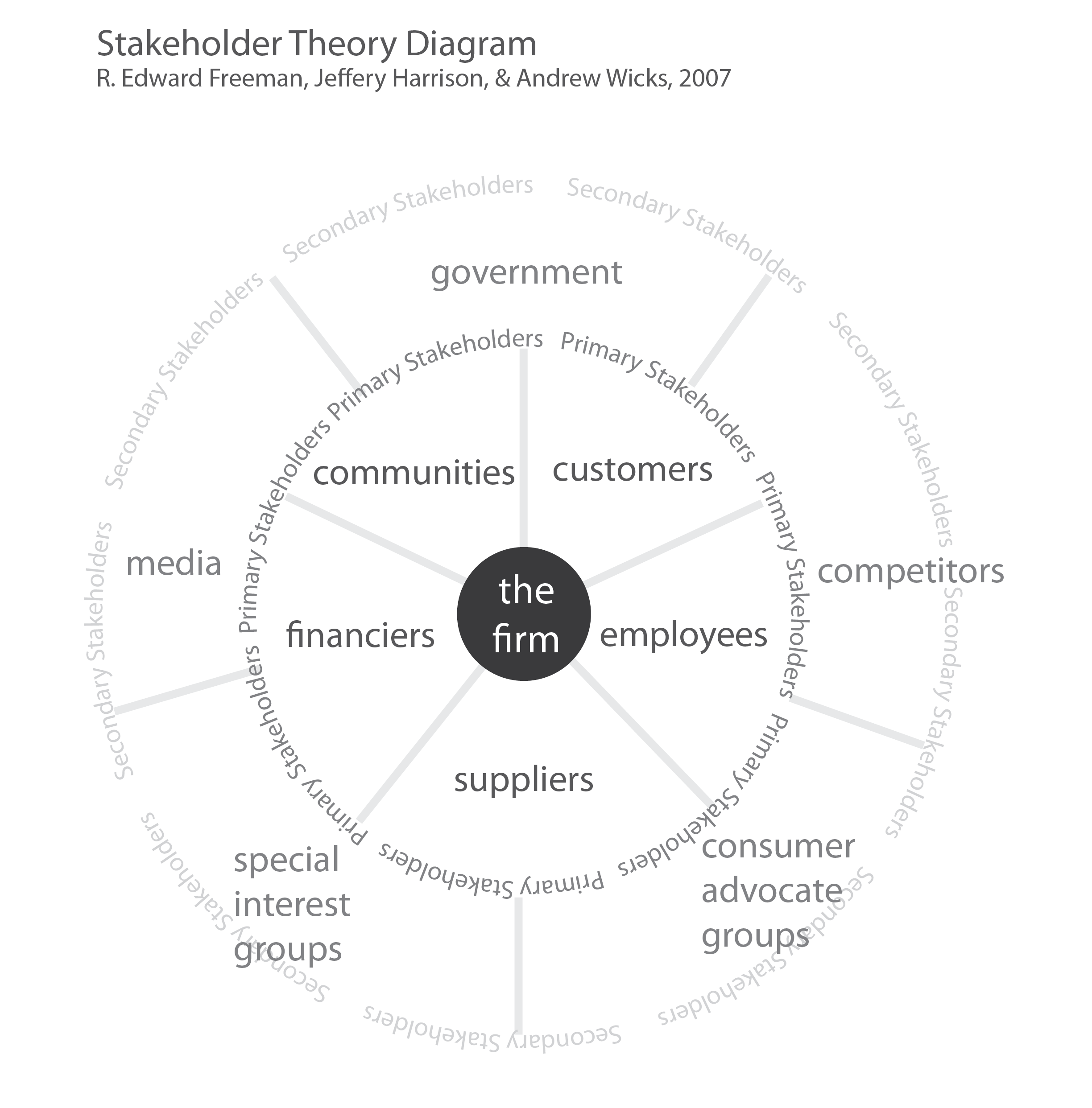
Stakeholder Theory Diagram – Firm Centric. Based on R. Edward Freeman
What Works
Many business courses introduce students to the stakeholder theory of management (Freeman, 2007) which offers a theoretical model that effectively opposes shareholder models in which decisions end up being viewed solely from the perspective of what might serve the firm’s financial goals. In many firms, financial goals are tied to shareholders or venture capitalists or other sorts of more creative investing scenarios.
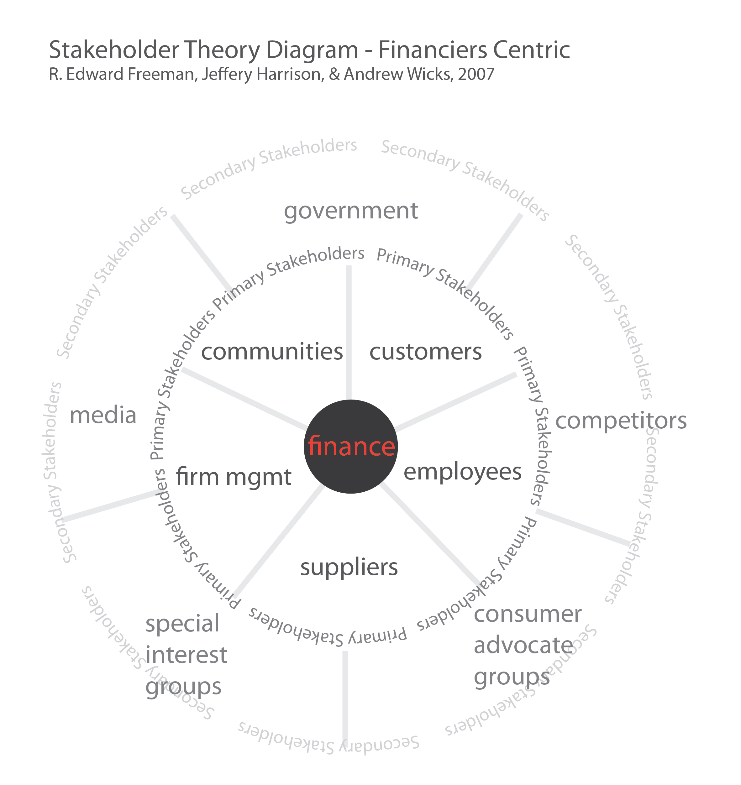
I find that it is useful to show students a finance-centri version of the same diagram to make the point that the goals of finance (or financiers) are not exactly the same as the goals of the overall firm.
Stakeholder Theory Diagram – Finance- or Profit-Centric. Based on R. Edward Freeman
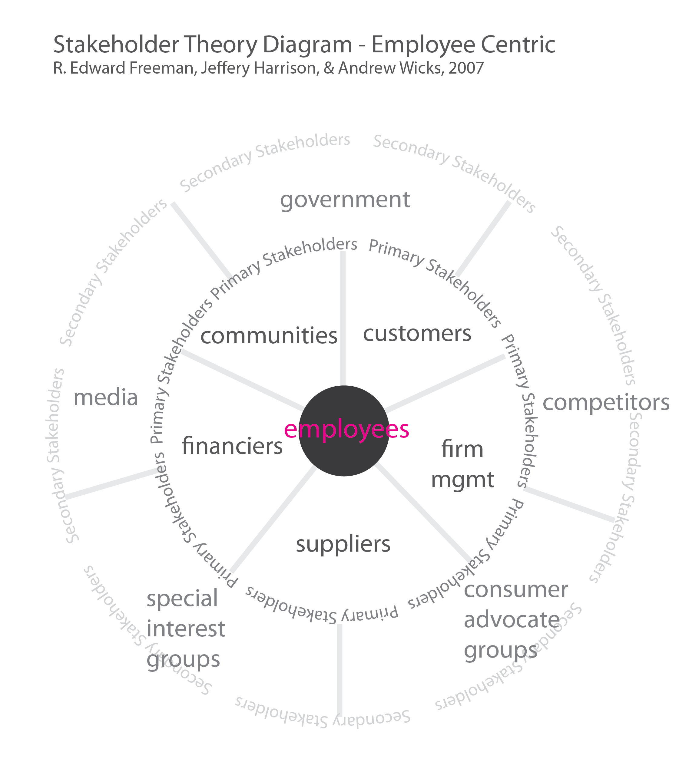
Once students see that finance and the firm are distinct, they are more open to the suggestion (which is made in R. Edward Freeman’s article) that any of the primary stakeholders could be viewed as the central stakeholder. In fact, as a theoretical exercise, every primary stakeholder *should* cycle into position at the center of the stakeholder donut to help understand what each stakeholders priorities are and what all the diverse sources of value may be.
When employees are at the center of the diagram, job tenure and ability to move into fresh and better-paid positions becomes part of the conversation. This is not some revolutionary idea in management. It’s the type of knowledge that becomes available in an organized way by systematically using the diagram to consider each successive primary stakeholder as the most central stakeholder.
Stakeholder Theory Diagram – Employee Centric. Based on R. Edward Freeman
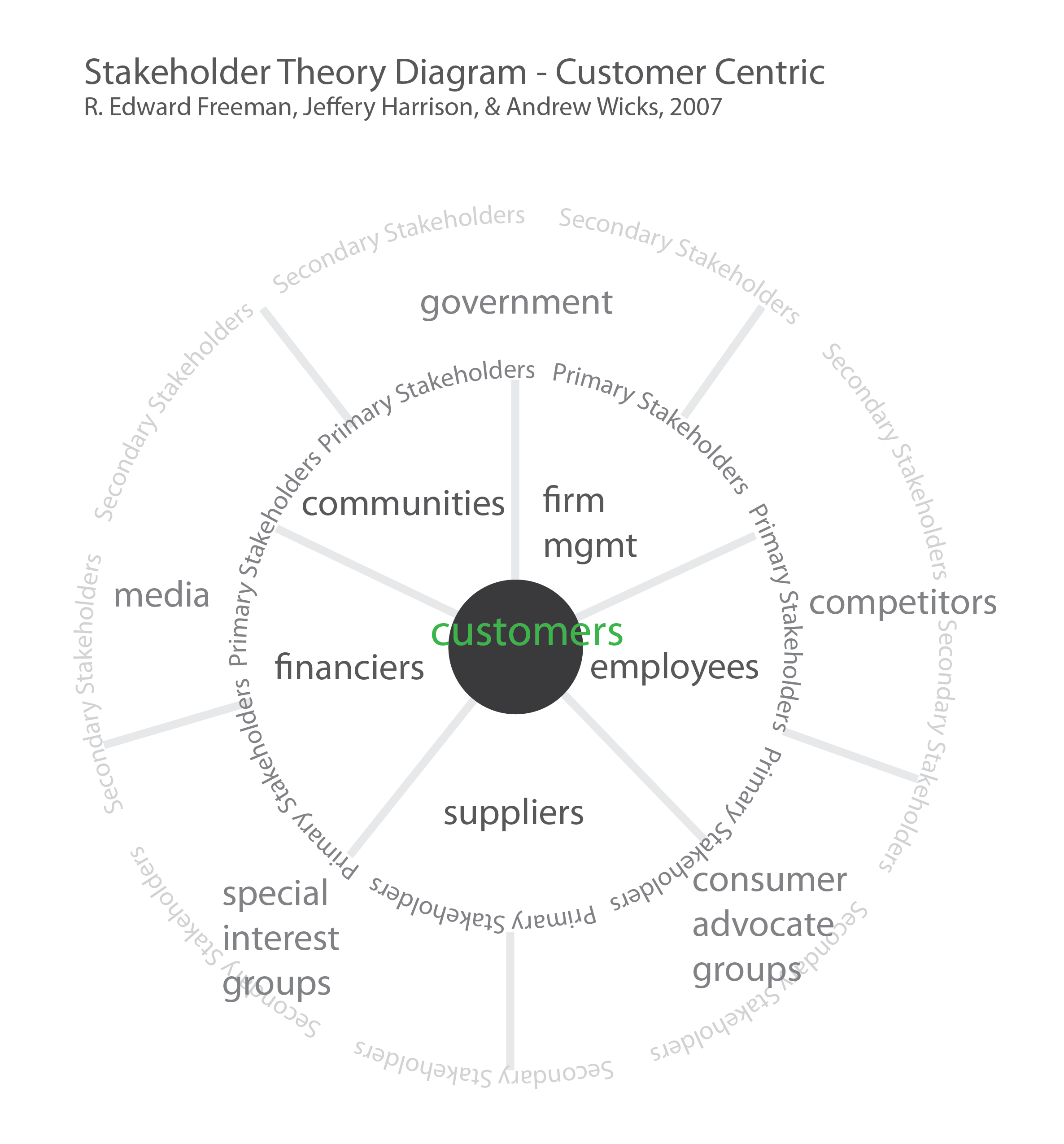
When customers are at the center of the model, the user experience, product durability, cost, and delivery become the most salient characteristics alongside marketing and, for a growing number of customers, social and environmental responsibility.
Stakeholder Theory Diagram – Customer Centric. Based on R. Edward Freeman
What needs work
This set of static diagrams would work better as an animation.
Still, using them one after the next in a slide deck allows time to have a class discussion about what is at stake when the central stakeholder changes.
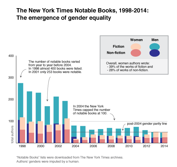
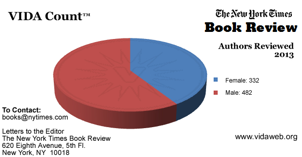
The above graphic represents the absolute volume of authors who have been mentioned in The New York Times year-end list of notable books. Since 2004 the newspaper has capped the list at 100 books, but prior to that the total number of listed books varied significantly from year to year. Therefore, displaying the absolute number of books considered notable is more illustrative of patterns within the organization than showing only the relative percentage of authors by gender.
One of the interesting things that this visualization implies is that capping the list at 100 at first drastically reduced the absolute number of authors who were mentioned in the list, but that this burden hit women hardest. During the first year after the cap was introduced only five women who wrote works of non-fiction in the previous year were mentioned. Fourteen women novelists and poets were listed. That’s only 19% of the hundred authors considered notable that year. In fact, I would argue that the most notable quality of the list that year was its dismal gender parity. It is possible some in the organization were able to confront the gender disparity because it started to move closer to 50/50, jumping to 39/61 the next year. But then…the best intentions may have faltered as the proportions slipped little by little back towards the one-third women, two-thirds men scenario that was more or less the pattern in the pre-2004 years.
Then in 2012 numbers once again jumped to 40/60. And in 2013 and 2014 the numbers held steady at an even split overall AND there was gender parity within the fiction and non-fiction verticals. In my head, I imagine some firm voice at a meeting demanding a quota, dammit, because all past efforts to agree to do the right thing with respect to gender parity had resulted in a lukewarm 40/60 that couldn’t hold up for more than a year at a time. This same voice probably also pointed out that it was not going to work to disproportionately recognize women novelists and poets and continue to leave women non-fiction writers under-appreciated. The quota covered the overall balance of the 100 notables and it applied within the fiction/poetry and non-fiction verticals. OK. That took a while.
Gender isn’t the only category of interest in these top book lists. Back in 2011 I looked at the number of academic authors who had made the list to better understand the backgrounds of our public intellectuals. Unsurprisingly, the NYTimes turned out to be partly populist, partly academic aristocracy.
What needs work
As with so many depictions of gender, this one is locked into a gender binary. There were some trans authors mentioned. For example, Deirdre McCloskey’s Crossing: A memoir made the list in 1999. In her case, since she currently identifies as a woman, I counted her as a woman even though her book was about the experience of transitioning from one gender to another. It is an exemplary instance of why it might be more accurate to have a gender spectrum instead of a gender binary. Alas, I didn’t visualize that here. I’m not yet up to that challenge. I also failed to deal with publications released by committees or coalitions. Since they were impossible to categorize with respect to gender I left them out. The best example of a left out publication is the 9/11 report.
Another problem with this graphic is that it is static, not interactive. It would be more interesting if it had hover-over capabilities that could pop up the absolute numbers to which the area of the shapes are representing.
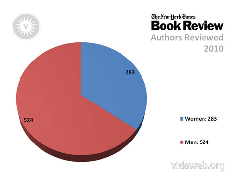
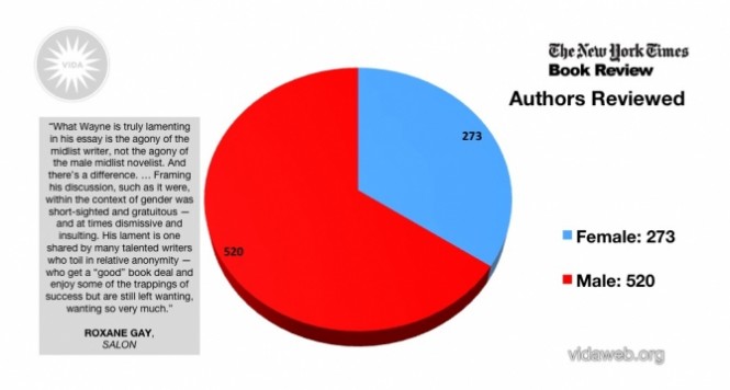
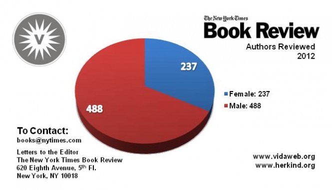
The gender disparity in the highest reaches of the literary scene is well known and widespread. Keep reading for some history on the gender parity problem in the literary profession that demonstrates both how well known and widespread it is. Choosing to represent only a single reviewing organization – The New York Times notable books list – is faulty in a couple ways. First, it implies that this particular organization is somehow at fault for a pattern that has been shown to be endemic in the field. Second, The New York Times has taken what appear to be successful steps towards ensuring an equal number of women and men get accolades for their work, regardless of whether they write fiction or non-fiction. This is a great success with respect to gender equity within that particular list, but it is lazy to assume other literary review organizations have been as successful. In fact, VIDA reports that most other organizations are still struggling to get to gender parity in terms of the authors whose books are reviewed and in terms of which types of people are publishing the reviews.
The history of gender equity in literary publishing
There is an entire organization set up to investigate the gender parity problem in literary circles called VIDA. Their mission is to “to increase critical attention to contemporary women’s writing as well as further transparency around gender equality issues in contemporary literary culture” using a “research driven” methodology. Since 2010 they have been putting together pie charts that show the gender parity within a whole range of literary field publications, including The New York Times book review, The New York Review of Books, n+1, The New Yorker, and many others. Also, they look at the gender of the people writing the reviews in addition to the gender of the people whose books are being reviewed.
These pie charts are all from The New York Times book review because that is where the data for the chart above was published. VIDA has many more pie charts available. Part of what I was trying to do with the chart above is improve on the pie chart visualization technique.
VIDA uses a team of interns to gather the publication history of all the newspapers and magazines they consider part of the literary scene. Mostly, these interns are unpaid. That is amazing. For the chart above, I grabbed all the data and did not rely on what they had done.
What else could work: A Datathon
Most savvy computational sociologists would recommend using a web scraper to generate a database with publication information and take a first pass at assigning a gender to the authors and reviewers. Some authors and reviewers will use initials (e.g. J. K. Rowling), have gender-ambiguous names (e.g. Pat, Parker, Taylor), or have otherwise difficult to gender-ize names. These would still need to be investigated by humans equipped with a search engine, but the workload would be dramatically reduced.
Does anyone feel like getting together at a datathon and scraping all the web-based publishers in a single weekend? Reply in comments.
“100: Fiction and Poetry Notable Books of the Year.” New York Times (1923-Current file): 3. Dec 04 2005. ProQuest. Web. 27 Jan. 2015. [Note: This file also included non-fiction titles though that would not be implied from the document’s title. For inexplicable reasons, the 2005 Notable Books list was not available through The New York Times search function at nytimes.com and had to be downloaded through the ProQuest database which is a proprietary service that I accessed through the New York University library.]
I defended my dissertation last fall and am returning to Graphic Sociology to keep writing about data visualization. The field has advanced quite a bit since I started this blog. In order for me to catch up I’m going to be learning new skills like web-scraping, software-driven visualization, and web-based interactive graphics.
My progress will be slow and self-taught, but I’ll try to explain what I’m learning along the way in case readers want to join in.
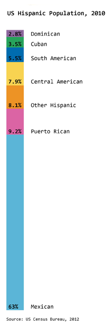
The Hispanic population is the fastest growing minority ethnic group in America. In the previous post about Race and Ethnicity in America, I showed the overall racial and ethnic proportions in America (2010 data). The graphic here specifically looks at what we mean when we say Hispanic in America. The predominant country of origin for Hispanic Americans is Mexico, accounting for almost two-thirds of the Hispanic population (63%). The Mexican American population continues to grow; Mexico is a much more populous place than, say, Puerto Rico, Cuba, or the Dominican Republic which is one explanation for the disparity in locations of origin. However, because Puerto Rico is part of the United States, it is the next largest source of Hispanic Americans at 9.2% followed closely by Hispanics from Central American countries at 7.9%.
What needs work
Admittedly, the graphic is nothing special just a stacked bar. I’m sharing it because it seemed miserly of me withhold it since it offers a better understanding of the ethnic make-up of America than the previous graphic alone. I probably should have posted it in the previous post, but it’s too late for that now.
References
Ennis, Sharon, Merarys Rios-Varga, and Nora Albert. 2011. The Hispanic Population. Census Briefs 2010. US Census Bureau.
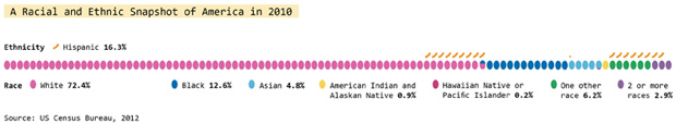
This graphic does a great job of depicting race and ethnicity as distinct concepts. The orange hash marks above the racial groupings indicate the proportion of people in the racial categories that are also Hispanic by ethnicity. I made this to correct the graphics that lump race and ethnicity together (and – bafflingly – they still add up to 100%).
Race and ethnicity are not the same. Race refers to differences between people that include physical differences like skin color, hair texture and the shape of eyelids though the physical characteristics that add up to a social decision to consider person A a member of racial group 1 can change over time. Irish and Italian people in America used to be considered separate racial groups, based in part on skin color distinctions that most Americans could no longer make. What does “swarthy” look like anyway?
Ethnicity – a closely related concept – refers to shared cultural traits like language, religion, beliefs, and foodways. Often, people who are in a racial group also share an ethnicity, but this certainly isn’t always true. American Indians are considered a racial group but there are hundreds and hundreds of distinct tribes in the US and their religions, beliefs, foodways, and languages vary from tribe to tribe. Hispanics in America often share common language(s) (Spanish and/or English) but they may not share the same race. At the moment, most Hispanics in America self-identify as white. I have often wondered if, when I’m 60, the ethnic boundaries currently describing Hispanic people will have faded away, much like the boundaries describing Italian and Irish folks faded away, becoming more of a symbolic ethnicity that can become more important during the holidays and less important during day-to-day life.
What needs work
The elephant on the blog is that I have been on hiatus since February. I’m writing my dissertation and I plan to stay on hiatus through the spring to finish that. My decision may seem irresponsible from the perspective of regular readers and I apologize for my absence.
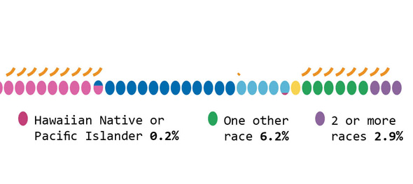
Close-up of graphic
As for the graphic, it was designed to run along the bottom of a two-page spread so it does not work well here on the blog. If anyone wants a higher-resolution version to use in class or in a powerpoint, shoot me an email and I’ll send it.
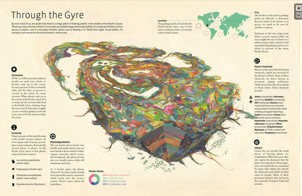
Through the Gyre by Jacob McGraw-Mickelson via GOOD Transparency
Information graphics and Illustrations
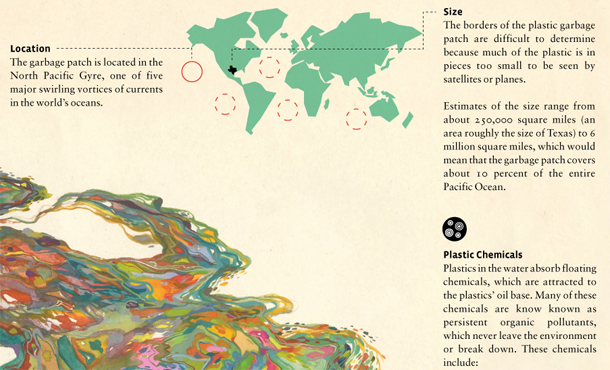
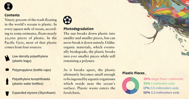
Information graphics generally do not include significant elements of illustration. It is even more rare that they are dominated by illustrations the way “Through the Gyre” is. Jacob McGraw-Mickelson created the illustration – it’s his imagination of what the Pacific Gyre might be like, not an anatomical cross-section. Using an illustration in a place where we come to expect something schematic and, therefore, representative of reality could be a dangerous play-on-truth using images and conventional expectations to convince viewers of a truth they will never be able to confirm. The Pacific Gyre is nearly impossible to visualize because it is operating at competing scales. The pieces of plastic are teeny tiny but they cover a swath of ocean that’s about as big as Texas. Reports of its density at various depths are still being developed.
Because the gyre is so difficult to visualize McGraw-Mickelson’s illustration of it has an easy time standing in for reality. We have no other photographs or scientific diagrams (yet) that aim to give us a visual overview. The ease of convincing a viewership could be seen as a kind of deceit-with-images but I prefer to think of it as art in the service of environmentalism. It may not be ‘representative’ of reality or even provide a schematic for thinking through oceanographic relationships. But it does bring gravity and depth to the following factoids that were developed as more traditional information graphics around the main illustration of the gyre.
Location of Pacific Gyre – Zoom of “Through the Gyre” by Jacob McGraw-Mickelson and GOOD transparencyMake-up of plastic pieces in the Pacific Gyre – Zoom of “Through the Gyre” by Jacob McGraw-MickelsonImpact of the Pacific Gyre – Zoom of “Through the Gyre” by Jacob McGraw-Mickelson and GOOD transparency
What Works
This graphic gave me a whole new way to think through problems related to representing important concepts and ideas that do not have clear schematics, photos, or graphics but can inspire deep reflection. I bought a copy of the print of just the ‘gyre’ to remind myself to be cautious about my embrace of the American lifestyle. I could end up eating that plastic bag again someday as it makes it way into the food cycle.
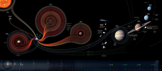
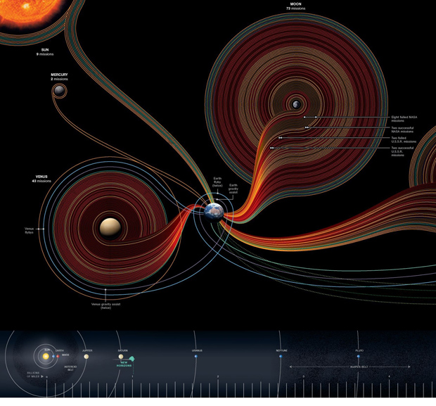
50 years of space Exploration | by Sean McNaughton and Samuel Velasco50 years of space exploration, zoom-in | by Sean McNaughton and Samuel Velasco
Why space exploration is like a small-group network graph
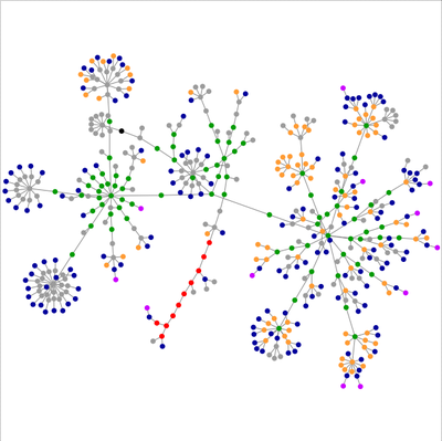
This blog is supposed to be about social data and while there are certainly social components to space exploration, that’s not the angle I am going to discuss here. [See Alex Madrigal’s piece in The Atlantic Moondoggle: The forgotten opposition to the space program” to get a taste of the sociopolitical forces behind the American space program.] Rather, what excited me about this graphic was the form and it’s potential application to relatively small network visualizations. Here’ what I’m thinking: say you have small work groups (like, for instance, in my dissertation) and you would like to visualize some kind of behavior or linkage pattern in that network. You might also like to have the power hierarchy in the visualization – and this would be the structural hierarchy that exists in relation to, but not as a cause of, the pattern of linkages and/or traffic in the network. You could use a nest-y network map like this:
Clear, well-visualized network graph
OR…the formal standards in the space exploration graphic could be modified to suit network traffic, assuming a network with a small number of nodes. The planets could be people and they could be scaled and positioned to reflect their structural hierarchy. The edges – which in the space graphic are the trips – could be meetings or emails or any other kind of linkage that is important in the network. In the case of meetings, some meetings last longer or are otherwise more consequential so the edge could be thicker or more saturated with color.
Lots of network analysis looks at big networks where the nest-y network graph visualization technique is a good fit. But networks with fewer nodes and edges in which we know something about the social structure of the arrangement end up losing some of that context when they are represented in the nest-y network graphs. Those graphs are designed to help identify patterns where researchers either do not know much about the patterns in the first place or want to find an unbiased way to test their assumptions about the patterns they will find. But with the networks I am studying, I have discovered social patterns through ethnographic methods that I would like to have represented in my graphs. This space exploration graphic looks a lot like my back-of-napkin sketches for small groups. Of course, it is far more polished and more well-integrated with the ‘site plan’ running along the bottom of the graphic that helps establish scale, much like the way architect’s include a thumbnail site plan on their blue prints to establish a context for the siting of the building that’s represented in much greater detail on the plan.
Coming attractions
Over the next week, I hope to have a better sketch of a small-group network informed by ethnographic research up on Graphic Sociology.
References
Graphic Designers
Sean McNaughton, National Geographic Staff, www.nationalgeographic.com Samuel Velasco, 5W Infographics, www.5wgraphics.com [this website was under renovation at the date of this blog post]
I reviewed Susan Schulten’s new book, Mapping the Nation: History and cartography in 19th Century America, for publicbooks.org but there were so many images (90%) that did not make it into that review I decided to write a post here, too. This blog tends to focus on contemporary graphics, but information graphics are not new and the historical context of infographic forms is fascinating, especially in light of research that examines the status of information graphics as the output of inscription devices (Latour and Woolgar, 1979). How did we end up with the selection of graphic forms we now have? In what way were these images originally used and by whom?
The images in Schulten’s book – and on her superb companion website – are mostly maps, but there are also a surprising number of information graphics. As Schulten writes, maps and mapping were both made possible because America became a country (and thus had a government that could be petitioned to support the expense of creating maps and provide a centralized repository in which maps could be collectively held and made available) and they made America an imaginable possibility. In short, the establishment of American government made mapping possible and the existence of national maps made America an imaginable possibility. Without being able to see not only the colonies, but also the rest of the North American continent, it would have been far more difficult to imagine and pursue westward expansion, for instance. The first chapters of the book provide a nice companion to Benedict Anderson’s “Imagined Communities” that focused on the role of newspapers and novels in creating a national imagination. Schulten is also interested in printed matter, but for her the big deal is mapping.
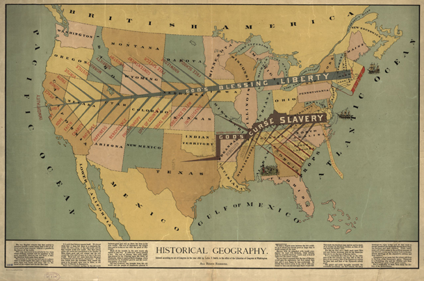
Maps as propaganda
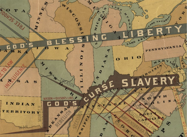
If mapping in the immediate post-colonial and early frontier eras was exciting – and it was – it got even more exciting during the contentious lead-up to the Civil War. One of the maps I’m including here is propaganda for the abolition of slavery. I have included the whole map as well as a close-up, but I encourage you to click through to Schulten’s companion website where you will find high quality scans of all the maps that will give you far more detail than I am able to show here.
Antebellum Historical Geography Map of US | by John SmithClose-up of antebellum historical geography map | John Smith
Propaganda is typically not something maps are used for now, at least not in the blatant fashion of the pre-Civil War years, but it is true that maps are depictions of political boundaries and, as such, are ripe for the delivery of political messages. [For a more recent example of US maps used in politically charged ways see modern artist Jasper Johns.]
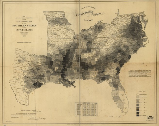
What I found more intriguing were the maps that displayed their political messages almost invisibly using choropleth techniques. The choropleth technique is still extremely common today and relies on shading assigned to political divisions like state or county lines. Census tract boundaries can also be used. It’s debatable whether or not census tracts are political boundaries but they certainly are not boundaries based on natural features like streams or mountain ranges. Some of the first choropleths were developed to show more precise locations and densities of slave labor in an effort to discredit Southern claims that slavery covered the South like a blanket without which Southern economies would freeze.
Slavery map of US, 1861 | Edwin HergsheimerSlavery map of US, 1861 [closeup] | Edwin Hergsheimer
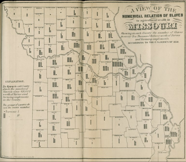
Another attempt at a similar political message – to display variation in slave holdings in order to prove that other economic models were viable and operant in the South during the 1850s – failed as a map but introduced an interesting graphical form. This Missouri map shows county boundaries within each of which there is a small graphic with the overall intent of providing:
A view of the numerical relation of slaves to agricultural wealth in Missouri, Showing in each county the number of slaves to every ten thousand dollars worth of farms and farming implements according to the US Census of 1850.
To interpret the map, then, keep in mind that counties with more dots rely more heavily on slave labor rather than mechanical labor. Of course, counties with few dots could either be utilizing human labor more efficiently, and thus have lower slave-to-machine ratios, or they could have had very little agricultural practice of any kind, slave or free. Because the graphic elements represent such an obscure, unfamiliar measure (slaves-to-machines), the map ought not to be considered a great success. But it is an excellent example of maps depicting thematic data without resorting to choropleths. We could use more of this boundary pushing map-graphic hybridity now
Missouri Slave Density map, 1850 | Edwin Leigh
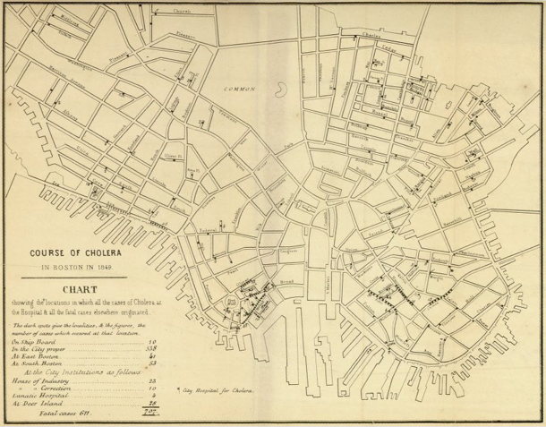
Disease mapping in America
With some chagrin, I admit Schulten’s book corrected an inaccurate belief of mine with respect to the use of maps in the detection of disease. I had erroneously thought that John Snow was the first person to use maps as a tool to detect the cause of disease when he pinpointed the cause of London’s cholera epidemic to a public water pump. He was not the first to use maps to discover disease. Americans in Baltimore, Boston, and New Orleans were mapping all sorts of potential causes of diseases like cholera including weather patterns, train routes, proximity to open water, and the eventual culprit, proximity to public water. Snow was the first to hone in on the cause, but he was not the first to use maps. Further, he was likely aware of American public health mapping efforts.
Cholera map of Boston, 1849 | Henry WilliamsCholera map of Boston, 1849 [closeup] | Henry Williams
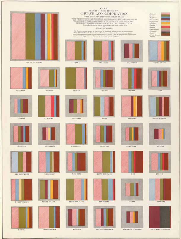
Bonus image
I am including one more image – not a map – to show just how fresh 19th century graphics were. This is a graphic that uses states as categories but breaks them out of the map form in order to present them as squares. It is easier to divide squares into percentages, which is just what Francis A. Walker did to show the types of church denominations present from one state to the next. It is easy to see why he avoided using a map – it would be difficult to divide the irregular shapes of states into precise percentages. Further, even if he could divide the irregular areas properly, if he then filled the areas with particular denominations, it would have appeared that the denominations were geographically tied to particular places within the states. His choice of squares as representations of the states is logical. From this graphic solution to his problem we end up with a visual technique for representing all sorts of information that is bound to related categories.
Church denominations in the US by state | Francis A. Walker via Susan Schulten
References
Latour and Woolgar. (1979) Laboratory Life: The Social Construction of Scientific Facts. Beverly Hills: Sage.
Norén, Laura. (2013) Mapping a young America Review of Susan Schulten’s “Mapping the Nation: History and cartography in 19th Century America. PublicBooks.org
Cairo, Alberto. (2013) The Functional Art: An introduction to information graphics and visualization. Berkeley: New Riders, a division of Pearson.
Overview
A functional art is a book in divided into four parts, but really it is easier to understand as only two parts. The first part is a sustained and convincingly argument that information graphics and data visualizations are technologies, not art, and that there are good reasons to follow certain guiding principles when reading and designing them. It is written by Alberto Cairo, a professor of journalism at the University of Miami an information graphics journalist who has had the not always pleasant experience of trying to apply functional rules in organizational structures that occasionally prefer formal rules.
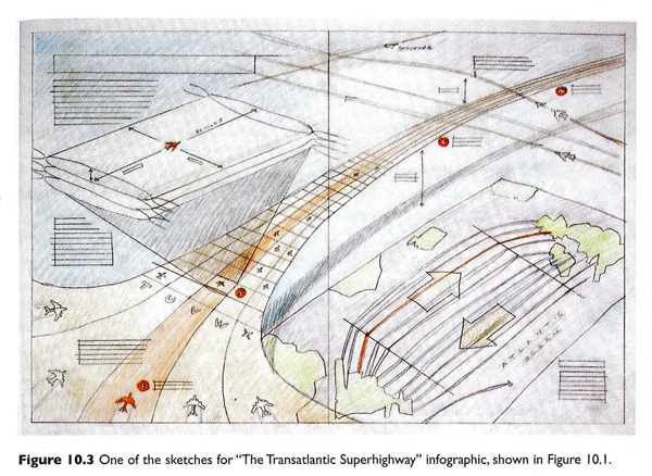
Sketch of “The Transatlantic Superhighway” by John Grimwade which was originally for Conde Nast Traveler and reprinted in The Functional Art. Click for the full interview with Grimwade.
The second part of the book is a series of interviews with journalists, designers, and artists about graphics and the work required to make good ones. This part of the book is as much about the organizational culture of art and design and specifically of graphics desks in newsrooms as it is about graphic design processes. The process drawings are fantastic. I’ve included two of them here. The first by John Grimwade is multi-layered, full of color and dynamic vitality. These qualities were carried through into the final graphic but are often very difficult to build into computer-generated images. I wondered if the graphic would have been as dynamic if it had come from a less well-developed hand sketch (or no sketch at all).
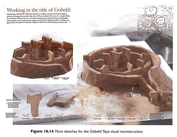
Photo of clay model of Gobekli Tepe by Juan Velasco with Fernando Baptista for National Geographic. Click for a video of the model building process.
The second is a set of photographs taken of a clay model by Juan Velasco and Fernando Baptista of National Geographic that was used to recreate an ancient dwelling place call Gobekli Tepe that was in what is now Turkey. Both of these examples lead me to the iceberg hypothesis of graphic design – the more the design that shows up in the newspaper or magazine is just the tip of an iceberg of research, development, and creative work, the more accurate and engaging it is likely to be.
As a sociologist I am accustomed to reading interviews and am fascinated by the convergence and divergence in the opinions represented. In this case, I especially appreciated that Cairo’s interview questions touched on the organizational structures and working arrangements, as did his own anecdotes throughout the book, to provide an understanding of the opportunities and constraints journalists and information graphic designers face. Their work is massively collaborative and the book works to reveal the bureaucratic structures that come to promote and impinge upon design processes and products.
There is a fifth part to the book, too, a DVD of Cairo presenting the material covered in the first three chapters of the book. I admit, I have rarely been a large fan of DVD inclusions. They are easy to lose, scratch and/or break. But assuming the DVD is intact and accessible, I never know when I ought to stop reading and start watching. And even if the book has annotations indicating that an obedient reader should stop reading and start watching the DVD, this assumes the reader is willing and able to put down the book and fire up the computer. The only time I can imagine using the DVD is as a teaching aid in class to give the students a break from having to listen to me all the time. Unfortunately, that is prohibited by Pearson.
Still, it is worth watching because Cairo has a great voice and he is able to discuss interactive content/design in a way that is not easy in the pages of the book. While some of the discussion repeats themes from the first part of the book, there are new examples from additional designers, including some who have been Cairo’s students, which might be of interest to people thinking of signing up for his online course.
What does this book do well?
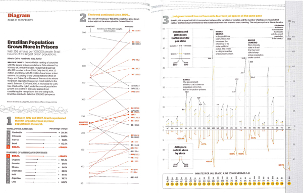
“Brazilian population grows more in prisons” by Alberto Cairo originally in Epoca magazine November 2010, reprinted in “The Functional Art” by Alberto Cairo in 2013.
The book does a great job of explaining the decision making behind graphic design. The sketches, process drawings, and recounts of the conversations that went on in editorial meetings gave important depth of context. The organizational culture and day-to-day expectations of the newsroom tend to encourage the use of templates and discourage exuberant creativity. Cairo explained that this Brazilian prison graphic that eventually won the Malofiel design award also won him a reprimand from his boss who proclaimed it to be “ugly”. In practice, conceptual distinctions between art and technologies for comprehension are made rigid by bureaucratic structures in which, “the infographics director is subordinate to the art director, who is usually a graphic designer,” and that this arrangement, “can lead to damaging misunderstandings.”
The more prominent argument follows from these peeks into the backstage of journalism. Infographics and visualizations are technologies, not illustrations. Cairo writes that:
The first and main goal of any graphic and visualization is to be a tool for your eyes and brain to perceive what lies beyond their natural reach….The form of a technological object must depend on the tasks it should help with….the form should be constrained by the functions of your presentation….the better defined the goals of an artifact, the narrower the variety of forms it can adopt.
One of the writing techniques that Cairo uses is summarizing his take-away points from previous paragraphs in quick lists of pointers or key questions. Cairo incorporated these quick lists gracefully into the writing style and I never felt like I was reading a textbook. Still, the quick lists make it easy to use the book as a reference. The index, bibliography and detailed table of contents add strength to the book as a reference source, too. Note to the publisher: I found it frustrating that the book did not include a list of figures, especially given the subject matter.
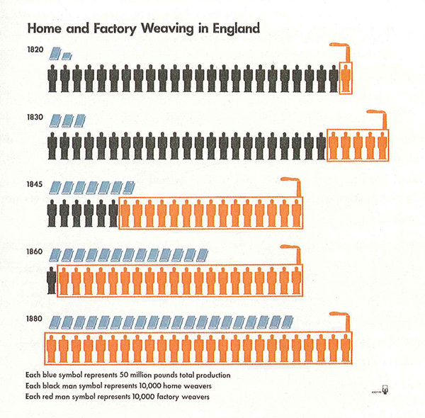
“Home and Factory Weaving in England, 1820-1880” Otto and Marie Neurath Isotype Collection, University of Reading as seen in The Functional Art by Alberto Cairo.
Diversity
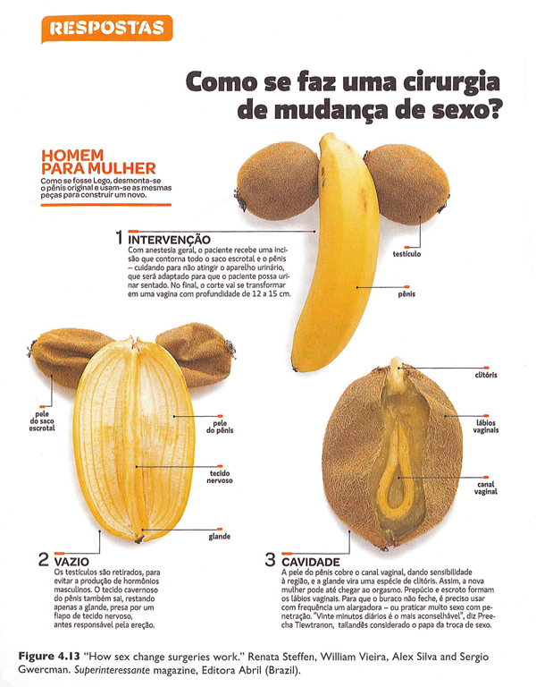
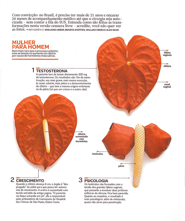
One of the greatest strengths of this book is the diversity of sources from which Cairo draws his material. Yes, he uses graphics he has developed in many cases which is hugely valuable because he is able to provide insights into the development processes. However, he also draws from graphics old and new [see an old one he pulled out of an archive at the University of Reading about weaving in the industrial revolution], from magazines, newspapers, and the internet, made by freelancers, in-house designers, and students, and in languages other than English (some of which are translated, some of which impressively need little translation). My favorite graphic in the book was one I never would have come across that uses pieces of fruit to describe the surgical procedures used to achieve sexual reassignment.
“How sex change surgeries work.” by Renata Steffen, William Vieira, Alex Silva and Sergio Gwercman in Superinteressante magazine (Brazil). Part 1 of 2.“How sex change surgeries work.” by Renata Steffen, William Vieira, Alex Silva and Sergio Gwercman in Superinteressante magazine (Brazil). Part 2 of 2.
This diversity serves as an example of the breadth of Cairo’s experience in the world of journalistic information graphics. It is also a testament to his real joy in the subject. Many authors of design books are happy to fill the pages with their own work. Cairo is surely talented enough to have done. Instead, he chose to showcase an incredible range of designers and styles. This diversity, combined with the accessibility of the writing, are cause enough to recommend this book for anyone who is curious about graphics and journalism, especially journalism students.
What doesn’t this book do well?
The most curious shortcoming – given the incredible diversity of designers, styles, countries, and publication types represented – is the scarcity of women designers. There are thirteen designers profiled in part IV of the book; only two are women. There were forty-seven graphics reprinted; five were designed by women. With respect to the reprints, Cairo is completely justified in reprinting his own work more often than the work of others because he knows how the design process unfolded in those cases. Since he is a man, this inflates the masculine contribution to the reprinted graphics category. Still, many of the graphics he worked on were collaborative efforts and his collaborators could have been women in a more ideal world. But mostly, they were men.
Because the information graphics world is relatively interdisciplinary and (so far as I know) has no specific professional organization whose membership includes a representative sample of practicing information graphics and data visualization professionals, it is hard to tell if the gendered pattern in Cairo’s book is due to some oversight on his part or the underlying gendered make-up of the industry or a combination of both. Even if the industry is dominated by men, it is important for people who write and edit textbooks to ensure that women are represented or they run the risk of sending the message that women may not be welcome or well-rewarded if they choose to pursue data visualization. That is unacceptable. The graphics world will lose out on half its talent pool and women might avoid careers that could have been satisfying and rewarding for them. Notably, the kinds of graphic design that require coding – like data visualization and interactive design – are better compensated than illustration and static design so it’s possible that women are being subtly nudged into the less well-compensated areas of graphic design along the line. It would have been nice if this textbook that is so diverse in so many other ways could have pushed the gender boundary and included more women.
The book also over-promises in the cognition section. The first chapter on cognition was too basic. The second and third chapters in this section had more that was directly applicable to design. All three chapters could have been condensed into one. It is certainly true that perception and cognition ought to be included and there were some useful applications derived from the three chapters, but there was too much review and too few clear applications of the basic principles of cognition and perception to graphic design.
Here are the pointers I did find useful, if you happen to want to buy the book and skip those chapters:
+ If you want viewers to estimate changes by visually comparing elements, you will have the best luck if those changes are depicted using elements of the smallest number of dimensions possible. For instance, viewers will have an easier time coming up with an accurate estimate of the difference in size between two lines (1D) than between two circles or squares (2D). It’s best to avoid 3D comparisons altogether. I would also add that regular objects like circles and squares are cognitively easier to think with than irregular objects like polygons other than squares.
+ The less frequently a color appears in nature, the more likely it is to draw the eye. Reserve the use of colors like red, pink, purple, orange, teal, and yellow for elements that are meant to draw attention.
+ Humans cannot focus on multiple elements at the same time. Design graphics that have one focal point or clear hierarchies of focal points. Do this by eliminating unnecessary use of bright color, chart junk like grid lines that aren’t absolutely necessary, and by establishing a logical information hierarchy in the page layout.
+ Landscapes have horizon lines. Humans are used to encountering the world this way. This is one reason why it is easier to make comparisons using bar graphs (where all the elements start from a common horizon line) rather than pie charts (where there is no shared horizon).
+ Eyes are good at detecting motion and they will focus attention on moving objects. Try not to ask viewers to read text and simultaneously watch a moving element in interactive graphics.
+ Human brains are good at picking out patterns. Often, fairly small changes to a graphic layout that strengthen the appearance of grouping or other types of patterns will add to the ability of the graphic to deliver an instant impression or overview of the message being communicated. For instance, changing the spacing of the bars in a bar graph so that every fourth bar has twice as much space after it as all the rest will make the graph appear to have groups of 4-bar units.
+ Interposition – placing one object in front of another so they overlap – is a good way to add depth. If objects never overlap, the opportunity for the illusion of depth is lost.
Summary
Overall, the book was well-written, included valuable insight into the process underlying the creation of strong, successful information graphics and visualizations, and would be a solid textbook for use in journalism departments. The representation of women designers was disappointingly low and the segment on cognition could be condensed or otherwise improved. Cairo is clearly a talented designer and teacher. This book meaningfully combines both of those strengths and is an important contribution to undergraduate and graduate education in the emerging sub-discipline of information visualization and design.
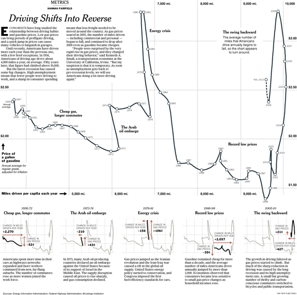
I am sending you out with one of the graphics I was most impressed by, in part because the graphic is good, but mostly because Cairo helped me to see why a rather average looking graphic is in fact rather brilliant. It is by Hannah Fairfield of the New York Times graphic desk and it shows that the driving behavior of Americans is sensitive to changes in the economy. During the 2005 recession when gas prices were high but the economy was struggling overall, Americans drove fewer miles. This pattern had only one historical precedent – the 1970s. The graphic depicts this by having a timeline that appears to walk backwards during those two periods in history, a broken pattern your pattern-loving mind is likely to fixate on once you realize this is not your average line graph. Smart.
“Driving shifts into reverse” by Hannah Fairfield originally published in the New York Times, May 2010; reprinted in “The Functional Art” by Alberto Cairo, 2013.
Grimwade, John. (1996) The Transatlantic Superhighway. [information graphic]. New York: Conde Nast Traveler.
Steffen, Renata; Vieira, William; Silva, Alex and Gwercman, Sergio. “How sex change surgeries work.” Superinteressante magazine. Brazil.
Velasco, Juan and Fernando Baptista. () “Gobekli Tepe Process Shots”. National Geographic Magazine. In Cairo, Alberto (2013) The Functional Art p. 238.
About Graphic Sociology
Analyzing the visual presentation of social data. Each post, Laura Norén takes a chart, table, interactive graphic or other display of sociologically relevant data and evaluates the success of the graphic. Read more…


![Slavery map of US, 1861 [closeup]](https://thesocietypages.org/graphicsociology/files/2013/01/slavery-map-of-us-closeup-EDWIN-HERGSHEIMER.png)
![Cholera map of Boston, 1849 [closeup] | Henry Williams](https://thesocietypages.org/graphicsociology/files/2013/01/closeup-cholera-map-of-Boston-HENRY-WILLIAMS.png)
