political

Infographic Humanitarian images in Time and Newsweek

An Original Creation – Draft Only

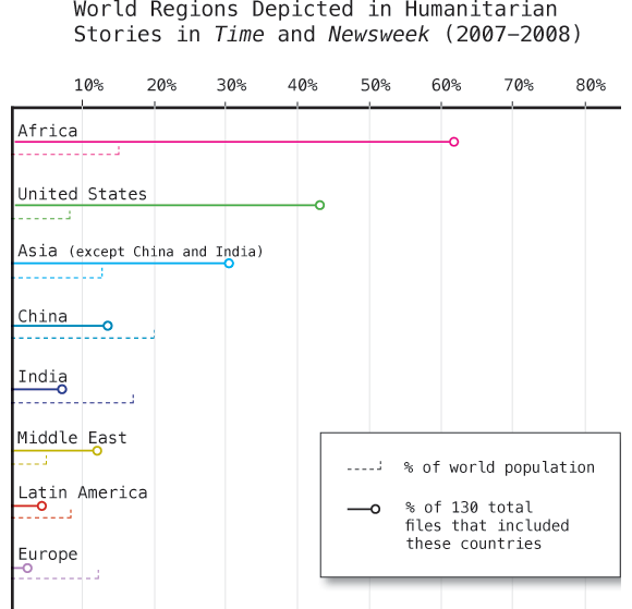
Jen Telesca and Nandi Dill, my fellow research assistants at the Institute for Public Knowledge, presented a paper last year based on data they gathered doing visual content analysis of Time and Newsweek during the years 2007 and 2008. They looked through each issue, identified the articles that were humanitarian in nature, and then coded those images according to geography, the type of situation depicted, and the purported status of the individuals in the image (military actor, activist, politician, celebrity, etc). I am helping create the graphics and I thought I would share this one even though it isn’t yet complete.

As per usual, I welcome your comments and criticisms with open arms. Tear it apart, but be specific.

Methods and Findings

There were a total of 130 articles containing 363 images. The above graphic is supposed to help viewers come to the realization that not all areas are equally represented. I assumed – and this is a wild leap here – that there is some baseline level of social disease and natural disaster plaguing any population. More people = more trouble though we know the relationship is imperfect. Poor areas may experience a natural disaster as a humanitarian crisis leading to orphanhood, starvation, lack of adequate food and shelter where another region would have experienced the same natural disaster as a major inconvenience but one that insurance policies would more or less cover. A natural disaster does not always become a humanitarian disaster. Variables like wealth, racism, literacy, and so forth do play a role and I cannot capture those elements by showing a simple population statistic.

Am I forgetting something major? Am I taking Time and Newsweek to be tellers of the truth, representers of the world as it is, completely objective and unbiased by budgetary constraints or political agendas? Not really. I’m also not trying to push those issues too hard. One could assume from this graphic that some regions are more likely to be represented as suffering from (or aiding in the recovery from) humanitarian emergencies than others for reasons that have nothing to do with the frequency of these kinds of emergencies.

I hope that the graphic leads you to wonder why some regions appear more frequently than others but that it does not beat you over the head with the claim that Time and Newsweek like to depict Africa and the Middle East as sufferers and the US as altruistic helpers far more than a random sample of suffering or aid giving would indicate. Just look at Europe. They appear neither to suffer from or aid in humanitarian crises much compared to how many people live there. One theory is that US based magazines prefer to show US citizens performing acts of altruistic heroism rather than showing Europeans lending a hand. To what degree is Africa over represented because there are simply more humanitarian emergencies there versus being over represented in images because in this particular moment, in these two magazines, Africa equates well with the typical imagination of victimhood?

The graphic cannot answer all those questions. Mostly it just intends to raise them. What do you think?

Please send me comments

I will post the next draft when it is ready. I’ll tell you right now that it will include an indication of how often impending or ongoing crises were associated with each region. That should make it easier to tell which geographies are shown to be full of victims and which are full of altruists.

[There is a future graphic that uses the same dataset to show that being a victim and being an altruist are more or less mutually exclusive. For instance, stories involving crises in Africa almost never show Africans helping Africans. Instead, folks from wealthy countries are usually the ones depicted doing the helping.]

US Federal Contract Spending | Pitch Interactive for Design for America Contest
Another Iteration | Pitch Interactive for Design for America contest
US Federal Contract Spending, the straight story | Pitch Interactive for Design for America contest

What works

What I especially like about the full blog post describing the development of this graphic is that it presents multiple iterations of the same design as the designers respond to difficulties they uncovered along the way as well as criticisms from the blogging world.

The third one, that loses the circle concept, works best for me. The labels are legible and I understand how contract spending and the media coverage (they used the New York Times, so that’s how you should interpret the term ‘media coverage’ here) of contract spending are related more clearly than in the circular version where the implication that the flow is not a simple one-way deal gets lost. And confuses things.

What needs work

Honestly, there have been plenty of criticisms of this graphic already. Rather than repeat what others have said, I’m going to introduce you to Matthias Shapiro at Political Math (a stranger to me) who has provided an intelligent critique of the above visualization series. He says,

Pitch Interactive has gotten beaten up a great deal over this visualization and they have been nothing but gracious throughout. So I just want to take a moment to say that I think their work is remarkable and that the problems with this graph are a series of very honest mistakes.

But one of the things my blog does is point out mistakes to increase understanding.

My biggest problem with the image is that it still perpetuates the stereotype that the federal government spends most of its money on defense. This image in particular drives that point home by ranking the spending areas according to their “media coverage” ranking where we can see the extent of media coverage each department saw (based on the New York Times API). “Defense” reporting is clearly out of proportion to Defense spending.

The first problem has been addressed elsewhere… it’s the issue of scaling the radius instead of the area of the circles. If the numbers were a correct representation of federal spending (more on that later), the circle visualization commits this “radius is not equal to area” visual error that really bugs me. I even gave it a couple pages in my book chapter (now available online for the low, low price of free) and mentioned it in my Microsoft talk on visualization because it is such a common mistake.

But I encourage you to click through and read his entire post. And read the entire post that Pitch Interactive wrote, too. I figure with all that reading you won’t care to slog through my opinion.

The general question, I would say, is whether or not this kind of graphic works for displaying relational data – Pitch Interactive is trying to show how fiscal data measured in dollars relates to media coverage measured in mentions in a particular newspaper. What do you think? Does it work for them? Is it a relationship we should care about? And is this kind of depiction something that will work for relating other sets of data that use different measurement scales?

References

Pitch Interactive original blog about the graphics, updated. (1 June 2010) US Federal Contract Spending in 2009 vs. Agency Related Media Coverage.

Shapiro, Matthias. (28 May 2010) Government Spending Visualization Misses the Mark at Political Math: Political Information Visualization and other Math-y Things.

Sunlight Labs Design for America contest.

How a Bill Becomes a Law | Mike Wirth

Click through to get the full version or be lazy and just look at the graphic excerpt below

How our laws are made - excerpt | Mike Wirth

What works

My favorite part of this graphic is the inclusion of lobbyists along the way. I might have represented them with some sort of hint about the fact that lots of their power comes from money. Maybe some bills popping out of their suitcase?

Furthermore, it’s impressive that each step is so fully spelled out. Filibusters are in, as they should be.

What needs work

This is so busy. Information graphics are supposed to be relatively easy for the eye to digest. With this one, I do know where to start, but I get lost trying to follow the process along.

Here are some concrete suggestions:

  • Instead of gray-scaling the House of Representatives, the Senate and the President in underneath the curve, just make the segments related to the House, say, all one color, the Senate all another color, and the President a third color. To show variation within those three, play with saturation. It becomes less colorful but more intuitive.
  • The font sizes that vary within a segment and in the title are confusing. Just one font size per segment. This is a graphic, not a wordle. Plus, I never liked wordles. Words are mostly for writing, sometimes for labeling, but they do not make good graphics on their own with very few exceptions. Use words as words, not as graphics.
  • I would have tried to find a way to incorporate some of the balloons hanging off the main body into the main body. Aesthetic decision, but the whole thing looks hairy with all those balloons, lobbyist icons, kill points, and so on. Get some of that content into the segments, even if the segments have to expand to accept a bit of explanation.
  • I am not a fan of the buildings and whatnot sort of faded into the background. They don’t add to the story and the image is already too cluttered. Nix ’em.
  • The color of the conference committee – gray and white – makes it seem as though it is unrelated to the House or the Senate or anything else going on here. Maybe the members are extras from Twilight? This is actually the one place where a bit more color would have made sense. Blend the color of the HOR and the Senate and get them swirling around in conference.
  • The terms that are randomly defined or explained in blue boxes in what would have been ‘white space’ around the snake could have been collected and stuck into a single box somewhere. They could have been numbered and the numbers could have been applied to the graphic at the point where the viewer might have been most likely to wonder about them. Or not. With fewer than 10 terms, I think people would find their way through them without too much trouble even if they weren’t numbered and keyed directly to a particular spot on the graphic.

What needs to be said

This graphic was a winnner at Sunlight Labs Design for America contest. So all of my criticisms are, apparently, bunk. Because this one was judged to be the best of the “how the bill becomes a law” submissions. More from this design series coming soon. I can just tell you’re all getting excited about the IRS themed graphics.

References

Mike Wirth. “How a Bill Becomes a Law”

Johnson, Clay of Sunlight Labs. (26 May 2010) Design for America contest.

UK elections poll data | Information is Beautiful

What works

In the words of the creator of this graphic, the point here is that “there is no pattern”. The YouGov pollsters seemed to be a little more accurate, but then, as was also pointed out by the graphic’s creator, they only had one year to give it a go. Low N on that group, but maybe we can call them ‘one to watch’.

There is always a tendency in science – bench science, social science, any kind of science – to show positive results. It sort of sounds like: “Look! I found something!” Or, more likely, “After controlling for everything I could think of, including maternal grandmother’s underwear size, I have found a statistically significant correlation in the predicted direction.” But there is almost no support for saying, more or less, “I was looking for something but I found nothing.” In this particular case, a non-finding is of interest because it suggests action. We can stop paying attention to prediction polls (or chance it and continue to pay attention to YouGov, with a grain of salt). What works best here is the rigorous reporting of no pattern. Multiple polling companies, multiple elections, still no pattern.

What needs work

Seriously needs a key. Red and blue are always political colors, yellow not necessarily so, and the meanings of each cannot be assumed.

Love the title ‘poll dancing’ but wish it would mention ‘UK’ and ‘elections’ somewhere. We can deduce from the listing of the Guardian as a source that it probably has something to do with the UK, but information is global now, and we cannot assume national origins anymore. I often make this mistake myself, easy to forget to mention the nation-state. The good news is that our audiences are no longer only our neighbors. Or at least that’s how I like to think of it.

References

Suggestion from
Momin, a young fellow who contacted me by email suggested I post this one.

Graphic
McCandless, David and Key, James. (2010) “Poll Dancing: How accurate are poll predictions?” from Information is Beautiful.

See also:
McCandless, David. (2010, May 6) General election 2010: Information is Beautiful goes poll dancing at The Guardian, Data Blog.

Data
http://bit.ly/polldancing

Whaling Continues | 1985-2009

What Works

It’s easy to see, even without the explanatory text, that there must have been something happening circa 1986 that changed the way whales were killed. The explanatory text is necessary to understand that it was a legislative change as opposed to a whale disease or a human health scare similar to mad cow disease (crazy whale disease?).

What I like more about this graph is that it suggests something fishy might be going on when it comes to the ‘scientific’ capture of whales. The argument goes something like this: in order to understand and protect whales and whale habitats, some whales need to be captured and killed. Just eyeballing the bars, it would seem that from 1985-1990 something like 100-300 whales were killed annually in the name of science. Then the number of whales killed for the scientific preservation of whales started to drift upwards. In 2005 my estimation suggests that well over 1000 whales were killed for science. And that 1000/year number seems to hold from there through 2009. Now, maybe whale science has grown by leaps and bounds and requires the death of about 1000 whales per year.

The article does not address the increase in scientific whale deaths so I am left to wonder if the graphic is revealing some questionable whale fatality accounting procedures. In other words, this graphic is a champion because it raises a political question in a largely apolitical way. Good work, New York Times.

Reference

Broder, John. (14 April 2010) “Whaling Continues”. In The New York Times, Environment Section.

feltron graphic:  cnn.com site traffic since launch day
cnn.com site traffic since launch day

What Works

Think about what this graphic could have been: basically just a line graph showing growth over time. Now look at it again. The little flags point out cnn.com’s busiest days and remind you what was happening on those days – Obama’s inauguration, the September 11th attacks, various other political happenings. Even if this graphic weren’t labeled ‘cnn.com’ I bet you would have been able to predict it was a news site just by looking at which days it had the most hits.

Other things to like: the little graph at the top showing global internet use to remind us that the growth of page views per day could largely be a function of the growing number of people who have access to the internet rather than an inherent growth in popularity of cnn.com. Of course, the little bitty bar graph isn’t big enough to see if there is a difference in the growth rate in access to the internet overall and the growth rate in page hits at cnn.com.

Mirroring the trend over the x axis is a brilliant move here. On top, we see the page views per day averaged over the week in red and the annual weekly average. This allows them to go granular with their highest hit days and also give a trend line that smooths over the outliers. Nice. And on the bottom, then, they can show basically the same trendline broken into content areas. So if you’re a skeptic and you think all this growth is probably in entertainment because folks are just nitwits feasting on celebrity-ism, well, you can see that the home page gets by far more traffic than the entertainment page. It’s possible that the nitwit theory holds, but folks aren’t turning to cnn for juicy gossip. We can also see that video takes off and politics has more page views in election years.

And on Christmas, the number of people ignoring cnn peaks.

From Feltron, the graphic’s designer, the best thing about the narrative depicted by this graphic is the trust we all put in the internet as a reliable source of news after 11 September. “Ultimately, I think the most fascinating story here is the change in our news habits after September 11, 2001. After this day, a new and higher baseline for visits to the site is established, and the inference is that this event really established CNN.com and the greater Internet as a reliable, timely and indispensable source for news.”

What needs work

This is a sophisticated, well developed graphic that basically needs no work.

But…

The text is too small to read. Of course, it’s virtually impossible to create a graphic with this much detail that is elegant and uncluttered with text that fits in 800 x 800 pixels, or thereabouts. For folks who happened to have the ever widening monitors, it would have been nice to link to a ginormous version. I bet feltron has a larger version since I’m not sure how he would have been able to convince himself that some of the smallest text was legible otherwise.

References

Feltron (2009, 11 November) cnn.com traffic graphic on Feltron’s blog at tumblr.com.

Charles Blow's graphs to track voter apathy by age group

What needs work

These graphs are meant to illustrate voter apathy by age group.

Jay Livingston, blogger at Montclair socioblog, points out that comparisons between age groups would be far easier if all the age groups appeared on one graph. I agree.

I would also point out that I’m curious about whether it is strictly age or a cohort effect that is really at the heart of the question about who votes. In order to answer that by using infographics, I might have looked at voting rates within cohorts over time (so graph the baby boomers voting rates as they age and so forth).

One picky little detail: when making graphs that have to do with voting, it’s probably best to assume many people will see red and blue and think Republican and Democrat. I would have preferred any other colors, just to avoid confusion.

The bigger problem

Folks, leave your computer alone for a minute and vote.

References

Blow, Charles. (2009, 14 November) “The Passion of the Right” op-ed in the New York Times.

Obama Inauguration Animation - FlowingData

What Works

This is an animation based on twitter data from Obama’s inauguration day in the US – Inauguration was at noon. In case you weren’t a twitter user at the time, it is worthwhile to point out that twitter had partnered with Facebook for the day to increase usage. Both twitter and facebook were encouraging users to point their comments towards the topic of the inauguration.

I like it because its like watching fireworks from above and gives a tangible sense of the excitement amongst Obama fans that day. Best thought of as an emotional animation of political temperature than as any kind of quantitative data. I wouldn’t even call it an information graphic/animation. I would call it popcorn, animated.

What Needs Work

I have the same problem with this animation that I have with twitter which is that I really don’t know what good they do, even though I’m intrigued. I’ve been trying to figure twitter out by using it and I still don’t see the appeal. Thus, it is quite alright to think this animation is pretty, but dumb.

Relevant Resources

Flowing Data (2008) Worldwide Inauguration via Twitter