New York

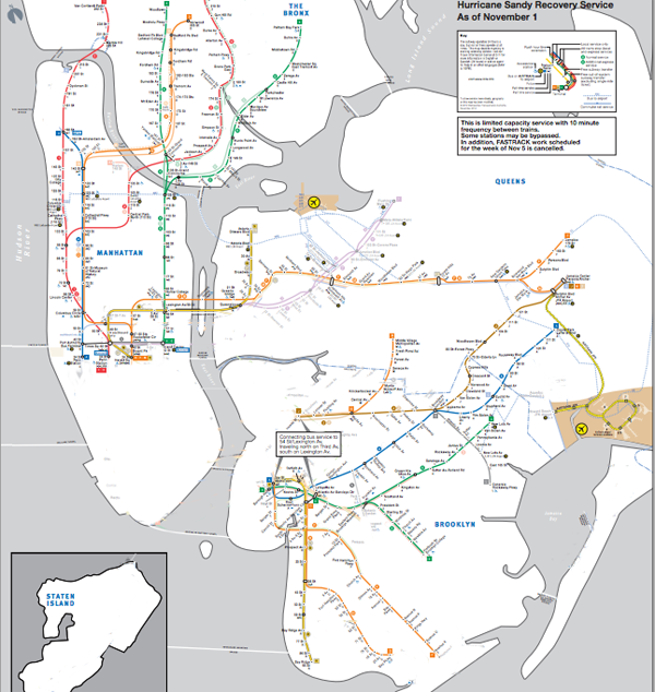
New York City subway map after Sandy

New York City subway map, Hurricane Sandy hangover map

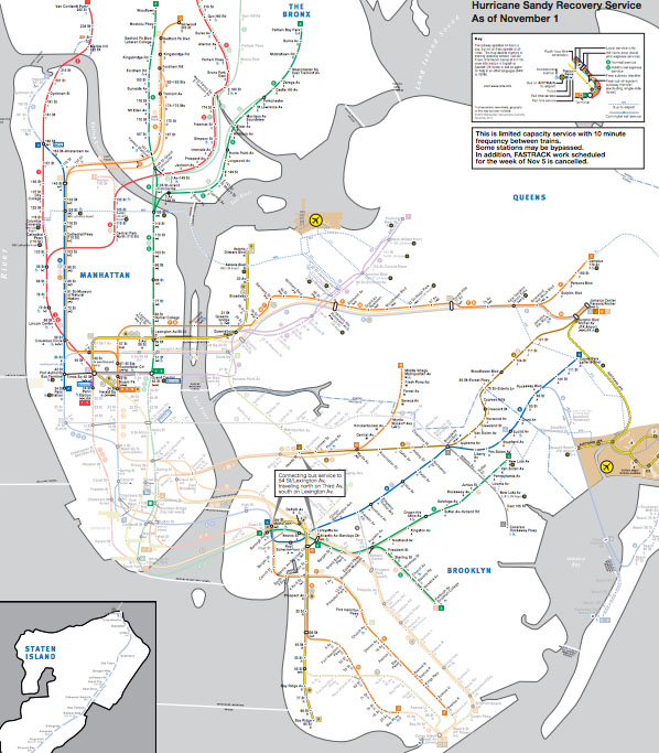
New York City ghosted lines subway map

New York City subway map
New York City subway map with all of the lines ghosted in

Not back to normal

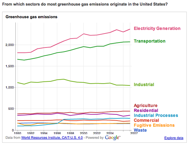
For those of you living in New York, the subway map is probably familiar to you. For those who are not here, but are listening to reports, I thought I would post the maps to illustrate that the subways are not back to normal. The national broadcasts I listen to keep mentioning that the subways are coming back, which is true, but Sandy essentially knocked the center out of the network. What was once one network is now two networks with very strange structures. They connect, if at all, not through their abdomens like spiders’ legs, but at the very ends of their extremities and there is no recognizable abdomen.

The storm also knocked out some specific edges of the network, like the end of the A train that ran past JFK and into the Rockaways. Note to travelers: The New York City subway is no longer connected to JFK airport.

As of this morning, I am hearing different reports about the 7 train in Queens. It might be running to the connection with the F train according to WNYC, but the mta.info website does not yet reflect that change. I left the line partially ghosted in. There are no reports that the 7 train is running all the way into Manhattan.

Brooklyn

There is subway service between Queens and Manhattan but Brooklyn has been cut off almost completely.

Who visits occupywallst.org? | Harrison Schultz and Hector R. Cordero-Guzman

What works

The graphic above was constructed using 5,006 surveys filled out by people who visited occupywallst.org. Here’s what the survey found:

Gender
Men 61%
Women 37.5%
Other 1.5%

Age
45 y/o 32%

Race/Ethnicity
White 81.4%
Black, African American 1.6%
Hispanic 6.8%
Asian 2.8%
Other 7.6%

Education
H.S. or less 9.9%
College 60.7%
Grad. School 29.4%

Annual Income
$50,000 30.1%

Employment
Unemployed 12.3%
Part-time 19.9%
Full-time 47%
Full-time student 10%
Other 10.7%

Politics
Support the protest 93%
———————
Republican 2.4%
Democrat 27.4%
Independent 70.7%

What needs work

I have two issues. First, I think the graphic is beautiful but functionally useless. It is nearly impossible to get any intuitive sense of anything at a glance. The circular shape forces the categories to come in the order of their popularity which is not always the most logical order. Look at the income data. That should come in order of least income to most income, but it doesn’t (why would anyone put incremental numerical data out of order?). The rounded sections of wedges are also nearly impossible to intuitively compare to one another in size, so I cannot figure out what the functional value of displaying demographic data in this modified pie chart is. In summary, it appears that the information part of the information graphic did not win the contest between aesthetics and utility. Remember: there should not be a contest between aesthetics and utility in the first place.

My second concern with this graphic is its overall reliability. The FastCompany article it accompanies is titled, “Who is Occupy Wall Street”. That title more than implies that this survey of visitors to a particular website associated with the movement – but not THE official website of the movement (there isn’t one) – accurately represent the protesters on the ground. I don’t think that the professor and his partner who conducted the surveys would make such grand claims.

References

Captain, Sean. (2 November 2011) Who is Occupy Wall Street? FastCompany.

Jess3. (2 November 2011) Who is Occupy Wall Street? [information graphic] FastCompany.

Figure 5. Average Salaries in New York City | Report 12, Office of the New York State Comptroller, Thomas DiNapoli

What works

This may not be the worldest most attractive graphic, but it makes its point: financial workers have much, much higher annual income than the rest of us and the gap is growing over time. The text of the New York State Comptroller’s report said the same thing in words.

Wages (including bonuses) paid to securities industry employees who work in New York City grew by 13.7 percent in 2010, to $58.4 billion. Nonetheless, wages remained below the record paid in 2007 ($73.9 billion), reflecting job losses. In 2010, the securities industry accounted for 23.5 percent of all wages paid in the private sector even though it accounted for only 5.3 percent of all private sector jobs. In 2007, the industry accounted for 28.2 percent of private sector wages.

In 2010, the average salary in the securities industry in New York City grew by 16.1 percent to $361,330 (see Figure 5), which was 5.5 times higher than the average salary in the rest of the private sector ($66,120). In 1981, the average salary in the securities industry was only twice as high as in all other private sector jobs.

You be the judge. I think the graphic leaves a greater impact than the text alone. The two together are striking. Maybe we should…occupy Wall Street to demand a decrease in inequality?

The short report has a few more interesting graphs. First, they throw together a quick graph of Wall Street bonuses. These bonuses are tied to performance and so big that they often represent more than a finance worker’s annual salary. As you can see, they took a dip, but they didn’t disappear even though the US economy is still not great.

Wall Street Bonuses | New York State Comptroller's Report No. 12, 2011

The other interesting metric the report contains is a compensation-to-earnings ratio graph, which is the right context for this discussion. Bankers often defend their large salaries and even larger bonuses by pointing out how much money they have made for their banks. I agree with the bankers that this is the place to look. The question should not be: “How much are individual bankers making?” Rather, it should be, “How much does the banking sector make and is that the way we as a society want to distribute our surplus, primarily to banks and bankers through processes of financialization?”

Ratio of banker's (and insurer's) compensation-to-net-revenues | New York State Comptroller's Report No. 12, 2011

What needs work

The graphs are not attractive and the first one reads as cluttered. I generally go with line graphs for this kind of trend data to cut down on the clutter impact, something I have repeated again and again so I won’t hammer on that point too much. I like the information behind these graphs so I am not going to swat at them too much. Excel is not a graphic design tool for graphs; I have occasionally made some sweet tables with it.

I’m glad the report put these data points into graphs, glad that the report is available during the discussions brought on by the OccupyWallStreet crowd, and glad that the New York State Comtroller’s office rolled right on ahead with the release of some fairly damning evidence against the status quo.

Want more?

Another Society Pages blog, Thick Culture, ran a post including graphs that deal with the compensation and wealth differentials between the tippy-top echelon of financiers and the rest of us at Tax Gordon Gekko.

References

DiNapoli, Thomas and Bleiwas, Kenneth. (October 2011) “The Securities Industry in New York City” Report No. 12, Office of the State Comptroller.

See also: A blog I wrote – Americans estimate our wealth distribution and fail. Horribly. using a Dan Ariely graphic about how bad Americans are at estimating the distribution of wealth in this country. Teaser: we think it is much more equitable than it actually is.

The most popular blog post of all time on Graphic Sociology: Champagne Glass Distribution of Wealth

New York mapped by geotagged photos

Just thought this was cool

This map of New York was created by Eric Fisher. He gathered the geotags of the photos uploaded to flickr. The colors work like this: blue photos were taken by locals (deemed to be local because they had taken pictures in the same location over an extended period of time), red indicates photos taken by tourists (people taking photos outside of their frequent-photo-taking-zone), and the yellow ones were indeterminate (taken by people who hadn’t uploaded any photos in the previous 30 days though we guess they might be tourists because they may be the kind of people who only take photos while on vacation).

I like the aesthetic and the method so that’s why I decided to share.

Greenhouse gas emissions graph
Greenhouse gas emissions | World Resource Institue and Google's Public Data Explorer

What works

The World Resource Institute has partnered with Google to create an interactive portal for creating visualizations based on publicly available data. Google has been in the business of doing this sort of thing at least since the time they acquired Trendalyzer from Scottish-based gapminder.org in 2007. To be sure, gapminder.org is still a going concern of its own and IBM also offers free web-based visualization services through their Many Eyes program.

The focus of the trendalyzer is to show change over time and they succeed in making it quite easy to watch panel data change over time.

What needs work

BUT…I find that this particular graphic is a great example of a misleading reliance on time as the key ‘context’ variable. So the graphic above breaks down greenhouse gas emissions by US state over the course of the year. If you have already clicked over to the World Resource Institute and watched the animation of these bars pumping up and down (more up than down) and trading places with each other over time, you will surely have been fascinated. I watched it three times in a row. But I was stuck wondering what the take away was meant to be. Clearly, there is the first order take away that the bars pretty much grow over time, they do not shrink. If I were the World Resource Institute, getting that message out would be important to me. But I would hope for more than just the bullhorn approach, “More is BAD! More is BAD!” which is kind of how this hits me at the moment.

One of the biggest problems with this graphic is: not all US states are the same size. Of course Texas emits more greenhouse gases than most states – many more people live there than in, say, Kentucky, Iowa, Oregon, etc. But the World Resource Institute chose to display per capita emissions with the bubble approach (which has almost no redeeming value in my opinion because I cannot even see half of the bubbles. Maybe they all could have been reduced by half or more? And maybe instead of going with colors on a spectrum, the worst could have been red, the best could have been green, and most everyone else could have been some shade of grey? It’s just not possible to hold 50 changing variables in your active cognitive space at once. Reducing it to three variables – the good, the bad and the mediocre – could actually increase retention and pattern recognition.)

Greenhouse Gas Emissions Per Capita, US 2007
Greenhouse Gas Emissions Per Capita, US 2007 | World Resource Institute and Google

But back to the bar graph at the top. For the purposes of greenhouse gas emissions, it makes the most sense to interpret size as population not square miles, so that’s what I am going to do. In an attempt to be helpful, I threw together a bar graph of the top 10 most populous US states (using 2009 population estimates) in good old Excel. Note that our friend Texas is not the most populous state by about 12 million people – that is a lot of people. California is the biggest and they emit way less than Texas. New York is the third most populous state and we emit far less than our proportional share would suggest. Let’s hope it stays that way because I already find it unpleasant to breathe the air in Manhattan (admittedly, that could be due to many causes besides greenhouse gas emissions).

Most populous US states by size

My suggestion here is clear: prepare a bar graph per state, per capita. And, yes, I would want to see how that changes over time. I would probably watch the animation six times instead of three times. My fantasy is that we could compare not necessarily by state, because that is in many ways arbitrary, but by personal habits. Say we get the most extreme environmentalists – vegan, freegan, won’t even take motorized public transportation, never flies, prefers candles to compact fluorescents, has a composting toilet – to the somewhat average person who has a car but not an SUV, eats meat but not every day, does not pay more for organic food – to the extreme non-environmentalist who owns three houses, drives in an Escalade or something of that nature, flies internationally at least four times a year, pays extra for organic food (but at restaurants), and sends clothes to the dry cleaners twice a week. But that would probably result in a graphic best described as “info-porn”, enticing and exciting but intellectually vacuous.

Summary

The WRI is on to something with their Google partnership. My favorite of their early work is this line graph that does a better job of telling the emissions story than any data broken down by state.

greenhouse gas origins
Greenhouse Gas Origins | World Resource Institute and Google

But the other great thing about the new partnership is that they ask for suggestions and set up a google group to manage the roll-out and incorporate nay-sayers like myself.

“By pairing [the Climate Analysis Indicators Tool] CAIT data with Google’s tools, there are new possibilities for people everywhere to take part in using sound data to tell stories that frame environmental problems and solutions. In the future, we hope to include additional data sets that can tell even more stories through Google’s visualization tools.

Suggestions for what you would like to see, or have a question about CAIT-U.S. data? Let us know here or join the conversation at http://groups.google.com/group/climate-analysis-indicators-tool.”

Manhattan traffic patterns
Manhattan traffic patterns | Wired Magazine June 2010

What works

The tendency with geographical data is to try to find a way to portray everything on a map. Surely, there is a map up there, and many people will recognize that the area is Manhattan instantly by looking at the map before they read it in the title. That’s a nice thing about maps – they transcend language and bad captioning to some degree. However, much of the detail is not to be found in the map. The map just shows us where congestion tends to occur, but it doesn’t tell us when we can expect these areas to be congested or just what “congested” means. In Manhattan, the average speed is under 10 mph so does congested mean less than 5 mph? Or what?

But if we look at the other graphs and charts it is a veritable jackpot of traffic information, at least at the collective level. I wouldn’t try to use this collection of information to plan your route through the city unless, of course, this collection of information causes you to take the subway instead of driving.

I hate pie graphs (as in the “Proportion of Miles Traveled”), but I am sympathetic to the triangulated pie graphs in the “Vehicle Distribution” graphic. At least it is visually easier to calculate the volume of a true triangle than a rounded off triangle. So if you find that you have to go with a pie graph, emulate the triangulated version found here and your viewers will come away with a better understanding of the information you are attempting to convey. I was surprised at how many people take taxis to get to work. But I am even more surprised at how many fewer trips there are on weekends. Fewer than half of those made on an average weekday.

Anecdotal evidence warning: When I first moved to Manhattan, I remember sitting in the car for two hours to drive around the block. There was a street fair nearby (not on any of the sides of the block traversed in this trip) and that seemed to slow everything to a standstill.

What needs work

I would have found a way to combine the average speed and the delays and associated costs. Clearly, the two are related – lower average speed must mean more delays. I had a little trouble understanding the delays and associated costs without the text from the article. If the speed and costs had been integrated into a single graphic instead of split into two (with a big pie graph in between), I think the link between speed, delays, and costs would have started to become more intuitive.

Here’s an excerpt from that section for the curious:

“In the end, Komanoff found that every car entering the CBD causes an average of 3.23 person-hours of delays. Multiply that by $39.53–a weighted average of vehicles’ time value within and outside the CBD–and it turns out that the average weekday vehicle journey costs other New Yorkers $128 in lost time.”

For more on how that was calculated, you’ll have to read the article. But the bottom line came down to a proposed $16 toll to enter Manhattan below 60th Street. It’s about what drivers in central London pay and the proceeds would go to bolster public transportation. Such an idea – known as congestion pricing – was proposed by the Bloomberg administration but voted down in 2008.

References

Salmon, Felix. (June 2010) “The Traffic Cop.” in Wired Magazine [infographic by Pitch Interactive].

Bonanos, Christopher. (17 December 2007) “Fare Enough” New York Magazine.

Conquest of Pestilence | Courtesty of New York City Dept. of Health via Glaeser

What works

Ah, old-timey graphics. What works here is that this graphic reveals how far we’ve come, I think. The purpose is to show what percentage of New York City’s population died, annually. We can see the trend jumps around a bit – infectious diseases cycle through, sanitation improvements are made, the demographics of the population change – but mostly trends downwards. I like the inclusion of information about deadly diseases though I wouldn’t have just stuck labels on the peaks. The labels here clutter up the graphic territory and do not leave any room for adding other kinds of helpful trendlines and so on like that.

What needs work

Of course, there is not nearly enough context to make proper sense of this information. The implication is that the general downward trend is due to public health improvements, so of course the spikes are all labeled with diseases. I do not dispute that people were dying from cholera or typhus, I just want to hear more about what might have been causing people to LIVE (rather than just seeing what was causing them to DIE). What about demographic changes that shifted the population towards and then away from a preponderance of new immigrants? From young babies to slightly older people (who used to be at risk of death more than children and adults)? What of other changes (like, say, improvement in building codes that made the Triangle Shirt Waist Fire an anomaly rather than one of many similar situations)? What about income levels? The assumption is that as income rises, death rates drop, but I’d like to see that represented because it’s unclear just how rising income is linked to public health measures. Are we healthier because our increased contributions to the general fund (through taxes) go to support public health? Or is there simply something about being richer – either as individuals or as a collective – that leads to better health independent of the direct funding of public health?

More to come on Time Lines

I’m working on timelines this week but I want to create something new rather than just talking about existing ones which is going to take me some time. It will be a group effort, I strongly encourage you to send in your favorite time lines, your least favorite time lines, and comments about the time line I put together once I’ve got it posted.

Thanks much.

References

Glaeser, Edward. (22 June 2010) The Health of the Cities in The New York Times, Economix blog.

New York City Department of Public Health. [the image]

Private/Public: Rethinking design for the homeless
Constituency Chart

What works

What Terri Chiao and Deborah Grossberg Katz from Columbia University’s GSAPP design school have done is come up with a way to represent percentages using a flow-chart. Not only is it creative in the sense that this sort of data rarely gets displayed this way, but it helps turn the data into a narrative. In order to figure it out, the viewer quite literally has to reconstruct a story that sounded something like this in my head: “The population they are concerned about has 40% of people already experiencing homelessness with another 60% at risk of homelessness. The folks who are already homeless are the only ones living on the street, but really, 75% of already homeless people live in shelters. As for the at-risk-of-homelessness people, 60% live with family or friends. Twenty-five percent of the at-risk population owns their homes … why, then, are they at risk of homelessness? Both the at-risk and already homeless groups have far more families than single folks. And what does it mean to be homeless in jail/prison? That you aren’t sure where you will go when you exit? Somehow I feel like that could describe a lot of the prison population. And what about half-way houses? Those still exist, right?”

The flow-chart concept is not typically used to describe the breakdown of percentages and what works here is that it forces the viewer to walk through the narrative. As a pedagogical maneuver, it’s quite successful. Because of the way the information is presented, it invites questions in a way that a pie chart or a bar graph may not. It’s also a little harder to interpret. Graphics that invite questions often are a bit more challenging to ingest, not quite so perfectly sealed as other more common strategies might appear.

What needs work

I spent a good deal of time looking at this chart trying to figure out what the blue means. I still don’t understand what the blue means.

I also would like to see on the graphic some explanation of how they determined who was at risk of being homeless. Because when I got to the section of the flow-chart that showed how many of the at-risk population owned their homes, I began to get confused. By ‘own home’ do they not mean actually owning the home, but renting it or paying a mortgage on it? And if they do mean that folks actually own their homes outright, how can they be at risk of homelessness? Is the home about to be seized by eminent domain to make way for Atlantic Yards? At risk of being condemned (I hope NYC doesn’t have so many properties at risk of condemnation)? I’m sure if the makers of the graphic ever find their way to this page they will be upset because ‘at-riskness’ is described in the paper. But in life online, stuffing a little more text into the graphic is often a good idea because cheap folks like me will take the graphic out of context and whatever isn’t included will be lost. In this case, though, all is not lost. First, you can visit the blog on which I found this lovely graphic and get the whole story. But if you aren’t ready for all that, note that the authors define those who are at risk of homelessness as anyone who has spent some time in a shelter in the past year, regardless of whether they happened to have been homeless at the time of the survey.

Bonus Graphic

They also included the graphic below. I still don’t know what the blue means. This graphic does make it easier to understand that being truly homeless appears to mean running out of friends and family who have homes to share. Because none of the truly homeless live with family and friends. It’s also clear from both graphics that most homeless people are not visibly homeless. The folks you might see sleeping on the train or the street 1) may not be homeless, they could be sleeping away from home for reasons unrelated to homelessness per se and 2) if they are homeless, they may be quite different from the rest of the homeless population. They’re more likely to be single adults than families and more likely to be men than women.

Public/Private:  Project Sites
Public/Private: Project Sites

References

Chiao, Terri and Grossberg Katz, Deborah. (11 November 2009) “Public/Private: Rethinking Design for the Homeless” at Urban Omnibus.

New York City - Upper East Side [from envisioning development]
New York City - Upper East Side {from the Center for Urban Pedagogy, envisioning development project}
New York City - East Harlem [from envisioning development]
New York City - East Harlem {from the Center for Urban Pedagogy, envisioning development project}

What works

Please click through to see the full affordable housing map of the New York City metropolitan area. The images above were generated using their pdf generator, but the full flash version is simply better.

Maps are hot. They’re everywhere. I was at a final presentation last night and one of the students said, “I’m kind of a map geek”. I didn’t realize it was possible to be a map geek, but I’m starting to understand. It’s quite easy to present a map – maps have been in use for centuries and some of the oldies are still goodies. It’s not so easy to combine a map with social science data in a smart, legible way. Folks try all the time. These folks at the Center for Urban Pedagogy got it right. Their affordable housing map tool is a solid example of the capability and execution of interactive data.

Why?

The map itself has been stylized. All they want to show you is neighborhood boundaries and neighborhood names. Gone are street markings, terrain, unnecessary color, landmarks, subway stops, and so on. They’re going to add some layers and your eyes are going to be better off without excess detail at the level of the map. Plus, they’re helping you to understand that it isn’t possible to get more granular than neighborhood masses. You can’t use this map to look at property values by block or by proximity to a subway stop so there’s no reason to include the subway map or street markings.

This grey massing approach helps focus my attention (and hopefully yours) on the layer of information about income by neighborhood. This information IS in color. It is added as a layer on top of the map without obscuring the map. They’ve used a modified bar graph layout in which information is embedded in the x-axis itself. The y-axis is implied – that’s just fine here.

And it’s interactive. In a good way.

From a technical perspective, this site makes good use of Flash. It loads quickly and is responsive. Once a neighborhood is selected the bar graphs realign themselves with colored blocks flying in from cyberspace to construct the balance of income for that neighborhood. Note that this is enough movement to make the whole experience a little exciting, a little sparkly but it doesn’t take so long to load or run that you’ve lost interest before you’ve gotten through it.

Layers.

It is my pedagogical opinion that the best graphics encourage the viewer to formulate a question which is then answered. In this case, what we see first is a neighborhood map. The viewer has to pick a neighborhood before any of the juicy data is revealed. This is great. Now, say, we’ve picked the Upper East Side and we see a towering skyscraper-like bar graph way over in the “High Income” department. Our next step can either be to compare to nearby neighborhoods, by clicking on East Harlem to the north, or to add the information about housing prices. The title is “What is affordable housing?” so clearly this is what the designers hope you’ll do. But they aren’t so impatient about it that they try to incorporate it into the first splash page.

References

Center for Urban Pedagogy. (fall 2009) Envisioning Development project. New York.

Diabetes rates in New York and the US

What Works

Contextualizing the story about diabetes in New York by including data at the national and global level is quite smart. Sticking with maps to tell the whole story lends consistency.

What Needs Work

Comparison maps like this are clearest when their scales are the same. I see no reason that they should be different or why the colors need to be different. In the sense that the scales, in fact, are different, I appreciate the choice to use different colors. At least there’s some visual indication that direct comparison between the maps is not a good idea.

With respect to the graphs, it appears that they are all the same, just different populations, but that is not the case. The city and national data shows prevalence rates but the global data shows mortality, not morbidity. Close readers can figure it out.

Relevant Resources

Kleinfield, N.R. (2006, 9 January) Diabetes and Its Awful Toll Quietly Emerge as a Crisis The New York Times.