health care

Cigarette Tax, Washington State

What Works

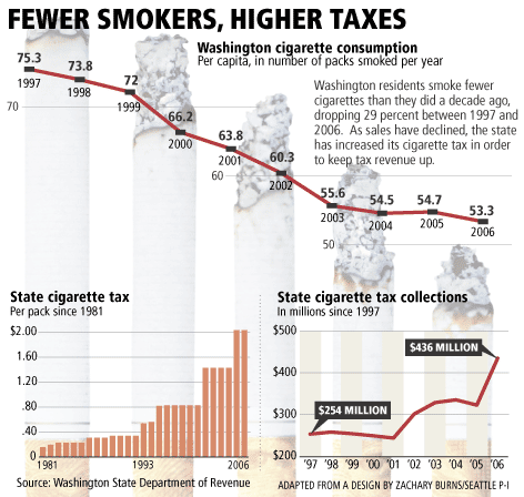
A simple overlay of graphs goes a long way to telling the story that as cigarette taxes increase, rates of smoking decrease. At the deli where I buy snacks, the cost of a pack is $12. Ouch. The reason raising taxes works so well in this situation is that it tends to prevent teens from starting to smoke in the first place because they are relatively poor and cannot afford to support an addiction causing habit. If they don’t start as teens, they are far less likely to start later in life when they might have more disposable income. Increasing tax rates works when it comes to causing a decline in smoking rates, but it might not work in causing other sorts of macro-behavioral changes, at least not over the long run.

Clearly, because we are looking at tax rates and prevalence rates, the two graphs could not share scales. I probably would have gone for either all line graphs or all bar graphs – I don’t like to mix it up for no good reason.

What Needs Work

Not sure I like the use of burning cigarettes as bars, or at least not these ones. Too cartoon-y for a serious subject.

Relevant Resources

Good Magazine (2008) Up in Smoke Interactive Graphic.

Virgin, B. (2007, 6 March) A taxing problem in anti-cigarette age Seattle PI.

Diabetes rates in New York and the US

What Works

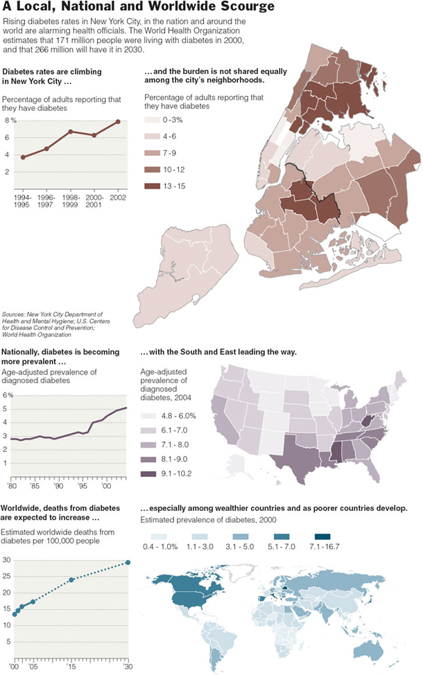
Contextualizing the story about diabetes in New York by including data at the national and global level is quite smart. Sticking with maps to tell the whole story lends consistency.

What Needs Work

Comparison maps like this are clearest when their scales are the same. I see no reason that they should be different or why the colors need to be different. In the sense that the scales, in fact, are different, I appreciate the choice to use different colors. At least there’s some visual indication that direct comparison between the maps is not a good idea.

With respect to the graphs, it appears that they are all the same, just different populations, but that is not the case. The city and national data shows prevalence rates but the global data shows mortality, not morbidity. Close readers can figure it out.

Relevant Resources

Kleinfield, N.R. (2006, 9 January) Diabetes and Its Awful Toll Quietly Emerge as a Crisis The New York Times.

Simple SIR model - Epidemic Spread

What Works

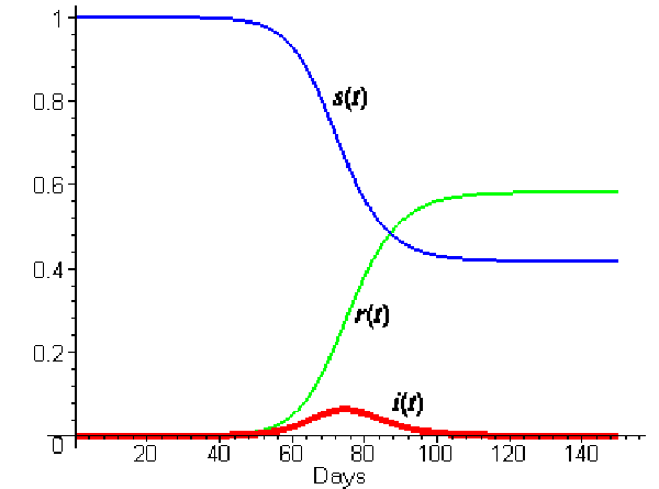
The relationship between infectious agents and the host populations is a tricky one, with three-parts at the very least. In order to understand how they relate, it helps to visualize what could otherwise be spelled out. In this graph, s(t) represents the proportion of the population who is susceptible (ie unexposed) to the infectious agent, r(t) represents the recovered population, and i(t) represents in the infected population – all are varying over time. You can see that everyone starts out susceptible, but slowly that proportion drops, though it doesn’t drop to zero. Some portions of the population are likely to remain uninfected. Note that the exact shape and inflection of these trend lines will depend on the particulars of the infectious agent – fatal agents have models that look different from non-fatal agents, long latency periods model differently than short latency periods.

Note the the peak of the i(t) trend will come before the crossover of the recovered and susceptible trends, as it does in this case. As soon as the derivative of the infection rate becomes negative, more people will have recovered than are susceptible and those two trend lines will intersect. I love this sort of graph.

What Needs Work

I would love this graph a whole lot more if it had a legend and applied to some specific disease. That’s mostly my fault.

Centers for Disease Control - Current Contraceptive Use of Women 15-44 years old

What Works

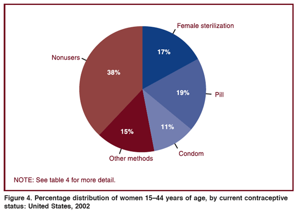
Pie charts are quick and (too?) clean, in my opinion. Their beauty lies in their ability to make data legible – everything will add up to 100%. It’s a world without outliers or oddities and it fits neatly in a perfect circle. Because of this neatness, pie charts can be visually pleasing – I’m not suggesting this one achieves beauty, but the potential is there.

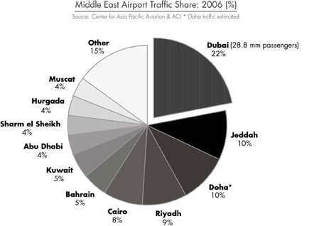
In fact, I’m including this gray scale pie chart that shows the share of airport traffic into the Middle East by city as an exemplar of a beautiful pie chart. One smooth swipe of a gradient.

Share of traffic into the Middle East by city
Share of airport traffic into the Middle East by city

What Needs Work

Pie charts either result in some kind of large residual category – like this one where “other methods” is clearly some kind of residual and accounts for more users than condoms. Interesting to me, the non-users category is also a bit of a catchall. In that 38% there are all sorts of different kinds of non-users. There could have been a 9.5% wedge for women who are either pregnant or trying to get pregnant. On the one hand, this is kind of a no-brainer: of course there are women who are trying to get pregnant. But honestly, I had forgotten all about that category when looking at this graphic because its caption tells me that I am supposed to be thinking about contraceptive users.

The other thing that this presentation obscures is the gender disparity in sterilization rates. We see that 17% of the women in the 15-44 year old age bracket are using sterilization as a contraceptive method. But how many men are sterilized? As a medical procedure, it is easier for a man to have a vasectomy than for a woman to have tubal ligation. Following that logic, one might assume that men are more likely to be sterilized than women, especially because some vasectomies can be reversed. Tubal ligations cannot be reversed. To their credit, they do include a table in the appendix that shows the rates of male sterilization in 1992 (6.1%), 1995 (7%), and 2002 (5.7%). Somewhat illogically then, rates of male sterilization are far lower than rates of female sterilization. What is happening here likely has something to do with the cultural construction of masculinity – male sexual activity following sterilization is likened to “shooting blanks” whereas I can think of no similar term for women (caveat: post-menopausal women might be referred to as “dried up” but this term is not typically used to reference sterilization).

Relevant References

Dudgeon, M.R.; Inhorn M.C. (2003 January) Gender, Masculinity, and Reproduction: Anthropological Perspectives International Journal of Men’s Health Vol. 2 No. 1. Harriman, TN: Men’s Studies Press.

Mosher, W.D.; Martinez, G.M.; Chandra, A.; Abma, J.C; and Willson, S.J. (2004, December 10) Use of Contraception and Use of Family Planning Services in the United States: 1982–2002 Advance Data from Vital and Health Statistics, No. 350. US Department of Health and Human Services, Center for Disease Control, National Center for Health Statistics.

Cost of War in Dollars - Absolute and Relative

Cost of War in Dollars

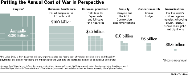
This graphic is what I like to call a politico-chart. It appears to represent brute facts but is, in fact, rather political in nature. Granted, I may tend to agree with the premise that it is better to save lives (health care) than to kill people (war) and thus a comparison between the cost of warfare and the cost of health care is relevant. But as the author (David Leonhardt) of the article accompanying this chart pointed out, it is cognitively challenging to make sense out of a trillion of anything. A trillion dollars, a trillion grains of sand, a trillion beats of a drum. Humans brains weren’t designed for that and we tend to resort to thinking in logarithmic scales somewhere upwards of 10,000. Thus, a trillion starts to seem a lot like a billion or even a million. This is all a long winded way of saying that it is very difficult to tell what is happening with this trillion dollars. Some goes to develop weaponry, but a good deal of it goes to pay for the health care costs of returning veterans which is a lot like the universal health care block that, in this graphic, looks like something totally different.

In trying to figure out just what went into this calculation of $1.2trillion, I’ll point you to the text of the article, where Leonhardt tries to break it down. He writes, “My own estimate falls on the conservative side, largely because it focuses on the actual money that Americans would have been able to spend in the absence of a war. I didn’t even attempt to put a monetary value on the more than 3,000 American deaths in the war.
Besides the direct military spending, I’m including the gas tax that the war has effectively imposed on American families (to the benefit of oil-producing countries like Iran, Russia and Saudi Arabia). At the start of 2003, a barrel of oil was selling for $30. Since then, the average price has been about $50. Attributing even $5 of this difference to the conflict adds another $150 billion to the war’s price tag, Ms. Bilmes and Mr. Stiglitz say.
The war has also guaranteed some big future expenses. Replacing the hardware used in Iraq and otherwise getting the United States military back into its prewar fighting shape could cost $100 billion. And if this war’s veterans receive disability payments and medical care at the same rate as veterans of the first gulf war, their health costs will add up to $250 billion. If the disability rate matches Vietnam’s, the number climbs higher. Either way, Ms. Bilmes says, “It’s like a miniature Medicare.”

While we’re thinking about war, and noting that Leonhardt looked only at the dollars, not the lives, we turn to a couple guys who did look at deaths, albeit long before the war was over. So take the next graphic with a stale, dated grain of salt.

Cost of War in Lives

Cost of War in Bodies

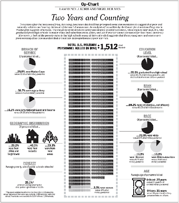
This chart attempts to stack up the dead in a blackened central column. It reminds me a little of the way John Snow stacked up his dead when mapping cholera’s progress on Broad Street. I like it overall, my biggest complaint is that the reference category for all these figures is military personnel. These folks are out there dying for the whole country, not just the military, so I think it makes more sense to compare them to the entire US population. Maybe they could show both the comparison to the rest of the military and the comparison to the entire nation.

I would also like to point out that this graphic was a collaborative effort between four people: Lawrence J. Korb, senior fellow at the Center for American Progress, former assistant secretary for manpower at the Department of Defense, Rajeev Goyle and Max Bergman, also of the Center for American Progress, and Nigel Holmes who is a graphic designer. The moral of the story is that even with great data, a great graphic design is not just going to spring forth. Graphic design skills are key and need to be credited. Nigel Holmes has been published all over the place and is fairly prominent, but younger graphic designers find it harder to get credit for what they do. So if you ever enlist the services of a graphic designer, please give him or her credit. [And as a practical point, please allow enough time for him or her to do a good job and go through a few iterations. Producing a final design is a lot like getting to the final draft of a paper – it takes a good deal of back and forth.]

Relevant Resources

Center for American Progress.

Holmes, Nigel. Professional website.

Leonhardt, David. (2007, 17 January) What $1.2trillion can buy in The New York Times Business Section.

Korb, Lawrence and Holmes, Nigel. (2005, 20 March) Op-Chart: Two Years and Counting. and the graphic.

Top 10 States by HIV Rate 1987 and 2007 (CDC data)

Top 10 States by HIV rate - modified

What Works

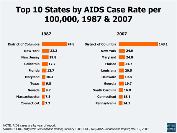
This data could easily have been thrown into a table – the bars make it a graphic. It is more visually interesting and instantly legible than a table, but are the bars enough?

What Needs Work

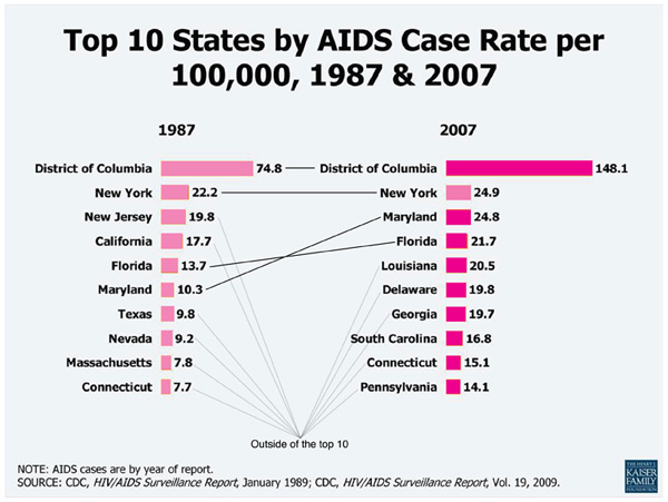
Most of the states on the top ten list in 1987 are not still on the list in 2007. That’s the most interesting part for me, and I would like the graphic to address that somehow — either by focusing on the four states that stayed on the list or by making sure it’s easy to see just how much movement there is on and off. What did the states at the top of the list in 1987 have in common? What about the states at the top in 2007? It appears that having a high percentage of the state living in urban areas makes some kind of difference but the graphic doesn’t give any clues at all about what is going on to get on or off the top ten list. Quite honestly, it doesn’t make sense to talk about the top ten states by HIV rate. It just doesn’t. That’s what the graph tells me.

I did try my hand at nudging the graphic in the right direction with the pink barred example. I don’t know if those converging lines pointing to somewhere outside the top ten help viewers to key into the large amount of movement on the list, but that is what I was thinking.

In the end, it would be better to go back to the data and come up with a more thoughtful analysis than to alter this graphic. The moral of the story is that the graphic can only be as helpful as the underlying data and the logic of the analysis.

Relevant Resources

CDC HIV Report – 2007

Centers for Disease Control. (2008) HIV/AIDS in the US – Factsheet

Kaiser Family Foundation. Topic: HIV/AIDS Fast Facts – Slides

Crude Suicide Death Rate by Age Group - Canadian First Nations vs. All Canadians

What Works

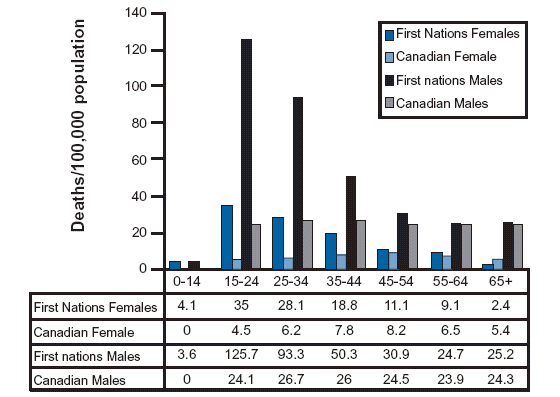
I went looking for information about suicide and American Indian populations because I know that this is one indicator of the mental and physical health of a population. There is written work on American Indians out there, but this was the best information graphic on the subject and it happens to come from Canada where the population in question is referred to as First Nations. I like it because it respects that there has been (and continues to be) a difference in the rate of male and female suicide victims. Women tend to attempt suicide more often; men tend to be more successful in their attempts. I like it because it shows that the teen years are the most dangerous years for First Nations members by continuing the analysis across all age groups. They could have just truncated the graph at age 35 or so, since they are primarily concerned with the teen years, but instead they show the entire range of age cohorts. The viewer has to pick up on the fact that the difference between suicide rates of First Nations vs. all Canadian populations is most during the teen years and then falls off so dramatically that there is hardly any difference in old age. When viewers have to figure things out for themselves they are more likely to remember and trust those insights. I like that the tabular data is appended below the graph.

What Needs Work

Bar graphs are best when they are simple and this one is beginning to move away from simple. There are four bars for each cohort – it’s still legible, but it’s becoming hard to grasp the message at a glance with all those comparisons going on at once.

Relevant Resources

The North American Aboriginal Two Spirit Information Pages University of Calgary

<a href=
New Jersey Commission on Rationalizing Health Care Resources
Hospital Pricing Graph - SF Bay Area originally published in Health Affairs by Uwe Reinhardt

What Works

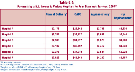
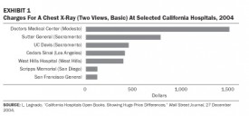
This comparison is a fairly straightforward examination of the relative merits of tables vs. charts.  Both of these images are trying to help explain the tricky business of health care pricing.  The bar graph comes from an article in Health Affairs by Uwe Reinhardt that starts by taking a look at the cost of a single procedure across hospitals within a small sample of hospitals in the state of California.  The table does the same sort of thing but it was written by the New Jersey Commission on Rationalizing Health Care Resources so it looks at hospitals in New Jersey.  It also looks across a number of treatments, not just one.

Each of these presentation styles has its merits.  The graph is an instantly legible message:  the cost of a chest X-ray varies a lot from one hospital to the next.  The table doesn’t have the same instant legibility but it provides much more detail across a range of treatments, demonstrating that the pattern of discrepant charges is not restricted to a single treatment.  Further, the table demonstrates a pattern – the relative cost of hospital treatments is fairly stable.  If a hospital charges at the low end for one treatment, it probably charges at the low end for all treatments.

What Needs Work

The bar graph does a good job of providing instant legibility but it doesn’t give much detail.  It works in the introduction of the paper to orient the reader but would not be nearly as useful in the results section because it shows only one treatment.

The table provides a lot of detail, but unless someone is already deeply interested in the problem of health care costs, they may not take the time to read it. No patterns are immediately obvious – it’s just a boxy sea of numbers. The presentation of the table as a graphic does little to help the eye.  At least the columns are arranged from lowest payment to the greatest payment.  They might have been made more visually legible if the font increased or the boxes got progressively darker as payment values increased down the columns.

Relevant Links

Chaos Behind a Veil of Secrecy in Health Affairs by Uwe E. Reinhardt

How Do Hospitals Get Paid – A Primer” on Nytimes.com Economix blog  by Uwe E. Reinhardt

New Jersey Commission on Rationalizing Health Care Resources, Final Report 2008 by the State of New Jersey Department of Health and Senior Services