

Cost of War in Dollars
This graphic is what I like to call a politico-chart. It appears to represent brute facts but is, in fact, rather political in nature. Granted, I may tend to agree with the premise that it is better to save lives (health care) than to kill people (war) and thus a comparison between the cost of warfare and the cost of health care is relevant. But as the author (David Leonhardt) of the article accompanying this chart pointed out, it is cognitively challenging to make sense out of a trillion of anything. A trillion dollars, a trillion grains of sand, a trillion beats of a drum. Humans brains weren’t designed for that and we tend to resort to thinking in logarithmic scales somewhere upwards of 10,000. Thus, a trillion starts to seem a lot like a billion or even a million. This is all a long winded way of saying that it is very difficult to tell what is happening with this trillion dollars. Some goes to develop weaponry, but a good deal of it goes to pay for the health care costs of returning veterans which is a lot like the universal health care block that, in this graphic, looks like something totally different.
In trying to figure out just what went into this calculation of $1.2trillion, I’ll point you to the text of the article, where Leonhardt tries to break it down. He writes, “My own estimate falls on the conservative side, largely because it focuses on the actual money that Americans would have been able to spend in the absence of a war. I didn’t even attempt to put a monetary value on the more than 3,000 American deaths in the war.
Besides the direct military spending, I’m including the gas tax that the war has effectively imposed on American families (to the benefit of oil-producing countries like Iran, Russia and Saudi Arabia). At the start of 2003, a barrel of oil was selling for $30. Since then, the average price has been about $50. Attributing even $5 of this difference to the conflict adds another $150 billion to the war’s price tag, Ms. Bilmes and Mr. Stiglitz say.
The war has also guaranteed some big future expenses. Replacing the hardware used in Iraq and otherwise getting the United States military back into its prewar fighting shape could cost $100 billion. And if this war’s veterans receive disability payments and medical care at the same rate as veterans of the first gulf war, their health costs will add up to $250 billion. If the disability rate matches Vietnam’s, the number climbs higher. Either way, Ms. Bilmes says, “It’s like a miniature Medicare.”
While we’re thinking about war, and noting that Leonhardt looked only at the dollars, not the lives, we turn to a couple guys who did look at deaths, albeit long before the war was over. So take the next graphic with a stale, dated grain of salt.
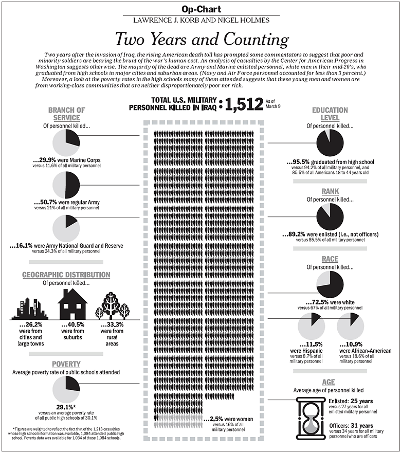
Cost of War in Bodies
This chart attempts to stack up the dead in a blackened central column. It reminds me a little of the way John Snow stacked up his dead when mapping cholera’s progress on Broad Street. I like it overall, my biggest complaint is that the reference category for all these figures is military personnel. These folks are out there dying for the whole country, not just the military, so I think it makes more sense to compare them to the entire US population. Maybe they could show both the comparison to the rest of the military and the comparison to the entire nation.
I would also like to point out that this graphic was a collaborative effort between four people: Lawrence J. Korb, senior fellow at the Center for American Progress, former assistant secretary for manpower at the Department of Defense, Rajeev Goyle and Max Bergman, also of the Center for American Progress, and Nigel Holmes who is a graphic designer. The moral of the story is that even with great data, a great graphic design is not just going to spring forth. Graphic design skills are key and need to be credited. Nigel Holmes has been published all over the place and is fairly prominent, but younger graphic designers find it harder to get credit for what they do. So if you ever enlist the services of a graphic designer, please give him or her credit. [And as a practical point, please allow enough time for him or her to do a good job and go through a few iterations. Producing a final design is a lot like getting to the final draft of a paper – it takes a good deal of back and forth.]
Relevant Resources
Holmes, Nigel. Professional website.
Leonhardt, David. (2007, 17 January) What $1.2trillion can buy in The New York Times Business Section.
Korb, Lawrence and Holmes, Nigel. (2005, 20 March) Op-Chart: Two Years and Counting. and the graphic.
Comments 2
Alessandra — March 17, 2009
I recently came across your blog and have been reading along. I thought I would leave my first comment. I don't know what to say except that I have enjoyed reading. Nice blog. I will keep visiting this blog very often.
Alessandra
chuk — March 23, 2009
That poverty indicator is confusing.