health

Global smoking rates by gender chart
Global smoking rates by gender | The Lancet via The Economist Daily Charts

What works

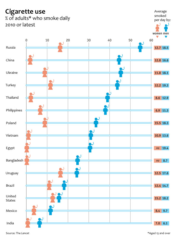
The Economist put together an infographic using data from a study published last week in The Lancet collected by an impressively large team of researchers from three different institutions in three different countries (The World Health Organisation, America’s Centres for Disease Control and the Canadian Public Health Association). The article in the Lancet has much more detailed data about all sorts of smoking traits that did not make it into this chart, but the chart succeeds in portraying two gendered vectors of smoking behavior: the different rates of smoking between men and women and the difference in the number of cigarettes smoked between the two genders.

Globally speaking, it is safe to say that smoking is a masculine activity. There is no country in which more women than men are smokers. That particular take-away is made extremely clear in the chart. Just a glance is enough exposure to the data to absorb the idea that smoking is somehow masculine.

What needs work

The graphic designers at the Economist try to expand on the notion that smoking is “somehow masculine” by layering another set of findings onto the basic rates of smoking by men and women. Way off to the right they have what is essentially two columns of a table that report the average number of cigarettes smoked by men and women. My fuzzy and addled brain wants this little table to be more like a bar chart in which the length of the bars corresponds to the number of smokes. Countries where smoking rates are highest would have longer bars. Countries where smoking rates are low would have shorter bars. Visually, the impact would increase dramatically if the size of the bar corresponded to the amount of cigarettes smoked.

Importantly for the point about the gendered nature of smoking, we could see another way in which smoking is gendered by looking at how many cigarettes are smoked by each gender. Some countries have dramatic differences: in Russia and Turkey men smoke about 1.5 times as many cigarettes as women. This is a marked contrast to the other end of the spectrum where in India, women who smoke (and there are very few women who smoke in India), smoke 7 cigarettes per day while the smoking men only smoke 6.1 cigarettes per day. If that part of the graphic had been given more space, it would have been easier to quickly absorb that pattern. As it is, only a careful reading of that table yields insight; we might as well just look at the data in Excel.

The other change I would order up for this graphic is to make the blue horizontal bars that run the full length of the graphic a different color than the male icon. My best option would have been to make the horizontal bars grey and truncate them after the male icon. There’s no need for them to go all the way across and it makes the table slightly harder to read. I realize that changing the horizontal bars to grey would then give the whole table a gridlike look due to the presence of the vertical bars. I would just shorten the vertical bars to tick marks at the top and tick marks at the bottom (it is a tall chart so tick marks only at the top or only at the bottom would be invisible to people who have to scroll to see the whole graphic).

I like the coral color used for the female icons. I would have turned the men navy because coral and navy are complimentary colors and look especially good together.

I wasn’t able to add the bar graphs out to the side or to fully eliminate the baby blue, but I did make some of the changes I suggested on the jpg below for your viewing ease.

Remix of The Economist Daily Chart from 20 August 2012 - Puffed Out: Daily cigarette smoking by men and women

References

The Economist. (20 August 2012) Puffed Out: Daily cigarette smoking by men and women The Economist: Daily Charts. [graphic design]

Giovino, Gary, et al. (18 August 2012) Tobacco use in 3 billion individuals from 16 countries: an analysis of nationally representative cross-sectional household surveys. The Lancet, Volume 380, Issue 9842, Pages 668 – 679, doi:10.1016/S0140-6736(12)61085-X

Sleep-wake graph of Danielle Carrick's week, May 1st, 2012
Sleep-wake graph of Danielle Carrick’s week, May 1st, 2012 | via daniellecarrick.com

What works

This simple graph is visually nothing all that unique but conceptually it makes a very smart use of the bar graph trope to display information. Sleeping and waking hours are taken to be each other’s opposites (and are assumed to happen in unbroken spans – no daytime naps for Danielle).

What needs work

I might have toyed with placing the waking hours on top and the sleeping hours on the bottom. Or, better yet, I might have flipped the axis and put waking hours on the right and sleeping hours on the left. But that’s simply a matter of taste. Flipping the axis doesn’t change the concept.

Quantified self

As we see more and more applications and products that aim to reveal patterns about individuals to individuals, we’ll see more and more of ourselves reflected back to us in information graphics like this one. I’m curious to find out how the visualization of the data shapes the way people use the data.

There will slowly be more on the quantified self theme here.

References

Carrick, Danielle. (May 2012) “Week of May 1st | Sleeping” [infographic].

Food Price Mashup | Mark Bittman

What works

After looking at this graphic, I imagine most viewers come away thinking that fast food is more expensive than cooking at home, which was the intention of the accompanying opinion piece by Mark Bittman. The graphic succeeds in conveying visually just exactly the point that the article made using words.

The photographs are vibrant and catchy, bordering on food porn.

The sidebars feature the calorie counts for these meals in addition to the large price tags. The nutritional information graphs are useful for Bittman’s response to existing critics of the ‘cooking at home is better’ movement who have tried to argue that though fast food may be more expensive on a per meal basis, it is actually cheaper on a per calorie basis because fast food is so calorie dense (if a bit too heavily reliant on nutritionally vacuous fats and sugars). Bittman uses the nutritional information graphs to refute this claim and I applaud the graphic designer for including the rebuff of the critics in the graphic. It would have been easy enough to simply run the photos of the meals with their price tags.

What needs work

The photos take up too much space. This almost looks like an advertisement for McDonald’s, chicken, and beans.

The nutritional information bar graphs are potentially confusing. They do not measure absolutes so much as they show how each of the home-cooked meals stack up against McDonald’s. Since people are not used to thinking of their meals in comparison to what they would have eaten had they eaten at McDonald’s, I’m not sure the comparative nutritional graphs work as well as one graph that used absolute data and had all three meals on it. I am almost positive the graphic designer probably tried making just exactly that graph – if they are out there reading this I invite them to send me what that looked like to prove that my hunch to use a unified graph on this one would have been ugly, confusing, or just plain wrong.

References

Bittman, Mark. (24 September 2011) Is Junk Food Really Cheaper? New York Times, Sunday Review. Op-ed column.

Bittman, Mark. (20 September 2011) Cooking Solves Everything: How Time in the Kitchen Can Save Your Health, Your Budget, and Even the Planet [e-book] published by Byliner.

Loneliness and Fat Consumption among middle-aged adults | Cacioppo and Williams

What works

Written by a social neuroscientist, the book Loneliness contained this heartfelt graph on page 100. Yes, even I feel the phrase ‘heartfelt graph’ is an oxymoron. But the way that the graphic artist worked over the details here – the way the edges of the butter columns are rounded, the way that the paper is folded back, even the way that the grid lines are rendered makes this two bar graph captivating. I am also intrigued by the mix of digital and hand-rendered – most everything was hand-drawn except the axial numerals and the text labels. I like the mix. I probably would have liked it better if the lettering had also been hand-rendered but I think that’s just me being a bit too precious about hand-rendered images.

The book describes the way that loneliness is a neurological event, one that overlaps with social and psychological parameters to produce a more or less predictable set of occurrences. In this graph, authors Cacioppo and Williams are discussing recent findings that indicate lonely middle-aged adults tend to get more of their calories from fats than non-lonely middle-aged adults. For younger adults, loneliness does not seem to have an effect on either food consumption patterns or exercise patterns.

Socially contented older adults were thirty-seven percent more likely than lonely older adults to have engaged in some type of vigorous physical activity in the previous two weeks. On average they exercised ten minutes more per day than their lonelier counterparts. The same pattern held for diet. Among the young, eating habits did not differ substantially between the lonely and the nonlonely. However, among the older adults, loneliness was associated with the higher percentage of daily calories from fat that we noted earlier (and that is illustrated in Figure 6).

Perhaps because this book is about empathy-inducing loneliness, it is especially nice to see a tenderly hand-drawn graph rather than something far less engaging, the standard excel-produced item. The same numerical information would have been conveyed – and in fact that information was conveyed fairly well in the text itself – but the hand drawn element indicates that the topic is worthy of more than quantitative concern alone.

I am about halfway through this book and so far, I recommend it. Even if you are not interested in loneliness, the book does a good job of demonstrating how diverse research fields can be woven together to examine a topic common to all. The book draws from psychology, sociology, evolutionary biology, and neuroscience to help explain why some people are lonelier than others and what the impact of loneliness can be on the short-term and long-term health and social outcomes for individuals.

What needs work

For the record: I cannot draw or render or do anything good with a pencil besides finding a way to hold my hair out of my face. I tend to be overly appreciative of drawings and people who can draw. My critique here is of myself and others like me who swoon over the hand drawn.

I also wish there might have been a way to get the exercise information included, if not on the same graph, than on a companion graph right next to the butter sticks.

In a public announcement sort of way: folks lonely and nonlonely seem to take much solace in eating. That’s a large amount of fat consumption.

References

Cacioppo, John T. and William Patrick. (2009 [2008]) Loneliness: Human nature and the Need for Social Connection. New York: W.W. Norton.

Childhood Obesity in the US, 1980 - 2008

What works

This infographic was part of a competition put forth by GOOD magazine on their transparency blog. This graphic didn’t win (winners are here), but I thought it was worth talking about the way Sarah Higgins represented changes in childhood obesity over time. She realized that in order to provide an accurate portrayal of the percentages of children who are overweight and obese, she would do well to display the overall change in the population of children in the US. Where there are just more kids in the US, there will be increases in the absolute number of children who are overweight/obese even if the percentages stay the same. Sometimes people care most about absolute numbers, sometimes they care more about proportions. It can be difficult to tell which is more important than the other. Figuring out a way to display both is often useful.

She shows us the total population as a function of the diameter of the circle. Then the proportion of kids who are overweight and obese are shaded in. We don’t know what the change in the absolute number of kids who are overweight and obese is. Let’s say you are an insurance company and you have to cover the cost of treating kids with, say, early onset Type II diabetes. In that case, you might like to have both the proportions and the absolute figures.

What needs work

If I were Sarah, I would have included some absolute numbers in each of the portions of the circle.

My larger concern is that I don’t believe the size changes in the circle are moving in step with reality. I don’t think the population of children in America is increasing as fast as the graphic suggests. I’m guessing that in order to make the concentric circles comply with the imagination that they ought to be clearly concentric, some fudging happened. Where fudging happens, using actual numbers to clarify is critical. But I don’t support fudging at all. Good infographics pick a rule that works numerically and visually. In this case, I’m guessing that if she had figured out a scalar that worked, her concentric circles would have overlapped one another and been very hard to read. She might have been able to find another scalar factor that would have been able to translate her datapoints into a 2D shape, but without trying it myself, I’m not sure this would have been so easy.

I still think this kind of concentric circle concept is worth considering when you’re confronted with an overall change in your population (more kids!) as well as changes within that population (more overweight and obese kids). If she had simply portrayed changes in the proportions of overweight and obese children we would have missed the idea that the absolute numbers are growing even faster because the underlying population is getting bigger.

References

Higgins, Sarah. (July 2010) Childhood Obesity. [Infographic}

Human Development Index Map
Massachusetts Human Development Index

What works

Mapping the Measure of America is a social science project that deliberately includes information graphics as a communication mechanism. In fact, it is the primary tool for communicating if we assume that more people will visit the (free) website than buy the book. And even the book is quite infographic dependent. I support this turn towards the visual. I also support the idea that they hired a graphic designer to work with them. Often, social scientists do not do well when left to their own under-developed graphic design skill set. Fair enough.

The website presents a unified view of the three images above. I couldn’t get them to fit in the 600 pixel width format, so I presented them one at a time. I encourage you to go to the website because one of the greatest strengths of this approach is the interactivity and layering. I happen to have picked Massachusetts, but each state plus DC has it’s own graphics available. There are other charts and whatnot available, but I think that this set of graphics (which you see all at once) are the strongest.

What needs work

Maps. Maps are too often used. Here’s why I think maps are a problem. Look, folks, political boundaries are meaningful when it comes to making policy or otherwise dealing with state-based funding. And that’s about it. Political boundaries occasionally coincide with geographical boundaries, but not always. Geographical boundaries are meaningful for some things – life opportunities may be based on natural resources or on historical benefits accruing to natural resources. But political boundaries and maps are often not all that useful because they imply that the key divisions are the divisions between states or counties or neighborhoods. Like I said, sometimes this is true because funding tends to be like the paint bucket tool – it flows right up to the boundaries and not beyond, even if the boundaries are arbitrary or oddly shaped. But where the issues are not heavily dependent on funding, thinking in terms of political boundaries makes it harder to see patterns that are organized along other axes. For instance, I wonder what would have happened if some of these categories – education, longevity, income – had been split between urban, suburban, and rural areas. Or urban and ex-urban areas if you prefer that perspective on the world as we know it.

In the end, I think the title is both accurate and disappointing: “Mapping the Measure of America”. Figuring out how to do information graphics well means figuring out which variables are the key variables. In this case, it seems that the graphic options might have determined the display of the information. Maps are easy enough – they appear to offer a comparison between my local and other people’s local. Those kinds of comparisons offer readers an easy way to access the information because everyone is from somewhere and there is a tendency to want to compare self to others. But ask yourself this: to what degree do you feel that state-level information is a reflection of yourself? Do you see yourself in your state?

References

Burd-Sharps, Sarah and Lewis, Kristen. (2010) Mapping the Measure of America with the American Human Development Project. Site design credit goes to Rosten Woo and Zachary Watson.

How Well Do We Take Care of America's Teeth?

How Are Our 17 Year Olds' Teeth Doing?

Dental Insurace or Health Insurance, Who Has What?

Who Has the Best Access to Dental Care?

Does More Education Mean Healthier Teeth?

Happy Halloween

This graphic is a bit too cartoon-ish for my tastes but it does a good job of illustrating a health care gap that, even during the health care debate, went over-looked. I figured Halloween – a holiday whose commercialization revolves around candy – might be a good time to post the dental health care graphics developed over at the GOOD magazine transparency blog.

In the spirit of full disclosure: I was a dental assistant for a summer. The numbers here are accurate and have very real consequences. I used to see kids who did not know (they had no idea) that drinking soda was bad for their teeth. These kids sometimes had 7 and 8 cavities discovered in one check up. For older people, dry mouth would lead them to suck on lozenges or hard candy all day and they’d end up with a bunch of cavities, too. Bathing the mouth in sugar is bad. Combining the sugar with the etching acid in soda is even worse.

Once a tooth has a cavity, it needs to be filled or the bacteria causing the decay will continue to eat away at the tooth, eventually hitting the pulp in the middle of the tooth. Once that happens, the person is usually in pain and needs a root canal. Even if they aren’t in pain, they need to have the infected tissue removed (that’s what a root canal treatment does) or the infection can spread, sometimes into the jaw bone. There is no way for the body to fight an infection in a tooth because the blood supply is just too little to use the standard immune responses.

Dental decay progresses slowly. Kids lose their primary teeth any decay in those teeth goes with them. Therefore, it’s not all that common to see teenagers needing root canals. But it does happen. Root canals are expensive. It’s a lengthy procedure requiring multiple visits and a crown. Pricey stuff. BUT, this process allows the tooth to be saved. Without dental insurance, sometimes folks opt for the cheaper extraction option. Once a tooth is extracted, that’s it. It’s gone. (Yes, there is an option to have a dental implant but that’s even more expensive.) So a teenager who likes to suck on soda all day long and who may not be all that convinced about the benefits of flossing could end up losing teeth at a young age. I can tell you because I’ve seen it: a mouth without teeth is not a happy mouth. All those teeth tend to hold each other in place. Once some of them are extracted, the others can start to migrate. Extract some more and things get more interesting and people start to build diets around soft foods. Eventually, once enough of them are extracted the entire shape of the mouth flattens out – not even a denture can hang on to help the person eat.

Unfortunately, poor dental health disproportionately impacts poor people, as these graphics demonstrate. But that disproportionate impact can double down. Dental health is often seen as a sign of class status. People with poor dental health have trouble getting good jobs, especially in a service economy. For what it’s worth, I bet they also have more trouble in the dating/marriage market.

References

Di Ieso, Robert. (2 September 2010) How well do we take care of America’s Teeth? [Centers for Disease Control; Pediatrics]

Xanax Nation | GOOD Mag. Transparency Blog

What works

Um, so, I’m trying to think of what is working here. I guess we see that there are about 10 psychiatric drugs, that lots of people appear to be receiving treatment for anxiety (heck, two wars, an economic crisis, trapped Chilean miners, BP’s oil spill…all this anxiety makes sense to me). We are meant to believe that this represents a huge and possibly stifling example of big pharma. But really, this graphic doesn’t say that to me. It says “lots of people are anxious and choosing to take prescription drugs to cope”.

Xanax Nation without the map

What needs work

Just for some crazy antic fun, infographic style, I whipped out my digital crop tool and got rid of the map just to see what we would lose. Clearly, we lose some fun. Almost all the pretty colors are gone. But the information? It’s all still there. The map was being used as a giant and rather useless crutch in this case. This is a particularly egregious case, but there are many instances of maps that don’t encode any information that is useful for the debate of the topic at hand. Ask yourself: what did the map do? Was there any variation contained in the map? Was the dataset in question geographically oriented in any way? No. No, it was not.

Thanks to Austin Haney, Sociology grad student at Kent State for sending this our way.

References

Drugged Culture GOOD magazine, Transparency Blog.

(2010) One Nation Under Xanax in Psychiatric Times.

Getting drugs to market faster, timeline graphic | Wired Magazine May 2010
Getting drugs to market faster | Wired Magazine May 2010

What works

I am not a huge fan of this graphic though I admit it works better in print than it does in this crappy scan of the print article. My apologies. Click through here for a crisp version.

In summary, the article is about the way that research is done in the presence of many more data points (specifically, complete DNA maps of numerous individuals) and much more processing capacity. They argue using a case study revolving around the personal story of Sergey Brin who is at risk of developing the as-yet-untreatable Parkison’s disease, that data mining means research will progress much faster with no loss of accuracy over traditional research methods. They use a medical research case so they get to conclude that moving to data mining will mean people who might have died waiting around for some peer review committee (or other tedious component of double-blind research methodology) will live. Hallelujah for data mining!

They summarize their happiness in this Punky Brewster of a timeline.

What needs work

First, why did the art director order a timeline and not a diagram about how the assumptions underlying the research method have changed? It is clear that the article is taking a stand that the new research methods are better because they are faster and, in the case of Parkinson’s, could save lives by speeding things up. That is undoubtedly true, as it would be for any disease for which we currently don’t have anything that could be referred to as a “cure”. However, as a skeptical sort of reader, I find it difficult to simply believe that the new data-mining variety research is always going to come up with such a similar result – “people with Parkinson’s are 5.4 times more likely to carry the GBA mutation” (hypothesis driven method) vs. “people with Parkinson’s are 5 times more likely to carry the GBA mutation” (data-mining method). If the article is about research methods, which is ostensibly what it claims. However, featuring the chosen cause of e-world celebrity Sergey Brin could indicate that Wired doesn’t so much care about changing research methods as it cares about selling magazines via celeb power. Fair enough. It’s kind of like when Newsweek runs a cover story about AIDS in Africa accompanied by a picture of Angelina Jolie cradling a thin African child. Are we talking about the issue or the celebrity? In this particular article, it seems to me that if the core message were to focus appropriately on the method, the graphic could have depicted all of the costs and benefits of each research model. The traditional model is slower but it makes more conservative assumptions and subjects all findings to a great deal of peer review which offers fairly robust protection against fallacies of type 1 and type 2 (ie it protects us from rejecting a true hypothesis as false and accepting a false hypothesis as true). In the data mining scenario, since the process begins not with a hypothesis but with the design of a tool, there are reasons to believe that we may be more likely to run into trouble by designing tools that too narrowly define the problem. A graphic describing just how these tools are constructed and where the analogous checks and balances come in – where are the peer reviewers? What is the hypothesis? How do data-miners, who start by developing tools to extract data rather than hypotheses in line with the current literature, make sure they aren’t prematurely narrowing their vision so much that they only end up collecting context-free data (which is basically useless in my opinion)?

Don’t get me wrong, I am excited by the vast quantities of data that are both available and easy to analyze on desk top computers (even more can be done on big work stations and so forth). Caution is in order lest we throw out all that is reliable and robust about current research methods in favor of getting to a result more quickly. We could use the traditional hypothesis driven, double-blind kind of trial procedure coupled with the power of DNA analysis and greater processing capacity. It’s somewhat unclear why we would abandon the elements of the traditional scientific method that have served us well. There is a way to integrate the advances in technology to smooth over some of our stumbling blocks from the past without reinventing the wheel.

Concerns about the graphic

My second major problem is that this graphic is one of a type commonly referred to as a ‘time line’. In this case, what we appear to have is a time line warped by a psychedelic drug. This might, in fact, be appropriate give that the article is about neurology and neuropathy. Yet, the darn thing is much harder to read in the Rainbow Brite configuration than it would be if it were, well, a line. Time. Line. And the loop back factor implies that there is going to be a repetition of the research cycle starting with the same question (or dataset) all over again. That’s sort of true – the research cycle has a repetitive quality – but it is not strictly true because hopefully the researchers will have learned enough not to ask the exact same question, following the exact same path all over again.

References

Goetz, Thomas. (July 2010) Sergey’s Story Wired Magazine.

Wired magazine. (12 March 2009) Science as Search: Sergey Brin to Fund Parkinson’s Study on the Wired Science blog.

23andme (11 March 2009) A New Approach to Research: The 23andMe Parkinson’s Disease Initiative. [This was an early announcement about this project from 23andme who offered the DNA analysis].

Map comparison highlighting walking distances in urban grid vs. cul-de-sac layout
Cul-de-sac urban planning limits walking distances | Urban Design 4 Health

What works

This side by side comparison is meant to show the length of all possible paths from a given point, assuming a person walks for five minutes. (Or maybe it’s ten minutes, but you get the idea.) Because the grid goes on forever – remember calculus? a line is defined by two points in space but continues for infinite length – the length of linear X-minute walking paths is longer than the more ‘organic’ length of cul-de-sacs. Of course, in cities, we are not talking about the ideal typical infinite lines found in calculus nor are cul-de-sacs some naturally determined path based on where deer walked down to the stream to get water before developers plopped a suburb down in the same spot. Both the grid and the cul-de-sac based suburb are planned developments. The question has become (see references below for a small sample of the people who are asking it): is the grid better than cul-de-sacs?

The folks who constructed the graphic above are interested in fit cities. They want you to see that because cul-de-sacs make it much harder to walk (or bike) around the neighborhood, they might be contributing to car culture and, in the end, making us fat. Fit cities are the antidote to fat cities and there is much urban design being driven by our collective (and towering) BMI. Lawrence Frank, Bombardier Chair in Sustainable Transportation at the University of British Columbia gets his hands dirty researching this question and he found that, “neighborhoods in King County, Washington: Residents in areas with the most interconnected streets travel 26% fewer vehicle miles than those in areas with many cul-de-sacs.” Furthermore, “Recent studies by Frank and others show that as a neighborhood’s overall walkability increases, so does the amount of walking and biking—while per capita, air pollution and body mass index decrease.

Cul-de-sac illustration
Illustration by Lauren Nassef

I think the concept behind the above graphic is solid. It doesn’t do the best job at showing distances walked, but it does a great job of visually demonstrating general walkability. The grid is good at making space permeable; cul-de-sacs are good at making space rather impermeable. I would point out that everything could have been much cleaner if some of the information and colors in the background had been dropped out. A grey-scale representation of the available routes overlaid with the walking routes in color would have put some polish on the visual without altering the concept. Plus, I would have liked a key somewhere telling me if this is 5 or 10 minute walking distance.

What needs work

Collective fitness has only recently hit the urban planning scene as a concern foremost in designers’ minds. Back in the 1980s when crime rates tended to be higher, for example, there was a great deal of concern about safety. Shane Johnson and Kate Bowers did a similar comparison also setting cul-de-sacs up against the grid (sadly, without generating any infographics) but this time they were wondering if cul-de-sacs experienced fewer burglaries than linear streets. Before you get your panties in a snit about demographic issues like income that could impact both burglary rates and the likelihood of living in a cul-de-sac neighborhood, I’m telling you that Johnson and Bowers controlled for income. They also controlled for ethnic heterogeneity. They were not able to measure whether or not cul-de-sac neighbors were more likely to have home security systems. What did they find? Cul-de-sacs are safer – fewer burglaries. They point out that there could still be elements of cul-de-sac neighborhoods that have nothing to do with urban design that they weren’t able to fit in their statistical model. Feel free to read the paper and make your own decision, but I was compelled by the fact that even the presence of foot paths connecting cul-de-sac hoods tended to increase the incidence of burglaries.

Johnson and Bowers sum it up thus:

For this study area at least, the policy implications would seem to be quite clear; permeability should be limited to that necessary to facilitate local journeys and sustainable transportation. Additional connectivity may lead to elevated burglary risk and so should be avoided. Cul-de-sacs, in particular, would appear to be a beneficial design feature of urban areas and so should be encouraged.

Overall, then, I think the jury is still out on the question of cul-de-sacs. Perhaps the most important point is to note that like many other things – fashion, food, sport – scholarship has trends. The trend in urban design now focuses on public health, especially fitness. It used to be crime. Before that one might remember that fears of nuclear annihilation influenced design. I’m not picking on urban designers for being faddish. Trends flow through all disciplines with which I am familiar.

References

Johnson, Shane and Bowers, Kate. (Online | December 2009, Print | March 2010) Permeability and Burglary Risk: Are Cul-de-Sacs Safer? . Journal of Quantitative Criminology Vol. 26 (1).

Popken, Ben. (23 June 2010) Cul-de-sacs are making us fat at Consumerist.

New York Times Magazine. (2009) “Ninth Annual Year in Ideas: The Cul-de-Sac Ban”. [above illustration by Lauren Nassef].

New York Chapter of the American Institute of Architects. (2010) Fit City 5: Promoting Physical Activity Through Design” Architecture Lab.

Wieckowski, Ania. (May 2010) Back to the City in Harvard Business Review.