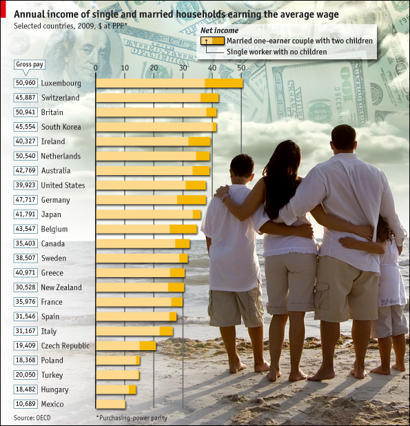
economics

Annual change in U.S. GDP under different scenarios | 2009-2019

What Works

We are able to see the results of three hypothetical assumptions regarding the treatment of unauthorized immigrants and the impact that could have on the GDP of the US from 2009-2019. While I often advocate trend lines for showing changes over time, in this case, what we are interested in is not just a trend over time, but the difference between the three outcomes in each year. For that reason, the choice of bars works better than would the choice of trend lines. Seeing all the three options on the same graph neatly summarizes the overall findings of the report. If you are interested in learning more about just how these projections were made, all of that is detailed in the report [link below in references]. One important note that the report mentioned more than once is that the cost of the mass deportation scenario does not include the cost of deporting individuals (which would be legal and physical), it just represents the impact on the economy of removing unauthorized workers.

What Needs Work

I snipped this graphic out of a report, so the following critique is for me more than for the graphic creator. Because this kind of projection requires so many assumptions and simplifications, providing summaries of the most critical assumptions is necessary for the proper cognitive digestion of the infographic. The report contains sufficient discussion and references, but in a world where people like me clip graphics and stick them in other reports or on blogs, savvy designers will include longer captions [the original caption is included in the image file] or other explanatory text even if that same information is included in the formal text. Hyper text culture is spreading. It is far more common now to put together a little bit of this from here and a little bit of that from over there in search of just that bit of information that we think we want rather than reading/watching the full, originally constituted work. Love it or hate it, this hyperlink no place is the place where we have arrived.

References

Hinojosa-Ojeda, Raúl. (7 January 2010) “Raising the Floor for American Workers: The Economic Benefits of Comprehensive Immigration Reform”. Center for American Progress.

Living Single is More Expensive than Marriage? | The Economist Online

What Works

In this particular case, where the point is to show the difference between two groups (not three or four) it is acceptable to use the stacked bar graph approach. This technique emphasizes the difference between the two groups. When people use the same technique with three or four groups, it becomes very difficult to pick out the visual differences. But the folks at the Economist stuck to two groups and it does show the difference in earnings between singles and married-with-two-kids people.

What Needs Work

The picture is not helping anything. Please, people, think twice before inserting stock photography in your infographics. There should never be an element of an infographic that fails to communicate information clearly. The whole money in the clouds motif is also…questionable in terms of the art direction.

Aside from my qualms about the aesthetic choices, I have a more important contention. It would seem that the point of this graphic is to suggest that married people operate under more favorable tax laws than unmarried people. If that is the case, I think it would be nice to see some information about the taxes coming into play. I say this in part because the commenters to the article revealed that they mistakenly believed this data is pre-tax. But it isn’t. Furthermore, this graphic implies that marrieds have more money on hand than singles in the same income brackets, but that isn’t necessarily true either. Those kids do cost something – they need clothes, food, bigger houses, bigger cars, and an endless list of other things. So even though Mr. and Ms. Single do not take home as much, I bet they have fewer carrying costs. Granted, the graphic is about taxation policy, not about discretionary spending opportunities, but it fails to emphasize taxation and leaves itself open for other interpretations. These interpretations are available for your reading pleasure in the comments section following the original post. I do encourage you to read the comments because it makes clear that people do not read, not even the single paragraph of explanatory text.

Reference

Economist Online Staff. (11 May 2010) Single supplement: The average single worker takes home less than his married counterpart. The Economist online.

War on Drugs in Mexico (Civil war - Mexican cartels versus Mexicans)

What works

Throwing in a map is smart – most Americans do not know where all the Mexican states are. Breaking the murders down by location is also smart. A national total would obscure part of the point, which is that the drug wars in Mexico are not hitting the whole country equally. Some areas are much more important to the cartels and are getting walloped while others are relatively unscathed, at least in terms of murders and other violence. Including the map and breaking the graph down by geographical boundaries both communicate the geographical specificity of the murder problem.

What needs work

This graphic illustrates just one element, one metric, of a whole constellation of economic and social problems. In journalism, getting any graphics into an article on a tight deadlines is difficult. One could argue that since the troubles in Mexico are not so new, it might be worth putting some extra time into the production of a graphic that could display murders, kidnappings (of whom and for what purpose – money, political deals, revenge), the quantity and type of drugs trafficked from which areas, trafficked/processed through which locations, for distribution where and by which cartels.

Besides a comprenhensive narrative of the trade, which is probably nearly impossible to construct because if it were easy to get information about where drugs are grown, processed and distributed I would be amazed. However, there is at least one other way to demonstrate the violence in a more comprehensive fashion, just by making some assumptions about social/economic networks with respect to the people murdered. The information on kidnappings may not be available – the article mentioned that five journalists had been kidnapped but only one was reported to the police. So we are left with murders, and that is probably why the Washington Post ran the graphic that it did.

Widespread murder creates a terror society – one in which fears and suspicions impact daily life over a sustained period of time. But it can be quite difficult to quantify terror and many graphics rely on quantifiable data. The article is well written and its narrative does a good job of conveying the magnitude of the drug violence and its encroachment on the lives of everyday folks.

The spasm of killing, kidnapping and extortion in the northeastern states of Tamaulipas and Nuevo Leon — vital trade, energy and manufacturing centers on the Texas border — marks a serious escalation in the U.S.-backed drug war and comes with a 21st-century twist: Mexican officials struggle to calm what they call a mass psychosis of fear, stoked by social-media chatter and grisly YouTube videos, by using Twitter to post warnings about “situations of risk.” — William Booth

There is clearly good reason for graphics to accompany text – each play unique roles. That being said, I still think there may be a way to create a network graph that demonstrates the social span of the violence. It could look at one of the hard hit communities in which all people are assumed to be alive and unrelated to anyone who was murdered. Let’s imagine one dot for each person, colored green to show they are alive. Now, a person who is murdered will become a black X and all of their family members and close friends will become black dots (still alive, but severely impacted by violence since they lost friends or family). In a perfect world, more distant friends would become brown dots. But it would be difficult to make a map like that because it is difficult to identify looser friendships. Use guest books at funerals to gather data? Facebook? Hard to say. Kidnappings, where known, could be similarly mapped. After constructing a network map like this, it would be much easier to see that one murder impacts a much wider swath of a community. Once there are many murders, there will be very few people left as green dots. Widespread murder is like necrotic tissue.

Where the persons murdered and kidnapped were wage earners, it would also be possible to demonstrate the income lost by the community as compared to the estimated value of the trafficking activity over a given time period. Of course the value of human life should not be measured by the money they failed to earn because they were dead. It’s just as silly as reducing the value of a human life to the market value of the chemical components of the human body. The point of such a comparison would be to demonstrate the economic impact on the community rather than some sort of death calculus.

References

Booth, William. (21 April 2010) “Drug war violence appears in Mexico’s Northeast, near Texas border”. In The Washington Post, World, North America section.

Humanities and Social Science PhDs - completion failure and job market failure

What needs work

Actually, the graphics aren’t bad, but the story is depressing for someone nearing the final year of a PhD in sociology. The first one is quite good. I might have added a horizontal line under which the ‘failures’ ended up and above which the ‘successes’ floated.

Many people who read this blog are academics and thus familiar with the concept that getting a tenure track job is tough. These graphics do an excellent job of contextualizing what might often seem like personal anxiety to present the problem as a mismatch between supply and demand. There are far more PhDs minted each year than we need and there would be even more if everyone who started down the PhD path actually finished. Who is to blame? For an answer to that question, link to the article (in references below).

Otherwise, just get depressed looking at the graphic story.

References

Cohen, P. (8 April 2010) The Long Haul Degree. In The New York Times, Education Life section.

Divorce rate - the short and incomplete story

Zoom in and it looks like poverty could be good for marriage

Philip N. Cohen from the Family Inequality blog (and the sociology department at UNC Chapel Hill) sent along the two line graphs in this post saying, “For the last week I’ve been steamed about these two figures from a report on marriage by W. Brad Wilcox.” [Note: W. Bradford Wilcox is the director of the National Marriage Project at the University of Virginia where he is also Associate Professor of Sociology.] The zoomed-in graph above was used in the main text to show that the divorce rate is going down during the current recession. Poverty must be great for marriage! No matter how folks feel about their spouses, they must feel more strongly about having enough money so they stay together. Or, to put it slightly differently: what unemployed person is about to leave the comforts of an intact home, even if that home is a disgruntled one?

Cohen goes on to point out that Mr. Wilcox’s strategy of zooming in on the data was also picked up by the media who are happy to run a story about the unexpected positive impact of the recession on lasting marriages.

Mr. Wilcox did include a complete picture of the divorce rate since 1970 in his appendix which is copied below.

Divorce rate in the US |  1960 - 2008
Divorce rate in the US | 1960 - 2008

Zoom out and it just looks like the divorce rate hit a speedbump on the way down

As evidenced by this line graph, the divorce rate has been declining for years. The brief period of increasing divorce from 2005 to 2007 was more like a speedbump in a declining trend than the end of a trend of increasing divorce rates.

Read more about why this matters at Philip Cohen’s blog.

An improved graphic

Philip Cohen's sketch including recessions in purple

My point is simply that all infographics tell richer stories the more data they depict. Zooming in is generally a bad idea because it reduces the context from which the reader can draw solid conclusions. If the recession were going to be part of the story about divorce, recessionary periods should be indicated on the graph, too. That would make it easier to tell if all recessions tend to decrease divorces or if somehow a decrease in divorce just happened to coincide with this current recession. It’s easy to ‘lie’ with info graphics by being overly selective. And lying just isn’t what we’re after.

References

Wilcox, W. Bradford. (2009, December 11) “Can the recession save marriage?” in The Wall Street Journal. Opinion Section.

Cohen, Philip. (2009) Recession, resilience, divorce?” in The Family Blog.

Visualizing a Billion Dollars - Those are pallets
That's a Trillion Dollars - See the guy still in the lower left corner?

What Works

This is a blatant repost of content – all these blogs are – but this one is particularly blatant. [For full effect, click through.] The folks over at pagetour.com went to the trouble to visualize just how much money a billion and a trillion dollars actually is. I have heard on NPR that it’s hard for people to make decisions about monetary volumes once the order of magnitude goes above 7 or 8, that humans unconsciously shift to logarithmic scale thinking which leaves 100 million dollars being only slightly less than 1 billion dollars. That’s like thinking that 100 dollars is only slightly less than 1000 dollars. Have a look. Think about it.

Relevant Resources

pagetour.com A virtual tour of one trillion dollars

Cigarette Tax, Washington State

What Works

A simple overlay of graphs goes a long way to telling the story that as cigarette taxes increase, rates of smoking decrease. At the deli where I buy snacks, the cost of a pack is $12. Ouch. The reason raising taxes works so well in this situation is that it tends to prevent teens from starting to smoke in the first place because they are relatively poor and cannot afford to support an addiction causing habit. If they don’t start as teens, they are far less likely to start later in life when they might have more disposable income. Increasing tax rates works when it comes to causing a decline in smoking rates, but it might not work in causing other sorts of macro-behavioral changes, at least not over the long run.

Clearly, because we are looking at tax rates and prevalence rates, the two graphs could not share scales. I probably would have gone for either all line graphs or all bar graphs – I don’t like to mix it up for no good reason.

What Needs Work

Not sure I like the use of burning cigarettes as bars, or at least not these ones. Too cartoon-y for a serious subject.

Relevant Resources

Good Magazine (2008) Up in Smoke Interactive Graphic.

Virgin, B. (2007, 6 March) A taxing problem in anti-cigarette age Seattle PI.

Stimulus Package - Washington Post (Laura Stanton)

What Works

First, the paper allowed three different graphics to run – the overview provided by the bars at the top that show how the stimulus is divided by spending and tax cuts, the more granular breakdown of the pigeonholes for these dollars, and the time line that helps us understand when the money is going to hit the economy (and when we can expect all these transit programs to get going). Second, the main graphic does two things. It is both a fairly simple, readily understood cascading design that draws each category down to its constituent parts across the vertical access. It is also artful – when I look at this I see a sort of mobile hanging over head offering glassy baubles of funding to the madding crowds (ie the states). I’m not trying to insult the states here. In this economy, we’re all the madding crowds, but I really like the fact that the graphic incorporates mood and sensibility. Third, the timeline is a critical component of the stimulus package because there is so much anxiety about when this down turn will be ending. The stimulus money hitting the market is not a direct indicator that the downturn will end, but it is an indicator of when we can start looking for positive economic signs. Furthermore, the timeline could almost stand alone as both a timeline and a description of how the money was allotted. It is nice to be able to look at the package’s pigeon holes/piles of money in two different ways.

I also smiled when I didn’t see a map. Not every story can be visually summed up by the deployment of a shaded map.

What Needs Work

This blog isn’t wide enough to satisfactorily display the graphic so click through to get the whole story.

Relevant Resources

Congressional Budget Office

Stanton, L. (2009, 1 Feb.) Adding up the $819 Stimulus Package – Graphic. The Washington Post.

Yourish, K. (2009, 1 Feb.) Adding up the $819 stimulus package – Reporting The Washington Post

NYtimes.com - College Endowments Loss Is Worst Drop Since ’70s
Remixed College Endowment Graphic

What Works

Stories like this one that cover a data driven report should always include an info graphic. But, of course, this is coming from an avid fan of info graphics. Kudos to the NYTimes for including a graphic and for including not only the punchline – the huge drop in college endowments in the very recent past months – but also some context about what college endowments were doing before. I would have liked even more context because fiscal year ’08 was already seeing some of the downturn in the market. Total movement for all endowments, or endowments divided into fewer categories, since ’00 would have been even better.

What Needs Work

It is intuitive to portray data that “drops” (according to the headline) or rises with the change along the y-axis. I did a little remix just to show you what I mean. In the first glance at the data, the increase or decrease is going to be more legible when it’s happening on the vertical axis. It’s just the way we learn to read charts and graphs. Before that, I suppose our tendency to associate the vertical axis with things rising and falling came from gravity. The laws of physics aren’t going to change – stick dropping/rising data on the y-axis until gravity causes changes in the x-axis.

The other thing I might have changed was the choice of categorization. What is gained by splitting the data into the uneven increments that appear here? First, increments should either be even or should have some reason for being uneven. We’ve got a $500m range, a $400m range, a $50m range…it’s all very unclear why these are the important categories, especially when there is no immediately obvious significant difference between them. They all seem to have been more or less flat in FY’08. Then they all plummeted ~21-22% between July and November of ’08. I would have opted for more historical context and fewer categories.

The Wall Street Journal is running basically the same story with a different graphic though they still stick with the horizontal arrangement. I like there’s even less because they

Relevant Resources

Katie Zezima (27 January 2009) Data Show College Endowments Loss Is Worst Drop Since ’70s at the NYTimes.com

John Hechinger (27 January 2009) College Endowments Plunge Wall Street Journal Online

National Association of College and University Business Officers 2008 NACUBO Endowment Study Available for Purchase.