Graphic: Gender ratio of recent US graduates by degree
Gender ratio of recent US graduates by degree | Laura Norén | click caption for pdf

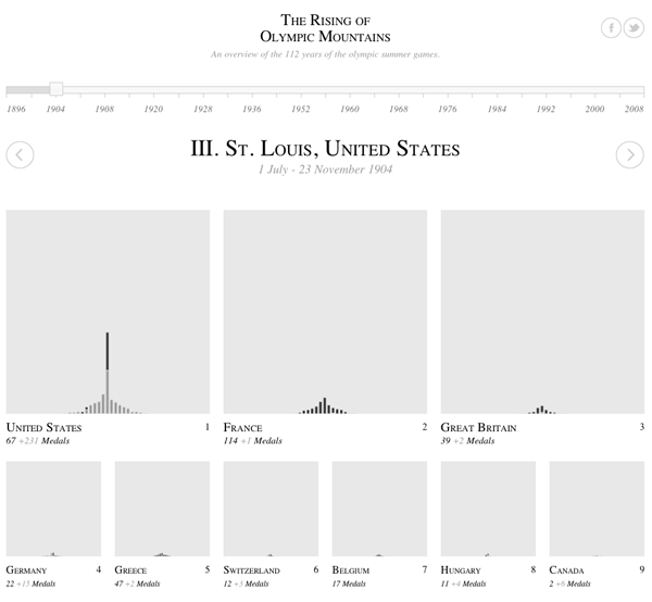
Is higher education “dominated” by women?

There has been plenty of news coverage recently about the rise of women and the decline of men. While I have always disliked the irrational use of zero-sum language – why do we have to frame this discussion as men who are losing because women are making some gains? – I thought it would be worth taking a closer look at the gender ratio in higher education. I found many text-heavy stories (the Guardian, the New York Times, the Chronicle of Higher Ed, Huffington Post, The Atlantic, and many others) about female students earning more bachelors but surprisingly few graphics.

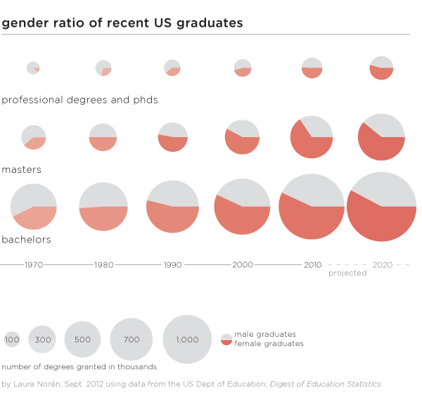
Graphics can do an excellent job of summarizing the gender gaps as they have developed over time within bachelors, masters, and professional+doctoral degrees. One graphic, quite thought provoking. All of the three degrees were more likely to be earned by men in 1970. Then between 1970 and 1980 women made rapid gains which continued through the 1980s. The gains for women slowed down once they hit the 50/50 mark for both bachelors and masters degrees and I predict they will also slow down for phd and professional degrees. Though it’s hard to tell by looking at the graphic, women are earning the largest proportion of masters degrees (projected to be 61% in 2020) which is slightly more than the 58% of bachelors degrees they are projected to earn in 2020.

Why aren’t women earning more if they are so well educated?

There is still a pay gap in earnings between men and women. Within the university, male faculty members tend to make slightly more than female faculty members. Overall, the most powerful explanation for pay gaps is not so much a failure to pay men and women equally for the same job. Rather, women are more likely to get degrees that lead to positions which are paid less than the positions men are more likely to get following their collegiate specializations. More women end up in education and nursing; more men end up in engineering and computer science. Education and nursing are not as likely to be lucrative as jobs that require engineering and computer science degrees.

To answer the question about women “dominating” higher education it is clear from the numbers that there are more female students at every level, though some majors still tilt towards men. What’s perhaps more important, women may or may not go on to match the earning potential of men, in part because they may not always choose the majors that lead to the most lucrative careers. Some argue that earning potential should drive choice-of-major but I’m still of the mind that going to school is not all about (or even primarily about) producing good workers. Going to school is about taking the time to explore different ways of thinking in depth and without undue concern for their ability to produce economic return. I’m glad that we have gotten to the point where there is enough gender parity to return to conversations about what school is for rather than who school is for…

Does the gender gap in graduation rates vary by race/ethnicity?

Graphic: 2009 US bachelors degrees by race/ethnicity and gender
2009 US bachelors degrees and gender gaps by race/ethnicity | Laura Norén | click caption for pdf

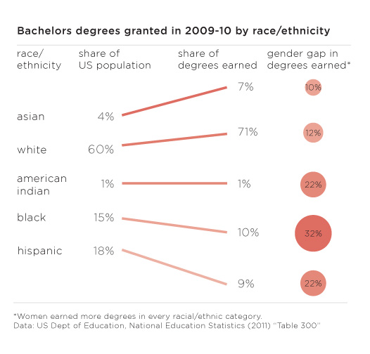
…but on the other hand, there are still critical gaps in access to higher education and degree completion that trend along racial/ethnic lines (class lines, too, but I didn’t get into that in this post). The graphic above displays the share of bachelors going to different racial/ethnic groups in 2009. In order to provide a relevant framework for comparison, I plotted the share of degrees earned next to the share of the total population of 18-24 year olds constituted by each racial group. There are some missing categories – mixed race people, for instance – but I couldn’t find graduation rates broken down any further than the five traditional racial/ethnic categories. Asians and Pacific Islanders only make up 4% of the population but they earn 7% of the bachelors in 2009 and their gender gap that year was only 10%. Whites were similarly over-represented in degree-earners and had a similar gender gap of 12%. But then things got interesting. The gender gaps for American Indians and Hispanics were much higher at 22% and the gender gap for blacks/African Americans was even higher still at 32%.

Especially when it comes to studying gender which is often constructed as a binary in which both groups make up about 50% of the whole, it is important to realize that analytical rigor might be increased by further segmenting these gender categories by some other key analytical variable. In this case, adding vectors for race/ethnicity provided a new perspective, one that might be a decent proxy for class.

References

Norén, Laura. (4 September 2012) Gender ratio of recent US graduates [infographic] New York.

Norén, Laura. (4 September 2012) US bachelors degrees by race/ethnicity [infographic] New York.

National Center for Education Statistics. (2011) Table 283: Degrees conferred by degree-granting institutions, by level of degree and sex of student: Selected years, 1869-70 through 2020-21 [Available in html and xls] US Department of Education.

National Center for Education Statistics. (2011) Table 300: Bachelor’s degrees conferred by degree-granting institutions, by race/ethnicity and sex of student: Selected years, 1976-77 through 2009-10 US Department of Education.

US Census Bureau. (2012) Table 10: Resident Population by Race, Hispanic Origin, and Age: 2000 and 2009 In The 2012 US Statistical Abstract. [Available in pdf and xls.

Expert commentators on women's issues in American media | 4thEstate.net
Expert commentators on women’s issues in American media | 4thEstate.net

What works

Election coverage dominates the American media in the months before any presidential election and the group (of unnamed people) over at the 4thestate.net are covering the coverage of the election. They tend to share their findings as graphics. The graphic above came from a special report on gender that looked at the gender of the experts who are called upon to comment on women’s issues like abortion, birth control, planned parenthood, and women’s rights. I can already tell that the first criticism is going to be that these issues are not just women’s issues. Fair enough. The point that they are trying to make, though, is that even in a media system that some say has a “liberal bias” women are significantly under-represented as expert voices. Or any kind of voices.

The graphic does a good job of showing THREE categories of commentators – men, women, and institutions.

In terms of color, the graphic resorts to a men-are-blue, women-are-red division which is fairly stereotypical. I am glad that women are not pink (see this post for an example of what happens when light blue and pink are used to represent gender). While I feel a lot of pressure to escape traditional gender binaries, in graphic design, harnessing people’s existing stereotypes is often a powerful way to make an instant impression. So while these designers could have used any two colors to represent men and women – purple and yellow, orange and green, teal and chartreuse – the fact that they leveraged the underlying American stereotypes associated with the gendering of colors gave them a way to tie together different graphical elements into one infographic. Personally, it does not bother me that women are represented as red and men are represented as blue, even if it is stereotypical. Some stereotypes hurt; this isn’t one of them as far as I am concerned. Pastel colors like light blue and light pink tend to infantilize the appearance of presumably adult behaviors and I would avoid using those to represent adults. But the red and blue used here are plenty grown up. Feel free to scold me about gender stereotypes in the comments if you disagree.

What needs work

Graphical donut - Women quoted in print media in 2012 election coverage on abortion
Graphical donut – Women quoted in print media in 2012 election coverage on abortion

I am on the fence about the donuts. Would the donut be easier to read as a bar graph? Perhaps. But turning the circle form into a bar form would eliminate a good deal of the natural division in the graphic between print media – all donuts – and specific media outlets – collections of bar graphs. Right now, without even bothering to read the titles, I can tell that the donuts are all comparable to one another but not necessarily directly comparable to the other elements of the graphic. This prompts me to read the titles to figure out how I ought to be making comparisons between the graphic elements. If the donuts were straightened out into bar graphs, I’m not sure I would instantly sense that they were unlike the rest of the graphic because they would look the same even if they had different titles. The graphical forms should emphasize the text of the headings and the designers here got that right.

My question about what needs work is that I am not sure any comparisons between donuts and bar graphs are easy to make because it seems like some members of the 4th estate team wanted to see the data broken down by issue, others wanted to see it broken down by specific publication, and instead of choosing one or the other, they compromised and showed both. Rather than thinking of this as a comparison issue, I guess I will think of it as simply two different sets of data that both deal with the question of how women are denied roles as expert commenters when it comes to women’s issues.

Acknowledgements

Thanks to Letta Wren Page for sending me the graphic and to the 4thestate for their decidedly graphic coverage of the 2012 election.

References

4th Estate. (2012) Silenced: Gender gap in 2012 election coverage [infographic] 4thestate.net

US food security map | Gallup via Marketplace.org

What works

Food insecurity – worrying about having enough money to buy food – is an extremely important problem. Gallup came up with new poll numbers on the prevalence of food insecurity in the US just this week and spokesman Frank Newport did an interview on the findings with Tess Vigeland of the radio show Marketplace. Marketplace ran the map graphic above on their website which is somewhat rare for a radio program given that graphics just do not have much of a place on the radio.

The survey question was:

Has there been one time in the last 12 months when you did not have enough money to buy the food that you or your family need? And overall, 18 percent of Americans so far this year — the first half of the year — said yes, there has been at least one time.

The graphic makes clear that the problem of food insecurity has a north-south pattern to it. People in the South have “high” levels of reporting food insecurity while people in the middle and on the west coast have “moderate” levels of food insecurity and folks in the north have “low” levels of food insecurity. But…

What needs work

…where are the numbers? What ranges are represented by the “low”, “medium”, and “high” levels of reported food insecurity? This information should be in the graphic. Legends matter.

What we can imply from the interview is that the states in the “high” range have 20% of their poll respondents reporting that they’ve had trouble paying for the food they need in the last 12 months. The “low” level of insecurity includes states like North Dakota where 10% of people reported having trouble paying for food. That still seems high given how wealthy Americans are on the whole. This food insecurity data is one way to think about just how economic inequality plays out in the US. Folks cannot even afford the food they need.

Here’s another graphic to think about, the rate of the use of food stamps (SNAP):

Food stamp program participation 1970-2010
Food Stamp program participation 1970-2010

Understanding food insecurity is one of those things that is going to require more than a single map based on a single survey question asked at one point in time. Well-designed graphics can and should aim to depict complexity and nuance…kind of like any other representation of critical analysis (writing, reporting, etc).

References

Vigeland, Tess. (23 August 2012) Americans struggle to feed their families. [Interview with Frank Newport] marketplace.org

Global smoking rates by gender chart
Global smoking rates by gender | The Lancet via The Economist Daily Charts

What works

The Economist put together an infographic using data from a study published last week in The Lancet collected by an impressively large team of researchers from three different institutions in three different countries (The World Health Organisation, America’s Centres for Disease Control and the Canadian Public Health Association). The article in the Lancet has much more detailed data about all sorts of smoking traits that did not make it into this chart, but the chart succeeds in portraying two gendered vectors of smoking behavior: the different rates of smoking between men and women and the difference in the number of cigarettes smoked between the two genders.

Globally speaking, it is safe to say that smoking is a masculine activity. There is no country in which more women than men are smokers. That particular take-away is made extremely clear in the chart. Just a glance is enough exposure to the data to absorb the idea that smoking is somehow masculine.

What needs work

The graphic designers at the Economist try to expand on the notion that smoking is “somehow masculine” by layering another set of findings onto the basic rates of smoking by men and women. Way off to the right they have what is essentially two columns of a table that report the average number of cigarettes smoked by men and women. My fuzzy and addled brain wants this little table to be more like a bar chart in which the length of the bars corresponds to the number of smokes. Countries where smoking rates are highest would have longer bars. Countries where smoking rates are low would have shorter bars. Visually, the impact would increase dramatically if the size of the bar corresponded to the amount of cigarettes smoked.

Importantly for the point about the gendered nature of smoking, we could see another way in which smoking is gendered by looking at how many cigarettes are smoked by each gender. Some countries have dramatic differences: in Russia and Turkey men smoke about 1.5 times as many cigarettes as women. This is a marked contrast to the other end of the spectrum where in India, women who smoke (and there are very few women who smoke in India), smoke 7 cigarettes per day while the smoking men only smoke 6.1 cigarettes per day. If that part of the graphic had been given more space, it would have been easier to quickly absorb that pattern. As it is, only a careful reading of that table yields insight; we might as well just look at the data in Excel.

The other change I would order up for this graphic is to make the blue horizontal bars that run the full length of the graphic a different color than the male icon. My best option would have been to make the horizontal bars grey and truncate them after the male icon. There’s no need for them to go all the way across and it makes the table slightly harder to read. I realize that changing the horizontal bars to grey would then give the whole table a gridlike look due to the presence of the vertical bars. I would just shorten the vertical bars to tick marks at the top and tick marks at the bottom (it is a tall chart so tick marks only at the top or only at the bottom would be invisible to people who have to scroll to see the whole graphic).

I like the coral color used for the female icons. I would have turned the men navy because coral and navy are complimentary colors and look especially good together.

I wasn’t able to add the bar graphs out to the side or to fully eliminate the baby blue, but I did make some of the changes I suggested on the jpg below for your viewing ease.

Remix of The Economist Daily Chart from 20 August 2012 - Puffed Out: Daily cigarette smoking by men and women

References

The Economist. (20 August 2012) Puffed Out: Daily cigarette smoking by men and women The Economist: Daily Charts. [graphic design]

Giovino, Gary, et al. (18 August 2012) Tobacco use in 3 billion individuals from 16 countries: an analysis of nationally representative cross-sectional household surveys. The Lancet, Volume 380, Issue 9842, Pages 668 – 679, doi:10.1016/S0140-6736(12)61085-X

Global charitable giving

Global charitable giving map, 2011
Global charitable giving map, 2011 | Charities Aid Foundation

How much do people give?

Globally, there are some major differences in giving rates on a national basis. The Charitable Aid Foundation conducts and annual global poll that asks about giving money, giving time, and helping individual strangers. The 2011 report notes that when it comes to predicting which countries have the most generous citizens:

The countries whose populations are the most likely to give are not necessarily the world’s most affluent. Only five of the countries that feature in the World Bank’s top 20 by GDP (PPP) per capita feature in CAF’s World Giving Index top 20.

World Giving Index by World Region
World Giving Index by World Region, Charities Aid Foundation

The US moved from 5th place in 2010 to 1st place in 2011 with increases in the number of people donating time, money, and aid to individual strangers. I guess we respond to the economic crisis by donating to specific people and causes while demanding lower taxes? Anyone else want to try to interpret that?

As for the graphic, I wish there were a key. I figured out eventually that the number inside the circle represents the country’s overall rank and that the size of the circle is proportional to per capita giving. I had to look at the graphic for a while to convince myself that the size of the circles was proportional to per capita rather than total giving per country. The one thing I like most is the inclusion of the small inset map in the upper right corner that helps relate the circles back to the map of the world that we are used to seeing.

But let’s take a look at giving in the US, since we are supposedly the top of the heap as of 2011.

US charitable giving

Charitable giving in the US by region, 2000

How much do Americans give?

Caveat: I was not able to find US data from 2011 so the bottom half of this blog and the top half are out of sync temporally. Also, the US study only looked at cash donations whereas the global index looks at donations of cash and time as well as helping behavior towards individual strangers.

Individual giving in America is divided between two general categories of giving – religious and secular. Many church members give cash and write checks to their churches either as part of tithing or in less formal donations to the offering plate when they get around to attending a service. Measures of religiosity in the US indicate that Americans are slowly becoming less religious over time. A WIN-Gallop poll of global religiosity came out on July 27th and showed that only 60% of Americans are regular churchgoers, down from 73% seven years ago. I wondered how that would impact charitable giving here in the US. Unfortunately, the only free data I could find was from 2000 which is well before the findings from the recent poll data. [Note: If you are extremely interested in charitable giving in the US there are quite a few reports available to those willing to pony up some cash at Giving USA.]

The table above is a summary of the state-level, individual cash donation activity of Americans in 2000 that was originally constructed by John Havens and Paul Schervish at Boston College’s Center on Wealth and Philanthropy. They used a slightly different methodology from the one used by the aforementioned Giving USA group that I found more compelling. Giving USA was looking at cash giving by examining the itemized deductions folks list on their annual income tax forms. However, many people (especially lower income people) do not itemize their deductions. Further complicating matters at the state level is the fact that some states have many more itemizers than others. Therefore, looking at itemizers in one state is very different than looking at itemizers in another state. In one state we might only capture fairly wealthy people. In other state, we might be looking at a much broader cross section of the population. Havens and Schervish not only tried to make sure they had comparable samples of people from each state, they also took into account costs of living in different states and weighted their totals based on the number of households in each state.

I summarized their major findings above. What frustrated my data visualization self the most was that I could not make a similar cartograph that would allow us to see the US the way we can see the globe in the cartograph at the top. Havens and Schervish pooled data for a number of states together – see where I have tried to list all the states in each of the regions? See how it says ‘Other States’ four different times? The explanation for this was that the sample size in some states was so small it had to be pooled in order to maintain the subjects’ anonymity. Fair enough. I just wish it were otherwise.

Are states within the same region similar when it comes to charitable giving? For the most part, no.

The midwest has no major outliers, high or low (at least, not that I can tell given that some states are lumped into that obscure “other states” category). The other three regions show wider dispersion. The west, for example, has the most generous state (Utah: $2632) but just next door is Nevada with a very low rate of giving (Nevada: $303). The south looks fairly generous on average, but that average obscures some dramatic differences. Two states pull up the average (Alabama: $1842 and South Carolina: $1243) and make up for the two of the least generous states which are also in the South (Kentucky: $218 and the District of Columbia: $273). With respect to DC, my hunch is that wealthy lawmakers and other multi-state residents buzzing around DC may be reporting all of their charitable giving on their tax forms for their “home” states. I cannot explain why Kentucky gives so little. Another notable miser of a state is New Hampshire (New Hampshire: $246). Shall we take a moment to ponder the implications of the “live free or die” ideology?

References

Charities Aid Foundation. (2011) World Giving Index [information graphic] Kent, UK.

Charities Aid Foundation. (2011) World Giving Index 2011. [Report]. Kent, UK.

Havens, John and Schervish, Paul. (2005, November) Geography and Generosity: Boston and Beyond [report] Boston: Center on Wealth and Philanthropy at Boston College. For convenience, I extracted the relevant table for download <a href="generosity-report-extract“>here.

Olympic Medal Winners | Ivo Afonso

Update: Award winners

Update: Both Ivo Afonso’s print graphic and Christian Gross’s interactive graphic won awards in the visualizing.org Olympic graphics contest. Ivo won the audience choice award and Christian won the award for interactive graphics.

Kudos to both!

Seeing the Olympics…

Olympics are visual. That is just the way it is. Most of the visualizing is happening on screens, either your TV or your computer if you happen to have access to nbc’s streaming content. But there are also graphics and animations about the Olympics out there so I thought I would share some of the ones I’ve run across over the past couple of weeks.

…in print

The graphic above by Ivo Afonso of Portugal is a print graphic that’s part of the visualizing.org graphic design contest sponsored by GE and voted on by viewers like you. (In order to vote, you’ll have to set up a free account.)

What I like about the graphic above is that it follows Edward Tufte’s recommendation that each drop of ink better be communicating salient data. In one (Portuguese sized) piece of paper, Afonso has summarized not only the top three country totals in each Olympics but also the number of triple podium instances and world records broken. Good job getting it all in there.

I am still a little confused about why some host countries have particular colors in their names though I do like that when host countries are in the top three, they use the same colors in their fonts as hosts and as medalists. It would appear that there is a correlation between hosting the Olympics and winning a lot of medals. Before jumping to the “home court advantage” assumption, please consider that perhaps only countries that dedicate lots of time and resources to developing world class athletes want to be bothered to host the games in the first place. But back to the graphic. Besides that linkage, though, I don’t see why host countries have the colors in their fonts that they do. I want there to be a pattern because there is so much going on in this single sheet that any choice should service the delivery of understanding about the data.

I also find the whole thing a little hard to read – I probably would have amped up the contrast between the background and the darkness of the fonts, especially with such small font sizes.

Rising Olympic Mountains, 1904 | Christian Gross
Rising Olympic Mountains, 1980 | Christian Gross

…in interactive graphics

The Rising Olympic Mountains by Christian Gross that’s also part of the visualizing.org contest. It is an interactive graphic so, you know, click through and interact before reading the rest of this. Again, this is a favorite of mine so trust me and take the 30-60 seconds to go over and poke around a bit.

Things I like:
I like that the name is a play on Mount Olympus. Punny.

I enjoy the simplicity of watching the mountains pile up over time.

I love that when I hover over the winners in a particular country in a specific category like, say, gymnastics, all of the other gymnastics winners in other countries light up to make it easy for me to compare one country to the next. Without this feature, each country would only be comparable to the others with respect to the total size of the mountains which represents cumulative medals.

I like the animation that happens when countries switch rankings positions. Very exciting for a largely black and white animation.

What I don’t like as much is that these graphics automatically privilege sports in which there are more events. Of course there are going to be taller peaks for “athletics” than for, say, tennis. All of the race-oriented sports that have multiple events within the same sporting category will rack up more total medals than will sports with only a small number of events. Tennis, for instance, had only mens’ and womens’ singles and doubles for 4 total events. Mixed doubles came back this year, but that’s still only five total events compared to say, “athletics” which probably has upwards of 25 total events lumped into it. It would be nice if the graphic could at least give us a hint that the Olympics has far more events in some sporting categories than others.

All the medalists in the men's 100 meter race, ever | New York Times
All the medalists in the men’s 100 meter race, ever | New York Times

…as animations

Click through and watch the animation. It’s worth it. They relate history to the present so effortlessly (well, it’s effortless for the viewer, I’m sure it was challenging for the designers) that these animations have now become part of my ‘best practices’ portfolio in the animations category. I was especially impressed at the way they incorporated information about young racers who are 8 or 10 years old compared to the historic record in the sport. It’s also not that easy to incorporate the basic elements of Olympic data that people tend to care about – from the cult of personality that surrounds champions to the national origins of the racers – in a way that feels like all part of a whole rather than disjointed bits and pieces.

Want more like this? Keven Quealy and Graham Roberts created similar graphics for all the medalists in the men’s long jump and the men’s 100-meter freestyle. Apparently, Quealy and Roberts are not all that interested in women’s races.

References

Afonso, Ivo. (2012) Olympic Medal Winners [Infographic] Uploaded to visualizing.org.

Gross, Christian. (2012) Rising Olympic Mountains [Infographic] Uploaded to visualizing.org.

Quealy, Kevin and Roberts, Graham. (2012) One Race, Every Medalist Ever [animation] New York, New York Times.

Food blog content characteristics and frequency of use | The Food Blog Study

What works

I conducted a web-based survey of food bloggers last summer as a doctoral intern at Microsoft Research in the Social Media Collective. I am now analyzing the mountains of data that I gathered in the interviews (N=30), survey (N=303), and web crawler (N=30,000) and getting ready to send out papers for publication. I thought it would be nice to share some of the findings here in advance of the slow academic publishing process.

Since I made the graphic and since I am modest, I’ll just say that I like the colors and I like that I was able to find a way to keep all of the granular detail of tabular data while adding visual impact.

If you would rather hear about the substance of the study than about the struggles I had while creating the graphic, skip to the bottom third of the post and the “What surprised me” heading.

What needs work

Since I have the benefit of having seen the data I can say that two things certainly need work. First, the survey asked about many more behaviors than I have decided to depict in this graphic. I left out data mostly because I want to be able to publish it and publishers are not keen on accepting already-published material. Some of them are not too bothered if bits and pieces of the findings are blogged about here and there. Some of them are hugely bothered and will not accept submissions that have been written about on blogs at all. There are good reasons for subjecting the findings to peer-review – like having smart people verify that the findings are not fabricated from thin air or otherwise constituted by complete rubbish. All that being said, my biggest problem with this graphic is that it is just the tip of the iceberg in terms of what the survey had to say about the characteristics of food blog content.

The second big problem with this is that I had a very difficult time dealing with proportional data in the rows and the columns. In case you still haven’t figured out what this graphic is saying – and I don’t blame you if you find it hard to digest – the graphic is depicting the frequency with which about 300 food bloggers (303 to be exact) reported using the listed types of content. For example, 96% of food bloggers report using video 20% of the time or less. Video just is not all that common on food blogs and most food bloggers hardly ever use it. Images, on the other hand, are included in food blog posts most of the time by most food bloggers. Seventy-four percent of food bloggers use photos 80% of the time or more. Reviews of restaurants, cookbooks, and kitchen gear, on the other hand, end up on 11% of food bloggers posts very frequently (80% or more posts contain reviews) while fully half of food bloggers hardly ever post reviews (20% or fewer of their posts contain reviews).

Since most food bloggers like to mix things up at least a little – hardly anyone has such a firmly established template for their blog content that 100% of their posts contain recipes and photos while 0% of their posts contain videos or discussion of non-food content (which would include mentions of important life events like getting a book contract, having a child, getting married, or getting cancer). With content, then, I wanted to let food bloggers explain about how often they posted a variety of different kinds of content. But then I had this difficulty of having proportions in the rows and the columns of the graphic which makes it difficult to interpret. Believe me, the tabluar data without the blocks changing sizes and colors was even harder to interpret so turning this information into a visual did help the analysis along by making the patterns clearer.

What surprised me

I was expecting many more bloggers to report including recipes more often. Only 37% said that 80% or more of their posts contained recipes. From what I gathered in the interviews, having someone else make your recipe and then leave a comment about it is one of the routine gratifications associated with food blogging. Web traffic to the site from google.com and on mini-search engines within the site is generally related to recipes, as well. So whether food bloggers care about the deeper meaning associated with food blogging and being part of a community or the hard-nosed economics and web traffic side of writing a blog, from the interviews, I was expecting recipes to be a bigger part of reported content than what I found in the survey. Recipes are one of the main activities around which both creativity and community are wound. They also draw a lot of traffic. On blogs, traffic often equals money (though not all that much money, which is why I think the meaning associated with recipes is more interesting than the money associated with recipes).

I was not at all surprised that most bloggers ignore nutritional information but I think that people who have never done much with food blogs would be surprised to see that three-quarters of bloggers mention nutrition and nutritional information 20% of the time or less. Food blogging gets its meaning and importance through practices of creating and community-making, not because the blogs are used as archives or tracking devices for those trying to lose weight or achieve other health goals. There are blogging communities organized around those things, but generally speaking, folks in those communities do not identify with the term ‘food blogger’.

Reference

Norén, Laura. (2012) Infographic: The Content of Food Blogs. The Food Blog Study. [www.foodblogstudy.info/findings.html]

Wind Map

Viewing note

Click on the image above or here to go to the actual graphic. What you see above is just a screen grab. If you like the screen grab, you will love the active graphic in which you can see what it would look like the visualize the wind blowing across the US right now. Yes, whenever you are reading this, you can download recent data to populate the graphic.

What works

This is a great use of a map to display information. Think, for instance, what the same data would look like in a table.

State                     Speed      Direction
Bismarck, SD          16 mph     S
Columbus, OH        5 mph      W
Fargo, ND               8 mph      N
Minneapolis, MN     2 mph      SW
New York, NY         6 mph      E

In a table, cities would probably be arranged alphabetically which is fine if you want to know exactly what is happening in a given city but terrible if you are trying to discern if there’s any geographical pattern to wind flows. Looking at the map, it is easy to detect geographical patterns. In fact, it would be nearly impossible to avoid detecting geographical patterns. Huge win for the map as a graphic with respect to wind data.

The fact that the wind appears to blow is a programming achievement.

The fact that users can update the graphic with a fresh pull-down from the National Digital Forecast Database is another major programming achievement.

The creators of the graphic at hint.fm offer this disclaimer, “We’ve done our best to make this as accurate as possible, but can’t make any guarantees about the correctness of the data or our software. Please do not use the map or its data to fly a plane, sail a boat, or fight wildfires”. That being said, I think the graphic could be useful for those sorts of purposes. I also think it could be used to perform site selection for windfarms or at least as an educational tool to explain to people why the Dakotas make excellent states to harvest wind while the neighboring state Minnesota is a poor choice.

What needs work

I wish there were an easier way to find graphics like this. I stumbled upon this one via Albert Cairo’s twitter feed, but there must be other awesome graphic work out there just waiting to be discovered.

Reading suggestions

On that note, if you happen to enjoy stumbling upon information graphics, I highly recommend visiting visualizing.org and visual.ly, two websites that aggregate information graphics by allowing people to upload their own work. Both sites have relatively high collective standards for design and are trying to maintain the same high standards for data quality.

Then there’s Nathan Yau’s blog, flowingdata.com, which has long been on my list of must-reads. I assume many of my readers know about flowingdata but it is worth mentioning because it’s a great blog.

Good.is has a portion of their site set aside for GOOD information graphics.

For a more strictly aesthetic experience, behance.net is a giant collection of graphic artists’ portfolios. Looking through it is the digital equivalent of walking around in a flea market – great stuff, unique stuff, and lots that is instantly forgotten even though its presence adds to the atmosphere. Most graphic artists are not information graphic designers so much of what is on behance is not information oriented.

I sometimes find things on pinterest, too, which is more like the digital equivalent of a mash-up between jcrew and a flea market. Oddities organized. It’s much harder to find good information graphics there because, for reasons I do not understand, pinterest is dominated by the long vertical graphics that require lots of scrolling. I’m not a huge fan of those. They encourage laziness – nothing needs to be integrated when you have an infinite length of scroll to just layer unaffiliated fact upon unaffiliated fact and hope that with a picture or two thrown in, a narrative will emerge.

Besides newspapers and magazines, where else do you find information graphics?

References

hint.fm (2012) Wind Map Graphic.

visual.ly
visualizing.org
flowingdata.com
behance.net
pinterest.com

What works

This is an example of activism by animation. It’s not an information graphic so I’m not going to offer a critique, but I find it interesting that the economic benefits of coral reefs like tourism, fishing, and pharmaceutical discovery are foregrounded while environmental concerns like species biodiversity and ocean acidity are mentioned afterwards.

Have a happy Friday, readers.

What I would enjoy seeing

I would love to see an animation of this quality that explained the process of ocean acidification and what we would have to do to reverse it. How much would our carbon emissions have to be decreased to make a difference at this point? And how much would that impact the typical American lifestyle?

References

World Resources Institute. (9 July 2012) “Coral reefs: Polyps in peril”. Animation by Jim Toomey.

Community college demographics
Community college demographics | The New York Times, Education Life section

What works

What I like about the graphic is that it provides a quick demographic snapshot of the community college population so that readers of the adjacent article have an additional piece of context as they try to absorb what it is that is new about The New Community College at CUNY” program. Graphics like this one make for dry written copy, but they add an important element of depth and context to news articles. News articles are always trying to find what is new which can make it challenging for journalists to slip demographics into their stories. Demographics are usually fairly slow-to-change and almost never make the news. Occasionally, there are stories about the crossing of particular tipping points (see any mention of <a href="http://www.theatlanticcities.com/neighborhoods/2012/05/us-metros-are-ground-zero-majority-minority-populations/2043/"majority-minority cities, states, and other places). But typically, demographics alone are not new enough to be newsworthy even though demographic information is salient for the critical analysis of many programs and social issues.

Community colleges in Obama’s plan for a better economic situation

This graphic ran in a long article about a new community college program at the City University of New York in which students will be required to take a strictly defined course in which remedial education is integrated into syllabi and will receive close, frequent mentoring. The number of stories about the social, educational, and financial situation facing community colleges in the US has increased over the past 6-12 months, thanks in part to efforts by Obama’s administration. In February the White House Press office announced a program to train 2 million workers by relying on the community college system that followed the 2010 announcement of the “Skills for America’s Future” community college-employer partnership program, a joint effort with the Aspen Institute.

Dr. Jill Biden, Joe Biden’s wife, worked in community colleges for 18 years and it is nice to see that her expertise is not being overlooked.

What needs work

After that lengthy praise for the inclusion of demographics above, I have many points of improvement.

First, demographic information is snapshot information. It’s taken at one point in time of what, in this case, is only part of the population. What I would have done, two options:

1+st option: compare community college demographics now to community college demographics of the past. Is the current enrollment pattern stable? Is it changing in important ways? This will help readers figure out whether the new program the article mentions is addressing change well.

+ 2nd option (my favored option): compare the community college population to the high school population and to the 4-year college population. The article is about the design of educational institutions so let’s see how community college enrollments compare to their nearest brethren.

Second, the graphic is off to a great start but doesn’t include enough demographic data. From the Aspen Institute’s website (which used data from the American Association of Community Colleges), I gathered up this additional demographic information.

As of 2007–2008 (American Association of Community Colleges)

  • Average age of community college students: 28
  • Median age of community college students: 23
  • 21 or younger: 39%
  • 22-39: 45%
  • 40 or older: 15%
  • First generation to attend college: 42%
  • Single parents: 13%
  • Non- US Citizens: 6%
  • Veterans: 3%
  • Students with disabilities: 12%

As of fall 2008

  • Women: 58%
  • Men: 42%
  • Minorities: 45%

For the age data, I would have graphed it so that we could see that even though the median age is relatively high, it’s pulled that way by a long tail to the right.

Further, the Aspen Institute page got into a bit more detail on the way students with remedial needs fare in the community college system.

The percentage of community college students who must take one or more remedial courses is estimated at about 80%. Fewer than 25% of community college students who took a remedial education course completed a degree within 8 years of enrollment. (Community College Resource Center)

We can compare the 80% who reportedly need remedial courses to the 42% who have taken them as well as the fact that actually taking time out to get the remedial coursework seems to slow progress to graduation to understand why the CUNY program integrated remedial work into existing courses.

The final piece of information that the Aspen Institute included in their overview that wasn’t in the NYTimes graphic is not demographic data, but it is still important for many of the same reasons that demographic data are relevant.

Revenue Sources for Community Colleges (American Association of Community Colleges)

  • State funds 36%
  • Local funds 19%
  • Tuition and fees 16%
  • Federal funds 14%
  • Other: 15%

In both cases, the information is presented in a basic list format. Not all that visually stimulating. I like the Aspen Institute’s lists better because they do not privilege numbers by making them huge compared to the text. While it would have been possible to do more with graphics in both cases, I would rather have the information included and spare than excluded because it fails to meet designerly criteria.

References

Pérez-Peña, Richard. (20 July 2012) The New Community College Try. The New York Times, Education Life section.

The White House. (13 February 2012) FACT SHEET: A Blueprint to Train Two Million Workers for High-Demand Industries through a Community College to Career Fund. Office of the Press Secretary.