The relationship between infectious agents and the host populations is a tricky one, with three-parts at the very least. In order to understand how they relate, it helps to visualize what could otherwise be spelled out. In this graph, s(t) represents the proportion of the population who is susceptible (ie unexposed) to the infectious agent, r(t) represents the recovered population, and i(t) represents in the infected population – all are varying over time. You can see that everyone starts out susceptible, but slowly that proportion drops, though it doesn’t drop to zero. Some portions of the population are likely to remain uninfected. Note that the exact shape and inflection of these trend lines will depend on the particulars of the infectious agent – fatal agents have models that look different from non-fatal agents, long latency periods model differently than short latency periods.
Note the the peak of the i(t) trend will come before the crossover of the recovered and susceptible trends, as it does in this case. As soon as the derivative of the infection rate becomes negative, more people will have recovered than are susceptible and those two trend lines will intersect. I love this sort of graph.
What Needs Work
I would love this graph a whole lot more if it had a legend and applied to some specific disease. That’s mostly my fault.
Good magazine is indeed a good source for thought provoking information graphics. This one has to be clicked through to be seen in any kind of entirety. What I like is the layering – they manage to represent total track length, total yearly ridership (both visually and with absolute numerical data), as well as showing little schematic maps of the systems themselves. You see that many of these systems are hub and spoke systems.
As urban areas continue to grow, transit options are going to need to expand and grow in places that don’t have mass transit infrastructure dating back to the turn of the 20th century like New York and Boston. An article in this month’s context magazine by Michael Goldman and Wesley Longhofer writes about the difficulty of adding mass transit of any sort to the existing urban fabric looking at the Indian city Bangalore: “hundreds of residents marched to protest the widening of streets and felling of trees for the new elevated Metro system. Bicyclists claimed that tearing down more than 90.000 beautiful shade-producing trees ruined the appeal of what was once known as India’s “garden city.” Shop owners and concerned citizens pushed for the Metro to be built underground so businesses wouldn’t be shuttered to make way for it. Advocated for the poor argued that widening roads would turn sidewalks, where so much daily commerce and social interaction occurs, into prime real estate. Purge the city of its street vendors and sidewalks, and you’ve stripped the life out of the Indian city.” That gives a whole new context to systems with hundreds of miles of track.
What Needs Work
I wish that there would be a way to show that the installation of mass transit systems bulldozes old neighborhoods and creates new opportunities. New growth tends to look very different that the old growth it replaces. I think there’s a call for a new kind of mass transit graphic that can show the past and present of transit decisions both in economic and social/cultural terms.
This story is a little dated – it was published when gas prices were at $4 a gallon. The facts, as written, look something like this: “Deaths on motorcycles hit a low of 2,116 in 1997. Since, they have risen 128 percent. Their share of crash fatalities has jumped to almost 13 percent from 5 percent.” In this graphic, we’ve got absolute numbers of fatalities by vehicle type in the bar graph and some sort of relative measure in the line graphs. I am not sure four graphs together is the most elegant way to show this information, but it does the trick. We see that car fatalities are trending downwards slightly while motorcycle fatalities are trending upwards. What we don’t see is that fewer cars were on the road and more motorcycles were out there. People shifted from gas guzzling cars to more efficient motorcycles or to public transportation. One would expect that with more motorcycles there would be more motorcycle accidents and that with fewer overall drivers there would be fewer car accidents. So how much of this is a real change in the relative danger of riding a motorcycle versus driving a car, which is what these graphs and the accompanying story are trying to suggest exists?
What Needs Work
I like that the absolute measures of car fatalities and motorcycle fatalities are directly comparable. I don’t like that they chose to look at two different relative measures. We’ve got deaths per 100 million miles driven for cars and motorcycle deaths as a percentage of all vehicle fatalities for our relative measures and that just doesn’t make for any kind of rational direct comparison. They are two completely different kinds of measures.
Note
Wear helmets. A mind is a terrible thing to waste, especially when it’s your own.
I want to thank Mike Bader, PhD candidate in Sociology at the University of Michigan, for pointing me to these graphics. Please follow his example and send me what you come across.
In another note, for this post you really have to click through and play around with the interactive graphics at Pew or you are going to miss out on the best part.
What Works
These graphics are high quality and thoughtful, they offer more the more you look at them and play around with them. I especially like the “net movers” diagram because it works as a static graphic and as an interactive graphic. They are high quality and represent a clear effort on the part of the people at Pew to develop information graphics as a tool of information dissemination. The immigration data they use is all available from the Census Bureau (either from the decennial census or from the American Community Survey) and here that data has been masterfully presented.
The interactive graphic based on the map works the best. Because it offers just a bare minimum of information at first glance – either positive or negative net migration – users are compelled to actively engage. They have to actually move the mouse over the graphic in order to unlock the richness. It’s not a huge hurdle, there aren’t too many people who will be deterred from the interaction because it’s just too much for them, but it does mean that they have to have some kind of motivating question. And asking a question, even it the question is so simple its almost sub-conscious, “what does this thing do?” means that the user is actively looking for an answer. Pedagogically, when learners generate their own questions, they are more likely to retain the information presented. For this reason, most interactive graphics are likely to be better learning tools than would, say, a list of bulleted points about immigration patterns.
I also like the detail available in the pop-out tables. Tables are tricky beasts – they have the ability to offer a great deal of precise data which is generally tantalizing to empirical researchers. It’s tempting to build row on row and column on column of exacting detail in a grid that allows for efficient reference. But tables are much better for answering questions for posing them. If you know what you want to look up, you’re happy to have a table. But if you don’t come to a table full of data with a question, it’s highly unlikely that seeing table data is going to help you generate a question. Think: how often do you pour over the train schedules for distant cities? Probably only when you’re about to travel to those cities. A table as a graphic is about as interesting to readers as a bus schedule for nowheresville. On the other hand, if you happen to live in nowheresville, you are extremely motivated to check the train schedule because it’s imperative that you get on a bus to somewheresville.
This graphic wouldn’t have worked if it were simply a table by state with all the same data that is in the mouseovers. And yet, that same data presented in bite size table format in a rollover is suddenly interesting because the user was internally motivated to find out. Even if the motivation was no more than, “hey, what happens on mouseover?” that is enough to hook viewers into the project going on here. It’s kind of like a modern version of jack-in-the-box. An empty box is so boring one might not even see it. But a box that something is going to pop out of is irresistible. It’s not like the act of mousing over or winding a spring is inherently interesting. Both are boring in themselves. But even a little element of surprise can not only motivate people to act, but can spark a spot of enthusiasm.
What Needs Work
The static graphic with the giant arrows floating around the country wastes its 3D quality Does anyone else see something like a giant game of chutes and ladders where emigrants climb up out of one area and then turn into immigrants as they slide down into a new area? Maybe it would be more engaging if little animated people were actually sliding around the country. The interactive graphic offers so much more information than what is contained in the static graphic – let’s face it, all we’ve got is a loose sense that there is internal movement – that I can’t even stand to look at this for more than about ten seconds before I move on to the interactive part. However, static graphics CAN be just as rich, offering just as much deep information, as interactive graphics. This one fails, but there have been many successful static graphics featured. (list of static graphics here – Jaegerman, death penalty, tomorrow’s post)
Centers for Disease Control - Current Contraceptive Use of Women 15-44 years old
What Works
Pie charts are quick and (too?) clean, in my opinion. Their beauty lies in their ability to make data legible – everything will add up to 100%. It’s a world without outliers or oddities and it fits neatly in a perfect circle. Because of this neatness, pie charts can be visually pleasing – I’m not suggesting this one achieves beauty, but the potential is there.
In fact, I’m including this gray scale pie chart that shows the share of airport traffic into the Middle East by city as an exemplar of a beautiful pie chart. One smooth swipe of a gradient.
Share of airport traffic into the Middle East by city
What Needs Work
Pie charts either result in some kind of large residual category – like this one where “other methods” is clearly some kind of residual and accounts for more users than condoms. Interesting to me, the non-users category is also a bit of a catchall. In that 38% there are all sorts of different kinds of non-users. There could have been a 9.5% wedge for women who are either pregnant or trying to get pregnant. On the one hand, this is kind of a no-brainer: of course there are women who are trying to get pregnant. But honestly, I had forgotten all about that category when looking at this graphic because its caption tells me that I am supposed to be thinking about contraceptive users.
The other thing that this presentation obscures is the gender disparity in sterilization rates. We see that 17% of the women in the 15-44 year old age bracket are using sterilization as a contraceptive method. But how many men are sterilized? As a medical procedure, it is easier for a man to have a vasectomy than for a woman to have tubal ligation. Following that logic, one might assume that men are more likely to be sterilized than women, especially because some vasectomies can be reversed. Tubal ligations cannot be reversed. To their credit, they do include a table in the appendix that shows the rates of male sterilization in 1992 (6.1%), 1995 (7%), and 2002 (5.7%). Somewhat illogically then, rates of male sterilization are far lower than rates of female sterilization. What is happening here likely has something to do with the cultural construction of masculinity – male sexual activity following sterilization is likened to “shooting blanks” whereas I can think of no similar term for women (caveat: post-menopausal women might be referred to as “dried up” but this term is not typically used to reference sterilization).
Cost of Transit - Derived from (1999) Transportation for Livable Cities By Vukan R. Vuchic
Reader Note
It’s been nice to be away at a couple of conferences and a few days alone in Paris, but now I’m back and so is Graphic Sociology. I thought I might come across more material to discuss here. Much to my dismay, I saw hardly anything by way of charts, diagrams, or graphics used to support/illustrate sociological arguments. Tomorrow I have something from the Corporation for Public Broadcasting courtesy of a panel at the Eastern Sociological Association, but that really is about all I’ve got so far.
What Works
The above graphic is something I found on the interwebs though it was derived from a book that I admittedly have not read. With that in mind, I am not going to be able to comment on the veracity of the data. What I can comment on is the strategy employed to organize the information.
First, the use of color to split public transit from private car travel is quite helpful.
Second, I am pleased at the use of the zero line. The use of the zero line allows the graphic to establish a binary that quickly registers as a sort of good/bad moral binary. Often the zero line draws a distinction between good and bad where the good is growth and the bad is shrinkage (think financial graphics – they’re always sticking growth on the plus side of zero and shrinkage on the negative side). Values above the line mean one thing, things below the line mean a opposite, or at least directly opposed, worse thing. In this case, the good kind of transit expenditure is the expenditure that accrues to the individual and the amounts on the negative side of the zero line represent portions of transit that are paid for by larger collectives.
What Needs Work
I don’t understand the use of color beyond the blue/red division between public transit and car travel. It seems both arbitrary and not especially pleasing to my eye.
The category “environment” and “social” are not instantly legible but at least they’re better than “indirect user costs”. The use of precisely chosen language is critically important in graphics because it’s fairly easy to assume that many people are not going to read your text. Since I don’t have the book, I can’t even post the relevant text here to help clarify what those categories represent in detail.
My biggest concern with this graphic is one of the things I like about it: the use of the zero line. Generally speaking, using a zero line gives graphics greater dimensionality because of the greater symbolic value of zero compared to other numbers. In terms of absolute value, this graphic could have just showed us the net costs of transit options which then could have been represented as values where zero was a minimum value. In that depiction, rail would be the tallest bar and car travel without tolls and parking fees could have been set to equal zero. (what you would be looking at there would be the difference in cost between the modes of transit). Using the zero line here allows for a distinction between public and private expenditures on transit which is good.
BUT…the implication that the zero line divides the positive from the negative, the good from the bad, makes it look like public funding for transit is a bad thing while private expenditures are good. This is problematic. I can see what the author is trying to nudge us towards – that people who drive private cars pass a lot of the cost of that behavior on to collective populations. All the bus and subway riders are still breathing air polluted by passenger and delivery vehicles even as they spend more time out on the street walking to the subway and bus stop. However, this graph implies that all public funding or cost-bearing for transit is bad while private expenditures are good. This carries a decidedly pro-capitalist, up by your bootstraps kind of political implication. If you look closely, it isn’t that hard to see that imposing parking fees seems to decrease the amount of public subsidy to its lowest point.
I don’t know the overall message of the book where this graphic was derived but I imagine that it was pro-public transit. This graphic subtly disservices that message by indicating that all public expenditure on transit is bad. The strongest message I draw from this is that parking isn’t expensive enough and neither is gas. Also, that the social costs are incorrectly calculated – how can they be non-existent for rail and the same for cars with cheap parking, cars with expensive parking, and buses? Buses are louder and smellier than cars but I’m more likely to be killed by a car than a bus. Noise, smell and the potential for fatality seem to be social costs, but how can they be weighed against each other? Seems like a classic apples to oranges problem hidden in a little blue block. This is on top of the bigger problem that public subsidy is going to attend all transit options and is not necessarily a negative thing, neither is private payment for transit necessarily a positive thing. There are those who suggest that mobility should be considered a public good, something to which everyone should have equal access, thus private payment is necessarily a bad thing because it is regressive.
Flattening all the categories into the same kind of value – environmental costs are the same sort of thing as social and public subsidy costs – makes it possible to graph these things, but is troubling. Because I don’t know what is included in the environmental costs or how they are calculated, it’s hard for me to tell whether or not I would prefer to increase subsidies now (or increase fares and parking fees) to avoid environmental costs that could have significant long term consequences which will be even more costly in the future than they are at the moment. I mean, if the environmental costs include things like extremely high rates of asthma in poor communities that abut highways, I might think that’s too high a lifestyle price to pay even if the actual cost of treating the asthma is calculable and relatively low. (Maybe that “social” cost category includes things like monetizing lifestyles – what does a life riddled with asthma cost?)
Context
Just to contextualize this debate a little more, the following chart was derived from the American Community Survey of the US Census Bureau (2005) and shows just how people get to work. Commuting is the type of travel in which people are most likely to take public transportation – more so than taking one off trips to shop or visit friends and family. As you can see, public transit makes up a fairly small percentage of American’s transit behaviors. This is changing, public transit is experiencing growth in rider-ship, but chipping away at that three-quarters of the population whose experience of mobility is private and on-demand, is not going to happen overnight.
US Census Bureau. (2007 June 13) Most of Us Still Drive to Work – Alone from Public Transportation Commuters Concentrated in a Handful of Large Cities. Press Release, US Census Bureau News.
This graphic is what I like to call a politico-chart. It appears to represent brute facts but is, in fact, rather political in nature. Granted, I may tend to agree with the premise that it is better to save lives (health care) than to kill people (war) and thus a comparison between the cost of warfare and the cost of health care is relevant. But as the author (David Leonhardt) of the article accompanying this chart pointed out, it is cognitively challenging to make sense out of a trillion of anything. A trillion dollars, a trillion grains of sand, a trillion beats of a drum. Humans brains weren’t designed for that and we tend to resort to thinking in logarithmic scales somewhere upwards of 10,000. Thus, a trillion starts to seem a lot like a billion or even a million. This is all a long winded way of saying that it is very difficult to tell what is happening with this trillion dollars. Some goes to develop weaponry, but a good deal of it goes to pay for the health care costs of returning veterans which is a lot like the universal health care block that, in this graphic, looks like something totally different.
In trying to figure out just what went into this calculation of $1.2trillion, I’ll point you to the text of the article, where Leonhardt tries to break it down. He writes, “My own estimate falls on the conservative side, largely because it focuses on the actual money that Americans would have been able to spend in the absence of a war. I didn’t even attempt to put a monetary value on the more than 3,000 American deaths in the war.
Besides the direct military spending, I’m including the gas tax that the war has effectively imposed on American families (to the benefit of oil-producing countries like Iran, Russia and Saudi Arabia). At the start of 2003, a barrel of oil was selling for $30. Since then, the average price has been about $50. Attributing even $5 of this difference to the conflict adds another $150 billion to the war’s price tag, Ms. Bilmes and Mr. Stiglitz say.
The war has also guaranteed some big future expenses. Replacing the hardware used in Iraq and otherwise getting the United States military back into its prewar fighting shape could cost $100 billion. And if this war’s veterans receive disability payments and medical care at the same rate as veterans of the first gulf war, their health costs will add up to $250 billion. If the disability rate matches Vietnam’s, the number climbs higher. Either way, Ms. Bilmes says, “It’s like a miniature Medicare.”
While we’re thinking about war, and noting that Leonhardt looked only at the dollars, not the lives, we turn to a couple guys who did look at deaths, albeit long before the war was over. So take the next graphic with a stale, dated grain of salt.
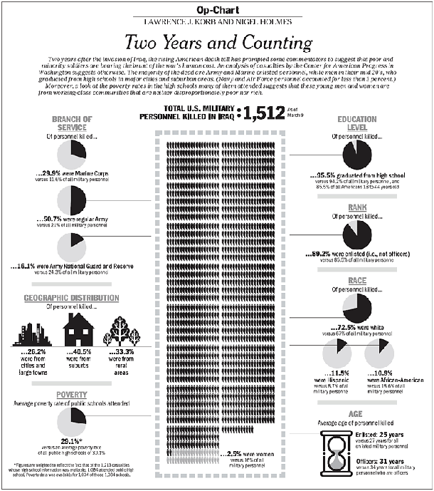
Cost of War in Lives
Cost of War in Bodies
This chart attempts to stack up the dead in a blackened central column. It reminds me a little of the way John Snow stacked up his dead when mapping cholera’s progress on Broad Street. I like it overall, my biggest complaint is that the reference category for all these figures is military personnel. These folks are out there dying for the whole country, not just the military, so I think it makes more sense to compare them to the entire US population. Maybe they could show both the comparison to the rest of the military and the comparison to the entire nation.
I would also like to point out that this graphic was a collaborative effort between four people: Lawrence J. Korb, senior fellow at the Center for American Progress, former assistant secretary for manpower at the Department of Defense, Rajeev Goyle and Max Bergman, also of the Center for American Progress, and Nigel Holmes who is a graphic designer. The moral of the story is that even with great data, a great graphic design is not just going to spring forth. Graphic design skills are key and need to be credited. Nigel Holmes has been published all over the place and is fairly prominent, but younger graphic designers find it harder to get credit for what they do. So if you ever enlist the services of a graphic designer, please give him or her credit. [And as a practical point, please allow enough time for him or her to do a good job and go through a few iterations. Producing a final design is a lot like getting to the final draft of a paper – it takes a good deal of back and forth.]
This is an odd kind of chart, it uses 2004 data to show how the average of 81 people who die each day by guns are killed – suicides, homicides, accidents/police action. Note that people who die in war are not included. I find this both intriguing and incomplete. For contextualizing sensational events like yesterday’s murders and suicide in Alabama, this is useful. People die everyday at the wrong end of guns, some as a result of homicide, more as a result of suicide in older cohorts. But…
What Needs Work
… where’s the depth? The dotted circles grouping the bullets are not all that sensitive. It’s the same dots across the board, no matter what’s being grouped. Somehow that seems too hasty; it takes a lot of reading to decode this graphic. There could have been a way to do it so that race and gender were visually obvious without needing the words. Maybe the bullets representing dead females could have taken on a feminine form. Maybe race could have been represented by colored bands around the bullets.
Relevant Resources
Arum, Richard and Taylor, Edward. (2007, 7 May) The Sociology of School Shootings Edited transcript and audio link of a recent Voice of America interview with Richard Arum of the SSRC and Edward Taylor of U. Minn., presented with the permission of VOA. From the SSRC site.
Top 10 States by HIV Rate 1987 and 2007 (CDC data)
Top 10 States by HIV rate - modified
What Works
This data could easily have been thrown into a table – the bars make it a graphic. It is more visually interesting and instantly legible than a table, but are the bars enough?
What Needs Work
Most of the states on the top ten list in 1987 are not still on the list in 2007. That’s the most interesting part for me, and I would like the graphic to address that somehow — either by focusing on the four states that stayed on the list or by making sure it’s easy to see just how much movement there is on and off. What did the states at the top of the list in 1987 have in common? What about the states at the top in 2007? It appears that having a high percentage of the state living in urban areas makes some kind of difference but the graphic doesn’t give any clues at all about what is going on to get on or off the top ten list. Quite honestly, it doesn’t make sense to talk about the top ten states by HIV rate. It just doesn’t. That’s what the graph tells me.
I did try my hand at nudging the graphic in the right direction with the pink barred example. I don’t know if those converging lines pointing to somewhere outside the top ten help viewers to key into the large amount of movement on the list, but that is what I was thinking.
In the end, it would be better to go back to the data and come up with a more thoughtful analysis than to alter this graphic. The moral of the story is that the graphic can only be as helpful as the underlying data and the logic of the analysis.
Crude Suicide Death Rate by Age Group - Canadian First Nations vs. All Canadians
What Works
I went looking for information about suicide and American Indian populations because I know that this is one indicator of the mental and physical health of a population. There is written work on American Indians out there, but this was the best information graphic on the subject and it happens to come from Canada where the population in question is referred to as First Nations. I like it because it respects that there has been (and continues to be) a difference in the rate of male and female suicide victims. Women tend to attempt suicide more often; men tend to be more successful in their attempts. I like it because it shows that the teen years are the most dangerous years for First Nations members by continuing the analysis across all age groups. They could have just truncated the graph at age 35 or so, since they are primarily concerned with the teen years, but instead they show the entire range of age cohorts. The viewer has to pick up on the fact that the difference between suicide rates of First Nations vs. all Canadian populations is most during the teen years and then falls off so dramatically that there is hardly any difference in old age. When viewers have to figure things out for themselves they are more likely to remember and trust those insights. I like that the tabular data is appended below the graph.
What Needs Work
Bar graphs are best when they are simple and this one is beginning to move away from simple. There are four bars for each cohort – it’s still legible, but it’s becoming hard to grasp the message at a glance with all those comparisons going on at once.
Analyzing the visual presentation of social data. Each post, Laura Norén takes a chart, table, interactive graphic or other display of sociologically relevant data and evaluates the success of the graphic. Read more…


 Transportation for Livable Cities By Vukan R. Vuchic")


")

