Field of likely GOP candidates for Republican party nomination | Nate Silver

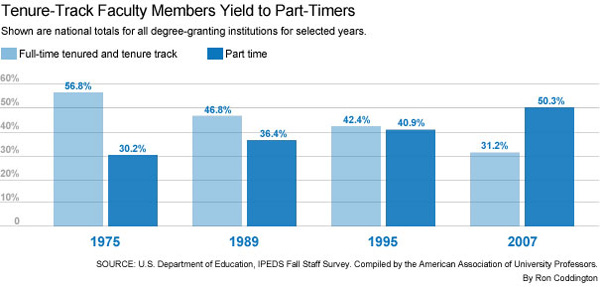
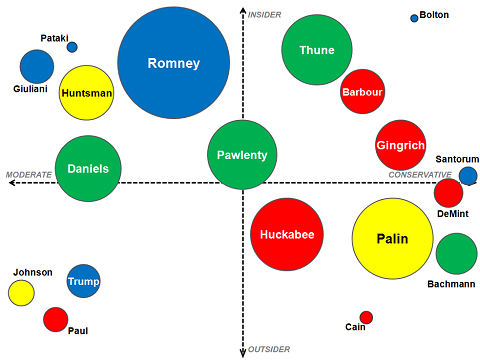
Nate Silver of 538 created this field map of the likely GOP candidates seeking the party’s nomination for President. I note, as does Mr. Silver, that none of these candidates have yet announced official intentions to run.

What works

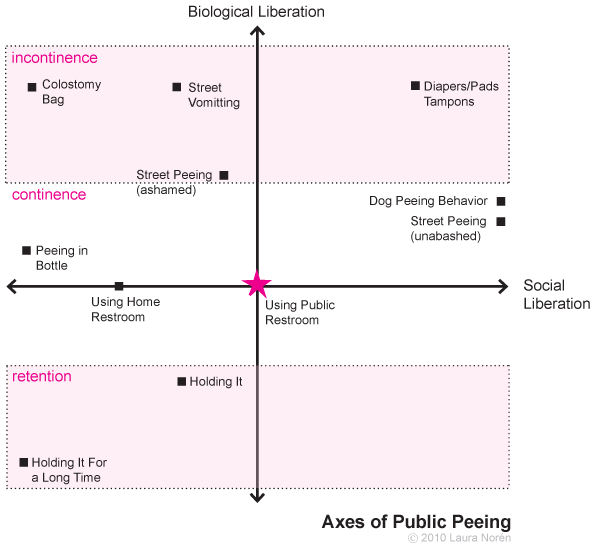
Mr. Silver and I seem to share a fondness for two-axis field maps as a way to wrangle with a pool of qualitative information. Earlier, I used the same kind of strategy to sort my thoughts regarding peeing in public.

Here Mr. Silver is the field map approach (along with different sized/colored circles) to apply a system useful for thinking through the possible Republican nominees for President. As he explains, the x-axis is one of the most commonly used sorting devices for any candidate – political conservativism on the right, liberalism on the left. In this case, because all the candidates fall to the right of center, ‘moderate’ is used as the left hand label. Mr. Silver admits the y-axis need not have been the one he chose. But he decided to go with insider-outsider status because that will be an important element in this primary battle, given the claims made by the Tea Party.

The two axis field map works well for establishing some basic rules with which to sort out candidates who are attached to all manner of qualitative facts that may matter. The field map gives us a way to sort out messy, unmeasurable (qualitative, or quantitative but on different scales) information in a way that allows us a bit of clarity. If you want to use this as a tactic in your own work, I would suggest thinking through a number of different choices for axes. In this case, Silver was fairly confident about the x-axis (level of conservativism) but he was less sure that the y-axis was going to be the most meaningful compared to other choices. He didn’t discuss the other y-axes he might have considered – I can think of a few – but the point is that if you are using this approach in your own work, you need not limit yourself to coming up with one field map. In a situation like this one where you are reasonably certain about the x-axis, keep that same x-axis but redraw the field map with multiple y-axes. Maybe one of them will make the most sense. Likely they will all make some sense when it comes to explaining some things, but not as much when it comes to explaining something else. It is acceptable to end up with an array of field maps, not just one. The social world is a complicated places. Expecting it to fit into a two-axis field map is unrealistic, but helpful as a starting point.

Also, in this case, I like the use of different sized circles. The bigger the circle, the higher the odds of that candidate’s taking the nomination, according to a third party.

What needs work

I am unconvinced by the use of color. Silver himself wasn’t sure that it made sense to color-code these folks by their region of origin, but he threw in the color just because region of origin has mattered in some elections in the past. Again, if one variable doesn’t quite jive with what you think matters, I might try another. For instance, as the primary race heats up, maybe Silver would want to drop the concern with region-of-origin in favor of something like ‘attitude towards gun control’ or ‘attitude towards abortion’. Since neither of those are binary issues, he might be able to get away with using a single hue and darkening it for ardent supporters while moderate supports end up with lighter hues. Clearly, that graphic technique could be used to represent any kind of platform issue.

Further Reading

I encourage you to read Silver’s full post if you are interested in figuring out why he put the candidates where he did. No need to rehash what he has to say – he does a better job of explaining himself than I could.

Tenure Trends | Robin Wilson for The Chronicle of Higher Education

Tenure dies, three graphics

Tenure is declining. There are many reasons for this, most of which are economic. Tenured professors are very expensive compared to, say, adjuncts and graduate student TAs. Once upon a time in departments far far away, even recitation/discussion sessions were led by tenured faculty members. The only experience I ever had with such a situation was in a department (physics) heavily funded by dollars from the Department of Defense. Don’t say the militaristic state never gave you anything, my fellow classmates. I’m not bragging, but I do think I am pretty clever when it comes to Newtonian physics, at least for a sociologist.

The story here is clear in the graphics…or is it?

This first graphic ran in The Chronicle of Higher Education last July in an article written by Robin Wilson who asked:
“What does vanishing tenure mean for higher education? For starters, some observers say that college faculties are being filled with people who may be less willing to speak their minds: contingent instructors, usually working on short-term contracts….But others argue that the disappearance of tenure is actually not the worst thing that could happen in academe. The competition to secure a tenure-track job and then earn tenure has become so fierce in some disciplines that academe may actually be turning away highly qualified people who don’t want the hassle. A system without tenure, but one that still gave professors reasonable pay and job security, might draw that talent back.”

It’s not my place to get into that discussion here, but I do want to interrogate the graphic that ran with the story to see if it captured the essence of the tenure story.

First, the Chronicle’s graphic has numbers that do not add to 100%. So I went back to the report from the American Association of University Professors that the Chronicle had pulled their numbers from and came up with this:

Trends in Faculty Status, 1975 - 2007 | AAUP

This report clearly has more detail – we can see where those missing numbers are (full-time non-tenured faculty) – as well as understand the distinction between full-time already tenured faculty and those who are in the process of seeking full-time tenured positions.

I decided to compile this information into a line graph for two reasons. First, a line graph is the best way to show trends over time. Second, the data were collected at odd intervals so the eye would not have an easy time just stringing together a line connecting the bar graphs to understand the pattern. I imposed a grid. I added in the missing category. I gave it some color (darker colors correspond to more reliable, financially sound employment categories; lighter colors refer to more fleeting or otherwise less remunerative employment categories).

Tenure is Dying | Laura Noren

References

(16 December 2010) The disposable academic: Why doing a phd is often a waste of time The Economist. Accessed online but it ran in the print edition.

Relevant quote:
“The earnings premium for a PhD is 26%. But the premium for a master’s degree, which can be accomplished in as little as one year, is almost as high, at 23%. In some subjects the premium for a PhD vanishes entirely. PhDs in maths and computing, social sciences and languages earn no more than those with master’s degrees. The premium for a PhD is actually smaller than for a master’s degree in engineering and technology, architecture and education.”

Wilson, Robin. (4 July 2010) Tenure, RIP. In The Chronicle of Higher Education.

The Annual Report on the Status of the Profession, 2007. The American Association of University Professors. Fact Sheet: 2007.

Human Development Index Map
Massachusetts Human Development Index

What works

Mapping the Measure of America is a social science project that deliberately includes information graphics as a communication mechanism. In fact, it is the primary tool for communicating if we assume that more people will visit the (free) website than buy the book. And even the book is quite infographic dependent. I support this turn towards the visual. I also support the idea that they hired a graphic designer to work with them. Often, social scientists do not do well when left to their own under-developed graphic design skill set. Fair enough.

The website presents a unified view of the three images above. I couldn’t get them to fit in the 600 pixel width format, so I presented them one at a time. I encourage you to go to the website because one of the greatest strengths of this approach is the interactivity and layering. I happen to have picked Massachusetts, but each state plus DC has it’s own graphics available. There are other charts and whatnot available, but I think that this set of graphics (which you see all at once) are the strongest.

What needs work

Maps. Maps are too often used. Here’s why I think maps are a problem. Look, folks, political boundaries are meaningful when it comes to making policy or otherwise dealing with state-based funding. And that’s about it. Political boundaries occasionally coincide with geographical boundaries, but not always. Geographical boundaries are meaningful for some things – life opportunities may be based on natural resources or on historical benefits accruing to natural resources. But political boundaries and maps are often not all that useful because they imply that the key divisions are the divisions between states or counties or neighborhoods. Like I said, sometimes this is true because funding tends to be like the paint bucket tool – it flows right up to the boundaries and not beyond, even if the boundaries are arbitrary or oddly shaped. But where the issues are not heavily dependent on funding, thinking in terms of political boundaries makes it harder to see patterns that are organized along other axes. For instance, I wonder what would have happened if some of these categories – education, longevity, income – had been split between urban, suburban, and rural areas. Or urban and ex-urban areas if you prefer that perspective on the world as we know it.

In the end, I think the title is both accurate and disappointing: “Mapping the Measure of America”. Figuring out how to do information graphics well means figuring out which variables are the key variables. In this case, it seems that the graphic options might have determined the display of the information. Maps are easy enough – they appear to offer a comparison between my local and other people’s local. Those kinds of comparisons offer readers an easy way to access the information because everyone is from somewhere and there is a tendency to want to compare self to others. But ask yourself this: to what degree do you feel that state-level information is a reflection of yourself? Do you see yourself in your state?

References

Burd-Sharps, Sarah and Lewis, Kristen. (2010) Mapping the Measure of America with the American Human Development Project. Site design credit goes to Rosten Woo and Zachary Watson.

Kira Alexander. (1976)  The Bathroom.  Urine Trajectories
Kira Alexander. (1976) The Bathroom. Urine trajectories by sex

What works

This is the most graphic of graphic sociology so far. For those of you with delicate constitutions, give yourself a pat on the back for taking a deep breath and deciding to read the rest of this post without tossing it upon first glance.

This was published in 1976 in a book that is now out of print called The Bathroom by Alexander Kira, an architect and professor at Cornell. He was interested in the bathroom as a design challenge with an eye to the ergonomics of the fixtures and spaces commonly encountered in standard bathrooms, home to standard fixtures. The bathroom is not exactly a hotbed of design revolution so many of his ideas are not only still relevant, but still fresh. This particular diagram was used to help sort out how one might go about designing a urinal for women (if not a unisex urinal that could serve both women and men, not at the same time, though).

I usually find the use of photographs in information graphics to be superfluous. Generally, there is some graph about, say poverty or out of wedlock birth and the photograph paired with the graph takes a person and turns them into a token. The homeless man as icon of poverty; the mother and child (usually a woman of color) as icon of poignant nurturance. That sort of reductive photography has no place in information graphics. Quite frankly, I’d be happy never to see predictable, reductionist photography like that anywhere.

But in this case, Kira used a grid in the photo shoot turning the resulting photograph into an infographic. Did I mention that his ideas still seem fresh? With the grid, we have a much easier time making the visual comparison between trajectories of urine between women and men.

Imagine you are a urinal designer. Ask yourself: how would I use these diagrams to help me design a urinal that works for women? Realize that you would either pursue a trough strategy or, better, a urinal that women do not face. They could stand with their backs to it and bend forward like the woman in the third panel is doing. Of course, there are sartorial concerns. Backing up to a urinal works just fine if you are naked, like our urination model is. But what if she’s wearing clothing? That’s a different design challenge. I would be interested to see what would be possible by relocating pants’ zippers so that they open between the legs rather than in the front.

What needs work

I apologize that in some of these panels it is hard to see the stream of urine, which is a necessary piece of information. With the women, it’s pretty much straight down except when bent over at the waist. For the men, it is slightly in front of the body unless he is holding his penis in which case the trajectory is quite a bit in front of him — it leaves the photographic frame.

Reference

Kira, Alexander. (1976) The Bathroom New York: Viking Adult. [out of print]

Procrastination | Jorge Chan, phd comics

What Works

It’s finals season so this one seems appropriate. And I always like it when people tell jokes with graphs. Extra funny. Maybe only extra funny if you are a nerd.

References

Chan, Jorge. (27 October 2010) Procrastination

Hi all. I put together the following biblio after some of the folks in the audience during my presentation at The Image conference (UCLA). They were wondering how to create better information graphics.

This list of resources is good if you are sick of using excel and killing yourself trying to use Word to make graphics or wondering what you should be aiming for within a categorical type (what’s a good bar graph, anyways?). Admittedly, none of the resources are perfect, most do not tell you how to use which software programs. But there are good pieces of advice and instructions in just about all of them.

The list is available for download here. And in html below.

Infographics Biblio – emphasis on how-to

Cleveland, William. (1994) Elements of Graphing Data. Summit, NJ: Hobart Press.
+ Table of Contents and Chapter 1: http://hobart.com/Elements.PDF

— (1993) Visualizing Data. Summit, NJ: Hobart Press.
+ Table of Contents and Chapter 1: http://hobart.com/Visualizing.PDF

Few, Stephen. (2004) Show Me the Numbers: Designing Tables and Graphs to Enlighten. Oakland, CA: Analytics Press.
+ Perceptual Edge blog

Graff, Gerald and Catherine Birkenstein. (2009) “They Say/I Say”: The moves that matter in academic writing. New York: W. W. Norton.
+ This book is not about graphics. I find that it offers a useful framework for figuring out
which contextual information needs to be included in a graphic in order to provide
enough context for a useful discussions. If academics creating infographics include some
history of an argument or predict what critics might say, they will create a stronger, clearer
graphic just the way writers create stronger, clearer arguments if they situate their
argument within a field and address predicted criticism before they arise.

IBM Research: Many Eyes Visualization Tool.

Roam, Dan. (2009) Unfolding the Napkin: The hands-on method for solving complex problems with simple pictures. New York: Portfolio Trade, a division of Penguin.

Rosling, Hans. (2005-present) GapMinder Visualizations and tools to make your own visualizations.

Seagram, Toby and Jeff Hammerbacher. (2009) Beautiful Data: The stories behind elegant data
solutions
. Sebastopol, CA: O’Reilly Media.
+ Table of contents

Steele, Julie and Noah Iliinsky. (2010) Beautiful Visualization: Looking at data through the eyes of experts. Sebastopol, CA: O’Reilly Media.

Tufte, Edward. (2006) Beautiful Evidence. New Haven, CT: The Graphics Press.
— (2001) The Visual Display of Quantitative Information, 2nd ed. New Haven, CT: The Graphics Press.
— (1990) Envisioning Information. New Haven, CT: The Graphics Press.
— (1997) Visual Explanations: Images and Quantities, Evidence and Narrative. New Haven, CT: The Graphics Press.

Ware, Colin. (2004) Information Visualization: Perception for Design, 2nd ed. Morgan Kaufmann.

Wong, Dona M. (2010) The Wall Street Journal Guide to Information Graphics: The dos and don’ts of presenting data, facts, and figures. New York: W. W. Norton.
+ Table of contents and sample pages

Life Satisfaction and GDP per capita at PPP | The Economist

What Works

This graphic comparison in The Economist is an excellent piece of evidence in support of the use of logged scales. If you are an economist or quantitative sociologist reading this, you probably just fell asleep because you know about log scales already. Still you have to agree that the graphs here do an excellent job of visually explaining why log scales are better than linear scales in this case.

One of the general rules in multi-variable models involving per capita income data is that this data should be logged. The above graphs visually describe what happens when linear wage data is logged. That is the only change made between these two graphs. On the left, the wage data is measured just as it comes, on a linear scale which assumes that the difference between one dollar of per capita GDP is the same between no dollars of per capita GDP and that very first dollar of GDP as it is between the 10,000th dollar of GDP and the 10,001 dollar of GDP. The graph on the right logs the per capita GDP. This changes the assumptions about the distance between the zeroth and first dollars of income and the distance between the 10,000th and 10,001st dollars of income. In the graph on the right, logging the per capita GDP gives us a scale that is far more sensitive to differences when integers are small than when they are large. That difference between having no per capita GDP and having just one dollar of per capita GDP, or between one dollar and ten dollars has a relatively greater impact than the difference between 10,000 and 10,001 (or between 10,000 and 10,010). Logged values are sensitive to differences in orders of magnitude. There is an order of magnitude change between 1 and 10, then not again until we get to 100, not again until we get to 1000, and not again until we get to 10,000. The distance between each of these milestones grows successively larger. That’s the mathematical logic behind logged scales. Why do they tend to produce better fit lines for per capita income level data than the linear scale does?

Imagine this: you have no money and someone gives you $10. That is quite meaningful. Now you are able to take the subway, get something to eat, and make a call at a pay phone, three things you would not have been able to do when you had nothing. Those $10 mean a whole lot to you in a way they wouldn’t if you had $10,000 and I gave you $10. With your $10,000 you would already have been able to do all the things I mentioned above. Having an extra $10 would not make much meaningful change in your immediate material conditions or your investing options. The point here is that when folks have no income, they are a lot more sensitive to small changes in income than they are when they have a measurable income. The more income they have, the less sensitive they are to small (or even moderate) changes in income. This is why economists and quantitative social scientists almost always log measures of income. The assumptions I just explained are almost always true.

In the graphs, once the per capita GDP (which isn’t exactly a measure of income, but it is closely correlated) is logged, the relationship between income and happiness is much clearer. The model fits better when per capita GDP is logged and it appears that there may be a positive relationship between money and happiness after all.

What needs work

These happiness measures are rather uninspiring. Happiness is quite possibly culturally specific – what makes my mother happy, for instance, is my singleness. What makes mothers in other places happy might be that their 30-year-old daughters are married and have healthy children. I can hear you all saying, ‘But wait! Your mom is weird, what makes her happy is singular’. And that is just exactly my point. Happiness is contingent upon so many other things that trying to measure it is difficult – what makes a person happy changes over time and place so we cannot measure happiness based on easily observed objective measures. Some people like to think they can measure levels of depression or even serotonin to figure out who’s happy or not. But I simply don’t buy it. In places where there is more health care, more people are going to be diagnosed with depression. But does that mean that a population with a high level of reported cases of depression (a seemingly scientific diagnosis of unhappiness) is any less happy than a place in which seeking a diagnosis for mental illness bears a prohibitively high financial or social cost such that people do not even seek diagnoses in the first place? Perhaps the people getting treated for depression are now happier than they were before they were treated and thus the place with a high collective rate of diagnosed depressives is actually happier than a place where people are not being treated for their depression?

Dalton Conley was on a panel I recently attended that was called together to offer thoughts on THE MEASURE OF AMERICA 2010-2011: MAPPING RISKS AND RESILIENCE”. Someone from the audience pointed out that the book tends to use measures like health, education, income, and mortality but that these may be missing the right question. The right question was something along the lines of, “But are people happy?” Dalton pointed out that this is a normative question (and thus not the point of the volume which is demographic in nature) and that it is methodologically nearly impossible. The reason the information in the book is meaningful is that the measures that have been established can be rigorously measured across time and place. And they HAVE been measured across time so we are able to see patterns. The problem with any new measure is that there isn’t much to compare it against for a couple decades. More importantly, there is no objective way to measure happiness. A pound is a pound where ever you weigh it on the face of the earth (OK, yes, there are some exceptions to this but those are for physicists). A dead person is a dead person just about no matter where they are so mortality tends to be a good measure, too. But happiness does not fit well into a measurement framework. And even if it did, we’d be back to Dalton’s first point, which is that all we could do with that information is become normative.

This increasing desire to find the roots of happiness seems both misguided and heavy handed. Just as people appreciate seasonality in nature, I tend to think there is something to be said for having a full set of emotions. If that is true, there is no particularly good reason to run around trying to doggedly pursue happiness. There are benefits to being sad and introspective just as there are benefits to being happy. What is *with* all this fixation on happiness?

You’ve heard plenty from me at this point so I’m shutting up. I would like to hear your thoughts about both log scales and measuring happiness.

References

(25 November 2010) Money and Happiness [Daily Chart] The Economist online.

Lewis, Kristen and Burd-Sharps, Sarah. (2010) The Measure of America 1900-2010: Mapping Risks and Resilience. with an introduction by Jeffrey Sachs. New York: NYU Press. Part of the American Human Development Project of the Social Science Research Council.

Hans Rosling | MSNBC

What Works

Hans Rosling argues that by raising the living standards of the globe’s poor people we can avert a population growth disaster. He uses statistics and on-stage demonstrations to do it. Worth watching. Over at TEDtalks. Happy to see a kindred spirit having his day with TED.

TED logo | TED
I approve of the rockstar version of Hans Rosling’s portrait so I cribbed it from MSNBC. Thanks graphic designer out there somewhere, working to make statisticians more visually stimulating.

References

Rosling, Hans. (July 2010) Global Population Growth TED talks.

Gap Minder is Hans Rosling’s website. It features many more animations than just the one about population growth as well as tools to build your own animations. The emphasis is on country-level data.

Axes of Peeing in Public
The social and biological axes of public peeing

What works

This was something I used to help me think through the two main axes that determine peeing behavior – biological and social control. Urination is a biological function that has been subjected to a great degree of social control. Unfortunately, urban design has not kept pace with the demand for clean, easily accessible public restrooms for humans. And there has been no attempt to create any kind of system to deal with canine urine. In most cities it is illegal for humans to pee in public but both legal and widely accepted for dogs to pee where ever they like (in New York, they cannot pee on the grass in parks).

What worked about this as a graphic is that it helped me sort out how I was thinking about the problem of access to the city when the bladder is a leash. I couldn’t quite sort out how to think about what it means that some public peeing is acceptable even though it is mostly completely unacceptable. One of the odd side effects of the introduction of the new TSA pat down procedures is that it revealed just how many people struggle with incontinence, either needing to urinate frequently or needing to wear diapers (or both). I was aware of those issues before the TSA started sticking their hands in private places, but I wasn’t sure how to simultaneously think about adult diapers, dogs peeing on the street, and taxi/truck drivers peeing in jugs while still in their cabs. Where social control is very strong – as it is in the case of urination – it can almost trump biological needs, especially if the biological needs offer a level of control. Clearly, not all peeing can be put under biological control, but a good deal of it can. I stuck vomiting on the map since that is harder to control than peeing and it was useful to include a biological drive that has not been so easy to tame with the civilizing process.

What needs work

The glaring problem here is the ‘who cares’ problem. Very few care about the axes of social and biological control, though there are a few other case types that could use these axes (burping/farting, posture, chewing, etc). But the re-use of this exact same set of axes is not the point. Nor do I particularly care if you are interested in public peeing.

I introduced this graphic because it was helpful to me in thinking through the analysis of a multi-faceted problem. All social science problems are multi-faceted. Setting up four quadrants as a field is superior to setting up four quadrants in a two by two table, though that is a variant of this approach. I find that approach is too reductive, forcing things to be lumped together that really are not all that similar. In this case, I was able to add more nuance by leaving the mid-section of the biological control vector unmarked while I singled out incontinence and retention (where retention is beyond routine continence).

This approach to thinking through forces you to come up with the two critical dimensions that organize both the empirical information you’ve gathered and the theoretical arc you would like to follow. If you are skilled, you could add a third dimension. A 2×2 table only gives you boxes, not spectrums. What’s more, the spectrum approach is more open, allowing the addition of further segmentation or layering which is not as easy to achieve in a 2×2 table.

LifeMap life timeline | Ritwik Dey

What works

This is a great timeline. If all CVs were displayed like this I think employers would have a much better idea who they’re hiring.

Here’s why I like it:

    LifeMap

  • shows simultaneity – layering colored strips
  • shows relative weights – some stripes are fatter than others
  • shows the split between two classes of life – academic and personal by simply sticking the axis between them and then emphasizing this split with a different color scheme for each class
  • mixes words seamlessly with the graphic elements – each of the activities on the map is listed only once, even if the band it occupies shifts noticeably. Re-listing each element would add clutter and the colors are easy for the eye to follow across the graph even where there are discontinuities.
  • displays location at the top without making location seem like the primary element. It’s hard to get the thing that appears at the top NOT to seem like the most important. Clearly, in the course of a life, moving from Mumbai to New York is a big deal, so this is a critical component, but it doesn’t dominate the graphic. We are able to see the elements that make the leap from one place to the next but we aren’t quite sure if it was the shift from one place to the next or from one level of schooling to the next…and maybe even Mr. Dey doesn’t know. How can anyone untangle the causality of an individual trajectory?

It’s clear to me that many of the design elements here will be useful for future portrayals of social science data. In this case, I’d say we are looking at an enhanced CV, brave enough to indicate the passing of a parent and even a mother’s new relationship (which preceded the passing of the father). Spare visual narrative, intriguing in what is left out, remarkably rich nevertheless.

What needs work

The font relative to the graphic is too small. I know that this was probably intended as a poster and displayed at such a scale that the font wasn’t a problem. I apologize that you have to click through to see all of the categories.

Another comment while we’re on the topic of fonts and words relative to graphics: Mr. Dey was able to describe all of his interests with one or two words. It looks great. He expanded his accomplishments a bit beyond the two word limit, but they are still quite brief. I like the idea of choosing the one, two or three most precise words and making sure the graphic itself can carry the rest of the message. It’s a good test to see if your design is helping – when it can speak almost on its own things are looking good.

The limited number of words makes the whole thing not only visually and verbally poetic but also increases its functional value. One of my functionality measuring sticks is the number of words a person would have to translate if they were trying to read this graphic in a foreign language. The fewer words, the easier it is for non-English speakers. The more specific the words are, the more likely they are to translate appropriately. Therefore, ‘swimming’ and ‘3D modeling’ probably translate without difficulty. I have no idea if there is any kind of meaningful translation of “scouts” or “scouting” in any language other than English, but that is not a problem any graphic designer is going to be able to solve.

I wonder, though, if no-more-than-two-words rule led to the choice of the word “derive”. I know what that means in the context of calculus. I have no idea what that means in the context of a LifeMap, but it remains salient for years so I wish I did know what it meant. Sometimes the word restriction rule leaves out the phrase that would best describe whatever it is you might be trying to describe. Or maybe Mr. Dey does a lot of theoretical derivations.

References

Dey, Ritwik. (2005) LifeMap Project for Information Design course with Dmitry Krasny at Parsons School of Design in New York City.