http://www.datapointed.net/

Data Pointed

I experienced the vastness of the internet today, stumbling across Data Pointed which is a not-new blog featuring original data visualizations. Why haven’t I come across it before? I wish I knew the answer to that as well as to the related question: how many other interesting data visualizations sites are out there that I do not know about?

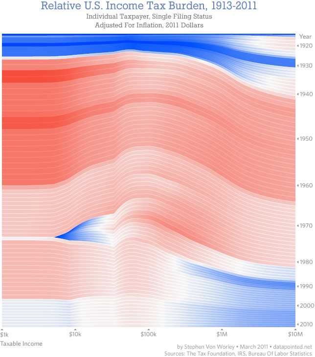
What you see above is the most recent post at Data Pointed by Stephen Von Worley. He produces sophisticated graphics across a wide array of subject areas. Just so happens that this one is about the inter-relationship of the income distribution and the tax distribution which is of keen interest to social scientists, and policy people in particular. I find this visualization to be beautiful looking but a little hard to read. Each year is represented by a line, that line is drawn through all of the income brackets you see along the x-axis. As the line passes through these income brackets it changes both color and thickness. Thick red lines indicate areas in which people are paying more than their share of taxes; thin blue lines are areas in which people are paying less than their share of taxes. Von Worley had this to say:

“A modified Reagan-era tax system lingers to this day. To his credit, Dubya did reduce taxes on very low earners, so they’re no longer getting hammered. But, the people at our economy’s core – the full-time workers earning between $20,000 and $150,000 a year – still pay at up to double the rate of the ultra-wealthy, relative to what history suggests they should.”

Personally, I had a hard time drawing that message out of the graphic, despite the fact that it is so beautiful and elegant that I was compelled to stare at it and read the explanation until I could figure out how it worked.

McDonald’s Distances in the US

Von Worley himself notes that Data Visualization was not the popular success he had hoped, at least not at first. [Note: Graphic Sociology isn’t exactly a success in terms of page traffic, but it has a core of steady followers generating a four-digit count of unique page views per week.] Data Visualization got popular after Von Worley created the map graphic below that uses blobbiness to indicate distances between points on the US map and the nearest McDonald’s. The farthest you can get from a McDonald’s in the US is 107 miles and you would be in South Dakota.
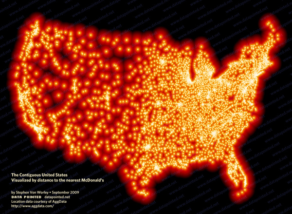
Distance to nearest McDonald's in the US | Stephen Von Worley

Does the map work?

I am not entirely sure the map is working – again, it is beautiful. Beautiful is compelling and being compelled, I wanted to spend time looking at it. I also love that it kind of looks like fat globules. How appropriate and subtly political. We also end up with a very good proxy for American population density. Not bad. But what would have been even more awesome is if we could tell this was a distance map without having to read the caption. I want to know that there’s a McD’s at the center of each blob and that what I’m supposed to notice is the distance I need to go to get from the darkness to the light. (In my version, I might have had the centers of the blobs be dark and the peripheries be light but I’m guessing it wouldn’t read as well visually no matter how well it fits with my understanding of McD’s as a morally shady place.)

References

Stephen Von Worley (15 March 2011) Shifting Burdens: U.S. Taxes By Income Level Over The Years at Data Pointed Blog.

A recent (well, 2010 so not *that* recent) report from the UNDP traces the history of information graphics as tools for the promotion of public health. Illustrious crusaders from the yesteryear of public health like John Snow and Florence Nightingale developed some of the earliest ‘infographics’ in service of their public health goals. I’ll post more on that portion of the report later this week. But for now, I’d like to discuss the bulk of the report which was dedicated to the decisions that César Hidalgo (Professor at MIT’s Media Lab, Student at Harvard’s Center for International Development, Associate Professor at Northeastern’s School of Art and Design) made as he developed an appropriate information graphic to represent country level data generated by the Human Development Index. (See also: Measure of America’s Human Development Index graphics for the US only and the Graphic Sociology post about them).

The graphic below this is not intended to be a graphic. It is the basic formula upon which the Human Development Index (HDI) is based. The HDI is a single number that represents a composite score that takes contributions from educational, income, and health measures (which are themselves composite scores). The authors first came up with a simple, almost graphical representation of the relationship between the contributing factors that’s a sort of formula/graphic hybrid. Many social scientists would stop here and move on to the writing of the report, content to let a table with country-level data do the reporting for them.

Basic Human Development Index Relationship | César Hidalgo

HDI Spline Tree

From this hybrid between a formula and a graphic, Hidalgo developed the spline tree you see below. It shares some aspects with the basic formula above, that much is visually clear, but already the lengths and colors of the components are taking on meaning, allowing each country/year combination to produce a tree that is distinct from other trees, but similar enough to be comparable.

The HDI Tree - Spline Design | César Hidalgo

One of designer’s common strengths/weaknesses is the inability to stop designing. Design is never done because the design has reached some obvious and agreed-upon level of perfection. Usually design is deemed ‘done’ when the deadline rolls around. It would appear that Hidalgo was ahead of schedule and decided to go for another iteration, coming up with the diamond tree you see below. Though, as you’ll also see, he did not completely abandon the spline tree. It shows up again.

HDI Diamond Tree

The diamond HDI tree takes an area-based approach, one that is easier to understand visually at first glance than the spline tree. With the spline tree approach, the challenge is that the viewer needs to visually compare the lengths of lines that are not parallel to one another to gain full comprehension. Granted, one might most often compare the lengths of lines that ARE parallel to one another because viewers might mostly be comparing one country to the next. But that isn’t always the case. And even that is not as easy as comparing the areas in the diamond tree approach.

The Human Development Tree - Diamond Tree | César Hidalgo

The rules for the HDI diamond tree (and I’m quoting Hidalgo and team here) are as follows:

* The height of the tree trunk is proportional to the total value of the HDI
* The side of the tree branches are proportional to each sub-indicator
* The branches are ordered in increasing order from left to right
* The color of the trunk is the average color of the components

All together

And here is one country’s worth of Diamond and Spline trees, represented over time. This is where I think the two tree graphics – and the diamond tree in particular – work their magic best. Human eyes are good at doing comparison’s in this sort of way. The trees are more or less the same thing over and over again so this repetitive presentation allows the eye to pick out the relatively small changes over time, especially as they aggregate from one year to the next.

HDI in Rwanda 1970-2005 | César Hidalgo

Pan-Africa

With the last graphic in the series, you can see what it would look like to present the entire continent of Africa, by country, in two different years. It’s a little tough to fit a properly sized graphic into the format of the blog. I encourage you to click through to the full report in the references where you can see a much better version of the final graphic.

Human Development in Africa by country, 1970-2005 | César Hidalgo

Kudos

My biggest applause goes out to the Hidalgo team for abandoning the use of any map at all. This graphic should prove the point that just because one is faced with country level data – something that seems geographical in nature – one should not feel that they must use a map. A map would not have added anything to this information and it probably would have precluded the development of the tree concepts that are working pretty well.

References

Hidalgo, César A. (2010) Graphical Statistical Methods for the Representation of the Human Development Index and its Components [Research Paper] United Nations Development Program.

In theory there is an interactive portal for comparing any two HDI Diamond Trees of your choosing but I was not able to get it to work in Firefox. Worked like a charm in Safari and Chrome.

For ongoing comments on these graphics see: The HDI Tree: A visual representation at “Let’s Talk Human Development” a website published by the United Nations Development Project.

Percentage of US citizens holding passports, by state
Percentage of US citizens holding passports, by state | Andrew Sullivan

Passport background

In 2008 as part of the war against terror, US citizens were required to have a passport to travel to countries like Canada and Mexico that had previously allowed passport-free travel. US citizens could drive or walk into Canada and Mexico with a driver’s license and be allowed to drive or walk right back in. In 2011, we see from this map that even now, not all US citizens have passports, not even close. Getting a passport is time consuming, costly, and generally requires some evidence that the person applying for the passport intends to travel outside the US. That last requirement is kind of a no-brainer, why would anyone want to go through the effort to obtain a passport if they never planned to leave the US?

What works

Always skeptical about mapping data that could appear in a table or chart, I have decided that I’m neutral on this particular use of mapping as a presentation device. If the map had included Canada and Mexico rather than just making the US appear to float in space, I would probably have been more convinced that the map was the way to proceed with this information. If I had created a chart or a table, I would have divided the US states into two groups: those that border foreign countries and those that do not. Have a glance at the map again and you will see that the states bordering foreign countries have higher percentages of passport holders, on average, than those states that do not border foreign countries. Florida and Illinois do not border foreign countries and yet they both have high percentages of passport holders. In the Florida case, I would say it’s almost as if Florida borders foreign countries since so many of its near neighbors are island nations – Haiti, the British Virgin Islands, the Dominican Republic, and so forth.

Illinois is home to Chicago, a destination for immigrants and immigrants often leave family in other countries whom they would like to visit. Thus, they will need passports. The same is true for most big cities – New York and California (home to New York City and Los Angeles) also have large immigrant populations and large numbers of passport holders. On the other hand, Saskia Sassen might point out that what’s going on in Chicago, LA, and New York is that all of these cities are global cities, hubs of activity in Finance, Insurance and Real Estate (FIRE industries). These FIRE industries are global industries and require their workers to travel internationally at higher rates than the same kinds of workers in other industries.

It would be interesting to compare the rates of passport holders to both the rates of first generation immigrants and the proportion of workers in the FIRE industries in all these states.

What needs work

As I mentioned, presenting this information as a map begs to have Canada and Mexico included. In order to visualize the story here, it would be helpful to see what is happening at the borders, to remind ourselves that the US does not simply float in space. It is geographically specific and it matters that some states have international borders and others do not. Sometimes these borders ARE the story and I think when we’re talking about passport holders, the borders are important.

If this information were to be presented as a set of bar graphs, we would risk some information overload since there would be 50 bars. But that might be alright if it became instantly visually clear that the border states have higher rates of passport holdership than the interior and non-bordering states. Plus, with a bar graph, the numbers could have been layered on each bar (and really, they could have been layered on each state in the map) so that we would be able to get a more precise calculation. Simply knowing that we are working with some number in a 10% range is kind of sloppy for my tastes. That’s just me. And sometimes with information like this it’s silly to try to get granular because the data collection method could have a fairly wide margin of error. Though I should hope that the feds know who is holding passports. I suppose people could apply for them in one state and then move to another state. The feds may not know about moves following passport application and that could introduce some fuzziness.

Note: I tried to go to the original source of the map several times but the page timed out repeatedly. Therefore, I ended up citing Andrew Sullivan at the Atlantic since that is where I encountered the map and it is a website that I believe you can visit whereas cgpgrey.com/blog is not visit-able. If I had been able to visit I might have been able to figure out where the passport data came from in the first place – presumably some federal department.

References

Sullivan, Andrew. (8 March 2011) Map of the Day: How many Americans have a passport, by state in The Daily Dish at The Atlantic online. [Graphic by cgpgrey.com/blog]

Sassen, Saskia. (2001 [1991]) The Global City: New York, London, Tokyo, 2nd ed. Princeton, New Jersey: Princeton University Press.

Regroup, Ex-Google workers at their next jobs | R. Justin Stewart
2am 2pm, Minneapolis Transit on a Sunday | R. Justin Stewart

Art and infographics intersect

Artist R. Justin Stewart has taken infographics into the third dimension. His work is more art than information but it’s clear that it builds on the visual tropes of information graphics.

The first image depicts the way that ex-Google workers dispersed into new jobs after their time at Google. The point is not that any of us happen to care deeply about Google workers – someone does but probably not the readers of this blog – but to see how Stewart depicts network graphs in actual space.

The second two images depict a transit system in Minneapolis over a twelve hour period on a Sunday morning. It’s elegant but far too abstract to ‘work’ as an infographic. This is not a critique – I do not think Stewart wanted to make literal art – but it does not take much creativity to see that it would be easy to layer more information onto the artistry of the presentation.

My major contribution to this discussion and the reason that I decided to post Stewart’s work is that much of the art that has been inspired by the data revolution has happened in digital space. We have seen some amazing pixel-based animations and visualizations on this very blog. But I have not come across too much work in three dimensions, real space, that shares so many conventions with information graphics or data-based ways of knowing. A million points tell a story. Usually they tell that story in the same digital realm in which they were born, but Stewart takes them offline into actual spaces. They get installed. He has to come up with the way he wants to represent intangible information with tangible physical components.

Meta Infographic | Think Brilliant

What works

Using an infographic to deconstruct and critique trends in infographic design is a bit more clever than what I do – using text to deconstruct and critique infographics – though I still think there is good reason to do what I’m doing.

Even though Think Brilliant does a good job of spelling out some of tropes of information design that often populate information graphics, they leave some of these pesky problems obvious-yet-unarticulated. In particular, I love the way they split the word DIAGRAMS in odd places so that it would conform to the shape of the text box it inhabits. I very much dislike that sort of trick. The text need not conform so tightly to its text box that it stops looking like a word and starts looking like an advertisement for the typeface.

Click through on the image or the caption and read it over yourself. Notice that Think Brilliant agrees with me about maps – they get used at times when it seems as though there is barely any geographical information being displayed. Sure, cities exist somewhere in the global geography, but if the viewer is supposed to be comparing one city to the next, it is usually far easier to do that using a graph, table, or chart than a map. If you want to tell me about the weather, go ahead and use a map. But if there is no good reason to use a map rather than a chart or table, using that map often dilutes the message by implying that geography is the primary element determining the quantities in question when it is rarely the case that geography is primary.

I also dislike 3D graphs because they make it harder for the eye to connect the bar back to the axis in for purposes of interpretation. And even though it often seems that infographics have the number one purpose of being pretty, in fact, their number one purpose is to make complicated multi-variable situations easier to interpret.

Well done, Think Brilliant.

Friday afternoon thoughts about infographics vs. writing

Writing about something generally requires a linear interpretation because it is nearly impossible to read two things at the same time and it isn’t all that easy to read something that does not have a singular flow. I guess one could read unordered, bulleted lists…but that’s tedious and inelegant. Making an infographic does not require linearity. It does require just as much thought and craft as writing. Where the story is mostly linear, by all means do us all a favor and write about it. Unless you cannot write and then you are welcome to try your hand at infographic creation (ahem, NYU undergrads, that bit about not being able to write well includes more of you than you think).

In the best of all possible worlds, graphics will be used alongside writing in order to offer readers/viewers multiple ways to understand and engage with your work. Social scientists generally present multi-layered research findings based on sometimes complex sets of assumptions. Asking the reader to get with the program and hold all those moving parts in mind at once can be a lot to ask. For all we know, the reader has not consumed anywhere near the amount of caffeine that they need to operate at peak efficiency. Help the reader. Tell the same story with your words, graphics, and images. This goes for both qualitative and quantitative methods. Just because a project is based on interview and ethnographic data does not mean it is impossible to make graphics or acceptable to skip their inclusion in your work.

As you can see from the graphic above, people can see through designerly gimmicks. Folks want meaningful information in their graphics. Better to create a simple infographic that risks being a bit plain than to skip creating a graphic (or to turn a simple graphic into something that makes ridiculous use of 3D, color, maps, typeface, layout, or any other graphic design trope applied without any value-add in the meaning department).

Market data for natural gas, 1990 - 2011
Market data for natural gas, 1990 - 2011 | The New York Times

What works

If one graphic cannot tell the whole story, use three. Or four. Or four static graphics plus an interactive graphic (keep reading)! Most people would have stopped creating graphics after they produced the first graph – the one that tracks oil and natural gas prices from 1990 up to 2011. I appreciate the second graph which compresses the salient point from the first graph into a single line. It hammers home the point that what we are meant to notice is not the fluctuation in natural gas prices so much as the fluctuation in the difference between gas and oil prices. The other two graphics both deal with oil consumption only, something I find slightly odd given that the story is about natural gas. Yes, it is clear that there is a relationship between oil and natural gas consumption – we see that with the first two graphs. But we also see from the first two graphs that the relationship between oil and gas is not always predictable, especially not right now where natural gas is significantly cheaper than oil, cheaper than we would have predicted if we had to use the past as a guide. Yes, of course oil prices might go up as they respond to increasing demand from “the rest of the world” (weird terminology that means NOT US, Japan, or “developed Europe”).

It’s also true that oil prices are sensitive to political unrest in the middle east, which has been underway lately in a number of countries. It is difficult to tell if these graphs are using numbers crunched before the revolution in Egypt and unrest in Middle Eastern countries or after. The graphic was published 25 February 2011, well after the Egyptian revolution began. But the weekly price is listed in January 2011 dollars which means the rest of the information might have preceded the Egyptian revolution. Still, the path towards divergence appears to have begun in 2009, which renders the timing question I raised a bit beside the point. And this is why we look at trends over long periods of time. Point estimates can be misleading.

More is more

Natural Gas Fracking

The Times has been covering natural gas regularly, and it seems they decided that more is more in pursuit of a fully comprehensive understanding of natural gas not just as a brute commodity being traded in a free market, but as a potentially harmful environmental toxin, especially when it is seen as being at the center of brutal extraction practices. There is an elegant slideshow-animation that describes how natural gas is extracted and explains what the consequences of this practice can be as a result of the mechanical changes the drilling process leaves behind.

The combination of slideshow and animation works well here. If it were just an animation, it would be hard to fit the explanatory text within the temporal flow. Giving the viewer a chance to watch a small segment of animation and then read an explanation about what is supposed to happen and what can go wrong brings appropriate pacing to the explanatory experience. What’s more, I think it is a great idea to force the viewer to keep clicking in order to advance the slides. It’s barely above a fully passive learning experience, but anything that raises the level of participation – like reading or having to click somewhere – helps keep the viewer’s body and mind more fully engaged and pumps up retention.

My favorite slide came near the end – these people built up some narrative tension. I kept wondering where this drilling process went wrong. So when do the toxins hit my drinking water? That’s what I was wondering, and this slide filled me in. It’s a simple question, one that we know we’ll find the answer to based on the title of the slideshow, but it’s always good if your viewer goes in with some direction. An obvious question is fine. Getting viewers to envision a more complicated question might be better, but overall I think this approach works well.

Natural Gas Fracking - Water problems

Please click through to make sure you understand why fracking presents environmental problems. I do not want to spell it out here because I think that would lessen your experience of the interactive graphic as a learning tool.

References

Norris, Floyd. 25 February 2011 Two Directions for the price of natural gas and oil New York Times.

Graham Roberts, Mika GrÖndahl and Bill Marsh. 26 February 2011 Extracting Natural Gas from Rock [Interactive Graphic]. The New York Times.

PS

It feels like swearing to talk about fracking. Thank you, Battlestar Galactica.

American Shame | Charles Blow for the New York Times

What works

To social scientists: you can make your own information graphics with the programs you are already comfortable using. This graphic is something you could put together in Excel. One of the common questions I hear goes something like this: “I want to use more infographics but HOW do I make them?” I often use the Adobe Suite to make my graphics, but sometimes Excel can be a decent tool for making fairly sophisticated tables. I would not recommend trying to use Word to make graphics. You will become so frustrated with the clunkiness of trying to use a word processor as a graphic design tool that you may be tempted to pick up your computer and throw it out the window. Or, if you are a pacifist, to pick up yourself and leave the office for the rest of the day. But Excel is a more robust, stable program that won’t get finicky if you start manipulating cell colors and border conditions.

What needs work

In general, Excel is probably not the program that’s going to generate elegance. It will allow you to use color and line weight to add layers of visual information, but as you can see here, the results are not necessarily going to be attractive.

In particular, this graphic makes weird color assumptions. The red is bad, the gold is good, and though there is a kind of natural spectrum between red and gold, this graphic doesn’t follow it. I would have used a single color and varied the hue. I have no idea why the middle category is grey. In my mind, grey does not appear on the color spectrum between red and gold. To strengthen this table-as-graphic, I’d go ahead and let every cell (except the empty ones) sit on the color spectrum being used to represent the best and worst. Color can be most meaningful only when it is used consistently. As it stands, there is an inconsistency in the middle categories here with the grey and an unnecessary use of two colors where one would have been enough.

I’m on the fence about the use of apparent depth or 3D-ness. The ‘worst’ buttons stick out like red pimples. On the one hand, the wannabe rebel in me is pleased to see that sort of flagrant display. On the other hand, the depth doesn’t so much add information as it adds visual clutter. Red is enough to make the ‘worst’ seem bad, right? I don’t know. Like I said, I’m on the fence. Maybe the depth element adds value because it helps anchor the eye *somewhere* in this rather extensive table. But it’s used so much that I’m not sure that purchase rings up when all is said and done.

Overall, presenting tables-as-graphics introduces an information overload scenario, one that this particular approach did not surmount. But that doesn’t mean all tables are bad or all uses of color in tables is bad.

I am also deeply skeptical about the Gallup Global Well-Being Index. I’d skip it. Who the heck knows what it means to have a failure to thrive? Very skeptical…

References

Blow, Charles. (2011) “Empire at the End of Decadence” in The New York Times, 19 February 2011. Featuring information graphic “American Shame”.

Water Supply Infrastructure Schematic
Water Supply Infrastructure Schematic | Laura Norén

Water Infrastructure Schematic Diagram*

I put together the diagram above to help me explain how water is delivered and taken away from urban locations. The point I want to make with the diagram is that the infrastructure is designed to deliver water to ‘typical’ buildings and that this means people who are wandering around cities where buildings are all private also lack access to water. There is a political debate going on right now about whether or not access to water is a human right – the UN voted on this and decided water IS a human right but large countries like the US disagreed. When the US does not back UN resolutions, those UN resolutions tend not to mean as much.

So why would the US vote against this resolution? I am not altogether sure, but I believe it has something to do with the fact that many places have privatized their water. Privatization of water takes different faces. Sometimes a system like the one diagrammed above is privatized. Studies have shown that when this happens, the company that sets up a system like the one above delivers a poorer quality product – more sedimentation and other low level contaminants which are the typical results of choosing sources quite close to cities. The closer the source is to the delivery, the lower the expenditure for engineering and installation of water mains, monitoring stations along the route, and reservoirs. The other way in which water can be privatized is through bottling – bottled water in some parts of Africa is more expensive than Coca-Cola. And this in areas that may have no access to safe alternatives for drinking water. Nestle owns the Poland Springs brand and folks in Maine are scrambling to get hydrological studies performed that can prove Nestle’s water extractions are drawing down lake volumes on adjacent properties. The only way to fight Nestle, it seems, is to prove that they are damaging one’s own property and yet water sources – rivers, lakes, oceans, springs – technically do not belong to private individuals. The individuals or corporations can own the land surrounding them, but the water is a bit like air and cannot be owned. (Rights to the fish found in the water CAN be owned. As you can see this gets complicated quickly.)

The diagram above contains none of the politics of the discussion below. For me, it is important to attempt to create graphics that are not political, even when I am creating them for the express purpose of delivering a presentation that takes a side in a political fight. For me, the challenge is two-fold. First, I face the technical difficulty of creating any kind of complex diagram. I’ll leave questions about execution out of this particular discussion though feel free to comment on execution below. Second, when I know I have a political message that I want to keep out of my graphics, I am often too far into my own head to be able to step back and determine whether I have created something that is both comprehensive enough to tell a complete (but apolitical) story and one that does not drift into the political. As it is, this diagram seems to err on the side of being incomplete rather than being more fully detailed where the details start to carry politics with them. My larger point is that this is one way in which cities are exclusionary zones by design. It would be easy to find a way to provide the basic infrastructure to supply water outside of buildings – fire hydrants do just that. But maintaining the ‘last mile’ of infrastructure is almost always completely given over to the private sector. Individuals and companies maintain bathrooms with all of their fixtures, cleaning, and maintenance requirements. This is big business. Just about every shop and restaurant on the street in New York reserves the rights to the bathroom for customers only.

2nd Avenue "no bathroom" sign, East Village, New York City (2009)

One of Starbucks redeeming qualities is that their bathrooms tend to be open to all, proving that it is possible to continue to service a relatively affluent clientele no matter who is in the bathroom.

Obama on Water

The word on the political street is that even though Obama’s stimulus efforts contain plans to address infrastructure, water infrastructure has been taken off the table at this point. Our water infrastructure is ageing; most of the current infrastructure is due to age out of acceptable functionality in the next ten years. Already there are an average of 240,000 water main breaks. Just yesterday the New York Times reported that a dam outside of Bakersfield is uncomfortably close to catastrophic failure, threatening the lives and livelihoods of thousands of people. There are another 4400 dams in the US that require work in order to fall within comfortable safety ranges. Some are publicly owned, some are privately owned. In either case, it is unclear which entities can foot the bill (projected at $16 billion dollars over 12 years).

*This diagram uses New York City as a guide. Not all cities have overflow valves that risk the release of raw sewage due to increases in rain. What’s more, in New York there are some other systems in place to recapture some of the overflow at the point of release. But this is a different kind of political discussion, one that focuses on the other typical focus of water discussions – the environment.

References

Ascher, Kate. (2005) The Works: Anatomy of a City. New York: The Penguin Press.

Bone, Kevin, ed. and Gina Pollara, Associate Ed. (2006) Water-Works: The architecture and engineering of the New York City water Supply. The Cooper Union School of Architecture, New York: The Monacelli Press.

Bozzo, Sam. (2009) Blue Gold: World Water Wars [Documentary film, available streaming for free]

Davis, Mike. (2006) Planet of Slums. Brooklyn, NY: Verso Books.

Fountain, Henry. (2011) Danger Pent Up Behind Aging Dams. New York Times. 21 February 2011.

Open Defecation by Region in India

India’s Public Restrooms

In “Squatting with dignity: Lessons from India” Kumar Alok details efforts to increase the provision of sanitation at the household and community level. Along the course of the book, he presents all sorts of interesting data – some of his studies present information rarely gathered in the US. In the first table I’ve chosen (on page 293), Alok demonstrates that even after areas have received ‘Clean Village Awards’ (Nirmal Gram Puraskar = NGP and means Clean Village Award) there is generally still open defecation, one of the key elements that was supposed to have been eradicated in order to achieve the NGP status in the first place. He writes that the reason for this is multiple. Of course, the first problem is the lack of household toilets, then there’s the lack of public toilets both of which force people out into the open. The Clean Village Award was intended as a measure to increase investment in toilet infrastructure and winners in the first year were photographed shaking hands with the President of India. Alok’s deep research revealed that this photo opportunity caused leaders in many villages to seek the award just to have a photo with the President. This increased the number of awardee villages in the second year of the program so much that the President was not able to shake all the hands: “…only few were allowed to personally receive the award from the President of India. For the rest, the photographers did the magic. Using the modern computer tools, they produced photographs of individual PRI members shaking hand with the President of India….There was a serpentine queue outside the photo shops in Bengali Market immediately after the NHP award distribution ceremony was over.”

It is hard to predict just what will stand in the way of public toilet provision. I would never have guessed photoshop (and its knock-offs) could have led to an increase in pro-toilet hype while subverting actual investment in toilet infrastructure.

Where do people excrete in India?

Where do people in India excrete?

The bars above are a bit clumsy as graphics, but they contextualize the information about open defecation by illustrating where else people might relieve themselves. The IHHL category refers to Individual Household Latrines and is the lowest section of the bars [the color coding does not come through at all]. Basically, this refers to people who use the toilet at home but does not indicate just how those toilets are plumbed. They may or may not be flush toilets. Many of them are not flush toilets. I find it useful to see how much variation there is across space. I also think it is worth noting that there are very few people who report using community or shared toilets. Open defecation is far more common than either of those two categories. In her film Q2P Paromita Vohra shows viewers that women have very few opportunities to use public or shared bathrooms. There are not many public facilities and where they do exist, the women’s areas are often taken over by men, leaving the women without a place to go. What’s more, where women’s rooms are still for women, the women have to pay to pee but men can use urinals in the men’s room for free.

Alok notes that another contributing factor to the relatively high proportion of open defecation is that not all toilets are being used. Sometimes open defecation is preferred. He writes that children are not deemed to need as much privacy as adults and that, furthermore, their feces is not thought to be as ‘dirty’ as adult feces. Thus, children are often allowed to go in the open rather than seeking out toilet facilities. As a result, “in only 51 per cent of the households either children are using toilets or child feces are disposed in the toilet. Forty-one per cent of households dispose feces in open space or along with solide waste, while 3 per cent drain out feces in the drain.” While it may at first seem a bit silly to think that children’s waste is somehow different than adult waste, think about what we do with dog waste. In the US people use hands covered with thin layers of plastic (or paper) to pick up dog poo and then dispose of it as if it were solid waste.

Alok continues to investigate sanitation practices, writing about hand-washing practices. This kind of information is something I would like to see for US-based populations. It is out there for hand-washing following the bathroom but there are not always break downs by what the person was doing (pooping or peeing) and I cannot recall coming across information about hand-washing before eating or after changing diapers…or picking up after dogs.
Hand Washing in Indian towns with "Clean Village Awards"

What works and needs work

My job here is to critique graphics and graphical representation of social science data. The tables and graphs here are not at all easy to use or beautiful to view. But the information is fascinating. It is almost always more important to get the information out in front of a public than to hide it away because it may not be formatted as well as you might like it to be.

References

Alok, Kumar. (2010) Squatting with Dignity: Lessons from India. New Delhi: Sage Publications India.

Trends in returns to college degrees, 1973-2009

What works

Looking at change over time is often best when using simple trend lines. They are easy for the eye to follow – easier than if the same figures were depicted as bar graphs. Given that there are measurable and meaningful differences between the returns for men and women, it is a good idea to show two separate trend lines, as they have done here.

What needs work

The major problem is that returns to college education do not come only from the education received. This trend line is a simple construction that cannot sort out how much income can be attributed to college alone. Sociologists know that a combination of factors – from parents’ educational attainment and parents’ income to things like the student’s aptitude – impact measures of the student’s attainment (like income and wealth). A far more sophisticated model would estimate just how much income one could expect, all other things being equal, for each additional year of schooling. That’s a much tougher model to construct and it wouldn’t be something that could be plotted using trendlines.

In fact, one of the big problems with trend lines is that they are often overly simplistic. On the other hand, they can be excellent representations of the big picture, whatever that might be. There is no simple rule I can think of that would help sort out when a trend line is a great idea and when it is overly simplistic. In this case, change over time is hardly the main story. The real wrinkle when it comes to education is that it can be difficult to determine if students are receiving indoctrination into social networks, ways of acting, and professional networks while they are at college and that these are the advantages that lead to the later bump in income or if they are receiving important knowledge that makes them better, more qualified workers. What’s more, even if we will never be able to divorce the networking from the knowledge gained, we still wouldn’t know how much the background a student starts school with influences their later life choices. Think about this. If someone deeply embedded in a network of people who would usually be a college attender chose not to go to college but continued to hang out with the same people and therefore received much of the same college experience, social and professional networks, how would they fare later in life? Since social scientists cannot randomly assign some students to attend college and others not to, it is very difficult to answer this question. And in this case, a trend line is an oversimplification that misses the major questions about returns to higher education altogether.

Knowing what we know about the various influences on wages later in life and what we see in the trend line, we might assume that women are better able to use educational attainment to escape lower incomes that would have been predicted by, for instance, their parents’ education and/or income. But again, the suggestion that educational attainment has some kind of positive influence on wage premiums is correct, but incomplete. Any assertion about the relationship represented by this graphic is likely to be inaccurate and certain to be incomplete.

References

Blau and Duncan’s Status Attainment Model.