Archive: 2011

Loneliness and Fat Consumption among middle-aged adults | Cacioppo and Williams

What works

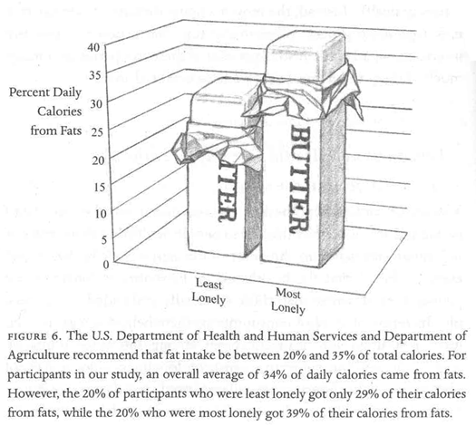
Written by a social neuroscientist, the book Loneliness contained this heartfelt graph on page 100. Yes, even I feel the phrase ‘heartfelt graph’ is an oxymoron. But the way that the graphic artist worked over the details here – the way the edges of the butter columns are rounded, the way that the paper is folded back, even the way that the grid lines are rendered makes this two bar graph captivating. I am also intrigued by the mix of digital and hand-rendered – most everything was hand-drawn except the axial numerals and the text labels. I like the mix. I probably would have liked it better if the lettering had also been hand-rendered but I think that’s just me being a bit too precious about hand-rendered images.

The book describes the way that loneliness is a neurological event, one that overlaps with social and psychological parameters to produce a more or less predictable set of occurrences. In this graph, authors Cacioppo and Williams are discussing recent findings that indicate lonely middle-aged adults tend to get more of their calories from fats than non-lonely middle-aged adults. For younger adults, loneliness does not seem to have an effect on either food consumption patterns or exercise patterns.

Socially contented older adults were thirty-seven percent more likely than lonely older adults to have engaged in some type of vigorous physical activity in the previous two weeks. On average they exercised ten minutes more per day than their lonelier counterparts. The same pattern held for diet. Among the young, eating habits did not differ substantially between the lonely and the nonlonely. However, among the older adults, loneliness was associated with the higher percentage of daily calories from fat that we noted earlier (and that is illustrated in Figure 6).

Perhaps because this book is about empathy-inducing loneliness, it is especially nice to see a tenderly hand-drawn graph rather than something far less engaging, the standard excel-produced item. The same numerical information would have been conveyed – and in fact that information was conveyed fairly well in the text itself – but the hand drawn element indicates that the topic is worthy of more than quantitative concern alone.

I am about halfway through this book and so far, I recommend it. Even if you are not interested in loneliness, the book does a good job of demonstrating how diverse research fields can be woven together to examine a topic common to all. The book draws from psychology, sociology, evolutionary biology, and neuroscience to help explain why some people are lonelier than others and what the impact of loneliness can be on the short-term and long-term health and social outcomes for individuals.

What needs work

For the record: I cannot draw or render or do anything good with a pencil besides finding a way to hold my hair out of my face. I tend to be overly appreciative of drawings and people who can draw. My critique here is of myself and others like me who swoon over the hand drawn.

I also wish there might have been a way to get the exercise information included, if not on the same graph, than on a companion graph right next to the butter sticks.

In a public announcement sort of way: folks lonely and nonlonely seem to take much solace in eating. That’s a large amount of fat consumption.

References

Cacioppo, John T. and William Patrick. (2009 [2008]) Loneliness: Human nature and the Need for Social Connection. New York: W.W. Norton.

World cites color map by size and location | Impure Blog

Introducing Impure

I have waited too long to introduce you to Impure Blog which is a blog presenting visualizations from the free-of-charge and powerful data visualization tool: Impure. The tool was developed (and is still being developed) by Spanish start-up visualization firm Bestario. Many posts are in both English and Castellano (that’s Spain’s version of Spanish for those of you who aren’t sure what Castellano means).

The work they have done in developing the visualization tool as well as the work they have done to use the tool well is commendable. IBM’s Many Eyes visualization tool is powerful, but the developers seem to have left a bit too much to the crowd when it comes to using the tool well. The gentleman at Bestario (and I believe they are all men, at least this was true the last time I checked) seem to be deeply interested in using the tool, not just building it.

I’ll have another post on the tool and what it’s good for, but today I think it makes sense to take a look at one of the projects they’ve recently released that uses a number of graphics to describe changes in urban growth around the globe since 1950.

The map at the top here uses rules about latitude and longitude to assign color values to all cities. This is one step above the rule used at gapminder which is that each country is assigned a single color based on it’s continent of origin. The Impure visualization is more sensitive – colors are assigned by latitude and longitude values so there is a gradient across each continent. Maybe it’s better to let them explain how they used longitude and latitude to assign color values:

Colors in the visualization are applied according to cities geographic coordinates: Hue varies with longitude, Saturation is always 1 and Value varies with latitude, based on the HSV color model, as the following image shows (cirlces areas are proportional to cities population in 2010)

This map works not because it tells the story they are trying to tell, but because it acts as a key for the interactive graphic below, which uses ordered-stacks of cities linked to themselves over time to demonstrate how city size has varied over time for 590 world cities.

Interactive City data

Embedded below is an interactive graphic that should have year labels starting at 1950 and ending at 2010. As a whole, it’s overwhelming to look at…no sense can be made of this block of color…until you start mousing over. Go ahead, mouse over, you’ll like it. I believe I said, “Oh!” when I did it the first time.

<<Disclaimer: most of the graphic embedded just fine but because of some size constraints that I wasn't able to overcome, the top cities are chopped off. Click through to get the full version and see what happens to Tokyo and Mumbai.>>

What works

Interactive graphics are often better than static graphics because they are not merely presented to the viewer, the viewer has an opportunity to alter which information she sees. As a pedagogical tool, dialogues are generally better for retention and comprehension than monologues. It’s hard to get a dialogue out of a static graphic – much easier to get a dialogue going with an interactive graphic.

I also applaud the team for presenting not only the crowning achievement – the interactive graphic – but also the map that acts as a color decoder, the line graph that contextualizes the growth in urban areas by illustrating the decline in population’s in rural areas, and the versions of the interactive graphic that breaks the world into continents (more or less) so that we can start to see larger trends.

Population change by rural/urban status, 1950-2010

Continent by continent comparison of population change in urban areas, 1950-2010

What needs work

My one major concern with the way the interactive graphic displays information is that it relies too heavily on rankings. It appears that the world population has remained the same since 1950, but people have just moved from one city to another, thereby changing the rank ordering of cities by population. That’s what happens when the size is constrained to a perfect rectangle. It would be nice if there were some way to show overall growth in population over time as well. I realize that would just look like a stacked, area-under-the-line graph. Not sure if that is an improvement or not. Quite sure that there is a creative way to solve the problem which hasn’t occurred to me yet.

References

Impure Blog

Bestario.org

Impure visualization tool

Urbanization at gapminder

Growth of the population of Hispanic and Asian children in America, 2000-2010
Growth of the population of Hispanic and Asian children in America, 2000-2010 | Wall Street Journal

What works

It’s nice to see all of the Census 2010 data coming out and generating infographics. This one comes from the Wall Street Journal which distilled the above panel of stills from an interactive graphic which also has maps for white and black kids and detailed tables by race and geography.

Though the two stills here do not do a good job of demonstrating the claim in the headline, that there are fewer white kids, the bar graph on the right and the interactive graphics, do, in fact, back up the headline claim. We could quibble about the flipside to the headline – rather than saying there are fewer white kids, should it have pointed out that there are more Hispanic and Asian kids? – but quibbling about headlines isn’t my concern here. Other news outlets did take that spin on the same set of information.

What I like here is that the graphs did not try to show everything all at once – each of the four racial categories included in this series gets its own graph. Yes, there are more than four racial categories and yes, it would be nice to see where other racial categories fit. But inasmuch as I am concerned with the overuse of mapping data, especially when those maps get layered up with all sorts of information that makes them illegible, I am happy to report that these folks had the commonsense to generate one map for each of the racial categories they decided to depict.

One of the incidental facts portrayed here is that the country continues to tip towards the southwest. The big red ‘decrease’ blobs appear in the northeast for whites and blacks and are not compensated for by blue ‘increase’ blobs among Hispanic and Asian births. Because I wouldn’t necessarily have picked this up from looking at a table, I think it’s clear to say that the use of maps was justified in this case because at least part of the story is geographic in nature.

What needs work

I have a tough time with the blob maps. I can get an overview but I have a tough time doing additions, let alone additions and subtractions. The bar graph that appears in the stills helps present the same information in a different way. In this case, the maps can only display the big picture. The bar graph is necessary to help understand how all these blobs add up. In particular, the top graph shows a large increase in the number of mixed-race kids by percentage, but this group is still so small that the absolute numbers wouldn’t even register on the blob maps.

Food for thought

The second, vertical, bar graph is my favorite part that ties all of rest of the information together. We see that white kids still make up more than half of the children born in the US, though it appears that this may not be the case in 2020. We see most clearly that Hispanic kids are growing faster than any other category of kids. I’m going to take this moment to note that Hispanic-ness is an ethnicity, not a race, and that many Hispanic kids are considered white. Remember that Central and South America were colonies of Spain and Portugal and we tend to consider Spanish and Portuguese people white. I’m not prepared to get into a discussion about what it takes to be white in America, just pointing out that Hispanic people are, in many cases, racially white even though they may consider themselves to be ethnically Hispanic. It is possible to hold both of those identities at the same time. Furthermore, if we look back in history there was a time when Irish and Italian immigrants were considered non-white. I have wondered if today’s Hispanics are similar to yesterday’s Irish and Italian immigrants in the sense that they will eventually come to be seen as white ethnics.

This is a debate I’m hardly qualified to comment on and I welcome others who are more qualified to take up this issue in the comments. In particular, I’m wondering how the numbers matter. If there are more and more Hispanics born in the US, will that mean that they are not under pressure to assimilate to mainstream white-ness and will have more opportunities to maintain a distinct identity? Or will the decreasing number of white folks mean that there is pressure to recruit new populations into the white identity as part of our one-drop anti-black legacy? I don’t know what this all means, but I do feel like the numerical balance is meaningful.

References

Frey, William H. (2011) Brookings Institution analysis of 2010 Census Data.

Dougherty, Conor. (6 April 2011) New Faces of Childhood: Census Shows Hispanic and Asian Children Surging as Whites, Blacks Shrink. Wall Street Journal.

Caloric availability in the US by food source, 1970

nutrition_circles_1990

nutrition_circles_2008

What works

These infographics are based on data from the United States Department of Agriculture. They depict the calories available per capita for the average American. It’s not an exact measurement of what’s on everyone’s plate, but it’s not bad. They made adjustments for waste and spoilage (which is not insignificant in this bountiful country of ours) saying:

Data on the availability of different foods per capita is adjusted for losses like spoilage and waste. Take for example the produce that goes bad at grocery stores or the leftovers tossed into the compost. By calculating such food losses, the USDA data closely approximates the amount of food that actually makes its way from the farm into the average American stomach.

This leaves us with a decent proxy for what passes through the average American in terms of nutritional categories. I think they’ve done a good job of breaking the categories down – looking at added fats and sugars as their own categories is useful and infrequently done in the world of nutritional infographics.

One more thing: this infographic is actually an interactive graphic that uses a slider bar to move across time. It’s a bit more pedagogically useful than the stills I have posted here. I encourage you to click through and play around with the full version of this infographic.

What needs work

Adding up the 2008 numbers shows a total intake of 2678 calories per person per day up from 2169 in 1970. As an infographic, I think this could have done a better job of showing the growth in total consumption – maybe just a bar somewhere that is either broken down by category or not. This is a meaningful change. The purpose of the infographic is to communicate that the change has mostly taken place in the grain category but that’s a little tough to see. I imagine part of the reason it’s tough to see is the way the graphic is constructed – lots of things are changing besides grain. But it’s also a problem inherent in the numbers since grain doesn’t change all that much. However, I still think this could have been done more clearly without the bubble approach. I still argue that the best way to show changes over time is by using line graphs. Humans are very adept at translating an upward sloping or downward sloping line. Of course, people tend to think that the upward and downward sloping lines are horribly boring and gravitate to bubbles and other mechanisms of pizzazzification.

References

Jezovit, Andrea. (5 April 2011) Is Grain Making Us Fat? From the Civil Eats blog as part of an ongoing collaboration between Civil Eats and the UC Berkeley Graduate School of Journalism.

Waterless Urinal Diagram | Wired Magazine

Accompanying text

The necessary accompanying text was not part of the image file, but here’s what it says under each panel:

Panel 1: “Instead of being flushed down with as much as a gallon of water, urine simply drains through openings in a specially designed plastic cartridge at the bottom of the bowl.”

Panel 2: “The entry chamber contains a blue liquid—a lighter-than-urine long-chain fatty alcohol. Gravity pulls urine through the liquid, but odors and sewer gases are trapped below.”

Panel 3: “As the urine descends through the cartridge chamber, its flow collides with a barrier, which prevents turbulence from displacing the floating sealant.”

Panel 4: “Urine passes beneath the barrier and into the exit chamber. When the urine level reaches the height of the drain, it spills over and empties into the outbound sewer pipe.”

Falcon Waterfree Technologies Waterless Urinal | Photo by Dan Krug

What works

I appreciate that Peter Grundy, the graphic designer, shows us the macro-scale first and then leaves the detailed working of the smaller catchment valve to the subsequent three panels. When describing something new, it’s good to start at a level that people recognize – presumably, men recognize the basic shape of a urinal more than the recognize the shape of the mechanism that makes it waterless. I probably would have made that first panel slightly bigger than the rest so that we know it isn’t four of the same things at different points in time, but one different thing and three of the same things.

I enjoy the way that the urine is displayed in balls so that it can appear bouncy. The dots are more than simply an enjoyable feature, they also help communicate about a problem in urinal design: backsplash. Urine is a bit bouncier than one might like – the text below the panel explains that dark blue liquid traps odors from seeping up but it is the L-shaped barrier that does most of the backsplash prevention work. I’m guessing it’s actually a combination of the L-shaped barrier and the blue liquid that keeps the urine from splashing. Not enough space for explanatory text to get into those details, but I appreciate the way the diagram brought attention to the backsplash problem and not just the waterlessness.

Another thing: I applaud Grundy for depicting a penis (a stylized penis, but only as stylized as the rest of the diagram) instead of a visual euphemism of the circle-and-arrow ‘male’ sign.

What needs work

The dark blue area is so dark that I initially had to sit and think about whether I was supposed to be reading it as a presence or a void. Perhaps a less dark color would have read more clearly as a presence, something we are meant to notice, than as a void. Yes, I can hear critics pointing out that since the color above the dark blue is white, one would have to assume the dark blue is presence. I speak for my eyeballs and cognitive structures when I say that I had to think about it.

That’s not all where the color critique comes from. Since water is often depicted as blue in diagrams and this diagram was supposed to be about the waterfree urinal, I probably would have chosen a color other than blue, even if the actual liquid in the device is blue. The big point is to remind us that there is no water here – we might lose sight of that amidst all the conventionally blue zones in this diagram.

I also do not quite understand the cylindricalness of this thing because the diagram makes no effort whatsoever to give depth. It’s just a section and a section of a rectangle will look the same as the section of a cylinder. Well. Except that isn’t strictly true. As far back as drafting goes, we know that there were conventions for making sure that cylinders and rectangular solids could be differentiated in section. Those rules might have been handy if extrapolated to fit this case.

The main problem I always run into with diagrams is the balance between image and text. Diagrams, in my experience, end up being more text heavy than other sorts of information graphics. This particular graphic would not work at all without the text, but that may be an unavoidable reality when it comes to diagrams. As I said above, at least the text is subordinate to the images and follows their table layout instead of sort of hanging around the fringes using arrows to connect text to image.

References

Davis, Joshua. (22 June 2010) Pissing Match: Is the World Ready for the Waterless Urinal?. Wired Magazine.

Grundy, Peter. (22 June 2010) “How it doesn’t flush” Wired Magazine. [Diagram]

Falcon Waterfree Technologies.

Reading, Writing, and Earning Money | GOOD Transparency Blog

What works

Nothing is working for me with this graphic except possibly the few places where the designers offered detailed information about a particular location’s high school graduation ranking, college graduation ranking, and income ranking. But that’s being generous.

What needs work

Horrible use of a map. Maps should only be used where there is good reason to believe the information being conveyed is tied closely to geography. This information is not tied closely to geography though it might be tied closely to states. But states need not always be represented as geographical entities. Often, they are political entities and their particular geography is not salient.

The math that led to the graphic flattens important details and renders this a useless graphic. What I believe the designers did was something like this:

  • They took all of their numbers and turned them into some scale between 0 and 100%
  • Then they decided to represent each of the three variables with pure Cyan, Magenta, or Yellow. The higher the state scored on the scale from 0-100, the more saturated the color value.
  • Then they gave each county a combined score by building new colors from mixing the values of the previous three. Higher scoring states ended up with more saturated colors. Basically, higher scoring states started to approach black. States that scored high on just one vector ended up having a clearer, lighter color profile.

Here’s the big problem with this. It was hard for me to explain to my MIT-educated friend so I’m not sure this is going to make sense the first time ’round. Representing everything on a scale from 0-100 is a slide towards obfuscation. The graduation rates are both unadulterated rates. The income data represents un-scaled median incomes. I appreciate that they are not scaled, but I have a hard time adding 65% with $45,000. That’s some troubled math. At least in the monochrome maps we know what we’re looking at before the three variables get added up.

A grave sin was committed when the numbers for these three different variables were added up. Now, of course, it wasn’t the numbers that were added up. It was the color values of each of the three separate data points that were added up. Additive color seems to be something that does not send up a red flag. I can guarantee you that if they had presented something – a table or graph – where they had ended up adding values from high school graduation, college graduation, and income, red flags would have been flying. Why? Well, maybe you’re starting to catch my drift, but I’ll help you by spelling it out. What happens when the colors are added is a clear violation of the ‘apples to apples’ rule. Comparisons do not work unless you are sure you are comparing like things. Graduation rates are not like income. They are two different kinds of numbers – one is a rate the other is either a linear value or a log-linear value. Either way, they cannot be added up and still make sense. It’s no surprise that the graphic ends up looking like an incomprehensible slurry of a gray area.

References

GOOD and Gregory Hubacek. (March 2011) Reading, Writing, and Earning Money in GOOD Transparency Blog.

When the Data Struts Its Stuff | Natasha Singer for the New York Times

Reading Suggestion

In case you missed it over the weekend, the New York Times ran a story about information graphics and the people who use them to communicate with the public. Unsurprisingly, Hans Rosling of Gapminder in Sweden – one of the new heroic figures in infographics – was the man in the picture and the first to be quoted. Rosling deserves the attention – gapminder had fairly humble origins and has grown because it draws from sound data, it is free to use, and it does a predictably good job of providing a visual overview of country level comparisons over time. Natasha Singer, the journalist who wrote the article, also interviewed Professor Ben Schneiderman of the Human-Computer Interaction Lab at the University of Maryland and Jim Bartoo of the Hive Group. And that’s where the article obliquely addressed the growing divide between infographics that are meant to be serious, complex, and complete and those that are meant to be beautiful and compelling, but user-directed. This second sort of infographic is the sort of thing that gets accused of being ‘info-porn’ and often covers information that is of dubious social value. Do we really care about celebrity’s twitter usage patterns? Is that as important as the work Hans Rosling does? What can the academic side of information graphics makers learn from the commercial side?

The article has a slightly different take on these questions,

The fact that serious software companies are now tree mapping the pop charts is a sign that data visualization is no longer just a useful tool for researchers and corporations. It’s also an entertainment and marketing vehicle.

but it’s clear that there are some divisions within the world of infographics that are worth considering more seriously. Nobody ever claimed that all writing is of the same species or that everything on TV is trying to do the same thing. Documentaries are not like sit coms which are not like dramas which are not like soap operas…but then again, they can all be found on TV and thus have some common elements. It’s no surprise that there is a wide variety of infographics out there with distinct goals.

Figuring out just how each type fits into the information ecology and changes the expectations about the entire range of infographics is worthwhile. When graphic designers started to take infographics seriously, it raised the bar for social scientists who were trying to communicate with information graphics. No longer was a chunky bar graph going to look sophisticated. It might look so generic and grade-school that it would reflect poorly on the overall quality of the argument.

References

Singer, Natasha. (2 April 2011) When the data struts its stuff. New York Times, Business Day Section: Slipstream.

Hans Rosling. Gapminder.org Hans Rosling is also a frequent TED Talks presenter.

Jim Bartoo. Hive Group.

Ben Schneiderman. Human Computer Interaction Lab at the University of Maryland.

Hillman, Dan [Director and Producer] | Rosling, Hans [Presenter] (7 December 2010 was first broadcast date) The Joy of Stats BBC. [Documentary] 60 minutes.
In the US you can stream The Joy of Stats from Hans Rosling’s gapminder.org website. Perhaps this works in other countries as well, but I haven’t had a chance to test it.

Percentage of Americans Never Married, 1900-2010

What Works

There are two great things about this:

  1. We see that the current rise in never married Americans still doesn’t match the numbers of unmarried Americans back at the turn of the century.
  2. We see that what is changing now isn’t so much the overall number of never married Americans (which has been hovering at around 30% for the past three decades) but the number of relatively older Americans who have never been married. I couldn’t find consistent numbers for people any older than the 30-34 year old category, nor could I find numbers for the 30-34 year olds available online from before 1960. I am still working on extending that portion of the graphic back to 1900.

What needs work

I need more numbers! I can’t understand the overall trend – which is the increase in never married Americans – without getting more historical context. I need that 30-34 year old category to extend all the way back. I also need to know what the deal is with slightly older cohorts, like 40-44 year olds. If all this graph tells us is that people are getting married later that is a very different story than the one that sounds like: “Americans aren’t getting married at all”. Marrying late and never marrying are two different scenarios. I cannot yet tell from the numbers I’ve got, just what is going on. And the problem with the aggregate data is that it is not granular enough to help understand current trends. Pooling 30 year olds with their parents and grandparents does not help me understand the 30 year olds (or the 20 year olds). And I really want to know what is going to happen in the near future, not what happened in the relatively distant past.

Other people have complained that the ’15 and older’ marital status category is crazy. Who gets married at 15?? But the problem is that we have to keep looking at that category or we cannot follow trends over time. That was the way the category was established back in the beginning, so in order to look across time, we have to keep the boundaries of the category the same. Now, to get around that problem, I included the 30-34 year olds, but that data slice doesn’t go all the way back.

Tricky census data.

And it’s black and white for easy printing. Otherwise I would have gone color.

Childhood Obesity in the US, 1980 - 2008

What works

This infographic was part of a competition put forth by GOOD magazine on their transparency blog. This graphic didn’t win (winners are here), but I thought it was worth talking about the way Sarah Higgins represented changes in childhood obesity over time. She realized that in order to provide an accurate portrayal of the percentages of children who are overweight and obese, she would do well to display the overall change in the population of children in the US. Where there are just more kids in the US, there will be increases in the absolute number of children who are overweight/obese even if the percentages stay the same. Sometimes people care most about absolute numbers, sometimes they care more about proportions. It can be difficult to tell which is more important than the other. Figuring out a way to display both is often useful.

She shows us the total population as a function of the diameter of the circle. Then the proportion of kids who are overweight and obese are shaded in. We don’t know what the change in the absolute number of kids who are overweight and obese is. Let’s say you are an insurance company and you have to cover the cost of treating kids with, say, early onset Type II diabetes. In that case, you might like to have both the proportions and the absolute figures.

What needs work

If I were Sarah, I would have included some absolute numbers in each of the portions of the circle.

My larger concern is that I don’t believe the size changes in the circle are moving in step with reality. I don’t think the population of children in America is increasing as fast as the graphic suggests. I’m guessing that in order to make the concentric circles comply with the imagination that they ought to be clearly concentric, some fudging happened. Where fudging happens, using actual numbers to clarify is critical. But I don’t support fudging at all. Good infographics pick a rule that works numerically and visually. In this case, I’m guessing that if she had figured out a scalar that worked, her concentric circles would have overlapped one another and been very hard to read. She might have been able to find another scalar factor that would have been able to translate her datapoints into a 2D shape, but without trying it myself, I’m not sure this would have been so easy.

I still think this kind of concentric circle concept is worth considering when you’re confronted with an overall change in your population (more kids!) as well as changes within that population (more overweight and obese kids). If she had simply portrayed changes in the proportions of overweight and obese children we would have missed the idea that the absolute numbers are growing even faster because the underlying population is getting bigger.

References

Higgins, Sarah. (July 2010) Childhood Obesity. [Infographic}

http://www.datapointed.net/

Data Pointed

I experienced the vastness of the internet today, stumbling across Data Pointed which is a not-new blog featuring original data visualizations. Why haven’t I come across it before? I wish I knew the answer to that as well as to the related question: how many other interesting data visualizations sites are out there that I do not know about?

What you see above is the most recent post at Data Pointed by Stephen Von Worley. He produces sophisticated graphics across a wide array of subject areas. Just so happens that this one is about the inter-relationship of the income distribution and the tax distribution which is of keen interest to social scientists, and policy people in particular. I find this visualization to be beautiful looking but a little hard to read. Each year is represented by a line, that line is drawn through all of the income brackets you see along the x-axis. As the line passes through these income brackets it changes both color and thickness. Thick red lines indicate areas in which people are paying more than their share of taxes; thin blue lines are areas in which people are paying less than their share of taxes. Von Worley had this to say:

“A modified Reagan-era tax system lingers to this day. To his credit, Dubya did reduce taxes on very low earners, so they’re no longer getting hammered. But, the people at our economy’s core – the full-time workers earning between $20,000 and $150,000 a year – still pay at up to double the rate of the ultra-wealthy, relative to what history suggests they should.”

Personally, I had a hard time drawing that message out of the graphic, despite the fact that it is so beautiful and elegant that I was compelled to stare at it and read the explanation until I could figure out how it worked.

McDonald’s Distances in the US

Von Worley himself notes that Data Visualization was not the popular success he had hoped, at least not at first. [Note: Graphic Sociology isn’t exactly a success in terms of page traffic, but it has a core of steady followers generating a four-digit count of unique page views per week.] Data Visualization got popular after Von Worley created the map graphic below that uses blobbiness to indicate distances between points on the US map and the nearest McDonald’s. The farthest you can get from a McDonald’s in the US is 107 miles and you would be in South Dakota.

Distance to nearest McDonald's in the US | Stephen Von Worley

Does the map work?

I am not entirely sure the map is working – again, it is beautiful. Beautiful is compelling and being compelled, I wanted to spend time looking at it. I also love that it kind of looks like fat globules. How appropriate and subtly political. We also end up with a very good proxy for American population density. Not bad. But what would have been even more awesome is if we could tell this was a distance map without having to read the caption. I want to know that there’s a McD’s at the center of each blob and that what I’m supposed to notice is the distance I need to go to get from the darkness to the light. (In my version, I might have had the centers of the blobs be dark and the peripheries be light but I’m guessing it wouldn’t read as well visually no matter how well it fits with my understanding of McD’s as a morally shady place.)

References

Stephen Von Worley (15 March 2011) Shifting Burdens: U.S. Taxes By Income Level Over The Years at Data Pointed Blog.