
What works
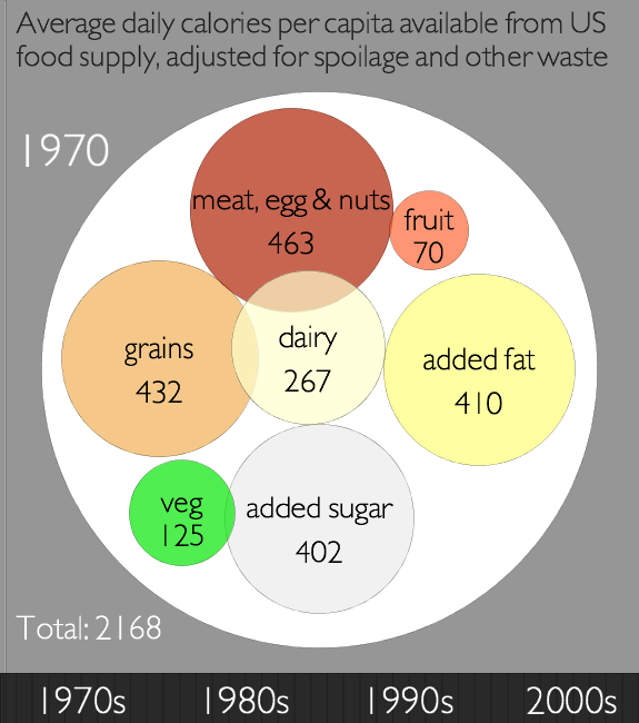
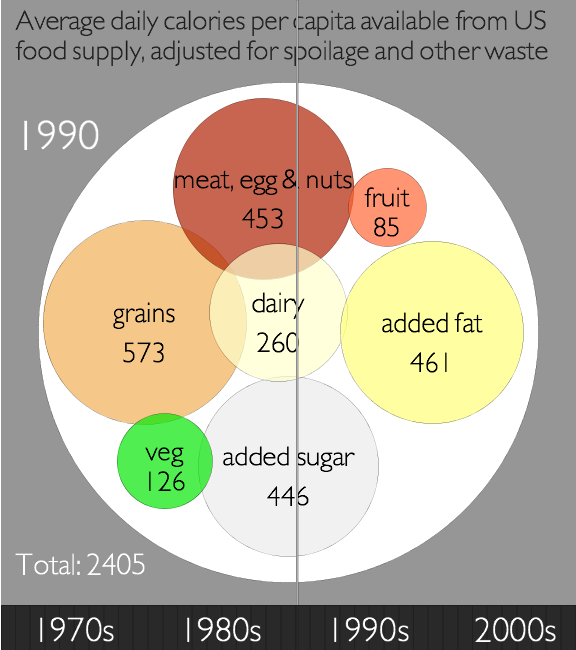
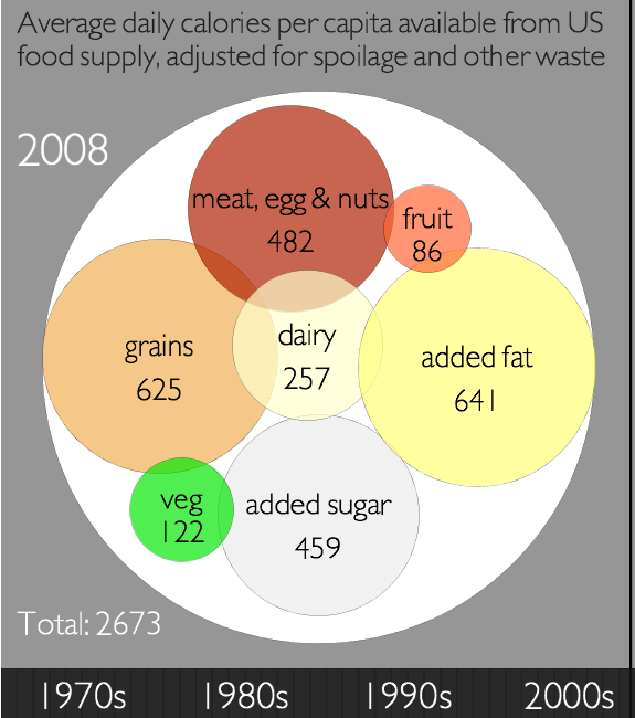
These infographics are based on data from the United States Department of Agriculture. They depict the calories available per capita for the average American. It’s not an exact measurement of what’s on everyone’s plate, but it’s not bad. They made adjustments for waste and spoilage (which is not insignificant in this bountiful country of ours) saying:
Data on the availability of different foods per capita is adjusted for losses like spoilage and waste. Take for example the produce that goes bad at grocery stores or the leftovers tossed into the compost. By calculating such food losses, the USDA data closely approximates the amount of food that actually makes its way from the farm into the average American stomach.
This leaves us with a decent proxy for what passes through the average American in terms of nutritional categories. I think they’ve done a good job of breaking the categories down – looking at added fats and sugars as their own categories is useful and infrequently done in the world of nutritional infographics.
One more thing: this infographic is actually an interactive graphic that uses a slider bar to move across time. It’s a bit more pedagogically useful than the stills I have posted here. I encourage you to click through and play around with the full version of this infographic.
What needs work
Adding up the 2008 numbers shows a total intake of 2678 calories per person per day up from 2169 in 1970. As an infographic, I think this could have done a better job of showing the growth in total consumption – maybe just a bar somewhere that is either broken down by category or not. This is a meaningful change. The purpose of the infographic is to communicate that the change has mostly taken place in the grain category but that’s a little tough to see. I imagine part of the reason it’s tough to see is the way the graphic is constructed – lots of things are changing besides grain. But it’s also a problem inherent in the numbers since grain doesn’t change all that much. However, I still think this could have been done more clearly without the bubble approach. I still argue that the best way to show changes over time is by using line graphs. Humans are very adept at translating an upward sloping or downward sloping line. Of course, people tend to think that the upward and downward sloping lines are horribly boring and gravitate to bubbles and other mechanisms of pizzazzification.
References
Jezovit, Andrea. (5 April 2011) Is Grain Making Us Fat? From the Civil Eats blog as part of an ongoing collaboration between Civil Eats and the UC Berkeley Graduate School of Journalism.