Archive: May 2010

Disease Fatality Rates | Information is Beautiful

What works

This graph is clean and balanced. Generally, it’s not good to abandon axes, and I don’t know if a social scientist could have gotten away with stripping them, but in this case, all the viewer needs to see is included next to each circle. The name of the disease is probably the most important element and that is easier to see right next to the dot than in some sort of axial label elsewhere. I’d also rather have the percentage values spelled out than have the circles simply plotted on a percentage continuum that I then have to mentally map. So it’s working for me. I’d also point out that if the axis had been a percentage continuum the flow of the cascade would not have been so elegant. Swine flu, malaria, and seasonal flu would have been more or less on top of each other. The way they’re presented here we can actually understand them a bit better than if they had been strictly plotted. The overall review is that relying on the principles of graphic design rather than relying on the principles of graph paper serves this particular data quite well.

What needs work

These colors strike me as being a bit too cheery for such a serious topic as disease fatality. While I am not the kind of graphics person who goes on and on about color theory, I do think that after sufficient cultural training (ie living in Western culture for a sufficient period of time or growing up here) will lead to a subconscious attachment of sentiment to particular colors. AIDS (untreated) and AIDS (treated) get the color tones more or less correct since orange and red are often correlated with anger, danger or aggression. AIDS is certainly an aggressive disease – any illness is experienced as an assault, in my opinion. Tuberculosis is also an angry, aggressive disease with a high fatality rate and yet it’s green. Green is related with invigoration, health, and the positive features of the natural order (that’s why all those bath products are green. Marketers like color theory.). Purple and magenta, especially when they are right next to each other as they are here, kind of look like carefree fun, the kind of fun associated with bubble gum, bike streamers, and pop rocks. So red and orange are working for me but green is a misstep. The colors for the rest could have been either shades of red or shades of gray and black. Yes, the graphic overall would have been more depressing, but that is the point.

Some information isn’t inherently beautiful and dressing it up as beautiful information may dilute the message. I think yesterday’s CO2 graphic was ‘beautiful information’ and yet it was only red, black and white.

References

McCandless, David. (September 2009) Fatal Infection at Information is Beautiful

For more on fatality rates
World Health Organization, CDC.

For more on circular graphics, see this newsletter [pdf]. I still dislike pie charts.
Few, Stephen. Our Fascination with all things Circular Perceptual Edge.
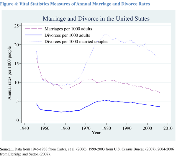
Planes or volcano? What is emitting more CO2?

What works

Volcano = triangle. Love it. Red is bad, black is good = kind of perfect. Being able to see that the volcanic eruptions are actually net benefit events because they release less CO2 than they prevent is great. I do wonder if the uptick in flights that inevitably follows any singular event could be mapped. Furthermore, when I was in Europe during the first major eruption event and I would say plenty of people were renting cars. I know that isn’t nearly as bad as flying, but it does contribute some CO2. I also wonder if this graphic could be expanded over time to see if the volcano ends up contributing or inhibiting contributions to global CO2 over time. Will people stay home or at least stay out of Europe, taking shorter flights (or no flights) because they are worried about the volcano?

What needs work

The volcano needs work. It needs to stop eating my luggage. That’s all I have to say. I know that if you are reading this and even moderately awake, you will point out that if I stopped flying I would not have a luggage problem and I would not be polluting your world with all my flight traffic. So maybe I’m the one who needs work.

References

The Graphic
McCandless, David and Bartels, Ben. (16 April 2010) Planes or Volcano? at Information is Beautiful.

The Data
USGS, BBC, EEA, Nordic Volcanological Institute, AFP [lower estimates used]

Fibonacci sequence snapshot 1
Fibonacci sequence | Still
Fibonacci sequence snapshot 2
Fibonacci sequence | Still 2

What Works

The above images are stills from a flash animation by textist. It is worth watching and blissfully silent. It does a great job of bringing dynamism to an online lesson. I have often thought about how Open Course Ware projects could be improved. Flash animations are one step above static content – here’s another that helps visually explain the sine curve. Good for teaching trigonometry.

Graph of the sine curve | Emerson and Talman

What Needs Work

I realize that sociology doesn’t always lead itself to animations in the same ways that math and physics do. What needs work, in this case, is that I need to find a way to use animations to help understand social science teaching best practices, not math and engineering teaching best practices. Even though I wasn’t able to find something a bit more relevant to sociology, the increase in online and remote digital teaching is moving fast enough to warrant a post even though it’s not directly sociological yet.

References

Emerson and Talman. (1999) The Graph of the Sine Curve” at Mathematics Animated.

Allen, Dean (Texist). Fibonacci Sequence

US Federal Budget | Jorge Cham at PhD Comics

What Works

This was published as a joke. To be sure, the numbers represent real data. The punch line was supposed to be that research gets so little of the total pool. Or at least that is what I thought it was supposed to be. PhD Comics people prove their dedication to comedy with this. Time consuming to pull together and unlike their normal style.

That being said, others have attempted to find a way to visualize where tax dollars go. The vertical orientation is nice for the web. We’ve all learned to accept scrolling up/down much more than right/left. It’s nice to see tiny slices included here and there.

What Needs Work

I have trouble getting the overview from this graphic. Even just using a bigger font for some of the lumped categories would have helped. The aggregating triangles in the background are good in theory but not quite perfected in practice. Still not totally sure how they are meant to be interpreted.

Reference

Cham, Jorge. (2010) The US Federal Budget.

Airplane Seating Diagram | Show Me How
Airplane Seating Diagram - detail | Show Me How

What works

The diagram assumes a number of user groups – parents of youngsters, sleepers, long-leggers – in addition to universal concerns like not dying in a crash or understanding that your appendages are more likely to be run over by the beverage cart if you’re seated on the aisle. Friend of mine broke a foot that way so I’d say it’s a non-trivial concern and lends support to the choice of the bulkhead rather than an aisle seat for those with long legs.

What needs work

This blog needs work. I haven’t posted any non-standard graphics lately. Boring. Even though this has nothing to do with sociology, it’s a necessary inclusion.

Reference

Smith, Lauren and Fagerstrom, Derek. (2008) Show Me How. Collins Design.

Trends in Marital Stability (2004) | Betsey Stevenson and Justin Wolfers

What Works

Last night this blog received a deluge of spam from someone with an IP address in Australia promoting wholesale wedding dresses. In response, I first exercised a wholesale ‘delete’ event. Now we’ve got a graph about the stability of marriage in the US since the 1950s. The next time someone tells you that 50% of marriages end in divorce, you’ll know how to show them that they’re wrong.

As you can see from the above graphic representation, marriages in the 1950’s were less likely to end in divorce within the first 25 years of marriage than any subsequent cohort of married folks. We have no idea if those were ‘good’ marriages that lasted, we just know that they were less likely to end in divorce. From the representation we see that divorce rates climbed through the 1960s and 1970s but started falling in the 1980s and continues to fall, inching back towards 1960s levels.

Measures of Annual Marriage and Divorce Rates | Betsey Stevenson and Justin Wolfers

Furthermore, from this next graph, we can see that the decrease in the divorce rate is not only due to marriages lasting, but that any given person is less likely to experience divorce because we are now less likely to get married in the first place. If one doesn’t get married, one cannot get divorced. It would seem that people might actually be making fairly appropriate decisions around the ‘I do’ moment because the people who choose marriage are staying married longer. In other words, the folks less likely to stay married may somehow recognize this about themselves and opt out of marriage altogether.

Using multiple graphs tells a much more complete picture than relying on just one. The first graph was designed to debunk the notion that 50% of marriages end in divorce by showing that for a brief moment, marriages formed in the 1970s may have approached that dissolution rate but that marrieds have been sticking together more and more since then. The second graph is more interesting to me because it details overall trends in marriage, including the slow slide away from marriage altogether. It could be that people are just waiting longer to get married, in which case the decline in the marriage rate recently might just be a lag. Lifetime marriage rate is something I’d still be interested in checking out, though I feel that we haven’t maxed out on age at first marriage so it would be hard to see, at least not in 2010, if the trend is toward later marriage or no marriage at all. My prediction would be that age at first marriage will start to hit a plateau at around 30 for women because reproductive ability tends to decrease markedly starting at about 35, or so I’ve been told, and many people get married at least in part because they’d like to have some kids. But we’ve got a long way to go before we hit 30 for women’s marrying age. Median age at first marriage for women is just 26 and even though it is climbing, it isn’t skyrocketing.

References

Stevenson, Betsey and Wolfers, Justin. (2007) Trends in Marital Stability. Working Paper.

Wolfers, Justin. (21 March 2008) Misreporting on Divorce. on the Freakonomics blog at the New York Times.

Admissions rates at top schools drop | Yale Daily News

What Works

The above graph was produced by Yale Daily News. It is clean and does a good job of displaying their admission status compared to their competitors. The reason I thought it was worth mentioning is that a few small aesthetic decisions make the graph pleasing. I like the open circles. I like the fact that the ending values are included as numbers. I would have liked it if they had included starting numerical values, too.

Comparison

For those going through the college admissions process, it can be all-consuming. The New York Times runs a blog called The Choice that focuses solely on this process from the testing to wait lists to moving, transferring and everything in between. Unsurprisingly, then, they ran a table showing similar information about a larger number of schools which they gathered through a mix of old-fashioned reporting – contacting schools and asking them – and Web 2.0 reporting in which schools who had not made the initial deadline could email their data in to be added to the table. Have a look below.

The Choice blog at New York Times 2010 admissions data |  J. Steinberg
The Choice blog at New York Times 2010 admissions data | J. Steinberg

Ask yourself about the difference between a table and a graph when it comes to conveying information. Edward Tufte is a fan of tables because they can display a great deal more information than a graph. That is true in this case – look at how many more categories of information there are in the table. What do you think? When is it better to present a table full of all the details and when is it better to display a graph like the one above?

References

Lu, Carmen. (5 April 2010) Admissions game getting riskier. Graph. Yale Daily News.*

Sternberg, Jacques. (2 April 2010) Applications to Selective Colleges Rise as Admission Rates Fall. The New York Times “The Choice” blog.

*Note that I wonder if the graphic designer got the data from The Choice blog piece – the publication dates could just be coincidental.

Europe's Web of Debt | Bill Marsh, The New York Times

What Works

Headlines have lately focused on particular countries – Greece, Spain, Portugal – to discuss the current economic situation in Europe. I like this diagram because it is impossible to think of the EU situation from that one-country-at-a-time perspective. One currency, one tangled web of relationships. We also see that focusing on Greece could be considered short-sighted simply because Greece’s total debt is relatively small compared to, say, Italy which is a country we haven’t been hearing much about. Now, going back to my initial reason for liking this graphic, it’s important not to focus on one country. The adoption of the Euro was motivated by the robustness of networked flows and we see from the graphic that the problems of any one country should not bring it down but, if the cause of the single country’s problems are also putting downward pressure on other countries/nodes in the network, the cascade could be swift and deep. And the biggest losers are going to be France and Germany. Just look at all those arrows directing debt at those two countries. I am not an economist so I’m not making a prediction about the future of the EU economies or of the Euro as a stabilizing device.

What needs work

Because so much of the debt flows involve France and Germany, I think they belong in this diagrams as nodes. Or at the very least, one easy fix would be to show outgoing arrows to Germany all in the same color and to France all in a different color (like, say, the color of freedom).

Reference

Marsh, Bill. (2 May 2010) Europe’s Web of Debt. The New York Times, Week in Review Section from the intial source “Bank for International Settlements”.

Flight Delays - from GOOD magazine's Transparency blog

Above

The entire graphic is quite large. If you click on the image or here you will be able to see it in all its glory. Hope you invested in some screen real estate because GOOD is making some optimistic assumptions about the size of your monitor(s).

Below

I took the liberty of including a close-up here. Should suffice.

Flight Delays - Close Up

What Works

The window up and down is cute and of course I am thrilled that they included the percentages those window shades are representing with actual numbers.

What Needs Work

This strikes me as one of those graphics that looks far more clever than it actually is. I have no reason to believe that security measures caused flight delays, except that the explanatory text suggests it is so. Here’s why I have logical doubts. First, the period over the Christmas/New Year’s holiday season is notorious for weather related delays. Maybe some of these cities had some nasty weather in one year that they didn’t have the previous year? I didn’t actually look this up, but the point is that if I were to be convinced that security alone could cause flights to be delayed I would need to know about other likely reasons for delays. Another problem could have been the relative level of fullness of the flights – fuller flights take longer to board and deboard.

From my anecdotal experience, another cause of delays has been the increase in baggage fees. Due to the fees, more people try to cram all their luggage into the overhead compartment which makes planing and deplaning an agonizing experience. I’m quite sure we’ve watched someone about my height (short) struggle to remove an uncommonly heavy and unwieldy bag from the overhead compartment a few rows BEHIND their assigned seat. The fight goes on for at least two minutes and could include the passenger standing, one leg in each aisle seat. Hey, kids, that’s entertainment. If everyone involved is lucky, nobody gets hurt. If not, the bag is a hard-sided suitcase full of, say, sociology text books, that lands on the head of an unhelpful but otherwise blameless person sitting in the seat below. Then there are at least five minutes of first aid, profuse apologies, tardy offers of assistance from some passenger who had been standing around making impatient grumpy faces up to this point, and general pandemonium.

My point is: this graphic seems to be based on convenient rather than thorough research. Maybe the delays were caused by increased security measures alone. But as a logical consumer of infographics (and frequent flyer) I admit, I’m skeptical. Could have been weather, could have been fuller flights, could have been the restructuring of baggage handling, or, more likely, some combination of all those things.

References

GOOD Magazine and Design Language. (2010) “Flight Delays”.

endcarryoncrunch.org

Annual change in U.S. GDP under different scenarios | 2009-2019

What Works

We are able to see the results of three hypothetical assumptions regarding the treatment of unauthorized immigrants and the impact that could have on the GDP of the US from 2009-2019. While I often advocate trend lines for showing changes over time, in this case, what we are interested in is not just a trend over time, but the difference between the three outcomes in each year. For that reason, the choice of bars works better than would the choice of trend lines. Seeing all the three options on the same graph neatly summarizes the overall findings of the report. If you are interested in learning more about just how these projections were made, all of that is detailed in the report [link below in references]. One important note that the report mentioned more than once is that the cost of the mass deportation scenario does not include the cost of deporting individuals (which would be legal and physical), it just represents the impact on the economy of removing unauthorized workers.

What Needs Work

I snipped this graphic out of a report, so the following critique is for me more than for the graphic creator. Because this kind of projection requires so many assumptions and simplifications, providing summaries of the most critical assumptions is necessary for the proper cognitive digestion of the infographic. The report contains sufficient discussion and references, but in a world where people like me clip graphics and stick them in other reports or on blogs, savvy designers will include longer captions [the original caption is included in the image file] or other explanatory text even if that same information is included in the formal text. Hyper text culture is spreading. It is far more common now to put together a little bit of this from here and a little bit of that from over there in search of just that bit of information that we think we want rather than reading/watching the full, originally constituted work. Love it or hate it, this hyperlink no place is the place where we have arrived.

References

Hinojosa-Ojeda, Raúl. (7 January 2010) “Raising the Floor for American Workers: The Economic Benefits of Comprehensive Immigration Reform”. Center for American Progress.