Archive: May 2010

Whaling Continues | 1985-2009

What Works

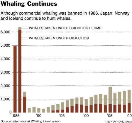
It’s easy to see, even without the explanatory text, that there must have been something happening circa 1986 that changed the way whales were killed. The explanatory text is necessary to understand that it was a legislative change as opposed to a whale disease or a human health scare similar to mad cow disease (crazy whale disease?).

What I like more about this graph is that it suggests something fishy might be going on when it comes to the ‘scientific’ capture of whales. The argument goes something like this: in order to understand and protect whales and whale habitats, some whales need to be captured and killed. Just eyeballing the bars, it would seem that from 1985-1990 something like 100-300 whales were killed annually in the name of science. Then the number of whales killed for the scientific preservation of whales started to drift upwards. In 2005 my estimation suggests that well over 1000 whales were killed for science. And that 1000/year number seems to hold from there through 2009. Now, maybe whale science has grown by leaps and bounds and requires the death of about 1000 whales per year.

The article does not address the increase in scientific whale deaths so I am left to wonder if the graphic is revealing some questionable whale fatality accounting procedures. In other words, this graphic is a champion because it raises a political question in a largely apolitical way. Good work, New York Times.

Reference

Broder, John. (14 April 2010) “Whaling Continues”. In The New York Times, Environment Section.

Living Single is More Expensive than Marriage? | The Economist Online

What Works

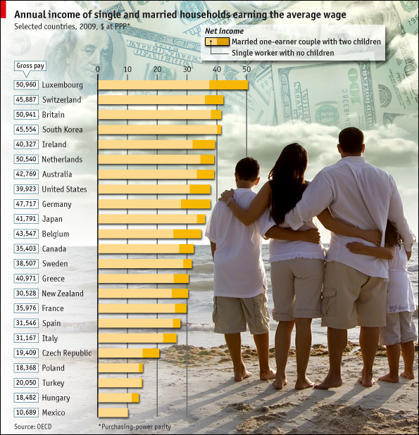
In this particular case, where the point is to show the difference between two groups (not three or four) it is acceptable to use the stacked bar graph approach. This technique emphasizes the difference between the two groups. When people use the same technique with three or four groups, it becomes very difficult to pick out the visual differences. But the folks at the Economist stuck to two groups and it does show the difference in earnings between singles and married-with-two-kids people.

What Needs Work

The picture is not helping anything. Please, people, think twice before inserting stock photography in your infographics. There should never be an element of an infographic that fails to communicate information clearly. The whole money in the clouds motif is also…questionable in terms of the art direction.

Aside from my qualms about the aesthetic choices, I have a more important contention. It would seem that the point of this graphic is to suggest that married people operate under more favorable tax laws than unmarried people. If that is the case, I think it would be nice to see some information about the taxes coming into play. I say this in part because the commenters to the article revealed that they mistakenly believed this data is pre-tax. But it isn’t. Furthermore, this graphic implies that marrieds have more money on hand than singles in the same income brackets, but that isn’t necessarily true either. Those kids do cost something – they need clothes, food, bigger houses, bigger cars, and an endless list of other things. So even though Mr. and Ms. Single do not take home as much, I bet they have fewer carrying costs. Granted, the graphic is about taxation policy, not about discretionary spending opportunities, but it fails to emphasize taxation and leaves itself open for other interpretations. These interpretations are available for your reading pleasure in the comments section following the original post. I do encourage you to read the comments because it makes clear that people do not read, not even the single paragraph of explanatory text.

Reference

Economist Online Staff. (11 May 2010) Single supplement: The average single worker takes home less than his married counterpart. The Economist online.

Facebook Privacy Settings 2005 Facebook Privacy Settings 2006

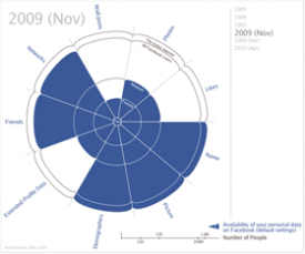
Facebook Privacy Settings 2007Facebook Privacy Settings Nov 2009

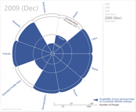
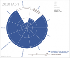
Facebook Privacy Settings Dec 2009 Facebook Privacy Settings 2010

What Works

If you are a New York Times reader or a facebook user you are probably aware that Facebook periodically makes changes to their privacy policy. These changes often anger advocates for privacy who then write articles about why they are upset and which settings Facebook users should change in order to protect their online privacy. There are also ongoing debates about whether or not it would be measurably detrimental to simply delete one’s Facebook account as well as whether or not there will continue to be social stigma related to pictures and wall posts of activities that are common enough (drinking, wearing bathing suits, sleeping in, telling little white lies).

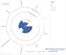
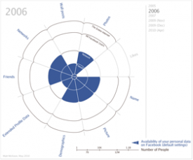
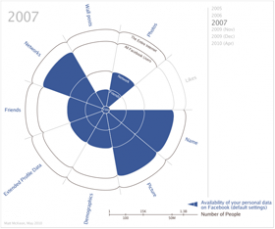
Regardless of where you stand, it has been a little hard to understand just how Facebook’s privacy changes are, well, changes. The series of graphics above eliminate the need to read dry legalese (or even those New York Times articles) and allow us to see the changes. The graphic is interactive and I encourage you to click through and play around with it. Among it’s great features, it allows you to select the privacy settings so that you can see just which bits of your personal data you can still protect and which bits are out of your cyber control.

What Needs Work

There is nothing that needs work about this graphic – the author explains his methods and assumption, invites comments, provided this graphic from the motivation to make information free, and he provides full-disclosure about what he does for his day job (works for IBM Research at the Center for Social Software).

References

Holson, Laura. (8 May 2010) Tell-All Generation Learns to Keep Things Offline. In The New York Times, Fashion & Style Section.

McKeon, Matt. (May 2010) The Evolution of Privacy on Facebook. Personal website.

Nussbaum, Emily. (12 February 2007) Say Everything. New York Magazine, Features.

Perez, Sarah. (20 January 2010) The 3 Facebook Settings Every User Should Check Now. In The New York Times, Technology Section.

Valentino-DeVries, Jennifer. (26 April 2010) http://blogs.wsj.com/digits/2010/04/26/getting-control-of-your-facebook-privacy-settings/tab/article/. In the Wall Street Journal, Digits Section.

Global Population and Cereal Production
Global Population and Cereal Production - FAOSTAT database

What Works

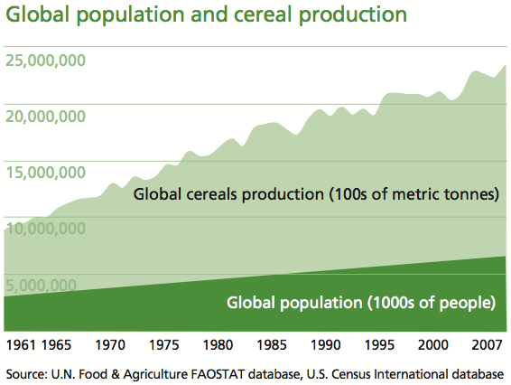
The strength of this graph is its simplicity. It shows two trends at once – neither would be all that interesting without the other, but in concert, they tell us something. It’s a simple move that most social scientists ought to consider because it isn’t all that much harder than creating two individual graphs and displaying them side by side. This simple move, contextualizing global cereals production with the growth in the global population, clearly summarizes the issue addressed in the multi-thousand word essay. That message is, as I am sure you can guess from looking at the infographic above, is that population growth is not driving the growth in world hunger. The production of cereals is outpacing the growth in overall population.

For the sake of cross-media comparison, what would that infographic look like in words?

“Scarcity is a compelling, common-sense perspective that dominates both popular perceptions and public policy. But while food concerns may start with limited supply, there’s much more to world hunger than that.

A good deal of thinking and research in sociology, building off the ideas of Nobel laureate economist Amartya Sen, suggests that world hunger has less to do with the shortage of food than with a shortage of affordable or accessible food.” –Stephen Scanlan, J. Craig Jenkins, and Lindsey Peterson, Contexts Vol. 9:1; Winter 2010, p. 34-39.

What Needs Work

The article also ran with a graphic that shows the increase in the number of calories available per capita. Personally, I would have combined this data with the rise in global population because it is a more intuitive combination, even though the y axis would no longer be quite the same (one of them would be population in millions and the other would be calories in thousands – both are absolute scales so there would be a relatively easy work around that would allow the trend lines to be compared, which is what we are aiming for in the end). The original graphic looks at cereal production next to global population growth which invites questions about what portion of caloric intake comes from cereal, how sensitive cereals are to market fluctuations, and so forth like that.

References

Scanlan, Stephen; Jenkins, J. Craig; and Peterson, Lindsey. (Winter 2010) The Scarcity Fallacy in Contexts Vol. 9:1; p. 34-39.

FAOSTAT. Food and Agriculture Organization of the United Nations.
Note: I highly recommend FAOSTAT.

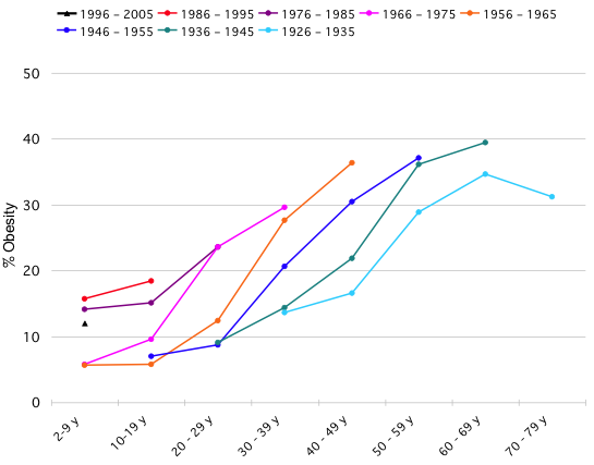
The graph below was originally posted at Flowing Data with an invitation for readers to take the same information and display it with clarity and meaning. The image below is difficult to understand – it brings to mind one of my favorite tricks which is to see if the infographic would deliver more or less the same message if it were in gray scale. This one would suffer in gray scale even more than it already is, a bad sign.

The original chart showing the increase in obesity (confusing)

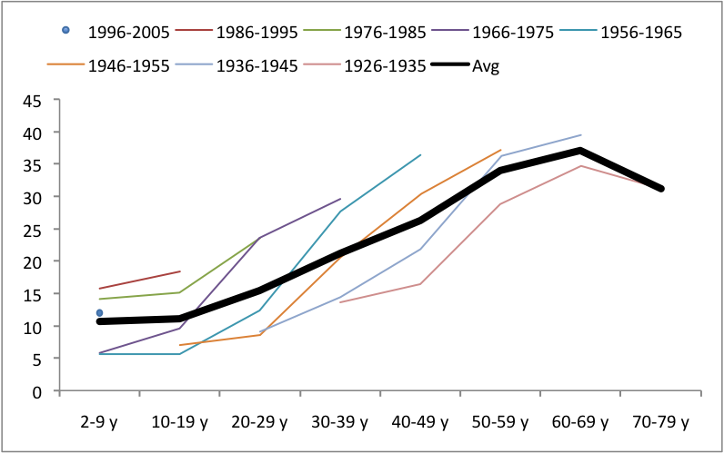
Jonas Sekamane took up the challenge posed by Flowing Data and came up with what you see below as a first stab. He said, “My main “beef” with the graph above, is that comparison is difficult, if not impossible. This is of course due to the data gaps, but it could easily be fix with a guideline of some sort. Adding an age-group average, makes it much easier for the viewer to see if the level of obesity is in fact high or low.”

The second draft - now there is a single trend line, but still confusing

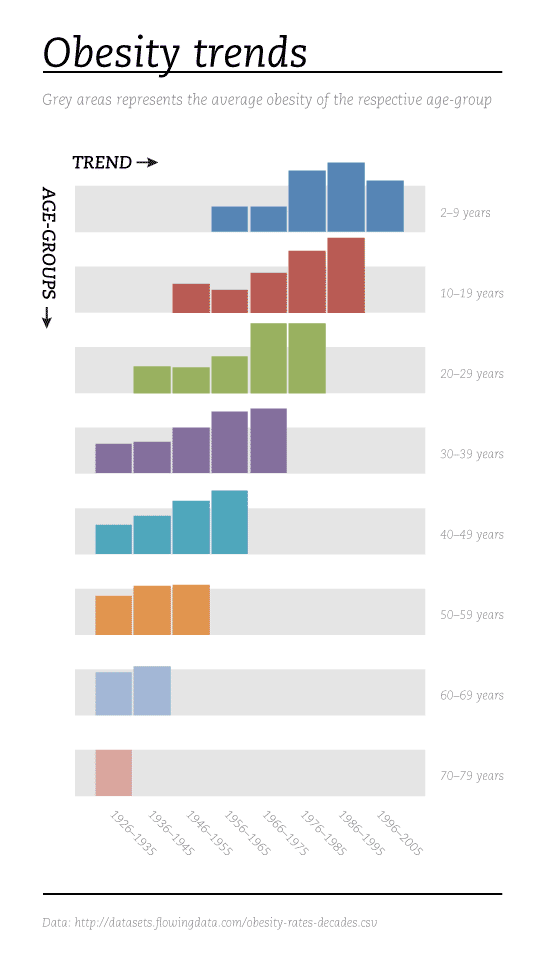
But he didn’t rest on his relatively simple fix. He decided that starting over altogether would be the only way to wrestle this information into a clear, meaningful infographic. First, he massaged the data into a more visually relevant format by calculating, “an index in Excel where 100 = the age-group average.”

I agree with his assessment of the original – that it was too far gone to be saved. I’d also like to take this opportunity to address social scientists more accustomed to the writing process than to graphic design process. Just as a paper will require several drafts before it reaches it’s potential, most graphics get better with revision. And like this reworking proves, sometimes it is necessary to scrap it all and start over, even after you think you have something could work. The key is that you cannot fall in love with your graphic designs (or your papers). In order to maximize their potential, some of them will need demolition and redesign, not just a new coat of paint.

No more trend line - Easy to see that obesity is increasing, especially for young people

Reference

Sekamane, Jonas. (29 April 2010) “Obesity Trends – Makeover”

Flowing Data (29 April 2010) Challenge – Graphing Obesity Trends

How Genetics Works - repost from 9gag

I felt like sharing this one with you but I have no commentary because none is necessary.

Reference

9gag (photographer) How Genetics Works which was possibly originally from a book of photographs published in the 1960s. I couldn’t find that source with certainty.

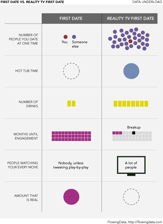
First Date vs. Reality TV First Date - by Nathan Yau from Flowing Data

What Works

I love jokes told via infographic.

What Needs Work

We need to tell more jokes via infographic and some of those jokes could be inside jokes that you wouldn’t immediately understand. When I come across an example of what I mean I’ll post it.

Reference

Yau, Nathan (25 April 2010) “First Date vs. Reality TV First Date” at Flowing Data.

An Overview of the Online Dating Field by Zosia Bielski and Tonia Cowan

What Works

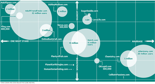
Imagine this data as a bar graph that illustrates how many users each site has. Maybe there is even some sort of inception date from the site included, too. That would be a typical way to represent this sort of data because all the reporters had in terms of numbers, were user totals. But they weren’t interested in simply showing how big one site was with respect to another. They were interested in discussing hook-up culture. Now, so far as I know, there is no agreed upon quantitative measure of ‘hooking up’. These folks didn’t claim to invent one (which is nice). They just used a couple different qualitative axes to illustrate the distinctions they saw within the field of online dating when it comes to marriage vs. hooking up and raunchiness vs. wholesomeness.

I think Bourdieu would have recognized some of his own influence here. He had similar Cartesian field maps in Distinction. Granted, he may not have been thrilled to have his concept used to describe online dating – ‘raunchy’ is a word that may not have been part of his vocabulary. On the other hand, his axis of choice probably would have been class (high and low) and as far as I can tell, the desire for lasting vs. fleeting sex does not show a clear relationship to class. Feel free to debate that assertion in the comments.

What Needs Work

Not a fan of the colors. I also wonder how certain smaller sites made the list – seems a bit arbitrary considering how many sites were left off the list.

References

Bielski, Zosia. (2009, April 9) “One Click Stands” in The Globe and Mail. [Tonia Cowan also contributed to the production of the graphic.]

Bourdieu, Pierre. [tras. Richard Nice] (1987) Distinction: A Social Critique of the Judgement of Taste. Cambridge, MA: Harvard University Press.