design

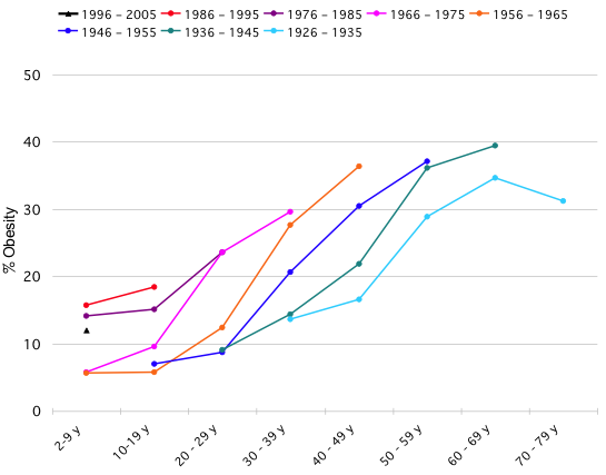
The graph below was originally posted at Flowing Data with an invitation for readers to take the same information and display it with clarity and meaning. The image below is difficult to understand – it brings to mind one of my favorite tricks which is to see if the infographic would deliver more or less the same message if it were in gray scale. This one would suffer in gray scale even more than it already is, a bad sign.

The original chart showing the increase in obesity (confusing)

Jonas Sekamane took up the challenge posed by Flowing Data and came up with what you see below as a first stab. He said, “My main “beef” with the graph above, is that comparison is difficult, if not impossible. This is of course due to the data gaps, but it could easily be fix with a guideline of some sort. Adding an age-group average, makes it much easier for the viewer to see if the level of obesity is in fact high or low.”

The second draft - now there is a single trend line, but still confusing

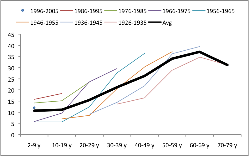
But he didn’t rest on his relatively simple fix. He decided that starting over altogether would be the only way to wrestle this information into a clear, meaningful infographic. First, he massaged the data into a more visually relevant format by calculating, “an index in Excel where 100 = the age-group average.”

I agree with his assessment of the original – that it was too far gone to be saved. I’d also like to take this opportunity to address social scientists more accustomed to the writing process than to graphic design process. Just as a paper will require several drafts before it reaches it’s potential, most graphics get better with revision. And like this reworking proves, sometimes it is necessary to scrap it all and start over, even after you think you have something could work. The key is that you cannot fall in love with your graphic designs (or your papers). In order to maximize their potential, some of them will need demolition and redesign, not just a new coat of paint.

No more trend line - Easy to see that obesity is increasing, especially for young people

Reference

Sekamane, Jonas. (29 April 2010) “Obesity Trends – Makeover”

Flowing Data (29 April 2010) Challenge – Graphing Obesity Trends

Where does my money go? in the UK - Open Knowledge Foundation, raphic by Iconomical

What works

This visually arresting graphic does a great job of presenting data about national spending in an apolitical but altogether fascinating way. It’s interactive, by the way, but I’m not commenting on the interactive part, just the static graphic. I find that getting the static graphic clear is an important first step towards making a functional interactive graphic. If ever I hear someone say ‘but it’s interactive’ as an excuse for having a weak static graphic, I cringe. See my post about the USDA mypyramid food guide for a case study on the importance of a strong relationship between the static and interactive iterations of graphics as tools.

Each dot represents a different department or governmental program with the size corresponding to the funding level. Smart.

If you link through to the originating site, you’ll be able to follow blog posts that take readers through the development of the graphic. They ask for input and do their best to incorporate it. I like that approach. Good use of technology, OKF.

What needs work

I can’t quite tell why the circles are arranged the way they are or why their hues are the shades they are. Graphics, especially the beautiful ones, are the best when their simple clarity gives way to an elegant complexity. In other words, when I pose the question: “why does the hue vary within given funding types?” I’d like the graphic to lead me to an answer. I’m sure there is a reason for each hue, I just haven’t been able to figure it out.

One tiny, American-centric request: Add ‘UK’ to the page or the graphic somewhere. Maybe change “Total spending” to “Total UK spending”. Or “Where does my money go?” could be “Where do UK taxes go?”. These here interwebs are global. Yes, of course, the £ symbol tends to give it away. Maybe I’m just being too picky.

References

Open Knowledge Foundation. (2009) “Where does my money go?” United Kingdom. Data available

by Christopher Niemann

What works

I never thought of a fuzzy halo-like hairstyle as an exploded pie chart before. Mostly, I just saw this and it made me smile. Recall from my earlier post Translating inspiration into better design that seeing something which you believe to be beautiful or clever can be a springboard for improving your own ability to design elegant information graphics.

What needs work

Clearly, it would be great if this had anything at all to do with social science or research. But it doesn’t. And I’m sure some of my readers are going to be upset that it had anything to do with Mr. Gladwell, but it is unfair to let personal opinions about Malcolm alter the reception of Christopher Niemann’s graphic.

References

Pinker, Stephen. (2009, 15 November) “Malcolm Gladwell, Eclectic Detective” [book review for “What the dog saw”] New York Times, Sunday Book Review.

Niemann, Christopher. (2009, 15 November) Illustration for Stephen Pinker’s review of Malcolm Gladwell’s book “What the Dog Saw”

Michael Schwabs poster design for the Art Center College of Design in Pasadena, CA

How to go from inspiration to design?

There are plenty of great graphic designers plastering walls with posters, filling magazines with intelligent ads, and even getting their work into museums. A lot of the time, it’s hard to see how all the inspiration and excitement of graphic design for advertising can make it’s way into the information graphics social scientists use to communicate their findings.

I took a fake example to show you how I translated my appreciation for Schwab’s design into some thoughts about enlivening a basic line graph. Let me emphasize this one more time: this example is fake. I didn’t use real data. Yes, global consumption of meat is increasing per capita, but no, it’s not as dramatic at it appears here. I went ahead and left off scales on the X and Y axes to ensure this graphic doesn’t end up traveling around the interwebs as truth.

Step 1

Break down Schwab’s graphic. He’s basically got a right triangle sitting on a single color background that bleeds into a thick border. The border contains the only text. The only realist element – the pencil – intersects the triangle to make what is like a giant X in the center of the poster.

How is this at all like social science graphics? Well, if you flip the triangle, it’s a lot like any positive relationship as depicted by a line graph.

Basic positive relationship depicted by a line graph

What next?

Now that you can see how a line graph is a little like Michael Schwab’s elegant pencil poster we can start to apply his decisions directly to our graphic. First, we can add a clearer background. If it’s just white the thick borders do not read as thick borders. They just look like the same old place everyone puts their axial labels. I distinguish this by adding a background color which will pull the borders into a relationship with the background behind the graph. I also go ahead and fill in the area under the graph to help nudge it into reading as an area, rather than some jiggly line.

The tough part here is the graphic. Not all stories we want to tell are going to be linked to a slender X-making image. I chose to depict the rise in meat consumption. Sure, I could have picked a cattle prod or other cattle killing tool dripping with blood. It would have been slender and I could have made an X. But I was trying not to appear unbiased so I just went with an iconic image of a beef cow. I planted the cow in the middle. We do lose a few data points in the middle – there are ways to deal with that if it’s important (overlay a yellow line across our cow’s gut where the data points are missing).

Here’s what we’ve got. The point is that the graphic below is the basically the same data as our line graph above except far more arresting (I took the liberty of adding two more lines of text – not necessary, but I was trying to closely follow Schwab’s concept). If you are trying to keep the attention of the audience in a presentation, be they sleepy students or sleepy colleagues, it might be worth your while to take a little extra time on your most important graphics. And if you do have one or two major points you want the people to take away from the graphic, you can write them across the top or up the side. Writing up the side is not as good – use it only for secondary points or graphic credits in the case that you hire someone to craft your graphics.

Simple line graph copying Michael Schwab's concept

References

Schwab, Michael. (2009) “Instrument of Creativity” [poster design] Art Center College of Design in Pasadena, CA.

Hirasuna, Delphine. (2009) “Art Center’s Instrument of Creativity” in At Issue Journal: The Online Journal of Business and Design. San Francisco, CA.

Office bathroom semi-public bathroom

Suggestion for a future unisex office bathroom

Stadium/Airport public bathroom

Suggestion for a future large public restroom

A better public bathroom

One of the reason this blog has been quiet recently is that I have been busy with too many projects, one of which is just finishing up now. It’s a book about the politics and social life of public bathrooms that I am co-editing with Harvey Molotch and will come out maybe next fall with NYU Press. In the concluding chapter, in a practice uncharacteristic of sociologists, Harvey and I suggest a design solution to a social problem in the form of the schematics you see above.

Here’s the context that you would have gotten had you read the book:

1. There aren’t enough public bathrooms and access to safe, clean places to go often operates to sort out the undesirables and, thus, make them even more undesirable as they are faced with the nowhere-to-go situation.

2. Public bathrooms heighten fears of the Other via their association with waste and dirt (ala Mary Douglas). Electronic fixtures have been installed to alleviate the frisson of coming up against other people’s private moments, past and present (in the stall next to you). But electronic fixtures can be quite frustrating and controlling, especially if you are doing something out of the ordinary like trying to brush your teeth.

3. People who don’t conform to traditional gender norms are not well-served by the bathroom binary. A person got kicked out of a restroom for using the woman’s room when she didn’t appear to be feminine enough. Her attempt to prove that she now identified and had always identified as female was dismissed.

4. The assumption that visiting the restroom is an act undertaken by individuals is faulty. Pairs and groups go, too. People with disabilities might need to take a helper in with them and that helper may very well be of the opposite sex. Parents with young children have all sorts of difficulty. When their kids are babies, where does the stroller go? When they get to be tots, are they going to crawl under the stalls or sit on floors of dubious cleanliness while mom/dad uses the toilet? When they get to be old enough to know the difference between boys and girls but not old enough for mom/dad to feel comfortable letting them use the public restroom alone, what can be done?

5. Architects and regulatory boards often do not have the time or the desire to rethink the design of the bathroom. Offering up a schematic plan is a step towards closing the gap between social science research and the physical world under construction.

Our solution is to make bathrooms unisex. Rather than tuck each individual into a small room completely sealed off from other bathroom users, we maintained the shared space. There’s a lot to learn about navigating taboos in the bathroom, and sorting people into their own private rooms would eliminate those opportunities altogether. On top of the primary concern that sharing the anxious space of the public restroom is a socially productive situation, there’s also the problem that most buildings don’t have enough space for as many private stalls as would be required by law.

We’ve kept urinals because they are so much more environmentally sound than toilets. But they’re tucked away so that men will keep their privacy and women won’t be confronted with the potential site of a penis out of pants.

We’ve turned sinks and toilets into mechanisms operated with foot pedals. Women kick to flush anyways; putting the pedal on the floor makes it a whole lot more accessible and thus, safer.

We’ve suggested that prams and bikes and luggage are part of everyday life and they need a place to be. In the large public restroom, they are parked near an attendant’s area. In the office-scale version, there is a parking nook next to the hand dryers, outside the general circulation route and also outside the typical lines of sight to help prevent theft.

The question

What do you think of our attempt to solve social problems by design? Should we stick to sociology and leave the designing to the architects and planners? Or, is it helpful to see – in plan – how all of the bathroom difficulties from diverse user groups can sit more comfortably together in space?

Are these plans convincing as communication tools? As pieces of graphic design, what else could be done? (color isn’t an option)

'A Common Mistake' [original caption]
'Identity Crisis' [original caption]

What Works

Think about explaining in words: “So you see kids, sharks get confused. They see a surfer and it looks like a seal to them.” Now think about being a little tyke and imagining a surfer and a seal. They don’t look anything alike to you. You wonder if sharks are practically blind or something.

Now think about showing them the first graphic. Instant comprehension. The kids don’t even have to think, they just know. This is graphic design at its best.

As for the second graphic, man, I think everyone loves some Venn diagrams. Such a powerful way to depict the union of two sets. This one is even better than average so I thought I would share it.

What needs work

I might have run these without captions. Errol Morris had a piece, “Photography as a Weapon” about how much captions can change the meaning of an image and ever since I read it, I’ve been looking at images with and without captions to see if it changes the way I think about them.

References

Morris, Errol. (2008, 11 August) “Photography as a Weapon” [blog entry] New York Times Zoom Blog.

Philips, Mason. (2009) Shark graphics for the Discovery Channel’s shark week.

Books are still great, no matter what happens on these here internets. They make much better references because the information stays where it is and is accompanied by indices and tables of contents. No link rot, no head scratching while trying to navigate a tag cloud, no wondering if the review was posted by the publisher or an actual reader (ie not the author’s mom, either). They do cost more than free-media (aka e-media?), unless you can find them at your library.

Here’s a start to a list of books you might consider buying if you’re interested in graphic design. Most social scientists might like to be better informed about graphics, but have a bit of trouble getting into it. Below are books that are compelling and beautiful. They won’t tell you how to run the software you might use or write clean html/css or insert hacks for working around the stupidity of IE6. I can post some of those another day, if you like. Our contexts IT guru Jon will be invited to guest blog on the topic of how to do online publishing, as well.

1. Edward Tufte

Tufte is widely regarded as a key figure in graphic design, especially the visual display of quantitative information (which is the title of one of his books). He also has a brilliant essay on powerpoint, of which he is not a fan.

Envisioning Information - Edward Tufte
Visual Explanations - Edward Tufte
The Visual Display of Quantitative Information - Edward Tufte
Beautiful Evidence - Edward Tufte

2. Typography

The Elements of Typographic Style by Robert Bringhurst review by Roy Johnson.

The Elements of Typographic Style by Robert Bringhurst

Typography is a critical component of graphic design. Font size is often the least flexible component and thus serves as a starting point for the rest of the design, assuming the design includes text. With respect to accessibility, small font sizes are terrible since many people have trouble with their eyes. (Even if only a few people had trouble with their eyes, designers should still make inclusive designs.) With respect to design, it is often better to have small fonts so that text blocks read as blocks rather than stripes. Reconciling those two and adhering to branding and identity strategies relies on a firm command of typography. Bringhurst’s book is recommended wide and far so I’m not saying anything new here.

Hoefler and Frere-Jones

Tobias Frere-Jones and his partner Jonathan Hoefler are current giants in the field of typography and have resources on their website – Hoefler & Frere-Jones. They have created typography for the White House, Gucci, the United Nations, Saatchi and Saatchi, Wieden + Kennedy, J. Walter Thompson, all the Martha Stewart magazines, Wired, The New York Times, The Washington Post, Apple, IBM, Sony, and on and on. They represent a sizable portion of the world of font development.

Thinking With Type - Ellen Lupton

Ellen Lupton of Maryland Institute College of Art says/writes much worth hearing/reading, including typography. Her Thinking With Type has it’s own website with additional information. Cheaper than buying the book, but I still recommend owning books if you can afford them.

3. The Grid

Grid Systems in Graphic Design - Josef Muller-Brockmann
Grid Systems in Graphic Design - Josef Muller-Bronfmann

Grid Systems in Graphic Design (Josef Muller-Brockmann)

Muller-Brockmann’s book is a solid introduction to the grid as a design framework. It’s good to read if you know nothing about design and good to read if you need a refresher in the basics, before you slide down what can be a slippery Flash-driven rabbit hole into a world where nothing makes sense.

See also tutorialblog on the use of grid systems in web design.

4. Universal Principles of Design by William Lidwell, Kritina Holden and Jill Butler

Universal Principles of Design - Lidwell, Holden and Butler

This book is not just about graphic design, but is more, well, universal, as the title suggests. It’s organized alphabetically, with one page of explanation and one page of examples for each of the 100 principles they’ve chosen. They admit that there are more than 100 principles, but they had to cut it off somewhere. Included are the 80/20 rule (or pareto’s principle), the Fibonacci sequence, the golden ratio, the baby face principle, and so on. I was so fascinated by it that I couldn’t put it down.

5. 79 Short Essays on Design by Michael Beirut of Pentagram

79 Short Essays on Design by Michael Beirut

Michael Beirut is a towering figure in design, as is the company he works for, Pentagram. His little collection of essays includes some gems, though not all are equally worthy of recommendation. The book has been widely recommended by others; maybe they were more evenly impressed by the collection than I was. Good one for checking out of the library because all the essays go pretty quickly so it would be nice to read on the train.

6. Design Blog Recommendation #1

Design Observer - Helfland and Drenttel

Design Observer and the related Winterhouse Institute (Jessica Helfand and Bill Drenttel)

This last one is a blog you might want to follow that features design related books, articles, entries, videos and so on. I am new to following it, but I like it so far.

World Wide Web Usage - Browser Market Share

What Works

This is one amazing piece of advanced pie chart. The trouble with mapping browser market share is that the number of people online keeps growing so absolute numbers don’t mean anything for more than a minute – most figures with respect to market share are giving no more than a cross section, a snapshot in time. This goes way beyond that and breaks out of the cartesian coordinates, too.

This works by starting at T=1, a red dot in the middle of the graph when the internet was in its infancy. At that point Mosaic was king which got clobbered by Netscape. Then Internet Explorer grew and then took off when it started to be bundled with all Windows installations. Remember those lawsuits? Who can forget. Netscape became Mozilla, which is now known as Firefox to most of us. Safari and Opera have some share, but it’s negligible. The game now is between IE and FF with enough representation by the smaller browsers that we cannot ignore them.

The graphic is great as it shows how many total users are online over time and what proportion of those users log-on with IE, FF, Safari, Opera, and others. So smart. Even managing to capture the changing names and ownerships of the browsers without cluttering things up with text box descriptions.

What Needs Work

I’m so impressed by this that I can’t think what needs work. Here’s where readers come in. What is wrong with this graphic? Anything? It was just a class project, so it’s hard to fault him for anything, even little things, knowing that he wasn’t aiming for a professional audience.

Relevant Resources

Gimpl, M. (2006) Systems of Representation – Affective Map Exercise. Research Group at Media Lab Helsinki.

Spotting a Hidden Handgun - Graphic by Megan Jaegerman

What Works

This is one of my favorite information graphics of all time. A somewhat smaller version of this appeared in the New York Times and was then amended as you see above to appear in Edward Tufte’s book “Beautiful Information”. Since Edward Tufte is seen by many as the king of presenting data visually, I’d say his endorsement is worth far more than mine. Click through the links under Relevant Resources to see what he has to say about this graphic on his blog (which is basically a scan of a page or two from his $52 book). You will also get to see more of Megan Jaegerman’s graphics including the lifecycle of women in the developed world, the price of mowing the lawn, the price of quitting smoking, a complete strength training workout, a guide to rest/ice/compression/elevation after a soft-tissue injury, and sports graphics covering hockey, figure skating, baseball, gymnastics, and diving.

I want you to have time to look at the stylistic conventions she has developed. So follow the first link below.

What Needs Work

Megan disappeared from the graphics scene. Megan, if you’re out there, know that you are missed.

Relevant Resources

Edward Tufte reviews Spotting a Hidden Handgun by Megan Jaegerman.

Tufte, Edward. (2006) Beautiful Evidence. The Graphics Press.

Jaegerman, Megan. (June 1997) Life: Start Here Women’s Health graphic adapted for the web. The New York Times.

The Design of Everyday Things by Donald Norman

Book Recommendation

Donald Norman’s “The Design of Everyday Things” is currently my commuting book which I’ve had ample opportunity to read because the F train here in NYC is the most capricious multi-ton object I’ve ever encountered. This is a good book if you want a straightforward introduction to basic design principles. Norman is an engineer by training which means he comes from a different tradition than, say, an architect. He goes through all sorts of examples of commonly encountered objects – keyboards, sinks, ovens, telephones – to help demonstrate that good design would benefit from prototyping and user-testing because, in the end, humans are fairly adept at taking clues about how to use an object from their first glance. When things aren’t obvious, it’s the fault of the design, not the fault of the person who has trouble figuring out how to put someone on hold or transfer a call with a phone system that can likely ONLY be used by a robot or an algorithm. He opposes beautiful design for the sake of beauty – glass doors stripped of plates and hand bars in service to the sleek glossiness of glass’s amazing material properties are no good if people end up pushing on the hinged side of the door when they should be pulling on its swinging side.

Norman offers users a set of criteria by which everyday design can be critiqued as well as some rules of thumb for figuring out particularly obtuse design challenges. He absolves humans their occasional mechanical buffoonery, “Humans, I discovered, do not always behave clumsily. Humans do not always err. But they do when the things they use are badly conceived and designed.” Norman doesn’t go so far as to suggest that the objects themselves possess agency, it’s not the fault of the things, but of the people who designed them, “When you have trouble with things…it’s not your fault. Don’t blame yourself; blame the designer. It’s the fault of the technology, or more precisely, of the design.” This part of his theory is the weakest. It’s rather simplistic to blame the designers without interrogating why they produce shoddy designs. He hints that designing for the sake of beauty is part of the problem and that user testing happens in the market place where negative reactions are likely to kill the product line altogether rather than resulting in intelligent, sensitive redesign. Luckily, other books (Harvey Molotch’s “Where Stuff Comes From” for example) do a better job of revealing the motivations and constraints on designers.

Where Norman is at his best is in the many detailed examples of everyday objects gone screwy with clear, diagramatic prescriptions for improvement. Norman never rants about bad design just to sharpen his teeth. His examples are accompanied by constructive suggestions that are so clearly spelled out that readers are capable of critiquing his suggestions, a sure sign that the book succeeds as a teaching tool. Furthermore, Norman illustrates his discussion with photos, sketches and diagrams throughout which enriches the legibility of the project and subtly introduces readers to the practice of learning through drawing that is common in design practice, but not all that common outside of it.

Relevant Resources

Norman, Donald A. (1998) “The Design of Everday Things” Cambridge, MA: MIT Press.

Molotch, Harvey. (2003) Where Stuff Comes From: How Toasters, Toilets, Cars, Computers and Many Other Things Come to Be As They Are. New York: Routledge.

Where Stuff Comes From - Harvey Molotch