Archive: Apr 2011

Introducing diagrams from a humanities scholar – Michael Gallope

Passing by a shared conference room last week, I was captivated by this series of graphics that Michael Gallope, a musician (electric organ) and scholar (Ph.D. student) at the NYU Humanities Initiative, developed to present his dissertation research. His work stems from his interest in music and an Adorno-inflected understanding of cultural criticism. Most of the rest of this post is by Gallope, which is for the best. He does a better job of telling you what his dissertation is about than I ever could. And I’m sure you’re sick of hearing my voice all the time.

I’m thrilled to see humanities scholars using diagrams to communicate their ideas. It helps. And that’s the point. It’s hard to get on the same page of a complex discourse if nobody is quite sure where that page is. Using words and graphics and…I don’t know…performance? Or whatever other avenues scholars have available to make sure that their points are clear and that the rest of the discourse can unfold is extremely useful. It’s not frilly, it’s not an add-on that’s ‘nice to have’. Communicating clearly is necessary for fruitful discourse. I, for one, tend to think that most academics are good at processing words and helped along by images. I don’t know if performances are always clarifying, but when the topic is music, performance is a useful mechanism for communication, not to mention a nice change of pace from the usual academic humdrum of meetings and presentations.

This is a representation of the role of negative dialectics in Theodor Adorno’s understanding of a resistant artwork.

Adorno -01
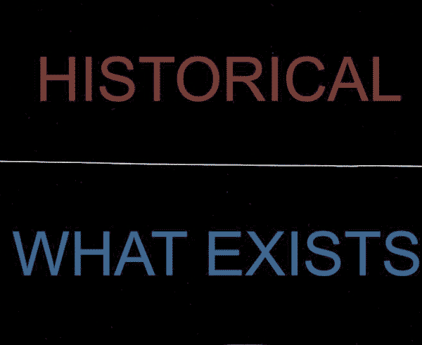
1. Below the middle line is “what exists.” Above is “what we can think.” If this were a diagram of Plato’s philosophy, everything above the line would be filled with ideal forms. But in Adorno’s philosophy, everything above the middle line is marked “historical” because Adorno believes in our power (indeed, our ethical imperative) to think about everything around us as *a congealed product of history.* Thus, if we were to think about a chair, we would not imagine a perfect immaterial chair in our heads (Plato). Instead, we would look at an actual chair and attempt to think about the history of this specific chair—all the industrial design, the history of chair-making, and the concrete manufacturing labor that brought this chair to be what it is.

Adorno -02

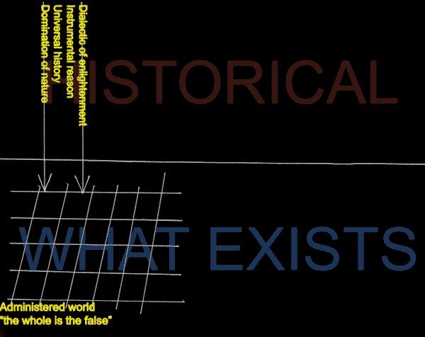
2. The arrows on the left side pointing down represent Adorno’s *universal* understanding of world history—that there is really just one history, and it is the history of an Enlightenment that never made any meaningful break from mythology, and thus, bequeathed to us “disaster triumphant.” We live in a world that, despite outward signs of historical progress, is in truth little more than a world of domination, cruelty, and un-reflective mechanistic thinking.

Adorno -03

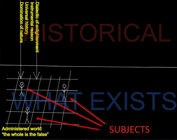
3. These stick figures represent existing subjects. Their capacity to “think freely” does not escape the strictures of existence (as dictated by universal history), thus they are securely “on” the grid.

Adorno -04

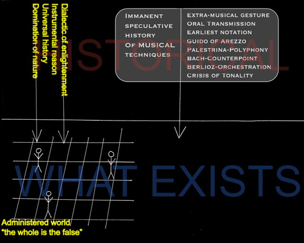
4. For Adorno, there is an important way for a subject get past the impasse of a devastated world: one must find an exemplary work of art that seems, itself, to recognize the horrors of modern existence. This is represented on the diagram by the white beach-ball drawing that is attached to (but struggling out from) the grid of existence. And of all the arts, musical works were exceptional in indicating an obscure sense of resistance, suffering, or utopia, in Adorno’s vocabulary. Now the question arises: how do you know a specific musical work (like a composition by Schoenberg) is genuinely resistant?

Adorno -05

5. We answer this question by thinking of the musical work at hand as historical. In order to do that, we adopt a quick and dirty universal understanding of the history of music as having its own history of musical techniques (chant notation, polyphony, tonality, new orchestration techniques, discourses on absolute music and romanticism, a crisis of tonality, etc.). This is represented by the bubble above the musical work that, like universal history, points down to the work that exists, implying that thinking it is a necessary prerequisite for understanding a musical work. Why? Because a resistant musical work understands that it cannot just imitate the music of Bach or Mozart in the twentieth century—it must have a historically honest relationship with the modern state of musical composition. (Certain techniques, like the diminished seventh chord, have lost their power to astonish, and thus should be laid aside).

Adorno -06

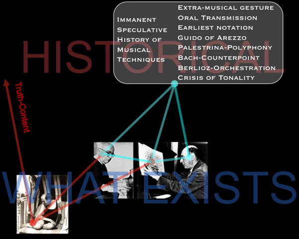
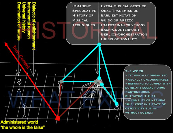
6. If one links this cognitive historical recollection of music history with the act of composition (represented by the stick figure to the lower right of the work), one might end up composing a certain kind of musical work that seems to refuse the adoption of any simple musical cliches (as in some of Schoenberg’s atonal compositions). If this has happened, the work must then be heard by a listener (represented to the left of the work) who understands precisely this very same history. When composer and listener and work are linked together, one can then think of this work from the perspective of an “immanent critique” that might negate (via the red arrow) the horrors of the existing world. Only then, through a kind of mirror reflection, do we get a glimpse of what Adorno calls “truth-content” or Wahrheitsgehalt in German. By negating (and only by negating) the horrors of modern life, do we glimpse a sense of the utopian.

References

Adorno, Theodor. (1983 [1966]) Negative Dialectics. New York: Continuum.

Gallope’s music projects:

Janka Nabay and the Bubu Gang (as featured in a 2010 Village Voice article)
Skeleton$ an avant-rock project led by composer Matt Mehlan
Starring a riot-prrrog psychedelic music collective

Cost of Health Care by Country | National Geographic

Explanation

This graphic is doing a lot of work compared to how simple it looks. Here’s an annotated list for review purposes:

  1. The colors of the lines show us which countries have universal health care (most of them) and which do not (the US, Mexico). Note that these colors do not differentiate between who, precisely, is paying for this health care – that’s complicated. In many nations the state pays for some people’s care or for some care for all people, but wealthier people or particular kinds of care are not covered by the state but are picked up by private insurers. It would get much more complicated if the graphic had to have a color for each – nearly every country would end up with its own color. Even in the US, the state pays for some of very poor people’s health care and for health care for those above 65 (though there are some limits on what the state’s willing to cover).
  2. The width of the lines show us how many trips people take to the doctor. The Japanese and people in the Czech Republic appear to see their doctor more often than I see my mom. Sorry, mom. However, even though people are always at the doctor in these places, their overall health care expenditures per person are not sky high. This could lead you to conclude that going to the doctor more often means that people are getting better preventative care. Preventative care is generally cheaper than ‘fix-it’ care. It could also lead you to conclude that people who are obsessed with their health are both more invested in taking care of themselves at home and more likely to run to the doctor at the sign of any little problem (On the one hand, if they are obsessed they will recognize any little problem sooner than those who are a bit more oblivious and it would seem that they might be less likely to try ‘quackery’, preferring to go to the doctor for the official treatment. No gingko biloba or St. John’s Wart from the Vitamin Shoppe unless the doctor says so.)
  3. The length of the line means nothing. These are not time lines.
  4. The slope of the line means…well…it implies that there ought to be a relationship between health care expenditures per person and average life expectancy. The implication goes like this: a country’s ranking in terms of per capita health care expenditures ought to match their ranking in life expectancy. Granted, I think anyone who has created this kind of graph before knows that the person who made it probably spent some time trying to come up with which measure of health would be the best one to use as the proxy for success – should it be life expectancy? Should it be some conglomerate variable that combines life expectancy, infant mortality, and something else? If you play this game with yourself, you probably end up just deciding that life expectancy is the cleanest comparison. But you may admit that it is imperfect. And it is. There are so many other things that get between health care expenditures and life expectancy. There’s environment, there’s the value of a given health care dollar which is not the same from one country to the next, there are cultural attitudes supporting relatively healthier and unhealthier lifestyles that vary from country to country, and so forth. This graph ignores those issues. It has to, but you don’t. Keep all that in mind, especially when thinking about how to allocate health care dollars. Maybe those Japanese people are on to something – they go to the doctor all the time, live long lives, and don’t spend inordinate amounts on health care. I know that if I had to stand on a scale in front of my doctor once a month or even once every 6 weeks I would think twice before eating things I shouldn’t eat or chickening out on my exercise regimen. There’s just something about getting an authority figure involved in processes like these to make us accountable for our own actions.
  5. The graph implies that there is a kind of sweet-spot for per capita spending that appears to fall between $2,000 and $4,000 [2007 dollars]. The US, of course, looks ridiculously over zealous when it comes to how much we spend and dismally stupid when it comes to where we put these dollars because we spend more on health care and get less in terms of life expectancy.
  6. Rankings to rankings comparisons

    I am not a fan of these rankings to rankings comparisons overall. Yes, this particular graphic packs a bunch of information in, but I still wonder how legitimate it is to compare national rankings in per capita expenditures on health care to national rankings in life expectancy. Forgive me for being an academic who *wants* the complex story. This is over-simplified. There is absolutely nothing in this graphic that would suggest what can be done about improving a nation’s average life expectancy whatsoever. Mexico seems to be doing OK – it spends relatively little compared to where it stands in the life expectancy rankings. So, clearly, if this graphic were all that we had to base decisions on, we might not decide that universal health care would give us a bump in life expectancy. If this were all we had, we’d probably just gut spending right away because the clearest point here is that the US is spending far too much compared to other countries in absolute terms as well as in relative terms when measured by life expectancy.

    The other thing the graphic does not show – something I’m always curious about – is how much of the money we spend on health care goes to administer the system both in the US and in other places. In our fair union, with all the insurance companies requiring different claims processes, we have to hire experts at the hospitals and clinics to submit claims and experts at the insurance companies to decide what to do about the claims. We hire other experts to negotiate the terms of groups plans in the first place – and where someone gets a special deal that requires a more complicated claims process. All of the complexity of health care meets the additional complexity of administering health care the way we’re doing it now and leaves space for lawsuits. So…lawyers sue various parties for a wide variety of reasons and doctors have to buy more malpractice insurance. The system increases the costs of keeping itself going without actually adding much of anything to the quality or quantity of patient care.

    Reference

    Uberti, Oliver. (2011) “The Cost of Care” [Information graphic] in National Geographic using OECD Health Data 2009 which draws on data gathered in 2007.

Measuring the Impact of Humans on the planet | National Geographic

Note

My dad sent this along to me and I decided to leave his handwritten note at the top. Since he was interested in the graphic and not the article, I do not know exactly which article in the March 2011 issue of National Geographic contained the Human Impact graph, but my educated guess suggests it came from the one entitled, “The Age of Man” by Elizabeth Kolbert. I checked out the online version and could not find this graphic, but print and online versions of magazines do not always contain the same content.

This is why it’s nice to have parents who will cut things out of print magazines for me. Thanks, dad.

What works

The best feature of this graphic is that it provides a way for readers to understand population growth taking into consideration the qualities of the population – and the way that changes in those qualities over time mean that population growth at one point in time is not the same as population growth at a different point in time. As we all get richer, we demand more of the planet in terms of food (increased affluence leads to eating higher up the food chain which is less ecologically efficient), in terms of energy (more affluence means more demands for electricity and fossil fuels), and all of our affluence allows us to spend more time inventing things that will make our lives even better than they already are. The increase in affluence as measured by global GDP and the increase in technological sophistication as measured by patent applications are going to go hand in hand. I would point out that patent applications would not be necessary in economic systems other than capitalism, so that particular metric might be off in countries that aren’t wholly capitalist (Cuba comes to mind).

What needs work

What’s weird about this to me is that this growth is exponential and yet it has been represented linearly. I’m wondering what an exponentially growing volume looks like – probably looks pretty interesting depending on how the parameters constraining the volume are keyed to the variables. This is a tough criticism because I don’t even know the answer myself, I just know that something isn’t quite right with the tidy right angles here.

I’m a bit upset, too, about the fact that we’ve run into the apples and oranges problem again. One unit on any of these axes cannot be compared to one unit on the other two – a patent application is not like a human and neither of these are like dollars of GDP. Because I cannot compare one axis to the next, I know that I cannot use this graphic to form anything other than an impression about the factors comprising the impact of humans being born today. I cannot, say, decide that cutting back on technological growth would be better or worse for the planet than limiting population growth.

There is something good to be said about graphics that represent concepts rather than data. Impressions are not worthless so if this thing gives viewers the impression that population growth is not a problem on its own, but only a problem in the context of the way humans live, that is an accomplishment of which to be proud.

References

Tomanio, John and Bryan Christie. (March 2011) “Why is our impact growing?” [Graphic] in National Geographic p. 72.

Kolbert, Elizabeth. (2011) Age of Man National Geographic Magazine.

Loneliness and Fat Consumption among middle-aged adults | Cacioppo and Williams

What works

Written by a social neuroscientist, the book Loneliness contained this heartfelt graph on page 100. Yes, even I feel the phrase ‘heartfelt graph’ is an oxymoron. But the way that the graphic artist worked over the details here – the way the edges of the butter columns are rounded, the way that the paper is folded back, even the way that the grid lines are rendered makes this two bar graph captivating. I am also intrigued by the mix of digital and hand-rendered – most everything was hand-drawn except the axial numerals and the text labels. I like the mix. I probably would have liked it better if the lettering had also been hand-rendered but I think that’s just me being a bit too precious about hand-rendered images.

The book describes the way that loneliness is a neurological event, one that overlaps with social and psychological parameters to produce a more or less predictable set of occurrences. In this graph, authors Cacioppo and Williams are discussing recent findings that indicate lonely middle-aged adults tend to get more of their calories from fats than non-lonely middle-aged adults. For younger adults, loneliness does not seem to have an effect on either food consumption patterns or exercise patterns.

Socially contented older adults were thirty-seven percent more likely than lonely older adults to have engaged in some type of vigorous physical activity in the previous two weeks. On average they exercised ten minutes more per day than their lonelier counterparts. The same pattern held for diet. Among the young, eating habits did not differ substantially between the lonely and the nonlonely. However, among the older adults, loneliness was associated with the higher percentage of daily calories from fat that we noted earlier (and that is illustrated in Figure 6).

Perhaps because this book is about empathy-inducing loneliness, it is especially nice to see a tenderly hand-drawn graph rather than something far less engaging, the standard excel-produced item. The same numerical information would have been conveyed – and in fact that information was conveyed fairly well in the text itself – but the hand drawn element indicates that the topic is worthy of more than quantitative concern alone.

I am about halfway through this book and so far, I recommend it. Even if you are not interested in loneliness, the book does a good job of demonstrating how diverse research fields can be woven together to examine a topic common to all. The book draws from psychology, sociology, evolutionary biology, and neuroscience to help explain why some people are lonelier than others and what the impact of loneliness can be on the short-term and long-term health and social outcomes for individuals.

What needs work

For the record: I cannot draw or render or do anything good with a pencil besides finding a way to hold my hair out of my face. I tend to be overly appreciative of drawings and people who can draw. My critique here is of myself and others like me who swoon over the hand drawn.

I also wish there might have been a way to get the exercise information included, if not on the same graph, than on a companion graph right next to the butter sticks.

In a public announcement sort of way: folks lonely and nonlonely seem to take much solace in eating. That’s a large amount of fat consumption.

References

Cacioppo, John T. and William Patrick. (2009 [2008]) Loneliness: Human nature and the Need for Social Connection. New York: W.W. Norton.

World cites color map by size and location | Impure Blog

Introducing Impure

I have waited too long to introduce you to Impure Blog which is a blog presenting visualizations from the free-of-charge and powerful data visualization tool: Impure. The tool was developed (and is still being developed) by Spanish start-up visualization firm Bestario. Many posts are in both English and Castellano (that’s Spain’s version of Spanish for those of you who aren’t sure what Castellano means).

The work they have done in developing the visualization tool as well as the work they have done to use the tool well is commendable. IBM’s Many Eyes visualization tool is powerful, but the developers seem to have left a bit too much to the crowd when it comes to using the tool well. The gentleman at Bestario (and I believe they are all men, at least this was true the last time I checked) seem to be deeply interested in using the tool, not just building it.

I’ll have another post on the tool and what it’s good for, but today I think it makes sense to take a look at one of the projects they’ve recently released that uses a number of graphics to describe changes in urban growth around the globe since 1950.

The map at the top here uses rules about latitude and longitude to assign color values to all cities. This is one step above the rule used at gapminder which is that each country is assigned a single color based on it’s continent of origin. The Impure visualization is more sensitive – colors are assigned by latitude and longitude values so there is a gradient across each continent. Maybe it’s better to let them explain how they used longitude and latitude to assign color values:

Colors in the visualization are applied according to cities geographic coordinates: Hue varies with longitude, Saturation is always 1 and Value varies with latitude, based on the HSV color model, as the following image shows (cirlces areas are proportional to cities population in 2010)

This map works not because it tells the story they are trying to tell, but because it acts as a key for the interactive graphic below, which uses ordered-stacks of cities linked to themselves over time to demonstrate how city size has varied over time for 590 world cities.

Interactive City data

Embedded below is an interactive graphic that should have year labels starting at 1950 and ending at 2010. As a whole, it’s overwhelming to look at…no sense can be made of this block of color…until you start mousing over. Go ahead, mouse over, you’ll like it. I believe I said, “Oh!” when I did it the first time.

<<Disclaimer: most of the graphic embedded just fine but because of some size constraints that I wasn't able to overcome, the top cities are chopped off. Click through to get the full version and see what happens to Tokyo and Mumbai.>>

What works

Interactive graphics are often better than static graphics because they are not merely presented to the viewer, the viewer has an opportunity to alter which information she sees. As a pedagogical tool, dialogues are generally better for retention and comprehension than monologues. It’s hard to get a dialogue out of a static graphic – much easier to get a dialogue going with an interactive graphic.

I also applaud the team for presenting not only the crowning achievement – the interactive graphic – but also the map that acts as a color decoder, the line graph that contextualizes the growth in urban areas by illustrating the decline in population’s in rural areas, and the versions of the interactive graphic that breaks the world into continents (more or less) so that we can start to see larger trends.

Population change by rural/urban status, 1950-2010

Continent by continent comparison of population change in urban areas, 1950-2010

What needs work

My one major concern with the way the interactive graphic displays information is that it relies too heavily on rankings. It appears that the world population has remained the same since 1950, but people have just moved from one city to another, thereby changing the rank ordering of cities by population. That’s what happens when the size is constrained to a perfect rectangle. It would be nice if there were some way to show overall growth in population over time as well. I realize that would just look like a stacked, area-under-the-line graph. Not sure if that is an improvement or not. Quite sure that there is a creative way to solve the problem which hasn’t occurred to me yet.

References

Impure Blog

Bestario.org

Impure visualization tool

Urbanization at gapminder

Growth of the population of Hispanic and Asian children in America, 2000-2010
Growth of the population of Hispanic and Asian children in America, 2000-2010 | Wall Street Journal

What works

It’s nice to see all of the Census 2010 data coming out and generating infographics. This one comes from the Wall Street Journal which distilled the above panel of stills from an interactive graphic which also has maps for white and black kids and detailed tables by race and geography.

Though the two stills here do not do a good job of demonstrating the claim in the headline, that there are fewer white kids, the bar graph on the right and the interactive graphics, do, in fact, back up the headline claim. We could quibble about the flipside to the headline – rather than saying there are fewer white kids, should it have pointed out that there are more Hispanic and Asian kids? – but quibbling about headlines isn’t my concern here. Other news outlets did take that spin on the same set of information.

What I like here is that the graphs did not try to show everything all at once – each of the four racial categories included in this series gets its own graph. Yes, there are more than four racial categories and yes, it would be nice to see where other racial categories fit. But inasmuch as I am concerned with the overuse of mapping data, especially when those maps get layered up with all sorts of information that makes them illegible, I am happy to report that these folks had the commonsense to generate one map for each of the racial categories they decided to depict.

One of the incidental facts portrayed here is that the country continues to tip towards the southwest. The big red ‘decrease’ blobs appear in the northeast for whites and blacks and are not compensated for by blue ‘increase’ blobs among Hispanic and Asian births. Because I wouldn’t necessarily have picked this up from looking at a table, I think it’s clear to say that the use of maps was justified in this case because at least part of the story is geographic in nature.

What needs work

I have a tough time with the blob maps. I can get an overview but I have a tough time doing additions, let alone additions and subtractions. The bar graph that appears in the stills helps present the same information in a different way. In this case, the maps can only display the big picture. The bar graph is necessary to help understand how all these blobs add up. In particular, the top graph shows a large increase in the number of mixed-race kids by percentage, but this group is still so small that the absolute numbers wouldn’t even register on the blob maps.

Food for thought

The second, vertical, bar graph is my favorite part that ties all of rest of the information together. We see that white kids still make up more than half of the children born in the US, though it appears that this may not be the case in 2020. We see most clearly that Hispanic kids are growing faster than any other category of kids. I’m going to take this moment to note that Hispanic-ness is an ethnicity, not a race, and that many Hispanic kids are considered white. Remember that Central and South America were colonies of Spain and Portugal and we tend to consider Spanish and Portuguese people white. I’m not prepared to get into a discussion about what it takes to be white in America, just pointing out that Hispanic people are, in many cases, racially white even though they may consider themselves to be ethnically Hispanic. It is possible to hold both of those identities at the same time. Furthermore, if we look back in history there was a time when Irish and Italian immigrants were considered non-white. I have wondered if today’s Hispanics are similar to yesterday’s Irish and Italian immigrants in the sense that they will eventually come to be seen as white ethnics.

This is a debate I’m hardly qualified to comment on and I welcome others who are more qualified to take up this issue in the comments. In particular, I’m wondering how the numbers matter. If there are more and more Hispanics born in the US, will that mean that they are not under pressure to assimilate to mainstream white-ness and will have more opportunities to maintain a distinct identity? Or will the decreasing number of white folks mean that there is pressure to recruit new populations into the white identity as part of our one-drop anti-black legacy? I don’t know what this all means, but I do feel like the numerical balance is meaningful.

References

Frey, William H. (2011) Brookings Institution analysis of 2010 Census Data.

Dougherty, Conor. (6 April 2011) New Faces of Childhood: Census Shows Hispanic and Asian Children Surging as Whites, Blacks Shrink. Wall Street Journal.

Caloric availability in the US by food source, 1970

nutrition_circles_1990

nutrition_circles_2008

What works

These infographics are based on data from the United States Department of Agriculture. They depict the calories available per capita for the average American. It’s not an exact measurement of what’s on everyone’s plate, but it’s not bad. They made adjustments for waste and spoilage (which is not insignificant in this bountiful country of ours) saying:

Data on the availability of different foods per capita is adjusted for losses like spoilage and waste. Take for example the produce that goes bad at grocery stores or the leftovers tossed into the compost. By calculating such food losses, the USDA data closely approximates the amount of food that actually makes its way from the farm into the average American stomach.

This leaves us with a decent proxy for what passes through the average American in terms of nutritional categories. I think they’ve done a good job of breaking the categories down – looking at added fats and sugars as their own categories is useful and infrequently done in the world of nutritional infographics.

One more thing: this infographic is actually an interactive graphic that uses a slider bar to move across time. It’s a bit more pedagogically useful than the stills I have posted here. I encourage you to click through and play around with the full version of this infographic.

What needs work

Adding up the 2008 numbers shows a total intake of 2678 calories per person per day up from 2169 in 1970. As an infographic, I think this could have done a better job of showing the growth in total consumption – maybe just a bar somewhere that is either broken down by category or not. This is a meaningful change. The purpose of the infographic is to communicate that the change has mostly taken place in the grain category but that’s a little tough to see. I imagine part of the reason it’s tough to see is the way the graphic is constructed – lots of things are changing besides grain. But it’s also a problem inherent in the numbers since grain doesn’t change all that much. However, I still think this could have been done more clearly without the bubble approach. I still argue that the best way to show changes over time is by using line graphs. Humans are very adept at translating an upward sloping or downward sloping line. Of course, people tend to think that the upward and downward sloping lines are horribly boring and gravitate to bubbles and other mechanisms of pizzazzification.

References

Jezovit, Andrea. (5 April 2011) Is Grain Making Us Fat? From the Civil Eats blog as part of an ongoing collaboration between Civil Eats and the UC Berkeley Graduate School of Journalism.

Waterless Urinal Diagram | Wired Magazine

Accompanying text

The necessary accompanying text was not part of the image file, but here’s what it says under each panel:

Panel 1: “Instead of being flushed down with as much as a gallon of water, urine simply drains through openings in a specially designed plastic cartridge at the bottom of the bowl.”

Panel 2: “The entry chamber contains a blue liquid—a lighter-than-urine long-chain fatty alcohol. Gravity pulls urine through the liquid, but odors and sewer gases are trapped below.”

Panel 3: “As the urine descends through the cartridge chamber, its flow collides with a barrier, which prevents turbulence from displacing the floating sealant.”

Panel 4: “Urine passes beneath the barrier and into the exit chamber. When the urine level reaches the height of the drain, it spills over and empties into the outbound sewer pipe.”

Falcon Waterfree Technologies Waterless Urinal | Photo by Dan Krug

What works

I appreciate that Peter Grundy, the graphic designer, shows us the macro-scale first and then leaves the detailed working of the smaller catchment valve to the subsequent three panels. When describing something new, it’s good to start at a level that people recognize – presumably, men recognize the basic shape of a urinal more than the recognize the shape of the mechanism that makes it waterless. I probably would have made that first panel slightly bigger than the rest so that we know it isn’t four of the same things at different points in time, but one different thing and three of the same things.

I enjoy the way that the urine is displayed in balls so that it can appear bouncy. The dots are more than simply an enjoyable feature, they also help communicate about a problem in urinal design: backsplash. Urine is a bit bouncier than one might like – the text below the panel explains that dark blue liquid traps odors from seeping up but it is the L-shaped barrier that does most of the backsplash prevention work. I’m guessing it’s actually a combination of the L-shaped barrier and the blue liquid that keeps the urine from splashing. Not enough space for explanatory text to get into those details, but I appreciate the way the diagram brought attention to the backsplash problem and not just the waterlessness.

Another thing: I applaud Grundy for depicting a penis (a stylized penis, but only as stylized as the rest of the diagram) instead of a visual euphemism of the circle-and-arrow ‘male’ sign.

What needs work

The dark blue area is so dark that I initially had to sit and think about whether I was supposed to be reading it as a presence or a void. Perhaps a less dark color would have read more clearly as a presence, something we are meant to notice, than as a void. Yes, I can hear critics pointing out that since the color above the dark blue is white, one would have to assume the dark blue is presence. I speak for my eyeballs and cognitive structures when I say that I had to think about it.

That’s not all where the color critique comes from. Since water is often depicted as blue in diagrams and this diagram was supposed to be about the waterfree urinal, I probably would have chosen a color other than blue, even if the actual liquid in the device is blue. The big point is to remind us that there is no water here – we might lose sight of that amidst all the conventionally blue zones in this diagram.

I also do not quite understand the cylindricalness of this thing because the diagram makes no effort whatsoever to give depth. It’s just a section and a section of a rectangle will look the same as the section of a cylinder. Well. Except that isn’t strictly true. As far back as drafting goes, we know that there were conventions for making sure that cylinders and rectangular solids could be differentiated in section. Those rules might have been handy if extrapolated to fit this case.

The main problem I always run into with diagrams is the balance between image and text. Diagrams, in my experience, end up being more text heavy than other sorts of information graphics. This particular graphic would not work at all without the text, but that may be an unavoidable reality when it comes to diagrams. As I said above, at least the text is subordinate to the images and follows their table layout instead of sort of hanging around the fringes using arrows to connect text to image.

References

Davis, Joshua. (22 June 2010) Pissing Match: Is the World Ready for the Waterless Urinal?. Wired Magazine.

Grundy, Peter. (22 June 2010) “How it doesn’t flush” Wired Magazine. [Diagram]

Falcon Waterfree Technologies.

Reading, Writing, and Earning Money | GOOD Transparency Blog

What works

Nothing is working for me with this graphic except possibly the few places where the designers offered detailed information about a particular location’s high school graduation ranking, college graduation ranking, and income ranking. But that’s being generous.

What needs work

Horrible use of a map. Maps should only be used where there is good reason to believe the information being conveyed is tied closely to geography. This information is not tied closely to geography though it might be tied closely to states. But states need not always be represented as geographical entities. Often, they are political entities and their particular geography is not salient.

The math that led to the graphic flattens important details and renders this a useless graphic. What I believe the designers did was something like this:

  • They took all of their numbers and turned them into some scale between 0 and 100%
  • Then they decided to represent each of the three variables with pure Cyan, Magenta, or Yellow. The higher the state scored on the scale from 0-100, the more saturated the color value.
  • Then they gave each county a combined score by building new colors from mixing the values of the previous three. Higher scoring states ended up with more saturated colors. Basically, higher scoring states started to approach black. States that scored high on just one vector ended up having a clearer, lighter color profile.

Here’s the big problem with this. It was hard for me to explain to my MIT-educated friend so I’m not sure this is going to make sense the first time ’round. Representing everything on a scale from 0-100 is a slide towards obfuscation. The graduation rates are both unadulterated rates. The income data represents un-scaled median incomes. I appreciate that they are not scaled, but I have a hard time adding 65% with $45,000. That’s some troubled math. At least in the monochrome maps we know what we’re looking at before the three variables get added up.

A grave sin was committed when the numbers for these three different variables were added up. Now, of course, it wasn’t the numbers that were added up. It was the color values of each of the three separate data points that were added up. Additive color seems to be something that does not send up a red flag. I can guarantee you that if they had presented something – a table or graph – where they had ended up adding values from high school graduation, college graduation, and income, red flags would have been flying. Why? Well, maybe you’re starting to catch my drift, but I’ll help you by spelling it out. What happens when the colors are added is a clear violation of the ‘apples to apples’ rule. Comparisons do not work unless you are sure you are comparing like things. Graduation rates are not like income. They are two different kinds of numbers – one is a rate the other is either a linear value or a log-linear value. Either way, they cannot be added up and still make sense. It’s no surprise that the graphic ends up looking like an incomprehensible slurry of a gray area.

References

GOOD and Gregory Hubacek. (March 2011) Reading, Writing, and Earning Money in GOOD Transparency Blog.

When the Data Struts Its Stuff | Natasha Singer for the New York Times

Reading Suggestion

In case you missed it over the weekend, the New York Times ran a story about information graphics and the people who use them to communicate with the public. Unsurprisingly, Hans Rosling of Gapminder in Sweden – one of the new heroic figures in infographics – was the man in the picture and the first to be quoted. Rosling deserves the attention – gapminder had fairly humble origins and has grown because it draws from sound data, it is free to use, and it does a predictably good job of providing a visual overview of country level comparisons over time. Natasha Singer, the journalist who wrote the article, also interviewed Professor Ben Schneiderman of the Human-Computer Interaction Lab at the University of Maryland and Jim Bartoo of the Hive Group. And that’s where the article obliquely addressed the growing divide between infographics that are meant to be serious, complex, and complete and those that are meant to be beautiful and compelling, but user-directed. This second sort of infographic is the sort of thing that gets accused of being ‘info-porn’ and often covers information that is of dubious social value. Do we really care about celebrity’s twitter usage patterns? Is that as important as the work Hans Rosling does? What can the academic side of information graphics makers learn from the commercial side?

The article has a slightly different take on these questions,

The fact that serious software companies are now tree mapping the pop charts is a sign that data visualization is no longer just a useful tool for researchers and corporations. It’s also an entertainment and marketing vehicle.

but it’s clear that there are some divisions within the world of infographics that are worth considering more seriously. Nobody ever claimed that all writing is of the same species or that everything on TV is trying to do the same thing. Documentaries are not like sit coms which are not like dramas which are not like soap operas…but then again, they can all be found on TV and thus have some common elements. It’s no surprise that there is a wide variety of infographics out there with distinct goals.

Figuring out just how each type fits into the information ecology and changes the expectations about the entire range of infographics is worthwhile. When graphic designers started to take infographics seriously, it raised the bar for social scientists who were trying to communicate with information graphics. No longer was a chunky bar graph going to look sophisticated. It might look so generic and grade-school that it would reflect poorly on the overall quality of the argument.

References

Singer, Natasha. (2 April 2011) When the data struts its stuff. New York Times, Business Day Section: Slipstream.

Hans Rosling. Gapminder.org Hans Rosling is also a frequent TED Talks presenter.

Jim Bartoo. Hive Group.

Ben Schneiderman. Human Computer Interaction Lab at the University of Maryland.

Hillman, Dan [Director and Producer] | Rosling, Hans [Presenter] (7 December 2010 was first broadcast date) The Joy of Stats BBC. [Documentary] 60 minutes.
In the US you can stream The Joy of Stats from Hans Rosling’s gapminder.org website. Perhaps this works in other countries as well, but I haven’t had a chance to test it.