reading suggestion

Hi all. I put together the following biblio after some of the folks in the audience during my presentation at The Image conference (UCLA). They were wondering how to create better information graphics.

This list of resources is good if you are sick of using excel and killing yourself trying to use Word to make graphics or wondering what you should be aiming for within a categorical type (what’s a good bar graph, anyways?). Admittedly, none of the resources are perfect, most do not tell you how to use which software programs. But there are good pieces of advice and instructions in just about all of them.

The list is available for download here. And in html below.

Infographics Biblio – emphasis on how-to

Cleveland, William. (1994) Elements of Graphing Data. Summit, NJ: Hobart Press.
+ Table of Contents and Chapter 1: http://hobart.com/Elements.PDF

— (1993) Visualizing Data. Summit, NJ: Hobart Press.
+ Table of Contents and Chapter 1: http://hobart.com/Visualizing.PDF

Few, Stephen. (2004) Show Me the Numbers: Designing Tables and Graphs to Enlighten. Oakland, CA: Analytics Press.
+ Perceptual Edge blog

Graff, Gerald and Catherine Birkenstein. (2009) “They Say/I Say”: The moves that matter in academic writing. New York: W. W. Norton.
+ This book is not about graphics. I find that it offers a useful framework for figuring out
which contextual information needs to be included in a graphic in order to provide
enough context for a useful discussions. If academics creating infographics include some
history of an argument or predict what critics might say, they will create a stronger, clearer
graphic just the way writers create stronger, clearer arguments if they situate their
argument within a field and address predicted criticism before they arise.

IBM Research: Many Eyes Visualization Tool.

Roam, Dan. (2009) Unfolding the Napkin: The hands-on method for solving complex problems with simple pictures. New York: Portfolio Trade, a division of Penguin.

Rosling, Hans. (2005-present) GapMinder Visualizations and tools to make your own visualizations.

Seagram, Toby and Jeff Hammerbacher. (2009) Beautiful Data: The stories behind elegant data
solutions
. Sebastopol, CA: O’Reilly Media.
+ Table of contents

Steele, Julie and Noah Iliinsky. (2010) Beautiful Visualization: Looking at data through the eyes of experts. Sebastopol, CA: O’Reilly Media.

Tufte, Edward. (2006) Beautiful Evidence. New Haven, CT: The Graphics Press.
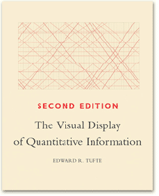
— (2001) The Visual Display of Quantitative Information, 2nd ed. New Haven, CT: The Graphics Press.
— (1990) Envisioning Information. New Haven, CT: The Graphics Press.
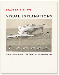
— (1997) Visual Explanations: Images and Quantities, Evidence and Narrative. New Haven, CT: The Graphics Press.

Ware, Colin. (2004) Information Visualization: Perception for Design, 2nd ed. Morgan Kaufmann.

Wong, Dona M. (2010) The Wall Street Journal Guide to Information Graphics: The dos and don’ts of presenting data, facts, and figures. New York: W. W. Norton.
+ Table of contents and sample pages

Hans Rosling | MSNBC

What Works

Hans Rosling argues that by raising the living standards of the globe’s poor people we can avert a population growth disaster. He uses statistics and on-stage demonstrations to do it. Worth watching. Over at TEDtalks. Happy to see a kindred spirit having his day with TED.

TED logo | TED
I approve of the rockstar version of Hans Rosling’s portrait so I cribbed it from MSNBC. Thanks graphic designer out there somewhere, working to make statisticians more visually stimulating.

References

Rosling, Hans. (July 2010) Global Population Growth TED talks.

Gap Minder is Hans Rosling’s website. It features many more animations than just the one about population growth as well as tools to build your own animations. The emphasis is on country-level data.

grain edit logo

What works

grain edit is a graphic design blog that will expand your mind’s collection of graphic design to remember. It is not restricted to information graphics – in fact, most of the work has nothing to do with information graphics – but it includes a wide variety of graphic design and illustration. I’m posting this reading suggestion on a Sunday because it is a bit off the core topic here which is supposed to be social science data presented via information graphics. Still, if you are at least mildly interested in graphic design, surely you will find something you like over at grain edit. Not only can you see what ‘the work’ looks like, you can also read interviews, and get photographic studio tours with some of the designers they feature. And if you are super keen on the whole concept, their blog roll will take you on a fantastic cyber-tour of thought provoking eye candy.

My favorite links:

References

grain edit blog

things magazine

Lumadessa

Readers, dear readers, I know my regulars are sick of hearing about how much I hate pie charts. But I came across Stephen Few’s latest newsletter – Mr. Few is a man who is a professional information graphics guru and he hates pie charts, too. Of course, he is a professional and he doesn’t use the word hate. When I saw his newsletter, a smug smile of satisfaction crossed my face and I thought to myself, “Self, maybe the readers are sick of hearing you complain about pie charts, but they might want to hear how someone else complains about them. Because: Look! He has illustrations!”.

Why pie charts are not the best choice

Think of this as graphic art for geeks, abridged from Stephen Few’s newsletter, “Save the Pies for Dessert” from his information graphics educational company The Perceptual Edge.

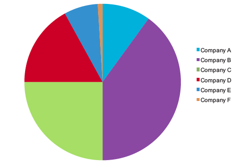
In the first pie chart, a person might be convinced that pie charts are a decent tool. Just look at how easy it is to see that the light green segment is 25%? Super easy. Without even thinking, it’s obvious, which is the mark of a good information graphic. As for the other segments…same problem as always. Most humans are not good at visually estimating rounded volumes.

Easy to see 25% pie chart
See how easy it is to see the 25% segment here? | Stephen Few, Perceptual Edge

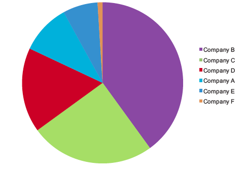
And what if we simply rotated the pie a little?

Pie chart rotated
Pie chart rotated - much more difficult to estimate the size of the 25% segment

Now it is much more difficult to get a quick visual estimate of any of the segments, even the 25% piece and all Mr. Few did was rotate the pie. Mr. Few notes that when people use software to generate pies like this, they have little control over what piece of the pie ends up in which position. He explains that our eyes have very few visual metaphors for segmented circles, one of which is the clock: “In the earlier example, our ability to decode the green slice at 25% was assisted by the fact that the green slice began at the 6 o’clock position and extended neatly to the 9 o’clock position.”

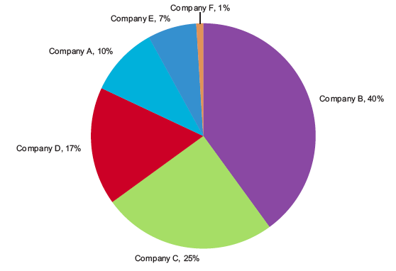
Perhaps we solve the problem by just sticking the numerical value right near the slices of pie? He does that and then adds another layer saying, “Why stop here? ….We can solve this problem by directly labeling the slices with both the company names and the values…” which leads to this graphic:

Overly labeled pie charts
Overly labeled pie charts | Stephen Few

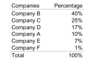
But that leads him to a conclusion that I support which is that this information is much easier on the eye if it’s just in a simple table. The pie itself just confuses things.

Turning the pie into a table
Turning the pie into a table | Stephen Few

Much clearer in a table, no? I think so. And so does Mr. Few.

References

Few, Stephen. (July 2010) “Save the Pies for Dessert” newsletter for Perceptual Edge.

Infographics News header
Infographics News

Reading suggestion

I came across a blog that was new to me, all about information graphics with a Euro-slant, though the New York Times is still well-represented. The writer is Chiqui Estaban out of Madrid and somewhat heroically, he posts in English and Castellano. If you can read Spanish, I recommend that version because the English isn’t perfect. But then again, if you are reading this blog, you understand the value of a good image to communicate clearly, so hopefully you can look beyond a few errors in grammar.

Digressive Thought About English on the Interwebs

The fact that Sr. Esteban publishes in not only his native language but also in English makes me wonder if it is time for one of the contexts blogs to start a discussion about the primacy of English online. It’s harder to detect if English is your native tongue, but in other places, making a website requires knowing another language, hiring a translator, or using google translate (or Yahoo!s Babel Fish, etc.). And for a blog that is posted everyday, that is tedious (and therefore, may not happen). There is a much larger conversation here. English speakers have hidden privileges online (borrowing and repurposing that term from Lipsitz) that make their e-productions more international than they likely know.

References

Esteban, Chiqui. Infographic News.

Lipsitz, George. (1998) “The Possessive Investment in Whiteness”. Temple University Press.

Beautiful Visualization | Chapter 2 by Matthias Shapiro

Yesterday I posted an excerpt from Matthias Shapiro’s critique of the winning design for visualizing the federal budget. While I was reading his blog, I also happened across this free download of a chapter he wrote for a new book about information graphics. The chapter is worthwhile and covers many basic principles with illustrated examples. I haven’t seen the whole book yet. Still waiting for that day when someone decides I’m an influential blogger and sends me all the relevant new books for free. Until then, I’m happy to find free downloads like this one.

The full citation for the chapter is like this:

  • Shapiro, Matthias. (24 June 2010) “Once upon a stacked time series” chapter in Steele, J. and Iliinsky, N., eds. Beautiful Visualization, O’Reilly Media.
  • Click here to download

cover image of "Ways of Seeing" by John Berger

*Update: Sociological Images has videos from Ways of Seeing*

What works

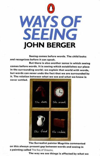
John Berger’s “Ways of Seeing” is a series of 7 essays, three of which are composed of visuals only, collected into a short book. They are based on a BBC television series.

He starts the first essay:

“Seeing comes before words. The child looks and recognizes before it can speak. But there is also another sense in which seeing comes before words. It is seeing which establishes our place in the surrounding world; we explain that world with words, but words can never undo the fact that we are surrounded by it. The relation between what we see and what we know is never settled. Each evening we see the sun set. We know that the earth is turning away from it. Yet the knowledge, the explanation, never quite fits the sight.”

Vanity by Hans Memling, 1485

In one of the essays about the female nude he goes on to develop how power has been embedded in the relationship between seeing and being seen. This sort of exposition on the female nude is common in art history but made especially accessible in Berger’s short essay collection. Using Vanity by Hans Memling (above) as an example, he writes: “The mirror was often used as a symbol of the vanity of woman. The moralizing, however, was mostly hypocritical. You painted a naked woman because you enjoyed looking at her, you put a mirror in her hand and you called the painting Vanity, thus morally condemning the woman whose nakedness you had depicted for your own pleasure.”

References

Berger, John. (1972) Ways of Seeing [essay collection] London: BBC and Penguin Books.

Books are still great, no matter what happens on these here internets. They make much better references because the information stays where it is and is accompanied by indices and tables of contents. No link rot, no head scratching while trying to navigate a tag cloud, no wondering if the review was posted by the publisher or an actual reader (ie not the author’s mom, either). They do cost more than free-media (aka e-media?), unless you can find them at your library.

Here’s a start to a list of books you might consider buying if you’re interested in graphic design. Most social scientists might like to be better informed about graphics, but have a bit of trouble getting into it. Below are books that are compelling and beautiful. They won’t tell you how to run the software you might use or write clean html/css or insert hacks for working around the stupidity of IE6. I can post some of those another day, if you like. Our contexts IT guru Jon will be invited to guest blog on the topic of how to do online publishing, as well.

1. Edward Tufte

Tufte is widely regarded as a key figure in graphic design, especially the visual display of quantitative information (which is the title of one of his books). He also has a brilliant essay on powerpoint, of which he is not a fan.

Envisioning Information - Edward Tufte
Visual Explanations - Edward Tufte
The Visual Display of Quantitative Information - Edward Tufte
Beautiful Evidence - Edward Tufte

2. Typography

The Elements of Typographic Style by Robert Bringhurst review by Roy Johnson.

The Elements of Typographic Style by Robert Bringhurst

Typography is a critical component of graphic design. Font size is often the least flexible component and thus serves as a starting point for the rest of the design, assuming the design includes text. With respect to accessibility, small font sizes are terrible since many people have trouble with their eyes. (Even if only a few people had trouble with their eyes, designers should still make inclusive designs.) With respect to design, it is often better to have small fonts so that text blocks read as blocks rather than stripes. Reconciling those two and adhering to branding and identity strategies relies on a firm command of typography. Bringhurst’s book is recommended wide and far so I’m not saying anything new here.

Hoefler and Frere-Jones

Tobias Frere-Jones and his partner Jonathan Hoefler are current giants in the field of typography and have resources on their website – Hoefler & Frere-Jones. They have created typography for the White House, Gucci, the United Nations, Saatchi and Saatchi, Wieden + Kennedy, J. Walter Thompson, all the Martha Stewart magazines, Wired, The New York Times, The Washington Post, Apple, IBM, Sony, and on and on. They represent a sizable portion of the world of font development.

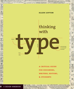
Thinking With Type - Ellen Lupton

Ellen Lupton of Maryland Institute College of Art says/writes much worth hearing/reading, including typography. Her Thinking With Type has it’s own website with additional information. Cheaper than buying the book, but I still recommend owning books if you can afford them.

3. The Grid

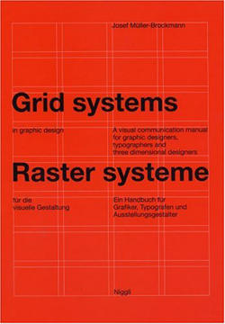
Grid Systems in Graphic Design - Josef Muller-Brockmann
Grid Systems in Graphic Design - Josef Muller-Bronfmann

Grid Systems in Graphic Design (Josef Muller-Brockmann)

Muller-Brockmann’s book is a solid introduction to the grid as a design framework. It’s good to read if you know nothing about design and good to read if you need a refresher in the basics, before you slide down what can be a slippery Flash-driven rabbit hole into a world where nothing makes sense.

See also tutorialblog on the use of grid systems in web design.

4. Universal Principles of Design by William Lidwell, Kritina Holden and Jill Butler

Universal Principles of Design - Lidwell, Holden and Butler

This book is not just about graphic design, but is more, well, universal, as the title suggests. It’s organized alphabetically, with one page of explanation and one page of examples for each of the 100 principles they’ve chosen. They admit that there are more than 100 principles, but they had to cut it off somewhere. Included are the 80/20 rule (or pareto’s principle), the Fibonacci sequence, the golden ratio, the baby face principle, and so on. I was so fascinated by it that I couldn’t put it down.

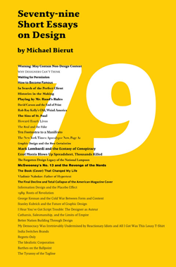
5. 79 Short Essays on Design by Michael Beirut of Pentagram

79 Short Essays on Design by Michael Beirut

Michael Beirut is a towering figure in design, as is the company he works for, Pentagram. His little collection of essays includes some gems, though not all are equally worthy of recommendation. The book has been widely recommended by others; maybe they were more evenly impressed by the collection than I was. Good one for checking out of the library because all the essays go pretty quickly so it would be nice to read on the train.

6. Design Blog Recommendation #1

Design Observer - Helfland and Drenttel

Design Observer and the related Winterhouse Institute (Jessica Helfand and Bill Drenttel)

This last one is a blog you might want to follow that features design related books, articles, entries, videos and so on. I am new to following it, but I like it so far.

For those of you who aren’t watching the Oscars (or, in fact, maybe especially for those of you who are), I send some statistics your way on a Sunday evening. It doesn’t fit with a theme and there’s no way it’s going to be as popular as the blog about marijuana arrests in New York City. (Note that like any curious person, I fully intend to test my hypothesis that writing about drugs is more popular than writing about sex. Coming soon is a blog about measuring marital infidelity, an historically slippery subject that has generated competing statistics and tends to say more about survey methods than about sexual habits.)

But for tonight, I am sending you to a surprisingly emotional essay by Stephen Jay Gould on the trouble with reducing statistics to the central tendency. Yes, I said emotional. And then I said ‘central tendency’. What, you may wonder, can get your cold hearts pumping while talking about how to measure the central tendency? In a word? Cancer. In a few more words? A life expectancy delivered in terms of a right skewed median of 8 months.

He uses his own biography to make a broader point about the general tendency to divorce the intellect from the emotions: “Many people make an unfortunate and invalid separation between heart and mind, or feeling and intellect. In some contemporary traditions, abetted by attitudes stereotypically centered on Southern California, feelings are exalted as more “real” and the only proper basis for action – if it feels good, do it – while intellect gets short shrift as a hang-up of outmoded elitism. Statistics, in this absurd dichotomy, often become the symbol of the enemy.”

logic + love = the well-lived life? These are the questions I don’t even try to answer, it’s why I do sociology, not philosophy.

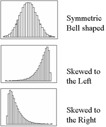
Seeing Skew

Skew Graph Examples - No Skew, Left skew, Right Skew (which is closest to Gould's case)

Just to refresh your memory on skewness, here’s a visual reminder of what’s at stake. Refer back here when Gould talks about the many people who aren’t diagnosed with the type of cancer he had until they die, stacking the left side of the graph high with cases of life expectancy equal to zero and creating a right-skewed life expectancy.

Epilogue: Gould is no longer alive, but he didn’t die of the cancer in this essay. He lived for another 20 years and died of a different cancer at age 60.

Relevant Resources

Gould, Stephen Jay. (1985) The Median Isn’t the Message currently reposted all over the blogosphere, but originally published in Discover Magazine in 1985.

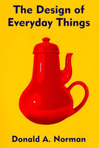
The Design of Everyday Things by Donald Norman

Book Recommendation

Donald Norman’s “The Design of Everyday Things” is currently my commuting book which I’ve had ample opportunity to read because the F train here in NYC is the most capricious multi-ton object I’ve ever encountered. This is a good book if you want a straightforward introduction to basic design principles. Norman is an engineer by training which means he comes from a different tradition than, say, an architect. He goes through all sorts of examples of commonly encountered objects – keyboards, sinks, ovens, telephones – to help demonstrate that good design would benefit from prototyping and user-testing because, in the end, humans are fairly adept at taking clues about how to use an object from their first glance. When things aren’t obvious, it’s the fault of the design, not the fault of the person who has trouble figuring out how to put someone on hold or transfer a call with a phone system that can likely ONLY be used by a robot or an algorithm. He opposes beautiful design for the sake of beauty – glass doors stripped of plates and hand bars in service to the sleek glossiness of glass’s amazing material properties are no good if people end up pushing on the hinged side of the door when they should be pulling on its swinging side.

Norman offers users a set of criteria by which everyday design can be critiqued as well as some rules of thumb for figuring out particularly obtuse design challenges. He absolves humans their occasional mechanical buffoonery, “Humans, I discovered, do not always behave clumsily. Humans do not always err. But they do when the things they use are badly conceived and designed.” Norman doesn’t go so far as to suggest that the objects themselves possess agency, it’s not the fault of the things, but of the people who designed them, “When you have trouble with things…it’s not your fault. Don’t blame yourself; blame the designer. It’s the fault of the technology, or more precisely, of the design.” This part of his theory is the weakest. It’s rather simplistic to blame the designers without interrogating why they produce shoddy designs. He hints that designing for the sake of beauty is part of the problem and that user testing happens in the market place where negative reactions are likely to kill the product line altogether rather than resulting in intelligent, sensitive redesign. Luckily, other books (Harvey Molotch’s “Where Stuff Comes From” for example) do a better job of revealing the motivations and constraints on designers.

Where Norman is at his best is in the many detailed examples of everyday objects gone screwy with clear, diagramatic prescriptions for improvement. Norman never rants about bad design just to sharpen his teeth. His examples are accompanied by constructive suggestions that are so clearly spelled out that readers are capable of critiquing his suggestions, a sure sign that the book succeeds as a teaching tool. Furthermore, Norman illustrates his discussion with photos, sketches and diagrams throughout which enriches the legibility of the project and subtly introduces readers to the practice of learning through drawing that is common in design practice, but not all that common outside of it.

Relevant Resources

Norman, Donald A. (1998) “The Design of Everday Things” Cambridge, MA: MIT Press.

Molotch, Harvey. (2003) Where Stuff Comes From: How Toasters, Toilets, Cars, Computers and Many Other Things Come to Be As They Are. New York: Routledge.

Where Stuff Comes From - Harvey Molotch