
Readers, dear readers, I know my regulars are sick of hearing about how much I hate pie charts. But I came across Stephen Few’s latest newsletter – Mr. Few is a man who is a professional information graphics guru and he hates pie charts, too. Of course, he is a professional and he doesn’t use the word hate. When I saw his newsletter, a smug smile of satisfaction crossed my face and I thought to myself, “Self, maybe the readers are sick of hearing you complain about pie charts, but they might want to hear how someone else complains about them. Because: Look! He has illustrations!”.
Why pie charts are not the best choice
Think of this as graphic art for geeks, abridged from Stephen Few’s newsletter, “Save the Pies for Dessert” from his information graphics educational company The Perceptual Edge.
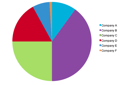
In the first pie chart, a person might be convinced that pie charts are a decent tool. Just look at how easy it is to see that the light green segment is 25%? Super easy. Without even thinking, it’s obvious, which is the mark of a good information graphic. As for the other segments…same problem as always. Most humans are not good at visually estimating rounded volumes.
And what if we simply rotated the pie a little?
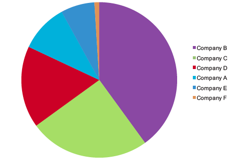
Now it is much more difficult to get a quick visual estimate of any of the segments, even the 25% piece and all Mr. Few did was rotate the pie. Mr. Few notes that when people use software to generate pies like this, they have little control over what piece of the pie ends up in which position. He explains that our eyes have very few visual metaphors for segmented circles, one of which is the clock: “In the earlier example, our ability to decode the green slice at 25% was assisted by the fact that the green slice began at the 6 o’clock position and extended neatly to the 9 o’clock position.”
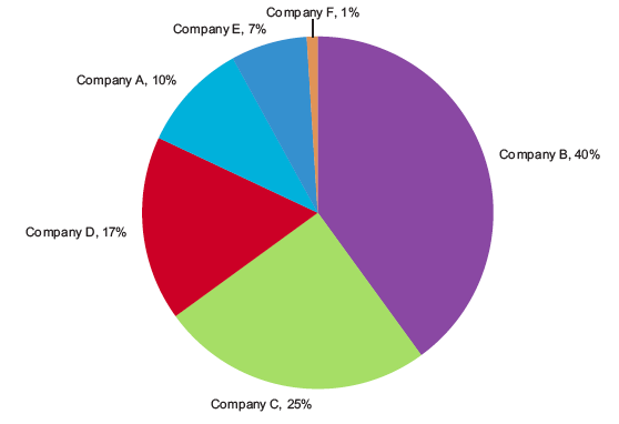
Perhaps we solve the problem by just sticking the numerical value right near the slices of pie? He does that and then adds another layer saying, “Why stop here? ….We can solve this problem by directly labeling the slices with both the company names and the values…” which leads to this graphic:
But that leads him to a conclusion that I support which is that this information is much easier on the eye if it’s just in a simple table. The pie itself just confuses things.
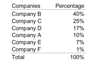
Much clearer in a table, no? I think so. And so does Mr. Few.
References
Few, Stephen. (July 2010) “Save the Pies for Dessert” newsletter for Perceptual Edge.
Comments 3
Philip Cohen — July 30, 2010
I agree these aren't good for conveying all that information, compared with the table. But I like pie charts when there is a simple, single point to be made that doesn't depend on the details. For example, "look at what a tiny slice of the budget is for foreign aid compared with defense?" Or, "Whites are actually more than half of the people receiving welfare." Of course both of those can more accurately be done with the table, but the picture might help make that single point stick, if it's reinforced in the text.
אבטלה סמויה » אבטלת סופשבוע — August 6, 2010
[...] מאמר קצר על pie charts (תרשימי עוגה). [...]