networks

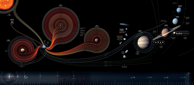
50 years of space Exploration
50 years of space Exploration | by Sean McNaughton and Samuel Velasco
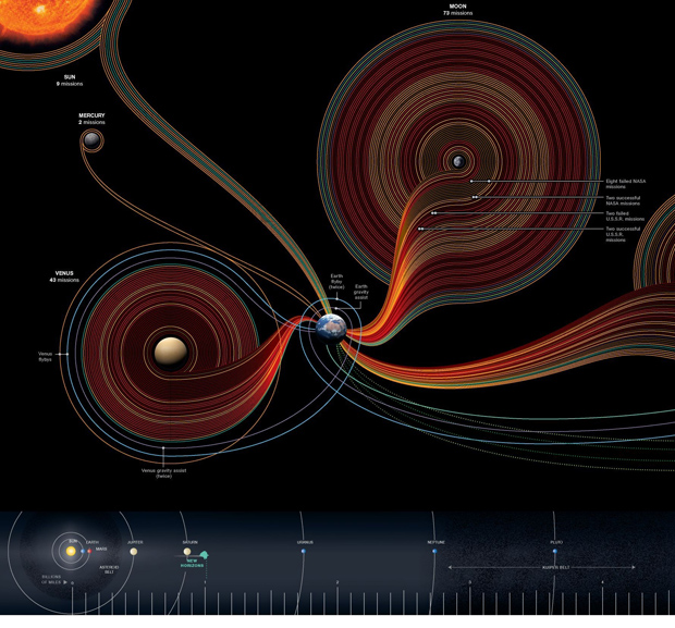
50 years of space exploration, zoom-in
50 years of space exploration, zoom-in | by Sean McNaughton and Samuel Velasco

Why space exploration is like a small-group network graph

This blog is supposed to be about social data and while there are certainly social components to space exploration, that’s not the angle I am going to discuss here. [See Alex Madrigal’s piece in The Atlantic Moondoggle: The forgotten opposition to the space program” to get a taste of the sociopolitical forces behind the American space program.] Rather, what excited me about this graphic was the form and it’s potential application to relatively small network visualizations. Here’ what I’m thinking: say you have small work groups (like, for instance, in my dissertation) and you would like to visualize some kind of behavior or linkage pattern in that network. You might also like to have the power hierarchy in the visualization – and this would be the structural hierarchy that exists in relation to, but not as a cause of, the pattern of linkages and/or traffic in the network. You could use a nest-y network map like this:
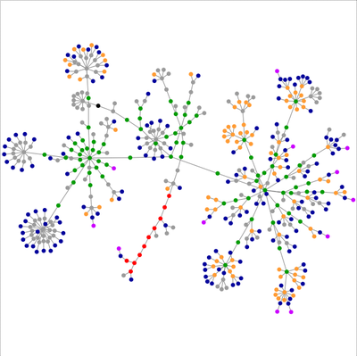
Clear, well-visualized network graph

OR…the formal standards in the space exploration graphic could be modified to suit network traffic, assuming a network with a small number of nodes. The planets could be people and they could be scaled and positioned to reflect their structural hierarchy. The edges – which in the space graphic are the trips – could be meetings or emails or any other kind of linkage that is important in the network. In the case of meetings, some meetings last longer or are otherwise more consequential so the edge could be thicker or more saturated with color.

Lots of network analysis looks at big networks where the nest-y network graph visualization technique is a good fit. But networks with fewer nodes and edges in which we know something about the social structure of the arrangement end up losing some of that context when they are represented in the nest-y network graphs. Those graphs are designed to help identify patterns where researchers either do not know much about the patterns in the first place or want to find an unbiased way to test their assumptions about the patterns they will find. But with the networks I am studying, I have discovered social patterns through ethnographic methods that I would like to have represented in my graphs. This space exploration graphic looks a lot like my back-of-napkin sketches for small groups. Of course, it is far more polished and more well-integrated with the ‘site plan’ running along the bottom of the graphic that helps establish scale, much like the way architect’s include a thumbnail site plan on their blue prints to establish a context for the siting of the building that’s represented in much greater detail on the plan.

Coming attractions

Over the next week, I hope to have a better sketch of a small-group network informed by ethnographic research up on Graphic Sociology.

References

Graphic Designers
Sean McNaughton, National Geographic Staff, www.nationalgeographic.com
Samuel Velasco, 5W Infographics, www.5wgraphics.com [this website was under renovation at the date of this blog post]

Madrigal, Alex. (Sept. 2012) Moondoggle: The forgotten opposition to the space program”. The Atlantic.

Hat-tip to Adam Crowe and <a href="http://www.flickr.com/photos/adamcrowe/sets/72157622579426670/"his flickr account.

Visualization of outbreak pathways in a hospital
Visualization of outbreak pathways in a hospital | Scientific American, Graphic by Jan Willem Tulp

What works

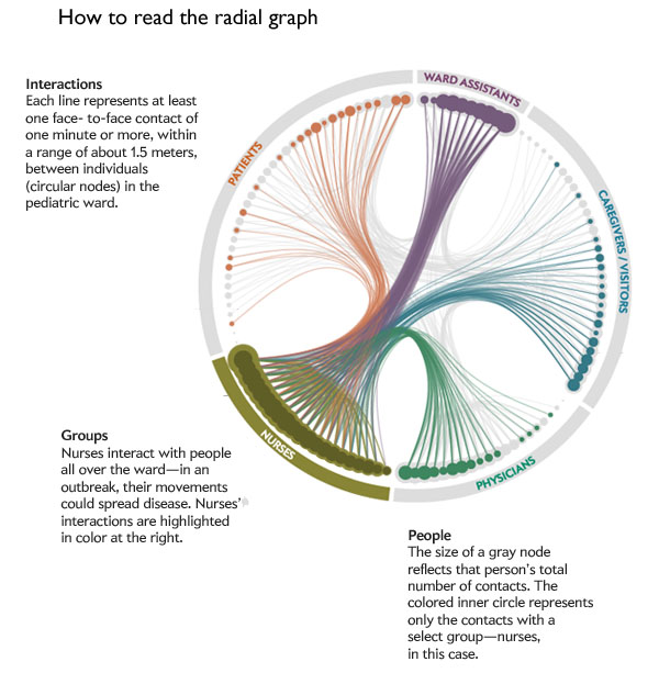
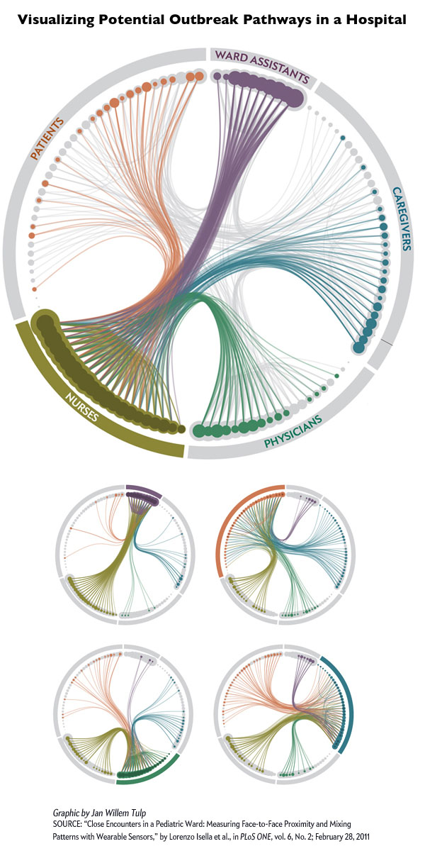
Using RFID tags worn by hospital staff and patients at the Bambino Ges&#uacute; pediatric hospital in Rome, researchers with the SocioPatterns group tracked interaction patterns to help understand how nosocomial illnesses spread. Nosocomial infections are infections patients and hospital staff contract while they are in the hospital. According to wikipedia, about 10% of patients in hospitals in the US contract some kind of nosocomial infection every year; the most common infection is the urinary tract infection (36%).

The RFID tags were distributed to 119 individuals to tally up each person’s encounters with anyone who came within 1.5 meters for a minute or more. Of course, this generated a great deal of data. The graphic above does a good job of condensing the data into a single image – well, actually, there is one image for each category of person in the hospital and it is important to look at all five images for full analytical impact. Click on the graphic to go to Scientific American and see them all.

Legend for reading the radial graph of outbreak pathways in a hospital
Legend for reading the radial graph of outbreak pathways in a hospital | Scientific American, Jan Willem Tulp [graphic]

Somewhat unsurprisingly, nurses proved to be the most well-connected people in the hospital. They interact frequently with each other and with every other category of person: patients, ward assistants, doctors, and care givers. Even though I said this finding was “unsurprising” it is extremely important to have solid data supporting what seem to be obvious findings. For instance, imagine you had not read the previous paragraphs or looked at the graphics and I had written: “Unsurprisingly, doctors proved to be the most well-connected people in the hospital, interacting frequently with patients, care givers, nurses, and ward assistants”. It sounds almost as logical as what I wrote about nurses (quite frankly, I would have found it hard to believe that doctors interact frequently with ward assistants). The point is, before data exists, it is easy to convince ourselves that a variety of different logical scenarios are playing out. The RFID methodology was a wise choice because it did not rely on self-reports. Self-reports are tough because they ask responders to remember all their contacts AND to be unbiased about reporting them. Some encounters in hospitals are more valued than others. Contacts with patients are valuable because patient care is the manifest purpose of a hospital and would thus be more likely to be reported than, say, standing next to another nurse at the bathroom sink or urinal for a minute.

What needs work

Radial graphs, to me, are difficult to read. The science of networks is still what I would call an emerging field in the sense that both the methodologies and the techniques for analyzing data are not yet fixed. New strategies are still being developed at a relatively rapid rate. I think there might be a better way to present the data than the above radial graph, but the radial graph is a huge step ahead of the messy network nests that used to dominate the presentations/analysis of network research.

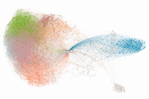
Messy nest network visualization
Nest visualization technique. Even with the colors it’s hard to make sense of the cluster on the left.

Here’s where I am having a hard time making sense of the radial graph. First of all, I didn’t get the immediate impression that nurses were the network hubs holding this whole situation together. I had to click through each of the five graphics twice to ‘see’ the finding that nurses are more well-connected than others in the network. Even then, it would have been relatively easy to make a mistake and think that ward assistants were just about equally important (and maybe they are!) because the dots representing their total contacts are just as large and somewhat more tightly clustered than the dots representing the nurses total contacts. However, the size of the dots records only total contacts and it seems that ward assistants have a great deal of contacts with each other (perhaps they work in teams?), but relatively little contact with patients or physicians. But the lines representing that data are faint compared to the weight of the dots making that part of the data analysis seem secondary, which is not the case.

I don’t have a great solution to the radial graph visualization of networks situation. To me, it seems like it is a huge step beyond the messy nests that used to be the go-to for network visualization but not yet fully baked as the gold standard.

References

Matson, John. (November 2012) RFID tags track possible outbreak pathways in the hospital Scientific American.
Note: The official date on the above source is 15 November 2012 but since it is only 4 November 2012, I left the day out of the date field.

Graphic by Jan Willem Tulp; Source: “Close Encounters in a Pediatric Ward: Measuring Face-to-Face Proximity and Mixing Patterns with Wearable Sensors,” by Lorenzo Isella et al., in PLoS ONE, vol. 6, No. 2, article e17144; 2011

Crony Capitalism | Original by Stephanie Herman posted to lewrockwell.com/blog

What works

There is a lot of information here, that’s one of the best things about these Venn diagrams. People often stick a single word or a phrase in one circle, another in the next, and that’s it. But this graphic proves Venn diagrams can help organize much more detailed, drilled-down information fairly well.

What needs work

For the sake of legibility and small font sizes, I probably would have made one of the circles white instead of black, then left the colored one a color, and had the middle oval shape have a much lighter background. That might have helped make some of the text easier to read. In particular, I think it’s important to read the names themselves, so I would have worked to make sure they stood out.

I might have snugged the titles up to the curve. Their spacing is a little haphazard. Clearly, in a circular format, one cannot use a vertical margin line, but then that leaves a question about whether to mirror the shape of the circles on the outside or the ovaloid shape on the inside. I would have tried it both ways and then picked one. Not sure what happened here.

References

Herman, Stephanie. (2011) Venn diagram of Corporate Cronyism in America on geke.us

The detailed view (before) | whitehouse.gov

What needs work

The complete view of the bureaucracy in the federal government is totally confusing, even when it is color coded and arranged so as to be easily viewed from 30,000 feet (see above).

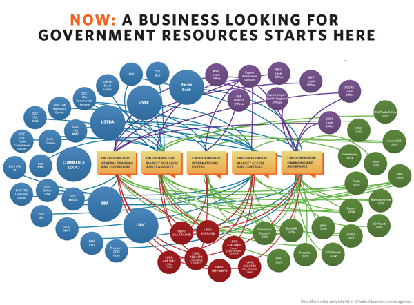
BusinessUSA initiative aims to make it easier for businesses to interact with the US Federal government

What works

The US Federal Government has copied a kind of 311-style approach to helping businesses navigate the portions of the federal bureaucracy relevant to them. One department, one number, one website.

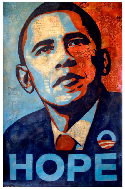
What interests me the most is the choice of those in the White House to promote this program through information graphics. This reflects the visual skills of Obama’s administration which have been evident since the middle of his campaign where not only those like Shepard Fairey but also his official campaign team launched an extremely successful visual campaign.

Shepard Fairey - HOPE
Obama Campaign Logo, 2008

The White House choice to use graphics in order to explain and promote their simplification of a portion of the federal government is also evidence of a growing shift towards the use of infographic stylings in the service of persuasion. Infographics gain a great deal of traction from the notion that humans tend to believe what they see. They gain even more traction when they mobilize numerical data that many people feel uncomfortable processing on their own. This graphic manipulates that sense of visual numeracy by taking a network (nest?) of dizzying resources and simplifying it into three nodes, each of which will bring businesses to the same pool of resources. ‘From many, one’ is an extremely powerful message, made all the more powerful by the strength of this visualization – it is clean, the nest part is detailed, and the resolution in the ‘one’ is not represented as a single node (which wouldn’t work as well because it would appear hyperbolic and would efface the modern entry modes into the federal government – the phone and the internet).

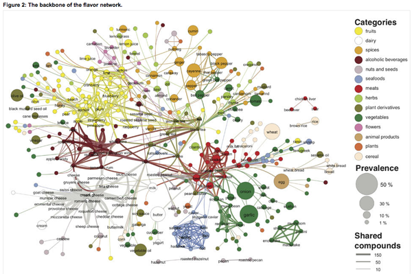
The Backbone of the Flavor Network | Ahn, Ahnert, Bagrow, Barabási

Each node denotes an ingredient, the node color indicates food category, and node size reflects the ingredient prevalence in recipes. Two ingredients are connected if they share a significant number of flavor compounds, link thickness representing the number of shared compounds between the two ingredients. Adjacent links are bundled to reduce the clutter. Note that the map shows only the statistically significant links, as identified by the algorithm of Refs.28, 29 for p-value 0.04. A drawing of the full network is too dense to be informative. We use, however, the full network in our subsequent measurements.

What Works

Trying to visualize the connections between flavors (ingredients?) is a new direction for both visualization and network research, though there has been some work on which flavors/ingredients tend to go well together (see Michael Ruhlman’s “Ratio” for basic recipe ratios and a bazillion cookbooks for specific flavor/ingredient combinations). In fact, the researchers for this article used the 56.000+ recipes at allrecipes.com, epicurious.com, and menupan.com (a Korean recipe site) to generate the network above, clearing out the noise by displaying only the biggest nodes which are the most commonly occurring ingredients.

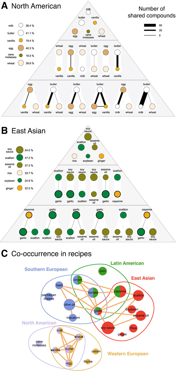
What the researchers were after was figuring out whether similar ingredients are more likely to attract or repel each other. They broke the common ingredients down into their chemical components to help measure similarity and examined American and Korean recipes both lumped together and separately. In the separated case, they found that, “The results largely correlate with our earlier observations: in North American recipes, the more compounds are shared by two ingredients, the more likely they appear in recipes. By contrast, in East Asian cuisine the more flavor compounds two ingredients share, the less likely they are used together.” However, they figured out that some combinations of ingredients appeared so frequently in both cuisines that they were skewing the results. Americans like to use milk, butter, cocoa, vanilla, cream, and egg together. East Asians have a lot of recipes that use beef, ginger, pork, cayenne, chicken, and onion. When you sort these ingredients out, the networks are kind of silly because, at least in the American case, at least one of the ingredients on the ‘frequent’ list appears in about 75% of the recipes.

Next, they honed in on these co-occurring ingredients/flavor compounds and constructed what they call an “authenticity” score. Quoting the authors, “If an ingredient has a high level of authenticity, then it is prevalent in a cuisine while not so prevalent in all other cuisines.” The figure below highlights the ingredients, ingredient pairs, and ingredient triplets that scored high on “authenticity” using pyramids.

Flavor authenticity pyramids by ethnicity of cuisine | Ahn, Ahnert, et al

Personally, what I think this shows is that Americans like to bake much more than anyone else or at least that they are more likely to use recipes to bake. Baking is thought to be the more exacting of the cooking/baking pair, and thus would be more likely to require a recipe than would cooking. Again, I refer you to Michael Ruhlman’s “Ratio” in which he somewhat disputes the necessity of following recipes in favor of memorizing and then following ratios.

As for the success of the graphics here, I admit that I would not have read this article had it not been for the graphics. I find the methodology interesting though the findings are the kind of findings that make a lot of people shrug their shoulders and say, “um, that’s nice.” Another networks researcher, Duncan Watts, came out with a book earlier this year called: “Everything is obvious, once you know the answer” in which he argues for the kind of science that offers testable mechanisms for assessing the things we think are true. I guess if we take his point, we can feel more confident in our pronouncements about what makes American food American or East Asian food East Asian. Yes, area studies people, I know that East Asian food varies and that the trends they find in American food might also be discovered in French food. I’m just using the categories they worked with rather than those established by food studies scholars and cooks.

References

Ahn, Ahnert, Bagrow, and Barabasi. (15 December 2011) Flavor Network and the Principles of Food Pairing. Nature: Scientific Reports 1: Article 196.

Ruhlman, Michael. (2009) Ratio: The simple codes behind the craft of everyday cooking. Scribner.

Watts, Duncan. (2011) Everything is obvious, *once you know the answer. Crown Business.

Network Map of Largest Global Capitalists | New Scientist
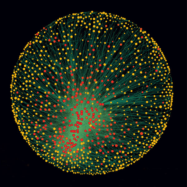
Network Map of Largest Global Capitalists | Vitali, Glattfelder, and Battiston

Note: The 1318 transnational corporations that form the core of the economy. Superconnected companies are red, very connected companies are yellow. The size of the dot represents revenue (Image: PLoS One).

The top 50 of the 147 superconnected companies

1. Barclays plc
2. Capital Group Companies Inc
3. FMR Corporation
4. AXA
5. State Street Corporation
6. JP Morgan Chase & Co
7. Legal & General Group plc
8. Vanguard Group Inc
9. UBS AG
10. Merrill Lynch & Co Inc
11. Wellington Management Co LLP
12. Deutsche Bank AG
13. Franklin Resources Inc
14. Credit Suisse Group
15. Walton Enterprises LLC
16. Bank of New York Mellon Corp
17. Natixis
18. Goldman Sachs Group Inc
19. T Rowe Price Group Inc
20. Legg Mason Inc
21. Morgan Stanley
22. Mitsubishi UFJ Financial Group Inc
23. Northern Trust Corporation
24. Société Générale
25. Bank of America Corporation
26. Lloyds TSB Group plc
27. Invesco plc
28. Allianz SE 29. TIAA
30. Old Mutual Public Limited Company
31. Aviva plc
32. Schroders plc
33. Dodge & Cox
34. Lehman Brothers Holdings Inc*
35. Sun Life Financial Inc
36. Standard Life plc
37. CNCE
38. Nomura Holdings Inc
39. The Depository Trust Company
40. Massachusetts Mutual Life Insurance
41. ING Groep NV
42. Brandes Investment Partners LP
43. Unicredito Italiano SPA
44. Deposit Insurance Corporation of Japan
45. Vereniging Aegon
46. BNP Paribas
47. Affiliated Managers Group Inc
48. Resona Holdings Inc
49. Capital Group International Inc
50. China Petrochemical Group Company
* Lehman still existed in the 2007 dataset used

What works

This graphic has been running all over the internet so I will point you to the New Scientist to get the back story. I will focus on the graphic itself.

Network graphics are difficult to produce. They are inherently challenging to graph because network space is Euclidean, not Cartesian. What I mean by that is that the distance between any two nodes in a network cannot be measured in miles or any other linear sort of distance. The distance between two nodes in a network is measured by how many other nodes you would have to go through in order to get from one node to the next. If the two nodes are connected they have a distance of one. If we would have to take a path that hits four other nodes before we can connect our node A to our desired node B, we have a distance of four. That distance does not relate to actual space. The distance between two people in a dorm social network is not the distance between their rooms, it depends on how many friends and friends of friends you would have to talk to if you wanted to get from one person in a dorm to some other randomly chosen person in a dorm.

Representing these paths that are not related to physical distance is hard. Network diagrams are often quite difficult to produce – how do you plot the 1318 nodes in this network of capitalists? Usually people do not create network diagrams by hand, they write code (or use someone else’s code) to make these visualizations. In this case the authors, Stefania Vitali, James Glattfelder, and Stefano Battiston, used the Cuttlefish program developed in their research group and the services of someone acknowledged as D. Garcia.

This graphic is done relatively well. It is easy to see that there is some kind of red cluster though the red cluster is not located in the middle. I think it is better off to the side – if it were in the middle it would be harder to identify it as a cluster because it would just look like the red nodes in the middle. The point of this diagram is to communicate that clustering within these 1318 powerful, globally dominant companies is inherently dangerous because the impact of a copy-cat phenomenon is greater when all the most powerful companies are well-positioned to copy one another. It’s hard for them to get new information when all of their information is coming from within the same highly clustered group of companies.

What would a more stable arrangement look like? In theory, it would look like a network with, oh, say about 4-6 clusters spread around the larger network of these 1318 companies. Rather than one big cluster of the most powerful, there would have been smaller clusters composed of both really big, powerful companies and smaller, less powerful companies. Companies that are not yet at the peak of their power (or trying to get to a new peak of capital under management) are going to look for different kinds of information and thus have different information to share and different management/development strategies in place than the larger, more well-capitalized companies. These two groups might do well to share their information with one another, even if – and maybe especially because – they will not act on it in the same way. The entire capitalist system would be more stable if there were more strategies being tested and rejected simultaneously.

I’m not sure the graphic actually communicates that point on its own, but it certainly makes the case in the text stronger by visually displaying the concentration of capital. It also makes this research more accessible to a broader audience who would not be able to understand the meaning of a clustering coefficient.

What needs work

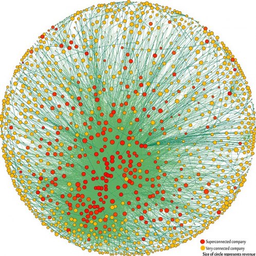
I like the white background version better than the black background version because it is much easier to see the edges.

1318 biggest capitalists in the world | Glattfelder

Seeing the edges is nice – without being able to see all the little edges scattered around it is possible to think that all edges lead to that central cluster and that there are hardly any connections between nodes that are not in the center.

References

Vitalia, Stefania; Glattfelder, James; and Battiston, Stefano. (2011) “The network of global corporate control” working paper from Systems Design, Zurich ETH.

Coghlan, Andy and MacKenzie, Debora. (24 October 2011) Revealed – the capitalist network that runs the world The New Scientist.

Regroup, Ex-Google workers at their next jobs | R. Justin Stewart
2am 2pm, Minneapolis Transit on a Sunday | R. Justin Stewart

Art and infographics intersect

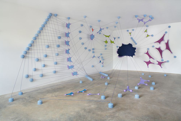
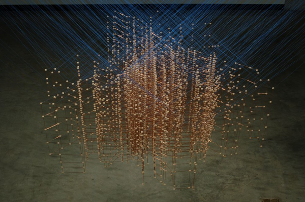
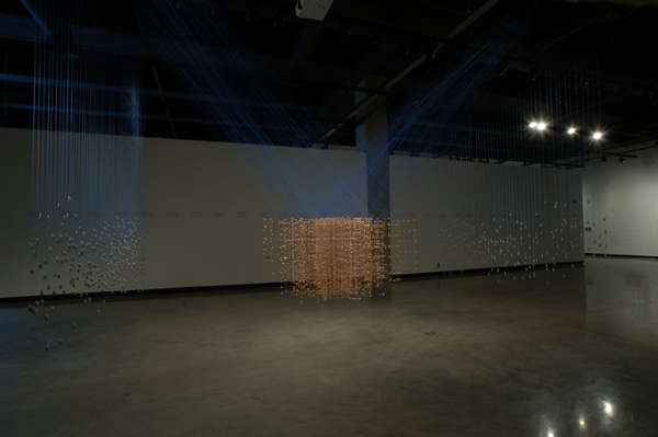
Artist R. Justin Stewart has taken infographics into the third dimension. His work is more art than information but it’s clear that it builds on the visual tropes of information graphics.

The first image depicts the way that ex-Google workers dispersed into new jobs after their time at Google. The point is not that any of us happen to care deeply about Google workers – someone does but probably not the readers of this blog – but to see how Stewart depicts network graphs in actual space.

The second two images depict a transit system in Minneapolis over a twelve hour period on a Sunday morning. It’s elegant but far too abstract to ‘work’ as an infographic. This is not a critique – I do not think Stewart wanted to make literal art – but it does not take much creativity to see that it would be easy to layer more information onto the artistry of the presentation.

My major contribution to this discussion and the reason that I decided to post Stewart’s work is that much of the art that has been inspired by the data revolution has happened in digital space. We have seen some amazing pixel-based animations and visualizations on this very blog. But I have not come across too much work in three dimensions, real space, that shares so many conventions with information graphics or data-based ways of knowing. A million points tell a story. Usually they tell that story in the same digital realm in which they were born, but Stewart takes them offline into actual spaces. They get installed. He has to come up with the way he wants to represent intangible information with tangible physical components.

tokyo-map-metro
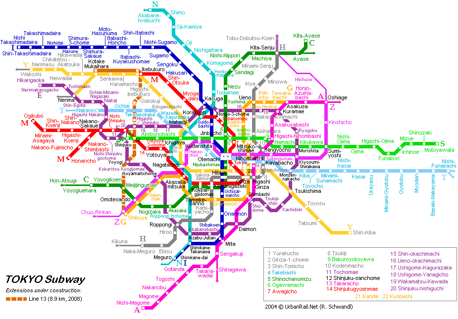
Tokyo Metro Map (click to embiggen)

Away message

Maps of public transportation are my favorite visual shorthand for any major city, not only because I have to rely on mass transit where ever I go, but also because these highly stylized versions of cities contain much more than the bare minimum amount of information to get from one point to the next. I will be in Tokyo checking out the public transit system and attending the 4S conference through the end of the month.

See you back here in September.

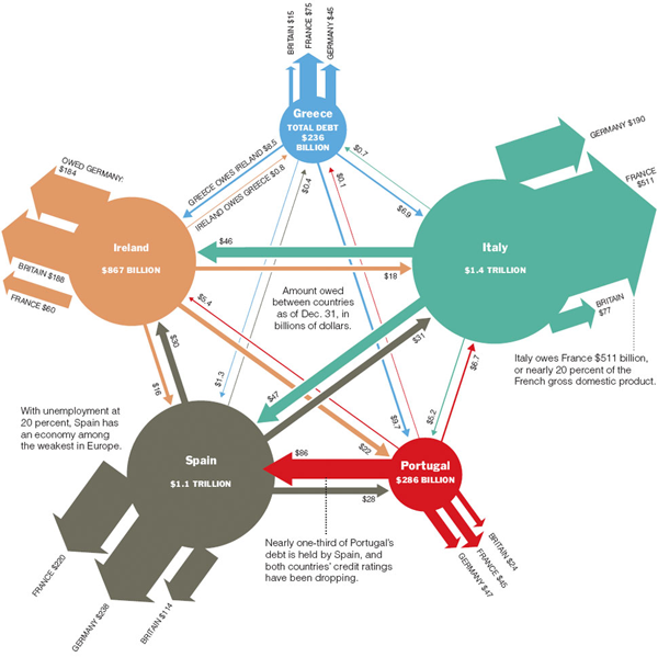
Europe's Web of Debt | Bill Marsh, The New York Times

What Works

Headlines have lately focused on particular countries – Greece, Spain, Portugal – to discuss the current economic situation in Europe. I like this diagram because it is impossible to think of the EU situation from that one-country-at-a-time perspective. One currency, one tangled web of relationships. We also see that focusing on Greece could be considered short-sighted simply because Greece’s total debt is relatively small compared to, say, Italy which is a country we haven’t been hearing much about. Now, going back to my initial reason for liking this graphic, it’s important not to focus on one country. The adoption of the Euro was motivated by the robustness of networked flows and we see from the graphic that the problems of any one country should not bring it down but, if the cause of the single country’s problems are also putting downward pressure on other countries/nodes in the network, the cascade could be swift and deep. And the biggest losers are going to be France and Germany. Just look at all those arrows directing debt at those two countries. I am not an economist so I’m not making a prediction about the future of the EU economies or of the Euro as a stabilizing device.

What needs work

Because so much of the debt flows involve France and Germany, I think they belong in this diagrams as nodes. Or at the very least, one easy fix would be to show outgoing arrows to Germany all in the same color and to France all in a different color (like, say, the color of freedom).

Reference

Marsh, Bill. (2 May 2010) Europe’s Web of Debt. The New York Times, Week in Review Section from the intial source “Bank for International Settlements”.

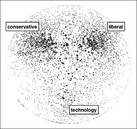
John Kelly's map of the blogosphere

What works

Oversimplification makes this a surprisingly legible collection of tiny dots.

What needs work

I have no idea how to trust this graphic. The labels seem arbitrarily applied – that could just as easily be food blogs, design blogs, and gossip blogs. Or maybe if you left the labels blank it could be a Web 2.0 Rorschach test.

The article is built around these key findings:
+ “The Web sites of legacy media firms are the strongest performers. The top 10 mainstream media sites, led by nytimes.com, washingtonpost.com, and BBC.com, account for 10.9 percent of all dynamic links.”

+ “By contrast, the top 10 blogs account for only 3.2 percent of dynamic outlinks.”

In other words, old media (still) rules. Not exactly sure why, if those two points are the primary arguments, the story ran with a graphic about politics and tech blogs dominating the blogosphere.

[As far as I can tell, the author agrees with me that it’s not even all that interesting to talk about why politics and technology dominate the blogosphere. Tech geeks are comfortable in cyberspace (they may even prefer it). So that’s a no-brainer. Blogs are perfectly designed to facilitate the dissemination of opinions what with the casual tone and the comment features. Politics is heavily rationalized opinion. Thus: blogs + politics = eureka.]

I would love to see someone write about the relationship between recipe trading and the development of the internet. THOSE are the blogs that are inexplicably everywhere. And the early users of the internet were happy to use primitive bulletin boards for trading recipes.

Bottom line

Just because it’s pretty doesn’t mean it’s relevant.

References

Kelly, John. (2009) “Mapping the Blogosphere: Offering a Guide to Journalism’s Future” The Nieman Reports. Nieman Foundation for Journalism at Harvard University.