mobility

Tango VehicleZap Alias Vehicle

EmasCityCar Vehicle

EN-Vehicle

What works

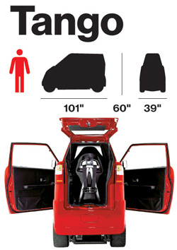
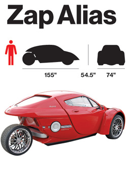
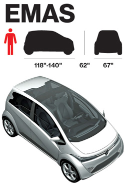
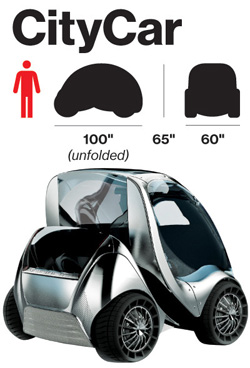
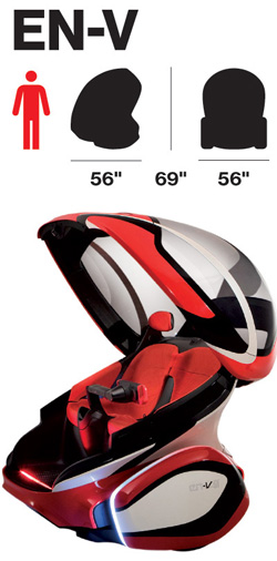
It’s nice to have the dimensions of the cars represented along with their profile and frontal massing.

What needs work

In order to make this work better, I would have put the dimensions and massing images right next to each other instead of next to the renderings/photos. It’s hard to compare when they are so distant from one another.

More important, the choice of these images to tell the story about the electric cars of the future is missing at least half the story. It continues to do for cars what we have long done for cars which is to treat them as fetishized objects. But in reality, most of the time we experience not A car, but cars as streets and highways carving up space or cars as a parking lot (either full or empty, but they always have to exist whether or not they are full at any given point in time) or cars as sources of air pollution or cars as noise. The implied message here is that because these cars are electric, at the least we shift the pollution story out of the city. But to where? We must generate electricity to run these babies and there is no hope to do that with renewable sources right now.

Furthermore, on the parking angle, these cars are smaller and will therefore take up far less space when parked. But if they have to be charged, does that mean that we will have to build new infrastructure on top of the existing parking infrastructure? Will we use the extra space not taken up by these vehicles to park bigger combustion engine vehicles? Will we have two distinct parking set-ups whereby these new cars, because they are green, get to take over sidewalk space? Or will it be something different? At the very least, I would have liked to see how many of these cars can fit in a normal parking space for, say, a Corolla as well as for a Lincoln Navigator. That would have added to the graphic.

And on pollution, I want to know if the faster models above – the Zap! – are less efficient. Generally, to go faster the car will need a bit more on board which will weigh more and thus require more batteries (which themselves weigh more). So what about relative efficiencies? [Was the Tesla left off this list for some reason?]

Also, I’m under the impression that electric cars are quieter simply because the Prius is quiet. But is that always true? I feel like I have also heard some surprisingly whiny electric scooters. Another point: can they engineer these cars of the future so that their security systems make car alarms obsolete? As far as the noise cars make is concerned, the car alarm has to be one of the worst. Every time a bus or sanitation vehicle drives by my house a car alarm goes off. And my apartment is on a bus route for two more weeks which means I am almost happy that the bus route has been eliminated due to budget shortfalls. Can’t believe I am cheering the demise of public transportation because of a pesky car alarm. But in this case, I am.

Overall, these graphics simply fail to tell the story of the future of electric cars. The change is not going to come in the fetishism of the car-as-object, but in the changing relationship between cities, suburbs, energy sourcing, and mobility.

References

Bear, Adrian. (5 March 2010) Ginebra 2010, Protón Emas, Emas3, and Emas Country concept at cocheseco.com.

Bloomberg BusinessWeek. (13 May 2010) Fully Charged.

Commuter Cars. Tango Car.

GM Media. (24 March 2010) “GM Unveils EN-V Concept: A Vision for Future Urban Mobility”. Press release from GM about the EN-V.

Smart Cities Group at MIT – CityCar

Zap Cars Zap Alias.

Reinventing the Automobile* is a book that lays out a vision for a progressive evolution of urban mobility transition that offers a robust point-to-point on-demand mobility network of 2-passenger fully electric vehicles. These vehicles would take up less parking space because not only are they small, but one proposed design folds up when parked. And they’d be able to tell you where the nearest parking spot is as you’re approaching your destination. Being fully electric they require a plug….or do they? The authors suggest that after an initial period of individual owners plugging these babies into outlets in their garages overnight, folks in city planning departments or franchise owners would trust the technology and economics enough to start installing wireless charging devices available curbside or in the road bed itself. Stuck in a bottleneck at a bridge or tunnel entrance? At least charging pads in the roadway can ensure that your 2-seater won’t run out of juice before you get where you’re trying to go. You can sit there and it will charge itself with embedded charging device in the road surface while plodding through gridlock. Even farther down the timeline, the cars might be able to drive themselves. So you can sleep through the gridlock or make calls or surf the ‘net. Just don’t post facebook status updates about your traffic problems. Nobody cares.

What I like most about the book as an object of intellectual design is that even if readers decide to skip all the words and they only look at the images, charts, maps, and diagrams, they won’t miss much. This book is stuffed with great graphics. I haven’t included them all as that would constitute copyright infringement and be too long for a single post. What you see below is just a small sample from Chapter 9: Personal Mobility in an Urbanizing World.

Daily driving in Paris

Daily Trips in Paris - Reinventing the Automobile (Mitchell, Boroni-Bird, and Burns), Figure 9.6

What works

This graphic is both elegant and deep. (Or it would be elegant if I had a better scanner.) It’s a simple form – Paris as concentric circles – but the more you look at it the more you learn. Rewarding that way. What sometimes happens in elegant graphics is that the details become obscured in iconography or approximations. But this graphic includes percentages as well as absolute numbers of two different kinds of trips – public transit and trips by cars. We see that Central Paris is defined as Arrondissements 1-20, the first ring is Seine Saint-Denis, Val-de-Marne, and Hauts-de-Seine, and the second ring is the rest of the Île-de-France region. There’s a summary of all the trips over in the legend so that the graphic itself can just show you the break down of different kinds of trips.

What needs work

In terms of transit, things like rivers often represent real barriers. There are only so many bridges and tunnels which creates a bottleneck effect. Paris is a city on a river so the one thing the elegance of this graphic obscures is the impact of the natural geography on transit choices. Maybe it’s not important when it comes to the cars vs. transit question, but bottlenecks are critical factors when it comes to planning mobility and I’m curious about whether bottlenecks push more people to transit or cars. In Boston/Cambridge, MA only one bridge has a train running across it and I have always assumed that pushed more people into their cars because many of them would have to go out of their way if they took the train and could only go over that one bridge.

Parking in Albuquerque

Parking in Albuquerque - Reinventing the Automobile (Mitchell, Boroni-Bird, and Burns), Figure 9.13

What Works

What you are seeing here is a simplified map of downtown Albuquerque, New Mexico. The white areas are buildings. The teal areas are parking – darker teal represents multi-story parking structures while the lighter teal shows us where surface lots can be found. Lovely way to show this information. One could imagine the same sort of information as a percentage-of-land-use pie chart or some far less granular collection of numbers. This schematic doesn’t bother to calculate just how many square feet of land are dedicated to parking. Nope. This is the visual equivalent of the ‘show don’t tell’ rule that writing professors are always encouraging their students to adopt when constructing essays. A table with land use percentages would be telling. This graphic is showing.

Albuquerque is like a parking lot with some buildings in it.

What needs work

I have never been to Albuquerque but I’m guessing that if you lived in Albuquerque you might like to see some sort of orienting label. Even just a single recognizable street name thrown in their somewhere to help orient. Now, the point of Reinventing the Automobile is not to provide urban planning for Albuquerque so I know they aren’t all that concerned with just precisely which neighborhood in Albuquerque this schematic represents. Still. It’s almost too cleaned up to read as a city plan right away.

Vehicle-to-Vehicle Crashes

Vehicle-to-Vehicle Crashes - Reinventing the Automobile (Mitchell, Boroni-Bird, and Burns), Figure 9.16

What works

This graph does a great job of providing us with granular data and indicating a couple different trends visual. Keep in mind that they have multiple layers collapsed into a single graphic. It looks easy once it’s done but when one is faced with a pile of related numbers along multi-dimensions it isn’t always clear how to relate them to one another visually.

This graph has three levels of accident severity – minor, serious, fatal. It also shows the probability of injury. It also factors in variation in speed (which it does by creating five speed ranges). And then there’s the belted vs. unbelted division. That is a total of four different dimensions all displayed on one graph with a single measure on the y-axis. Color is used well. Grid lines are all that separates minor from serious from fatal accidents which are more or less three different graphs lined up next to one another.

References

Mitchell, William; Boroni-Bird, Christopher; and Burns, Lawrence. (2010) Reinventing the Automobile: Personal Urban Mobility for the 21st Century Cambridge, MA: MIT Press.

* The book specifically credits Ryan Chin, Chih-Chao Chuang, William Lark, Jr., Dimitris Papanikolaou, and Ruifeng Tian with “Illustration Production”.

"Who is coming to America?" GOOD magazine Transparency by Thomas Porostocky
Who is coming to America? GOOD magazine Transparency by Thomas Porostocky

What works

This is another graphic excerpt from GOOD magazine’s Transparency infographic collection. Note that I cropped out country-by-country break downs detailing how many people arrive as refugees and how many arrive as relatives of US citizens. Most immigrants to the US come as relatives of US citizens. That’s just how immigration law is set up, much to the disappointment of Bill Gates and other tech sector employers who used to frequently haul themselves to Washington to lobby for adding more visas for talented workers.

This graphic is clever, far more clever than many similar depictions of the same kind of data. I’ve seen pie charts where each piece of the pie represents a country. Bar graphs. Maps with a bunch of numbers and arrows. The concept here is both clean/easy to grasp at first glance and well executed. It would have taken me a minute to think of moving from a 2D flag to a 3D flag so that words and numbers could wrap the edges of the bars but I do think that helps present a cleaner image. Fewer characters on each bar.

Symbolically, it reminds us that America is constituted almost wholly by immigrants – this being the current numerical distribution of the countries of origin.

Though you cannot see it from the way I’ve cropped it, the text explains that these are LEGAL immigrants to the US. So, yes, Mexico sends the most legal immigrants to the US. That’s key. Americans tend to assume all immigrants from Mexico are illegal and that’s far from true.

Also, kudos for skipping flag textures on the bars. I’ve seen far too many similar graphics riddled with flags and that seems like a good idea but doesn’t work well because Americans just don’t know what the flags of other countries look like. Flags do not equal national icons, at least not in the eyes of Americans. Plus, if these bars had been wrapped in national flags it would have been symbolically interesting – America is made of all these different countries – but visually gross.

What needs work

I can’t tell from this graphic what the deal is with the “unknown” country category. I would have appreciated a little asterisk to clear that up (I know I cropped out a majority of the graphic so you can either take my word that there was no asterisk or you can click through to the full graphic above and check it out for yourself).

To emphasize the importance of Mexico as a sending country, I probably would have put it up in the shorter stripe area. Ditto for China. It looks like Mexico would have taken up two full short stripes and China would have taken a full shorty plus a little more.

I also would have found a way to group regions together. So El Salvador and Guatemala could have been close to Mexico and the Koreas and Russia could have been close to China.

References

Porostocky, Thomas. (2009, May 5) “Who is coming to America?” GOOD Magazine Transparency Infographic.

Migration Information Source clearinghouse for all sorts of information about US migration patterns, policies, and studies.

World City Train Comparison

What Works

Good magazine is indeed a good source for thought provoking information graphics. This one has to be clicked through to be seen in any kind of entirety. What I like is the layering – they manage to represent total track length, total yearly ridership (both visually and with absolute numerical data), as well as showing little schematic maps of the systems themselves. You see that many of these systems are hub and spoke systems.

As urban areas continue to grow, transit options are going to need to expand and grow in places that don’t have mass transit infrastructure dating back to the turn of the 20th century like New York and Boston. An article in this month’s context magazine by Michael Goldman and Wesley Longhofer writes about the difficulty of adding mass transit of any sort to the existing urban fabric looking at the Indian city Bangalore: “hundreds of residents marched to protest the widening of streets and felling of trees for the new elevated Metro system. Bicyclists claimed that tearing down more than 90.000 beautiful shade-producing trees ruined the appeal of what was once known as India’s “garden city.” Shop owners and concerned citizens pushed for the Metro to be built underground so businesses wouldn’t be shuttered to make way for it. Advocated for the poor argued that widening roads would turn sidewalks, where so much daily commerce and social interaction occurs, into prime real estate. Purge the city of its street vendors and sidewalks, and you’ve stripped the life out of the Indian city.” That gives a whole new context to systems with hundreds of miles of track.

What Needs Work

I wish that there would be a way to show that the installation of mass transit systems bulldozes old neighborhoods and creates new opportunities. New growth tends to look very different that the old growth it replaces. I think there’s a call for a new kind of mass transit graphic that can show the past and present of transit decisions both in economic and social/cultural terms.

Relevant Resources

Good Magazine Transparency Graphic with Robert A. Di Ieso, Jr.

Goldman, M. and Longhofer, W. (2009) making world cities Contexts, pp. 32-36.