

What Works
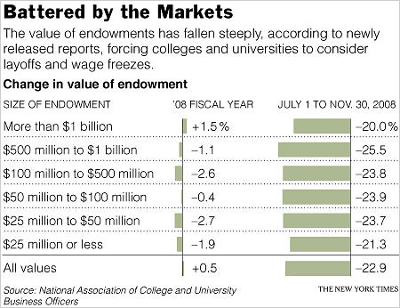
Stories like this one that cover a data driven report should always include an info graphic. But, of course, this is coming from an avid fan of info graphics. Kudos to the NYTimes for including a graphic and for including not only the punchline – the huge drop in college endowments in the very recent past months – but also some context about what college endowments were doing before. I would have liked even more context because fiscal year ’08 was already seeing some of the downturn in the market. Total movement for all endowments, or endowments divided into fewer categories, since ’00 would have been even better.
What Needs Work
It is intuitive to portray data that “drops” (according to the headline) or rises with the change along the y-axis. I did a little remix just to show you what I mean. In the first glance at the data, the increase or decrease is going to be more legible when it’s happening on the vertical axis. It’s just the way we learn to read charts and graphs. Before that, I suppose our tendency to associate the vertical axis with things rising and falling came from gravity. The laws of physics aren’t going to change – stick dropping/rising data on the y-axis until gravity causes changes in the x-axis.
The other thing I might have changed was the choice of categorization. What is gained by splitting the data into the uneven increments that appear here? First, increments should either be even or should have some reason for being uneven. We’ve got a $500m range, a $400m range, a $50m range…it’s all very unclear why these are the important categories, especially when there is no immediately obvious significant difference between them. They all seem to have been more or less flat in FY’08. Then they all plummeted ~21-22% between July and November of ’08. I would have opted for more historical context and fewer categories.
The Wall Street Journal is running basically the same story with a different graphic though they still stick with the horizontal arrangement. I like there’s even less because they
Relevant Resources
Katie Zezima (27 January 2009) Data Show College Endowments Loss Is Worst Drop Since ’70s at the NYTimes.com
John Hechinger (27 January 2009) College Endowments Plunge Wall Street Journal Online
National Association of College and University Business Officers 2008 NACUBO Endowment Study Available for Purchase.