Food Blog Study

Food blog content characteristics and frequency of use | The Food Blog Study

What works

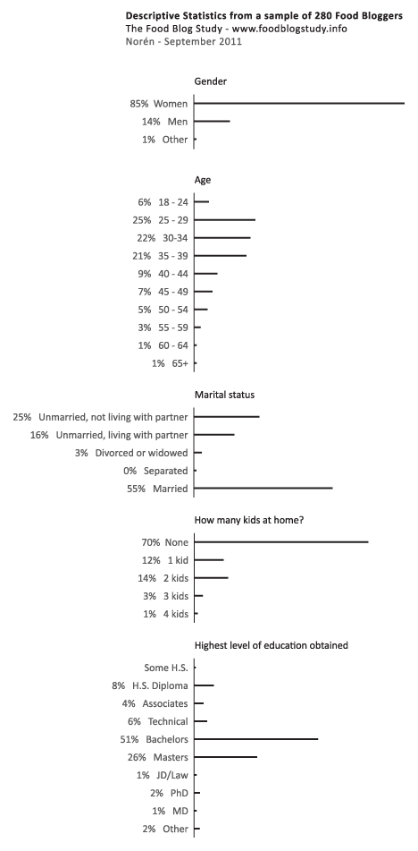
I conducted a web-based survey of food bloggers last summer as a doctoral intern at Microsoft Research in the Social Media Collective. I am now analyzing the mountains of data that I gathered in the interviews (N=30), survey (N=303), and web crawler (N=30,000) and getting ready to send out papers for publication. I thought it would be nice to share some of the findings here in advance of the slow academic publishing process.

Since I made the graphic and since I am modest, I’ll just say that I like the colors and I like that I was able to find a way to keep all of the granular detail of tabular data while adding visual impact.

If you would rather hear about the substance of the study than about the struggles I had while creating the graphic, skip to the bottom third of the post and the “What surprised me” heading.

What needs work

Since I have the benefit of having seen the data I can say that two things certainly need work. First, the survey asked about many more behaviors than I have decided to depict in this graphic. I left out data mostly because I want to be able to publish it and publishers are not keen on accepting already-published material. Some of them are not too bothered if bits and pieces of the findings are blogged about here and there. Some of them are hugely bothered and will not accept submissions that have been written about on blogs at all. There are good reasons for subjecting the findings to peer-review – like having smart people verify that the findings are not fabricated from thin air or otherwise constituted by complete rubbish. All that being said, my biggest problem with this graphic is that it is just the tip of the iceberg in terms of what the survey had to say about the characteristics of food blog content.

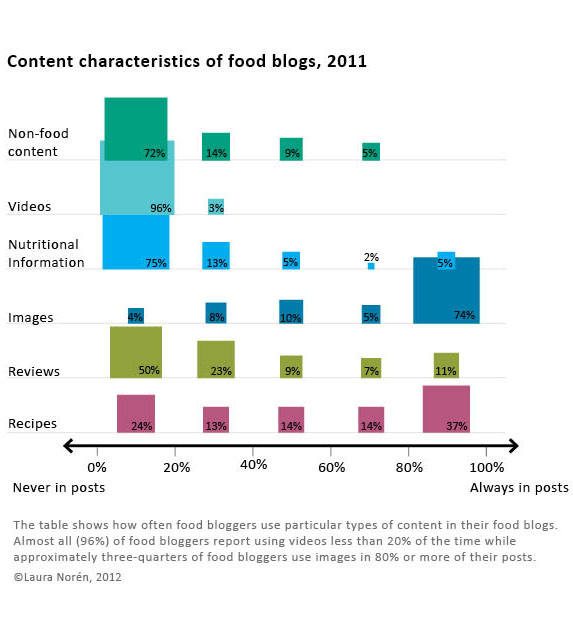
The second big problem with this is that I had a very difficult time dealing with proportional data in the rows and the columns. In case you still haven’t figured out what this graphic is saying – and I don’t blame you if you find it hard to digest – the graphic is depicting the frequency with which about 300 food bloggers (303 to be exact) reported using the listed types of content. For example, 96% of food bloggers report using video 20% of the time or less. Video just is not all that common on food blogs and most food bloggers hardly ever use it. Images, on the other hand, are included in food blog posts most of the time by most food bloggers. Seventy-four percent of food bloggers use photos 80% of the time or more. Reviews of restaurants, cookbooks, and kitchen gear, on the other hand, end up on 11% of food bloggers posts very frequently (80% or more posts contain reviews) while fully half of food bloggers hardly ever post reviews (20% or fewer of their posts contain reviews).

Since most food bloggers like to mix things up at least a little – hardly anyone has such a firmly established template for their blog content that 100% of their posts contain recipes and photos while 0% of their posts contain videos or discussion of non-food content (which would include mentions of important life events like getting a book contract, having a child, getting married, or getting cancer). With content, then, I wanted to let food bloggers explain about how often they posted a variety of different kinds of content. But then I had this difficulty of having proportions in the rows and the columns of the graphic which makes it difficult to interpret. Believe me, the tabluar data without the blocks changing sizes and colors was even harder to interpret so turning this information into a visual did help the analysis along by making the patterns clearer.

What surprised me

I was expecting many more bloggers to report including recipes more often. Only 37% said that 80% or more of their posts contained recipes. From what I gathered in the interviews, having someone else make your recipe and then leave a comment about it is one of the routine gratifications associated with food blogging. Web traffic to the site from google.com and on mini-search engines within the site is generally related to recipes, as well. So whether food bloggers care about the deeper meaning associated with food blogging and being part of a community or the hard-nosed economics and web traffic side of writing a blog, from the interviews, I was expecting recipes to be a bigger part of reported content than what I found in the survey. Recipes are one of the main activities around which both creativity and community are wound. They also draw a lot of traffic. On blogs, traffic often equals money (though not all that much money, which is why I think the meaning associated with recipes is more interesting than the money associated with recipes).

I was not at all surprised that most bloggers ignore nutritional information but I think that people who have never done much with food blogs would be surprised to see that three-quarters of bloggers mention nutrition and nutritional information 20% of the time or less. Food blogging gets its meaning and importance through practices of creating and community-making, not because the blogs are used as archives or tracking devices for those trying to lose weight or achieve other health goals. There are blogging communities organized around those things, but generally speaking, folks in those communities do not identify with the term ‘food blogger’.

Reference

Norén, Laura. (2012) Infographic: The Content of Food Blogs. The Food Blog Study. [www.foodblogstudy.info/findings.html]

Saveur food blog award nominees and winners by gender, 2010-2012

Gender in food blogging

Last summer I conducted a survey of food bloggers (N=283) which found that 85% of food bloggers are women (see here for more demographic statistics from the survey). I also conducted interviews with food bloggers and started to get the impression that food blogging is a community dominated by women in which the relatively few men end up being disproportionately successful. This kind of gender disparity – a group that is overwhelmingly women in which men are more likely to occupy positions of power or prestige – has been written about in the sociological literature with respect to elementary school teaching and nursing. In elementary schools, for example, the majority of the teachers were women but administrators (like the principal and vice principals) were disproportionately likely to be men. This gender disparity in the schools is no longer as pronounced as it once was. Women now occupy more of the administrative positions but men have not moved in to occupy more teaching positions. If food blogging follows the same trajectory, we can expect women to occupy more of the most prominent food blogging positions over time.

But what is a ‘prominent food blogging position’?

Since food bloggers are not working professionals within a clear hierarchy like teachers and nurses, I decided to look at food blog awards data as a proxy for success in the food blog world. The magazine Saveur hosts the longest running, most extensive set of food blogging awards of any organization. I used their awards nominees and winners to pull together the graphic above and find out how gender and success in food blogging interact.

Using the Saveur awards data, it is clear that there is a pattern of disproportionate male success within the food blog nominees and winners. In a perfectly gender-neutral world, we would expect that when 15% of the food blogs are written by men, 15% of the food blogging awards will be distributed to men. In fact, 26% of the nominees (chosen by Saveur) were men and 36% of the winners (voted on by the internet audience) were men. In other words, both the Saveur selections and the internet-audience voters were inclined to select men more often than strict chance would have predicted.

My interviews indicated that there could be a few explanations for this kind of pattern. However, I’m curious to hear what food bloggers – especially those who voted for or won Saveur‘s awards – have to say.

The comments are open.

Methodological note

N=194

I removed blogs whose writers’ genders were not revealed and blogs written by couples or other mixed-gender groups. I also removed blogs that did not meet my original definition of food blog which include the two categories for blogs about alcohol and the category for blogs about kitchen tools/gadgets.

References

Saveur Food Blog Awards 2012.
Saveur Food Blog Awards 2011.
Saveur Food Blog Awards 2010.

Norén, Laura. (2012) Saveur food blog award nominees and winners by gender, 2010-2012. [Blog post] Graphic Sociology blog.

Food Blog Study Descriptive Statistics Part 1 - Blogger Demographics

What works

Over the summer I surveyed 280 English-speaking food bloggers who were randomly drawn from a network of 23,000. Only the bloggers with email addresses, contact forms, or twitter accounts were invited to participate (obvious reasons…if I couldn’t get in touch with them, I couldn’t invite them to participate).

The graphic above represents my first attempt to present some of the basic descriptive statistics – gender, age, marital status, educational attainment, number of kids – just to see what works visually. Normally, this kind of information is presented in tables (I have those, too), but I wanted to try to add some horizontal bar graphs for impact. I kept them horizontal so that the axes labels would be easier to read.

The percentages are listed; the frequencies are represented visually.

Just for comparison sake (which is kind of difficult): the average age of people in the US is 37.2 (it’s 38.5 for females); about 50.5% of Americans are married now and only 2.5% are cohabiting. As for education, 28.5% didn’t get another degree after H.S., 17.7% stopped after their bachelor’s degree, and 10.4% have professional degrees. Clearly, the food bloggers are well-educated and more likely to be cohabiting than the American averages. I added these comparisons in response to Rob’s request. I know it would have been better to add them to the graphic, but the comparisons are a little tricky because the Census data is looking at a wider age range and I haven’t found any good summary stats on bloggers in general (which would be better than the aggregate comparison to the whole national pool).

What needs work

This strategy would not work for the entire set of variables – boring after a while. I am trying to think of better ways to show more variables at once without just building a column that goes on and on forever.

For more on “what needs work” see the comments section.

Blog reading and writing graph by gender, 2000-2010 | Pew Internet Research
Blog reading and writing by gender, 2000-2010 | Pew Internet Research

What works

This graphic was created using a wonderful, if not entirely complete, massive Excel spreadsheet summarizing interview results from the Pew Internet Project. There are many more questions than the three I looked at. I am primarily interested in how many adults write blogs and I was happy to see that the Pew Internet Research center has been asking adults about their blog reading and writing practices for about a decade. Just to give it context, I also plotted the percentage of adults using the internet at all.

I am also interested to see that women and men write blogs at about the same rate, these days, even though I know that they aren’t writing the same kinds of blogs. Food bloggers, for example, are overwhelmingly women as are baby bloggers (aka mommy bloggers, but using the term ‘mommy’ is too gender-restrictive). Political bloggers and tech bloggers tend to be male more often than not, though I know less about them.

What needs work

The interviews are different from year to year – some years I was averaging five or seven data points on the same question and some years I had only one (or, sadly, none). I wish there had been more years of data available on blog reading, for instance.

If I had one takeaway point it would be that we need to keep funding places like Pew to conduct detailed, ongoing research. I have found it invaluable to have access to their research and it makes the work I am currently conducting about food bloggers relatable to a wider body of practices.

References

Pew Center for Internet Research. Usage over time spreadsheet.
— If you cannot click on that link and automatically start a download, try downloading it from the Pew website

Food Blog Study | Web Crawler Progress Egg

Food Blog Study Update

I heard there was a graduate student once who used egg timers to break her dissertation down into writeable chunks. She had these timers all over the apartment, flipping one over to start a new bout of writing. Once it ran out, she might keep on writing since there was no buzzing or beeping to interrupt her. If she looked up and the sand had all run through, she would flip over another egg-timer to measure out a dose of ‘free-time’. Maybe I had her strategy in mind while I was trying to come up with a way to monitor progress on the food blog study. Large, long-term projects can envelope me, making it hard to see either where (and why) I started the project and where I mean to end up while I’m toiling away in the trenches of the day-to-day. This post is not about a final product. Rather it is about how I use information graphics to help me keep my mind on both the questions I started with and the place I mean to end up when all is said and done.

The food blog study is broken into three parts. The interviews (N=22) have all been conducted and are out being transcribed. The survey cannot begin until the web crawler has gotten to a stopping point. So where do things stand with the web crawler? That is not an easy question to answer except to say that it is doing what good bots do, chugging along finding food blogs to add to its growing collection with minor down times for maintenance here and there.

The graphic above demonstrates how the network set is growing – I simply used the file size of the daily cumulative db output to tell me how big to make each day’s egg. Still, looking at file size is kind of silly – it does not help me figure out when the network has been sufficiently crawled. It simply represents the absolute size of the database and because I do not have some target absolute size as my endpoint, knowing the current absolute size is mere trivia and not analytically useful.

Rather than considering absolute size or the linear growth of the network data, it is a lot more meaningful to examine the rate of change of new nodes from one day to the next. For comparison sake, I graphed both the linear growth of the network (top graph) and the number of nodes added per hour for each day in July (bottom graph) with the exception of July 17th when the crawler was down for maintenance. The linear growth is chugging along consistently enough with a few exceptions for reasons like maintenance and accidents (someone unplugged my computer from the internet for six hours one day. oops.). The rate of new food blogs added to the network set per hour is finicky, a pattern that is much easier to see in the bottom graph. That graph was calculated by taking the number of new food blogs added to the network during a given run and dividing it how long the run lasted to generate an hourly rate of growth. That hourly rate is what is plotted below – the crawler’s sweet spot seems to be when it is adding about 60 – 90 new food blogs per hour.

Food Blog Study | Graphs of Web Crawler Progress

The plunge in the rate of new blogs added per hour around the 18th of July is artificial. I happened to add a command that day which retroactively removed all of the blogs primarily focused on cocktails, wine, and beer. Their removal nearly outweighed the new food blogs that were added to the network that day so the overall rate of new blogs added appears to be extremely low at only 6 per hour.

This graph is extremely useful for keeping in mind where I started and helping me to figure out when I have gotten some where. I will know that the food blog bot is exhausting new nodes and that I have started to run into the bounds containing the food blog network when the rate of newly discovered food blogs per hour starts dropping and does not recover. Right now, the crawler is still pulling in new entries fairly rapidly so I know I am probably going to be babysitting it for at least another week. Thus far, the roughly-cleaned network includes about 32,000 nodes. Yes, folks, that means there are greater than 30,000 food blogs out there in the world. Probably a lot more, especially because the bot speaks food in English, Spanish, French, Italian, and German so the network under consideration is multi-national though not quite global.

Note on graphics

Could that egg have been perfectly round? Yes. And would perfectly round circles have been easier for average humans to measure with their eyes? Yes. So why did I choose an egg shape? Because I feel like this project is an incubation period. Data collection can be a delicate process – I would say that is especially true with respect to the web crawler because it was a tool custom-built for this project and thus has not been used and tested elsewhere. I also chose an egg because it is not important if viewers understand exact figures – this graphic was intended to provide an impressionistic view of the rate of growth of the network that the crawler is gathering. It grows incrementally, not by leaps and bounds. Like tree rings, the concentric nature of these eggs demonstrates that some days generate fatter rings than others.

As for the two graphs, I wanted to try using the same horizontal access because I wanted to make sure people understood that those two graphs are best understood as a pair. Basically, one is the derivative of the other, though there’s no need to pull out your calculus textbook just to understand these two. The top one just shows the total number of food blogs in the network so far. The bottom one shows how fast new blogs are being added from day to day. I didn’t want to clutter up the graphs with too many words so I opted to go with a single horizontal access, short titles, no labels for the vertical access (they are implied in the title), and I kept the two points about strange days outside of the bounds of the bottom graph. I don’t know if it is acceptable to stick asterisks in a graph, but I did it.

References

Noren, Laura. (2011) Food Blog Study.