Huge Flow of Waste - New York Times

What Works

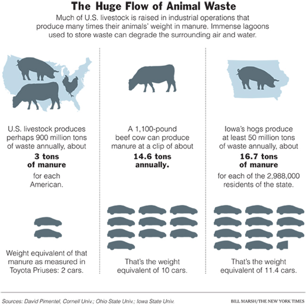
The clean color palette gives this graphic the aseptic look of ‘pure information’ while the inclusion of the numerical data (in tons of manure) backs up the intention of the graphical representation with checkable facts. I like the three different versions of the same concept; it increases my confidence in the basic point that raising livestock produces vast quantities of waste. It’s mostly a pigs and cows problem but it isn’t restricted to Iowa.

Measuring animal waste per capita is a brilliant way to remind readers that they play a role in this system. These animals are a special class of animals called livestock which means that they only exist to provide food for humans. Measuring waste per capita is a subtle, but incontrovertible way to remind us that all animal eaters are contributing to the pile-up of animal waste.

What Needs Work

The animal cut-outs overlaying the outline of the nation in the first panel and Iowa in the third panel seem like a first draft idea, not a final draft idea. The relative size of the animals seem to relate to their ability to fit within the outline behind them more than to relative proportions of waste.

I have no idea why animal waste should be related to the weight of a Prius. This is an unnecessary politicization of the data. There is no logical reason to measure animal waste in Priuses. I can only think of political reasons to do so. Tons is just fine. The Prius portion of this graphic could be lopped off and no information would be lost.

It makes sense to me to move sequentially through levels of analysis. In that case, I would have put Iowa in the middle so that our thoughts would move from largest level of analysis to smallest. This is especially true in this case where the Iowa level data and the national level data measure animal waste per capita while the cow’s waste is measured annually, not per capita. I would have translated the cow’s waste into per capita data, too, just to make the narrative of the graphic more cohesive.

Bittman writes, “Americans are downing close to 200 pounds of meat, poultry and fish per capita per year (dairy and eggs are separate, and hardly insignificant), an increase of 50 pounds per person from 50 years ago. We each consume something like 110 grams of protein a day, about twice the federal government’s recommended allowance; of that, about 75 grams come from animal protein. (The recommended level is itself considered by many dietary experts to be higher than it needs to be.) It’s likely that most of us would do just fine on around 30 grams of protein a day, virtually all of it from plant sources.” And that’s something I’d like to see represented in the graphic too – the fact that Americans don’t need meat to meet their nutritional needs. That isn’t to say we could easily do without meat – much of eating is cultural and from that perspective many Americans would be set adrift, at least from a culinary perspective, without meat.

Bonus: I would like to see more about the waste lagoons – something that talks about what happens to the waste over time would be incredibly useful because this graphic begs the “where does it all go?” question.

Relevant Resources

Bittman, Mark. (27 January 2008) Rethinking the Meat Guzzler in The New York Times, The World.

Flora, Jan; Chen, Qiaoli; Bastian, Stacy; Hartmann, Rick. (October 2007) Hog CAFOs: The Impact on Local Development and Water Quality in Iowa Report from the Iowa Policy Project.


The Design of Everyday Things by Donald Norman

Book Recommendation

Donald Norman’s “The Design of Everyday Things” is currently my commuting book which I’ve had ample opportunity to read because the F train here in NYC is the most capricious multi-ton object I’ve ever encountered. This is a good book if you want a straightforward introduction to basic design principles. Norman is an engineer by training which means he comes from a different tradition than, say, an architect. He goes through all sorts of examples of commonly encountered objects – keyboards, sinks, ovens, telephones – to help demonstrate that good design would benefit from prototyping and user-testing because, in the end, humans are fairly adept at taking clues about how to use an object from their first glance. When things aren’t obvious, it’s the fault of the design, not the fault of the person who has trouble figuring out how to put someone on hold or transfer a call with a phone system that can likely ONLY be used by a robot or an algorithm. He opposes beautiful design for the sake of beauty – glass doors stripped of plates and hand bars in service to the sleek glossiness of glass’s amazing material properties are no good if people end up pushing on the hinged side of the door when they should be pulling on its swinging side.

Norman offers users a set of criteria by which everyday design can be critiqued as well as some rules of thumb for figuring out particularly obtuse design challenges. He absolves humans their occasional mechanical buffoonery, “Humans, I discovered, do not always behave clumsily. Humans do not always err. But they do when the things they use are badly conceived and designed.” Norman doesn’t go so far as to suggest that the objects themselves possess agency, it’s not the fault of the things, but of the people who designed them, “When you have trouble with things…it’s not your fault. Don’t blame yourself; blame the designer. It’s the fault of the technology, or more precisely, of the design.” This part of his theory is the weakest. It’s rather simplistic to blame the designers without interrogating why they produce shoddy designs. He hints that designing for the sake of beauty is part of the problem and that user testing happens in the market place where negative reactions are likely to kill the product line altogether rather than resulting in intelligent, sensitive redesign. Luckily, other books (Harvey Molotch’s “Where Stuff Comes From” for example) do a better job of revealing the motivations and constraints on designers.

Where Norman is at his best is in the many detailed examples of everyday objects gone screwy with clear, diagramatic prescriptions for improvement. Norman never rants about bad design just to sharpen his teeth. His examples are accompanied by constructive suggestions that are so clearly spelled out that readers are capable of critiquing his suggestions, a sure sign that the book succeeds as a teaching tool. Furthermore, Norman illustrates his discussion with photos, sketches and diagrams throughout which enriches the legibility of the project and subtly introduces readers to the practice of learning through drawing that is common in design practice, but not all that common outside of it.

Relevant Resources

Norman, Donald A. (1998) “The Design of Everday Things” Cambridge, MA: MIT Press.

Molotch, Harvey. (2003) Where Stuff Comes From: How Toasters, Toilets, Cars, Computers and Many Other Things Come to Be As They Are. New York: Routledge.

Where Stuff Comes From - Harvey Molotch
Example of a wordle
Example of a wordle

What Works

Wordles are generated by inserting a block of text into an algorithm that filters out typically common words like ‘the’ and ‘they’ and then picks out frequently used but relatively uncommon words like ‘Mexico’ and ‘resistance’. These images get used occasionally in academia on websites where people want to use images to represent something like a talk or paper where they don’t actually have images that go with that talk or paper, but they do have an abstract, transcript, or full text of the talk or paper. In the sense, that a wordle is a relevant image to stick in the hole reserved for images. In another sense, I encourage you to go out and find public use images that are available, relevant to the talk/paper, and intellectually provocative rather than creating a Wordle.

What Needs Work

Wordles appear to tell you something you didn’t know by revealing patterns. In fact, Wordles are bizarre artifacts that sit somewhere between images and text. As images, they are fairly ugly agglomerations. As text, they don’t make much sense. In fact, I think Wordles are excellent when referred to as icons of the dystopic side of instantly available, decontextualized factoids that anchor the downside of the internet era. With but a click a block of carefully crafted (well, maybe it was carefully crafted) writing is blown apart and reconstructed as a brightly colored lettered blob that is somehow supposed to indicate the essential components of the piece of writing. A bit insulting to the person who wrote the text, if nothing else. A good abstract or even list of works cited says more than a Wordle in a clearer fashion.

Relevant Resources

Jonathan Feinberg of IBM Research created the Wordle Generator.

key

Web Map of thesocietypages.org

What Works

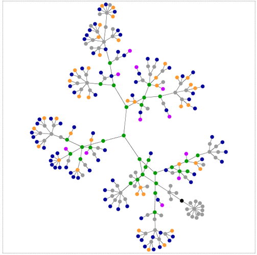
This is a map of a website.

Let’s reflect on that seemingly straightforward sentence for a moment. This is a map of something that does not exist in space. Baudrillard comes to mind here – “Abstraction today is no longer that of the map, the double, the mirror or the concept. Simulation is no longer that of a territory, a referential being or a substance. It is the generation by models of a real without origin or reality: a hyperreal. (from Simulacra and Simulations, Baudrillard)” I’ll let you decide whether or not you want to accept the notion that there is such a thing as the hyperreal without any further digression down that rabbit hole.

The visual elegance here cannot be overstated. It’s a simple non-cartesian network map with absolutely no frills, labels, anything besides a hint of color. As a graphic, what works here is that, if you happen to have a basic understanding of how websites are built, you can quickly see what kind of site you’re looking at. Lots of blue means lots of links, lots of green means the designer is using a lot of css, lots of red (tables) is kind of old-school (not in a good way), and so on. But it does require some knowledge of how websites are put together to decode this representation. That being said, it’s a brilliant way to reveal the skeleton supporting the visual skin of the websites you visit. See the links at the bottom to be taken to the applet that will allow you to map out the structure of any site you like.

Though this may not at first glance appear to have anything to do with my post earlier this week about John Snow, both Snow and the Aharef web-map generator represent tools for the examination of patterns. Pattern recognition is an undersung analytic tool in the social sciences.

What Needs Work

I wouldn’t mind a little more color in order to break out the grey “other” category a little more. I would also love a color that indicated use of javascripting and flash, but I understand that would be a different technical hurdle altogether. If this kind of map could be combined with page traffic information, we’d really have an amazing graphic. Just imagine that the traffic following each link could be mapped, say by making the node larger or smaller based on flow (or we could stick with the color thing, and lighter hues would indicate less traffic while darker ones indicate more traffic). It would also be nice to get some meaning related to the length between nodes. Right now that distance seems fairly arbitrary, constrained by the size of the viewing window.

Relevant Links

Generate your own webmap for any site

Original post about this applet tool by it’s creator Aharef on Aharef

Baudrillard, Jean. (1998) Simulacra and Simulations from Jean Baudrillard, Selected Writings, ed. Mark Poster.

USA Today Flash Animated Graphic accompanying the headline “Deaths Down on America’s Roads”

What Works

Nothing is working here and I’m not just saying that because it’s flash and I can’t repost it. Please link through for a hot minute and look at it anyways.

What Needs Work

My problem with this graphic is that it is ONLY a map of the US, except for the few seconds when you roll your mouse over it. Even then, you don’t end up seeing a pattern, you just see little pop up windows with some numbers in them. Information graphics need to artfully, intelligently, dare I say cleverly weave the information into the graphic so that the two become greater than the sum of their parts. None of that happens here.

The map of the US is still just a map of the US. No shading, no numbers, no way to tell that we’re talking about traffic deaths. Even just mapping out the interstate highway system would have given a hint of a visual clue to tell us what we’re talking about. In the previous post, Snow stacked bars to indicate dead bodies. Maybe it’s a little over the top, but if we are addressing the notion of a change in body count, I would like to see some visual representation either of bodies or of change (change is more abstract and probably more appropriate for USA Today than a visual representation of a body count). Furthermore, I want to know if there really is a relationship between gas prices and body counts which *could* be explored looking across states. States tax gas at different rates resulting in variations from one state to the next. Sensitively factor in income and unemployment and we might be able to get a sense of how much gas prices impact mortality on the roads. Even more interesting would be whether it’s the fact that people aren’t on the road at all that prevents them from dying out there (no gas = no go) or if it is somewhat more subtle – perhaps people drive slower to be more fuel efficient rather than staying home and it is the slow down, not the no-go that keeps people alive. The more likely scenario would also point out that cars continue to get safer and that seatbelt laws work. If we could look at the data over time, we’d have a better idea how more quickly traffic fatalities dropped in 2008 than in other recent years, which would help factor in the cars-are-safer-now + more-states-have-seatbelt-laws effects.

This graphic falls woefully short of even hinting at any of these questions. I wish they had left it out altogether, forcing everyone to read the article in full.

John Snow - Mapping Cholera 1854

What Works

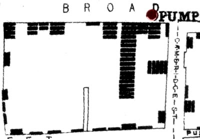
This is a combination of a map and a chart whose creation helped epidemiologists understand that cholera was not caused by a ‘miasma’ carried by the fog from the river, but rather was a germ carried in the water. It’s one of my personal favorite early examples of information graphics as a tool not of publication, but of analysis and discovery. Snow mapped the area around the Broad Street pump and then represented deaths with bars (not dots as some later cartographers have done when re-presenting Snow’s maps). The bars end up looking like stacked bodies, reinserting the gravity of the situation into the fairly sterile context of the map as info graphic.

The pattern is imperfect, but clear. Proximity to this well is directly proportional to mortality risk. The point of this entry it to encourage the use of information graphics not only in the publication stage of the research process, but also in the analysis stage. Granted, epidemiology isn’t a social science, but this is a classic example that sets the scene for contemporary examples of graphics as tools of analysis.

What Needs Work

There are other more comprehensive maps of the whole neighborhood that show the patterns even more clearly. What I have here is just a close up, probably a mistake on my part. The full version is here as a pdf. The romantic in me wanted to restrict this post to the original grainy, scanned map* drawn by Snow himself.

The realist in me notes that even though I believe the creation of information graphics can be used as analytic tools, the story in the John Snow case isn’t a perfect fit. An article by Brody et al in The Lancet points out that, “Snow developed and tested his hypothesis will before he drew his map. The map did not give rise to the insight, but rather it tended to confirm theories already held by the various investigators.” So Snow didn’t get his brilliant insight just by examining the map but he did use the map as an analytical tool later in the process to help confirm his hypothetical hunches. It wasn’t like he just threw the map/chart together to present at a conference or while he was writing up an article which is how I feel many social scientists end up using info graphics.

*This version is actually the second version though it’s main difference from the very first map is that the pump has moved just slightly off from the exact corner of Broad Street closer to the house of 18 deaths.

Relevant Resources

John Snow website at UCLA School of Public Health where I found many maps.

Brody, H., M. R. Pip, et al. <2000) “Map-making and myth-making in Broad street: The London Cholera epidemic, 1854.” The Lancet 356, (9223): p64-68.

Problem Set at Princeton - Marriage Patterns in France from 1968 - 1987

What Works

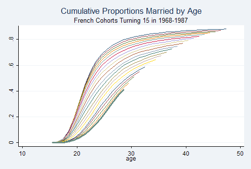
This example comes from a Princeton problem set in the Research Methods in Demography, a bit unexpectedly. What works is that the gently swooping shape is elegantly intriguing – an eye grabber that gets more interesting the harder you look at it. There is something to be said for beautiful forms, but unless there’s substance, info graphics that are only beautiful disappoint like vinyl siding. The fact that this one happens to generate such a fetching shape that it has been repeated throughout branded America is a real triumph.

Each line represents one cohort. The slope indicates the coherence within that cohort to age of first marriage – the steeper the line the more quickly the entire cohort goes from being single to being married. Later cohorts produce flatter slopes, indicating that there is a wider spread across ages of first marriage. It’s also easy to see that the age of first marriage slowly creeps up over time.

Note the popularity of this shape elsewhere:

New York Philharmonic Logo

What Needs Work

It’s not clear just which line goes with which cohort. Sure, demographers and pop culturists alike know that age of first marriage has been increasing over time and will assume that the cohorts who marry later are, in fact, the later cohorts, if we had different data that didn’t show such a smooth trend from year to year, it could be difficult to pick out which line represented just which cohort. Say there was suddenly a $10,000 incentive attached to getting married by age 22. Get married before your 22nd birthday and a giant $10,000 check arrives. That would push back the collective age at first marriage but in this chart, that line would just get buried among the earlier cohorts, or so I would predict. In this case, I might have recommended adding a year marker to every fifth line or so, just to reassure me that the pattern is smooth over time.

In 1900 the median age at first marriage was 21.9 for women and 25.9 for men and then these ages dropped til 1957 when they started rising again. Just saying. Age at marriage doesn’t have to keep going up.

Relevant Resources

German Rodriguez (2006) Office of Population Research, Princeton University. Problem Set 4: Marriage in France Research Methods in Demography.

US Census Bureau (2004) Estimated Median Age at First Marriage, by Sex: 1890 to Present in table format

USAID map of the area in and around Darfur
BBC map of Gaza 4 January 2009

What Works

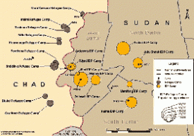
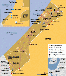
The best thing about the map of the camps around Darfur is that it exists at all. After looking at some of the elaborate maps that have been part of the news coverage of Gaza (see the one here, click through on the caption for a larger image) and earlier, of the bombings in Mumbai, I assumed I would be able to find something of similar quality related to the camps around Darfur to sate my curiosity about how big the camps are, where they are, how they are supplied, whether or not they are targets, and so on. But this map from USAID is one of the only things I could find around these interwebs that presented a basic map narrative of the camps in Darfur. Notably, I found many graphics promoting concerts that were fundraisers or awareness-raisers for the people in Darfur. Some of these concert posters and t-shirts got around the (apparently) tricky question of where Darfur is by just using an outline of the continent of Africa.

What Needs Work

The lack of a decent map-narrative around the problems in Sudan/Darfur indicates an uncomfortable fissure in the epistemology of crisis. I’m willing to conjecture that there may be an inverse relationship between perceived cultural differences and the production of ‘fact’ based information around crises. There isn’t an easy way to measure social/cultural difference, but it seems that the greater the degree of “otherness” of the people undergoing a crisis, the more likely the story is to be covered not with an onslaught of ‘hard facts’ that can be diagrammed, mapped, combed, regressed, permuted, computed, etc. but rather the story will be covered by emotive tools like first person narratives, photographs, and even awareness raising concerts, vigils, and that sort of thing.

I would love to hear what readers think about this theory of mine and I’ll continue to look for examples of differences in the use of information graphics across seemingly similar data sets.

Relevant Resources

BBC Map of Gaza Offensive – Week One (5 January 2009) with narrative time line.

NYTimes.com Israel and Hamas: Conflict in Gaza (4 January 2009) with narrative time line.

USAID map of camps in Sudan

USAID page on Sudan

The United States Holocaust Museum Mapping Initiatives Crisis in Darfur. This is a plug-in to googleEarth that layers photos, videos, quotes, and a bit of 2004 information about the camps on the googleEarth map of Sudan/Chad.

Piled Higher and Deeper - PhD Humor

What Works

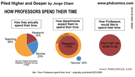
Humor is a slippery animal, indeed. I like to think of it as the pinnacle of culture, not in a high culture kind of way, but in a cultural development kind of way. Just think of trying to learn a foreign language. When you can intentionally, subtly be humorous in that language, you know you’re really getting somewhere. If you have never gotten to that point in a foreign language, just listen to kids try to tell jokes. They kind of suck. You end up laughing along because they’re kids and kids telling jokes is funny in itself, not because what they are saying is actually humorous. This is a fairly long winded way to point out that one indicator that telling stories with graphics is thick culture (thanks, Geertz) is that things like the above image are actually funny in a way that they couldn’t be funny in another format. If you had to say to someone, “man, professors spend lots of time on service activities, but the administration really doesn’t reward that or even notice” nobody would laugh. They might sigh and wish the economy were better so they could find a job that didn’t involve sitting on committees.

Bottom line: this works because we have been immersed in graphic storytelling. We get it. It doesn’t work in any other format.

Relevant Resources

Piled Higher and Deeper, a comic strip by Jorge Cham online. If you are a student or professor and haven’t discovered this, I’ll warn you that it could suck away an hour or two of your day if you click through right now.

Higher Education Research Institute at UCLA. The HERI Faculty Survey. There are fees associated with accessing the data but you can get an overview of how data about faculty time commitments is gathered.

This 2006 Obituary of Clifford Geertz in the New York Times does a good job of summarizing his life and work, for those who want to follow up on my parenthetical. His book “The Interpretation of Cultures” is a good place to start. If you want something shorter than a book, “Deep Play: Notes on a Balinese Cockfight” is worth a read.

Link to Bigger Map of Remittances from US to Mexico

What Works

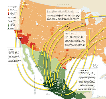
This map does a great job of demonstrating the granularity of the flow of remittances from particular cities in the US to particular cities in Mexico. It does a very good job of using a single characteristic – financial flow from the US – to illustrate a larger pattern of migration between sister cities in two countries. I talked to a restaurant chef-owner in New York on Monday and she said all of her cooks are from Puebla. This graphic could have told me about the same thing, though it wouldn’t have been able to tell me to look in the kitchen.

The graphic makes great use of color – picking one basic color for each country and increasing that color’s intensity to indicate concentrations of migration activity.

Credit for the article from which this was drawn goes to Raúl Hernández-Coss and credit for the graphic goes to Ryan Morris (I think, it’s really hard to read the fine print).

What Needs Work

Even in the bigger version of the graphic I can’t read the text in the boxes very well. I’m sure this looked good in print, but it didn’t translate well to digital. Still, even without being able to read the explanatory text, the basic point is obvious and legible.

Relevant Resources

Raúl Hernández-Coss. (2007) World Bank Working Paper 47 The U.S.-Mexico Remittance Corridor

Julie Watson (27 January 2009) Yearly Mexican Remittances Drop for the First Time in the Washington Post.

Matthew Quirk (2007) The Mexican Connection in The Atlantic. (This is where I first spotted the graphic)

Bigger Version of the Graph