Archive: Nov 2010

LifeMap life timeline | Ritwik Dey

What works

This is a great timeline. If all CVs were displayed like this I think employers would have a much better idea who they’re hiring.

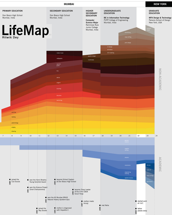
Here’s why I like it:

    LifeMap

  • shows simultaneity – layering colored strips
  • shows relative weights – some stripes are fatter than others
  • shows the split between two classes of life – academic and personal by simply sticking the axis between them and then emphasizing this split with a different color scheme for each class
  • mixes words seamlessly with the graphic elements – each of the activities on the map is listed only once, even if the band it occupies shifts noticeably. Re-listing each element would add clutter and the colors are easy for the eye to follow across the graph even where there are discontinuities.
  • displays location at the top without making location seem like the primary element. It’s hard to get the thing that appears at the top NOT to seem like the most important. Clearly, in the course of a life, moving from Mumbai to New York is a big deal, so this is a critical component, but it doesn’t dominate the graphic. We are able to see the elements that make the leap from one place to the next but we aren’t quite sure if it was the shift from one place to the next or from one level of schooling to the next…and maybe even Mr. Dey doesn’t know. How can anyone untangle the causality of an individual trajectory?

It’s clear to me that many of the design elements here will be useful for future portrayals of social science data. In this case, I’d say we are looking at an enhanced CV, brave enough to indicate the passing of a parent and even a mother’s new relationship (which preceded the passing of the father). Spare visual narrative, intriguing in what is left out, remarkably rich nevertheless.

What needs work

The font relative to the graphic is too small. I know that this was probably intended as a poster and displayed at such a scale that the font wasn’t a problem. I apologize that you have to click through to see all of the categories.

Another comment while we’re on the topic of fonts and words relative to graphics: Mr. Dey was able to describe all of his interests with one or two words. It looks great. He expanded his accomplishments a bit beyond the two word limit, but they are still quite brief. I like the idea of choosing the one, two or three most precise words and making sure the graphic itself can carry the rest of the message. It’s a good test to see if your design is helping – when it can speak almost on its own things are looking good.

The limited number of words makes the whole thing not only visually and verbally poetic but also increases its functional value. One of my functionality measuring sticks is the number of words a person would have to translate if they were trying to read this graphic in a foreign language. The fewer words, the easier it is for non-English speakers. The more specific the words are, the more likely they are to translate appropriately. Therefore, ‘swimming’ and ‘3D modeling’ probably translate without difficulty. I have no idea if there is any kind of meaningful translation of “scouts” or “scouting” in any language other than English, but that is not a problem any graphic designer is going to be able to solve.

I wonder, though, if no-more-than-two-words rule led to the choice of the word “derive”. I know what that means in the context of calculus. I have no idea what that means in the context of a LifeMap, but it remains salient for years so I wish I did know what it meant. Sometimes the word restriction rule leaves out the phrase that would best describe whatever it is you might be trying to describe. Or maybe Mr. Dey does a lot of theoretical derivations.

References

Dey, Ritwik. (2005) LifeMap Project for Information Design course with Dmitry Krasny at Parsons School of Design in New York City.

grain edit logo

What works

grain edit is a graphic design blog that will expand your mind’s collection of graphic design to remember. It is not restricted to information graphics – in fact, most of the work has nothing to do with information graphics – but it includes a wide variety of graphic design and illustration. I’m posting this reading suggestion on a Sunday because it is a bit off the core topic here which is supposed to be social science data presented via information graphics. Still, if you are at least mildly interested in graphic design, surely you will find something you like over at grain edit. Not only can you see what ‘the work’ looks like, you can also read interviews, and get photographic studio tours with some of the designers they feature. And if you are super keen on the whole concept, their blog roll will take you on a fantastic cyber-tour of thought provoking eye candy.

My favorite links:

References

grain edit blog

things magazine

Lumadessa

Clothing and Footwear, Global Spending 2007

Electronics, Global Spending 2007

Recreation, Global Spending 2007

What Works

I have been thinking about other ways to work with maps lately, and I stumbled upon this interactive consumption map created by the folks at the New York Times using numbers from Euromonitor International, 2007. This graph was certainly a product of a moment in time – I don’t see too many people making consumption graphs like this one these days. They might be making line graphs where the total amount of consumer spending or consumer confidence is of immense concern to finance people who are eager for the next growth period in the economy. (I’m not saying that only finance people are looking forward to economic growth, just suggesting that they are the people who spend a lot of time studying consumer behavior as they anticipate the growth period. The rest of us might be looking at our own retirement statements or home values or paychecks.)

This map approach to spending is great because the graphic designers – Hannah Fairfield, Elaine He and Kevin Quealy – realized that maps are just schematics. It isn’t necessary to stick with a country’s shape, but it is nice to keep them in about the same positions relative to one another. Freeing each country from the shape of its political boundaries allows each square country to change dimensions in direct relation to total consumer spending within a sector. The color tells us what this works out to in terms of per capita spending. If you clicked through to look at the actual interactive graphics you’ll find that if you mouse-over a country, you can see the dollar amount of the total spending for whatever sector you happen to be viewing.

The strength of this graphic is that it strips away unnecessary detail to focus your eye’s attention on the most salient information in an easy-to-digest kind of way. This is a huge improvement over the sort of thing that I see all too often (and have included a little global poverty example here). My eye is terrible at assessing relative areas when the shapes are so irregular like this. Much better to just keep the relative positions of the countries and give them square shapes that can be quickly, effortlessly scanned for the sake of comparison.

Human Poverty
Human Poverty

What needs work

I would have put the per capita spending in the roll-over as well. Right now it’s just the country’s total spending. I also would have thought about a way to represent all the countries that don’t even make this map. Something understated and subtle – a sprinkling of grey dots? But then those countries might look like dust…still thinking about that.

The other thing I might have liked would be to have either gone completely grey scale (preferred) or to have selected a single color for each sector with increasing saturation as spending increases. The second approach would have made more sense if the product was a series of print graphics, but the approach they actually took and the grayscale approach are better for this sort of interactive graphic in which the viewer sees only one at a time.

References

Hannah Fairfield, Elaine He and Kevin Quealy. (4 Sep 2008) “What your global neighbors are buying”. Business Section of the New York Times. Using Euromonitor International figures.

Fairfield, Hannah. (4 Sep 2008) Guccis or Gadgets? Business Section of the New York Times. [related article that ran with the graphic]

How Well Do We Take Care of America's Teeth?

How Are Our 17 Year Olds' Teeth Doing?

Dental Insurace or Health Insurance, Who Has What?

Who Has the Best Access to Dental Care?

Does More Education Mean Healthier Teeth?

Happy Halloween

This graphic is a bit too cartoon-ish for my tastes but it does a good job of illustrating a health care gap that, even during the health care debate, went over-looked. I figured Halloween – a holiday whose commercialization revolves around candy – might be a good time to post the dental health care graphics developed over at the GOOD magazine transparency blog.

In the spirit of full disclosure: I was a dental assistant for a summer. The numbers here are accurate and have very real consequences. I used to see kids who did not know (they had no idea) that drinking soda was bad for their teeth. These kids sometimes had 7 and 8 cavities discovered in one check up. For older people, dry mouth would lead them to suck on lozenges or hard candy all day and they’d end up with a bunch of cavities, too. Bathing the mouth in sugar is bad. Combining the sugar with the etching acid in soda is even worse.

Once a tooth has a cavity, it needs to be filled or the bacteria causing the decay will continue to eat away at the tooth, eventually hitting the pulp in the middle of the tooth. Once that happens, the person is usually in pain and needs a root canal. Even if they aren’t in pain, they need to have the infected tissue removed (that’s what a root canal treatment does) or the infection can spread, sometimes into the jaw bone. There is no way for the body to fight an infection in a tooth because the blood supply is just too little to use the standard immune responses.

Dental decay progresses slowly. Kids lose their primary teeth any decay in those teeth goes with them. Therefore, it’s not all that common to see teenagers needing root canals. But it does happen. Root canals are expensive. It’s a lengthy procedure requiring multiple visits and a crown. Pricey stuff. BUT, this process allows the tooth to be saved. Without dental insurance, sometimes folks opt for the cheaper extraction option. Once a tooth is extracted, that’s it. It’s gone. (Yes, there is an option to have a dental implant but that’s even more expensive.) So a teenager who likes to suck on soda all day long and who may not be all that convinced about the benefits of flossing could end up losing teeth at a young age. I can tell you because I’ve seen it: a mouth without teeth is not a happy mouth. All those teeth tend to hold each other in place. Once some of them are extracted, the others can start to migrate. Extract some more and things get more interesting and people start to build diets around soft foods. Eventually, once enough of them are extracted the entire shape of the mouth flattens out – not even a denture can hang on to help the person eat.

Unfortunately, poor dental health disproportionately impacts poor people, as these graphics demonstrate. But that disproportionate impact can double down. Dental health is often seen as a sign of class status. People with poor dental health have trouble getting good jobs, especially in a service economy. For what it’s worth, I bet they also have more trouble in the dating/marriage market.

References

Di Ieso, Robert. (2 September 2010) How well do we take care of America’s Teeth? [Centers for Disease Control; Pediatrics]