Archive: Jan 2009

Link to Bigger Map of Remittances from US to Mexico

What Works

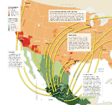
This map does a great job of demonstrating the granularity of the flow of remittances from particular cities in the US to particular cities in Mexico. It does a very good job of using a single characteristic – financial flow from the US – to illustrate a larger pattern of migration between sister cities in two countries. I talked to a restaurant chef-owner in New York on Monday and she said all of her cooks are from Puebla. This graphic could have told me about the same thing, though it wouldn’t have been able to tell me to look in the kitchen.

The graphic makes great use of color – picking one basic color for each country and increasing that color’s intensity to indicate concentrations of migration activity.

Credit for the article from which this was drawn goes to Raúl Hernández-Coss and credit for the graphic goes to Ryan Morris (I think, it’s really hard to read the fine print).

What Needs Work

Even in the bigger version of the graphic I can’t read the text in the boxes very well. I’m sure this looked good in print, but it didn’t translate well to digital. Still, even without being able to read the explanatory text, the basic point is obvious and legible.

Relevant Resources

Raúl Hernández-Coss. (2007) World Bank Working Paper 47 The U.S.-Mexico Remittance Corridor

Julie Watson (27 January 2009) Yearly Mexican Remittances Drop for the First Time in the Washington Post.

Matthew Quirk (2007) The Mexican Connection in The Atlantic. (This is where I first spotted the graphic)

Bigger Version of the Graph

Click Here to View the Animation by Aaron Koblin

What Works

Click on the link in the caption to go to Aaron Koblin’s site and watch the animation. It’s mesmerizing and I ended up watching it more than once, trying to pick out the patterns. And, in fact, what works about this approach is it’s ability to help quickly identify patterns. Generally speaking, data that is dynamic (usually the change is happening over time, as in this case) is data that may lend itself to this sort of pattern recognition analysis via visualization.

As you watch the whole visualization, you’ll see that Aaron Koblin experimented with three different ways of displaying the same data. He starts with impermanent white lines over a dark background, then globs of oil-ish substance over a white background, then he applies color to the original white-on-black version. I like the political implication of using the oily blobs – that is what we are collectively doing when we’re flying – burning up vast quantities of fossil fuels by using just about the least fuel-efficient form of transportation we’ve got. Vehicles for traveling outside earth’s orbit are even less efficient. I still think the white-on-black version works best because I couldn’t figure out what the colors represented.

I love the total flight counter and the running clock. Adds a great deal of contextual information very subtly.

What Needs Work

I think this animation does a great job of showing what it sets out to show – the flight patterns in the US over a 24 hour period. If there was an intention to include data about the environmental cost, I would have liked something that isn’t quite as subtle as showing the patterns using blobs of oil-like substance. But modeling that sort of data would be even more complicated than what was done here because it would count on knowing how big each plane was – jets use more fuel than smaller planes – and some estimate of how heavy it was – full flights use more fuel than empty ones.

I also wanted to know if this represents all passenger and cargo flights, or if it is just passenger flights?

Relevant Resources

Aaron Koblin’s website and a link to the specific animation related to this post.

For more on globalisation, see Saskia Sassen who was interviewed about her work by John Sutherland at the Guardian in 2004.

For more on the relationship between aircraft and climate change see this slightly outdated 2001 report from the Intergovernmental Panel on Climate Change (UNEP)

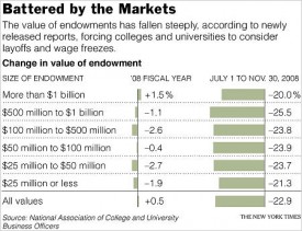
NYtimes.com - College Endowments Loss Is Worst Drop Since ’70s
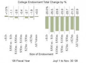
Remixed College Endowment Graphic

What Works

Stories like this one that cover a data driven report should always include an info graphic. But, of course, this is coming from an avid fan of info graphics. Kudos to the NYTimes for including a graphic and for including not only the punchline – the huge drop in college endowments in the very recent past months – but also some context about what college endowments were doing before. I would have liked even more context because fiscal year ’08 was already seeing some of the downturn in the market. Total movement for all endowments, or endowments divided into fewer categories, since ’00 would have been even better.

What Needs Work

It is intuitive to portray data that “drops” (according to the headline) or rises with the change along the y-axis. I did a little remix just to show you what I mean. In the first glance at the data, the increase or decrease is going to be more legible when it’s happening on the vertical axis. It’s just the way we learn to read charts and graphs. Before that, I suppose our tendency to associate the vertical axis with things rising and falling came from gravity. The laws of physics aren’t going to change – stick dropping/rising data on the y-axis until gravity causes changes in the x-axis.

The other thing I might have changed was the choice of categorization. What is gained by splitting the data into the uneven increments that appear here? First, increments should either be even or should have some reason for being uneven. We’ve got a $500m range, a $400m range, a $50m range…it’s all very unclear why these are the important categories, especially when there is no immediately obvious significant difference between them. They all seem to have been more or less flat in FY’08. Then they all plummeted ~21-22% between July and November of ’08. I would have opted for more historical context and fewer categories.

The Wall Street Journal is running basically the same story with a different graphic though they still stick with the horizontal arrangement. I like there’s even less because they

Relevant Resources

Katie Zezima (27 January 2009) Data Show College Endowments Loss Is Worst Drop Since ’70s at the NYTimes.com

John Hechinger (27 January 2009) College Endowments Plunge Wall Street Journal Online

National Association of College and University Business Officers 2008 NACUBO Endowment Study Available for Purchase.

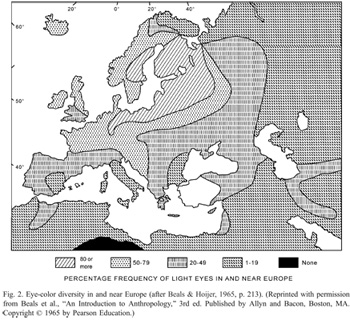
Eye Color Map from Peter Frost (2006) via Beals & Hoijer (1965) An Introduction to Anthropology
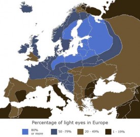
Eye Color Map of Europe - In color!

What Works

Color works. It helps that in this case, the characteristic being mapped is eye color, so it’s kind of a no-brainer to shade the areas where blue eyes are prevalent in blue and the areas where brown eyes are prevalent in brown. Even if this graph were to be printed in a grayscale journal (which is probably why the one on the left tries to use hatching to distinguish the areas), using degrees of full shading is easier to distinguish than using hatching patterns. Most printers can handle printing 10% gray, 50% gray, and so on.

What Needs Work

The areas that need some work, even in the color version, are the areas between blue and brown. Right now, those areas are lighter blue and lighter brown. The problem is that because the blue is mapping directly to the characteristic in question – blue eyes, blue area – it’s easy to think that the lighter blue areas represent areas where people have really light blue eyes. But, in fact, those areas are full of a mix of people, some with light eyes, some with dark eyes. I might have gone with a staggered blue/brown pattern or just chosen a color that doesn’t have anything to do with eye color, like purple.

Relevant Resources

Peter Frost (2006) Why Do Europeans Have So Many Hair and Eye Colors?

Western Paradigm blog (February 2008) The Blue Eye Map of Europe [Note to Readers: I couldn’t find the original version of the color map so I am linking to the blog where I found it rather than the original source.]

Wired Magazine Features Infoporn - Playmates' Diverging Bust-to-Cup Size Ratio
Wired Magazine Features Infoporn - Playmates

What Works

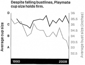
This graph does a nice job of representing three different linear scales without having to be in three dimensions. Time is on the x-axis, as it usually is. Then we see cup size on the right y-axis and bust size on the left y-axis. These two measurements use quite different scales – bust size is measured in inches and cup size is measured in two different ways, both of which are mapped onto an equidistant lettered scale. The distance between an A and a B on the left y-axis is actually about the same (1″) as the distance between 33 and 34 on the right y-axis. If you were going to set up a similar graph, it would be important to maintain the ratio between the two y-axes measurement scales. In this case, the ratio is 1:1, but you could imagine that the same style graph would work if the ratio were 1:2 or 1:3, just about any linear relationship will do.

What Needs Work

I suppose it may be more risque, but it strikes me that the same information could be conveyed with more pizzazz if the relationship were communicated visually. Most people, women included, don’t have a good sense of just what changing both cup size and bust size at the same time is going to look at. Humans are good at perceiving symmetry and proportion. Thus, I’d rather see this information as a series of clay models than as a chart. Bottom line: the information is visual to begin with, we’re talking about the way playmates look, after all. So why translate visual data (the pictures of women) into a chart?

Relevant Resources

Katharine Gammon for Wired Magazine (2009) Issue 17.02 “Infoporn: Today’s Playmates Are More Like Anime Figures Than Real Humans”

Carol Rados for the Food and Drug Administration Consumer Magazine (2005) Making an Informed Decision About Breast Implants

<a href=
New Jersey Commission on Rationalizing Health Care Resources
Hospital Pricing Graph - SF Bay Area originally published in Health Affairs by Uwe Reinhardt

What Works

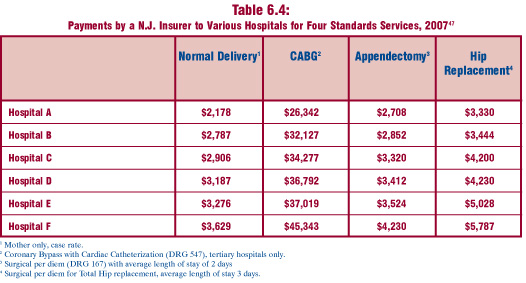
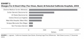
This comparison is a fairly straightforward examination of the relative merits of tables vs. charts.  Both of these images are trying to help explain the tricky business of health care pricing.  The bar graph comes from an article in Health Affairs by Uwe Reinhardt that starts by taking a look at the cost of a single procedure across hospitals within a small sample of hospitals in the state of California.  The table does the same sort of thing but it was written by the New Jersey Commission on Rationalizing Health Care Resources so it looks at hospitals in New Jersey.  It also looks across a number of treatments, not just one.

Each of these presentation styles has its merits.  The graph is an instantly legible message:  the cost of a chest X-ray varies a lot from one hospital to the next.  The table doesn’t have the same instant legibility but it provides much more detail across a range of treatments, demonstrating that the pattern of discrepant charges is not restricted to a single treatment.  Further, the table demonstrates a pattern – the relative cost of hospital treatments is fairly stable.  If a hospital charges at the low end for one treatment, it probably charges at the low end for all treatments.

What Needs Work

The bar graph does a good job of providing instant legibility but it doesn’t give much detail.  It works in the introduction of the paper to orient the reader but would not be nearly as useful in the results section because it shows only one treatment.

The table provides a lot of detail, but unless someone is already deeply interested in the problem of health care costs, they may not take the time to read it. No patterns are immediately obvious – it’s just a boxy sea of numbers. The presentation of the table as a graphic does little to help the eye.  At least the columns are arranged from lowest payment to the greatest payment.  They might have been made more visually legible if the font increased or the boxes got progressively darker as payment values increased down the columns.

Relevant Links

Chaos Behind a Veil of Secrecy in Health Affairs by Uwe E. Reinhardt

How Do Hospitals Get Paid – A Primer” on Nytimes.com Economix blog  by Uwe E. Reinhardt

New Jersey Commission on Rationalizing Health Care Resources, Final Report 2008 by the State of New Jersey Department of Health and Senior Services