food blog study

Food Blog Study Descriptive Statistics Part 1 - Blogger Demographics

What works

Over the summer I surveyed 280 English-speaking food bloggers who were randomly drawn from a network of 23,000. Only the bloggers with email addresses, contact forms, or twitter accounts were invited to participate (obvious reasons…if I couldn’t get in touch with them, I couldn’t invite them to participate).

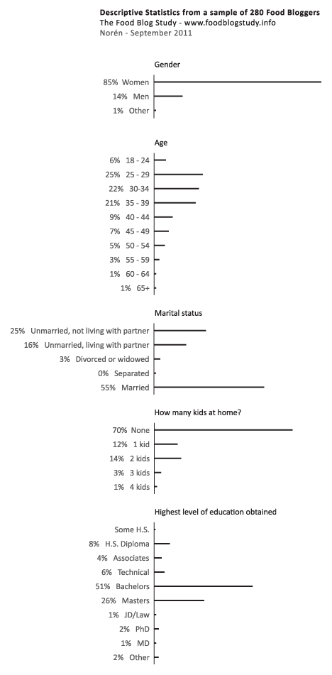
The graphic above represents my first attempt to present some of the basic descriptive statistics – gender, age, marital status, educational attainment, number of kids – just to see what works visually. Normally, this kind of information is presented in tables (I have those, too), but I wanted to try to add some horizontal bar graphs for impact. I kept them horizontal so that the axes labels would be easier to read.

The percentages are listed; the frequencies are represented visually.

Just for comparison sake (which is kind of difficult): the average age of people in the US is 37.2 (it’s 38.5 for females); about 50.5% of Americans are married now and only 2.5% are cohabiting. As for education, 28.5% didn’t get another degree after H.S., 17.7% stopped after their bachelor’s degree, and 10.4% have professional degrees. Clearly, the food bloggers are well-educated and more likely to be cohabiting than the American averages. I added these comparisons in response to Rob’s request. I know it would have been better to add them to the graphic, but the comparisons are a little tricky because the Census data is looking at a wider age range and I haven’t found any good summary stats on bloggers in general (which would be better than the aggregate comparison to the whole national pool).

What needs work

This strategy would not work for the entire set of variables – boring after a while. I am trying to think of better ways to show more variables at once without just building a column that goes on and on forever.

For more on “what needs work” see the comments section.

Blog reading and writing graph by gender, 2000-2010 | Pew Internet Research
Blog reading and writing by gender, 2000-2010 | Pew Internet Research

What works

This graphic was created using a wonderful, if not entirely complete, massive Excel spreadsheet summarizing interview results from the Pew Internet Project. There are many more questions than the three I looked at. I am primarily interested in how many adults write blogs and I was happy to see that the Pew Internet Research center has been asking adults about their blog reading and writing practices for about a decade. Just to give it context, I also plotted the percentage of adults using the internet at all.

I am also interested to see that women and men write blogs at about the same rate, these days, even though I know that they aren’t writing the same kinds of blogs. Food bloggers, for example, are overwhelmingly women as are baby bloggers (aka mommy bloggers, but using the term ‘mommy’ is too gender-restrictive). Political bloggers and tech bloggers tend to be male more often than not, though I know less about them.

What needs work

The interviews are different from year to year – some years I was averaging five or seven data points on the same question and some years I had only one (or, sadly, none). I wish there had been more years of data available on blog reading, for instance.

If I had one takeaway point it would be that we need to keep funding places like Pew to conduct detailed, ongoing research. I have found it invaluable to have access to their research and it makes the work I am currently conducting about food bloggers relatable to a wider body of practices.

References

Pew Center for Internet Research. Usage over time spreadsheet.
— If you cannot click on that link and automatically start a download, try downloading it from the Pew website

Food Blog Study | Web Crawler Progress Egg

Food Blog Study Update

I heard there was a graduate student once who used egg timers to break her dissertation down into writeable chunks. She had these timers all over the apartment, flipping one over to start a new bout of writing. Once it ran out, she might keep on writing since there was no buzzing or beeping to interrupt her. If she looked up and the sand had all run through, she would flip over another egg-timer to measure out a dose of ‘free-time’. Maybe I had her strategy in mind while I was trying to come up with a way to monitor progress on the food blog study. Large, long-term projects can envelope me, making it hard to see either where (and why) I started the project and where I mean to end up while I’m toiling away in the trenches of the day-to-day. This post is not about a final product. Rather it is about how I use information graphics to help me keep my mind on both the questions I started with and the place I mean to end up when all is said and done.

The food blog study is broken into three parts. The interviews (N=22) have all been conducted and are out being transcribed. The survey cannot begin until the web crawler has gotten to a stopping point. So where do things stand with the web crawler? That is not an easy question to answer except to say that it is doing what good bots do, chugging along finding food blogs to add to its growing collection with minor down times for maintenance here and there.

The graphic above demonstrates how the network set is growing – I simply used the file size of the daily cumulative db output to tell me how big to make each day’s egg. Still, looking at file size is kind of silly – it does not help me figure out when the network has been sufficiently crawled. It simply represents the absolute size of the database and because I do not have some target absolute size as my endpoint, knowing the current absolute size is mere trivia and not analytically useful.

Rather than considering absolute size or the linear growth of the network data, it is a lot more meaningful to examine the rate of change of new nodes from one day to the next. For comparison sake, I graphed both the linear growth of the network (top graph) and the number of nodes added per hour for each day in July (bottom graph) with the exception of July 17th when the crawler was down for maintenance. The linear growth is chugging along consistently enough with a few exceptions for reasons like maintenance and accidents (someone unplugged my computer from the internet for six hours one day. oops.). The rate of new food blogs added to the network set per hour is finicky, a pattern that is much easier to see in the bottom graph. That graph was calculated by taking the number of new food blogs added to the network during a given run and dividing it how long the run lasted to generate an hourly rate of growth. That hourly rate is what is plotted below – the crawler’s sweet spot seems to be when it is adding about 60 – 90 new food blogs per hour.

Food Blog Study | Graphs of Web Crawler Progress

The plunge in the rate of new blogs added per hour around the 18th of July is artificial. I happened to add a command that day which retroactively removed all of the blogs primarily focused on cocktails, wine, and beer. Their removal nearly outweighed the new food blogs that were added to the network that day so the overall rate of new blogs added appears to be extremely low at only 6 per hour.

This graph is extremely useful for keeping in mind where I started and helping me to figure out when I have gotten some where. I will know that the food blog bot is exhausting new nodes and that I have started to run into the bounds containing the food blog network when the rate of newly discovered food blogs per hour starts dropping and does not recover. Right now, the crawler is still pulling in new entries fairly rapidly so I know I am probably going to be babysitting it for at least another week. Thus far, the roughly-cleaned network includes about 32,000 nodes. Yes, folks, that means there are greater than 30,000 food blogs out there in the world. Probably a lot more, especially because the bot speaks food in English, Spanish, French, Italian, and German so the network under consideration is multi-national though not quite global.

Note on graphics

Could that egg have been perfectly round? Yes. And would perfectly round circles have been easier for average humans to measure with their eyes? Yes. So why did I choose an egg shape? Because I feel like this project is an incubation period. Data collection can be a delicate process – I would say that is especially true with respect to the web crawler because it was a tool custom-built for this project and thus has not been used and tested elsewhere. I also chose an egg because it is not important if viewers understand exact figures – this graphic was intended to provide an impressionistic view of the rate of growth of the network that the crawler is gathering. It grows incrementally, not by leaps and bounds. Like tree rings, the concentric nature of these eggs demonstrates that some days generate fatter rings than others.

As for the two graphs, I wanted to try using the same horizontal access because I wanted to make sure people understood that those two graphs are best understood as a pair. Basically, one is the derivative of the other, though there’s no need to pull out your calculus textbook just to understand these two. The top one just shows the total number of food blogs in the network so far. The bottom one shows how fast new blogs are being added from day to day. I didn’t want to clutter up the graphs with too many words so I opted to go with a single horizontal access, short titles, no labels for the vertical access (they are implied in the title), and I kept the two points about strange days outside of the bounds of the bottom graph. I don’t know if it is acceptable to stick asterisks in a graph, but I did it.

References

Noren, Laura. (2011) Food Blog Study.

Anatomy of a Cupcake | Allen Hemberger

What works

Not all information graphics arise from the same design process. In this case, the graphic creator went so far as to make a video of the creation process so, if you are so inclined, you can click through to Allen Hemberger’s “Things” blog to see how the Anatomy of a Cupcake went from sketch to photography and then to poster-sized graphic. If you love it maximally, you can even buy a print. [Note: If you like Hemberger’s work he has a food blog “The Alinea Project” and a photography blog.]

I chose this image for three reasons: first, I love that Hemberger took the time to make a video showing the process of going from idea to a tightly composed stylized photograph. Second, I am always happy to find people who construct information graphics differently. This one is a hybrid between photography and baking. What makes it work is the proper execution of both the baking and the photography as well as the care that was given to the original sketches that determined the storyboard for the idea. If the flow chart failed, he could have had the same cupcake components and the same photographic skills, but ended up with something that was merely ‘cute’ rather than something that is simultaneously aesthetically pleasing and clever.

The third reason I chose this image is even more personal than the first two. My summer research project, funded in part by Microsoft Research in Cambridge, MA, uses food blogs and food bloggers as a lens for focusing on the tensions between material and immaterial creative skills. I’m interested in figuring out how people move between the material world in which all of their senses can engage with a process and the not-quite-as-material world of the web in which the sensory world is reduced to the visual (though in some cases there is an audio component). The rest of the sensory experience of the material world has to be represented by text, photography, and graphic design. Why are there so many food blogs when food is something that has long been understood as a part of the material world that has to be tasted and smelled in order to be experienced properly? Why do people choose to blog about food and what keeps them going? Making and serving food are also ritualized practices for building connections between people – it is one of the primary physical elements through which culture is expressed. How does the collective experience of food work online?

The project has three components:

1. A web crawler is out poking around the English-speaking portion of the internet, creating a network of all of the food blogs that are linked in some way to an initial list of 50 top food blogs. So far, we have about 22,000 blogs in the English-speaking food blog network. Visualizations coming in another 6 weeks or so. The point of the web crawler is to see how many food blogs there are, how they connect to one another, and whether or not there are discernible lobes of the food blogosphere (say, for instance, a vegan lobe or a molecular gastronomy lobe). Because the food blog network is a grassroots sort of place – very few people are getting paid or prodded to start blogs and they are then free to link to whomever they want – there are some interesting social network questions we can answer about self-selecting networks. For instance, how many outlinks do food bloggers use? Is there geographical clustering or is the network oblivious to geography? Are bloggers who are more heavily linked to (or from) more likely to keep at it?

2. Once the crawler begins to reach a plateau in terms of adding new links, we will stop it, clean up the returns a bit, and then take a random sample of blogs who will receive an invitation to participate in a web-based survey. The survey does three things: it gathers blogger demographics (gender, race, age, kids or no kids, location, education, income), demographics of the blog (proportion dedicated to restaurant reviews vs. recipes, frequency of posts, perceived and measured audience, site traffic, comment traffic, presence on twitter and facebook, amount spent and earned), and the survey finishes with a few questions about motivations and perceptions of one’s blog.

3. To help construct a good survey instrument and to deepen the context within which the analysis of the survey results will take place, I am also interviewing 20-25 food bloggers. So far, the interviews have been fantastic. They are much better at getting at the nuances of practice – especially the crafting practices that are part of cooking/baking and blogging (photography, writing, graphic design, and online social networking…this last one may not be a craft practice).

All of this has been taking up a significant portion of my time and keeping me away from the blog. However, as the data comes in, I will have an opportunity to make graphics from scratch, rather than critiquing other people’s work all the time. I start to feel a bit like Oscar the Grouch when I’m in the midst of a string of critiques, especially since I know my own work is far from perfect.

If this blog uses the first person more than normal, it is because I have been reading so many food blogs where writing in first person is the norm. This just goes to show: if you want to be a good writer, be a good reader. The linguistic and grammatical styles we read eventually start to influence the way we speak and write.

References

Hemberger, Allen. “Anatomy of a Cupcake”.