demography

Housing vacancy rate in Wisconsin, 2010
Housing vacancy rate in Wisconsin, 2010 | Jan Willem Tulp

What works

The “Ghost Counties” interactive visualization by Jan Willem Tulp that I review in this post won the Eyeo Festival at the Walker Art Center last year. The challenge set forth by the Eyeo Festival committee in 2011 (for the Festival happening in 2012) was to use Census 2010 data to create a visualization using Census data that did not rely on maps…or if it did rely on maps, it had to use maps in a highly innovative way. This is an excellent design program – maps are over-used. Yet it’s one thing to assert that maps are over-used and another thing to produce an innovative graphic representation that is not a map.

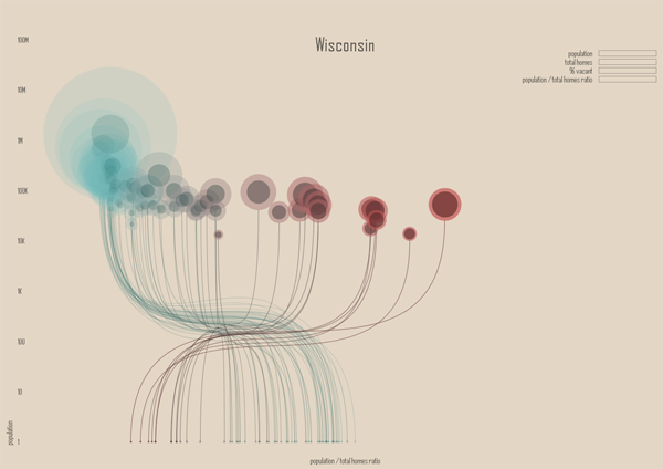
Tulp does a great job of leaving the map behind. He also does a phenomenal job of incorporating a large dataset (8 Mb of data serve the images in the interactive graphic from which the stills in this post were captured). The graphic has a snappy response time once it has loaded and his work makes a solid case for the beautiful union of large data and clear representation thereof.

The color scheme is great and reveals itself without a key. Those counties with low vacancy are teal, those sort of in the middle are grey-green, and those with high vacancy are maroon. The background is light, but not white. White would have been too stark – like an anesthetized space. He experimented with darker backgrounds (see his other options at his flickr stream here) but those ended up presenting an outer space feel. The background color he settled on was (and is) the best choice. Background colors set the tone for the entire graphic, along with the font color, and Tulp’s work is positive evidence of the value of carefully considering them.

Pie charts might be better than circles-in-circles

The dot within a dot is difficult for the eye to measure. Pie charts- which I only recommend if there are very few wedges – would have worked well with this type of data because there are only two wedges (see here for an example of a two wedged pie chart). I just finished reading Alberto Cairo’s important new book The functional art and he had a solid critique of the circle-in-circle approach that helped me realize what’s so appealing, but just plain wrong, about circles-in-circles:

“Bubbles are misleading. They make you underestimate difference….If the bubbles have no functional purpose, why not design a simple and honest table? Because circles look good. (emphasis in original)”

In this case, a wedge in a pie chart could have represented the percent of total housing units occupied.

Why is it so hard to ‘see’ rural vs. urban?

The x-axis is a log scale for population size. It’s clear from what we know about the general trend towards urbanization that we would expect urban areas to have lower vacancy rates than rural areas. Even in 1990 – two census surveys before the 2010 data that was used here – the New York Times ran a story about the population decline in rural America and there has been widespread coverage of the trend towards urbanization by both journalists and academics (the LSE Cities program does nice work).

Housing vacancy rate in Minnesota, 2010
Housing vacancy rate in Minnesota, 2010 | Jan Willem Tulp
Housing vacancy rate in New York, 2010
Housing vacancy rate in New York, 2010 | Jan Willem Tulp

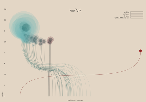
The two states shown here – New York and Minnesota – both have some big cities and a whole of small cities in rural areas. Some small cities are also in suburban areas. That’s a problem with this visualization, the distinctions that have been established in academic literature between rural, suburban, ex-urban, and urban are difficult to pick out of this visual scheme. While it would be difficult to find a sociologist who could wrangle the data to produce this kind of visualization, I imagine many of my intellectual kin would be confused by this visual scheme and demand to return to a map-based graphic because at least in that case they could see patterns associated with the rural-urban spectrum the old-fashioned way. I am not wedded to the notion that a map is the only way to “see” the rural-urban spectrum, but the current configuration makes it difficult to think with the existing literature about housing patterns even though the attempt to distinguish between population size was built into the graphic on the x-axis. Population size is not always a great proxy for urban vs. rural, so it is a weak operationalization of spatial concepts social scientists have found to be meaningful. For instance, a small, exclusive ex-urban area filled with wealthy folks and their swimming pools is conceptually much different from a small, depopulating rural town even if they have roughly similar population sizes.

It is important in a research community to build on good existing work and reveal the weaknesses of existing work where it’s falling short. Either way, it is a bad idea to ignore existing work. Where a project does not relate to existing work – neither building momentum in a positive direction nor steering intellectual growth away from blind alleys – it will likely become an orphan. In this case, the project is only an orphan with respect to urban scholarship. As a computational challenge, it most definitely advanced the field of web-based interactive visualization of large datasets. As a visual representation, it adhered to a design aesthetic that I would like to see more of in academic work. But as a sociological analysis, it’s nearly impossible to ‘see’ clearly or with new eyes any of the existing questions around housing patterns. It is also my opinion – and this is far more easily contested – that it does not raise new important questions about housing patterns in urban, suburban, or rural America either.

My critique here is not that all data visualization is pretty but useless and that we should stick to our maps because they tie us to our existing disciplines and silos of knowledge. Rather, my critique is that in order for data visualization to become a useful tool in the analytical and communication toolkits of social scientists, the work of social science is going to have to find a way into the data visualization community. As anyone who has tried to use Census data knows, looking at piles of data is not synonymous with analysis. While Tulp’s graphics certainly present an analysis, that analysis seems to have turned its back on a fairly sizable swath of journalism on urbanization, not to mention the hefty body of academic work on the same set of topics.

Graphic Sociology exists in part to find a way to keep social scientists motivated to produce higher quality infographics and data visualizations than what is currently standard in our field. But the blog is equally good for sharing a social scientific perspective with computer scientists and designers who are ahead of us with respect to the visual analysis and display of social data. There is a way to bring the strengths of these fields together in a meaningful, positive way. We are not there yet.

References

Cairo, Albert. (2013) “The Functional Art: An introduction to information graphics and visualization.” Berkeley: New Riders.

Eyeo Festival.

Tulp, Jan Willem. (2011) “Ghost Counties” [Interactive Visualization] Submitted to Eyeo Festival and selected the winner in 2012.

Congressional demographics
Congressional demographics | “Who are the members of Congress?” graphic by Kiss Me I’m Polish from the textbook “We the people: An introduction to American politics” by Ginsberg, Lowi, Weir, and Tolbert.

What works: Big picture

In the midst of election season, it can be easy to lose sight of the forest because we’re so entranced by the trees (or the leaves, for that matter). This graphic was developed by the design firm kiss me i’m polish in partnership with W. W. Norton and the authors of “We the People” to help students think through what it means to live in a representative democracy. The biggest outer arch of the rainbow depicts the breakdown of the total US population. So, for instance, we are split 50/50 when it comes to gender and just slightly less than half of us are Protestant. Then the middle arch illustrates how the 435 members of the House are divided and the smallest inner arch does the same thing for the 100 members of the Senate. It’s a great way to keep students thinking about not only the members of Congress but also about how that membership compares to the population they are supposed to represent.

The graphic lead me to wonder how it is that we come to collectively held opinions about what kind of parity is important. Gender parity – having about the same percentage of women in the House and Senate as we do in the general population – is a worthy goal. But age parity and educational parity are murkier. Legally, there are age minimums for serving in the House and Senate so we are never going to have age parity. I tend to agree with the founding folks who believed that wisdom and age have a measurable positive correlation, though I would probably argue that age is simply a fairly reliable proxy for experience. A young person with a great deal of life experience might be considerably wiser than an older person with very little life experience.

It would be easy enough to argue that we should also elect more well-educated people and feel like we are making a sensible choice as we do so. Right? More well-educated people have taken up lots of the facts and ideas circulating in a given time and place so education is probably a good thing for representatives to have. But education is correlated with class. Electing people who are overwhelmingly more well-educated also tends to mean we elect higher class folks. Of course, this is not a perfect relationship and it matters only if we think that class and political behavior are related. And, well, they are, but not in entirely linear ways, especially if education is our only proxy variable for class.

The main concern of this particular post is to show you a graphic that does an excellent job of raising fairly complicated questions without simultaneously implying answers. I am not going to push closer to any answers about how to understand the meaning of parity between individuals and their elected representatives is something we’d like to see in our representative democracy.

What works: Specific details

Color: The use of color here – especially for race – overcomes the typical tendency to try to use pink for women and maybe something dark brown for African American people. Yeah, both of those choices may make sense in some contexts, but unless there is a great justification for reinforcing stereotypes, buck stereotypes.

Fan + rainbow shape: The fan + rainbow shape is striking from a distance and allows for both segments and stripes. It offers more visual vectors for categories than I would have imagined. I probably would have gotten hung up thinking only about the stripes in rainbows and forgotten that the rainbow shape is also like a fan, and fans have segments.

Rainbow and Fan

Numbers are not layered over the graphic: The graphics stand on their own and the numbers are presented directly adjacent to them in small tables. This is a best-of-both-worlds approach that displays the actual numbers accompanying the impressionistic visualization of the data without having to deal with the clutter of seeing the numbers layered over or arrowing into the data which messes up the visual comparison task and also makes the numbers harder to read.

What I would have liked…

The age variable is listed as averages here, nothing visual. That’s fine, but whether or not the information is displayed just as a mean or it is developed as a graphic similar to the others, it would have been nice to be reminded that Senators have to be at least 30 and Representatives have to be at least 25 years old. This is a relevant contextual touch, helping to remind the (young) students that there are slightly different elements structuring the age disparity. Some of the extremely astute students might have been reminded that the racial category used to have a similar asterisk pointing to the role of law in politics.

References

(2012) “Who are the members of Congress?” [infographic] by kiss me i’m polish. New York.

Ginsberg, Benjamin; Lowi, Theodore; Weir, Margaret; and Tolbert, Caroline. (2012) We the people: An introduction to American politics, 9th edition. New York: W. W. Norton.
[Note: The link here goes to the web page for the 8th edition of this book but the graphic was taken from the 9th edition. A similar graphic was included in the 8th edition. The 9th edition image above includes updates that reflect the results of elections that have happened since the 8th edition was published but the overall look-feel and the design concept remained the same.]

How many households are like yours infographic.
Overview: How Many Households Are Like Yours? | New York Times using IPUMS and Social Explorer

The American Family – A demographic portrait

The New York Times has been running a variety of stories about American demography ever since the 2010 Census results were made publicly available. In this story (which came out last June…sorry for the delay), the article focused on today’s atypical families by spending time with a family comprised of a mom who used sperm donated by a gay friend of hers to have a baby. The biological dad stayed in the picture more than he had planned, as did his partner, though the end of the article hints that the biological mom and dad might be slowly coming closer to a shared living situation that more closely mirrors the traditional set-up.

That sort of one-off telling of the tale of a particular family is not what drew my attention. The larger demographic trends are what I find more fascinating and the interactive infographic offers a much less linear tool for exploring the changes in the demography of the American family than does the article. The article offers a narrative about a particular set of relationships. The infographic presents a question and then gives users enough historical and national context to poke around the possible answers to that question for themselves.

Married Couple
Married Couple - American Family Demography

The site allows users to start with a head of household – that matches the way the Census is collected and makes sense. I picked a married couple above. Below I pick a variety of others but if you are sick of crappy screen grabs, feel free to go to the NYTimes site and choose the selections on your own.

What works

+ The graphic design is friendly without offending too many sensibilities (OK, the guy’s hair could be different to be more racially inclusive and it would be nice if the woman didn’t have to wear a skirt, but overall, I like the figures).

+ Another thing I like about the design is that they smack the percentage up there without feeling that they have to stick it in a pie chart or a graph or any other visual. They assume people have basic numeracy and can interpret a percentage without having to see it as a pac man…I mean pie chart. This leaves the visual field fairly clean and allows the focus to be on the family.

+ The graphs underneath the main family form do an excellent job of providing historical, racial, and income-based context. I love the history one – I think the big point about American family forms is that they are now and have always been subject to a fair amount of change despite the fact that it is fairly common to hear the “American family” referred to as if it were one kind of thing and had been since time immemorial.

+ The interactive component is excellent. Add some kids. Then kill them off. Or keep the kids and give them a different household head. Or get rid of the young kids and add adult kids. Or forget kids and spouses: just add siblings. Besides how much fun I had doing this, I ended up exploring many more angles of the American family demography question than I otherwise would have.

Of course, I was interested in what the story is for people like me (single women)…

American Family Demography - Single Female

if I were a man

…and whether or not my situation would be different if I were a man. I was surprised that there are more single women than men until I remembered that men die younger so I bet that the difference shows up at the later end of the life course, not so much among my age cohort.

American Family Demography - Single Man

on the other hand

…or had a child on my own like the woman in the article.

American Family Demography - Mom and Kid

What about the same sex couples? Not exactly a huge percentage of the population, but the Census data upon which this was based are having trouble keeping tabs on the variations of legal statuses of same sex cohabiting couples. In some states same sex couples could marry in 2010, in some states not so much. This is a trend to watch in 2020 and 2030.

American Family Demography - Female partners
American Family Demography - Male Partners

What needs work

I wish there were a way to visualize ‘any children’ instead of having everything broken down by age and number of children. I found myself curious to figure out how many households had kids, who they were, and whether or not they were single-headed, couple-headed, same-sex couple-headed and so on. But there’s no way to do the basic kids vs. no-kids comparison here.

Accessing good data online

This contemporary overview of American family demography was put together by some of the digital team at the New York Times and ran alongside “Baby Makes Four, and Complications”. It uses IPUMS data (which came from the US Census but had to be cleaned up and made properly malleable for crunching with statistical software before it could be analyzed).

The Integrated Public Use Microdata Series – IPUMS – is a project based at the Minnesota Population Center and used widely by American social scientists to study both domestic and international demography. Users – and just about anyone can become a user – can download subsets of the US Census suitable for data analysis on typical desktop computers. The subsets are random samples of the full Census and are generally considered to uphold the highest standards currently outlined for use with the statistical modeling techniques that common among social scientists. While IPUMS is an excellent, fantastic, extremely valuable resource for academic researchers. The Social Explorer, a website supported by Oxford University Press and headed up by Andrew Beveridge at Queens College and the CUNY Grad Center, tries harder to produce public-facing reports using data from IPUMS as well as the American Community Survey and other large-scale surveys. The Social Explorer also makes data available for others to analyze, so between IPUMS and The Social Explorer, it is much easier to get good data sets for analysis than it was in the past.

References

Kleinfield, N.R. (19 June 2011) Baby Makes Four, and Complications New York Times, NY/Region Section.

Steven Ruggles, J. Trent Alexander, Katie Genadek, Ronald Goeken, Matthew B. Schroeder, and Matthew Sobek. Integrated Public Use Microdata Series: Version 5.0 [Machine-readable database]. Minneapolis: University of Minnesota, 2010.IPUMS USA website

Beveridge, Andrew, et al. The Social Explorer website. New York: Oxford University Press.

Who visits occupywallst.org? | Harrison Schultz and Hector R. Cordero-Guzman

What works

The graphic above was constructed using 5,006 surveys filled out by people who visited occupywallst.org. Here’s what the survey found:

Gender
Men 61%
Women 37.5%
Other 1.5%

Age
45 y/o 32%

Race/Ethnicity
White 81.4%
Black, African American 1.6%
Hispanic 6.8%
Asian 2.8%
Other 7.6%

Education
H.S. or less 9.9%
College 60.7%
Grad. School 29.4%

Annual Income
$50,000 30.1%

Employment
Unemployed 12.3%
Part-time 19.9%
Full-time 47%
Full-time student 10%
Other 10.7%

Politics
Support the protest 93%
———————
Republican 2.4%
Democrat 27.4%
Independent 70.7%

What needs work

I have two issues. First, I think the graphic is beautiful but functionally useless. It is nearly impossible to get any intuitive sense of anything at a glance. The circular shape forces the categories to come in the order of their popularity which is not always the most logical order. Look at the income data. That should come in order of least income to most income, but it doesn’t (why would anyone put incremental numerical data out of order?). The rounded sections of wedges are also nearly impossible to intuitively compare to one another in size, so I cannot figure out what the functional value of displaying demographic data in this modified pie chart is. In summary, it appears that the information part of the information graphic did not win the contest between aesthetics and utility. Remember: there should not be a contest between aesthetics and utility in the first place.

My second concern with this graphic is its overall reliability. The FastCompany article it accompanies is titled, “Who is Occupy Wall Street”. That title more than implies that this survey of visitors to a particular website associated with the movement – but not THE official website of the movement (there isn’t one) – accurately represent the protesters on the ground. I don’t think that the professor and his partner who conducted the surveys would make such grand claims.

References

Captain, Sean. (2 November 2011) Who is Occupy Wall Street? FastCompany.

Jess3. (2 November 2011) Who is Occupy Wall Street? [information graphic] FastCompany.