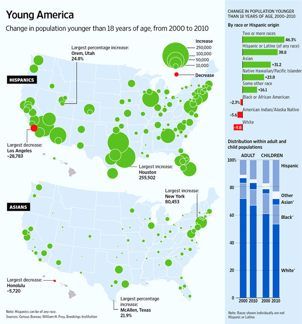
children

How happy are parents vs. non-parents? | Graph
How happy are parents vs. non-parents? | Graphic by Norén based on Margolis and Myrskyla

Kids and happiness

Thanks to my twitter feed I landed on Philip Cohen’s blog post “Children beget happiness, eventually” on his blog Family Inequality. In the post, Cohen discusses A Global Perspective on Happiness and Fertility which appeared in Population and Development Review last March.

Margolis and Myrskyla used the World Values Survey from 1981 – 2005 for a total of 201,988 responses across 86 countries to perform their inquiry into the relationship between having kids and being happy. They measured happiness by asking people “taking all things together, would you say you are very happy, quite happy, somewhat happy, or not at all happy?”. They controlled for all sorts of things that probably matter like socioeconomic status, country level effects, and state welfare regimes. This is global evidence, folks, not US-only.

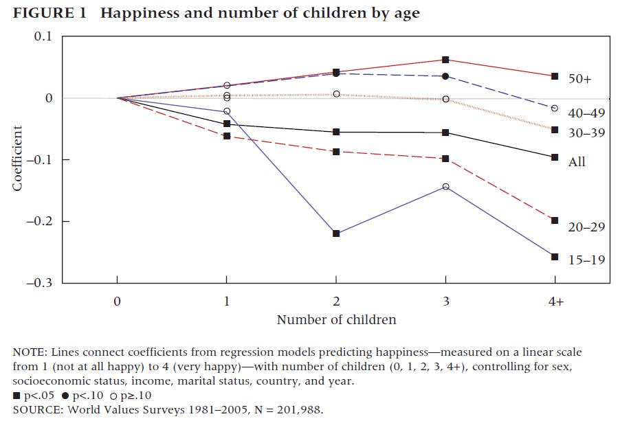
Cohen included the graph below and discussed the author’s findings which, in summary, are as follows:

1. Having kids does not lead to happiness when parents are actively involved in raising said children.
2. Older parents consistently report being happier than their childless counterparts. [My editorial comment: It is reasonable to believe that, for the most part, the children are no longer living with their parents by the time their parents start to report increases in happiness. At the very least, the kids are at least spending more time out of the home by the time mom and dad are between ages 40 and 49. The majority of kids are almost surely out of the house by the time their parents are 50+ which is the ‘happiest’ time to be a parent. Perhaps it’s because parents are proud of their kids’ accomplishments, perhaps it’s because the parents are no longer anxiously worrying about their kids well-being on a day-to-day basis. Who can say.]
3. Results in the 15 – 19 age cohort have fewer data points and are thus somewhat less representative. It’s hard to have three or four kids while in that age cohort.

Happiness and number of children by age of parent | Margolis and Myrskyla

An experiment

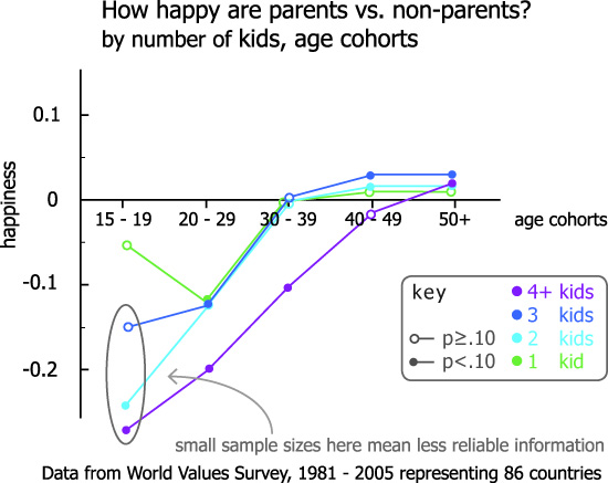
I used the exact same evidence to create the graph at the top of the blog because I wasn’t satisfied that the results were being clearly communicated by the graph above. Instead of plotting the happiness of age cohorts, I flipped it around and looked at happiness by number of children. Since I used the exact same information – pulling it directly from the graph because I couldn’t find a corresponding table in the paper – I do not have distinctly different findings to report. Duh. However, this is an excellent example of why visualizations are meaningful. It’s the same information, plotted in two different ways.

In my version, it is clearer to see that having 1 – 3 children represents extremely similar patterns of happiness across the life course. I discount the results at the very low age range because we know that the data at that end is less-than-representative. If we just look from the 20-29 cohort through to the 50+ cohort, we see that having more kids eventually represents more happiness for parents but that they are about equally unhappy during the most active years of child-rearing.

Having four or more kids breaks the pattern. This is evident in both graphic representations. In my opinion, it is more evident in the first version of the graph than the second version, as they appear in this post. I used a similar sensibility for the colors of 1, 2, and 3 children trends and a different kind of color for the 4+ kids scenario.

The graphs do not explain why having four (or more) kids would be so different than having, say, three kids. More study is needed.

My #1 take-away: do not have four or more children if you value your happiness.
My #2 take-away: Think twice about having any children at all if you would prefer to be happy for the twenty or so years it’s going to take those kids to move out.
My #3 take-away: Thanks, mom and dad. I hope you’re happy now.

References

Cohen, Philip. (14 May 2011) Children beget happiness, eventually [blog post] on Family Inequality.

Conley, Dalton. (2005) The Pecking Order: A Bold New Look at How Family and Society Determine Who We Are, New York: Vintage.

Margolis, Rachel and Mikko Myrskyla. (9 March 2011) A Global Perspective on Happiness and Fertility in Population and Development Review, Vol.37(1): 29-56.

Growth of the population of Hispanic and Asian children in America, 2000-2010
Growth of the population of Hispanic and Asian children in America, 2000-2010 | Wall Street Journal

What works

It’s nice to see all of the Census 2010 data coming out and generating infographics. This one comes from the Wall Street Journal which distilled the above panel of stills from an interactive graphic which also has maps for white and black kids and detailed tables by race and geography.

Though the two stills here do not do a good job of demonstrating the claim in the headline, that there are fewer white kids, the bar graph on the right and the interactive graphics, do, in fact, back up the headline claim. We could quibble about the flipside to the headline – rather than saying there are fewer white kids, should it have pointed out that there are more Hispanic and Asian kids? – but quibbling about headlines isn’t my concern here. Other news outlets did take that spin on the same set of information.

What I like here is that the graphs did not try to show everything all at once – each of the four racial categories included in this series gets its own graph. Yes, there are more than four racial categories and yes, it would be nice to see where other racial categories fit. But inasmuch as I am concerned with the overuse of mapping data, especially when those maps get layered up with all sorts of information that makes them illegible, I am happy to report that these folks had the commonsense to generate one map for each of the racial categories they decided to depict.

One of the incidental facts portrayed here is that the country continues to tip towards the southwest. The big red ‘decrease’ blobs appear in the northeast for whites and blacks and are not compensated for by blue ‘increase’ blobs among Hispanic and Asian births. Because I wouldn’t necessarily have picked this up from looking at a table, I think it’s clear to say that the use of maps was justified in this case because at least part of the story is geographic in nature.

What needs work

I have a tough time with the blob maps. I can get an overview but I have a tough time doing additions, let alone additions and subtractions. The bar graph that appears in the stills helps present the same information in a different way. In this case, the maps can only display the big picture. The bar graph is necessary to help understand how all these blobs add up. In particular, the top graph shows a large increase in the number of mixed-race kids by percentage, but this group is still so small that the absolute numbers wouldn’t even register on the blob maps.

Food for thought

The second, vertical, bar graph is my favorite part that ties all of rest of the information together. We see that white kids still make up more than half of the children born in the US, though it appears that this may not be the case in 2020. We see most clearly that Hispanic kids are growing faster than any other category of kids. I’m going to take this moment to note that Hispanic-ness is an ethnicity, not a race, and that many Hispanic kids are considered white. Remember that Central and South America were colonies of Spain and Portugal and we tend to consider Spanish and Portuguese people white. I’m not prepared to get into a discussion about what it takes to be white in America, just pointing out that Hispanic people are, in many cases, racially white even though they may consider themselves to be ethnically Hispanic. It is possible to hold both of those identities at the same time. Furthermore, if we look back in history there was a time when Irish and Italian immigrants were considered non-white. I have wondered if today’s Hispanics are similar to yesterday’s Irish and Italian immigrants in the sense that they will eventually come to be seen as white ethnics.

This is a debate I’m hardly qualified to comment on and I welcome others who are more qualified to take up this issue in the comments. In particular, I’m wondering how the numbers matter. If there are more and more Hispanics born in the US, will that mean that they are not under pressure to assimilate to mainstream white-ness and will have more opportunities to maintain a distinct identity? Or will the decreasing number of white folks mean that there is pressure to recruit new populations into the white identity as part of our one-drop anti-black legacy? I don’t know what this all means, but I do feel like the numerical balance is meaningful.

References

Frey, William H. (2011) Brookings Institution analysis of 2010 Census Data.

Dougherty, Conor. (6 April 2011) New Faces of Childhood: Census Shows Hispanic and Asian Children Surging as Whites, Blacks Shrink. Wall Street Journal.

Childhood Obesity in the US, 1980 - 2008

What works

This infographic was part of a competition put forth by GOOD magazine on their transparency blog. This graphic didn’t win (winners are here), but I thought it was worth talking about the way Sarah Higgins represented changes in childhood obesity over time. She realized that in order to provide an accurate portrayal of the percentages of children who are overweight and obese, she would do well to display the overall change in the population of children in the US. Where there are just more kids in the US, there will be increases in the absolute number of children who are overweight/obese even if the percentages stay the same. Sometimes people care most about absolute numbers, sometimes they care more about proportions. It can be difficult to tell which is more important than the other. Figuring out a way to display both is often useful.

She shows us the total population as a function of the diameter of the circle. Then the proportion of kids who are overweight and obese are shaded in. We don’t know what the change in the absolute number of kids who are overweight and obese is. Let’s say you are an insurance company and you have to cover the cost of treating kids with, say, early onset Type II diabetes. In that case, you might like to have both the proportions and the absolute figures.

What needs work

If I were Sarah, I would have included some absolute numbers in each of the portions of the circle.

My larger concern is that I don’t believe the size changes in the circle are moving in step with reality. I don’t think the population of children in America is increasing as fast as the graphic suggests. I’m guessing that in order to make the concentric circles comply with the imagination that they ought to be clearly concentric, some fudging happened. Where fudging happens, using actual numbers to clarify is critical. But I don’t support fudging at all. Good infographics pick a rule that works numerically and visually. In this case, I’m guessing that if she had figured out a scalar that worked, her concentric circles would have overlapped one another and been very hard to read. She might have been able to find another scalar factor that would have been able to translate her datapoints into a 2D shape, but without trying it myself, I’m not sure this would have been so easy.

I still think this kind of concentric circle concept is worth considering when you’re confronted with an overall change in your population (more kids!) as well as changes within that population (more overweight and obese kids). If she had simply portrayed changes in the proportions of overweight and obese children we would have missed the idea that the absolute numbers are growing even faster because the underlying population is getting bigger.

References

Higgins, Sarah. (July 2010) Childhood Obesity. [Infographic}

Number in Poverty and Poverty Rate, 1959 - 2009 | US Census Bureau, Current Population Survey
Poverty Rates by Age, 1959 - 2009 | US Census Bureau, Current Population Survey

What Works

I love that recessionary periods are included in this graphic. They are the lavender columns and it is obvious that recessions tend to correlate with increases in the number of people in poverty and that the current recession is really a doozy.

What saddens me the most is the graphic that depicts how poverty breaks down by age. First, note that people over age 65 have the lowest poverty rate of any age group. Then remember that they receive social security and health care. Now wonder what would happen to the economy if every US citizen were supported at that level or above. I cannot answer that question, but this graphic compels me to pose it.

Second, note that the age group most likely to be poverty stricken is children. Over 20 percent of people under the age of 18 are living in poverty. Think about it: if a parent with three kids loses his or her job, that means four people are negatively impacted from that single job loss. In this economy, I’m guessing that is part of the reason we see children sliding into poverty.

Demographic Makeup of the Population at Varying Degrees of Poverty, 2009 | US Census Bureau, Current Population Survey

Third, have a look at this next graphic. Note that beyond the absolute number of poor kids and the rate of poverty among children, the proportion of impoverished Americans who are under 18 shows over-representation. Growing up poor is not only difficult for the kids, but it is not good for the future of the country. Being poor comes with all sorts of baggage for kids – they are more likely to live in poorer school districts with lower quality schools, they are more likely to live in more dangerous neighborhoods, they are more likely to have food insecurity (just try studying for a math test or writing a composition when you’re hungry), poor kids are more likely to be African or Hispanic American which might mean they are also dealing with face-to-face and institutional racism all throughout their lives, and so forth. Not trying to sound like Stevie Wonder here, but these kids are our future. As a country we’re doing a crap job at making sure they have the basic physical, social, and educational support they need to live up to their best potential. Quite stupid. Decision making made by people who have trouble seeing past the end of their own nose, perhaps?

Forgive me. I know I am supposed to keep politics out of my blog but it’s hard to see how making sure kids are not living in poverty is a political issue. It’s a human issue. I would hope we can at least agree kids should not be living in poverty. I realize that it is much more difficult to agree on how to go about getting them out of poverty and preventing others from becoming poverty-stricken in the first place.

What Needs Work

Right. So what needs work here is our economy. But that is not news so I’ll let that debate sit.

The New York Times article about this topic pointed out that what needs work is the way the poverty line is calculated. On one hand, at about $11,000 for a single adult and $22,000 for a family of four it’s awfully low. This is because when the original formula for calculating poverty was adopted, it was tied to food prices and food budgets now make up a smaller proportion of the overall family budget than they did when the formula was concocted. [Remember this example folks: equations are not unbiased.] Over the years, family food budgets have experienced a real drop due to subsidies (the true costs are not passed to consumers), technological advances (we can grow more for less $ with fertilizer, GMOs, antibiotics for livestock, and pesticides for greens/grains), and ‘advances’ in corporate agriculture (economies of scale, see Michael Pollan’s work, Eric Schlosser’s “Fast Food Nation”, Marion Nestle’s “Food Politics”). Other critical costs for surviving from day to day like housing and health care have risen. On the other hand, benefits from programs like food stamps are not included in ‘income’ so there might be a few people bouncing above that poverty line once we take their food stamps (and a few other benefits) into account. Then again, the poverty line is too low so even if food stamps sends a family above it, they are still likely to experience poverty even if they don’t fit the current fiscal definition of poverty. The other problem with the calculation is that it does not take into account differences in regional costs of living. Living in New York City is expensive. Living in a rural area may be less so though paying to own, insure, maintain, and fuel a car or two to drive to work, school, and the grocery store could hike up the rural cost of living more than I know. With an annual budget of $22,000 for a family of four, a car or two would be a real cost, one that an NYC resident would not need to handle.

There is a graphic in the report that shows where poverty rates would be if the poverty line were adjusted upward or downwards.

References

DeNavas-Walt, Carmen; Proctor, Bernadette; Smith, Jessica. (September 2010) Income, Poverty, and Health Insurance Coverage in the United States, 2009 US Census Bureau, Current Population Reports: Consumer Income.

Eckholm, Eric. (16 September 2010)
Poverty Rate Rose Sharply in 2009, Says Census Bureau
. New York Times.